User talk:Geo Swan/archive/2007
- User Talk:Geo Swan/archive/2005
- User Talk:Geo Swan/archive/2006
- User Talk:Geo Swan/archive/2007
- User Talk:Geo Swan/archive/2008
- User Talk:Geo Swan/archive/2009
- User Talk:Geo Swan/archive/2010
- User Talk:Geo Swan/archive/2011
- User Talk:Geo Swan/archive/2012
- User Talk:Geo Swan/archive/2013
- User Talk:Geo Swan/archive/2014
- User Talk:Geo Swan/archive/2015
- User Talk:Geo Swan/archive/2016
- User Talk:Geo Swan/archive/2017
- User Talk:Geo Swan/archive/2018 01 02 03 04 05 06 07 08 09 10 11 12
- User Talk:Geo Swan/archive/2019 01 02 03 04 05 06 07 08 09 10 11 12
- User Talk:Geo Swan/archive/2020 01 02 03 04 05 06 07 08 09 10 11 12
- User Talk:Geo Swan/archive/2021 01 02 03 04 05 06 07 08 09 10 11 12
Image:Communities where Inuktitut is spoken.png[edit]
Hi, you marked Image:Communities where Inuktitut is spoken.png for deletion, but did not give a reason besides saying it's "administrative". Also note that on commons, {{speedydelete|give reason}} is used for speedydeletion, and that {{delete}} is the ordinary process. Commons:Deletion guidelines has more options. At the moment, Image:Communities where Inuktitut is spoken.png is sitting in "incomplete deletion requests" and is NOT considered for deletion. Thank you. Deadstar 15:26, 12 July 2007 (UTC)
Readable river maps[edit]


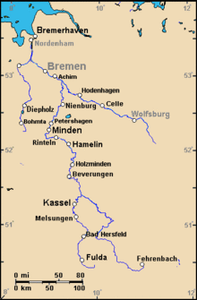
04-Oct-2007: I am using your original maps, with the labels enlarged and background colors filled as dimmer; for Germany (or Austria), I am thinking: land as dark tan, with highlight areas of dark green and medium brown (Bavarian coloring uses brown).
- Font-size - The major trick for readable maps is font-size as 1 pixel letter width for each 200px of image width: when labels are only 1-pixel thick, the "full-size" map should not exceed 300px wide. A 600px-wide map should have 3-pixel-thick lettering, or at least "2.5" pixels, as 2 solid pixels plus a gray-shade pixel. Note: most maps on the Internet will not look good on Wikipedia due to the small font-sizes. So almost all maps should be adjusted for Wikipedia. Using 1-pixel-per-200px-width is almost magic for making maps suddenly readable (when resized small).
- Coloring - For Germany (or Austria), I have begun using dimmer colors: land as dark tan (Red/Green/Blue RGB = 250/223/184), with highlight areas of dark green and medium brown. This is based on Bavarian coloring that uses brown and dark wood colors. Also, in Arab countries, such as Egypt, there seems to be a preference for dimmer colors on maps, perhaps even darker than in Germany. I am trying to keep local maps shaded with the coloring as preferred by the local culture. I think in Denmark, various lighter shades of green as preferred. There is a lot of potential here for interesting maps that local people will use more.
- Coordinates - Moving coordinates inside the map allows for more narrow size, and magnifies the contents as a map becomes more narrow. I have used a dark-gray for German map coordinates; however, the standard American CIA maps label map coordinates in a light, sky-blue. The CIA maps are good for whole-country maps, but I prefer other colors for river-maps, such as you have been creating.
- Non-equirectangular longitude - On English Wikipedia, I have created a template that allows the typical polar skew where longitude lines converge to the north: en:Template:Location map skew. It is a lengthy template and can only be used a few times in an article due to consuming the template resources. However, it is possible to use that template once, following an infobox, to label 4 extra points on a river map.
Also see: "en:Template:Location map many" for putting, up to 9, multiple markers on a rectangular map. Those are the major issues for Wikipedia maps that I have been analyzing. Good luck with this. -Wikid77 06:17, 4 October 2007 (UTC)