Commons:Featured picture candidates/File:Stained-glass Antwerp 3a.jpg
Jump to navigation
Jump to search

File:Stained-glass Antwerp 3a.jpg[edit]
Voting period is over. Please don't add any new votes.Voting period ends on 2 Nov 2015 at 23:49:45 (UTC)
Visit the nomination page to add or modify image notes.

- Category: Commons:Featured pictures/Objects
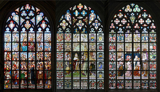
 Info Three stained-glass windows in the Cathedral of Our Lady, Antwerp. From left to right: Saint Ursula and Saint Gaspar, by E. Didron, 1873; Alexander Farnese offering the keys of Antwerp to Our Lady, by Stalins & Janssens, 1884; and Our Lady of Stekske, by Stalins & Janssens, 1878. There are 34 large stained-glass windows in the cathedral. All by Alvesgaspar (talk) 23:49, 24 October 2015 (UTC)
 Support -- Alvesgaspar (talk) 23:49, 24 October 2015 (UTC)
- Support Excellent Quality. --The Photographer (talk) 23:52, 24 October 2015 (UTC)
- Support --LivioAndronico (talk) 07:00, 25 October 2015 (UTC)
 Oppose I suppose you made 3 different shots and stitch them in one, but problem in there is visible difference in exposition and WB, so you should enframe them separately giving some space between them. Borders in shadow are disturbing and one might think this is original appearance. Otherwise vitrages are great. --Mile (talk) 08:08, 25 October 2015 (UTC)
- Oppose per Mile. The seams are very prominently not matching. — Julian H.✈ 09:11, 25 October 2015 (UTC)
 Question I can't really see the mismatched seams that well ... can someone point them out in a note? Daniel Case (talk) 03:50, 26 October 2015 (UTC)
- I put two notes. --Mile (talk) 13:47, 26 October 2015 (UTC)
- Can anything be done about this? I suppose the changes would take longer, won't they? --Tremonist (talk) 15:17, 27 October 2015 (UTC)
- Info The only thing that can be done is to paint the offending areas by cloning. I'm not sure I will or should do that. @Mile: the differences between the windows are colour differences, not caused by variations in wb or exposition. Alvesgaspar (talk) 15:58, 27 October 2015 (UTC)
- @Alvesgaspar: I am talking for differences in shadows. Vitgares are fine. You just cut each from your originals and put them in one photo, some white spacing between. I cant solve it from this one since you made some unlucky borders and rectangles...and this is FP worthy. --Mile (talk) 17:18, 27 October 2015 (UTC)
![]() I withdraw my nomination Thanks to all for the suggestions. I will re-submit a new version with improvements. Alvesgaspar (talk) 16:49, 31 October 2015 (UTC)
I withdraw my nomination Thanks to all for the suggestions. I will re-submit a new version with improvements. Alvesgaspar (talk) 16:49, 31 October 2015 (UTC)