Commons:Featured picture candidates/File:Sonnenuntergang am Kaisergebirge, Tirol, 160623, ako.jpg
Jump to navigation
Jump to search

File:Sonnenuntergang am Kaisergebirge, Tirol, 160623, ako.jpg, not featured[edit]
Voting period is over. Please don't add any new votes.Voting period ends on 13 Mar 2017 at 00:43:18 (UTC)
Visit the nomination page to add or modify image notes.

- Category: Commons:Featured pictures/Places
 Info created & uploaded by User:Code - nominated by User:Ikan Kekek -- Ikan Kekek (talk) 00:43, 4 March 2017 (UTC)
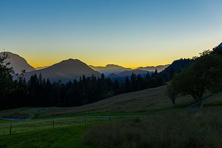
 Support - If your first reaction is "This is just another sunset picture", hear me out. No it's not. First of all, I think this very peaceful rural motif is borderline featurable even in normal light. But beyond that, this is a picture of a sunset in which we can't see the sun but can see the light in several colors being refracted by and through the mountains and coming up behind them. I can't know whether it'll be special enough to you for you to vote to feature the photo, but it is to me, and it surely is not just an average well-taken sunset shot. -- Ikan Kekek (talk) 00:43, 4 March 2017 (UTC)
 Oppose Oversaturated, tilting, unnatural colors, unsharp, lack of wow. -- KennyOMG (talk) 01:41, 4 March 2017 (UTC)
- Someone else can address the rest of your objections if they like ("tilting" strikes me as an odd objection to a photo of a hilly area, but maybe there's something I missed), but knowing the solar light spectrum as we all do, why do you think the colors are "unnatural"? -- Ikan Kekek (talk) 02:04, 4 March 2017 (UTC)
- Seems like I'm on an oppose run tonight. I get that the rays are from the sun and are not supposed to be horizontal, however 3–4 degrees cw looks more natural to me (especially the trees on the far right). Can't be sure though, maybe I'm wrong about it. However the colors _do_ look unnatural to me, specifically the yellow. Even with the saturation dialed down to −30 or so it still doesn't feel right. I've seen some weirdo sunsets but never canary-yellow. Again, might be my mistake, and if you can point me to other examples of it I'll happily change to Neutral since that's my biggest gripe with this one. -- KennyOMG (talk) 05:21, 4 March 2017 (UTC)
- Well, I'm of course fine with oppose votes but I think KennyOMG is wrong regarding tilt and unsharpness. There is no tilt IMO (how would you see it, there are no verticals in the picture?) and the sharpness is rather excellent (it's the sharpest lens I own and the settings were just right for this situation). Saturation and wow may be a matter of taste, of course. --Code (talk) 06:58, 4 March 2017 (UTC)
- As I've said, Code, the trees on the right look more natural with a few degrees cw. However there's also a somewhat objective way of judging (not 100% but shows medium to large tilts): reduce the colorspace to 8 bits with no dither and you'll see how the different colors start to band. The yellow should be horizontal on the left, curving slightly downwards towards the right as you get closer to the sun. As for unsharp, I was referring to the bottom part of the image - but thinking about it I'll retract that, since most digital sensors have trouble resolving dark greens to begin with. Instead I'd like to point out auras around some hills (but not all). -- KennyOMG (talk) 19:59, 5 March 2017 (UTC)
- Support Thank you for the nomination, Ikan Kekek. I know that sunset pictures are always very difficult here and I'm therefore not sure this one will pass but for me it's one of my better landscape pictures. And yes, I indeed increased the saturation of the red and yellow tones somewhat to emphasize the warm light of the sun a little bit because that's what my impression was when I was there. The RAW file of course looks somewhat flat (as mostly). What I personally like of this picture is the depth it provides due to the different mountain layers. --Code (talk) 06:58, 4 March 2017 (UTC)
- Support Daniel Case (talk) 17:20, 4 March 2017 (UTC)
- Support - It's not significantly tilted, and clearly not by 3 or 4°... the evergreen trunks in the background are perfectly vertical as near as I can tell. I do think it's a little oversaturated but probably not enough to ruin it. –Juliancolton | Talk 01:45, 5 March 2017 (UTC)
- Oppose Per Kenny, the yellow and blue look off a bit to me too. lNeverCry 07:27, 5 March 2017 (UTC)
- Support – LucasT 10:44, 5 March 2017 (UTC)
- Support --Martin Falbisoner (talk) 11:48, 5 March 2017 (UTC)
- Support Most people go home, when the sun is set; photographers know: that's when the colors start to show .. --PtrQs (talk) 23:07, 5 March 2017 (UTC)
- Oppose sorry, but I think this image is oversaturated: blue fog??? --Alchemist-hp (talk) 00:47, 6 March 2017 (UTC)
- I've seen purple fog at sundown, so why not blue fog? Ikan Kekek (talk) 03:04, 6 March 2017 (UTC)
- Because perhaps "oversaturated"!? --Alchemist-hp (talk) 07:21, 6 March 2017 (UTC)
- Oppose per others. --Milseburg (talk) 11:34, 12 March 2017 (UTC)
Confirmed results: