Commons:Featured picture candidates/File:Rio de Janeiro Mountains.jpg
Jump to navigation
Jump to search


File:Rio de Janeiro Mountains.jpg[edit]
Voting period is over. Please don't add any new votes.Voting period ends on 19 Nov 2015 at 09:15:16 (UTC)
Visit the nomination page to add or modify image notes.

- Category: Commons:Featured pictures/Natural phenomena
 Info created and uploaded by Donatas Dabravolskas - nominated by Arion -- 😄 ArionEstar 😜 (talk) 09:15, 10 November 2015 (UTC)
 Support Fantastic mood. -- 😄 ArionEstar 😜 (talk) 09:15, 10 November 2015 (UTC)
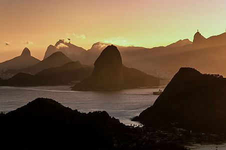
 Neutral fake colors --The Photographer (talk) 12:27, 10 November 2015 (UTC)
 Question Before yelling "Fake!" let me ask the question: Were the colors retouched in such a way that they differ significantly from the actual scene? --Hendric Stattmann (talk) 12:51, 10 November 2015 (UTC)
- I was there, there. I never saw that colors intensity. --The Photographer (talk) 13:04, 10 November 2015 (UTC)
- @The Photographer: Hello my dear The Photographer! Ok. Can you fix that? 😄 ArionEstar 😜 (talk) 14:46, 10 November 2015 (UTC)
- I was there, there. I never saw that colors intensity. --The Photographer (talk) 13:04, 10 November 2015 (UTC)
 Oppose It certainly looks over-coloured and this tool indicates the Lightroom modifications made. The problem is, what you see here is the photographer's creation as he/she intended it. It's a bit disrespectful to say "Can you fix it?" Such a hyper-real photography is popular (e.g., http://www.stuckincustoms.com/) and just not the kind of image we tend to value on Commons FP. -- Colin (talk) 20:05, 10 November 2015 (UTC)
- Oppose per Colin. Daniel Case (talk) 20:57, 10 November 2015 (UTC)
- Oppose per Colin. --Tremonist (talk) 13:44, 11 November 2015 (UTC)
 Comment Some one saw that we have a whole village at the bottom? This black points that could be birds, but at the final picture, seem to be just dust in the sensor, anyway...
- On the winter, because of pollution, and other shits, this colour is not rare too see, but it's a little bit less: similar to this (crazy google photos link, I did not uploaded here, because the amount of noisy/artefacts created raising the shadow, especially in JPEG file), however, in this case, the main problem is not the colour, that is not that much far from real (the alt is even further away from reality) check another image, the main issue is that the colour lead us to the boring sky, and it's so dark at the bottom that we lost this village, the city at the left, creating a illusion of uninhabited site.
- And I really do not like "over-processed" images as 110% of "winners" in WLE "BR": as this (o.O), but some fine editions, creating a artistic look, could be very interesting, and should be more accepted; here you demonise even fine art, that do not even derail from the educational purpose... Another day I had to hear that B&W should not be FP, because the world is colour-full... We need to stop enter in the Colin's vibe, and not raise to many barriers, to not died in your own poop, that do not mean low the level, but be aware that we have to evaluate by the photo, not by a general rule. -- RTA 06:05, 13 November 2015 (UTC)
Alt version[edit]

- Info This file was derived from: Rio de Janeiro Mountains.jpg
by dably, small colors and light fixs by The Photographer. Btw, I can't fix it because it could be done from the RAW file, there was a color destruction by the imposition of yellow. However, I try to reconstruct the colors. This is only a representation of what I think could be observed, however, is not the reality. --The Photographer (talk) 16:31, 10 November 2015 (UTC)- @The Photographer: Do you consider this colors better? 😄 ArionEstar 😜 (talk) 16:51, 10 November 2015 (UTC)
- This is not better or worse, it's just my humble representation of what I think can be closer to reality. This colors IMHO could be more closer to reality yes. --The Photographer (talk) 16:54, 10 November 2015 (UTC)
- @The Photographer: Do you consider this colors better? 😄 ArionEstar 😜 (talk) 16:51, 10 November 2015 (UTC)
- Oppose Pointless alteration. The colours are a bit faded imo and the technical quality is lacking for FP. And The Photographer, once again, you are not the "Author". This is a derivative work and you must jointly credit the author(s) of the work(s) you derived in a way just as prominent as your own name. This is the law, not an optional nicety. -- Colin (talk) 20:05, 10 November 2015 (UTC)
- Per Colin Daniel Case (talk) 20:57, 10 November 2015 (UTC)
- Oppose per Colin. --Tremonist (talk) 13:43, 11 November 2015 (UTC)
- Oppose per Colin. --The Photographer (talk) 16:02, 12 November 2015 (UTC)
- Oppose Per Colin --Medium69 You wanted talk to me? 12:32, 13 November 2015 (UTC)
 I withdraw my nomination 😄 ArionEstar 😜 (talk) 00:52, 14 November 2015 (UTC)