Commons:Quality images candidates/Archives October 08 2021
Jump to navigation
Jump to search

-
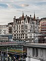
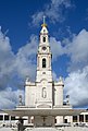
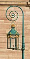
- Nomination Building at rue du Grand-Chene 8 in Lausanne, Vaud, Switzerland. --Tournasol7 03:41, 6 October 2021 (UTC)
- Promotion
 Support Good quality.--Agnes Monkelbaan 04:17, 6 October 2021 (UTC)
-
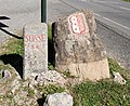
- Nomination France-Switzerland boundary stone at Pas de Morgins in Morgins, canton of Valais, Switzerland. --Tournasol7 03:41, 6 October 2021 (UTC)
- Promotion Support Good quality.--Agnes Monkelbaan 04:15, 6 October 2021 (UTC)
-

- Nomination Port of La Tour-de-Peilz, canton of Vaud, Switzerland. --Tournasol7 03:41, 6 October 2021 (UTC)
- Promotion Support Good quality. --XRay 03:58, 6 October 2021 (UTC)
-
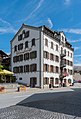
- Nomination Auberge de la Bourgeoisie in Troistorrents, Valais, Switzerland. --Tournasol7 03:41, 6 October 2021 (UTC)
- Promotion Support Good quality. --XRay 03:58, 6 October 2021 (UTC)
-

- Nomination Parco fluviale alta Val d'Elsa park. --Moroder 02:51, 6 October 2021 (UTC)
- Promotion Support Good quality. --Knopik-som 02:51, 6 October 2021 (UTC)
-

- Nomination Panoramic view of Manerba. --Moroder 02:51, 6 October 2021 (UTC)
- Promotion Support Good quality. --Knopik-som 02:52, 6 October 2021 (UTC)
-

- Nomination Colchicum autumnale. --Moroder 02:51, 6 October 2021 (UTC)
- Promotion Support Good quality -- Johann Jaritz 03:04, 6 October 2021 (UTC)
-

- Nomination Malva sylvestris. --Moroder 02:51, 6 October 2021 (UTC)
- Promotion Support Good quality -- Johann Jaritz 03:04, 6 October 2021 (UTC)
-

- Nomination View of San Gimignano. --Moroder 02:51, 6 October 2021 (UTC)
- Promotion Support Good quality. --Knopik-som 02:52, 6 October 2021 (UTC)
-

- Nomination Asarum europaeum. Leaf adaxial side. --Knopik-som 02:48, 6 October 2021 (UTC)
- Promotion Support Good quality -- Johann Jaritz 02:57, 6 October 2021 (UTC)
-

- Nomination Frangula alnus. Leaf adaxial side. --Knopik-som 02:48, 6 October 2021 (UTC)
- Promotion Support Good quality -- Johann Jaritz 02:51, 6 October 2021 (UTC)
-

- Nomination Frangula alnus. Leaf abaxial side. --Knopik-som 02:48, 6 October 2021 (UTC)
- Promotion Support Good quality -- Johann Jaritz 02:55, 6 October 2021 (UTC)
-

- Nomination Populus. Leaf adaxial side. --Knopik-som 02:48, 6 October 2021 (UTC)
- Promotion Support Good quality -- Johann Jaritz 02:51, 6 October 2021 (UTC)
-
- Nomination Populus. Leaf abaxial side. --Knopik-som 02:48, 6 October 2021 (UTC)
- Promotion Support Good quality -- Johann Jaritz 02:55, 6 October 2021 (UTC)
-

- Nomination Porch of the parish church Saint Nicholas on Kirchplatz #1 in Sirnitz, Albeck, Carinthia, Austria -- Johann Jaritz 02:46, 6 October 2021 (UTC)
- Promotion Support Good quality. --Knopik-som 02:49, 6 October 2021 (UTC)
-

- Nomination Gravestone of Josef Lackner at the parish church Saint Nicholas in Sirnitz, Albeck, Carinthia, Austria -- Johann Jaritz 02:46, 6 October 2021 (UTC)
- Promotion Support Good quality. --Knopik-som 02:49, 6 October 2021 (UTC)
-
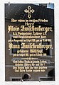
- Nomination Gravestone of family Zwischenberger at the parish church Saint Nicholas in Sirnitz, Albeck, Carinthia, Austria -- Johann Jaritz 02:46, 6 October 2021 (UTC)
- Promotion Support Good quality. --Knopik-som 02:50, 6 October 2021 (UTC)
-

- Nomination Northeastern portal of the parish church Saint Nicholas on Kirchplatz #1 in Sirnitz, Albeck, Carinthia, Austria -- Johann Jaritz 02:46, 6 October 2021 (UTC)
- Promotion Support Good quality. --Knopik-som 02:50, 6 October 2021 (UTC)
-

- Nomination South wall with retaining walls of the Roman Catholic parish church Saint Nicholas in Sirnitz, Albeck, Carinthia, Austria -- Johann Jaritz 02:46, 6 October 2021 (UTC)
- Promotion Support Good quality. --Knopik-som 02:50, 6 October 2021 (UTC)
-

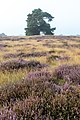
- Nomination Nature reserve “Westruper Heide” at the flowering of the heath, Haltern am See, North Rhine-Westphalia, Germany --XRay 02:40, 6 October 2021 (UTC)
- Promotion Support Good quality -- Johann Jaritz 02:48, 6 October 2021 (UTC)
-

- Nomination Nature reserve “Westruper Heide” at the flowering of the heath, Haltern am See, North Rhine-Westphalia, Germany --XRay 02:40, 6 October 2021 (UTC)
- Promotion Support Good quality -- Johann Jaritz 02:48, 6 October 2021 (UTC)
-

- Nomination House (Jücherstraße) in Esens, Lower Saxony, Germany --XRay 02:40, 6 October 2021 (UTC)
- Promotion Support Good quality -- Johann Jaritz 02:48, 6 October 2021 (UTC)
-

- Nomination Gläske House in Esens, Lower Saxony, Germany --XRay 02:40, 6 October 2021 (UTC)
- Promotion Support Good quality -- Johann Jaritz 02:50, 6 October 2021 (UTC)
-

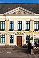
- Nomination Town hall in Bremen, Germany --XRay 02:40, 6 October 2021 (UTC)
- Promotion Support Good quality -- Johann Jaritz 02:50, 6 October 2021 (UTC)
-
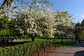
- Nomination Boston Public Garden. --King of Hearts 01:52, 6 October 2021 (UTC)
- Promotion Support Good quality. --XRay 02:41, 6 October 2021 (UTC)
-

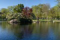
- Nomination Boston Public Garden Pond. --King of Hearts 01:52, 6 October 2021 (UTC)
- Promotion Support Good quality. --XRay 02:41, 6 October 2021 (UTC)
-

- Nomination Boston Public Garden Pond. --King of Hearts 01:52, 6 October 2021 (UTC)
- Promotion Support Good quality. --XRay 02:41, 6 October 2021 (UTC)
-
- Nomination Boston Public Garden Pond. --King of Hearts 01:52, 6 October 2021 (UTC)
- Promotion Support Good quality. --XRay 02:43, 6 October 2021 (UTC)
-

- Nomination Cessna Citation 525B N357N --Acroterion 01:44, 6 October 2021 (UTC)
- Promotion Support Good quality. --XRay 02:43, 6 October 2021 (UTC)
-

- Nomination A window at the Delaplaine Visual Arts Center, Frederick, Maryland --Acroterion 01:44, 6 October 2021 (UTC)
- Promotion Support Good quality. --XRay 02:43, 6 October 2021 (UTC)
-

-

- Nomination The Heaven - Marcantonio Bassetti.jpg --Commonists 19:36, 5 October 2021 (UTC)
- Promotion Support Good quality. --Steindy 00:09, 6 October 2021 (UTC)
-

- Nomination Nest of the median wasp (Dolichovespula media) --Carsten Steger 19:26, 5 October 2021 (UTC)
- Promotion Support Good quality. --Steindy 00:09, 6 October 2021 (UTC)
-

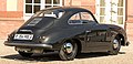
- Nomination FMR Tg500 at Classic-Gala Schwetzingen 2021.--Alexander-93 18:54, 5 October 2021 (UTC)
- Promotion Support Good quality. --Túllio F 23:46, 5 October 2021 (UTC)
-
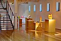
- Nomination Glasmuseum Lette--Horst J. Meuter 18:20, 5 October 2021 (UTC) Support Good quality. --Steindy 00:17, 6 October 2021 (UTC)
- Promotion {{{2}}}
- Nomination Glasmuseum Lette--Horst J. Meuter 18:20, 5 October 2021 (UTC)
-

- Nomination Porsche 356 A Speedster at Classic-Gala Schwetzingen 2021.--Alexander-93 15:57, 5 October 2021 (UTC)
- Promotion Support Good quality. --Halavar 16:13, 5 October 2021 (UTC)
-
- Nomination Porsche 356 pre A coupe at Classic-Gala Schwetzingen 2021.--Alexander-93 15:57, 5 October 2021 (UTC)
- Promotion Support Good quality. --Carsten Steger 19:34, 5 October 2021 (UTC)
-

- Nomination Porsche 914-6 at Classic-Gala Schwetzingen 2021.--Alexander-93 15:57, 5 October 2021 (UTC)
- Promotion Good Quality --PtrQs 16:14, 5 October 2021 (UTC) Support Good quality. --Túllio F 23:46, 5 October 2021 (UTC)
-

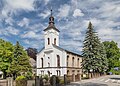
- Nomination Church of Saint Martin. Ochaby, Silesian Voivodeship, Poland. --Halavar 15:24, 5 October 2021 (UTC)
- Promotion Support Good quality. --Dey.sandip 16:32, 5 October 2021 (UTC)
-
- Nomination Lutheran church. Goleszów, Silesian Voivodeship, Poland. --Halavar 15:24, 5 October 2021 (UTC)
- Promotion Support Good quality. --Commonists 19:37, 5 October 2021 (UTC)
-
- Nomination Our Lady of the Snow chapel. Kacwin, Lesser Poland Voivodeship, Poland. --Halavar 15:24, 5 October 2021 (UTC)
- Promotion Support Good quality. --Tournasol7 15:50, 5 October 2021 (UTC)
-

- Nomination Holy Trinity church. Ulanów, Subcarpathian Voivodeship, Poland. --Halavar 15:24, 5 October 2021 (UTC)
- Promotion Support Good quality. --Tournasol7 15:50, 5 October 2021 (UTC)
-

- Nomination Facelifted Volkswagen Polo VI in Stuttgart-Vaihingen.--Alexander-93 15:13, 5 October 2021 (UTC)
- Promotion Support Good quality. --Commonists 19:37, 5 October 2021 (UTC)
-
-

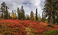
- Nomination Palkaskero in Pallas-Yllästunturi National Park --Ximonic 15:00, 5 October 2021 (UTC)
- Promotion Support Good quality. --Tournasol7 03:42, 6 October 2021 (UTC)
-

- Nomination St Martin church in St-Martin-le-Mault, Haute-Vienne, France. (By Tournasol7) --Sebring12Hrs 14:30, 5 October 2021 (UTC)
- Promotion Support Good quality. --Halavar 16:13, 5 October 2021 (UTC)
-

- Nomination La Tour aux Paulmes castle in Verneuil-Moustiers, H Vienne, France. (By Tournasol7) --Sebring12Hrs 14:30, 5 October 2021 (UTC)
- Promotion Good quality. --Ximonic 15:05, 5 October 2021 (UTC)
-

- Nomination Town hall of Bellac, Haute-Vienne, France. (By Tournasol7) --Sebring12Hrs 14:30, 5 October 2021 (UTC)
- Promotion Good quality. --Ximonic 15:05, 5 October 2021 (UTC)
-

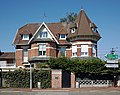
- Nomination Building of the Employment Agency Bayreuth-Hof. --PantheraLeo1359531 12:53, 5 October 2021 (UTC)
- Promotion Support Good quality. --Halavar 15:34, 5 October 2021 (UTC)
-

-

- Nomination Portal of Capelas Imperfeitas, Monastery of Batalha, Portugal. -- Alvesgaspar 11:03, 5 October 2021 (UTC)
- Promotion Support Good quality. --Commonists 19:37, 5 October 2021 (UTC)
-
- Nomination Church of Nossa Senhora do Rosário. Fátima, Portugal. -- Alvesgaspar 11:03, 5 October 2021 (UTC)
- Promotion Good quality. --Ximonic 15:05, 5 October 2021 (UTC)
-

- Nomination Cloister of D. João I. Monastery of Batalha, Portugal. -- Alvesgaspar 11:03, 5 October 2021 (UTC)
- Promotion Support Good quality. --Poco a poco 19:29, 5 October 2021 (UTC)
-

-
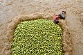
- Nomination A worker rests in between work at the Kothapet fruit market, Hyderabad, India --Dey.sandip 09:17, 5 October 2021 (UTC)
- Promotion Support A bit soft but still over the bar --Poco a poco 19:29, 5 October 2021 (UTC)
-

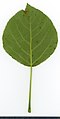
- Nomination Asarum europaeum. Leaf abaxial side. --Knopik-som 08:27, 5 October 2021 (UTC)
- Promotion Support Good quality. --Steindy 09:16, 5 October 2021 (UTC)
-

- Nomination Betula. Leaf adaxial side. --Knopik-som 08:27, 5 October 2021 (UTC)
- Promotion Support Good quality. --Steindy 09:16, 5 October 2021 (UTC)
-

- Nomination Betula. Leaf abaxial side. --Knopik-som 08:27, 5 October 2021 (UTC)
- Promotion Support Good quality. --Steindy 09:16, 5 October 2021 (UTC)
-

- Nomination Aronia mitschurinii. Leaf adaxial side. --Knopik-som 08:27, 5 October 2021 (UTC)
- Promotion Support Good quality. --Steindy 09:16, 5 October 2021 (UTC)
-

- Nomination Aronia mitschurinii. Leaf abaxial side. --Knopik-som 08:27, 5 October 2021 (UTC)
- Promotion Support Good quality. --Steindy 09:16, 5 October 2021 (UTC)
-

- Nomination Aerial view of Hirschaid in the district of Bamberg --Ermell 08:00, 5 October 2021 (UTC)
- Promotion Support Good quality. --Knopik-som 08:28, 5 October 2021 (UTC)
-

- Nomination Aerial view of the bridge over the Main-Danube Canal in Hirschaid. View direction north towards Bamberg. --Ermell 08:00, 5 October 2021 (UTC)
- Promotion Support Good quality. --Knopik-som 08:28, 5 October 2021 (UTC)
-

- Nomination Aerial view of Hirschaid in the district of Bamberg --Ermell 08:00, 5 October 2021 (UTC)
- Promotion Support Good quality. --Knopik-som 08:29, 5 October 2021 (UTC)
-

- Nomination Aerial view of Eggolsheim station in Neuses an der Regnitz --Ermell 08:00, 5 October 2021 (UTC)
- Promotion Support Good quality. --Knopik-som 08:29, 5 October 2021 (UTC)
-

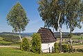
- Nomination Aerial view of Wonsees in the district of Bayreuth --Ermell 08:00, 5 October 2021 (UTC)
- Promotion Support Good quality. --Knopik-som 08:29, 5 October 2021 (UTC)
-

-

- Nomination Sheep in Virkaniemi, Pirkkala. --Kallerna 06:38, 5 October 2021 (UTC)
- Decline
 Oppose Large part out of focus. --Palauenc05 11:45, 5 October 2021 (UTC)
-

- Nomination Art Nouveau houses, Avenue Edouard Vaillant 1 to 5, Croix, France --Velvet 06:16, 5 October 2021 (UTC)
- Promotion Support Good quality. --Knopik-som 08:32, 5 October 2021 (UTC)
-
- Nomination Eclectic house, Avenue de Flandre 67, Croix, France --Velvet 06:15, 5 October 2021 (UTC)
- Promotion Support Good quality. --Knopik-som 08:32, 5 October 2021 (UTC)
-

- Nomination Monastery of Jesus, Setúbal, Portugal --Poco a poco 06:13, 5 October 2021 (UTC)
- Promotion Support Good quality. --Halavar 21:38, 5 October 2021 (UTC)
-

- Nomination St. Julian Church, Setúbal, Portugal --Poco a poco 06:13, 5 October 2021 (UTC)
- Promotion Support Good quality. --Dey.sandip 16:38, 5 October 2021 (UTC)
-

- Nomination Church of the Monastery of Jesus, Setúbal, Portugal --Poco a poco 06:13, 5 October 2021 (UTC)
- Promotion Support Good quality. --Knopik-som 08:34, 5 October 2021 (UTC)
-

- Nomination Church of St. Mary of Graces, Setúbal, Portugal --Poco a poco 06:13, 5 October 2021 (UTC)
- Promotion Support Good quality. --Knopik-som 08:34, 5 October 2021 (UTC)
-

- Nomination Church of St. Sebastian, Setúbal, Portugal --Poco a poco 06:13, 5 October 2021 (UTC)
- Promotion Support Good quality. --Knopik-som 08:34, 5 October 2021 (UTC)
 Comment Rotate 180°. Knopik-som,Poco a poco --PetarM 10:36, 5 October 2021 (UTC)
-
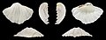
- Nomination Left valve ofa Giant clam, Tridacna gigas --Llez 05:42, 5 October 2021 (UTC)
- Promotion Support Good quality -- Johann Jaritz 05:45, 5 October 2021 (UTC)
-

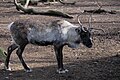
- Nomination Wolf; Wildpark Knüll, Schwalm-Eder-Kreis, Hesse, Germany --Llez 05:42, 5 October 2021 (UTC)
- Promotion Support Good quality -- Johann Jaritz 05:45, 5 October 2021 (UTC)
-

- Nomination Tree remnant, Wildpark Knüll, Schwalm-Eder-Kreis, Hesse, Germany --Llez 05:42, 5 October 2021 (UTC)
- Promotion Support Very smart photo! Good quality -- Johann Jaritz 06:07, 5 October 2021 (UTC)
-

- Nomination Westmaas-NL, the reformed church --Michielverbeek 05:19, 5 October 2021 (UTC)
- Promotion Support Good quality -- Johann Jaritz 06:06, 5 October 2021 (UTC)
-
- Nomination Klaaswaal-NL, the reformed church --Michielverbeek 05:19, 5 October 2021 (UTC)
- Promotion Support Good quality -- Johann Jaritz 06:06, 5 October 2021 (UTC)
-

- Nomination Strijen-NL, cghurch: the Grote- of Sint Lambertuskerk --Michielverbeek 05:19, 5 October 2021 (UTC)
- Promotion Support Good quality. --XRay 05:24, 5 October 2021 (UTC)
-

- Nomination Maasdam-NL, the Church --Michielverbeek 05:19, 5 October 2021 (UTC)
- Promotion Support Good quality. --XRay 05:24, 5 October 2021 (UTC)
-

- Nomination 's-Gravendeel-NL, church: the Kerk op de Heul --Michielverbeek 05:19, 5 October 2021 (UTC)
- Promotion Support Good quality. --XRay 05:25, 5 October 2021 (UTC)
-

- Nomination Tile graffiti on the “Karstadt” department store (Heinrich-Brüning-Straße) in Münster, North Rhine-Westphalia, Germany --XRay 05:16, 5 October 2021 (UTC)
- Promotion Support Good quality -- Johann Jaritz 05:41, 5 October 2021 (UTC)
-
-
- Nomination Nature reserve “Westruper Heide” at the flowering of the heath, Haltern am See, North Rhine-Westphalia, Germany --XRay 05:16, 5 October 2021 (UTC)
- Promotion Support Good quality -- Johann Jaritz 05:41, 5 October 2021 (UTC)
-
-

- Nomination Town hall in Bremen, Germany --XRay 05:16, 5 October 2021 (UTC)
- Promotion Good quality --Michielverbeek 05:23, 5 October 2021 (UTC)
-
- Nomination Смоленская церковь: Красногорье, Котельничский район, Кировская область --Ele-chudinovsk 05:09, 5 October 2021 (UTC)
- Promotion Support Good quality. --XRay 05:22, 5 October 2021 (UTC)
-

- Nomination Héron garde-boeufs (Bubulcus ibis) au parc animalier de Sainte-Croix. --Musicaline 05:03, 5 October 2021 (UTC)
- Promotion Support Good quality. --XRay 05:28, 5 October 2021 (UTC)
-

- Nomination Héron garde-boeufs (Bubulcus ibis) au parc animalier de Sainte-Croix. --Musicaline 05:03, 5 October 2021 (UTC)
- Promotion Support Good quality. --Poco a poco 06:16, 5 October 2021 (UTC)
-

- Nomination Ibis falcinelle (Plegadis falcinellus) au parc animalier de Sainte-Croix. --Musicaline 05:03, 5 October 2021 (UTC)
- Promotion Support Good quality. --Poco a poco 06:16, 5 October 2021 (UTC)
-

- Nomination Ibis falcinelle (Plegadis falcinellus) au parc animalier de Sainte-Croix. --Musicaline 05:03, 5 October 2021 (UTC)
- Promotion Support Good quality. --Poco a poco 06:16, 5 October 2021 (UTC)
-

- Nomination Baseltor in Solothurn, canton of Solothurn, Switzerland. --Tournasol7 04:43, 5 October 2021 (UTC)
- Promotion Support Good quality -- Johann Jaritz 05:40, 5 October 2021 (UTC)
-

- Nomination Grand Council of the Canton of Vaud in Lausanne, Switzerland. --Tournasol7 04:43, 5 October 2021 (UTC)
- Promotion Support Good quality -- Johann Jaritz 05:40, 5 October 2021 (UTC)
-

- Nomination View of the Saint Francis ref. church in Lausanne, Vaud, Switzerland. --Tournasol7 04:43, 5 October 2021 (UTC)
- Promotion Support Good quality -- Johann Jaritz 05:40, 5 October 2021 (UTC)
-

- Nomination Place de la Cathédrale 5 in Lausanne, Vaud, Switzerland. --Tournasol7 04:43, 5 October 2021 (UTC)
- Promotion Support Good quality -- Johann Jaritz 05:43, 5 October 2021 (UTC)
-

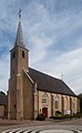
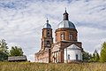
- Nomination Mary Magdalene church in Troistorrents, Valais, Switzerland. --Tournasol7 04:43, 5 October 2021 (UTC)
- Promotion Support Good quality -- Johann Jaritz 05:43, 5 October 2021 (UTC)
-
-

-

- Nomination Donis Avdijaj (SK Sturm Graz, right) in duel with Manuel Prietl (SV Mattersburg, middle). --Steindy 00:20, 5 October 2021 (UTC)
- Promotion Support Good quality. --Commonists 20:00, 5 October 2021 (UTC)
-

- Nomination Donis Avdijaj (SK Sturm Graz, in front) ifollowed by Manuel Prietl (SV Mattersburg, left) ans Thorsten Röcher (behind). --Steindy 00:20, 5 October 2021 (UTC)
- Promotion Support Good quality. --Commonists 20:00, 5 October 2021 (UTC)
-

- Nomination Bharat Natyam dancers in performing in Bharat Bhavan BhopalI, the copyright holder of this work, hereby publish it under the following license:This image was uploaded as part of Wiki Loves Folklore photographic contest. --Suyash.dwivedi 22:22, 4 October 2021 (UTC)
- Promotion Support Good quality. --Velvet 06:13, 5 October 2021 (UTC)
-
- Nomination Hindi Wiki Technical Workshop,Bhopal June 2018I, the copyright holder of this work, hereby publish it under the following license: --Suyash.dwivedi 22:22, 4 October 2021 (UTC)
- Promotion Support Good quality. --Velvet 06:13, 5 October 2021 (UTC)
-

- Nomination Portal of the Saint Praejectus church in Saint-Priest-Ligoure, Haute-Vienne, France. (By Tournasol7) --Sebring12Hrs 21:12, 4 October 2021 (UTC)
- Promotion Good quality --Llez 05:48, 5 October 2021 (UTC)
-
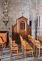
- Nomination Confessional in the Saint Maurice church in La Jonchere-Saint-Maurice, Haute-Vienne, France. (By Tournasol7) --Sebring12Hrs 21:12, 4 October 2021 (UTC)
- Promotion Good quality --Llez 05:48, 5 October 2021 (UTC)
-

- Nomination St Junien church in St-Junien-les-Combes, H Vienne, France. (By Tournasol7) --Sebring12Hrs 21:12, 4 October 2021 (UTC)
- Promotion Support Good quality. --Velvet 06:13, 5 October 2021 (UTC)
-

- Nomination Vlaardingen-Holy NL, view to the polder from the Holyweg --Michielverbeek 06:36, 4 October 2021 (UTC)
- Promotion Support Good quality. --Velvet 06:13, 5 October 2021 (UTC)
-

- Nomination Wayside cross (1858) north of Newel, Germany. --Palauenc05 20:10, 3 October 2021 (UTC)
- Promotion Good quality, but I'd call the composition "Pine tree (or whatever kind of evergreen it is), wayside cross and sign", and I think the category for the species of evergreen should be included. -- Ikan Kekek 23:25, 3 October 2021 (UTC) Comment Thanks for reviewing, I was thinking about that tree, too. However, I'm only able to say it's an old pine tree, the exact taxonomy is impossible for me (the traffic sign is of minor importance). --Palauenc05 08:07, 4 October 2021 (UTC) Comment My main point is that the tree is more the subject of the photo than the cross. -- Ikan Kekek 20:17, 4 October 2021 (UTC) Comment For me as a historian it's the other way round. Yes, that tree is bigger, that's all. There are billions of pine trees in the world, but this wayside cross is unique and a registered monument. Nevertheless, I like the composition with the contrast of the huge tree and the relatively small cross. --Palauenc05 08:29, 5 October 2021 (UTC)
-

- Nomination Meyer Memorial Lake, Lithia Park, Ashland, Oregon. --King of Hearts 17:31, 3 October 2021 (UTC)
- Promotion Support Good quality. --Steindy 00:12, 6 October 2021 (UTC)
-

- Nomination Street of the Sablière to the street of the Franche-Amitié at en:Saint-Étienne, France. --Touam 13:46, 3 October 2021 (UTC)
- Decline Oppose Bad composition. Focus problem. Picture is not sharp enough. --Halavar 19:31, 3 October 2021 (UTC) Oppose composição --Túllio F 23:46, 5 October 2021 (UTC)
-

- Nomination Jaguar XK140 drop head coupe at Classic-Gala Schwetzingen 2021.--Alexander-93 08:16, 3 October 2021 (UTC)
- Promotion Support Good quality. --JoachimKohler-HB 09:12, 3 October 2021 (UTC) Support Good quality. --Túllio F 23:46, 5 October 2021 (UTC)
-
-

- Nomination Alumnae Hall, Hood College, Frederick, Maryland --Acroterion 03:07, 2 October 2021 (UTC)
- Promotion
Please check the verticals. Thank you. --XRay 05:12, 2 October 2021 (UTC) Vertical fixed, thanks. Acroterion 19:48, 2 October 2021 (UTC)
The edge of the house on the right leans to the left and so do the columns. (Columns are narrower at the top than at the bottom.) --XRay 05:44, 3 October 2021 (UTC) Adjusted a little more - Ionic columns taper mostly in the top portion - Acroterion 00:48, 4 October 2021 (UTC)
Sorry. The edge of the house isn't vertical. There is a white edge top left and a touch of CAs too. So please check it again. (It's all fixable and the photograph could be QI.) --XRay 08:54, 4 October 2021 (UTC) Adjusted, commented on your talkpage a litle more - thanks. Acroterion 01:41, 5 October 2021 (UTC) Support Good quality now. Thank you for your patience. --XRay 05:20, 5 October 2021 (UTC)
-

- Nomination: Renne au parc animalier de Sainte-Croix. --Musicaline 04:41, 30 September 2021 (UTC)
- Review needed
-
- Nomination: Renne au parc animalier de Sainte-Croix. --Musicaline 04:41, 30 September 2021 (UTC)
- Review needed
-

- Nomination: Gibbon à favoris roux femelle au parc animalier de Sainte-Croix. --Musicaline 04:41, 30 September 2021 (UTC)
- Review needed
-

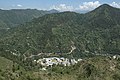
- Nomination: Nandli Village (Middle bottom) and Kataula village (Middle right) as seen from Khani top, Mandi, HP, India. --ADARSHluck 08:22, 29 September 2021 (UTC)
- Review needed
-
- Nomination Closeup of the North Campus, IIT Mandi campus and Khanahar peak as seen from Khani, Mandi, HP, India --ADARSHluck 08:17, 29 September 2021 (UTC)
- Promotion Good quality. --Moroder 18:05, 5 October 2021 (UTC)
-

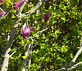
- Nomination Gladiolus, blooming at the CVR guest house, IIT Mandi, HP, India --ADARSHluck 08:12, 29 September 2021 (UTC)
- Promotion Good quality. --Moroder 18:02, 5 October 2021 (UTC)
-

- Nomination Renard roux au parc animalier de Sainte-Croix. --Musicaline 04:43, 29 September 2021 (UTC)
- Promotion Good quality. --Moroder 17:56, 5 October 2021 (UTC)
-

-

-

-

-

- Nomination Lémurs catta au parc animalier de Sainte-Croix. --Musicaline 05:52, 27 September 2021 (UTC)
- Promotion Good quality. --Moroder 08:33, 5 October 2021 (UTC)
-

- Nomination The column with the statue of Minerva. Колонна со статуей Минервы: Кусково, Вешняки, Восточный округ, Москва --Ulaisaeva 17:04, 26 September 2021 (UTC)
- Decline CommentNoisy IMO, very slight purple fringe, composition needs a serious crop at right (at least almost a quarter of the whole picture)--Jebulon 16:35, 4 October 2021 (UTC) Oppose Too much wasted canvas here for me. Why not shoot it in portrait and closer? Rodhullandemu 13:15, 5 October 2021 (UTC)
-
-

- Nomination: Window in the north wall of the Lady Chapel of St Helen's, Sefton. Unknown creator. --Rodhullandemu 19:02, 25 September 2021 (UTC)
- Review
I don't know why, but the left part of the window is not in focus. You said your lens was okay, I don't see what else could be. --Steindy 18:21, 29 September 2021 (UTC)
-

- Nomination: Nagina Masjid Cenotaph, Champaner-Pavagadh Archaeological Park, Gujarat.--Vijay Barot 18:25, 25 September 2021 (UTC)
Needs perspective correction. --Kallerna 06:25, 29 September 2021 (UTC) - Review needed
- Nomination: Nagina Masjid Cenotaph, Champaner-Pavagadh Archaeological Park, Gujarat.--Vijay Barot 18:25, 25 September 2021 (UTC)
-


.jpg)


.jpg)

.jpg)


_Classic-Gala_2021_1X7A0179.jpg)


_IMG_5322.jpg)

.jpg)
.jpg)


.jpg)


_(2).jpg)


.jpg)


.jpg)
.jpg)

.jpg)


.jpg)


.jpg)
.jpg)

_(1).jpg)


.jpg)
Consensual review
[edit]File:Rigi_Kulm_cross_20210905.jpg
[edit]
- Nomination Wooden cross on Rigi Kulm --Domob 16:17, 1 October 2021 (UTC)
- Promotion
- Support *Good quality. --Halavar 17:32, 1 October 2021 (UTC)
- Comment I'm working out the right WB on another nomination at the moment, and will update this one accordingly once we agree what it should be. --Domob 08:05, 3 October 2021 (UTC)
 Done I've adjusted the colours now. A bit warmer WB and also reduced blue a bit more. --Domob 10:41, 3 October 2021 (UTC)
- Support I wasn't there, but the white balance seems reasonable enough for me to support now. -- Ikan Kekek 22:08, 3 October 2021 (UTC)
- Support Ok for me now. --Milseburg 09:45, 4 October 2021 (UTC)
Total: 3 support (excluding the nominator), 0 oppose →  Promoted --Robert Flogaus-Faust 20:48, 7 October 2021 (UTC)
File:Zugersee_from_Rigi_panorama_20210905.jpg
[edit]
- Nomination Panoramic view of Zugersee from Rigi Kulm --Domob 16:17, 1 October 2021 (UTC)
- Promotion
- Support Good quality. --Halavar 17:32, 1 October 2021 (UTC)
- Comment I'm working out the right WB on another nomination at the moment, and will update this one accordingly once we agree what it should be. --Domob 08:06, 3 October 2021 (UTC)
- Done I've adjusted the WB now and made it in particular less blue. --Domob 13:04, 3 October 2021 (UTC)
- Even still, is the lake that aquamarine? -- Ikan Kekek 22:09, 3 October 2021 (UTC)
- Comment I can't guarantee that this colour is 100% what it looked like on the spot, but it doesn't seem very off to me from what I remember. I'm happy to make further adjustments to the WB if you have concrete suggestions, though. --Domob 05:56, 4 October 2021 (UTC)
- Even still, is the lake that aquamarine? -- Ikan Kekek 22:09, 3 October 2021 (UTC)
- Comment I'm not as convinced as on the other one, but good enough to give up oposing. --Milseburg 09:48, 4 October 2021 (UTC)
Total: 1 support (excluding the nominator), 0 oppose → Promoted --Robert Flogaus-Faust 20:49, 7 October 2021 (UTC)
File:Cn_Überseering_33a_2020_03.jpg
[edit]
- Nomination Hamburg, commercial area City Nord, office building Überseering 33a --Dirtsc 17:09, 26 September 2021 (UTC)
- Promotion
Please add more sharpness. --Halavar 18:45, 26 September 2021 (UTC) Comment I tried a new version. Please take a look. Greetings --Dirtsc 20:39, 26 September 2021 (UTC)
Sorry, but I do not see a big difference. The building is sharp, but problem is with other parts. Especially right side of the picture is not sharp enough. --Halavar 21:19, 26 September 2021 (UTC) Comment OK, I focused on the building, but I understand your point. The unsharpness at the right side (and at the left side) is due to the perpespective correction. With the trees and their branches you can see this very clearly. I don't think I can get rid of this unsharpness without changing the perspective correction. Feel free to decline the image, maybe I'll send it to CR to have more opinions on this problem. Greetings --Dirtsc 07:11, 27 September 2021 (UTC)
Yes, I think others should decide. --Halavar 09:01, 28 September 2021 (UTC) Comment Halavar did the review and was unsatisfied by the sharpness especially of the trees on the right. I'd like to see your opinions on this topic. As I said above, the perspective correction of the main motiv causes a decreasing sharpness towards the right and left borders of the image. This can imho only be solved if I apply a lesser perspective correction or if I crop the image at the borders. But maybe the image meets the QI criteria. Greetings --Dirtsc 07:08, 29 September 2021 (UTC) - Support Ok for me. --Hillopo2018 08:11, 30 September 2021 (UTC)
- Comment I believe that the lens used may be decentered. This does not seem to be uncommon with this zoom, as I have seen this and similar imperfections on several images taken with it. I find some remnants of CA on the right edge of the image, but not on the left edge. On the other hand, sharpness is better on the right than on the far left edge. Perhaps the lens is simply not very well suited for architectural shots - in landscapes, close-ups, etc. such a thing is usually less disturbing. You might be able to improve the result by stopping down to f/11 when shooting, but that's a bit borderline with a crop camera because of the diffraction. --Smial 09:50, 30 September 2021 (UTC) Translated with www.DeepL.com/Translator (free version)
Total: 1 support (excluding the nominator), 0 oppose → Promoted --Robert Flogaus-Faust 20:52, 7 October 2021 (UTC)