User talk:Yug/Locator maps (location map based)
To do list by order of priority[edit]
- SVG Toolbox/toolkit/maptemplate: to create (collect and gather different items).

- simplify the scheme for core area / controlled / claimed
- improve a bit the wording.
- add something for National Waters / Disputed waters,
- Naming convention: clarify.

- Degrees of control: clarify, rethink : 3 degrees of colors OR 3 degrees of strips!
- National waters: clarify.

Discussion[edit]
Consensual things should be directly inputted within the article's page.
Diverging points should be brought here, discussed frankly (short sentence, direct to the ppoints), in order to progress smoothly.
Toolbox[edit]
-en.svg)
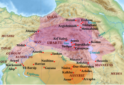
Simply need to collect different symbologies currently use on mone map. The Marocco map seems the most suitable (3 levels of control) to which markers, zooms and other can be added to create a fictional ideal example.
- is that something you want me to do? --TUBS
 15:32, 3 November 2012 (UTC)
- If possible, yes. So then it may become a file for further testing ! Yug (talk) 16:24, 3 November 2012 (UTC)
- That's my first attempt. PNG Version may render better and fonts will have improved readability. But we can do the png version later. The toolbox covers 99% of all cases. There may be cases like the Kosovo/Sebia issue where hatches mean something differently - not to mention the Jammu and Kashmir issue. I hope the B/C D/E is explained smoothly. By the way: I doubt that I sticked consistently to that scheme when creating my maps series...--TUBS 20:44, 4 November 2012 (UTC)
- First feedback: this look HANDSOME ! Yug (talk) 22:17, 4 November 2012 (UTC)
- I love this red by the way, it was my favorite color (until 5 when my older brother said that I will be a serial killer if my favorite color is red = . = , don t laugh....)
- Inconsistency in past maps are ok: we are here to do the future, and do it better : ) Yug (talk) 22:17, 4 November 2012 (UTC)
- I love this toolbox~~ Yug (talk) 22:59, 4 November 2012 (UTC)
- That's my first attempt. PNG Version may render better and fonts will have improved readability. But we can do the png version later. The toolbox covers 99% of all cases. There may be cases like the Kosovo/Sebia issue where hatches mean something differently - not to mention the Jammu and Kashmir issue. I hope the B/C D/E is explained smoothly. By the way: I doubt that I sticked consistently to that scheme when creating my maps series...--TUBS
- If possible, yes. So then it may become a file for further testing ! Yug (talk) 16:24, 3 November 2012 (UTC)
Naming convention[edit]
Naming scheme currently running:
| TUBS: | {Province(s)} in {Country(ies)} ({enlightening effect}) ({background map}.svg | Rhode Island in United States (zoom) (extra close) (US48).svg | _(extra_close)_(US48).svg)
|
| TUBS: | {Province(s)} in {Country} ({hatched area1}) ({hatched area2}).svg | Jammu and Kashmir in India (de-facto +claimed hatched) (claimed and disputed hatched).svg | _(claimed_and_disputed_hatched).svg)
|
| Profoss: | {Country} - {Province}.svg | Djibouti - Ali Sabieh.svg | 
|
| Виктор В | Location of {districtName District} ({Province}).svg | Location of Nesterovsky District (Kaliningrad Oblast).svg | .svg)
|
| Yug: | {Country} {Province} locator map (blank).svg | Cuba Camagüey locator map (blank).svg | — (former proposal) |
| NordNordWest: | {Country} {YYYY} {Province}.svg | Cuba 2011 Camagüey.svg | 
|
| Hoverfish | {Country} {Province} map.svg | Uruguay Durazno map.svg | 
|
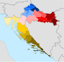
| Minestrone | {Country} location map, {ProvinceName}_county.svg | Croatia_location_map,_Lika-Senj_county.svg | 
|
| Sum up | {}{}{}.svg | example.svg | 120px |
|---|
Discussion[edit]
- Background
- I always applied "XY in COUNTRY/REGION/CONTINENT.svg" Thus you can tell if you show the location of Denmark in Europe, the EU, in the transcontinental Kingdom or relativ to neighboring countries. --TUBS 21:33, 2 November 2012 (UTC)
- User:Profoss/gallery. He uses superordinated and subordinated (=depicted) region, too. So one could propose: {Subject name in English} - {Superordiated object/depicted area} locator map (blank).svg' or so
- User:Виктор В preferes other colors. See Category:SVG locator maps of Northwestern Federal District (location map scheme)
- NNW's older locator maps also prefered other colors. Check out Category:SVG locator maps of provinces in Cuba (orange location map scheme). (Newer locator maps by him apply the "red scheme".)
- User:Hoverfish's Category:SVG locator maps of departments in Uruguay (orange location map scheme) is another example of similar maps. --TUBS 18:12, 3 November 2012 (UTC)
- Discussion
- Subject name: Large to Small: I personnally support to go from the general to the specific, from the Map area to the Subject, kind of Europe > Italia > Sicilia ; or Italia > Sicilia province. With this scheme, all maps of the same serie start with the same chain of characters, easing storing and finding.
- Locator tag: I also encourage to include the Locator name code, while I don't know where to put it in the full name: 1. Locator Europe Italia OR 2. Europe Italia locator ?). For the style, I favor the 2nd, for the file management, the first.
- Language tag: not needed.
- Dividers: i favor the simple space " ", the coma ",", and the "-".
- Disputed areas: [Still need to think about that]
- If our symbology is clear, then the filename doesn't need a specific name out of "-disputed". Yug (talk) 12:47, 3 November 2012 (UTC)
Levels of control: Strips or Opacity or Color ?[edit]
Both TUBS and myself came to the conclusion that 3 levels are neeed, such as : 1. Full red (undisputed), 2. Bold red strip (control/present but disputed) ; 3. Thin red strips (not controlled/present but some claims). For this 3 levels, different approaches are possibles:
- Strip-based?: This to keep consistence : 3 levels = 3 levels of strips (3/3 red ; 2/3 red ; 1/3 red). Strips will be a powerful tool to increase accessibility when black-white printed, and in Complex Maps (milti-players) since we can also change their directions. We lost, however, in elegance.
- Opacity-based (Sequential): an alternative would be to be opacity based: 1.0; 0.6 ; 0.3. This will be more elegant, but will push us in the wall on multi-player maps where red, yellow, blue, orange will enter the game. Can we get 3 times n colors clearly, printable, different levels of colors. Seems pretty hard. Colors-based 3 levels are thus likely to avoid.
- Color-based (Sequential): kind Red>orange>yellow ; Blue>purple>pink. Once again, while this will be for sure elegant, it will be problematic for Complex Maps and for Complex Maps on Topography. From what I remember, the most extrem use of colors have been on topographic bacground with 3 players but without degrees of controls. Yug (talk) 15:10, 3 November 2012 (UTC)
-
 Strips-based (1 example)
 -
 Mix Color-Strip (1 example)
 -
 Opacity-based (2 examples).
 -
 Color-based (1 example).
 -
 Color-based (many examples)
 -
 Color-based (3 examples)
 -

-

-

.svg)


.svg)
Comment[edit]
How about design conventions for maps that are focussed on second tier admin levels, cf. Category:SVG locator maps of districts in Saarland (location map scheme)? These maps color France and Germany (=same admin level as the depicted german state of Saarland) differently. It's exactly like in the location map schemes . In these cases, I always sticked to the grey/darkgrey design (like in File:Positionskartenerstellung - Signaturvorlage.png), while you should be aware of the fact that some mapmakers (mostly from the Americas, France and Spain) apply a grey/brown-orange scheme like in File:USA Texas location map.svg. Taking these admin levels into concern would of course complicate the toolbox and everything else, though it shouldn't have a great impact on the principles defined so far (main principle=take the location map and color one area red).--TUBS![]() 16:45, 19 November 2012 (UTC)
16:45, 19 November 2012 (UTC)
- I'am aware of this question which the Spanish lab already forwarded to me. Basically, we need to add an intermediate color, and to reach an agreement between the German tradition (greys) and the 'latin' tradition (grey+orange). Let postpone this Location guideline upgrade for now. (We first have a week[?] of work on the locator guideline.) Yug (talk) 16:58, 19 November 2012 (UTC)
SVG file fixes[edit]
- Full Red value ?
C22938ff (as you uploaded the svg template) or #C12838ff (as I previously found) ? Yug (talk) 15:44, 19 November 2012 (UTC)
- While the difference is visually small, yet, the SVG file and the wikipage should display the same red, as you know. Yug (talk) 15:44, 19 November 2012 (UTC)
- Chose the color you prefer. I wasn't very accurate on this issue so my red isn't always the very same tone of red....--TUBS 16:28, 19 November 2012 (UTC)
- ok. Yug (talk) 16:51, 19 November 2012 (UTC)
- I favor #B00000. Reason: really near, easy to remember, already in use. Yug (talk) 17:30, 28 November 2012 (UTC)
- Chose the color you prefer. I wasn't very accurate on this issue so my red isn't always the very same tone of red....--TUBS
- Glowing effect
Since it's both possible and convenient, I suggest to merge the glowing polygon and the separated full red border into a single polygon with body and a full red border. If there is no clear reason for this separation, I will move on into this direction. Yug (talk) 16:11, 19 November 2012 (UTC)
- yeah sure....--TUBS 16:28, 19 November 2012 (UTC)
- yeah sure....--TUBS