File talk:BlankMap-World.svg/Archive 1
 | This is an archive of past discussions. Do not edit the contents of this page. If you wish to start a new discussion or revive an old one, please do so on the current talk page. |
Disputed territories
The Kashmir and Arunachal Pradesh regions needs to be marked so that the map is considered to be an NPOV. Thanks! Nichalp 08:46, 10 December 2006 (UTC)
- A difficult task, as I know you know :) But how to do? Any suggestions? (Of course there's always the possibility that you can edit it and upload it (after all, isn't this supposed to be somethign anyone can edit?), at best, I'll keep it there and accept it, and at worst, I'll just revert it. :) :) )--Canuckguy 23:23, 10 December 2006 (UTC)
I have now decided to depict disputed areas as being part of the country that has administrative control of the disputed areas. If it is needed to depict a disputed area in another way, you are welcome to change the file (I assume the licensing I selected allows that, as it is my intention.) Keep in mind that groups can be selected and "ungrouped" to select an area that was separate from another area on the original, to make it easy. --Canuckguy 20:50, 16 December 2006 (UTC)
SVG weirdness
 Done: issue fixed.
Was this map traced from a bitmap using some external software? I ask because it seems the lines representing the borders of the countries are joined together extremely strangely. To see what I mean, fire up inkscape and drag a piece of border around - various parts of non-connected borders are combined into the same path, but few long straight stretches are combined into a single path as one would expect. 134.219.148.42 16:57, 8 January 2007 (UTC)
- This was another inherited "feature" from the original Image:BlankMap-World3.svg, I wondered about that myself too, but the combination of my being new with SVG and not having time to work on that means it's on the backburner. It's something I will do though, but if you feel you want to fix it, feel free to. (To answer the question, have no idea if it's traced from a bitmap, but since the note on Image:BlankMap-World2.svg, which v. 3 is in turn based on, says "adapted from Image:World_map_pol_2005_v02.svg", I highly suspect so.) --Canuckguy 00:32, 21 January 2007 (UTC)
- It seems this was fixed in User:Andrew pmk's revision, doing what I didn't have the time to do, and doing it very well I might add. Feel free to use the new revision without having to worry about those weird borders! --Canuckguy 02:40, 24 August 2007 (UTC)
Thanks to all
![]() Done
Thanks to all for this important map -- Jlorenz1 14:32, 11 May 2007 (UTC)
Done
Thanks to all for this important map -- Jlorenz1 14:32, 11 May 2007 (UTC)
Changes
![]() Done-
Done-
I've placed all the style rules into a style sheet at the start of the file. This doesn't change much from the outside (well, it makes the file size a little smaller) but it allows me to start work on an automatic tool for coloring the map in. When done, it'll be here, and I make an announcement on this page. --H2g2bob 01:29, 28 August 2007 (UTC)
The dokumentation part and future changes
- Done: issue fixed.
I've moved the dokumentation part of this talk page to Image talk:BlankMap-World6.svg/Dokumentation and have then transcluded it here. By doing this it will hopefully be easier to differ general comments and questions from instruction changes. I've also split the "Selecting and colouring countries" section into two parts, one deling with Inkscape and other WYSIWYG editors and one for text editors.
Finally I've updated the actual map once again. It's basically Canuckguy's edits but with a text-editor. Just a cautious warning. The problem with editing this map with Inkscape is that it (apart from making the file much bigger) tends to mess up the class structure of the file making text editor usage of this map much harder. As it is now derivatives of the map can be made both with Inkscape and with a text editor. /Lokal_Profil 19:33, 13 September 2007 (UTC)
Arctic colours?
- Done, summary: Antartic is in a different color according to usage (no formal decision), arguably may be because it's not a country.
Any particular reason to have the arctic coloured a lighter gray in the blank map? /Marmelad 20:44, 16 September 2007 (UTC)
- Not overly, I noticed that most maps coloured Antarctica (assuming that is what is meant rather than "arctic") a different colour, usually white, but that creates problems (as happened in Image:BlankMap-World3.svg) and it didn't look quite white as a grey like the rest of the countries, since Antarctica isn't a country and everything else on the map (arguably) is. --Canuckguy 21:24, 16 September 2007 (UTC)
- Nothing to do with the colours, just a comment that Antarctica has been renamed back to it's ISO code aq (same thing for the class). /Lokal_Profil 10:04, 18 September 2007 (UTC)
Compact map
I've created a compact version of this map Image:BlankMap-World6, compact.svg. It's identical to this one except for antarctica having been removed and the elliptical sea haveing been replaced with a square one without a border and the centre of the image shifted. Any edits to this map should be easy to replicate for that map as well and I've commented on the image description page that this is the guiding map and that that one should merely reflect this one. i.e. there should be no updates to that map which haven't already been made to this one. Any comments are welcome. /Lokal_Profil 19:24, 14 December 2007 (UTC)
Dependencies and other territories
For those of you wanting to group together the "dependencies and other territories" in derivative maps here is a list their iso codes and how they group. I've left Palestinian territories (ps), Taiwan (tw), Western Sahara (eh) and Vatican City (va) ungrouped.
- Kingdom of Denmark: (.gl, .fo)
- Overseas regions of France (all included in .fr): (.gp, .gf, .mq, .re)
- Overseas collectivities of France: (.pf, .yt, .pm, .wf, .mf, .bl) + Special status (.nc)
- (British) Crown dependencies (.je, .gg, .im)
- British overseas territories: (.ai, .bm, .vg, .ky, .fk, .gi, .ms, .pn, .sh, .tc)
- USA insular areas: (.as, .gu, .mp, .pr, .vi)
- Realm of New Zealand: (.ck, .nu)
- Kingdom of the Netherlands: (.aw, .an and technically .nl)
Please note that they are not grouped in this way in the actual map where they are all separate territories.
enable-background css attribute
.ocean has enable-background:accumulate. I don't think that's necessary, because according to http://www.w3.org/TR/SVG/filters.html , accumulate is enable-background's default value. Also, Firefox doesn't implement enable-background, and therefore throws an error. Could enable-background be removed?
- Done. Thanks for the w3.org link as well, I'm now trying to figure out how to link an external CSS style sheet to it, your w3.org resource says it can be done in the same way as adding one in XML is done, but it doesn't seem to work on this.--Canuckguy 20:44, 6 October 2007 (UTC)
- It might be that the WikiMedia software ignores externall CSS style sheets. /10:50, 7 October 2007 (UTC)
Stroke width and small islands
In the current version of this map many small islands (the Azores, Bahrain, &c.) are invisible since the thick white stroke entirely covers the island. Perhaps the "thin-line" class should be brought back?—Ketil Trout (<><!) 22:25, 8 November 2007 (UTC)
- I actually preferred the map back when there was no outline for the islands. However, I also like having the borders be the outlines and not their own objects (that was a lot of hassle) - the tradeoff however, is that gives the islands an outline (as they are technically a "border", between the country that island belongs to (or is) and the ocean.) So islands like Bahrain, Australia, and the Falklands would have a thin line class, as there are no land borders to differentiate, but islands like any of the Indonesian or Canadian ones would, as there is also a land border for the countries that they are part of. I wish there was a way to toggle outlines for seacoasts only (both costs for islands and continents) and keep the outlines for borders, but for now I don't think there is such a thing, and it might not look right having some islands (of true "island countries") be thin class, or off, and some islands (belonging to countries with a land border) having a thick/"normal" border. If anyone knows of such a way, let me know. --Canuckguy 04:27, 9 November 2007 (UTC)
- If one identifies the objects in question then it should be possible to set the line-width of the small islands to a more suitable size. This could be done using classes without the border being it's own object. /Lokal_Profil 10:08, 9 November 2007 (UTC)
- I believe I have just done this with the current upload by using the "coast" tag (which creates a smaller line width for islands witha coastline and no borders). However, it does look a little odd when you compare it with nearby islands (and continents) that do have borders. Take a zoom in on Britain and Ireland on the map and you'll see what I mean; Britain, with no borders, has a think-line coast. Ireland, with an international border, needs a thick-line coast to make the border the same size. Any thoguhts on how to avoid this, short of making the borders separate objects again (something I'm not keen on) --Canuckguy 04:15, 9 December 2007 (UTC)
- Fixed somewhat by making the border class smaller (0.5 instead of 1), the borders still look thick enough, so I'll leave it at that for now, and there's now less of a discrepancy between islands with borders and islands without borders. Comments? --Canuckguy 21:00, 9 December 2007 (UTC)
- I believe I have just done this with the current upload by using the "coast" tag (which creates a smaller line width for islands witha coastline and no borders). However, it does look a little odd when you compare it with nearby islands (and continents) that do have borders. Take a zoom in on Britain and Ireland on the map and you'll see what I mean; Britain, with no borders, has a think-line coast. Ireland, with an international border, needs a thick-line coast to make the border the same size. Any thoguhts on how to avoid this, short of making the borders separate objects again (something I'm not keen on) --Canuckguy 04:15, 9 December 2007 (UTC)
- If one identifies the objects in question then it should be possible to set the line-width of the small islands to a more suitable size. This could be done using classes without the border being it's own object. /Lokal_Profil 10:08, 9 November 2007 (UTC)
France
It may be seen as a bit controversial to make the "fr" (France) tag as representative of Metro. France and the overseas departments of Reunion, Martinique, French Guiana, and Guadeloupe in one shot, but it was done for a few reasons. Firstly, browsing around Wikipedia shows me that other maps, articles, and lists, seem to consider the overseas departments as integral to France, and represent it the same way as France is on that particular map/article/list. Also, I needed more room in the Caribbean for the circles for St. Bart's and St. Martin, getting rid of Guadeloupe's (and Martinique's) circle(s) got me that room (I know, not really a good reason, but ... ) Also keep in mind that the codes were kept as selectable, the same way as before, and probably shouldn't affect old maps created. --Canuckguy 04:21, 9 December 2007 (UTC)
- If the codes are selected as before (i.e. Martinique only) will that draw a circle around it? /Lokal_Profil 02:22, 12 December 2007 (UTC)
- Also I think you missedplaced the a "land fr" tag, (I find it five lines under the fr group id) but I don't remember exactly how the tagging worked so I'l leave it to you to upload a corrected version if it's really wrong./Lokal_Profil 02:41, 12 December 2007 (UTC)
- circles: no, no circles on the "overseas departments", ostenibly because "France entire" is bigger than the 20,000 km² threshhold (after all, a circle doesn't show on Hawaii when the US is selected, even though it's very small!).
- tags:yeah, when I did my first map update of my own private maps, I found something really wrong happening. Hadn't figured it out yet (no time, could tinker on weekend, but then that'll take time from other things :( ) but hadn't suspected a faulty "land fr" tag, that could very well be it. I'll upload when I have time to look at it. (I *really* have to get in the habit of *throuoghly* testing my maps before I upload them, I'm getting a reputation for making a big change, then 3 or 4 subsequent uploads immediately following of small changes and error fixes. :( ) --Canuckguy 04:09, 12 December 2007 (UTC)
- Better making updates and having to fix then not updating at all =). I'm uploading another map (with france marked) based on the latest version of this one with the "land fr" tag moved. If this works fine I might upload a quick updat to this map.
- Circles: What i meant was if you tag only martinique i.e. .mq does the circle pop up then? That it doesn't pop up when .fr is tagged is ok. /Lokal_Profil 13:39, 12 December 2007 (UTC)
- A quick look says that that "land fr" tag is supposed to be there, except it's supposed to say "land fx" (as that particular path is mainland metro France, taking a quick look at other countries that are an amalgam of islands and a mainland you'll see similar tags), however, changing the fr to fx doesn't work. As for the circles if only the islands are selected, no, no circles, once the circles for St. Barts and St. Martin were added, there was no room any more for the circles on those islands (and, being integral parts of France, they don't need them) --Canuckguy 01:46, 14 December 2007 (UTC)
- The solution is to make that section to look something like:
- A quick look says that that "land fr" tag is supposed to be there, except it's supposed to say "land fx" (as that particular path is mainland metro France, taking a quick look at other countries that are an amalgam of islands and a mainland you'll see similar tags), however, changing the fr to fx doesn't work. As for the circles if only the islands are selected, no, no circles, once the circles for St. Barts and St. Martin were added, there was no room any more for the circles on those islands (and, being integral parts of France, they don't need them) --Canuckguy 01:46, 14 December 2007 (UTC)
- Also I think you missedplaced the a "land fr" tag, (I find it five lines under the fr group id) but I don't remember exactly how the tagging worked so I'l leave it to you to upload a corrected version if it's really wrong./Lokal_Profil 02:41, 12 December 2007 (UTC)
<g id='fr'>
  <g class='land coast fr fx' id='fx'>
    <path d='...'/>
    <path d='...'/>
    <path d='...'/>
    <path d='...' id='path2174'/>
    <path class='land fr fx' d='...'/>
    <path d...
  </g>
  <g transform='...' class='land coast fr gp' id='gp'>
  ...
- i.e. with a fr together with the more specific tag. The order in which they are defined is probably important but this was the case already for kosovo/serbia.
- I'm also wondering about the need for the seccond "land fx" tag. Is it there only to override the coast tag? if that is the case then it might be better to design a "nocoast" class (i.e. just setting stroke-width:0.5) then to apply the bulky land class. /Lokal_Profil 02:40, 14 December 2007 (UTC)
- I've uploaded a version fixing France now (also moved france further up so that it doesn't block the Andorra circle etc. /Lokal_Profil 02:57, 14 December 2007 (UTC)
- Just a note that in the update that I'm working on (should be done by the end of the week), I'm working on a way to make the circles for Martinique, Guadeloupe, and Reunion visible if needed as separate from the "fr" tag, looks promising. Plus, I am also adding two more "integral parts of a country" that are frequently depicted on Wikipedia maps with different data from the rest of the country (due to the different governmental system), Hong Kong and Macau. So, the update that I'm working on will have those parts of France and China displayed if needed, the numbers returned to non-rounded values, the borders made to touch to eliminate the gaps, some lakes in the "lakes" tag on international borders (like Titicaca and Victoria) make to be shown as "gaps" in borders like the Great Lakes, and Kosovo added. With that all said and done, I'm very surprised when I said I think I can get it done by this coming weekend (Feb 24, 2008), but I might! (Please be patient, and don't frustrate me by posting another version before I get the update done! ;) ) --Canuckguy 22:09, 17 February 2008 (UTC)
- I've uploaded a version fixing France now (also moved france further up so that it doesn't block the Andorra circle etc. /Lokal_Profil 02:57, 14 December 2007 (UTC)
Rounding
I appreciate AzaToth's recent improvement to the map by trying to reduce the file size by rounding the numbers, and on a world-wide view there seems to be no noticable difference, but when the map is zoomed in (part of the purpose of SVG and why it's good for maps is that areas can be zoomed in on easy to create local maps) I notice errors abounding: borders not matching up in places (creating "lakes" on the border if the ocean is coloured (which I often do to test the map)), small islands grossly oversimplified (I noticed Anguilla, Sable Island (Nova Scotia, Canada), and St. Martin (in the Caribbean) as a few examples). I really like AzaToth's idea to reduce the file size, but I feel that it did cause a bit of harm doing it (but maybe we can use this idea as a stepping point for other ideas on reducing the filesize.) I'll probably have to make a data update to the map soon (word on the street is that Kosovo will declare independence before the month is out (one of the main reasons I had Kosovo in a special class since the map was created, as this was foreseeable), and the map will have to be updated) but I'd like to see what others' thoughts are between now and the time Kosovo will be added as an independent country. Then, when I do update that data, I'll either update it on the old version (if we decide to discard AzaToth's changes) or update it on the new version (if we decide to keep them.) AzaToth, you are, of course welcome to participate in the discussion (in fact I would very much like to hear from you!) --Canuckguy 03:50, 9 February 2008 (UTC) 03:48, 9 February 2008 (UTC)
- I made some quick calculations in my head, and as most whole numbers are in the area around 1000-10000, and the rounding is ±0.5 maximum, we are talking about less than 0.05% error. If countries wasn't aligned after, I highly suspect they wasn't aligned before. →AzaToth 17:37, 9 February 2008 (UTC)
- You are correct about the countries not lining up to begin with (again, a fault of the original map that I worked off), I would fix that, but then that'll create decimal numbers all over again. I don't know if it's possible to have the countries line up *and* have whole numbers (one would think it would, as they would share the same border and thus have the same numbers, but it doesn't seem that way.) There is also still the question of small islands completely losing their shapes (like the ones mentioned above). Plus I also noticed the Vatican's land area has completely disappeared! (Since it's so small, all its numbers got rounded to the same value). I'm still thinking that because of what SVG is, a precise graphics tool, that the decimal values shouldn't be messed with, I don't believe any other SVG file in Commons have their values roudned to whole numbers, I don't believe this one should either. (Note I haven't made a firm decision yet, I would still like to see discussion on this on both sides.) --Canuckguy 23:50, 9 February 2008 (UTC)
- I'd suggest going back to the full decimal image. Yes this image is huge but it's mainly used for derivatives. For this reason the more exact it is the better. Manually aligning borders (and in the process removing unnecessary decimals) is a great suggestion but would require a huge amount of manual work. /Lokal_Profil 02:18, 10 February 2008 (UTC)
- I'd also like to pitch in in favour of reversing this change, for the reasons given by Lokal Profil. Losing information from the original SVG is not a good thing. Biercenator 05:51, 12 February 2008 (UTC)
- Good points. I'll revert then, when Kosovo is added. Also, between now and then (provided I have time), I'll work on aligning the countries closer to prevent gaps (but I won't bother with whole numbers, yet it may remove some translate tags), this could give the benefit of having a usable blank world map without borders, if the stroke fill is set to "0". When Kosovo is added is also a bit of a crapshoot, the Unilateral Declaration of Independence is predicted for Feb. 17 (partly because there's an EU meeting scheduled for the 18th) but lots of countries have made a UDI and aren't on the map. However, if EU recognition comes on the 18th and US recognition soon after, that would be good cause to put it independent on the map (ie by month's end).
- Kosovo is already on the map. It's in the Serbia group id tag "kosovo". Should probably be changed to their isocode thoug. You also made a very valid point about translation tags. Getting rid of them will reduce filesize. /Lokal_Profil 18:30, 12 February 2008 (UTC)
- I meant putting Kosovo on as just like the rest of the countries instead of having no borders and as part of Serbia (which it still legally is, might I remind you, at least until the UDI and recognition). As for their ISO code, the ISO is often times very slow in adopting these things (take a look at how long rs took to get decided, for example), if Kosovo seeks UN membership, I'm sure a ISO code will be in place as the UN uses that. Ideally a code will be in place when the US gives it recognition, but the ISO machinations move slowly, so I'll have to use "kosovo" and change it when the ISO decides on a code. --Canuckguy 13:46, 13 February 2008 (UTC)
- Kosovo is already on the map. It's in the Serbia group id tag "kosovo". Should probably be changed to their isocode thoug. You also made a very valid point about translation tags. Getting rid of them will reduce filesize. /Lokal_Profil 18:30, 12 February 2008 (UTC)
- Good points. I'll revert then, when Kosovo is added. Also, between now and then (provided I have time), I'll work on aligning the countries closer to prevent gaps (but I won't bother with whole numbers, yet it may remove some translate tags), this could give the benefit of having a usable blank world map without borders, if the stroke fill is set to "0". When Kosovo is added is also a bit of a crapshoot, the Unilateral Declaration of Independence is predicted for Feb. 17 (partly because there's an EU meeting scheduled for the 18th) but lots of countries have made a UDI and aren't on the map. However, if EU recognition comes on the 18th and US recognition soon after, that would be good cause to put it independent on the map (ie by month's end).
- You are correct about the countries not lining up to begin with (again, a fault of the original map that I worked off), I would fix that, but then that'll create decimal numbers all over again. I don't know if it's possible to have the countries line up *and* have whole numbers (one would think it would, as they would share the same border and thus have the same numbers, but it doesn't seem that way.) There is also still the question of small islands completely losing their shapes (like the ones mentioned above). Plus I also noticed the Vatican's land area has completely disappeared! (Since it's so small, all its numbers got rounded to the same value). I'm still thinking that because of what SVG is, a precise graphics tool, that the decimal values shouldn't be messed with, I don't believe any other SVG file in Commons have their values roudned to whole numbers, I don't believe this one should either. (Note I haven't made a firm decision yet, I would still like to see discussion on this on both sides.) --Canuckguy 23:50, 9 February 2008 (UTC)
Latest update
I have made the changes I was promising earlier (reverting the rounding, making the borders touch to eliminate "border gaps", making the lakes that straddle borders as gaps, adding the Chinese SARs and working on a special "class" for the SARs and DOMs so that their circles can be selected separately.) I however, decided to hold off (for now?) on the inclusion of Kosovo as a separate country. As you can imagine, this is a contentious issue, and Wikipedia (and other Wikimedia projects, including Commons) hasn't taken an official position on it (nor should they, as they just merely record and report things). My official reason for not including it yet, if anyone asks ;) , is that it also doesn't have an ISO code yet, and if I were to make an exception for it (representing it as independent without an ISO code), where is the line drawn? (Transdnisteria? Abkhazia?) There have been, as you might expect, even more maps surfacing on Commons and Wikipedia that depict Kosovo with separate data from Serbia (I've seen several well before the UDI, but I've of course seen an increasing number since), and I figured keeping Kosovo the way it was/is, still highly selectable and displayable, is the best way. If/when an ISO 3166-1 alpha-2 code is assigned, that would be a good reason to depict it fully independent (as, again, if I continue to display it as part of Serbia while having its own code then where is the line drawn? Taiwan? Western Sahara?) --Canuckguy 22:00, 27 February 2008 (UTC)
SVG world map and Scripts ?
![]() Done see section below : Need of SVG programmers to make a SVG think tank
Hello, is here some project to fully use the possibilities of SVG, by example by putting this map as the "Mother one", and have script outputing Image:USA-locator.png ; Image:France-locator.png ; Image:Italy-locator.png, etc. ?
Done see section below : Need of SVG programmers to make a SVG think tank
Hello, is here some project to fully use the possibilities of SVG, by example by putting this map as the "Mother one", and have script outputing Image:USA-locator.png ; Image:France-locator.png ; Image:Italy-locator.png, etc. ?
Yug 16:17, 3 March 2008 (UTC)
Rename this map
Hello, I'm from the Wikigrphists/Graphic Labs team. We wish to use this map as our reference. Also, I strongly encourage to rename it "Image:BlankMap-World-current.svg" . This will de facto notify that THIS map is the more update one, and the one on which focus when apparition/disparition of country come. Yug 16:17, 3 March 2008 (UTC)
- I am in favour of this, per Commons talk:Project Mapmaking Wiki Standards. However, a lot of files link to this, hopefully the rename can accomodate this. --Canuckguy 16:50, 3 March 2008 (UTC)
- I'm against such a renaming. That would mean that if someone independently came up with an even better map (not extremely likely but possible) then this map would have to be renamed or that map would have to be uploaded on top of this. I've seen similar problems with other maps where it might be of interest to keep both versions but where the one named "current" might in fact not be the most current. /Lokal_Profil 22:43, 3 March 2008 (UTC)
- would it be possible to have a template called something like 'blank world map current' that only contains this image? then if the image is replaced, one can simply update the template and keep both images. don't know if this is technically possible, or even desirable, but thought i'd suggest it. /Marmelad 08:30, 4 March 2008 (UTC)
- I'm against such a renaming. That would mean that if someone independently came up with an even better map (not extremely likely but possible) then this map would have to be renamed or that map would have to be uploaded on top of this. I've seen similar problems with other maps where it might be of interest to keep both versions but where the one named "current" might in fact not be the most current. /Lokal_Profil 22:43, 3 March 2008 (UTC)
- This is a good idea, but as Lokal and Marmelad have pointed out, a smoother way of managing historical versions is needed. To paraphrase Donald Knuth, the Wikipedia interface is great for staying out in front, but sometimes one needs to know how one got here. Placing the map data in a more robust versioned storage system (such as Subversion) would solve this problem, but with the unfortunate side effect of raising a barrier to causal contributions. If you were to go that far, it would be a good idea to look at upstream sources of geographic data as the primary source for map generation. The R programming language has facilities for managing map data, which might be worth investigating further. SVG is great (terrific, in fact) as a middle layer for modelling presentation (small-country circles!) and for creating rasterized images, but as primary source it's going to be a bit awkward to maintain over the long haul. Biercenator 20:17, 17 April 2008 (UTC)
A small problem for small territories
I've noticed the SVG world map is becoming more and more popular throughout Wikipedia, which is a good thing. However, for us small territories this map causes an unfortunate outcome - these territories can barely be seen or distinguished on this map. I wonder if this being an SVG graphic it can be zoomed into losslessly (can it?), but anyhow, there is not easy way to do that from within the browser.
I will give Israel as an example (I do have a bias towards it because that's where I come from) but I believe Lebanon or Kuwait suffer a similar fate. In the old PNG version, Israel could clearly be discerned when the map was viewed at 100 percent, especially because the borders were very distinct. However, in the new version this is not so and even if Israel is coloured there is almost no way of telling - the borders are indistinguishable to the naked eye, especially if similar colours are used for the legend.
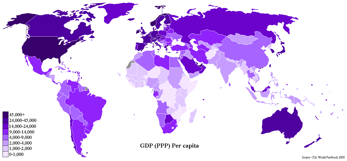
Compare, for example this: http://upload.wikimedia.org/wikipedia/commons/4/43/GDP_PPP_Per_Capita_Worldmap_2007_CIA_factbook.PNG and this: http://upload.wikimedia.org/wikipedia/commons/4/4d/UN_Human_Development_Report_2007_%282%29.svg. What is the GDP per capita of Lebanon? You can easily see it's the same shade of purple as Syria, but now compare their Human Development Index - I'm sure your nose is a fraction of a centimetre from the screen by the time you figure it out... mine is, and I don't wear glasses.
Could this map somehow be made larger by default (at least where the borders would be as easy to see as in the old popular PNG version)? I think considerable loss of information is being propagated as this version is becoming more and more popular... :(
Thanks for listening to my rant. Elad. 87.68.220.132 20:40, 15 March 2008 (UTC)
- One of the features I like most about this map is the fact that you can enable the small circles rather easily to display the small countries. Unfortunately, most maps made from this don't take advantage of it, and that was one of the main impetuses behind making that on this map! With the circles enabled, small territories can be seen a LOT easier (however, unfortunately, Israel is just a little too big - I made the dividing line at under 20,000 sq. km, and Israel is either just over 20K or 22K (depending on whether the Golan Heights is added), plus with circles for the Palestinian territories and Lebanon hemming in Israel, it might get a little crowded with an Israeli circle as well, I tried to move the Lebanese and Palestinian circles as far from Israel as I could to show as much of her territory as I could). Please, people, I would highly suggest if you make a derivative of the map, enable the small countries circles! That's what it's there for. --Canuckguy 03:54, 20 March 2008 (UTC)
Projection
What is the projection of this world map ? Winkel ? Mercator ? Robinson ? 220.135.4.212 11:56, 17 March 2008 (UTC)
- Looks very much like a Robinson projection. /Lokal_Profil 20:46, 17 March 2008 (UTC)
Need of SVG programmers to make a SVG think tank
Hello, I added some interesting stuff to the documentation : see this diff.
I think the list of name provide may be the basis to build an oraganized think tank about SVG integration on commons. We are de facto far, REALLY FAR, to make a complete use of SVG on commons. An SVG think tank with some programmers, completed by some skilled wikigraphist (2 elected representants of by Graphic lab) may produce great technology jump O.O .
So please, list below all wikipedia programmers you know who have skills (and free time~) to be part of it.
Yug 11:54, 17 March 2008 (UTC)
- Please complete the following table
| Name | main wiki | wikipedian ? | experience relate to SVG |
|---|---|---|---|
| Category programmers: your help whould be need for both imagine new funtions/tools and create code to ease SVG use on commons & wikipedia. | |||
| Arthur | / | inactive | Coded "Gunnmap" ( http://gunn.co.nz/map/ ), an astonishing flash application which can produce maps according to provided datas. This application can ease the spread of Map recommendations if the recommended colors are include by defaut. This application would be welcome to be the core of our future SVG Map tools expansion. Flash (expert?)... to manipulate SVG files. Important : Arthur is inactive on wikipedia. It's just a programmer which came to announce his application. I order to have more collaboration with him (request his help...), it would be need to contact him by email. Comment on possible Future developments: a/ this application should work fine work with all well constructed SVG map, allowing to output administrative-division Locator map, and gradiant map as well. It's to us to build-provide other well constructed SVG maps for each country. Starting with : Image:Départements+régions (France).svg (code to improve). b/ Gunnmap should then allow to choice the background map. c/ When they are less than 8(?) colors, Gunnmap should diplay the like on Image:Internet_connection_rate_2000.png. d/ It is no need to talk about the color recommendation now since they are far to be ready. |
| Slashme talk | en | active | programmer and wikigraphist, already made a script to provide standardised SVG legislature diagrams according to provided datas. The script can produce legislature perfectly adapted to each case : number of seat, number of rows, number colons, parties' color, tittle, etc are all customizable. Comment on possible Future developments: a/ the script was done at 90%. It stay to finish it, put it on the web, and spread it use. |
| Biercenator | jp | semi-active | A computing hobbyist, author of a script with options to transform the SVG source from a Robinson to a Mercator projection and back, and to extract individual countries (created for a specific website project, link forthcoming shortly). Comment on Future development: a/ with this as proof of concept, mathematically derived transforms based on the more straightforward Mercator source should be possible, such as the interesting Plate projection, or the Winkel projection. |
| Nikola Smolenski | ? | ? | Programmer. Coded a "Translate SVG script" (See here), which allow to translate all text appearing in SVG from commons.wikimedia.org. It may be need to extend it to enable to change "xxxxx" by "yyyyyy" what ever it is. Comment on possible Future developments: a/ I especially hope that it may soon allow to change a color #xxxxxx; into #yyyyyy; , this would be really helpful to convert hundred current SVG maps to coming new Common Map Recommendations. b/ I also hope it may change these colors directly on the commons server, to don't have to reuplaod the the hundreds images handly. |
| H2g2bob | en | ? | programmer, worked on a script for coloring SVG maps in. When done, it'll be here. Comment possible Future developments: will need to be merge with Nikola script. |
| Canuckguy | en | active | "cartographer", regularly updates and "maintains" (of a sort) BlankMap-World6.svg. SVG skills limited (the map file is his sole SVG experience), free time much more limited, has learned enough about SVG to perform maintenance on the map |
| Category SVG graphist: your help whould be need mainly to imagines tools according to your daily difficulties to edits and use SVG files on wikipedia, and to repport programmers the summary of your reflexion : your tools needs. | |||
| Sting | fr | active | wikigraphist, SVG Map leader on wiki fr. |
| Semhur or Pinpin | fr | active | wikigraphists, two other skilled SVG maps editors ; |
| Yug or 220.135.4.212 |
fr, en | mid-active | historical leader of the fr-Graphic lab. Coding abilities : Html/Wiki only ; XML (a very little). Will mostly just overview and set up the project page if several are interested to launch it. No special SVG skills, nor coding abilities. |
.svg)
- We also need to get a list of people together who are willing to go through all the .png maps on Commons and convert them to .svg, and possibly also replacing them on Wikipedia with the newly minted svg version. This is something I would *love* to do, but don't have the time (to demonstrate, I've been wanting to write this comment for a month and haven't even had the time for that!) --Canuckguy 01:04, 11 May 2008 (UTC)
- The Wikigraphists (in this cases the cartographers ones) have for long time said they will first set up map making standard, and then work to convert all maps (SVG and PNG) to thoses new standard.
- But it stay the fact that they need more SVG tools to avoid wast of time.
- By exemple, make a translation of a SVG currently need one translator, contacting one SVG graphist, which will then take 20 mins (download, edit, upload), to provide the new-language map. Why ? Why a such complex process when SVG is perfect to be edited online exactly like a wiki page. Wikicarthogrphers are hoping that trusted users on commons may be free to provide a list of traduction (pair of words, ex: London -> Londre ; England -> Angleterre ; Spain -> Espagne) on a page, state the image file, and then a bot will directly upload a new translated version on commons.
- As of 2008, we don't have this. In fact, we still work on SVG exactly like if it was a Bitmap: we take no advantage of the fact it's a text based media editable by scripts. Yug (talk) 20:17, 28 May 2008 (UTC)
Derivative maps
I'm pleased to see the plethora of so many maps made as an alternative to the main one (square ones, flat ones in different projections, and differently centered ones, everything but a south-at-top map (which I've seen in a few locations, but never made as a derivative from this.) :) ) But, I'm wondering, when this page gets updated/improved (as the file history shows this happens quite regularly) do all of these other maps get updated as well? I'm not worried as much about the derivative maps that are made to depict a data set (the reason that it's here), although those probably should be updated/improved whenever this main file is, but since the above are blank templates as well, it should be important for them to be updated and improved when the main one is as well. This goes doubly for the versions of this map hosted off Wikipedia (like at [1] for example, but harder to do because those pages aren't wikis and the webmaster nmight not know this file was improved in the meantime.--Canuckguy 16:56, 19 April 2008 (UTC)
- For the maps that I've done I'll probably keep an eye on the updates to this map and depending on how significant they are I would update the derivatives. The script that Biercenator wrote works on newer versions of the map (saved localy on your own desktop) that aren't bundled with the script so anything made from that should be easily updated. BTW where are the south on top maps... so that I can make a BlankMap-World6 version of them =) /Lokal_Profil 19:34, 19 April 2008 (UTC)
- Yes, we need scripts making automatic update of alternative version to avoid :
- a/ out of date data and mistakes ;
- b/ waste of humain time ;
- When will we get some great programmers to seriously [massively] take and rethink the SVG issue ? Yug 08:52, 2 May 2008 (UTC)
Document Metadata
hi, well done! wouldn't You like to fill in the meta-data section of Your templates? (Inkskape: File - Doc Metadata) - greetings from Austria --W!B: 06:52, 26 April 2008 (UTC)
- The problem with using Inkscape to add metadata is that it also adds a chunk of junk code. The file already contains some metadata namely:
	<metadata id='metadata24111'>
	    <rdf:RDF>
	      <cc:Work rdf:about="">
		<dc:format>image/svg+xml</dc:format>
		<dc:type rdf:resource="http://purl.org/dc/dcmitype/StillImage" />
		<cc:license rdf:resource="http://web.resource.org/cc/PublicDomain" />
		<dc:title>Blank World Map</dc:title>
	      </cc:Work>
	      <cc:License rdf:about="http://web.resource.org/cc/PublicDomain">
		<cc:permits rdf:resource="http://web.resource.org/cc/Reproduction" />
		<cc:permits rdf:resource="http://web.resource.org/cc/Distribution" />
		<cc:permits rdf:resource="http://web.resource.org/cc/DerivativeWorks" />
	      </cc:License>
	    </rdf:RDF>
	</metadata>
UK countries
Would it be possible to add the constituent countries of the United Kingdom (ie England, Northern Ireland, Scotland and Wales) as optionally separate entities on this map? --Kwekubo 01:27, 31 May 2008 (UTC)
- Don't think it can be done easily since it would require splitting up the polygon(s) which is UK. Also don't really think it's worth it. If you want that level of detail you're no longer interested in a world map. Also then I guess similar things should be done for all other countries with subdivisions which would make the size of the map unmanageable. /Lokal_Profil 19:29, 1 June 2008 (UTC)
- the technical difficulty aside, in some respects these are indeed countries, unlike most other country subdivisions. For example, they compete individually in many sports events. so if possible i would be in favour of splitting the uk polygon in 4. /Marmelad 21:33, 1 June 2008 (UTC)
- If you don't have an own ISO 3166 code your not a separate country =P. Jokes aside, Russia is similarly subdivided into several republics and there are many other countries with subdivisions that are much more self governing then, say, Wales. What I'm worried about is that doing this for the UK will open up to a lot of similar requests. This is apart from the actual technical difficulties of course. There is of course nothing stoping there from being a derivative map with the UK subdivided or inded all countris split up into their level two subdivisions./Lokal_Profil 19:58, 2 June 2008 (UTC)
- the technical difficulty aside, in some respects these are indeed countries, unlike most other country subdivisions. For example, they compete individually in many sports events. so if possible i would be in favour of splitting the uk polygon in 4. /Marmelad 21:33, 1 June 2008 (UTC)
POV corrections needed
I would like the map to be neutral and depict the correct status of Jammu and Kashmir and Arunachal Pradesh as per Image:India-locator-map-blank.svg. Four additional regions need to be marked out with varying opacity:
- Administered by India - Claimed by Pakistan
- Administered by India - Claimed by China
- Administered by Pakistan - Claimed by India
- Administered by China - Claimed by India
Could this map be suitable modified? Thanks Nichalp (talk) 07:30, 14 August 2008 (UTC)
- We've had this discussion before, see the top of the talk page (after the documentation part). I decided at the time that depicting administrative control is the easiest way to depict disputed areas, and I think that even more now. However, I haven't seen a map changed to depict it the way you're suggesting (ie with varying opacity), it might be a better way, but I haven't seen it and my SVG skills aren't nearly good enough to do so. I know yours are (I've mentioned your fabulous Image:India-locator-map-blank.svg before, so i know you can.) If you can change the opacity yourself (feel free, it's on commons so anyone can change it if they can) and it works well, then you might change my mind. At the very least, I may add a note in the documentation that "disputed areas are depicted as part of the territory that has administrative control", but for now the talk page discussion covers that. --Canuckguy (talk) 13:39, 14 October 2008 (UTC)
Coloring with css
I think it's some "," to much in the CSS in the "In a text editor" part of the page. It shold be no "," befor the "{"?
This map i so grate 11 of 5 stars from me. Thanx. —Preceding unsigned comment was added by 138.227.189.9 (talk) 13:32, 14 October, 2008 (UTC) (UTC)
![]() Done --Canuckguy (talk) 01:31, 9 November 2008 (UTC)
Done --Canuckguy (talk) 01:31, 9 November 2008 (UTC)
How to remove lines at left and top of image?
On my map/image of the map it lines at the top and left side, can you remowe them by editing the SVG-file? (this one: http://commons.wikimedia.org/wiki/Image:BlankMap-World6,_compact.svg)
- Go to the styles part of the code and to the style ".ocean". Here you change stroke-width: from 0.5 to 0.0 /Lokal_Profil 17:55, 31 October 2008 (UTC)
Abkhazia and South Ossetia
So what about these independent republics? SkyBonTalk\Contributions 21:56, 25 October 2008 (UTC)
- As discussed above in the "Latest Updates" section, in order to make some kind of authoritative decision as to what appears on the map as a separate territory and what doesn't, I've decided to primarily defer to the ISO 3166-1 list when deciding what to put on, at least in terms of "independent" entities (some dependencies on ISO 3166 aren't depicted on the map, however, I may rectify that). While Kosovo doesn't show as an independent territory (as colouring "rs" (Serbia) will colour the territory of Kosovo as well), it is selectable because I've seen several Wikipedia maps colour it differently. Are there masps on Wikipedia that would require this for these two territories? (Keep in mind that the "ge" (Georgia) territory would still colour Abkaz and S. Ossetian territory as Georgian since they lack a separate ISO code.) --Canuckguy (talk) 17:50, 27 October 2008 (UTC)
- For example, will be used to show the map as it's officially recognized in Russia. Flrn (talk) 13:15, 15 November 2008 (UTC)
Blank version?
There is a blank world map (i.e. no country borders) in PNG, but none in SVG. I'd love to see an addition like that. Unless of course I have been unable to locate one. --Svippong (talk) 16:39, 26 October 2008 (UTC)
- I believe just editing the .landxx tag to say "stroke:none" instead of "stroke:white" would accomplish the same thing - earlier this year I updated the file so that all the countries touch with no gaps (except for lakes) so that should display OK. And then, for example, if you want to show Africa on a blank world map, you can just select the African countries and display that way. (Continents like Europe and Asia, with transcontinental countries, though, would be more difficult.) --Canuckguy (talk) 20:32, 1 November 2008 (UTC)
Maldives?
I've been working with this map a bit and I've noticed that the Maldives (code "mv") appear to be both out-of-place and not fully represented on the map, as compared with satellite photos (such as those at http://maps.google.com/maps?q=maldives). I've seen raster images that seem quite similar to this svg version that had more accurate representations of the Maldives (http://commons.wikimedia.org/wiki/Image:BlankMap-World-Subdivisions.PNG for example), but none of the past revisions of this map seemed to have them in the correct place/size. Also, I suspect that the raster map that I pointed to and others like it may be distorting the size of some Pacific islands based on their status as separate countries (rather than using circles to draw attention, as this wonderful map does), but I can't confirm this... Can someone confirm that the Maldives are misrepresented in this map? Are other small island nations affected?
-Peter Mawhorter
- Maldives were a tricky one to represent on this map because they are so small. Several edits to the map ago, someone got rid of all the small islands, which I didn't mind, but that of course, left out the Maldives. Since I think that every country, no matter how small, had to have at least some land area on the map (as well as a circle if it's small enough), I put the Maldives back with a very small island, I may have put it back in the wrong place as a result. (The circle might also be a considerable ways away from that nation, circle placement for island nations is another reoccurring problem.) The original map that this came from en:Image:BlankMap-World3.svg is based on a World Factbook map (don't know the link to that one), and both of them have the Maldives in the correct position (I would assume so anyways), so you can easily use that one for reference if you want to move the remaining Maldivian island.--Canuckguy (talk) 23:32, 22 November 2008 (UTC)