Commons:Valued image candidates/Graphs of Global Warming

From Wikimedia Commons, the free media repository
Jump to navigation Jump to search

Graphs of Global Warming

undecided
Images
Description

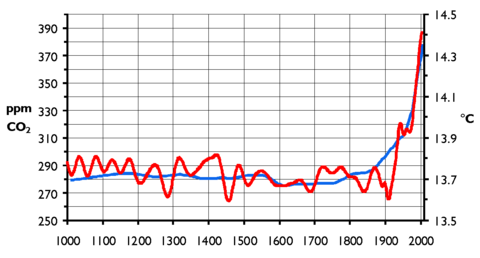
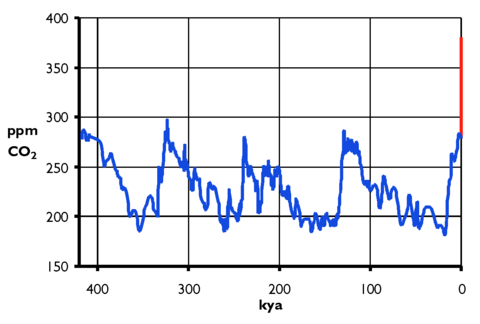
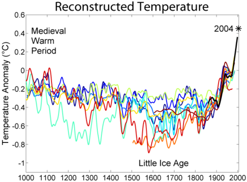
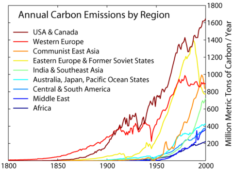
Many of these graphs have translations and/or Good descriptions. They originate from a variety of sources, but have pretty consistent presentation.

Nominated by Inkwina on 2008-03-11 07:04 (UTC)
Scope Nominated as the most valued set of images on Wikimedia Commons within the scope:
Evidence for Global Warming
Used in

Various pages on different wikipedias.

Review
(criteria)
  •  Oppose Although some of these graphs are interesting, they don't make any sort of compelling set of images; rather, they are simply a collection which is not the same thing at all. --MichaelMaggs 19:31, 18 March 2008 (UTC)[reply]
 Comment As I think I said elsewhere I created this set to test the criteria of what makes a set a set, as it is still not too clear. While I would oppose my own set on technical criteria (i.e. all the graphs should be SVG and link to source data and provide gnuplot code) I totally disagree with you that they are of completely different things. This set is a collection of graphs of numeric evidence (N.B. not proof, just evidence) for the wide subject of "Global Warming". The set is not complete, but I doubt such a set can ever be complete. I think it has wide enough coverage to be valuable, OTOH while disagreeing, I would understand if you think it is not complete enough. --Inkwina (talk contribs) 14:22, 19 March 2008 (UTC)[reply]
  •  Oppose First of all, thank you for making this nomination. It is good for testing purposes. As the nominator already has mentioned there is a general problem with the file format, lack of source data (or links to them) and lack of graph generating scripts. However, my biggest objection is really that this set of graphs is not a convincing nor complete image set, and it will never be. Each graph is valuable on its own, but I do not think the charts as seen together can be said to be particularly complete or as being more valuable than the accumumulated value of each image. Although I agree the graphs, when seen together points to a relation between global temperatures and carbon dioxide emission from fossil fuel etc. I could just as well argue that you were trying to make a point. There are other views/nuances to the picture such as the possible influence of the sunspot activity on cloud formation and thus the global temperature, which is not included in the set. I did not find any particularly good graphs on Commons relating to this, but I am talking about data in like these for instance and related data. Being the devils advocate I could argue that the set is deliberately incomplete. (I do not think there are any deliberate omissions though, just trying to see it from another POV). My point is that such a set of graphs can never be considered complete. Also, new theories evolve and are developed all the time making it very difficult to compile a complete set of valuable graphs for more than a split second. Thus, new graphs will continously appear making some of the images in the set obsolete concerning most valued. -- Slaunger 16:45, 25 March 2008 (UTC)[reply]
Result: 2 oppose
=> Declined. -- Slaunger 22:08, 22 April 2008 (UTC)[reply]
Declined -> undecided at the end of test review phase. -- Slaunger 20:51, 27 May 2008 (UTC)[reply]