Commons:Quality images candidates/Archives May 2011
-

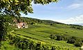
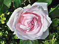
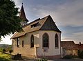
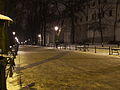
- Nomination Landscape Herscheid, Germany - Pro2 15:06, 28 May 2011 (UTC)
- Promotion Very nice sunset. --King of Hearts 07:34, 29 May 2011 (UTC)
-

-

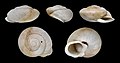
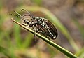
- Nomination Shell of a Miocene gastropod, Euthriofusus burdigalensis grateloupi --Llez 12:56, 28 May 2011 (UTC)
- Promotion
 Support QI & Useful --Archaeodontosaurus 13:30, 28 May 2011 (UTC)
-
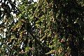
- Nomination Picea abies pollen cones, Beskid Żywiecki, Poland. --Crusier 12:16, 28 May 2011 (UTC)
- Decline Insufficient quality. Lacks detail. --Saffron Blaze 20:21, 28 May 2011 (UTC)
-

- Nomination Picea abies pollen cones, Beskid Żywiecki, Poland. --Crusier 12:16, 28 May 2011 (UTC)
- Decline Insufficient quality. Lacks detail and cones are overexposed. --Saffron Blaze 20:21, 28 May 2011 (UTC)
-
-

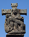
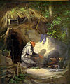
- Nomination Eucharist, Rygge church, Norway --Eaglestein 12:45, 28 May 2011 (UTC)
- Decline Very nice subject and artwork, but the quality is too bad: crop, tilt, light, composition, sharpness. Any chance for a re-shot ?--Jebulon 16:01, 28 May 2011 (UTC) No re-shot awailable, but this was my first try, and I thank you for your answer (I agree to most of it)--Eaglestein 07:50, 29 May 2011 (UTC)
-
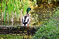
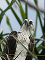
- Nomination Mallard at Weltvogelpark_Walsrode. --Fiorellino 20:51, 26 May 2011 (UTC)
- Decline
 Comment The head, which I presume is the main feature, is outside the area of sharpest focus. It is much softer than the back of the duck.Saffron Blaze 07:52, 27 May 2011 (UTC)
 Oppose Oversaturation --Archaeodontosaurus 13:38, 28 May 2011 (UTC)
-
- Nomination Shell of an endemic land snail of Tenerife, Hemicycla inutilis --Llez 14:32, 26 May 2011 (UTC)
- Promotion Support QI & Useful --Archaeodontosaurus 13:39, 28 May 2011 (UTC)
-

- Nomination CWS Flour Mills in Bristol. Mattbuck 04:03, 26 May 2011 (UTC)
- Promotion Comment This just needs a tilt adjust. Saffron Blaze 08:01, 26 May 2011 (UTC)
The near edge of the building is vertical. Mattbuck 17:10, 26 May 2011 (UTC)
Support --Archaeodontosaurus 13:40, 28 May 2011 (UTC)
-

- Nomination Rozino village church. --MrPanyGoff 06:34, 25 May 2011 (UTC)
- Promotion
 Question Small distortion of the roof of the tower appears to lean towards the right. Maybe even he is naturally like that? --Archaeodontosaurus 17:51, 25 May 2011 (UTC)
I corrected the distortion of the upper part of the tower. The tilt of the cross and the waterspout is actual.--MrPanyGoff 20:36, 25 May 2011 (UTC)
Support QI for me --Archaeodontosaurus 13:43, 28 May 2011 (UTC)
-
- Nomination: Jerusalem, Pool of Bethesda, remains of the byzantine church --Berthold Werner 11:25, 23 May 2011 (UTC)
- Review needed
-

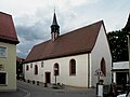
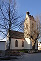
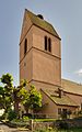
- Nomination: Wintersweiler: Protestant Church (bell tower) --Taxiarchos228 08:29, 23 May 2011 (UTC)
- Review needed
-

- Nomination: alarm and anti-aircraft gun sites on the esplanade of the Shrine of Our Lady of the castle -- Raghith 06:20, 23 May 2011 (UTC)
- Review needed
-
- Nomination: Forchheim.Marienkapelle --Vitold Muratov 22:12, 22 May 2011 (UTC)
- Review needed
-

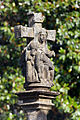
- Nomination The oldest gravestone carrying this coat of arms. --Pilettes 17:41, 22 May 2011 (UTC)
- Decline French caption added. High historical value, very interetsing, but the composition is not good. I miss the whole tombstone, or monument. This kind of things need a more classical (symmetrical) view, IMO. Can obviously be discussed ! --Jebulon 10:06, 29 May 2011 (UTC)
-

- Nomination: A capital in church in Germany. --Pilettes 17:31, 22 May 2011 (UTC)
- Review needed
-

- Nomination: Fueling of a plane.--Jebulon 17:25, 22 May 2011 (UTC)
- Review needed
-

- Nomination View of the moat, Medieval city of Rhodes, Greece.--Jebulon 15:58, 22 May 2011 (UTC)
- Promotion Support QI for me --Archaeodontosaurus 18:11, 28 May 2011 (UTC)
-

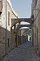
- Nomination: Street in the medieval city of Rhodes.--Jebulon 15:43, 22 May 2011 (UTC)
- Review needed
-

- Nomination Bronze Statute of Saint Francis of Assisi - Treviso Italy --Archaeodontosaurus 15:09, 22 May 2011 (UTC)
- Promotion And why not a crop left and right, almost like it is annotated ?--Jebulon 08:35, 28 May 2011 (UTC)
 Done --Archaeodontosaurus 12:55, 28 May 2011 (UTC)Far much better IMO, thank you.--Jebulon 14:48, 28 May 2011 (UTC)
-

- Nomination Odos Ippoton, Rhodes, --Jebulon 17:08, 21 May 2011 (UTC)
- Withdrawn Stange spot in sky (see note) --Archaeodontosaurus 15:07, 22 May 2011 (UTC) Indeed, but there is nothing I can do. Could somebody help, please ?--Jebulon 23:29, 25 May 2011 (UTC)
Done but i don't vote --Archaeodontosaurus 18:06, 28 May 2011 (UTC) Thank you Archaeo, but the issue is still here, and I see only this now, + some CA. This image does not deserve the QI status for now. I'll try to rework. Therefore  I withdraw my nomination--Jebulon 09:53, 29 May 2011 (UTC)
-
- Nomination An old alley in the medieval city of Rhodes, Greece.--Jebulon 16:30, 21 May 2011 (UTC)
- Promotion Support QI for me --Archaeodontosaurus 18:07, 28 May 2011 (UTC)
-
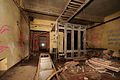
- Nomination Operations room inside an old nato base. --ComputerHotline 14:41, 21 May 2011 (UTC)
- Promotion Strong distortion seems to work here, leading the eye upward and enhancing the way the walls loom overhead. The dark shadows are tolerable IMO, as is the decreasing sharpness towards the edges. --Avenue 10:06, 29 May 2011 (UTC)
-

- Nomination Former Bank building in Pirdop. --MrPanyGoff 09:45, 28 May 2011 (UTC)
- Promotion Good quality. --Raghith 10:10, 28 May 2011 (UTC)
-

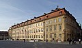
- Nomination Germany, Bamberg, Obere Königsstraße (Upper King's street) --Berthold Werner 08:54, 28 May 2011 (UTC)
- Promotion Good quality. --Saffron Blaze 10:34, 28 May 2011 (UTC)
-

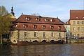
- Nomination Germany, Bamberg, Collegiate church St. Gangolf --Berthold Werner 08:54, 28 May 2011 (UTC)
- Promotion Good, but you could eliminate the contrail as it is distracting. --Saffron Blaze 10:34, 28 May 2011 (UTC)
-

-

-

- Nomination Abies alba cross section, Beskid Żywiecki, Poland. --Crusier 07:31, 28 May 2011 (UTC)
- Promotion Good quality. --Raghith 10:14, 28 May 2011 (UTC)
-
-
-

- Nomination St.Nedelya Church in Sofia. --MrPanyGoff 22:09, 27 May 2011 (UTC)
- Promotion Good quality. --Raghith 05:12, 28 May 2011 (UTC)
-

- Nomination Lana 180° Panorama --Böhringer 20:35, 27 May 2011 (UTC)
- Promotion Amazing quality. Made me go WOW. --Saffron Blaze 21:01, 27 May 2011 (UTC)
-

- Nomination The U.S. flag at a cemetary in Manhattan, New York City --Pilettes 19:27, 27 May 2011 (UTC)
- Promotion Good quality. --Saffron Blaze 20:32, 27 May 2011 (UTC)
-

-
-

- Nomination Sulawesi Wrinkled Hornbill at Weltvogelpark Walsrode. --Fiorellino 18:14, 27 May 2011 (UTC)
- Promotion Good quality. --Saffron Blaze 20:30, 27 May 2011 (UTC)
-
-

- Nomination Sundial, Stanisław Staszic Park in Częstochowa, Poland. --Crusier 17:16, 27 May 2011 (UTC)
- Promotion Good quality. --Saffron Blaze 20:34, 27 May 2011 (UTC)
-

-
- Nomination Germany, Bamberg, New Townhall --Berthold Werner 15:08, 27 May 2011 (UTC)
- Promotion Good quality. --Saffron Blaze 15:39, 27 May 2011 (UTC)
-
- Nomination dew on a young female Blue-tailed Damselfly (Ischnura elegans) --Leviathan1983 15:02, 27 May 2011 (UTC)
- Promotion Good quality. Nice detail on the eye. --Saffron Blaze 15:39, 27 May 2011 (UTC)
-
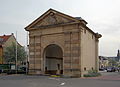
- Nomination Germany, Bamberg, old slaughterhouse --Berthold Werner 14:55, 27 May 2011 (UTC)
- Promotion Good one. Tomer T 15:23, 27 May 2011 (UTC)
-

-

- Nomination Holy Protection of the Theotokos Chapel in Sopot. --MrPanyGoff 13:16, 27 May 2011 (UTC)
- Promotion Good quality. --Saffron Blaze 15:41, 27 May 2011 (UTC)
-
- Nomination Germany, Frankenthal, Worms gate, view from west --Berthold Werner 11:08, 27 May 2011 (UTC)
- WARNING: third template parameter added – please remove.
-

- Nomination Iron bridge in Rheinfelden (no more existing) --Taxiarchos228 09:46, 27 May 2011 (UTC)
- Promotion Good quality. --Raghith 05:14, 28 May 2011 (UTC)
-

- Nomination The old hydroelectric power plant in Rheinfelden (no more existing) --Taxiarchos228 09:46, 27 May 2011 (UTC)
- Promotion Good quality. --Raghith 05:14, 28 May 2011 (UTC)
-

- Nomination Keleti Károly statue in Budapest. Tomer T 08:55, 27 May 2011 (UTC)
- Promotion Good quality. --Raghith 05:14, 28 May 2011 (UTC)
-
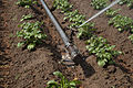
- Nomination Perrot-sprinkler-system in action --Alupus 21:08, 26 May 2011 (UTC)
- Promotion Comment The active part of the sprikler is blurry and there is something distracting on the ground under it (see note). Saffron Blaze 07:48, 27 May 2011 (UTC) Sorry, Saffron Blaze, your anotation show that you presumably don't really know how such kind of sprinkler works. That thing you held for the "active" and blurry part is the from the sprinkler produced waterjet. The distracting part you annoted is part of the mechanism, thats produces the rotation of the blast pipe round the vertical axis of the sprinkler. It's an counterwheigted crank, that in an oscillating motion periodical would be hit by the waterjet and so gives the sprinkler blast pipe an radial moment fo force to move an angle bracket further. Only the on high speed accelerated water jet and the oscillating crank are in case of motion volitional not sharp repoduced, in matter of educational show the parts of the system, that stir. --Alupus 15:59, 27 May 2011 (UTC) Very good and useful. The explanation above could/should be transposed in the file description page !!--Jebulon 16:48, 27 May 2011 (UTC) Comment Alupus, I am not sure why you are apologising. I asked a question and you answered it. Because of the blurriness I couldn't tell that was the counterweight, as it is longer than I would have expected. Regardless, I suppose the motion blur offers information as you put forth. Saffron Blaze 20:44, 27 May 2011 (UTC)
-

-

- Nomination Montmorency waterfalls --Taxiarchos228 11:27, 25 May 2011 (UTC)
- Promotion Stunning. The people on right give perspective on how large the falls is. --Saffron Blaze 13:15, 25 May 2011 (UTC)
Please geocode. --Avenue 13:55, 27 May 2011 (UTC)
-
-

-

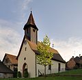
- Nomination: Istein: Saint Michaels Church --Taxiarchos228 11:31, 22 May 2011 (UTC)
- Review needed
-

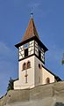
- Nomination: Istein: Saint Michaels Church (bell tower) --Taxiarchos228 11:31, 22 May 2011 (UTC)
- Review needed
-
- Nomination: Emperor Dragonfly, Exuvia. --Quartl 09:36, 22 May 2011 (UTC)
- Review needed
-
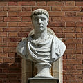
- Nomination: Bust of a pharaoh, Middle Kingdom (2134-1797 BCE), Musée des beaux-arts de Lyon. -- Rama 08:43, 22 May 2011 (UTC)
- Review needed
-

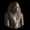
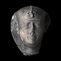
- Nomination: Head of Nectanebo II, last native pharaoh of Egypt. Greywacke, Late Period, Thirtieth dynasty (380-332 BCE), Musée des beaux-arts de Lyon. -- Rama 07:31, 22 May 2011 (UTC)
- Review needed
-

-

- Nomination The former Royal Palace in Sofia. --MrPanyGoff 17:14, 21 May 2011 (UTC)
- Promotion Good, QI--Jebulon 16:19, 27 May 2011 (UTC)
-

- Nomination: Rhodium sample --Alchemist-hp 16:33, 21 May 2011 (UTC)
- Review Comment The issue I have with this fairly good picture is the fact the plane of focus is on the hand and not on the material. As such the top of the metal is somewhat OOF. Saffron Blaze 10:28, 22 May 2011 (UTC)
-

- Nomination: An old wooden door, Rhodes, Greece.--Jebulon 16:11, 21 May 2011 (UTC)
- Review needed
-

- Nomination: Panoramic view from the Saukarkopf, a mountain in Austria. --High Contrast 15:08, 21 May 2011 (UTC)
- Review needed
-
- Nomination: Inside an old nato base. --ComputerHotline 14:41, 21 May 2011 (UTC)
- Review needed
-

- Nomination: Near the materials entry of an old nato base. --ComputerHotline 14:41, 21 May 2011 (UTC)
- Review needed
-

- Nomination: Plaque in Symi, Symi island, Greece.--Jebulon 13:41, 21 May 2011 (UTC)
- Review needed
-

- Nomination: Ancient greek stadium, Acropolis of Rhodes, Greece.--Jebulon 12:51, 21 May 2011 (UTC)
- Review needed
-

- Nomination: Ancient greek column element, Acropolis of Rhodes, Greece.--Jebulon 12:36, 21 May 2011 (UTC)
- Review needed
-

- Nomination: Istein, Germany --Taxiarchos228 11:03, 21 May 2011 (UTC)
- Review Comment The white aspects are rather bright, almost blown. Minor adjustment and this would be a great pic of that area. Saffron Blaze 10:35, 22 May 2011 (UTC)
-
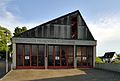
- Nomination Kleinkems: fire department --Taxiarchos228 06:31, 20 May 2011 (UTC)
- Promotion Good quality. --Jovianeye 13:00, 27 May 2011 (UTC)
-

- Nomination Drinking water.Nuremberg --Vitold Muratov 21:55, 15 May 2011 (UTC)
- Decline Comment The CAPTION is not very developed. --Archaeodontosaurus 05:52, 23 May 2011 (UTC) Comment Dupe of File:Нюрнберг.Декоративный источник.jpg, which is better categorized. --Coyau 12:42, 24 May 2011 (UTC) Because of the bad crop of the pond--Jebulon 08:19, 28 May 2011 (UTC)
-

- Nomination The Gunnuhver geothermal area on the Reykjanes Peninsula, Iceland. --Óðinn 21:15, 26 May 2011 (UTC)
- Decline Nice view. Bright at right, though not overexposed. Unfortunately it seems soft everywhere except the foreground. --Avenue 02:37, 27 May 2011 (UTC)
-

- Nomination The Gunnuhver geothermal area on the Reykjanes Peninsula, Iceland. --Óðinn 21:15, 26 May 2011 (UTC)
- Decline This is fine at web resolution but at full resolution it is very soft even through the plane of focus. --Saffron Blaze 07:45, 27 May 2011 (UTC)
-

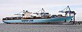
- Nomination MS Eleonora Maersk. Photo taken by myself. --Airwolf 20:34, 26 May 2011 (UTC)
- Promotion Meets all the criteria. --Saffron Blaze 20:43, 26 May 2011 (UTC)
-
- Nomination MS Eleonora Maersk. Photo taken by myself. --Airwolf 20:34, 26 May 2011 (UTC)
- Promotion Very Nice. --Saffron Blaze 20:42, 26 May 2011 (UTC)
-

- Nomination German politican Dirk Adams. --Alupus 19:59, 26 May 2011 (UTC)
- Promotion Good quality. --Taxiarchos228 20:03, 26 May 2011 (UTC)
-

-

-

- Nomination View of Baku metropolis. -- Azeri 17:19, 26 May 2011 (UTC)
- Decline very noisy --Taxiarchos228 08:04, 27 May 2011 (UTC)
-

- Nomination View of Veliko Tarnovo with the Church of Saints Constantine and Helena. --MrPanyGoff 16:19, 26 May 2011 (UTC)
- Promotion Good quality. --Taxiarchos228 08:04, 27 May 2011 (UTC)
-

- Nomination Punica granatum (pomegranate) flower, India.--Sankarshansen 15:50, 26 May 2011 (UTC)
- Decline This suffers from the same issue of lack of defination/sharpness. --Saffron Blaze 20:46, 26 May 2011 (UTC)
-

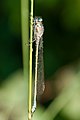
- Nomination Erythromma najas, tenerel female --Loz 15:11, 26 May 2011 (UTC)
- Promotion Perfect. --Saffron Blaze 18:06, 26 May 2011 (UTC)
-

-

- Nomination Erythromma najas, male --Loz 15:11, 26 May 2011 (UTC)
- Promotion Also perfect. --Saffron Blaze 18:09, 26 May 2011 (UTC)
-
- Nomination Erythromma najas, male --Loz 15:11, 26 May 2011 (UTC)
- Promotion Good quality. --Saffron Blaze 18:09, 26 May 2011 (UTC)
-

- Nomination Istein: Saint Michaels Church (interior) --Taxiarchos228 14:15, 26 May 2011 (UTC)
- Promotion Good. --Tomer T 09:08, 27 May 2011 (UTC)
-

- Nomination Istein: Saint Michaels Church (choir and altar) --Taxiarchos228 14:15, 26 May 2011 (UTC)
- Promotion good --Alupus 20:51, 26 May 2011 (UTC)
-
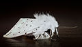
- Nomination a male Spilosoma lubricipeda --Leviathan1983 10:25, 26 May 2011 (UTC)
- Promotion Good quality. --null 09:06, 27 May 2011 (UTC)
-

- Nomination Bald eagle (Haliaeetus leucocephalus) and its nest near the Nicomekl River. --The High Fin Sperm Whale 02:48, 26 May 2011 (UTC)
- Promotion Good quality. --Raghith 05:03, 26 May 2011 (UTC)
Comment Wonderful composition and informative but this needs levels adjustment to lighten and whiten the Bald Eagle's head and tail. Saffron Blaze 08:13, 26 May 2011 (UTC)
Comment Puting my words into action: a quick redo: File:The Eagle's Nest v2.0.jpg --Saffron Blaze 19:25, 26 May 2011 (UTC)
-

- Nomination a male Spilosoma lubricipeda --Leviathan1983 18:30, 25 May 2011 (UTC)
- Promotion Excellent. --Cayambe 15:36, 26 May 2011 (UTC)
-

- Nomination Gymnetis stellata --Archaeodontosaurus 17:47, 25 May 2011 (UTC)
- Promotion Pinsharp and magnifique.in general. --Cayambe 15:34, 26 May 2011 (UTC)
-
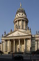
- Nomination Berlin, Französischer Dom von Osten --Berthold Werner 17:11, 25 May 2011 (UTC)
- Promotion Good quality. --Cayambe 15:38, 26 May 2011 (UTC)
-

- Nomination Anolis carolinensis - Top view from head to hind limb. --Cowenby 23:05, 22 May 2011 (UTC)
- Decline Insufficient quality and blown highlights on the leaf behind the anole. --Saffron Blaze 11:53, 27 May 2011 (UTC)
-

- Nomination The Willis Building in the City of London. --Colin 20:41, 22 May 2011 (UTC)
- Promotion Good quality. --Saffron Blaze 21:32, 26 May 2011 (UTC)
-
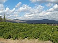
- Nomination Lemon Orchard in the Galilee, Israel. --Tomer T 19:07, 22 May 2011 (UTC)
- Promotion Beautiful landscape, sharpness acceptable. --King of Hearts 20:54, 26 May 2011 (UTC)
-

-

-

-

- Nomination Toronto Harbourfront: marina and Amsterdam Bridge --Taxiarchos228 07:52, 26 May 2011 (UTC)
- Promotion Good quality. --Saffron Blaze 07:56, 26 May 2011 (UTC)
-

- Nomination Brockville, Canada: bust of Isaac Brock --Taxiarchos228 07:52, 26 May 2011 (UTC)
- Promotion Good quality. --Saffron Blaze 07:56, 26 May 2011 (UTC)
-
- Nomination Brockville: Court House --Taxiarchos228 07:52, 26 May 2011 (UTC)
- Promotion Good quality. --Saffron Blaze 07:56, 26 May 2011 (UTC)
-

- Nomination Moose sign in French-speaking part of Canada --Taxiarchos228 07:52, 26 May 2011 (UTC)
- Promotion Good quality. The left justified crop might not be the best option. --Saffron Blaze 07:56, 26 May 2011 (UTC)
-

-

- Nomination Pier on the Nicomekl River. --The High Fin Sperm Whale 04:08, 26 May 2011 (UTC)
- Promotion Good quality. --Raghith 05:03, 26 May 2011 (UTC)
-

- Nomination Detail of a disused wagon at Kidderminster Town. Mattbuck 04:03, 26 May 2011 (UTC)
- Promotion The isolation and quality of this image is very good. Not sure about the EV. --Saffron Blaze 08:01, 26 May 2011 (UTC)
-

- Nomination Rusting crane at Ny-London on Blomstrandhalvøya, Svalbard. --Gestumblindi 01:33, 26 May 2011 (UTC)
- Decline
Oppose The detail offered is very nice but the colours seem off and quite a bit of colour noise in the sky. Saffron Blaze 08:13, 26 May 2011 (UTC) OpposeBecause of sky and crop at right.--Jebulon 10:13, 26 May 2011 (UTC)
-

- Nomination A Northwestern Salamander (Ambystoma gracile). --The High Fin Sperm Whale 01:20, 26 May 2011 (UTC)
- Promotion Good quality. --Raghith 05:05, 26 May 2011 (UTC)
-

-
- Nomination Pereslavl museum, gatekeeper's chamber, eastern facade.--PereslavlFoto 21:35, 25 May 2011 (UTC)
- Promotion This has really nice detail. Interesting architecturally for certain. Good quality. --Saffron Blaze 08:51, 26 May 2011 (UTC)
-

- Nomination Blue Jay --Cephas 21:32, 25 May 2011 (UTC)
- Promotion Good quality. --Saffron Blaze 23:05, 25 May 2011 (UTC)
-
-

- Nomination St Mary's on Chapel Hill, Tintern--Saffron Blaze 18:40, 25 May 2011 (UTC)
- Promotion Very good and very nice. --Berthold Werner 20:07, 25 May 2011 (UTC)
-

- Nomination Germany, Frankenthal, Twelve-apostle-church --Berthold Werner 17:30, 25 May 2011 (UTC)
- Promotion Until I saw the person I thinking this was a small parish church. Nice capture. --Saffron Blaze 09:00, 26 May 2011 (UTC)
-

-
- Nomination Monument of Mikhail Kalashnikov in Izhevsk. --Tomer T 17:01, 25 May 2011 (UTC)
- Decline Sorry but the image lower than 2M px --Archaeodontosaurus 17:44, 25 May 2011 (UTC)
-

-

-
-

-

- Nomination Rakovski street, Sofia. --MrPanyGoff 13:50, 25 May 2011 (UTC)
- Promotion Good quality. --Raghith 17:23, 25 May 2011 (UTC)
-

- Nomination at Tajima-mihonoura Coast in Shinonsen, Hyogo --663highland 13:24, 25 May 2011 (UTC)
- Promotion Good quality. --Raghith 17:23, 25 May 2011 (UTC)
-

- Nomination Germany, Trier, Monument for Johann Peter Wilhelm Stein, erected 1831 --Berthold Werner 13:05, 25 May 2011 (UTC)
- Promotion Good picture. --Tomer T 16:07, 25 May 2011 (UTC)
-

- Nomination Preserved open top bus. Geof Sheppard 12:54, 25 May 2011 (UTC)
- Promotion Good quality. --Raghith 17:23, 25 May 2011 (UTC)
-

- Nomination Guard inside the building of Horse guard Parades. --M0tty 12:50, 25 May 2011 (UTC)
- Promotion Great quality. --Tomer T 16:21, 25 May 2011 (UTC)
 Info It is british Royal Horse Artillery--Jebulon 23:35, 25 May 2011 (UTC) Now used in articles.--Jebulon 23:47, 25 May 2011 (UTC)
-

- Nomination Bulgarian Fir cones (Abies borisii-regis). --MrPanyGoff 12:47, 25 May 2011 (UTC)
- Promotion Good quality. --Raghith 17:23, 25 May 2011 (UTC)
-

-
- Nomination Town Baie-Saint-Paul at delta of Gouffre River --Taxiarchos228 11:27, 25 May 2011 (UTC)
- Promotion Good quality --Ximonic 16:51, 25 May 2011 (UTC)
-

- Nomination Tim Hortons in Quebéc --Taxiarchos228 11:27, 25 May 2011 (UTC)
- Promotion This would have been perfect if it was my Jeep at the drive through:). Great coffee, great photo. --Saffron Blaze 13:13, 25 May 2011 (UTC)
-

- Nomination Paris: Eiffel Tower --Taxiarchos228 11:27, 25 May 2011 (UTC)
- Promotion Not the best light but good composition. --King of Hearts 23:10, 25 May 2011 (UTC)
-

-

- Nomination Tibellus oblongus --Holleday 10:52, 25 May 2011 (UTC)
- Promotion Usually, in insect photos I would like the creature be sharp from head to the legs (which sure is difficult to achieve in many cases). Still, there is nothing to complain about quality so may this be a promotion. --Ximonic 17:04, 25 May 2011 (UTC)
-

- Nomination Bufo viridis --Holleday 10:45, 25 May 2011 (UTC)
- Promotion Good quality. --Andrei Stroe 16:22, 25 May 2011 (UTC)
-

- Nomination The sun sets on the Agora and De l'Assut de l'Or Bridge, Valencia. Saffron Blaze 20:06, 24 May 2011 (UTC)
it is curios: with a D700 an ISO 700 the noise should not be as strong like here is :( beautiful picture anyway --Taxiarchos228 06:11, 25 May 2011 (UTC) Comment File redone with NR in mind. Saffron Blaze 13:18, 25 May 2011 (UTC) - Promotion much better now, bit noisy, but I'll improve later, QI --Taxiarchos228 06:48, 26 May 2011 (UTC)
- Nomination The sun sets on the Agora and De l'Assut de l'Or Bridge, Valencia. Saffron Blaze 20:06, 24 May 2011 (UTC)
-
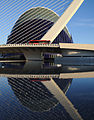
- Nomination The Agora and De l'Assut de l'Or Bridge, Valencia.Saffron Blaze 20:06, 24 May 2011 (UTC) Beautiful composition, but a lot of noise.--Ankara 22:19, 24 May 2011 (UTC) Comment File redone with NR in mind. Saffron Blaze 13:18, 25 May 2011 (UTC) I believe that everything above the bridge now is good enough for QI. But the water does not look good. Regards--Ankara 18:54, 25 May 2011 (UTC)
Comment The water is only a couple inches deep. What you see is the pebbled concrete that is the bottom of the reflecting pool. Nothing I can do about that :) Saffron Blaze 20:56, 25 May 2011 (UTC) Ok! --Ankara 06:02, 26 May 2011 (UTC) - Promotion {{{2}}}
- Nomination The Agora and De l'Assut de l'Or Bridge, Valencia.Saffron Blaze 20:06, 24 May 2011 (UTC) Beautiful composition, but a lot of noise.--Ankara 22:19, 24 May 2011 (UTC)
-

- Nomination Enceladus by Gaspard Marsy, Versailles. --Coyau 15:16, 24 May 2011 (UTC)
- Promotion Support Small overexposed areas but QI for me --Archaeodontosaurus 17:55, 25 May 2011 (UTC)
-

-

-

- Nomination View of the fort Saint Nicolas at Rhodes harbour, Greece.--Jebulon 13:31, 23 May 2011 (UTC)
- Promotion QI for me --Archaeodontosaurus 17:59, 25 May 2011 (UTC)
-

-
-
- Nomination The mosque and the knight. Rhodes, Greece.--Jebulon 22:06, 21 May 2011 (UTC)
- Promotion Love the silhouetted knight. While QI you could crop a bit of the bottom off for an even better picture. --Saffron Blaze 10:18, 22 May 2011 (UTC). Done Better now ? --Jebulon 12:44, 23 May 2011 (UTC) Comment Yes, indeed! Saffron Blaze 09:32, 26 May 2011 (UTC)
-

- Nomination Matthias Stadler, mayor of St. Pölten, Austria --AleXXw 21:40, 21 May 2011 (UTC)
- Decline If the purpose is to depict Mathias Stadler, could you crop it so it shows only him? --King of Hearts 23:25, 23 May 2011 (UTC)
Bad crop on right hand guy, overexposed sky. --Mattbuck 04:20, 26 May 2011 (UTC)
-

-

-

-
-

- Nomination Mappach: Protestant Church --Taxiarchos228 06:31, 20 May 2011 (UTC)
- Decline Perspective gives this a nasty tilt - should probably have chosen the near edge as vertical rather than the right one. --Mattbuck 04:11, 26 May 2011 (UTC)
-

-

-

-

- Nomination A Yellow Tang, Zebrasoma flavescens --Llez 05:51, 25 May 2011 (UTC)
- Promotion Wow! --King of Hearts 06:00, 25 May 2011 (UTC)
-

-

- Nomination Ancient rockcarvings in Qobustan, a UNESCO World Heritage site. -- Azeri 20:12, 24 May 2011 (UTC)
- WARNING: third template parameter added – please remove.
-

- Nomination YuMZ-6KL tractor, plowing -- George Chernilevsky 20:07, 24 May 2011 (UTC)
- Promotion Support QI and Useful --Archaeodontosaurus 20:19, 24 May 2011 (UTC)
-

- Nomination YuMZ-6KL tractor, plowing -- George Chernilevsky 20:07, 24 May 2011 (UTC)
- Promotion Support QI and Useful --Archaeodontosaurus 20:19, 24 May 2011 (UTC)
-

- Nomination Stanford Memorial Auditorium from Hoover Tower. --King of Hearts 19:39, 24 May 2011 (UTC)
- Promotion Very interesting, useful and good.--Jebulon 21:56, 24 May 2011 (UTC)
-

- Nomination Stanford Memorial Auditorium from Hoover Tower. --King of Hearts 19:39, 24 May 2011 (UTC)
- Promotion Good quality. --Saffron Blaze 20:11, 24 May 2011 (UTC)
-

- Nomination Stanford Memorial Auditorium from Hoover Tower. --King of Hearts 19:39, 24 May 2011 (UTC)
- Promotion Good quality. --Saffron Blaze 20:11, 24 May 2011 (UTC)
-

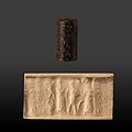
- Nomination Seal: scene of devotion with inscription. First dynasty of Babylone, 1850-1700 BCE. Hematit. Museum of Fine Arts of Lyon. -- Rama 19:13, 24 May 2011 (UTC)
- Promotion Good quality. EV. --Saffron Blaze 20:16, 24 May 2011 (UTC)
-
- Nomination Seal: Presentation to the divinity with a dwarf. First dynasty of Babylone, 1850-1700 BCE. Serpentine. Museum of Fine Arts of Lyon. -- Rama 19:10, 24 May 2011 (UTC)
- Promotion Good quality. EV. --Saffron Blaze 20:16, 24 May 2011 (UTC)
-

- Nomination Seal: hero fighting two male winged deamons, with stars above. Neo-assyrian or neo-babylonian empire, 8th-7th centuries BCE. Chalcedony. Museum of Fine Arts of Lyon. -- Rama 19:05, 24 May 2011 (UTC)
- Promotion Good quality. EV. --Saffron Blaze 20:16, 24 May 2011 (UTC)
-

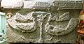
- Nomination Seal: Hero fighting two female winged deamons, with a tree of life under a star and a crescent of moon. Neo-assyrian or neo-babylonian empire, 8th-7th centuries BCE. Chalcedony. Museum of Fine Arts of Lyon. -- Rama 19:03, 24 May 2011 (UTC)
- Promotion Good quality. EV. --Saffron Blaze 20:17, 24 May 2011 (UTC)
-

-
- Nomination Ancient inscription of Caucasian Albania in a museum in Mingachevir. -- Azeri 18:34, 24 May 2011 (UTC)
- Decline Images should have at least 2 real megapixels of information. Below minimum size requirement. --Elektroschreiber 20:14, 24 May 2011 (UTC)
-
- Nomination Historic cabinet Tagiyev in the Museum of History of Azerbaijan. -- Azeri 18:34, 24 May 2011 (UTC)
- Decline I like the image but the full resolution 950 × 634 pixels is too small for QI. --Elektroschreiber 20:05, 24 May 2011 (UTC)
-

-

- Nomination A part of the cloister of the "new hospital of the knights", now archaeological museum of Rhodes, Greece. 15th century--Jebulon 17:57, 24 May 2011 (UTC)
- Promotion Nice composition: Repetition and contrast. --Jonathunder 18:20, 24 May 2011 (UTC)
-

- Nomination Shell of the dark form of an Adusta Murex, Chicoreus brunneus flavicunda --Llez 17:45, 24 May 2011 (UTC)
- Promotion Good quality. --Saffron Blaze 20:13, 24 May 2011 (UTC)
-

-

-
-
-
-

- Nomination Saint Nicholas Church, Karlovo. --MrPanyGoff 16:35, 24 May 2011 (UTC)
- Promotion Good quality. --Raghith 17:24, 24 May 2011 (UTC)
-

-

- Nomination The Maiden Tower in Old Baku is a UNESCO World Heritage Site built in the 11th–12th century. -- Azeri 15:55, 24 May 2011 (UTC)
- Decline Not one megapixel. Below minimum size requirement real 2 megapixel. --Elektroschreiber 20:24, 24 May 2011 (UTC)
-

- Nomination Berlin, St. Mathews church --Berthold Werner 14:59, 24 May 2011 (UTC)
- WARNING: third template parameter added – please remove.
-

-

- Nomination Germany, church of Springiersbach monatry --Berthold Werner 11:07, 24 May 2011 (UTC)
- Promotion It is a QI. I like the contrast very much, even if the cars are a bit disturbing.--Jebulon 23:43, 24 May 2011 (UTC)
-
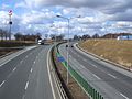
- Nomination Highway A4 in Poland, near Góra Świętej Anny. Direction Opole --Pudelek 09:54, 24 May 2011 (UTC)
- Promotion Nicely done. --King of Hearts 06:05, 25 May 2011 (UTC)
-

-

-
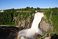
- Nomination Waterfall Montmorency --Taxiarchos228 09:17, 24 May 2011 (UTC)
- Decline Unfortunate crop below, disturbing shadow at the right bottom corner and looks oversaturated to me.--Jebulon 23:50, 24 May 2011 (UTC)
-
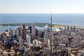
- Nomination Aerial view of downtown Toronto, with view of Toronto Islands and Lake Ontario in the background. --Taxiarchos228 08:25, 24 May 2011 (UTC)
- WARNING: third template parameter added – please remove.
-

-

- Nomination Mountainous landscape of Quba, Azerbaijan. -- Azeri 19:34, 23 May 2011 (UTC)
- Promotion Comment I see this was updated with a levels adjustment. Looks more natural. QI now.Saffron Blaze 15:41, 24 May 2011 (UTC)
-

- Nomination Bas-relief of a tumb: priest holding the mummy of the deceased. New Empire, 20th dynasty (1186-1070 BCE). Museum of Fine Arts of Lyon. (note: possible cache problems, the latest version is lighter and upright.) -- Rama 18:28, 23 May 2011 (UTC)
- Promotion Composition, lighting, detail, and EV are all there. --Saffron Blaze 12:18, 24 May 2011 (UTC)
-

- Nomination Historic Faribault Nursery --Jonathunder 17:11, 23 May 2011 (UTC)
- Decline A little bit greasy --A.Ceta 11:21, 24 May 2011 (UTC) Comment Greasy? --Jonathunder 18:16, 24 May 2011 (UTC)
-

-

- Nomination Lewis Hamilton --AngMoKio 20:19, 22 May 2011 (UTC)
- Decline The photographer just behind Hamilton is too disturbing for me. --Elektroschreiber 20:50, 24 May 2011 (UTC)
-

- Nomination Azerbaijani carpet, belonging to the Shirvan subgroup. Taken in July 21, 2009 -- Azeri 22:21, 21 May 2011 (UTC)
- Decline Below minimum size real 2 megapixel. --Elektroschreiber 20:21, 24 May 2011 (UTC)
-
- Nomination Nasua narica, Quintana Roo, Mexico. In captivity--Lmbuga 17:05, 20 May 2011 (UTC)
- Promotion Question Too strong flash?--Lmbuga 17:07, 20 May 2011 (UTC)
Borderline IMO. The flash causes bright spots and odd colours in the fur, just tolerable I think for QI. There is some foreground glare and the branch above the animal interrupts the darker background. I'd try an even tighter crop around the animal. Its captive context is not very informative, so there wouldn't be much loss there. --Avenue 13:07, 21 May 2011 (UTC)
Thanks Avenue, but I can't understand. I will say your words to a friend so that he translates them. Thanks --Lmbuga 16:29, 21 May 2011 (UTC)
Sorry. A simpler version: see image note for possible crop. Maybe the bright and blue spots in the fur are okay. --Avenue 03:39, 22 May 2011 (UTC)
Thanks. I think that I now understand. New version--Lmbuga 20:03, 23 May 2011 (UTC)
Thanks. Good detail outweighs some spots and blue patches in the fur, IMO. --Avenue 02:49, 25 May 2011 (UTC)
-

-

-

- Nomination Foundation figurine featuring a god kneeling and setting a nail, with remains of a dedication by Gudea to Ningirsu. -- Rama 17:39, 12 May 2011 (UTC)
- Promotion Question Is there a point in the tilt? --Slaunger 19:33, 20 May 2011 (UTC)
No, you're right. Corrected, thank you. Rama 05:10, 21 May 2011 (UTC)
Strange, I cleared my cache but I do not really see that the tilt has been fixed?? --Slaunger 09:04, 21 May 2011 (UTC)
I think there is some sort of bug somewhere, but you might have an idea of what I'm trying to do in the upload history. Weird indeed. Rama 09:38, 21 May 2011 (UTC)
Yes, I understand from the history, it is a caching problem, apparently. --Slaunger 10:55, 21 May 2011 (UTC)
No tilt now. Generally good, but I don't understand the glowing armpit. --Avenue 12:33, 23 May 2011 (UTC)
OK for me with the tilt corrected (which finally show up on my browser). --Slaunger 18:01, 24 May 2011 (UTC)
-

-

- Nomination St. Nicholas church in Slatina, Olt County, Romania. Andrei Stroe 10:13, 24 May 2011 (UTC)
- Promotion Nice photo! Shows all things that must be rocgnizable. --A.Ceta 11:18, 24 May 2011 (UTC)
-

- Nomination a robber fly Dysmachus trigonus --Leviathan1983 10:04, 24 May 2011 (UTC)
- Promotion Clearly a QI, despite the twig in front. --Quartl 10:15, 24 May 2011 (UTC)
-

- Nomination a robber fly Dysmachus trigonus --Leviathan1983 10:04, 24 May 2011 (UTC)
- Promotion Clearly a QI, despite the twig through the head. --Quartl 10:15, 24 May 2011 (UTC)
-

- Nomination Reddish Egret on Sanibel Island in Lee County, Florida, U.S.A. --Raghith 08:49, 24 May 2011 (UTC)
- Promotion Good quality. --Saffron Blaze 09:09, 24 May 2011 (UTC)
-

- Nomination Juvenile Red-bellied Woodpecker at Sanibel Island in Lee County, Florida, U.S.A. --Raghith 08:48, 24 May 2011 (UTC)
- Decline Not sharp. --Saffron Blaze 09:55, 24 May 2011 (UTC)
-

- Nomination Female Red-bellied Woodpecker at Everglades National Park in Miami-Dade County, Florida, U.S.A. --Raghith 08:48, 24 May 2011 (UTC)
- Decline Not sharp. --Saffron Blaze 09:55, 24 May 2011 (UTC)
-

- Nomination Hōtō, Ikegami Honmon-ji, Tokyo, Japan --Raghith 08:48, 24 May 2011 (UTC)
- Decline Sky is blown. Seems distorted. --Saffron Blaze 09:55, 24 May 2011 (UTC)
-
- Nomination Florida Gallinule at the Francis S. Taylor Wildlife Management Area-Water Conservation Area 3B in the Everglades National Park in Miami-Dade County, Florida, U.S.A. --Raghith 08:48, 24 May 2011 (UTC)
- Promotion Good quality. --Saffron Blaze 09:55, 24 May 2011 (UTC)
-

- Nomination Close up of a Great Egret on Dove Key in Monroe County, Florida, U.S.A. --Raghith 08:48, 24 May 2011 (UTC)
- Promotion Good quality. --Saffron Blaze 09:09, 24 May 2011 (UTC)
-

- Nomination Reddish Egret on Sanibel Island in Lee County, Florida, U.S.A. --Raghith 08:48, 24 May 2011 (UTC)
- Decline Cropped too tight on the right. --Saffron Blaze 10:00, 24 May 2011 (UTC)
-

- Nomination Toronto Music Garden with King's Landing Condominium --Taxiarchos228 08:25, 24 May 2011 (UTC)
- Promotion Good quality. --Saffron Blaze 09:12, 24 May 2011 (UTC)
-

- Nomination Hartland Bridge, New Brunswick --Taxiarchos228 08:25, 24 May 2011 (UTC)
- Promotion Good quality. --Saffron Blaze 09:27, 24 May 2011 (UTC)
-

- Nomination Halifax: pilon of the Angus L. Macdonald Bridge --Taxiarchos228 08:25, 24 May 2011 (UTC)
- Promotion Good quality. --Saffron Blaze 09:09, 24 May 2011 (UTC)
-
- Nomination City Hall, Halifax --Taxiarchos228 08:25, 24 May 2011 (UTC)
- Promotion Good quality. --Saffron Blaze 09:09, 24 May 2011 (UTC)
-

- Nomination Memory card reader --King of Hearts 06:33, 24 May 2011 (UTC)
- Promotion Good quality. --Saffron Blaze 07:55, 24 May 2011 (UTC)
-

- Nomination Balaeniceps rex --Raghith 05:52, 24 May 2011 (UTC)
- Promotion Good quality. --Saffron Blaze 07:55, 24 May 2011 (UTC)
-

- Nomination Panoramic view of the courtyard of the Blue Mosque, in Istanbul, Turkey. The courtyard has a square shape, but the mercator projection necessary to squeeze all the field of view into the frame bends the horizontal lines. Panorama created with Hugin. --Raghith 05:52, 24 May 2011 (UTC)
- Promotion I would think the distortions could be fixed by someone with PP skills but this is QI nonetheless. --Saffron Blaze 07:55, 24 May 2011 (UTC)
-

- Nomination Cygnet --Raghith 05:52, 24 May 2011 (UTC)
- Promotion Good quality. --Saffron Blaze 07:59, 24 May 2011 (UTC)
-

- Nomination Tulipas in a outdoor vase --Letartean 22:33, 23 May 2011 (UTC)
- Promotion Good choice of aperture. --King of Hearts 06:38, 24 May 2011 (UTC)
-

- Nomination Shoebillat Weltvogelpark Walsrode. --Fiorellino 21:46, 23 May 2011 (UTC)
- Promotion Good quality. --Saffron Blaze 23:39, 23 May 2011 (UTC)
-

- Nomination ANTONY GORMLEY --Böhringer 21:37, 23 May 2011 (UTC)
- Promotion Wierd but really wonderful. --Saffron Blaze 23:47, 23 May 2011 (UTC)
-

- Nomination Spectacled Owl at Weltvogelpark Walsrode. --Fiorellino 21:33, 23 May 2011 (UTC)
- Promotion Good quality. --Saffron Blaze 23:38, 23 May 2011 (UTC)
-

- Nomination Nemoptera --Archaeodontosaurus 20:30, 23 May 2011 (UTC)
- Promotion The symmetry is wonderful. Well done. --Saffron Blaze 20:43, 23 May 2011 (UTC)
-

- Nomination House of Culture, Zlatitsa. --MrPanyGoff 19:49, 23 May 2011 (UTC)
- Promotion Support QI for me --Archaeodontosaurus 20:33, 23 May 2011 (UTC)
-

- Nomination An old pumpjack on the outskirts of Baku, Azerbaijan. -- Azeri 19:38, 23 May 2011 (UTC)
- Promotion Interesting and dramatic. --Saffron Blaze 20:13, 23 May 2011 (UTC)
-
-

- Nomination Low grade squamous intraepithelial lesion. --Tomer T 19:24, 23 May 2011 (UTC)
- Promotion Captivating and informative. --Saffron Blaze 20:15, 23 May 2011 (UTC)
-

-

-

- Nomination Bust of a roman emperor, Versailles. --Coyau 17:20, 23 May 2011 (UTC)
- Promotion Excellent detail and lighting. --Saffron Blaze 23:44, 23 May 2011 (UTC)
-
-

- Nomination Zonotrichia leucophrys --Raghith 17:14, 23 May 2011 (UTC)
- Promotion CommentI like the image, but I don't like the crop: Too much space at top (but I can not do notes in the image, the notes in the images have been prohibited to me)--Lmbuga 21:12, 23 May 2011 (UTC)
QI to me--Lmbuga 21:12, 23 May 2011 (UTC)
-

-

- Nomination Atlantic horseshoe crab at St. Lucie County Marine Center in Fort Pierce, St. Lucie County, Florida, U.S.A. --Raghith 17:14, 23 May 2011 (UTC)
- Promotion Good quality and illustrative of the species. --Saffron Blaze 20:18, 23 May 2011 (UTC)
-

- Nomination Historic Faribault Deanery --Jonathunder 17:09, 23 May 2011 (UTC)
- Decline The leaves are disturbing in the front --A.Ceta 11:21, 24 May 2011 (UTC)
-

- Nomination Horse Shoe Falls. --Tomer T 16:52, 23 May 2011 (UTC)
- Promotion Very illustative of one of the natural wonders. --Saffron Blaze 17:15, 23 May 2011 (UTC)
-

-

-

-

- Nomination Burano Island, Canal view, Venice --Saffron Blaze 15:07, 23 May 2011 (UTC)
- Promotion Good quality. --Raghith 11:03, 24 May 2011 (UTC)
-

- Nomination Burano Island, Campo view, Venice --Saffron Blaze 15:07, 23 May 2011 (UTC)
- Promotion Good quality. --Raghith 11:03, 24 May 2011 (UTC)
-

- Nomination Bosquet de l'Encelade, Versailles. --Coyau 14:47, 23 May 2011 (UTC)
- Promotion Beautiful work, lovely picture --Saffron Blaze 20:48, 23 May 2011 (UTC)
-

- Nomination Ein, Kerem, Church of the Visitation --Berthold Werner 13:21, 23 May 2011 (UTC)
- Promotion Not perfectly sharp but good.--Jebulon 13:54, 23 May 2011 (UTC)
-

- Nomination Map showing the allocation of protestant and catholic churches in Landkreises Lörrach --Taxiarchos228 08:29, 23 May 2011 (UTC)
- Promotion Good quality. Nice work. --Saffron Blaze 23:43, 23 May 2011 (UTC)
-

- Nomination Mappach: Protestant Church (interior) --Taxiarchos228 08:29, 23 May 2011 (UTC)
- Promotion Good quality. A tighter crop on the right would improve symmetry. --Saffron Blaze 10:41, 24 May 2011 (UTC)
-

-

-

-

- Nomination Building "Auditorio de Galicia". Santiago de Compostela--Lmbuga 17:15, 21 May 2011 (UTC)
- Promotion Good but spot in sky (see note), easy to fix --Archaeodontosaurus 15:03, 22 May 2011 (UTC)
Thanks. Removed. New version--Lmbuga 20:15, 23 May 2011 (UTC)
Support QI for me --Archaeodontosaurus 20:45, 23 May 2011 (UTC)
-

-

- Nomination Entenmann Cake Donut. -- Raghith 08:40, 21 May 2011 (UTC)
- Promotion Support Gray to white gradient for the background would have better highlighted the perspective but otherwise no technical problem. --Archaeodontosaurus 17:07, 23 May 2011 (UTC)
-

-

-

- Nomination Crane in the harbour of Larvik, Norway, Feb 19, 2011 --Slaunger 18:56, 20 May 2011 (UTC)
- Promotion Comment A bit tilted CCW, please, fix it -- George Chernilevsky 09:22, 23 May 2011 (UTC)
You are rights. Thanks for noticing. Fixed --Slaunger 17:45, 23 May 2011 (UTC)
OK now -- George Chernilevsky 06:26, 24 May 2011 (UTC)
-
- Nomination Panorama of the city of Hod HaSharon, Israel. --Tomer T 10:07, 20 May 2011 (UTC)
- Decline Vignetting artifacts. --King of Hearts 23:21, 23 May 2011 (UTC)
-

-
-

- Nomination Monument in Zdzieszowice (Deschowitz), Upper Silesia --Pudelek 12:58, 19 May 2011 (UTC)
- Decline Face of the statue is cut. An angle like the one of this photo is better for illustrating this statue well. Tomer T 20:19, 23 May 2011 (UTC)
-
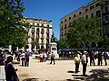
- Nomination Plaça de Independència, Girona, Catalonia, Spain -- Florent Pécassou 09:38, 19 May 2011 (UTC)
- Decline Noisy, bad composition. Tomer T 20:09, 23 May 2011 (UTC)
-
- Nomination Eimeldingen: Protestant Church --Taxiarchos228 09:09, 19 May 2011 (UTC)
- Decline Distracting trees. The angle really ruins it. --Tomer T 09:40, 24 May 2011 (UTC)
-

-
- Nomination: St. Othmar Church in Mödling, Lower Austria --Hendric Stattmann 10:32, 18 May 2011 (UTC)
bracketed images that are used for the HDR not optimal chosen but for QI it is ok IMO, but please correct the perspective --Taxiarchos228 10:47, 18 May 2011 (UTC) - Review needed
- Nomination: St. Othmar Church in Mödling, Lower Austria --Hendric Stattmann 10:32, 18 May 2011 (UTC)
-

- Nomination 3 matzot --Jonathunder 14:42, 14 May 2011 (UTC)
- Decline Comment Underexposed, as I can see. Could you please add some brightness?--PereslavlFoto 17:29, 18 May 2011 (UTC)
No response. --King of Hearts 23:14, 23 May 2011 (UTC)
-

- Nomination Jerusalem, Dome of the rock at night from the Austrian Hospice --Berthold Werner 08:42, 14 May 2011 (UTC)
- Promotion Categorized to a non-existing category. I am surprised by the relatively high noise level considering it is ISO 100. You might want do denoise the sky. Considering the image is so dark (which is OK for a night shot) I would have expected the sky to be pitch black, which would have helped better emphasize the main subject.. --Slaunger 20:13, 21 May 2011 (UTC) Comment Now sky denoised. --Berthold Werner 16:03, 22 May 2011 (UTC)
Sufficiently OK for me now. --Slaunger 18:26, 23 May 2011 (UTC)
-
- Nomination Kleinkems: Protestant Church --Taxiarchos228 08:29, 23 May 2011 (UTC)
- Promotion Nice. Sehr gut -- George Chernilevsky 11:14, 23 May 2011 (UTC)
-
- Nomination Welmlingen: Protestant Church --Taxiarchos228 08:29, 23 May 2011 (UTC)
- Promotion Good quality. --Raghith 08:49, 23 May 2011 (UTC)
-

- Nomination Sulawesi Wrinkled Hornbill (Aceros cassidix) at Weltvogelpark Walsrode. -- Fiorellino 06:48, 23 May 2011 (UTC)
- Promotion Perfect isolation on the eye. While QI it is more artistic than informative as compared to the two other versions included in the file description. In particular this File:Helmhornvogel WVP2010.jpg deserves FP consideration--Saffron Blaze 10:30, 23 May 2011 (UTC)
-

-

-

- Nomination Bracket fungi Polyporus squamosus -- George Chernilevsky 20:44, 22 May 2011 (UTC)
- Promotion Good quality. --Cowenby 00:46, 23 May 2011 (UTC)
-

- Nomination Bracket fungi Polyporus squamosus -- George Chernilevsky 20:44, 22 May 2011 (UTC)
- Promotion Good quality. --Cowenby 00:46, 23 May 2011 (UTC)
-

- Nomination Rock's tree peony (Paeonia rockii) -- George Chernilevsky 20:44, 22 May 2011 (UTC)
- Promotion Good quality. --Cowenby 00:50, 23 May 2011 (UTC)
-

- Nomination Rock's tree peony (Paeonia rockii) -- George Chernilevsky 20:44, 22 May 2011 (UTC)
- Promotion Structures on the white petals very good visible --Llez 11:01, 23 May 2011 (UTC)
-

- Nomination Rock's tree peony (Paeonia rockii) -- George Chernilevsky 20:44, 22 May 2011 (UTC)
- Promotion High quality --Llez 11:01, 23 May 2011 (UTC)
-

- Nomination Town wall of Forchheim --Vitold Muratov 22:30, 22 May 2011 (UTC)
- Promotion Good picture. --Tomer T 06:33, 23 May 2011 (UTC)
-

- Nomination Church in Belgershain --Saffron Blaze 20:00, 22 May 2011 (UTC)
- Promotion Good Quality--Cowenby 00:14, 23 May 2011 (UTC)
-
- Nomination Osprey with prey at Everglades National Park in Miami-Dade County, Florida, U.S.A. --Saffron Blaze 20:00, 22 May 2011 (UTC)
- Promotion Good quality. --Cowenby 00:14, 23 May 2011 (UTC)
-

- Nomination Johannes von Nepomuk, statue --Saffron Blaze 20:00, 22 May 2011 (UTC)
- Promotion Great --Cowenby 00:14, 23 May 2011 (UTC)
-

-

-

- Nomination Windmills in Rhodes, Greece.--Jebulon 17:13, 22 May 2011 (UTC)
- Promotion Good quality. --Taxiarchos228 17:34, 22 May 2011 (UTC)
-

- Nomination MS Golden iris.--Jebulon 16:57, 22 May 2011 (UTC)
- Promotion Support QI for me --Archaeodontosaurus 19:03, 22 May 2011 (UTC)
-

-

- Nomination Val Veny, Aosta Valley, Italy, in 2010 August --Ximonic 15:52, 22 May 2011 (UTC)
- Promotion I like this picture very much. Could it be that there is too much magenta in it? Anyway QI for me. --Schlaier 16:55, 22 May 2011 (UTC) Hmm, it was a little too yellow so I turned more towards blue, but atleast I haven't added any magenta. Maybe I still should take a closer look to the color settings. --Ximonic 19:14, 22 May 2011 (UTC)
-

- Nomination Detail of carved archway. --Avenue 15:47, 22 May 2011 (UTC)
- Promotion Support QI for me --Archaeodontosaurus 16:21, 22 May 2011 (UTC)
-

-

- Nomination Arches in Rhodos. --M0tty 15:12, 22 May 2011 (UTC)
- Promotion Remembers me something, but what ?...--Jebulon 15:29, 22 May 2011 (UTC) Yes, I took the same image as you one year ago ;-) --M0tty 15:40, 22 May 2011 (UTC) It's a nice place, isn't it ?--Jebulon 15:46, 22 May 2011 (UTC) Yes, it is ! And beautiful weather ! --M0tty 16:15, 22 May 2011 (UTC) hum hum, not every day in april, as you can see...--Jebulon 16:58, 22 May 2011 (UTC)
-

- Nomination Some colorful houses in the island of Symi, Greece.--Jebulon 15:08, 22 May 2011 (UTC)
- Promotion Support QI for me --Archaeodontosaurus 19:02, 22 May 2011 (UTC)
-

- Nomination Broadway Tower, Cotswolds. --Saffron Blaze 14:51, 22 May 2011 (UTC)
- Promotion Very good.--Jebulon 15:04, 22 May 2011 (UTC)
-

- Nomination Jerusalem, Mount of Olives, Gethsemane, Church of all nations --Berthold Werner 13:42, 22 May 2011 (UTC)
- Promotion Good quality. --Taxiarchos228 13:49, 22 May 2011 (UTC)
-

- Nomination A Common Frog Shell, Bufonaria rana --Llez 13:39, 22 May 2011 (UTC)
- Promotion Excellent detail --Saffron Blaze 14:36, 22 May 2011 (UTC)
-
- Nomination Ötlingen: view to the hill "Tüllinger" --Taxiarchos228 12:24, 22 May 2011 (UTC)
- Promotion Good quality. Very nice shot --Schlaier 13:40, 22 May 2011 (UTC)
-

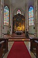
- Nomination Istein: Saint Michaels Church (Interior) --Taxiarchos228 11:31, 22 May 2011 (UTC)
- Promotion Not sure about the perspective but the detail offered of this beautifully decorated interior is exceptional. --Saffron Blaze 14:45, 22 May 2011 (UTC)
-
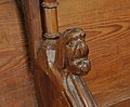
- Nomination Egringen: Protestant Church (detail of the choir stalls) --Taxiarchos228 11:31, 22 May 2011 (UTC)
- Promotion When you consider every seat in the church had a different carving it is very informative. Good quality pic too. --Saffron Blaze 14:39, 22 May 2011 (UTC)
-

-

- Nomination An old medieval palace in Rhodes. Greece. --Jebulon 09:51, 22 May 2011 (UTC)
- Promotion Good quality. --Taxiarchos228 13:52, 22 May 2011 (UTC)
-

- Nomination Biface Micoquien --Archaeodontosaurus 09:35, 22 May 2011 (UTC)
- Promotion Good quality --Llez 15:46, 22 May 2011 (UTC)
-

- Nomination Menabrea bridge, Dògali, Eritrea --Snaevar 19:54, 21 May 2011 (UTC)
Tilted.--Jebulon 21:43, 21 May 2011 (UTC) - Decline nice picture but below 1 MP --Taxiarchos228 13:54, 22 May 2011 (UTC)
- Nomination Menabrea bridge, Dògali, Eritrea --Snaevar 19:54, 21 May 2011 (UTC)
-

- Nomination Berlin, Brandenburg Gate, eastside --Berthold Werner 18:41, 21 May 2011 (UTC)
- Promotion Comment At a minimum this could use a tilt adjust. Saffron Blaze 20:33, 21 May 2011 (UTC)
Small correction made, but perhaps there is also a "optical illusion" due to the diagonal shadow? --Berthold Werner 13:39, 22 May 2011 (UTC)
Support QI for me --Archaeodontosaurus 05:47, 23 May 2011 (UTC)
-

- Nomination Back of San Francisco, Santiago de Compostela, Galicia (Spain)--Lmbuga 18:02, 21 May 2011 (UTC)
- Promotion Support QI for me --Archaeodontosaurus 14:56, 22 May 2011 (UTC)
-

-

- Nomination A Middle Jurassic Ammonite, Ludwigia murchisonae --Llez 11:35, 21 May 2011 (UTC)
- Promotion QI for me -- George Chernilevsky 09:18, 23 May 2011 (UTC)
-
-

- Nomination Weil am Rhein-Ötlingen: Organ at Saint Gallus Church --Taxiarchos228 12:39, 17 May 2011 (UTC)
- Decline Lighting is bothersome especially the dark pulpit --Saffron Blaze 09:03, 18 May 2011 (UTC)
I will improve this --Taxiarchos228 06:11, 20 May 2011 (UTC)
I am sorry, but this I can't improve (to few information in the basic file) --Taxiarchos228 11:13, 21 May 2011 (UTC)
I hope you don't mind but I uploaded a newer version with a bit of false HDR. Just revert if you don't care for it. --Saffron Blaze 01:13, 23 May 2011 (UTC)
-

- Nomination Detail of the motorway-bridge in Pratteln, Switzerland --Taxiarchos228 14:39, 15 May 2011 (UTC)
- Decline Interesting, but too tightly cropped IMO. Otherwise good. --Avenue 17:40, 22 May 2011 (UTC)
-

- Nomination Remains of the Temple of Athena, Lindos, Greece.--Jebulon 10:23, 22 May 2011 (UTC)
- Promotion I really must visit Greece. Nice capture. --Saffron Blaze 10:49, 22 May 2011 (UTC)
-

- Nomination Common Peony. --Quartl 09:36, 22 May 2011 (UTC)
- Promotion Good quality. --Saffron Blaze 10:57, 22 May 2011 (UTC)
-

- Nomination Rosa 'Dolly'. --Quartl 09:36, 22 May 2011 (UTC)
- Promotion Good quality. --Saffron Blaze 10:57, 22 May 2011 (UTC)
-
- Nomination Rosa 'La Nina'. --Quartl 09:36, 22 May 2011 (UTC)
- Promotion Good quality. --Saffron Blaze 10:57, 22 May 2011 (UTC)
-

- Nomination Emperor Dragonfly, Exuvia. --Quartl 09:36, 22 May 2011 (UTC)
- Promotion This is a superior capture to the other one. Nicer background, sharper and greater DOF. Useful too at this level of detail. --Saffron Blaze 10:52, 22 May 2011 (UTC)
-

-
-

-

-

-

-

-

- Nomination Pseudotsuga menziesii seed cones during pollination. Cultivated tree in Estonia, Keila. --Broc 20:37, 21 May 2011 (UTC)
- Promotion Lovely work... nice isolation on the new growth; focus area is very sharp. --Saffron Blaze 20:42, 21 May 2011 (UTC)
-

- Nomination EOL Wikipedia book --Broc 20:35, 21 May 2011 (UTC)
- Promotion Effective use of DOF and tack sharp --Saffron Blaze 20:47, 21 May 2011 (UTC)
-

- Nomination Anti-G8 demonstration in Le Havre, France, the week-end before the G8 summit in Deauville. --Broc 20:35, 21 May 2011 (UTC)
- Promotion A technically competent image. Nice composition offering tension and drama. --Saffron Blaze 20:47, 21 May 2011 (UTC)
-
-
-

- Nomination Château de Roquetaillade (Gironde, France). --Florent Pécassou 19:39, 21 May 2011 (UTC)
- Decline Sky pixellated, perspective strongly distorded and too tight crop above.--Jebulon 21:41, 21 May 2011 (UTC)
-

-

-
-
-

- Nomination Old street in Rhodes, Greece.--Jebulon 17:41, 21 May 2011 (UTC)
- Promotion Good quality. --Berthold Werner 19:22, 21 May 2011 (UTC)
-

- Nomination A heavy machine gun as part of a helicopter's armament. Photo taken by myself. --Airwolf 17:37, 21 May 2011 (UTC)
- Decline Focus point and limited DOF offers little in the way of information.. --Saffron Blaze 11:00, 22 May 2011 (UTC)
-

- Nomination An Iveco Magirus fire engine. Photo taken by myself. --Airwolf 17:37, 21 May 2011 (UTC)
- Promotion Good quality. --Saffron Blaze 11:00, 22 May 2011 (UTC)
-

-

-

- Nomination The ruins of the temple of Apollo, Acropolis of Rhodes, Greece.--Jebulon 13:03, 21 May 2011 (UTC)
- Promotion Good quality. --Saffron Blaze 10:28, 22 May 2011 (UTC)
-

- Nomination Kirchen: Town hall --Taxiarchos228 11:03, 21 May 2011 (UTC)
- Promotion Meets the criteria, imo.--MrPanyGoff 16:18, 21 May 2011 (UTC)
-

- Nomination Egringen: Protestant Church (war memorial) --Taxiarchos228 11:03, 21 May 2011 (UTC)
- Promotion Good quality. --Mbdortmund 16:34, 21 May 2011 (UTC)
-

- Nomination Egringen: Protestant Church (choir stalls) --Taxiarchos228 11:03, 21 May 2011 (UTC)
- Promotion Good quality. --Mbdortmund 16:33, 21 May 2011 (UTC)
-

- Nomination Monument Valley rock at sunset. --Tomer T 10:27, 21 May 2011 (UTC)
- Promotion Really good. --King of Hearts 12:21, 21 May 2011 (UTC)
-

- Nomination Milky Way Simply Caramel Split. -- Raghith 08:43, 21 May 2011 (UTC)
- Promotion High quality. --King of Hearts 21:03, 21 May 2011 (UTC)
-

-
- Nomination The Axe Majeur symbol of the Cergy-Pontoise district, France --Pline 20:44, 20 May 2011 (UTC)
- Promotion Good quality. --Saffron Blaze 11:19, 22 May 2011 (UTC)
-

-

- Nomination Berlin,Congress hall --Berthold Werner 15:51, 20 May 2011 (UTC)
- Promotion Ja, gut.--Jebulon 21:31, 21 May 2011 (UTC)
-

-

- Nomination A Roman Stele at Archaeological Museum, Sofia. --MrPanyGoff 13:56, 20 May 2011 (UTC)
- Promotion Good quality. --Cayambe 16:38, 21 May 2011 (UTC)
-

- Nomination Vase shaped as a nigger head. Bronze, 2nd century CE, Roman. -- Rama 12:18, 20 May 2011 (UTC)
- Promotion Good quality. --Taxiarchos228 12:40, 20 May 2011 (UTC)
CommentSeems like an unfortunate title to me and not certain it is correctly used anyway Saffron Blaze 12:50, 20 May 2011 (UTC)
The title is a precise translation of the musem label. Rama 14:35, 20 May 2011 (UTC) Comment Literal translations are not always good translations. In this case I don't think the item is actually a w:niggerhead, as such the use of the word nigger in this context would normally be considered vulgar and offensive Saffron Blaze 15:10, 20 May 2011 (UTC)
I do not think that censoring technical terms for the sake of political correctness is a good idea. Rama 06:29, 21 May 2011 (UTC) Comment Except this item is NOT a niggerhead. The are using the term incorrectly to identify a head of "African" origin. Saffron Blaze 11:14, 22 May 2011 (UTC)
-

- Nomination Efringen: Protestant Church --Taxiarchos228 06:31, 20 May 2011 (UTC)
- Promotion Meets the criteria, imo.--MrPanyGoff 16:24, 21 May 2011 (UTC)
-
- Nomination Kirchen: Protestant Church --Taxiarchos228 06:31, 20 May 2011 (UTC)
- Promotion Good. Please add geoatg. --Cayambe 12:37, 21 May 2011 (UTC)
-
- Nomination Kleinkems: Protestant Church --Taxiarchos228 06:31, 20 May 2011 (UTC)
- Promotion Good quality. --Saffron Blaze 11:19, 22 May 2011 (UTC)
-
- Nomination Jerusalem, entrance of the Austrian Hospice --Berthold Werner 17:21, 19 May 2011 (UTC)
- Promotion Good quality. --Cayambe 16:39, 21 May 2011 (UTC)
-

-
- Nomination Weil am Rhein: pylons of the Three Country Bridge --Taxiarchos228 08:58, 18 May 2011 (UTC)
- Promotion Nice composition. Please add geocode. --Cayambe 12:40, 21 May 2011 (UTC)
-

- Nomination Hausen im Wiesental: catholic church (altar and vault ) --Taxiarchos228 06:23, 16 May 2011 (UTC)
- Decline Poor composition, blown-out windows. --King of Hearts 21:11, 21 May 2011 (UTC)
-

- Nomination Hausen im Wiesental: catholic church (pulpit) --Taxiarchos228 06:23, 16 May 2011 (UTC)
- Decline Poor composition. --King of Hearts 21:11, 21 May 2011 (UTC)
-

- Nomination: Former drinking fountain with bear in Berndorf --Herzi Pinki 23:14, 15 May 2011 (UTC)
- Review needed
-

- Nomination: Buildings of the Berndorfer Metallwarenfabrik in Berndorf --Herzi Pinki 23:14, 15 May 2011 (UTC)
- Review needed
-

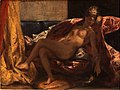
- Nomination Danae, by Jacques Blanchard (1600–1638) -- Rama 19:58, 15 May 2011 (UTC)
- Promotion the crop looks too tight left and right...--Jebulon 09:38, 16 May 2011 (UTC)
Now that's interesting. I've uploaded my raw file here for reference; either there are two copies of the painting, or the framing is odd. Rama 14:18, 17 May 2011 (UTC) Very funny: did you notice that there is a veil on your Danae, and none on mine ? Pudeur lyonnaise ? Your framing is obviously good, I support now.--Jebulon 21:26, 21 May 2011 (UTC)
-

-

- Nomination: Solothurn: Fountain in front of cathedral --Taxiarchos228 14:39, 15 May 2011 (UTC)
- Review needed
-

- Nomination: Varusha quarter east, Veliko Tarnovo. --MrPanyGoff 14:32, 15 May 2011 (UTC)
- Review needed
-

- Nomination Bridge in Nymphenburg park, Munich --Schlaier 13:41, 15 May 2011 (UTC)
- Decline Good but < 2MP. --King of Hearts 21:09, 21 May 2011 (UTC)
-

- Nomination Germany, Berlin, Deutscher Dom from south --Berthold Werner 12:22, 15 May 2011 (UTC)
- Decline Unsharp at top, even when viewed at QI minimum size, and details missing in some brighter areas near top. Also perspective distortion and strong shadows lower down. --Avenue 11:57, 22 May 2011 (UTC)
-

- Nomination Vacuum 24 manifold for miniprep columns --Przykuta 17:13, 14 May 2011 (UTC)
- Promotion Comment Chromatic aberration on the black detail, will support if corrected.--PereslavlFoto 17:29, 18 May 2011 (UTC)
Fixed. --King of Hearts 21:22, 21 May 2011 (UTC)
Good now. --Avenue 07:55, 22 May 2011 (UTC)
-

- Nomination Cattle on the mountain "Nebelhorn" in the Allgäu. --High Contrast 17:09, 14 May 2011 (UTC)
- Decline Looks nice in thumb, but I find the cow is not sharp enough, and the structure of the grass is too washed out. --Slaunger 20:07, 21 May 2011 (UTC)
-
- Nomination The cave city of Vardzia Georgia. --Geagea 00:51, 14 May 2011 (UTC)
- Promotion Sky is slightly blown at right, but this is a wide panorama and otherwise good. -- King of Hearts 21:24, 21 May 2011 (UTC)
-

- Nomination Festicultores group. Activity in defense of the Galician language "Correlingua". A Estrada, Galicia (Spain). 2011--Lmbuga 12:21, 14 May 2011 (UTC)
- Promotion Good quality, albeit the woman passing in the background is distracting. --Slaunger 20:04, 21 May 2011 (UTC)
-

-
-

-

- Nomination Weil am Rhein: Saint George Church --Taxiarchos228 12:51, 12 May 2011 (UTC)
- Decline Comment While I cannot say something special against this, I think you were too close to the church and that's why it looks innatural to me...--PereslavlFoto 17:20, 18 May 2011 (UTC)
Confusing composition. What's the subject, the trees or the church? The light and colors are good though. --Slaunger 19:53, 21 May 2011 (UTC)
-

- Nomination Weil am Rhein: Stations of cross at Saint Maria Church --Taxiarchos228 12:51, 12 May 2011 (UTC)
- Decline Comment Strange composition, too much cropped from all the sides.--PereslavlFoto 17:20, 18 May 2011 (UTC)
I agree the crop is very strange, no clear idea with the composition. I realize this is not COM:FPC and as such the technical quality is good, I just do not see the point in the crop. --Slaunger 19:31, 20 May 2011 (UTC)
Good composition is a QI requirement, just as much as other aspects of image quality. --Avenue 12:51, 21 May 2011 (UTC)
-

- Nomination The ancient theatre at Rhodes, Greece. --Jebulon 17:34, 11 May 2011 (UTC)
- Promotion New version uploaded--Jebulon 09:38, 13 May 2011 (UTC)Good; would be better with barrel distortion corrected. --Avenue 10:49, 13 May 2011 (UTC) agree. I'll correct this asap.--Jebulon 22:44, 19 May 2011 (UTC) Done Better now ?--Jebulon 23:47, 20 May 2011 (UTC)
Fine for me. --Slaunger 19:49, 21 May 2011 (UTC)
-

-

-

- Nomination Distortions you would normaly not see without infinite focus (see other versions with DOF) --Niabot 09:51, 21 May 2011 (UTC)
- Promotion Good quality. --Raghith 10:37, 21 May 2011 (UTC)
What's the difference between this one and this one? --Tomer T 10:50, 21 May 2011 (UTC)
The depth of field. The present image has an infinite depth of field, something that is not optically possible but is simulated here with computer rendering. -- Rama 10:57, 21 May 2011 (UTC)
-

-

-
-

-

- Nomination Rufous Hornbill at Weltvogelpark Walsrode --Fiorellino 03:59, 21 May 2011 (UTC)
- Promotion Good quality. --Raghith 06:25, 21 May 2011 (UTC)
-

- Nomination S R Crown Hall --Jovianeye 23:34, 20 May 2011 (UTC)
- Promotion OK -- George Chernilevsky 08:00, 21 May 2011 (UTC)
-

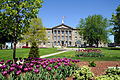
- Nomination Water castle Kottingbrunn in Lower Austria by User:Reinhold Stansich --Herzi Pinki 23:15, 20 May 2011 (UTC)
- Promotion Very good... except perhaps for the tree at right, which could be cropped away. --Cayambe 08:44, 21 May 2011 (UTC)
-

- Nomination Schlössl Möllersdorf - NÖ Landeskindergarten, a castle in Traiskirchen by User:Schletz--Herzi Pinki 23:15, 20 May 2011 (UTC)
- Promotion Good quality. --Mbdortmund 00:55, 21 May 2011 (UTC)
-

- Nomination A street in Trinidad, Cuba. --Tomer T 23:01, 20 May 2011 (UTC)
- Promotion The guy picking his nose notwithstanding, I like the effect of this picture and it is technically sound. --Saffron Blaze 01:33, 21 May 2011 (UTC)
-

- Nomination IIT Perlstein Hall --Jovianeye 22:47, 20 May 2011 (UTC)
- Promotion OK -- George Chernilevsky 07:59, 21 May 2011 (UTC)
-

-

-

-

- Nomination Gravestones in the Shirvan dynasty graveyard in Shamakhi, Azerbaijan, September 2008 --Azeri Azeri 19:30, 20 May 2011 (UTC)
- Promotion Interesting and QI --Saffron Blaze 20:21, 20 May 2011 (UTC)
-

- Nomination 15th century graveyard of the Shirvan dynasty in Shamakhi, Azerbaijan, September 2008 --Azeri Azeri 19:30, 20 May 2011 (UTC)
- Promotion Nice capture, detailed description. --Saffron Blaze 20:21, 20 May 2011 (UTC)
-

- Nomination Field Museum of Natural History --Jovianeye 18:18, 20 May 2011 (UTC)
- Promotion Nice symmetry too --Saffron Blaze 19:09, 20 May 2011 (UTC)
-

- Nomination Berlin, Gendarmenmarkt --Berthold Werner 17:14, 20 May 2011 (UTC)
- Promotion Good quality. --Cayambe 08:47, 21 May 2011 (UTC)
-

- Nomination The Franciscan Church, Maribor. --MrPanyGoff 16:36, 20 May 2011 (UTC)
- Promotion Good quality. --Saffron Blaze 19:09, 20 May 2011 (UTC)
-

- Nomination Vase shaped as a male bust. 2nd century CE. Bronze. -- Rama 14:38, 20 May 2011 (UTC)
- Promotion Good quality. --Saffron Blaze 19:09, 20 May 2011 (UTC)
-

- Nomination Aristaeus and Proteus, by Slodtz, Versailles. --Coyau 12:36, 20 May 2011 (UTC)
- Promotion Outstanding detail, nice colours and lighting --Saffron Blaze 12:47, 20 May 2011 (UTC)
-

- Nomination Magnifiying glass with focus on paper sheet. Note: Focussing on the glass and magnified content at the same time is an impossible task --Niabot 12:16, 20 May 2011 (UTC)
- Promotion
outside the glass not sharp -> no QILOL, Good quality. --Taxiarchos228 12:40, 20 May 2011 (UTC)
-

- Nomination St. Yoan Rilski church at Sofia Seminary. --MrPanyGoff 11:33, 20 May 2011 (UTC)
- Promotion Good quality. --Taxiarchos228 12:40, 20 May 2011 (UTC)
-

- Nomination Creation of Adam and Eve. The murder of Abel. -- Rama 10:23, 20 May 2011 (UTC)
- Promotion Good quality. --Taxiarchos228 12:40, 20 May 2011 (UTC)
-
- Nomination Two Evangelists, the Healing of the paralytic, and Christ with the Samaritan woman. -- Rama 10:23, 20 May 2011 (UTC)
- Promotion Good quality. --Taxiarchos228 12:40, 20 May 2011 (UTC)
-
- Nomination Egringen: Protestant Church (bell tower) --Taxiarchos228 06:31, 20 May 2011 (UTC)
- Promotion Good quality. --Cayambe 07:58, 21 May 2011 (UTC)
-

- Nomination Egringen: Protestant Church (organ) --Taxiarchos228 06:31, 20 May 2011 (UTC)
- Promotion nice --Pudelek 13:57, 20 May 2011 (UTC)
-

- Nomination Kleinkems: Protestant Church --Taxiarchos228 06:31, 20 May 2011 (UTC)
- Promotion Good quality. --Saffron Blaze 13:07, 20 May 2011 (UTC)
-
-
- Nomination Railway bridge over the River Parrett at Langport, Somerset, England. --Geof Sheppard 07:22, 16 May 2011 (UTC)
- Promotion nice view --Pudelek 13:58, 20 May 2011 (UTC)
-

- Nomination Hausen im Wiesental: catholic church (two keystones of the vault ) --Taxiarchos228 06:23, 16 May 2011 (UTC)
- Promotion Good quality. --Cayambe 08:04, 21 May 2011 (UTC)
-

-
-
-
- Nomination Monk making fried chicken --Vitold Muratov 23:05, 14 May 2011 (UTC)
- Decline Oppose too blurry --Archaeodontosaurus 16:34, 18 May 2011 (UTC)
Also strange speckling away from light and dark areas. --Avenue 15:30, 20 May 2011 (UTC)
-

- Nomination Lörrach: bell tower of Saint Peters Church --Taxiarchos228 09:06, 13 May 2011 (UTC)
- Promotion Good quality. --Cayambe 08:09, 21 May 2011 (UTC)
-

- Nomination Diadem. Gold. Greek, probably made in Alexandria, Egypt, 220 - 100 B.C. The piece probably belonged to a noble woman of the Ptolemaic dynasty in Egypt. -- Raghith 06:47, 13 May 2011 (UTC)
- Decline Not sufficiently sharp IMO (motion blurred?) and too much pixel noise. Would have been better with a tripod (if allowed), longer exposure, and smaller aperture --Slaunger 19:46, 20 May 2011 (UTC)
-

-

- Nomination South View - Tintern Abbey--Saffron Blaze 08:27, 20 May 2011 (UTC)
- Promotion nice an Good quality. --Taxiarchos228 08:43, 20 May 2011 (UTC)
-
- Nomination Basilique Notre-Dame du Cap--Saffron Blaze 08:27, 20 May 2011 (UTC)
- Promotion interesting basilica, good quality, it's a pity that the right part is cropped but anyhow QI --Taxiarchos228 08:43, 20 May 2011 (UTC)
-

-

-

- Nomination Sand Texture. --M0tty 20:58, 19 May 2011 (UTC)
- Promotion Good quality. --Mbdortmund 22:44, 19 May 2011 (UTC)
-

-

- Nomination Lonicera involucrata (Twinberry Honeysuckle), flower --Wsiegmund 17:48, 19 May 2011 (UTC)
- Promotion Stunning detail. I might have liked this even more if the fluffy seeds weren't there in the top right as they draw attention where it isn't wanted. --Saffron Blaze 17:55, 19 May 2011 (UTC)
-

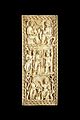
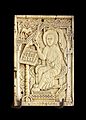
- Nomination The four Evangelists: Matthew. Ivory, 10th century, Nothern Italy. -- Rama 17:43, 19 May 2011 (UTC)
- Promotion Really good detail on this set. --Saffron Blaze 20:41, 19 May 2011 (UTC)
-

- Nomination The four Evangelists: Marc. Ivory, 10th century, Nothern Italy. -- Rama 17:43, 19 May 2011 (UTC)
- Promotion Good quality. --Saffron Blaze 20:41, 19 May 2011 (UTC)
-

- Nomination The four Evangelists: John. Ivory, 10th century, Nothern Italy. -- Rama 17:43, 19 May 2011 (UTC)
- Promotion Good quality. --Saffron Blaze 20:41, 19 May 2011 (UTC)
-
- Nomination The four Evangelists: Luke. Ivory, 10th century, Nothern Italy. -- Rama 17:43, 19 May 2011 (UTC)
- Promotion Good quality. --Saffron Blaze 20:41, 19 May 2011 (UTC)
-

- Nomination Vase with the flower of Nerium oleander. --Bff 15:42, 19 May 2011 (UTC)
- Decline Remove the light source glare on the vase --Saffron Blaze 17:27, 19 May 2011 (UTC)
-

- Nomination Fortress Cracow - Fort Kosciuszko --Pudelek 12:58, 19 May 2011 (UTC)
- Promotion Good quality. --Saffron Blaze 17:27, 19 May 2011 (UTC)
-

- Nomination Four Delacre's truffles. --M0tty 11:53, 19 May 2011 (UTC)
- Promotion Good quality. --Saffron Blaze 17:27, 19 May 2011 (UTC)
-

- Nomination Eimeldingen: Protestant Church (bell tower) --Taxiarchos228 09:09, 19 May 2011 (UTC)
- Promotion Too bad the bird isn't sharp but the structure is well captured --Saffron Blaze 17:27, 19 May 2011 (UTC)
-
- Nomination Statue of Robert Stolz, Lüneburg --Taxiarchos228 09:09, 19 May 2011 (UTC)
- Decline The plaque is tack sharp but the bust isn't --Saffron Blaze 17:27, 19 May 2011 (UTC)
-

- Nomination Lörrach: bell tower of protestant church --Taxiarchos228 09:09, 19 May 2011 (UTC)
- Promotion Perfect...even the pigeon on top is sharp. --Saffron Blaze 17:28, 19 May 2011 (UTC)
-

- Nomination Lörrach: organ at Church of Rötteln --Taxiarchos228 09:09, 19 May 2011 (UTC)
- Promotion This a a really wonderful picture... colour, sharpness and lighting. --Saffron Blaze 17:30, 19 May 2011 (UTC)
-

- Nomination Lörrach: founding board at Church of Rötteln --Taxiarchos228 09:09, 19 May 2011 (UTC)
- Promotion Can't get any better without a ladder --Saffron Blaze 17:27, 19 May 2011 (UTC)
-

- Nomination Self-portrait with hat, by Hyppolyte Flandrin. -- Rama 20:06, 18 May 2011 (UTC)
- Decline Stuck pixels under chin and in shadow of hat brim towards right. Also a red spot not far from his left shoulder. (See image notes.) --Avenue 12:46, 19 May 2011 (UTC)
Seems rather soft at full res and lacks detail. --Saffron Blaze 13:13, 19 May 2011 (UTC)
-
- Nomination Woman with parrot, by Eugene Delacroix. -- Rama 20:06, 18 May 2011 (UTC)
- Decline Insufficient quality. --Saffron Blaze 13:13, 19 May 2011 (UTC)
-

- Nomination Historical place for the greek flag, flight here for the first time in 1947, when Dodecanese joined Greece.--Jebulon 23:07, 14 May 2011 (UTC)
- Promotion Support QI & Useful --Archaeodontosaurus 16:37, 19 May 2011 (UTC)
-

- Nomination Panorama of Don Edwards San Francisco Bay National Wildlife Refuge. --King of Hearts 06:13, 19 May 2011 (UTC)
- Promotion Good quality. --Andrei Stroe 07:25, 19 May 2011 (UTC)
-

- Nomination A boat in Rhodos. --M0tty 05:45, 19 May 2011 (UTC)
- Decline The boat appears unsharp and a bit overexposed. --Andrei Stroe 07:32, 19 May 2011 (UTC)
-
-

- Nomination Accademia di belle'arti in Venice. --M0tty 05:45, 19 May 2011 (UTC)
- Decline Cut off, too tightly cropped and affected by perspective distortion --Andrei Stroe 07:25, 19 May 2011 (UTC)
-

- Nomination East Banqueting House and St James Church, Chipping Campden --Saffron Blaze 18:01, 18 May 2011 (UTC)
- Promotion Good quality. --Andrei Stroe 07:33, 19 May 2011 (UTC)
-

- Nomination Shell of a Thai land snail, Dyakia salangana --Llez 16:03, 18 May 2011 (UTC)
- Promotion Support QI & Useful --Archaeodontosaurus 16:18, 18 May 2011 (UTC)
-
- Nomination Coenagrion puella --ComputerHotline 14:22, 18 May 2011 (UTC)
- Promotion The right eye is just outside the plane of focus. Still a brilliant photo with lots of detail and wow quality. --Saffron Blaze 15:25, 18 May 2011 (UTC)
-

- Nomination Orthetrum albistylum copulation --ComputerHotline 14:22, 18 May 2011 (UTC)
- Promotion Very good quality. --Saffron Blaze 15:25, 18 May 2011 (UTC)
-

- Nomination Donetsk. Pushkin Boulevard. Festival of Orthodox Culture "Red Easter" - 2011. -- Raghith 11:08, 18 May 2011 (UTC)
- Decline Crop out the other person, otherwise a nice portrait. --Saffron Blaze 15:25, 18 May 2011 (UTC)
-

- Nomination Château de la Bourbansais. --Eusebius 19:52, 16 May 2011 (UTC)
- Promotion Comment Considerably tilted ;)--MrPanyGoff 07:25, 17 May 2011 (UTC) Comment Tilt adjusted. Beware, the field is not horizontal, it makes the whole image look unbalanced... Look at the central building instead. --Eusebius 17:17, 17 May 2011 (UTC)
Good quality even if still odd with the angle.. --Saffron Blaze 12:39, 18 May 2011 (UTC)
-

- Nomination Lower Slaughter, Cotswolds -- Saffron Blaze 19:02, 16 May 2011 (UTC)
- Promotion Good quality. --Taxiarchos228 14:24, 18 May 2011 (UTC)
-

- Nomination St Barnabas Church, Snowshill Village -- Saffron Blaze 19:00, 16 May 2011 (UTC)
- Promotion Good quality. --Taxiarchos228 14:24, 18 May 2011 (UTC)
-

- Nomination Tyndale Monument, North Nibley -- Saffron Blaze 18:50, 16 May 2011 (UTC)
- Promotion Good quality. --Taxiarchos228 14:24, 18 May 2011 (UTC)
-
- Nomination Horse Guards in London with the parliament building in the background. --Oile11 (msg)
- Promotion A nice combination of elements --Saffron Blaze 14:17, 18 May 2011 (UTC)
-
- Nomination Berlin, Alexanderplatz, Station --Berthold Werner 13:01, 16 May 2011 (UTC)
- Promotion Good quality. --Saffron Blaze 14:17, 18 May 2011 (UTC)
-

- Nomination Berlin, "Red Townhall", clock tower --Berthold Werner 12:03, 16 May 2011 (UTC)
- Promotion This is a good picture, but it could be even better with a minor levels adjustment to brighten. --Saffron Blaze 15:15, 18 May 2011 (UTC)
-

- Nomination Olg gate, Aarberg, Switzerland. Ludo29 11:50, 16 May 2011 (UTC)
- Promotion Good quality. --Saffron Blaze 14:17, 18 May 2011 (UTC)
-

- Nomination CWS Flour Mills in Avonmouth. Mattbuck 11:02, 16 May 2011 (UTC)
- Promotion Good quality. --Saffron Blaze 15:15, 18 May 2011 (UTC)
-
- Nomination Orge river near Paris. --Pline 10:16, 16 May 2011 (UTC)
- Promotion Good quality. --Saffron Blaze 14:46, 18 May 2011 (UTC)
-

- Nomination Pont Eiffel and river Onyar in Girona, Catalonia, Spain. -- Florent Pécassou 10:15, 16 May 2011 (UTC)
- Promotion This is really quite well done. --Saffron Blaze 14:46, 18 May 2011 (UTC)
-
- Nomination Footbridge and high voltage power lines near Paris. --Pline 09:58, 16 May 2011 (UTC)
- Decline Bike in foreground, lack of sharpness except for the powerlines, significant distortions --Saffron Blaze 15:15, 18 May 2011 (UTC)
-
- Nomination Gymnich, cemetary by User:Achim Raschka --Mbdortmund 19:56, 14 May 2011 (UTC)
- Promotion Good photo -- George Chernilevsky 08:30, 19 May 2011 (UTC)
-

- Nomination portable Geiger counter --Przykuta 17:13, 14 May 2011 (UTC)
- Promotion Good quality. --Taxiarchos228 07:37, 19 May 2011 (UTC)
-
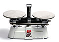
- Nomination Simple laboratory scales for balancing tubes --Przykuta 17:13, 14 May 2011 (UTC)
- Promotion Good quality. --Taxiarchos228 07:37, 19 May 2011 (UTC)
-

-

- Nomination: Lüneburg: Saint Nicolai Church --Taxiarchos228 09:06, 13 May 2011 (UTC)
- Review needed
-

- Nomination: Lörrach: Catholic Church Saint Peter at winter --Taxiarchos228 09:06, 13 May 2011 (UTC)
- Review needed
-

- Nomination: Double decker bus beneath a low bridge.--Geof Sheppard 07:25, 13 May 2011 (UTC)
- Review needed
-

- Nomination Zeus by Clérion, Versailles. --Coyau 04:58, 13 May 2011 (UTC)
- Promotion Good quality. --Andrei Stroe 07:29, 19 May 2011 (UTC)
-

- Nomination Water tower and chapel in Tilbeck, Westphalia. --Elektroschreiber 22:31, 12 May 2011 (UTC)
- Promotion I don't mind the CA in the foreground, subject is sharp enough, imo. --Coyau 16:22, 18 May 2011 (UTC)
-

- Nomination Ickenham tube station --Harrison49 20:37, 12 May 2011 (UTC)
- Decline Blown out sky. If taken in the morning might get some sunlight on the main facade. --Elekhh 08:53, 19 May 2011 (UTC)
-

- Nomination Three tercets of the Divina Comedia at the Arsenal's entrance of Venice. --M0tty 20:34, 12 May 2011 (UTC)
- Promotion Support Good contrast, fine sharpness, very good crop! Looks like a picture in a frame!--PereslavlFoto 17:20, 18 May 2011 (UTC)
-

-

- Nomination Cervus timorensis in Sir Seewoosagur Ramgoolam Botanical Garden. -- Raghith 10:46, 12 May 2011 (UTC)
- Decline Comment The photo is too gray, too dull. Maybe you can change the contrast and make the picture more vivid? Now I watch it as through the unclear glass...--PereslavlFoto 17:20, 18 May 2011 (UTC) Oppose Also bad composition and not sharp enough for a zoo image. --Elekhh 08:55, 19 May 2011 (UTC)
-
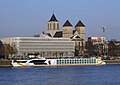
- Nomination River Cruise ship Vista Prima in winter 2010 --Rolf H. 19:50, 11 May 2011 (UTC)
- Decline CCW tilt, otherwise nearly good enough for QI. I'll support the nomination if you fix the tilt and apply a little sharpening and please leave a note on my talk page if you provide us with a reworked version that I may want to support! :-). Grand-Duc 04:07, 19 May 2011 (UTC)
-

- Nomination Laboratory peristaltic pump --Przykuta 16:14, 11 May 2011 (UTC)
- Promotion Support Looks fine, while minor chromatic aberrations in the bottom can be removed easily (desaturate them).--PereslavlFoto 17:13, 18 May 2011 (UTC)
-

- Nomination Random shot: River cruise ship Prinses Christina on tour in cologne --Rolf H. 12:36, 11 May 2011 (UTC)
- Decline Oppose Visible chromatic aberrations in the upper part on the bridge elements.--PereslavlFoto 17:13, 18 May 2011 (UTC)
-
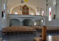
- Nomination Rheinfelden-Herten: Interior of Saint Josephs church --Taxiarchos228 08:16, 11 May 2011 (UTC)
- Promotion Support I cannot see any problems here.--PereslavlFoto 17:13, 18 May 2011 (UTC)
-
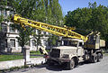
- Nomination Crane KrAZ-257. By Artemka.--Vizu 15:50, 10 May 2011 (UTC)
- Promotion Good quality. Harrison49 20:39, 18 May 2011 (UTC)
-

- Nomination Jean Hatzfeld at the 2011 Geneva book fair. -- Rama 20:48, 5 May 2011 (UTC)
- Promotion Good quality. --Raghith 17:02, 16 May 2011 (UTC)
-

- Nomination Berlin, Schiller monument at the Gendarmenmarkt --Berthold Werner 09:07, 18 May 2011 (UTC)
- Decline monument not sharp --Taxiarchos228 09:10, 18 May 2011 (UTC)
-

- Nomination Grand Hotel Veliko Tarnovo. --MrPanyGoff 08:09, 18 May 2011 (UTC)
- Promotion Good quality, nice shot and very interessting architecture --Taxiarchos228 08:17, 18 May 2011 (UTC)
-
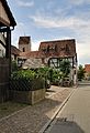
- Nomination Weil am Rhein-Ötlingen: Main street with view on Saint Gallus Church --Taxiarchos228 07:27, 18 May 2011 (UTC)
- Decline The rear ends of the car and the large shadow in the foreground detract from what is otherwise a good picture --Saffron Blaze 08:38, 18 May 2011 (UTC)
-
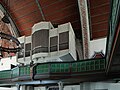
- Nomination Lörrach: Organ at Germanus Church --Taxiarchos228 07:27, 18 May 2011 (UTC)
- Decline Part of the organ is obscured by the chandelier. Perhaps a different perspective --Saffron Blaze 08:38, 18 May 2011 (UTC)
-

- Nomination Lörrach: head-figure at Germanus Church --Taxiarchos228 07:27, 18 May 2011 (UTC)
- Promotion Nice detail, good exposure --Saffron Blaze 08:38, 18 May 2011 (UTC)
-

- Nomination Lörrach: Germanus Church --Taxiarchos228 07:27, 18 May 2011 (UTC)
- Promotion Excellent all round --Saffron Blaze 08:38, 18 May 2011 (UTC)
-

- Nomination Lörrach: Church of Saint Fridolin (choir with altar) --Taxiarchos228 07:27, 18 May 2011 (UTC)
- Promotion Good quality. --Saffron Blaze 08:38, 18 May 2011 (UTC)
-

- Nomination Victory Day.-- Raghith 05:16, 18 May 2011 (UTC)
- Promotion A touch soft perhaps, but otherwise a wonderful picture --Saffron Blaze 08:38, 18 May 2011 (UTC)
-

- Nomination Panorama over the eastern side of Nørresø, the northern lake situated near Viborg, Denmark. The photo is stiched from five or so photos taken with a Sony α 300 using PTGui. Cropped using GIMP. --Slaunger 19:12, 17 May 2011 (UTC)
- Promotion Tremendous work --Saffron Blaze 08:44, 18 May 2011 (UTC)
-

- Nomination Aglia tau --Tlusťa 18:52, 17 May 2011 (UTC)
- Promotion Good quality. --Mbdortmund 22:11, 17 May 2011 (UTC)
-

- Nomination Pantocrator in Chora church, Istanbul. --Eusebius 17:47, 17 May 2011 (UTC)
- Decline Nice, however on both sides the image is overexposed --Chmee2 18:37, 17 May 2011 (UTC) It's not possible to do otherwise, they thought that restoring medieval mosaics should include powerful halogens just in front of them. --Eusebius 06:20, 18 May 2011 (UTC) Comment I see, however this is the case (for me) showing that not all taken image can be QI. Somewhere is not possible make technical well image and we are judging here technical quality not difficulty during photographing. Anyway, if you not agree with me, feel free make discussion to this image and wait for another reviewer(s). --Chmee2 09:37, 18 May 2011 (UTC)
-

- Nomination Clipper on Mexican Butterfly Weed. --Quartl 17:23, 17 May 2011 (UTC)
- Promotion Good quality. --Saffron Blaze 18:36, 17 May 2011 (UTC) Comment I really don't know it accepted or not. It is wonderfull shot and it was obviously hard to take it, however the head (the main center of image) is not sharp, focus plane is going trough the butterfly body... --Chmee2 18:41, 17 May 2011 (UTC)
I think the focus plane is ok and this is slight motion blur (see the proboscis), but feel free to put the image up for discussion. --Quartl 19:09, 17 May 2011 (UTC).
Thanks :) But how I wrote, I really like the image and I see a lot of work which is behinde. I keep fingers cross for you to have QI, but I just only tried to be objective and note this fact about unsharp head :) --Chmee2 19:19, 17 May 2011 (UTC)
-

- Nomination Flower of Chelidonium majus. --Bff 15:58, 17 May 2011 (UTC)
- Promotion Wonderful detail and DOF Saffron Blaze 18:25, 17 May 2011 (UTC)
-

- Nomination Salamander fountain Stuttgart-East --MSeses 15:39, 17 May 2011 (UTC)
- Decline The salamander in the salamander foundation is not sharp --Saffron Blaze 08:54, 18 May 2011 (UTC)
-

- Nomination Ickenham Hall -- Harrison49 14:43, 17 May 2011 (UTC)
- Promotion I hate cars in photos but in this case the mini at least adds to a good photo --Saffron Blaze 08:54, 18 May 2011 (UTC)
-
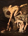
- Nomination Scene of deluge, by Joseph Désiré Court. -- Rama 14:22, 17 May 2011 (UTC)
- Promotion Very good quality. --Saffron Blaze 08:54, 18 May 2011 (UTC)
-

- Nomination 360° panorama seen from the fort du Mont Vaudois, Héricourt, France --ComputerHotline 14:11, 17 May 2011 (UTC)
- Promotion Happy with this now. --Saffron Blaze 18:36, 17 May 2011 (UTC)
-

- Nomination Inside the fort du Mont Vaudois, Héricourt, France --ComputerHotline 14:11, 17 May 2011 (UTC)
- Promotion Technically sound in a difficult lighting situation --Saffron Blaze 08:54, 18 May 2011 (UTC)
-

- Nomination Hausen im Wiesental: catholic church, side altar with Saint Boniface --Taxiarchos228 12:39, 17 May 2011 (UTC)
- Promotion Nice and sharp --Saffron Blaze 08:54, 18 May 2011 (UTC)
-

- Nomination Hausen im Wiesental: catholic church, bell tower --Taxiarchos228 12:39, 17 May 2011 (UTC)
- Promotion
Good enough.--PereslavlFoto 18:26, 17 May 2011 (UTC)
-

- Nomination Weil am Rhein-Ötlingen: Saint Gallus Church, stained glass --Taxiarchos228 12:39, 17 May 2011 (UTC)
- Promotion
What noise reduction was applied to this photo?--PereslavlFoto 18:26, 17 May 2011 (UTC)
no one, is this necessary here? --Taxiarchos228 19:37, 17 May 2011 (UTC)
See the colour noise inflows on the bottom.--PereslavlFoto 20:26, 17 May 2011 (UTC)
done --Taxiarchos228 20:59, 17 May 2011 (UTC)
Fine now! You may try to add sharpness with unsharp mask tool, anyway :-).--PereslavlFoto 21:11, 17 May 2011 (UTC)
I have --Taxiarchos228 21:18, 17 May 2011 (UTC)
That's why I didn't insist! :-) --PereslavlFoto 21:24, 17 May 2011 (UTC)
-
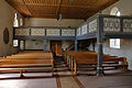
- Nomination Weil am Rhein-Ötlingen: Interior of Saint Gallus Church --Taxiarchos228 12:39, 17 May 2011 (UTC)
- Promotion
I have reduced the noise --Taxiarchos228 19:37, 17 May 2011 (UTC)
Next step is to make it sharper, try "unsharp mask" filter.--PereslavlFoto 20:26, 17 May 2011 (UTC)
done --Taxiarchos228 20:53, 17 May 2011 (UTC)
On the one hand, I cannot oppose now, the image is fine. On the other, I am against resampling and I advice you to combine sharpness and large size. Thanks.--PereslavlFoto 21:14, 17 May 2011 (UTC)
-

- Nomination Berlin, Französischer Dom --Berthold Werner 12:35, 17 May 2011 (UTC)
- Decline All the statues, especially on top are not sharp. --Saffron Blaze 09:03, 18 May 2011 (UTC)
-

- Nomination Berlin, Gendarmenmarkt, Schillerdenkmal vor dem Konzerthaus --Berthold Werner 12:35, 17 May 2011 (UTC)
- Promotion Good quality. --Saffron Blaze 09:03, 18 May 2011 (UTC)
-

- Nomination Min-Amon. Late New Empire (ca 1200 BCE) -- Rama 10:12, 17 May 2011 (UTC)
- Decline Insufficient detail --Saffron Blaze 09:03, 18 May 2011 (UTC)
-
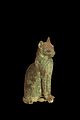
- Nomination Wooden statue of a cat. Egypt, Old Empire or Middle Empire. -- Rama 10:06, 17 May 2011 (UTC)
- Decline Insufficient detail. --Saffron Blaze 09:03, 18 May 2011 (UTC)
-
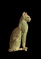
- Nomination Wooden statue of a cat. Egypt, Old Empire or Middle Empire. -- Rama 10:06, 17 May 2011 (UTC)
- Promotion Good quality. --Saffron Blaze 09:03, 18 May 2011 (UTC)
-

- Nomination A Crypt in the city Antwerp Belgium Delay 09:01, 17 May 2011 (UTC)
- Decline
Sorry, no sharpness is here...--PereslavlFoto 18:26, 17 May 2011 (UTC)
-

- Nomination Festung Krakau (Fortress Cracow) - Fort 2 Kosciuszko --Pudelek 21:39, 16 May 2011 (UTC)
- Decline Crop and lighting issues (too dark) --Saffron Blaze 09:24, 18 May 2011 (UTC)
-
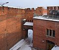
- Nomination Festung Krakau (Fortress Cracow) - Fort 2 Kosciuszko --Pudelek 21:39, 16 May 2011 (UTC)
- Promotion Good quality. --Saffron Blaze 09:24, 18 May 2011 (UTC)
-

- Nomination Philippe Almosnino (Les Wampas) at Balelec 2011. -- Rama 21:32, 16 May 2011 (UTC)
- Decline
Not sharp, colour noise.--PereslavlFoto 18:57, 17 May 2011 (UTC)
-

- Nomination Didier Wampas (Les Wampas) at Balelec 2011 -- Rama 21:27, 16 May 2011 (UTC)
- Decline
Not sharp, colour noise.--PereslavlFoto 21:28, 17 May 2011 (UTC)
-

- Nomination The Salzach Tower of Castle Hohenwerfen in Austria. --High Contrast 21:14, 16 May 2011 (UTC)
- Promotion Good quality. --Saffron Blaze 11:48, 18 May 2011 (UTC)
-

- Nomination Julia Butterfly. --Quartl 19:09, 16 May 2011 (UTC)
- Promotion Good quality. --Saffron Blaze 11:48, 18 May 2011 (UTC)
-

- Nomination Gatehouse with Saint Peter delivered. By David Teniers the Younger. -- Rama 19:07, 16 May 2011 (UTC)
- Promotion Good quality. --Saffron Blaze 11:48, 18 May 2011 (UTC)
-

- Nomination Mystical marriage of Saint Catherine. Attributed to Simone Pignoni. -- Rama 18:47, 16 May 2011 (UTC)
- Promotion Good quality. --Saffron Blaze 11:48, 18 May 2011 (UTC)
-

- Nomination Play equipment in Avonmouth. Mattbuck 11:02, 16 May 2011 (UTC)
- Decline
Needs more DOF. Dark.--PereslavlFoto 19:00, 17 May 2011 (UTC)
-
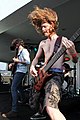
- Nomination Green Fairy at Balelec 2011 -- Rama 19:48, 15 May 2011 (UTC)
- Promotion Great action shot - love the hair! Lots of CA, though, and the mike at upper left and bright front leg could be distracting, so I am torn. The foreground bass player (Julien Waroux?) should be named, since he's the most visible. --Avenue 15:56, 16 May 2011 (UTC)
Thank you, corrected. -- Rama 09:58, 17 May 2011 (UTC)
Thanks, much better without the mike. QI now IMO. --Avenue 13:27, 17 May 2011 (UTC)
-
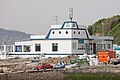
- Nomination Fish market, Panxón, Nigrán, Galicia (Spain)--Lmbuga 18:43, 13 May 2011 (UTC)
- Promotion Good -- George Chernilevsky 17:43, 17 May 2011 (UTC)
-
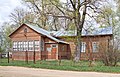
- Nomination Artist Korovin's house in Okhotino village, Pereslavl district. --PereslavlFoto 17:36, 13 May 2011 (UTC)
- Promotion Good -- George Chernilevsky 17:41, 17 May 2011 (UTC)
-

- Nomination Saint John the Baptist, by Mino da Fiesole (please click on image, the thumbnail may not be up to date) -- Rama 16:30, 13 May 2011 (UTC)
- WARNING: third template parameter added – please remove.
-

- Nomination Lüneburg: Organ at Saint Johannis Chruch --Taxiarchos228 09:06, 13 May 2011 (UTC)
- Promotion As at the first attempt, I like this picture very much, but I'm worried about the colors, looking unnatural. How could I be convinced ?...--Jebulon 15:41, 13 May 2011 (UTC)
Look at the other picture of this Organ (of Andreas Praefcke), nearly same view and same colours --Taxiarchos228 15:24, 15 May 2011 (UTC)OK. And yours is better, IMO.--Jebulon 15:33, 17 May 2011 (UTC)
-

- Nomination: Dawlish Warren station. Mattbuck 11:15, 12 May 2011 (UTC)
- Review needed
-

- Nomination: 357037 at Upminster. Mattbuck 11:15, 12 May 2011 (UTC)
- Review needed
-

- Nomination: 455863 at Guildford. Mattbuck 11:15, 12 May 2011 (UTC)
- Review needed
-
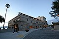
- Nomination Pazo los Escudos main bulding. -- Raghith 09:41, 12 May 2011 (UTC)
- Decline
Many troubles. Strong distortion of a wide-angle lens. Dark spots on the sky. Chromatic aberrations.--PereslavlFoto 19:11, 17 May 2011 (UTC)
-

- Nomination: Day trip ship RheinEnergie --Rolf H. 20:51, 11 May 2011 (UTC)
- Review needed
-
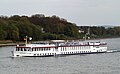
- Nomination: River Cruise ship Bellissima on tour --Rolf H. 19:50, 11 May 2011 (UTC)
- Review needed
-

- Nomination: Passenger ship Asbach in winter 2010 --Rolf H. 19:50, 11 May 2011 (UTC)
- Review needed
-

- Nomination: Passenger ship Wappen von Köln --Rolf H. 19:50, 11 May 2011 (UTC)
- Review needed
-

- Nomination: Henriksdalshamnen --Ankara 19:25, 11 May 2011 (UTC)
- Review needed
-
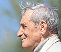
- Nomination: Igor Alexandrovich Kruchinin, teacher and local historian from Pereslavl. --PereslavlFoto 14:26, 11 May 2011 (UTC)
- Review needed
-

- Nomination Toronto: view from Sky Pod down to the roof of the Main Pod --Taxiarchos228 12:20, 11 May 2011 (UTC)
- Promotion
Good and interesting.--PereslavlFoto 19:14, 17 May 2011 (UTC)
-
- Nomination Small metal paperclip --Broc 19:57, 10 May 2011 (UTC)
- Decline
I don't like the composition. Maybe a tighter right crop?--Ankara 12:41, 11 May 2011 (UTC)
Not sharp.--PereslavlFoto 19:15, 17 May 2011 (UTC)
-

- Nomination Berlin, Entrance of the Humboldt University --Berthold Werner 17:01, 10 May 2011 (UTC)
- Promotion Good quality. Harrison49 23:03, 17 May 2011 (UTC)
-

- Nomination Dactylorhiza majalis in natural monument Chvalšovické pastviny, Czech Republic--Chmee2 12:09, 10 May 2011 (UTC)
- Promotion Good quality. Harrison49 23:03, 17 May 2011 (UTC)
-

- Nomination Oracle HQ building 300. --King of Hearts 10:18, 10 May 2011 (UTC)
- Promotion The technical quality of the building is very good. --Slaunger 20:29, 17 May 2011 (UTC)
-

-

- Nomination Swakeleys House, Ickenham --Harrison49 19:39, 9 May 2011 (UTC)
- Promotion Good quality. --Raghith 16:56, 17 May 2011 (UTC)
-

- Nomination Hirsau monastery - lady chapel. -- MSeses 07:23, 8 May 2011 (UTC)
- WARNING: third template parameter added – please remove.
-
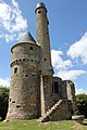
- Nomination Tower of Bonvouloir, Normandy, France --~Pyb 08:24, 3 May 2011 (UTC)
- Decline The picture has some chromatic aberrations (those unnatural green-red things) atleast on top of the tower and some at left side of the building. They should be desaturated I'd say. Other problem is the perspective in the building because, I know, many people in Commons would like a corrected perspective in building photos. --Ximonic 14:06, 4 May 2011 (UTC)
Another issue is the very tight crop above.--Jebulon 15:32, 10 May 2011 (UTC)
Tight crop, distortion, CA. Sorry, we cannot promote this photo. Seems that your lens works bad with f/16.--PereslavlFoto 19:20, 17 May 2011 (UTC)
-

- Nomination Sand Lizard male (Lacerta agilis) -- George Chernilevsky 19:49, 16 May 2011 (UTC)
- Promotion Good quality. --Mbdortmund 21:07, 16 May 2011 (UTC)
-

- Nomination Great Orange Tip. --Quartl 19:09, 16 May 2011 (UTC)
- Promotion Good quality. --Mbdortmund 21:07, 16 May 2011 (UTC)
-
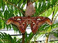
-

-
-

-
- Nomination Palladian Bridge and Prior Park--Saffron Blaze 15:23, 16 May 2011 (UTC)
- Promotion Good quality. --Raghith 16:39, 16 May 2011 (UTC)
-

- Nomination St Nikolay Sofiyski church, Sofia, fragment. --MrPanyGoff 14:22, 16 May 2011 (UTC)
- Promotion Good quality. --Raghith 17:04, 16 May 2011 (UTC)
-

- Nomination Berlin, Alexanderplatz, world clock --Berthold Werner 13:33, 16 May 2011 (UTC)
- Promotion Good quality. --Raghith 16:39, 16 May 2011 (UTC)
-

- Nomination Sofia Seminary, main entrance. --MrPanyGoff 12:46, 16 May 2011 (UTC)
- Promotion Good quality. --Raghith 16:39, 16 May 2011 (UTC)
-

-

- Nomination Marmot. -- Raghith 10:55, 16 May 2011 (UTC)
- Promotion Meets the criteria, imo.--MrPanyGoff 16:40, 16 May 2011 (UTC)
-
-

-
- Nomination Weil am Rhein: Vitra house --Taxiarchos228 06:23, 16 May 2011 (UTC)
- Promotion Meets the criteria, imo.--MrPanyGoff 16:36, 16 May 2011 (UTC)
-

-

- Nomination YuMZ-6KL tractor. -- George Chernilevsky 19:35, 15 May 2011 (UTC)
- Promotion Very good. --Cayambe 19:22, 16 May 2011 (UTC)
-

-

-
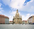
-
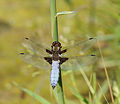
- Nomination Libellula depressa --ComputerHotline 19:26, 13 May 2011 (UTC)
- Promotion Good quality. --Quartl 17:09, 16 May 2011 (UTC)
-

- Nomination Orthetrum albistylum --ComputerHotline 19:26, 13 May 2011 (UTC)
- Decline Very distracting background, otherwise good. --Quartl 17:09, 16 May 2011 (UTC)
-
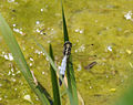
- Nomination Orthetrum albistylum --ComputerHotline 19:26, 13 May 2011 (UTC)
- Decline Subject partially obscured. --Quartl 17:09, 16 May 2011 (UTC)
-

- Nomination Ray-traced image of lines on nested hyperboloids. —David Eppstein 16:04, 13 May 2011 (UTC)
- Promotion Good quality. --Quartl 17:13, 16 May 2011 (UTC)
-

- Nomination Historic Methodist Church, Ceylon, Minnesota --Jonathunder 19:18, 11 May 2011 (UTC)
- Decline Too strong
 chromatic aberration (tree at left, weather vane), sorry. --Jebulon 15:19, 16 May 2011 (UTC)
-

- Nomination: High School main entrance, Austin, Minnesota --Jonathunder 11:42, 11 May 2011 (UTC)
- Review needed
-
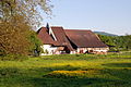
- Nomination: Rheinfelden: Working farm at Beuggen Castle --Taxiarchos228 08:16, 11 May 2011 (UTC)
- Review needed
-
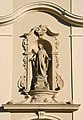
- Nomination: Rheinfelden-Herten: statue of the Virgin Mary at Saint Josephs church --Taxiarchos228 08:16, 11 May 2011 (UTC)
- Review needed
-

- Nomination: Opium poppy (Papaver somniferum), near Castromonte (Valladolid, Spain). --David Perez 06:57, 11 May 2011 (UTC)
- Review needed
-

- Nomination: A snowy path in Southern Germany --Harke 16:57, 10 May 2011 (UTC)
- Review needed
-

- Nomination: Pszczyna (Pless) Palace - the Oak Parlour (ground floor) --Pudelek 13:39, 10 May 2011 (UTC)
- Review needed
-

-

- Nomination City and beaches of Tossa de Mar, Catalonia, Spain -- Florent Pécassou 10:33, 16 May 2011 (UTC)
- Decline nice view but lacking quality --Taxiarchos228 10:44, 16 May 2011 (UTC)
-

- Nomination Hausen im Wiesental: protestant church (interior) --Taxiarchos228 06:23, 16 May 2011 (UTC)
- Promotion Good quality. --Schlaier 07:50, 16 May 2011 (UTC)
-

- Nomination Hausen im Wiesental: protestant church (interior) --Taxiarchos228 06:23, 16 May 2011 (UTC)
- Promotion Good quality. --Schlaier 07:50, 16 May 2011 (UTC)
-
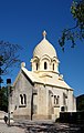
- Nomination The mausoleum of the Krupp family in Berndorf --Herzi Pinki 23:14, 15 May 2011 (UTC)
- Promotion Good quality. --Taxiarchos228 06:16, 16 May 2011 (UTC)
-
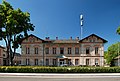
- Nomination Former primary school in Berndorf, now police station --Herzi Pinki 23:14, 15 May 2011 (UTC)
- Promotion Good quality. --Taxiarchos228 06:16, 16 May 2011 (UTC)
-

- Nomination The old manor house of the cotton spinning mill in Pottenstein --Herzi Pinki 23:14, 15 May 2011 (UTC)
- Promotion Good quality. --Schlaier 07:52, 16 May 2011 (UTC)
-

- Nomination The war memorial in Pottenstein --Herzi Pinki 23:14, 15 May 2011 (UTC)
- Promotion Good quality. --Schlaier 07:52, 16 May 2011 (UTC)
-

- Nomination St. Mary's church in Berndorf --Herzi Pinki 23:14, 15 May 2011 (UTC)
- Promotion Good quality. --Taxiarchos228 06:16, 16 May 2011 (UTC)
-
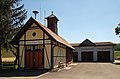
- Nomination Fire station in Kleinfeld, a village in the municipality of Hernstein --Herzi Pinki 23:14, 15 May 2011 (UTC)
- Promotion Good quality. --Raghith 08:59, 16 May 2011 (UTC)
-

- Nomination Hernsteiner Straße in Lindabrunn, Lower Austria --Herzi Pinki 23:14, 15 May 2011 (UTC)
- Promotion Good quality. --Schlaier 08:00, 16 May 2011 (UTC)
-
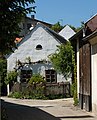
- Nomination Old farm house in Lindabrunn, Lower Austria --Herzi Pinki 23:14, 15 May 2011 (UTC)
- Promotion Good quality. --Schlaier 08:00, 16 May 2011 (UTC)
-
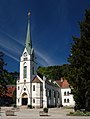
- Nomination Catholic parish church Saint Elisabeth in Hirtenberg --Herzi Pinki 23:14, 15 May 2011 (UTC)
- Promotion I think it meets the criteria.--MrPanyGoff 05:07, 16 May 2011 (UTC)
-

- Nomination war memorial in Enzesfeld, Lower Austria --Herzi Pinki 23:14, 15 May 2011 (UTC)
- Promotion Good quality. --Raghith 08:59, 16 May 2011 (UTC)
-

- Nomination Pöllakreuz in Leobersdorf --Herzi Pinki 23:14, 15 May 2011 (UTC)
- Promotion Meets the criteria, imo.--MrPanyGoff 05:10, 16 May 2011 (UTC)
-

- Nomination Berliner Plaz.Nürnberg. --Vitold Muratov 22:55, 15 May 2011 (UTC)
- Promotion Good quality. --Raghith 08:59, 16 May 2011 (UTC)
-

- Nomination France comforted by Time, by Jean Charles Nicaise Perrin. -- Rama 20:04, 15 May 2011 (UTC)
- Promotion Support QI & Useful --Archaeodontosaurus 05:49, 16 May 2011 (UTC)
-

- Nomination Peleides Blue Morpho, portrait. --Quartl 19:45, 15 May 2011 (UTC)
- Promotion Support QI & Useful --Archaeodontosaurus 05:52, 16 May 2011 (UTC)
-

-
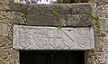
-

-

-

- Nomination Duomo di Treviso --Archaeodontosaurus 16:28, 15 May 2011 (UTC)
- Promotion Good quality. --Raghith 17:45, 15 May 2011 (UTC)
-

- Nomination High Rhine Bridge, as seen from Switzerland --Taxiarchos228 15:42, 15 May 2011 (UTC)
- WARNING: third template parameter added – please remove.
-

- Nomination CoA of S.R.E.Card. Pierre d'Aubusson, 40th Grand-Master of the Knights of Rhodes.--Jebulon 15:29, 15 May 2011 (UTC)
- Promotion Support QI & Useful --Archaeodontosaurus 16:34, 15 May 2011 (UTC)
-
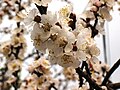
-
- Nomination Hellenistic veiled head of a woman. 2nd century BCE.--Jebulon 15:00, 15 May 2011 (UTC)
- Promotion Support QI & Useful --Archaeodontosaurus 16:36, 15 May 2011 (UTC)
-

- Nomination Castle Bottmingen, Switzland --Taxiarchos228 14:39, 15 May 2011 (UTC)
- Promotion Good quality. --Raghith 18:12, 15 May 2011 (UTC) Comment hier ist aber wirklich eine Korrektur der stürzenden Linien angebracht. Sollte aber wohl kein Problem darstellen. --Carschten 18:50, 15 May 2011 (UTC)
-
- Nomination Münster platform in Berne, Switzerland --Taxiarchos228 14:39, 15 May 2011 (UTC)
- WARNING: third template parameter added – please remove.
-

- Nomination Solothurn, Switzerland: Biel Gate --Taxiarchos228 14:39, 15 May 2011 (UTC)
- WARNING: third template parameter added – please remove.
-

- Nomination Solothurn: Saint Ursen Cathedral --Taxiarchos228 14:39, 15 May 2011 (UTC)
- Promotion QI to me.--Jebulon 15:31, 15 May 2011 (UTC)
-

- Nomination Solothurn, Switzerland: Dom of Saint Ursen Cathedral --Taxiarchos228 14:39, 15 May 2011 (UTC)
- Promotion Interesting photo! --Vizu 15:12, 15 May 2011 (UTC)
-

- Nomination The relief of CoA of G.B.Orsini, 39th grand-Master of the Order of the Knights of Rhodes, on the city walls, Greece.--Jebulon 13:24, 15 May 2011 (UTC)
- Promotion Good Quality, Godd Caption --Archaeodontosaurus 16:45, 15 May 2011 (UTC)
-

- Nomination Berlin, Beethoven-Hayden-Mozart monument, another view --Berthold Werner 12:17, 15 May 2011 (UTC)
- Promotion Much better than the first one, IMO. QI too. --Jebulon 13:24, 15 May 2011 (UTC)
-

- Nomination Cell phone tower, Lozen village. --MrPanyGoff 10:47, 15 May 2011 (UTC)
- Promotion Good quality. --Raghith 17:53, 15 May 2011 (UTC)
-

-
-
-
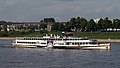
-

- Nomination Black Elder, flower. --MrPanyGoff 07:45, 15 May 2011 (UTC)
- Promotion Support QI & Useful --Archaeodontosaurus 16:52, 15 May 2011 (UTC)
-

- Nomination Mystic River Bascule Bridge Juliancolton 01:21, 15 May 2011 (UTC)
- Promotion Good quality. --Raghith 17:53, 15 May 2011 (UTC)
-

- Nomination Altar.XIV heiligen church --Vitold Muratov 23:44, 14 May 2011 (UTC)
- Decline Heavily overexposed parts and overall looking like a watercolor painting (noise reduction?) --Berthold Werner 16:51, 15 May 2011 (UTC)
-

- Nomination Scarabaeus laticollis --Holleday 21:37, 14 May 2011 (UTC)
- Withdrawn
-

- Nomination The ottoman mosque of Suleiman, Rhodes, Greece.--Jebulon 21:29, 14 May 2011 (UTC)
- Promotion QI & Useful --Archaeodontosaurus 16:54, 15 May 2011 (UTC)
-

- Nomination Neuschwanstein castle from above --Vitold Muratov 23:20, 14 May 2011 (UTC)
- Decline Also that watercolor painting look --Berthold Werner 16:51, 15 May 2011 (UTC)
-
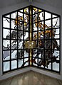
- Nomination Window of the chapell of Springiersbach monastry, Germany --Berthold Werner 15:28, 14 May 2011 (UTC)
- Withdrawn Nicht böse sein, aber die Glasmalerei ist durch FOP nicht gedeckt, oder? Sieht eher modern aus. --Mbdortmund 16:25, 14 May 2011 (UTC)
Stimmt, daran habe ich nicht gedacht. --Berthold Werner 18:00, 14 May 2011 (UTC)
Und wieder weg aus der Öffenlichkeit ;-) --Berthold Werner 16:44, 15 May 2011 (UTC)
-

- Nomination Mythical beasts on Ci En Pagoda, Taiwan --Bgag 22:20, 9 May 2011 (UTC)
- Promotion Support QI & Useful --Archaeodontosaurus 05:59, 16 May 2011 (UTC)
-

- Nomination Luxemb. city centre, showing the location of a plaque commemorating the composer of the national anthem. --Cayambe 07:26, 9 May 2011 (UTC)
- Promotion QI & Useful --Archaeodontosaurus 17:01, 15 May 2011 (UTC)
-

- Nomination School in Ochodze (Ochotz), Upper Silesia --Pudelek 20:49, 8 May 2011 (UTC)
- Promotion Good quality. Harrison49 12:39, 15 May 2011 (UTC)
-

- Nomination Hausen im Wiesental: Town hall --Taxiarchos228 19:18, 8 May 2011 (UTC)
- Promotion Good quality. Harrison49 12:40, 15 May 2011 (UTC)
-

- Nomination Sile river in Trevisio --Archaeodontosaurus 08:29, 15 May 2011 (UTC)
- Promotion QI--Jebulon 09:53, 15 May 2011 (UTC)
-
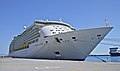
- Nomination Mariner of the Seas, Rhodes, Greece.--Jebulon 22:15, 14 May 2011 (UTC)
- Promotion Good quality. --Mbdortmund 23:01, 14 May 2011 (UTC)
-

- Nomination Lovis Corinth, detail, by User:Achim Raschka --Mbdortmund 19:56, 14 May 2011 (UTC)
- Withdrawn Uploaded by Achim, but who is the photographer? Link to web page.--Schlaier 22:56, 14 May 2011 (UTC)
Thx for your hint --Mbdortmund 23:03, 14 May 2011 (UTC)
-

- Nomination Lovis Corinth by User:Achim Raschka --Mbdortmund 19:56, 14 May 2011 (UTC)
- Withdrawn Uploaded by Achim, but who is the photographer? Link to web page.--Schlaier 22:56, 14 May 2011 (UTC)
-

- Nomination Berlin, Beethoven-Hayden-Mozart monument --Berthold Werner 18:13, 14 May 2011 (UTC)
- Promotion Meets the criteria, imo.--MrPanyGoff 07:54, 15 May 2011 (UTC)
-

-

- Nomination Vortex mixer --Przykuta 17:13, 14 May 2011 (UTC)
- Promotion Good quality. Could be cropped a little bit on top --Mbdortmund 19:58, 14 May 2011 (UTC)
-

- Nomination Tram MGP-1. --Vizu 18:16, 14 May 2011 (UTC)
- Decline Unsharp and greasy. --High Contrast 07:58, 15 May 2011 (UTC)
-

- Nomination Tram VTP-3. --Vizu --Vizu 18:30, 14 May 2011 (UTC)
- Decline Unsharp, greasy and blown-out sky. --High Contrast 07:58, 15 May 2011 (UTC)
-

-

-

- Nomination An Upper Jurassic ammonite, Ochetoceras canaliculatum --Llez 15:59, 14 May 2011 (UTC)
- Promotion Good quality. --Mbdortmund 16:24, 14 May 2011 (UTC)
-

- Nomination Ionian funerary woman bust, terracotta, 6th century BCE.--Jebulon 13:07, 14 May 2011 (UTC)
- Promotion good work, QI for me, but shouldn't you use Template:Retouched picture because of the Free-form select with replacement of backround? --J. Lunau 14:33, 14 May 2011 (UTC) If you want, but I think the "retouche" is here obvious. Done anyway.--Jebulon 16:27, 14 May 2011 (UTC) Comment thanks for adding the template, at the very first sight, I wondered, how the black backround was done, cause it also can be produced without retouching, like in this photo--J. Lunau 17:13, 14 May 2011 (UTC)
-
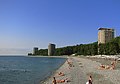
-

- Nomination Frauenkirche in Dresden at night --Schlaier 21:46, 13 May 2011 (UTC)
- Promotion Good quality. --Ralf Roletschek 13:14, 14 May 2011 (UTC)
-

-
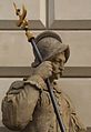
- Nomination Soldier - statue near palace in Pszczyna (Pless), Upper Silesia --Pudelek 13:20, 13 May 2011 (UTC)
- Promotion Good quality. --Ralf Roletschek 13:16, 14 May 2011 (UTC)
-

-

-

-

- Nomination: Fetal bovine serum cell culture medium --Przykuta 10:20, 9 May 2011 (UTC)
- Review needed
-

- Nomination: Dispensing needles --Przykuta 10:20, 9 May 2011 (UTC)
- Review needed
-

- Nomination: DMEM cell culture medium --Przykuta 10:20, 9 May 2011 (UTC)
- Review needed
-

- Nomination: Set of disposable plastic weighing boats --Przykuta 10:20, 9 May 2011 (UTC)
- Review needed
-
- Nomination: Hausen im Wiesental: catholic church (bell tower) --Taxiarchos228 06:31, 9 May 2011 (UTC)
- Review needed
-
- Nomination: Hausen im Wiesental: catholic church, side altar with Saint Boniface --Taxiarchos228 06:31, 9 May 2011 (UTC)
- Review needed
-

- Nomination: Manor Farm Cow Byre, Ruislip. --Harrison49 23:58, 8 May 2011 (UTC)
- Review needed
-

- Nomination: CA-92 bridge crossing Seal Slough. --King of Hearts 22:46, 8 May 2011 (UTC)
- Review needed
-
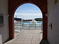
- Nomination: Uxbridge Lido entrance -- Harrison49 21:51, 8 May 2011 (UTC)
- Review needed
-
- Nomination: Ickenham Hall --Harrison49 21:51, 8 May 2011 (UTC)
- Review needed
-

- Nomination: St. Giles' church, Ickenham --Harrison49 21:51, 8 May 2011 (UTC)
- Review needed
-

- Nomination: The Manor Farm House at Manor Farm --Harrison49 21:38, 8 May 2011 (UTC)
- Review needed
-

- Nomination: The Sisterships Asbach and Loreley in Cologne --Rolf H. 19:43, 8 May 2011 (UTC)
- Review needed
-

- Nomination: Hausen im Wiesental: stop station of the Regio-S-Bahn (commuter railway system) --Taxiarchos228 19:18, 8 May 2011 (UTC)
- Review needed
-

- Nomination: Hausen im Wiesental: protestant church --Taxiarchos228 19:18, 8 May 2011 (UTC)
- Review needed
-
- Nomination: Paramount Theatre, Austin, Minnesota --Jonathunder 19:16, 8 May 2011 (UTC)
- Review needed
-

- Nomination: look-out tower in Germany/Bavaria, picture done on request of German wikipedia --J. Lunau 17:38, 8 May 2011 (UTC)
- Review needed
-
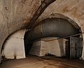
- Nomination: Inside an underground old NATO base, near Belfort, France. --ComputerHotline 16:43, 8 May 2011 (UTC)
- Review needed
-

- Nomination: Inside an underground old NATO base, near Belfort, France. --ComputerHotline 16:43, 8 May 2011 (UTC)
- Review needed
-
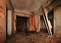
- Nomination: Inside an underground old NATO base, near Belfort, France. --ComputerHotline 16:43, 8 May 2011 (UTC)
- Review needed
-

- Nomination: Inside an underground old NATO base, near Belfort, France. --ComputerHotline 16:43, 8 May 2011 (UTC)
- Review needed
-

- Nomination: St. Marienkirche in Rheinberg (NRW/GER) --Carschten 13:51, 8 May 2011 (UTC)
- Review needed
-

- Nomination: France, Deux-Sèvres, Puits d'enfer, Orchis ustulata Flower.--Nico&co 13:16, 8 May 2011 (UTC)
- Review needed
-

- Nomination: Top-bottle dispenser --Przykuta 10:56, 8 May 2011 (UTC)
- Review partially overexposured, see notice --Mbdortmund 12:13, 8 May 2011 (UTC)
-

- Nomination The bell tower of the monastery of Panormitis, Island of Symi, Greece.--Jebulon 23:21, 7 May 2011 (UTC)
- Promotion Good quality. Harrison49 21:45, 14 May 2011 (UTC)
-

- Nomination Red Kite (Milvus Milvus) hunting -- Simisa 15:37, 7 May 2011 (UTC)
- Promotion Excellent clarity on the Kite. Harrison49 23:20, 14 May 2011 (UTC)
-

- Nomination Dinslaken Castle with its environment (NRW/GER) --Carschten 16:29, 6 May 2011 (UTC)
- Promotion Good quality, sharp focus. Harrison49 23:19, 14 May 2011 (UTC)
-

- Nomination An ancient greek plate in the rhodian style, featuring a sphinx, 600 BCE.--Jebulon 11:23, 14 May 2011 (UTC)
- Promotion Good quality. --Mbdortmund 11:46, 14 May 2011 (UTC)
-

- Nomination Munich – Maria column in the Marienplatz and the towers of the Frauenkirche --Schlaier 06:46, 14 May 2011 (UTC)
- Promotion nice composition --Mbdortmund 09:34, 14 May 2011 (UTC)
-

-

- Nomination Veliko Tarnovo Cathedral. --MrPanyGoff 16:55, 13 May 2011 (UTC)
- Promotion Good quality and very nice --Taxiarchos228 19:54, 13 May 2011 (UTC)
-
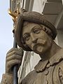
- Nomination Soldier - statue near palace in Pszczyna (Pless), Upper Silesia --Pudelek 13:20, 13 May 2011 (UTC)
- Promotion Good quality. --Berthold Werner 15:43, 13 May 2011 (UTC)Lack of informations, but good.--Jebulon 15:43, 13 May 2011 (UTC)
-

-

-

-
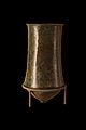
-

- Nomination Berlin Central Station --Berthold Werner 18:15, 12 May 2011 (UTC)
- Promotion Very good. --Cayambe 18:34, 13 May 2011 (UTC)
-

- Nomination Wehranlage Grosshesselohe, Munich, Germany Richard Bartz 17:07, 12 May 2011 (UTC)
- Promotion Very good. --Cayambe 18:35, 13 May 2011 (UTC)
-
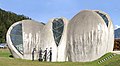
- Nomination Stone church Cazis, Switzerland --Taxiarchos228 12:51, 12 May 2011 (UTC)
- Promotion Good. Please geotag. --Cayambe 18:38, 13 May 2011 (UTC)
-

-

- Nomination sleeping male Andrena cineraria --Leviathan1983 16:04, 11 May 2011 (UTC)
- Promotion Good quality and impressive.. --Cayambe 18:41, 13 May 2011 (UTC)
-

- Nomination sleeping male Andrena cineraria --Leviathan1983 16:04, 11 May 2011 (UTC)
- Promotion Good quality. --Cayambe 18:41, 13 May 2011 (UTC)
-

-

- Nomination Oracle HQ sign. --King of Hearts 10:42, 10 May 2011 (UTC)
- Promotion Tilted CCW. Use background building to evaluate tilt. --Jovianeye 23:05, 11 May 2011 (UTC)
Actually, when I took this picture it was perfectly horizontal, but I noticed that the Oracle sign was tilted, i.e. the sign and the building are naturally not aligned. I think the sign is more important, so I had corrected 1°. --King of Hearts 04:34, 12 May 2011 (UTC)
Perhaps you're right. --Jovianeye 17:37, 13 May 2011 (UTC)
-

- Nomination: Dark bottle with ground glass plug --Przykuta 10:56, 8 May 2011 (UTC)
- Review there are some dustspots, see notice, else good --Mbdortmund 11:06, 8 May 2011 (UTC)
-

- Nomination: Set of different cell culture flat flasks --Przykuta 10:56, 8 May 2011 (UTC)
- Review bottles should be darker --Mbdortmund 11:10, 8 May 2011 (UTC)
-

- Nomination: Bottle-top disposable filtration set --Przykuta 10:56, 8 May 2011 (UTC)
- Review overexposured, loss of details --Mbdortmund 11:11, 8 May 2011 (UTC)
-

- Nomination: 96 well PCR plate --Przykuta 10:56, 8 May 2011 (UTC)
- Review needed
-

- Nomination: Hirsau monastery - southern gate building. -- MSeses 07:22, 8 May 2011 (UTC)
- Review needed
-

- Nomination: Proteus, a passenger ship of Greece, island of Symi.--Jebulon 23:07, 7 May 2011 (UTC)
- Review needed
-
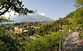
- Nomination: Botanischer Garten Meran --Böhringer 20:54, 7 May 2011 (UTC)
- Review Komischer Effekt am Baum oben links --Mbdortmund 22:59, 7 May 2011 (UTC)
-

- Nomination: Aaseestadt in Münster, Westphalia --Elektroschreiber 20:33, 7 May 2011 (UTC)
- Review needed
-

- Nomination: Hoheikan in Sapporo, Hokkaido, Japan --663highland 15:37, 7 May 2011 (UTC)
- Review needed
-

- Nomination: Nijojo-ninomaru-garden in Kyoto, Japan --663highland 15:37, 7 May 2011 (UTC)
- Review needed
-

- Nomination: Yonahamaehama Beach in Miyakojima, Okinawa, Japan --663highland 15:37, 7 May 2011 (UTC)
- Review needed
-

-
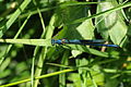
- Nomination: Calopteryx splendens --ComputerHotline 04:24, 6 May 2011 (UTC)
- Review Good quality but bad composition. A tighter crop would probably help. --Quartl 06:15, 8 May 2011 (UTC)
-

- Nomination: Platycnemis pennipes --ComputerHotline 04:24, 6 May 2011 (UTC)
- Review Good quality but bad composition. A tighter crop would probably help. --Quartl 06:18, 8 May 2011 (UTC)
-

- Nomination Lüneburg: bell tower of Saint Johannis Church --Taxiarchos228 09:06, 13 May 2011 (UTC)
- Promotion schief! --Ralf Roletschek 09:18, 13 May 2011 (UTC)
-

- Nomination Berlin,Congress hall --Berthold Werner 08:48, 13 May 2011 (UTC)
- Promotion little CA the the edge of the building, but good enough for QI --Taxiarchos228 08:51, 13 May 2011 (UTC)
-

- Nomination Menger Sponge (creator Niabot) --Taxiarchos228 06:51, 13 May 2011 (UTC)
- Promotion Good quality. --Ralf Roletschek 08:50, 13 May 2011 (UTC)
-

- Nomination River iceberg. --Avenue 05:33, 13 May 2011 (UTC)
- Promotion nice colors --Ralf Roletschek 08:59, 13 May 2011 (UTC)
-

-

- Nomination Belgian electric multiple unit #182 -- MJJR 21:04, 12 May 2011 (UTC)
- Promotion Good quality. --Mbdortmund 22:37, 12 May 2011 (UTC)
-

- Nomination Town Hall Veliko Tarnovo. --MrPanyGoff 20:21, 12 May 2011 (UTC)
- Promotion Good quality. --Taxiarchos228 09:17, 13 May 2011 (UTC)
-

- Nomination Bow view of the paddle steamer Goethe. --Rolf H. 19:56, 12 May 2011 (UTC)
- Promotion Good quality. Harrison49 00:32, 13 May 2011 (UTC)
-

- Nomination Paddle steamer Goethe - view from behind. --Rolf H. 19:56, 12 May 2011 (UTC)
- Promotion Good quality. Harrison49 00:32, 13 May 2011 (UTC)
-
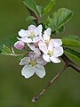
- Nomination Malus domestica flowers --Von.grzanka 18:32, 12 May 2011 (UTC)
- Decline nice composition but DOF too short --Mbdortmund 19:58, 12 May 2011 (UTC)
-

- Nomination Situla decorated by molding. Bronze, 9th–8th centuries BC. From Luristan. -- Rama 17:39, 12 May 2011 (UTC)
- Promotion Good quality. --Mbdortmund 20:01, 12 May 2011 (UTC)
-

- Nomination Axe-head. Bronze, 9th–8th centuries BC. From Luristan. -- Rama 17:25, 12 May 2011 (UTC)
- Promotion Good quality. --Mbdortmund 19:59, 12 May 2011 (UTC)
-
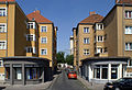
- Nomination a restored and a non-renovated residential building in Cologne-Bickendorf. --Rolf H. 13:05, 12 May 2011 (UTC)
- Promotion Good quality. --Taxiarchos228 14:03, 12 May 2011 (UTC)
-
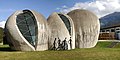
- Nomination Stone church Cazis, Switzerland --Taxiarchos228 12:51, 12 May 2011 (UTC)
- Promotion vielleicht könntest Du die Skulptur noch kategorisieren --Mbdortmund 16:29, 12 May 2011 (UTC)
-

- Nomination Weil am Rhein-Ötlingen: timberframed house --Taxiarchos228 12:51, 12 May 2011 (UTC)
- Promotion Good quality. --Richard Bartz 17:21, 12 May 2011 (UTC)
-

- Nomination 378005 at Willesden. Mattbuck 11:15, 12 May 2011 (UTC)
- Promotion Good quality. --Richard Bartz 17:21, 12 May 2011 (UTC)
-

- Nomination St. Nikolay Sofiyski church, Sofia. --MrPanyGoff 10:38, 12 May 2011 (UTC)
- Promotion Good quality. --Taxiarchos228 12:51, 12 May 2011 (UTC)
-

- Nomination Inflorescence of Thlaspi arvense. --Bff 09:47, 12 May 2011 (UTC)
- Promotion Portions of some of the petals are overexposed, but the stigmas and anthers are well-exposed and in focus so QI, I think. --Wsiegmund 00:30, 13 May 2011 (UTC)
-

-

-

- Nomination germany, Berlin, Brandenburg gate, westside --Berthold Werner 19:36, 11 May 2011 (UTC)
- Promotion Good quality. --Mbdortmund 20:41, 12 May 2011 (UTC)
-

-

- Nomination Arion by Raon, Versailles. --Coyau 18:15, 11 May 2011 (UTC)
- Promotion OK --Mbdortmund 22:47, 12 May 2011 (UTC)
-

- Nomination Galatea by Tuby, Versailles. --Coyau 18:04, 11 May 2011 (UTC)
- Decline partially overexposured --Mbdortmund 22:47, 12 May 2011 (UTC)
-
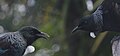
- Nomination Two tui. --Avenue 15:46, 11 May 2011 (UTC)
- Withdrawn On second thought, too dark. --Avenue 10:49, 13 May 2011 (UTC)
-
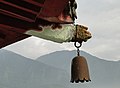
- Nomination A bell on Ci En Pagoda, Taiwan --Bgag 21:23, 10 May 2011 (UTC)
- Promotion Nice composition. Quality fine except for some minor compression artifacts. Is it tilted, or is the bell hanging at an angle for some reason (e.g. the wind)? --Avenue 03:40, 11 May 2011 (UTC) I have imported a new version of the picture. The picture is not tilted. Effectively it was very windy on the top of the pagoda. --Bgag 00:25, 13 May 2011 (UTC)
QI to me. --Avenue 08:29, 13 May 2011 (UTC)
-

- Nomination Staircase from look-out tower, lookup --J. Lunau 18:08, 10 May 2011 (UTC) Very good composition, not as impressive technical quality (D700 is not a bad camera at all, and the picture seems to be downsized but is still not very sharp).--Ankara 10:16, 11 May 2011 (UTC) Comment no downsized, all I did was sharpness, tilt, crop with Gimp 2.6.11 unsharp look is caused by the low light in the staircase and the used lens (24-120mm zoom at 24mm, f3,5) --J. Lunau 13:00, 11 May 2011 (UTC) It is perhaps a silly question, but why not use a higher ISO and smaller aperture? Do not D700 have a very good high-ISO performance?--Ankara 13:12, 11 May 2011 (UTC) Comment not at all not a silly question. D700 has a good ISO-performance but unfortunately I used my camera in program mode. For more details, please see your discussion --J. Lunau 08:22, 12 May 2011 (UTC) Ok. I promote, very nice composition and probably sufficient quality for QI.--Ankara 08:57, 13 May 2011 (UTC)
- Promotion
- Nomination Staircase from look-out tower, lookup --J. Lunau 18:08, 10 May 2011 (UTC) Very good composition, not as impressive technical quality (D700 is not a bad camera at all, and the picture seems to be downsized but is still not very sharp).--Ankara 10:16, 11 May 2011 (UTC)
-

- Nomination View over Basel and the Rhine knee from Basler Münster --Taxiarchos228 12:27, 10 May 2011 (UTC)
- Promotion Good quality. --Ralf Roletschek 14:11, 12 May 2011 (UTC)
-

- Nomination Tbilisi and Kura River. Geagea 05:14, 10 May 2011 (UTC)
- Promotion Good quality. --Ralf Roletschek 14:12, 12 May 2011 (UTC)
-

- Nomination Motte-and-bailey in Ruislip --Harrison49 21:51, 8 May 2011 (UTC)
- Promotion Good quality. --Cayambe 21:42, 12 May 2011 (UTC)
-
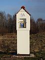
-

-
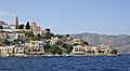
-
- Nomination Ki-no-Matsushima in Nachikatsuura, Wakayama, Japan --663highland 11:39, 8 May 2011 (UTC)
- Promotion Good quality. --Cayambe 16:10, 12 May 2011 (UTC)
-
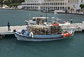
-
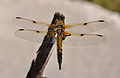
- Nomination Four-spotted Chaser. --Quartl 06:04, 8 May 2011 (UTC)
- Promotion good quality, well fokused --Leviathan1983 16:38, 12 May 2011 (UTC)
-
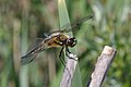
- Nomination Four-spotted Chaser. --Quartl 06:04, 8 May 2011 (UTC)
- Decline Sorry, but quality and composition don't convince me at this one. --Leviathan1983 16:44, 12 May 2011 (UTC)
-

- Nomination Broad-bodied Chaser. --Quartl 06:04, 8 May 2011 (UTC)
- Promotion good quality, sharpness on head could be better but QI for me --Leviathan1983 16:38, 12 May 2011 (UTC)
-

- Nomination Broad-bodied Chaser. --Quartl 06:04, 8 May 2011 (UTC)
- Promotion good quality, overall sharpness could be a bit better but still QI for me --Leviathan1983 16:38, 12 May 2011 (UTC)
-
- Nomination Marsh Frog. --Quartl 06:04, 8 May 2011 (UTC)
- Promotion good quality, composition maybe a bit too centered but still QI 4 me --Leviathan1983 16:38, 12 May 2011 (UTC)
-

- Nomination Part of the UNESCO world heritage "Oberharzer Wasserregal". -- MSeses 07:19, 8 May 2011 (UTC)
- Promotion Good quality. --Ralf Roletschek 14:13, 12 May 2011 (UTC)
-

-

- Nomination: Komprachcice (Comprachschütz), Upper Silesia - train station --Pudelek 10:54, 7 May 2011 (UTC)
- Review needed
-
- Nomination: RheinFantasie at the day of her Maiden voyage in Cologne. --Rolf H. 04:16, 7 May 2011 (UTC)
- Review needed
-

- Nomination: RheinFantasie at the day of her Maiden voyage in Cologne. --Rolf H. 04:16, 7 May 2011 (UTC)
- Review needed
-

- Nomination: Oresund shore --Vitold Muratov 23:50, 6 May 2011 (UTC)
- Review needed
-

- Nomination: Malmö.Turning Torso --Vitold Muratov 23:25, 6 May 2011 (UTC)
- Review needed
-

- Nomination: Cercidiphyllum japonicum in Gdańsk, Poland. --Crusier 21:17, 6 May 2011 (UTC)
- Review needed
-

- Nomination: Cercidiphyllum japonicum in Gdańsk, Poland. --Crusier 21:17, 6 May 2011 (UTC)
- Review needed
-
- Nomination: Stilt house in Bönnigheim, Baden-Württemberg. -- Felix Koenig 20:13, 6 May 2011 (UTC)
- Review needed
-
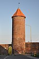
-

- Nomination: Tair Mansurov, Secretary General of en:EURASEC. A.Savin 18:08, 6 May 2011 (UTC)
- Review needed
-

- Nomination: Landscape (Pyrénées) from Abère, france --France64160 17:40, 6 May 2011 (UTC)
- Review needed
-

- Nomination: Fruit of Cucumis sativus. --Bff 17:07, 6 May 2011 (UTC)
- Review needed
-
- Nomination: Palace Hotel buildind in Kharkov City. --Vizu 14:42, 6 May 2011 (UTC)
- Review needed
-

- Nomination: Small church and Easter eggs in Kharkov. --Vizu 14:56, 6 May 2011 (UTC)
- Review needed
-

- Nomination: Priory Palace (Gatchina, Russia) --Art-top 11:30, 5 May 2011 (UTC)
- Review 1/1.250 f/3,2 is not so good for a building --Mbdortmund 10:00, 7 May 2011 (UTC)
-

- Nomination Square and commemorative sculpture of the arrival of the caravel "La Pinta" to Baiona, Galicia (Spain)--Lmbuga 22:53, 4 May 2011 (UTC)
- Promotion Good quality. Harrison49 00:35, 13 May 2011 (UTC)
-

- Nomination Square of Baiona, Galicia (Spain)--Lmbuga 22:53, 4 May 2011 (UTC)
- Promotion Good quality. Harrison49 00:35, 13 May 2011 (UTC)
-

- Nomination Mrs Mallard with her 11 ducklings. --Quartl 20:32, 4 May 2011 (UTC)
- Promotion Good quality. Harrison49 00:36, 13 May 2011 (UTC)
-

- Nomination Ceiling of Global Vipassana Pagoda --Jovianeye 14:47, 4 May 2011 (UTC)
- Promotion Good quality. Harrison49 00:35, 13 May 2011 (UTC)
-

-
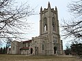
- Nomination Chapel, Carleton College, Minnesota --Jonathunder 03:11, 12 May 2011 (UTC)
- Decline distortion too strong, trees show no details (1/4.000 f/5,6) 4.000 Sekunden (0,00025) Blende f/5,6 --Mbdortmund 06:18, 12 May 2011 (UTC)
-

- Nomination Detail of a memorial window dedicated to the Prince of Wales's Regiment in Birr. --AFBorchert 21:21, 11 May 2011 (UTC)
- Promotion Good quality. --Jovianeye 22:53, 11 May 2011 (UTC)
-

-

- Nomination Portrait of Saint Just. -- Rama 21:12, 11 May 2011 (UTC)
- Promotion Good work, thank you for taking this. --AFBorchert 21:29, 11 May 2011 (UTC) Le bonheur est toujours une idée neuve en Europe...--Jebulon 09:26, 12 May 2011 (UTC)
-

-

-
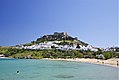
-

- Nomination The town hall of the village Klosterreichenbach, part of Baiersbronn, Black Forest, Baden-Württemberg -- Felix Koenig 17:16, 11 May 2011 (UTC)
- Promotion Meets the criteria for QI, imo.--MrPanyGoff 21:51, 11 May 2011 (UTC)
-

-

-

- Nomination Portable gas burner --Przykuta 16:14, 11 May 2011 (UTC)
- Promotion Good quality. --Taxiarchos228 07:56, 12 May 2011 (UTC)
-

- Nomination Head for portable propane-butane burner --Przykuta 16:14, 11 May 2011 (UTC)
- Promotion Good quality. --Taxiarchos228 07:56, 12 May 2011 (UTC)
-
- Nomination The former Post Hall in Veliko Tarnovo. --MrPanyGoff 15:44, 11 May 2011 (UTC)
- Promotion Good. Intresting building.--Ankara 15:59, 11 May 2011 (UTC)
-

-

- Nomination Lörrach: hamlet "Rötteln" with church --Taxiarchos228 13:20, 11 May 2011 (UTC)
- Promotion Good quality. --Schlaier 16:46, 11 May 2011 (UTC)
-

- Nomination Shell of a Graceful Fig Shell, Ficus gracilis--Llez 12:29, 11 May 2011 (UTC)
- Promotion Good quality. --Taxiarchos228 14:43, 11 May 2011 (UTC)
-
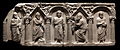
- Nomination Front of a paleo-Christian sarcophagus: Christ and His apostles. Genzano, Italy. 5th century CE. -- Rama 12:00, 11 May 2011 (UTC)
- Promotion Good quality. --Taxiarchos228 14:43, 11 May 2011 (UTC)
-
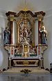
- Nomination Rheinfelden: high altar at Saint Josephs church --Taxiarchos228 08:16, 11 May 2011 (UTC)
- Promotion A bit soft maybe (denoising ?), and crop tight above, but QI nevertheless.--Jebulon 17:44, 11 May 2011 (UTC)
-

- Nomination Hausen im Wiesental: catholic church, interior --Taxiarchos228 08:16, 11 May 2011 (UTC)
- Promotion Good and useful.--Ankara 12:35, 11 May 2011 (UTC)
-
-

-

-

- Nomination St Nikolay Sofiyski church, Sofia, fragment. --MrPanyGoff 09:32, 10 May 2011 (UTC)
- Promotion Good quality. --Jovianeye 23:05, 11 May 2011 (UTC)
-

- Nomination Hausen im Wiesental: protestant church --Taxiarchos228 08:24, 10 May 2011 (UTC)
- Promotion Good quality.--Ankara 13:04, 11 May 2011 (UTC)
-
- Nomination Berlin, Altes Museum und Lustgarten --Berthold Werner 13:05, 9 May 2011 (UTC)
- Decline Maine object to dark, and not very sharp.--Ankara 12:45, 11 May 2011 (UTC)
-

-

-

-

-

- Nomination: Tower on Mont Royal --Taxiarchos228 09:06, 6 May 2011 (UTC)
- Review needed
-

- Nomination: Bad Mitterndorf: Church Saint Margareta --Taxiarchos228 09:06, 6 May 2011 (UTC)
- Review needed
-

- Nomination: Märkt: bell tower of protestant church --Taxiarchos228 09:06, 6 May 2011 (UTC)
- Review needed
-

- Nomination: Church of the Good Shepherd (Weil am Rhein): stone showing year of foundation --Taxiarchos228 09:06, 6 May 2011 (UTC)
- Review needed
-

- Nomination: Inflorescence of Ligularia dentata ‘Desdemona’. Moscow region, Russia. --Bff 07:36, 6 May 2011 (UTC)
- Review needed
-

- Nomination: Bursa clock tower. --Eusebius 07:33, 6 May 2011 (UTC)
- Review needed
-
- Nomination: Fontaine de l'Encelade, Versailles. --Coyau 06:11, 6 May 2011 (UTC)
- Review needed
-
- Nomination: Bosquet de l'Encelade, Versailles. --Coyau 06:11, 6 May 2011 (UTC)
- Review needed
-
- Nomination: Platycnemis pennipes is eating an insect. --ComputerHotline 04:24, 6 May 2011 (UTC)
- Review needed
-
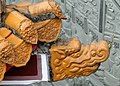
- Nomination: Dragon head in Wen Wu Temple, Taiwan --Bgag 23:28, 5 May 2011 (UTC)
- Review needed
-

- Nomination: Joëlle Esso at the 2011 Geneva book fair. -- Rama 21:12, 5 May 2011 (UTC)
- Review needed
-

- Nomination: Clock tower in Bursa, Turkey. --Eusebius 20:52, 5 May 2011 (UTC)
- Review needed
-

- Nomination: Protestant Trinity church in Münster, Westphalia. Build in 1924 this was the third protestant church in Münster. --Elektroschreiber 20:42, 5 May 2011 (UTC)
- Review needed
-

- Nomination: Guy Poitry at the 2011 Geneva book fair. -- Rama 19:51, 5 May 2011 (UTC)
- Review needed
-

- Nomination: Guy Poitry at the 2011 Geneva book fair. -- Rama 19:51, 5 May 2011 (UTC)
- Review needed
-

- Nomination: Guillaume Long at the 2011 Geneva book fair. -- Rama 19:51, 5 May 2011 (UTC)
- Review needed
-

- Nomination: Gilles Labarthe at the 2011 Geneva book fair. -- Rama 19:27, 5 May 2011 (UTC)
- Review needed
-
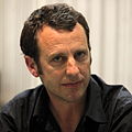
- Nomination: Gilles Labarthe at the 2011 Geneva book fair. -- Rama 19:27, 5 May 2011 (UTC)
- Review needed
-

- Nomination: The grave of Leo von Klenze, a German neoclassicist architect, painter and writer, on the Alte Südfriedhof - an historic cementary in the south of Munich's city centre. --Schlaier 18:57, 5 May 2011 (UTC)
- Review needed
-

- Nomination: Millennium Bridge, London, Great Britain, with St. Paul's Cathedral on the right hand side. --Schlaier 18:25, 5 May 2011 (UTC)
- Review needed
-

- Nomination: Emmanuel Dongala at the 2011 Geneva book fair. -- Rama 18:06, 5 May 2011 (UTC)
- Review needed
-

- Nomination France, Loire atlantique, Clisson City --Nico&Co 19:25, 5 May 2011 (UTC)
- Promotion Nice photo and I think it meets the criteria.--MrPanyGoff 22:11, 11 May 2011 (UTC)
-

- Nomination: Komprachice, Silesia - cultural center --Pudelek 14:12, 5 May 2011 (UTC)
- Review needed
-

- Nomination: Church in Zlate Hory --Pudelek 14:12, 5 May 2011 (UTC)
- Review needed
-

- Nomination: Lipová-lázně (Bad Lindewiese), Czech Silesia - main road (nr 369) --Pudelek 14:12, 5 May 2011 (UTC)~
- Review needed
-

- Nomination: Christophe Dubois at the Salon du Livre 2011 in Geneva -- Rama 12:47, 5 May 2011 (UTC)
- Review needed
-

- Nomination: Christophe Dubois at the Salon du Livre 2011 in Geneva -- Rama 12:47, 5 May 2011 (UTC)
- Review needed
-

- Nomination Jerusalem, Via Dolorosa, start of the friday procession --Berthold Werner 17:01, 4 May 2011 (UTC)
- Promotion Ok. --Jovianeye 22:36, 11 May 2011 (UTC)
-

-

- Nomination: Köthen Bahnhof, DB Regio 642167 der Elbe-Saale-Bahn --Ralf Roletschek 19:57, 3 May 2011 (UTC)
- Review Please correct the perspective or tilt. It can be done easily in ShiftN. --Jovianeye 00:11, 4 May 2011 (UTC) sorry, i don´t want "correct" ist. --Ralf Roletschek 10:54, 6 May 2011 (UTC)
-

- Nomination Weir separating Sterkfontein and Driekloof Dam in the Free State, South Africa. --Tomer T 17:58, 3 May 2011 (UTC)
- Decline Strong vignetting, overall too soft. --King of Hearts 04:31, 12 May 2011 (UTC)
-

- Nomination Toronto: Hart House (part of the University of Toronto at St. George Campus) --Taxiarchos228 07:18, 29 April 2011 (UTC)
- Promotion Comment Beinahe hätte ich übersehen, dass der Himmel stark verrauscht ist, das kannst du ja korrigieren. --Berthold Werner 17:05, 4 May 2011 (UTC)
jupp, ist entrauscht --Taxiarchos228 16:46, 11 May 2011 (UTC)
Good now. --Berthold Werner 20:18, 5 May 2011 (UTC)
-

- Nomination: Bust of a roman emperor, Versailles. --Coyau 14:27, 26 April 2011 (UTC)
- Review Please correct the distortion. Jovianeye 05:00, 5 May 2011 (UTC)
Distortion already corrected, if you're reffering to the bricks, they are really messy and there's nothing to be done ahout that (they are not aligned on both sides of the statue). --Coyau 12:55, 5 May 2011 (UTC)
-

- Nomination Small chapel near Onšovice village, Prachatice District, Czech Republic --Chmee2 11:34, 11 May 2011 (UTC)
- Promotion Good quality. --Taxiarchos228 11:47, 11 May 2011 (UTC)
-

- Nomination St. Iliya Church, Sevlievo. --MrPanyGoff 11:15, 11 May 2011 (UTC)
- Promotion Good quality and nice --Taxiarchos228 11:17, 11 May 2011 (UTC)
-

- Nomination Halberd-axe head with the head of a mouflon. Luristan bronze, late 2nd millennium–early 1st millennium BC. From Amlash, Iran. -- Rama 11:07, 11 May 2011 (UTC)
- Promotion Good quality. --Taxiarchos228 11:17, 11 May 2011 (UTC)
-

- Nomination Ancient greek grave statue of a lion, Archaeological museum of Rhodes, Greece. 2nd attempt.--Jebulon 10:09, 11 May 2011 (UTC)
- Promotion Good quality. --Taxiarchos228 11:17, 11 May 2011 (UTC)
-

- Nomination Toronto Harbourfront --Taxiarchos228 09:02, 11 May 2011 (UTC)
- Promotion schau an, ein Türmchen :) --Ralf Roletschek 10:48, 11 May 2011 (UTC)
also ich sehe keines, höhö :) --Taxiarchos228 11:06, 11 May 2011 (UTC)
-

- Nomination The Russian church, Sofia. --MrPanyGoff 17:51, 10 May 2011 (UTC)
- Promotion QI for me, nice shoot --J. Lunau 18:20, 10 May 2011 (UTC)
-

-

-

-
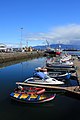
- Nomination Boats in Reykjavík harbour. --Avenue 15:18, 10 May 2011 (UTC)
- Promotion very good --Ralf Roletschek 17:29, 10 May 2011 (UTC)
-

-

- Nomination Kotor and Boka kotorska - panorama from city wall --Pudelek 13:39, 10 May 2011 (UTC)
- Promotion Good quality. --Taxiarchos228 13:54, 10 May 2011 (UTC)
-

- Nomination Chapel in Žár village, Czech Republic --Chmee2 12:09, 10 May 2011 (UTC)
- Promotion Good quality. --Ralf Roletschek 12:23, 10 May 2011 (UTC)
-

- Nomination Natural monument Háje, Czech Republic --Chmee2 12:09, 10 May 2011 (UTC)
- Promotion very nice! --Ralf Roletschek 12:23, 10 May 2011 (UTC)
-

- Nomination a male Coenomyia ferruginea --Leviathan1983 09:14, 10 May 2011 (UTC)
- Promotion Good quality. --Mbdortmund 13:20, 10 May 2011 (UTC)
-
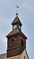
- Nomination Hausen im Wiesental: protestant church, bell tower --Taxiarchos228 08:24, 10 May 2011 (UTC)
- Promotion Good quality. --Mbdortmund 13:21, 10 May 2011 (UTC)
-

- Nomination Evans Peak. --The High Fin Sperm Whale 21:57, 9 May 2011 (UTC)
- Promotion Very good. --Cayambe 06:26, 11 May 2011 (UTC)
-

- Nomination St. Nikolay Sofiyski church, Sofia. --MrPanyGoff 20:32, 9 May 2011 (UTC)
- Promotion Good quality. --Cayambe 06:24, 11 May 2011 (UTC)
-
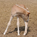
-

- Nomination The old town hall of Flein, Baden-Württemberg. -- Felix Koenig 19:15, 9 May 2011 (UTC)
- Promotion Good quality. --Cayambe 06:22, 11 May 2011 (UTC)
-

-

- Nomination Grabplatte Abt Tobias, wahrscheinlich 1463 --Ralf Roletschek 14:14, 9 May 2011 (UTC)
- Decline Unsharp, Schade !!--Jebulon 15:17, 10 May 2011 (UTC)
-

-

-

-

- Nomination War memorial, Andoins, France --France64160 22:17, 5 May 2011 (UTC)
- Promotion good--Jebulon 23:28, 10 May 2011 (UTC)
-

- Nomination A Harbor Seal taking a breath at the Ratujemy Baltyckie Foki in Hel, Poland. --Schlaier 19:18, 5 May 2011 (UTC)
- Promotion Some highlights lack detail, and there's some noise in darker areas, but technically good nonetheless. As a photo of the animal itself, I think not enough is showing (at least for a captive animal), but viewed as a shot of the seal taking a breath, it's good. I've changed the description accordingly. --Avenue 01:00, 11 May 2011 (UTC)
-

- Nomination: Eiffel Tower: upper observation deck --Taxiarchos228 11:47, 5 May 2011 (UTC)
- Review needed
-
- Nomination: Lüneburg: Saint Nicolai church, choir side --Taxiarchos228 11:47, 5 May 2011 (UTC)
- Review needed
-

- Nomination: Lüneburg: organ at Saint Johannis church --Taxiarchos228 11:47, 5 May 2011 (UTC)
- Review needed
-
- Nomination: Tactile model for the blind in the foreground, Tower Bridge and London's City Hall in the background, London, UK --Ralf Roletschek 11:28, 5 May 2011 (UTC)
- Review needed
-

- Nomination: Détail d'un armet exposé au musée de l'Armée à Paris. --Thesupermat 11:25, 5 May 2011 (UTC)
- Review needed
-

- Nomination Kabira Bay of Ishigaki Island, Okinawa, Japan --663highland 10:19, 5 May 2011 (UTC)
- Decline The problem: quite strong red-cyan chromatic aberrations at the sides of the picture. Those could be desatured though and maybe then even this could be a QI. --Ximonic 02:46, 11 May 2011 (UTC)
-

- Nomination Kabira Bay of Ishigaki Island, Okinawa, Japan --663highland 10:19, 5 May 2011 (UTC)
- Promotion No major problems. Quality is good. --Ximonic 02:46, 11 May 2011 (UTC)
-

- Nomination: Tojin-baka in Ishigaki Island, Okinawa, Japan --663highland 10:19, 5 May 2011 (UTC)
- Review needed
-

- Nomination A graham cracker. --King of Hearts 07:21, 5 May 2011 (UTC)
- Promotion A quality graham cracker. --Ximonic 02:49, 11 May 2011 (UTC)
-

- Nomination: Milestone, Switzerland. -- Ludo29 07:20, 5 May 2011 (UTC)
- Review needed
-

- Nomination: Slavín, soviet memorial in Bratislava, Slovakia. Tomer T 05:29, 5 May 2011 (UTC)
- Review needed
-

- Nomination: Ruines of the Château de Coucy. Tomer T 05:47, 5 May 2011 (UTC)
- Review needed
-

-

-

- Nomination: Tower of Hercules, A Coruña, Galicia--Lmbuga 23:21, 4 May 2011 (UTC)
- Review needed
-

-
- Nomination: Port of Panxón, Nigrán, Galicia (Spain)--Lmbuga 22:58, 4 May 2011 (UTC)
- Review needed
-

- Nomination: Port of Panxón, Nigrán, Galicia (Spain)--Lmbuga 22:57, 4 May 2011 (UTC)
- Review needed
-

- Nomination: Church by Antonio Palacios, Panxón, Nigrán, Galicia (Spain)--Lmbuga 22:55, 4 May 2011 (UTC)
- Review needed
-

- Nomination: Interior of the church of Panxón, by Antonio Palacios, Panxón, Nigrán, Galicia (Spain)--Lmbuga 22:53, 4 May 2011 (UTC)
- Review needed
-

- Nomination: Church by Antonio Palacios, Panxón, Nigrán, Galicia (Spain)--Lmbuga 22:53, 4 May 2011 (UTC)
- Review needed
-
- Nomination: Beach of A Madorra, Panxón, Nigrán, Galicia (Spain)--Lmbuga 22:53, 4 May 2011 (UTC)
- Review needed
-
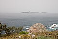
- Nomination: Marine brand of A Meda, Monteferro, Nigrán, Galicia (Spain)--Lmbuga 22:53, 4 May 2011 (UTC)
- Review needed
-

- Nomination: Marine brand of A Meda, Monteferro, Nigrán, Galicia (Spain)--Lmbuga 22:53, 4 May 2011 (UTC)
- Review needed
-
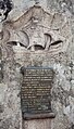
- Nomination: Commemorative sculpture of the arrival of the caravel "La Pinta" to Baiona, Galicia (Spain)--Lmbuga 22:53, 4 May 2011 (UTC)
- Review needed
-
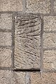
- Nomination: Stele. Church by Antonio Palacios, Panxón, Nigrán, Galicia (Spain)--Lmbuga 22:53, 4 May 2011 (UTC)
- Review needed
-
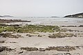
- Nomination: Beach of A Madorra, Panxón, Nigrán, Galicia (Spain)--Lmbuga 22:53, 4 May 2011 (UTC)
- Review needed
-

- Nomination Cell Phone Tower --Jovianeye 20:46, 4 May 2011 (UTC)
- Promotion Good quality. --Taxiarchos228 20:47, 10 May 2011 (UTC)
-
- Nomination Chain drive sprockets -- Ludo29 19:02, 4 May 2011 (UTC)
- Promotion Good quality. --Taxiarchos228 20:47, 10 May 2011 (UTC)
-
- Nomination: 3 statues in the parc of Versailles. --Coyau 17:33, 4 May 2011 (UTC)
- Review needed
-

- Nomination: Albert Weinberg at the 2011 Geneval book fair. -- Rama 17:02, 4 May 2011 (UTC)
- Review needed
-

-

- Nomination Studio microphone--Slfi 13:06, 4 May 2011 (UTC)
- Promotion Good quality. --Taxiarchos228 16:39, 10 May 2011 (UTC)
-

-

- Nomination Sculpture at Rogers Centre, Toronto --Taxiarchos228 14:18, 2 May 2011 (UTC)
- Promotion Good as QI (if no copyright)--Jebulon 15:30, 10 May 2011 (UTC)
-
- Nomination Weil am Rhein: Three country bridge --Taxiarchos228 12:02, 7 May 2011 (UTC)
- Promotion Nicely done. --King of Hearts 08:45, 11 May 2011 (UTC)
-

- Nomination Weil am Rhein: Three country bridge --Taxiarchos228 12:02, 7 May 2011 (UTC)
- Promotion Nicely done. --King of Hearts 08:45, 11 May 2011 (UTC)
-

- Nomination Small church in Kharkov. --Vizu 17:24, 29 April 2011 (UTC)
- Promotion Not sure it can be QI, but sure it needs a perspective correction--Jebulon 08:32, 4 May 2011 (UTC) :...A new version? --Vizu 13:49, 6 May 2011 (UTC) Comment Sure it can be QI, but it needs some contrast and a cropping out of the disturbing foreground. Please remove the thing in the bottom left corner --Carschten 20:06, 7 May 2011 (UTC) Done See a new version, pls. --Vizu 17:13, 10 May 2011 (UTC) Support QI now imo --Carschten 20:28, 10 May 2011 (UTC)
-

- Nomination Weil am Rhein: Saint Johannes church --Taxiarchos228 07:51, 28 April 2011 (UTC)
- Promotion Ugly and disturbing newspaper on the ground. Crop out ?--Jebulon 13:48, 1 May 2011 (UTC)
better now? --Taxiarchos228 19:05, 9 May 2011 (UTC) Yes, better. QI--Jebulon 10:15, 11 May 2011 (UTC)
-

- Nomination Hausen im Wiesental: protestant church (gallery) --Taxiarchos228 08:24, 10 May 2011 (UTC)
- Promotion Good quality. --Ralf Roletschek 09:13, 10 May 2011 (UTC)
-

- Nomination Ten Mile River. —David Eppstein 05:51, 10 May 2011 (UTC)
- Promotion Lovely composition. --King of Hearts 10:45, 10 May 2011 (UTC)
-

- Nomination Haflinger Hengstfohlen --Böhringer 19:32, 9 May 2011 (UTC)
- Promotion Good quality. --Mbdortmund 20:31, 9 May 2011 (UTC)
-

- Nomination Bar and barwomen in Kharkov City. --Vizu 16:40, 9 May 2011 (UTC)
- Decline sorry, for me is the flash too strong. --Ralf Roletschek 18:51, 9 May 2011 (UTC)
-

- Nomination a female Coenomyia ferruginea --Leviathan1983 16:24, 9 May 2011 (UTC)
- Promotion The early photographer catches the stink fly while it's still clammy. Very good quality. --Quartl 20:20, 9 May 2011 (UTC)
-

- Nomination Reconstruction of the "Stolper Turm", Germany --Ralf Roletschek 14:14, 9 May 2011 (UTC)
- Decline Es tut mir ja wirklich weh, aber 2MP sind Richtlinie bei den QIC, alles darunter ist nicht zugelassen. -- Felix Koenig 19:15, 9 May 2011 (UTC)
-

- Nomination Hausen im Wiesental: catholic church --Taxiarchos228 06:31, 9 May 2011 (UTC)
- Decline Question (Ironically fitting but) why is there a halo around the church? --King of Hearts 07:01, 9 May 2011 (UTC)
maybe I have distended the HDR-algorithm (I can reduce this), however the sky was nearly white behind the nave roof --Taxiarchos228 07:12, 9 May 2011 (UTC)
Sorry, it just looks too unnatural. --King of Hearts 05:29, 10 May 2011 (UTC)
-

- Nomination Hausen im Wiesental: catholic church as seen from northeast --Taxiarchos228 06:31, 9 May 2011 (UTC)
- Promotion Good quality. --Cayambe 19:35, 9 May 2011 (UTC)
-

- Nomination Hausen im Wiesental: catholic church (organ) --Taxiarchos228 06:31, 9 May 2011 (UTC)
- Promotion Good quality. --Cayambe 19:35, 9 May 2011 (UTC)
-

- Nomination Swakeleys House, Ickenham. --Harrison49 23:58, 8 May 2011 (UTC)
- Promotion Good. --King of Hearts 10:19, 10 May 2011 (UTC)
-

- Nomination Fête de la Fédération, 14 july 1790, bronze relief, "Monument to the Republic", Paris.--Jebulon 10:45, 8 May 2011 (UTC)
- Promotion Good. --Coyau 08:58, 10 May 2011 (UTC)
-

- Nomination Vabel Church, Targovishte. --MrPanyGoff 08:19, 8 May 2011 (UTC)
- Promotion Good quality. It looked a little tilted to the right for me. But it is not. --Elektroschreiber 06:19, 10 May 2011 (UTC)
-

-

- Nomination Abère church, France --France64160 17:40, 6 May 2011 (UTC)
- Promotion Good enough.--Jebulon 16:31, 9 May 2011 (UTC)
-

- Nomination War memorial Abère, France --France64160 17:40, 6 May 2011 (UTC)
- Decline Too tight crop above, sorry.--Jebulon 16:32, 9 May 2011 (UTC)
-

- Nomination Sculpture of Manuel Vázquez Figueroa, park of Santiago de Compostela, Galicia (Spain)--Lmbuga 23:39, 4 May 2011 (UTC)
- Promotion Tilted --Jebulon 08:19, 5 May 2011 (UTC)
Ok, Withdrawn (Ok, the images QI can not be tilted)--Lmbuga 21:14, 7 May 2011 (UTC)
Sorry, I haven't the raw file--Lmbuga 21:19, 7 May 2011 (UTC) No need of the raw file !! I've uploaded a corrected version, please withdraw your withdrawn !!--Jebulon 16:01, 8 May 2011 (UTC)
Ok, thanks. Thank you. The image is "nomination"--Lmbuga 22:32, 8 May 2011 (UTC)
Very good work, Jebulon--Lmbuga 22:35, 8 May 2011 (UTC)
Good now (although a little tight below). --Avenue 01:00, 10 May 2011 (UTC)
-
- Nomination rugby. -- Ludo29 20:36, 4 May 2011 (UTC)
- Promotion Nice action shot; I like the low angle. It would be a stronger photo if the goalposts featured in the background, and if some DOF was sacrificed to freeze the hands, feet and ball better, but still QI IMO. --Avenue 00:52, 10 May 2011 (UTC)
-

- Nomination: Church in Lipova-lazne, Czech Republic --Pudelek 11:00, 4 May 2011 (UTC)
- Review needed
-

-

- Nomination: Breisach Minster conch --Taxiarchos228 07:58, 4 May 2011 (UTC)
- Review needed
-

- Nomination: Breisach Minster. General view from South. Breisach am Rhein, Germany. --Taxiarchos228 07:58, 4 May 2011 (UTC)
- Review needed
-
-

- Nomination: Breisach Minster pewage detail --Taxiarchos228 07:43, 4 May 2011 (UTC)
- Review needed
-

- Nomination: Breisach Minster rood screen detail --Taxiarchos228 07:43, 4 May 2011 (UTC)
- Review needed
-
-

- Nomination Church St. Joseph in Münster, Westphalia. --Elektroschreiber 21:46, 3 May 2011 (UTC)
- Decline The cyclist in the front is too distracting, sorry. --King of Hearts 08:08, 10 May 2011 (UTC)
-

- Nomination: University of Eberswalde, Campus at evening --Ralf Roletschek 19:57, 3 May 2011 (UTC)
- Review needed
-

- Nomination: Broken statue of eagle on Eagle Column (Gatchina, Russia) --Art-top 18:20, 3 May 2011 (UTC)
- Review needed
-

-

- Nomination Santa Maria Val Muestair --Taxiarchos228 11:19, 3 May 2011 (UTC)
- Promotion Maybe a little perspective correction left ?--Jebulon 12:31, 3 May 2011 (UTC)
should be better now --Taxiarchos228 19:30, 9 May 2011 (UTC) Atleast in my opinion, it is a quality image now. Yet I have to say, I can see some chromatic aberrations at the left. Maybe one could desaturate those? --Ximonic 15:05, 4 May 2011 (UTC)
-

-

- Nomination: Love padlocks on the hohenzollern-bridge, Cologne --Superbass 20:50, 3 May 2011 (UTC)
- Review needed
-

- Nomination Grenzach-Wyhlen: Peace church, bell tower --Taxiarchos228 14:18, 2 May 2011 (UTC)
- Promotion Good quality. --Ralf Roletschek 09:20, 10 May 2011 (UTC)
-

- Nomination Detail of the Sparkassen-building in the Neue Mitte of Ulm of architect Stephan Braunfels. --Schlaier 13:49, 1 May 2011 (UTC)
- Promotion solide Arbeit --Ralf Roletschek 15:03, 9 May 2011 (UTC)
-

- Nomination Jerusalem, St. Anna church. --Berthold Werner 12:39, 30 April 2011 (UTC)
- Promotion Minor corrections needed. Please see image annotations. --Jovianeye 20:58, 8 May 2011 (UTC)
This is from lines of bird control spikes as you can better see here: File:Jerusalem St Anna BW 2.JPG --Berthold Werner 11:17, 9 May 2011 (UTC)I support, and not only because of the flag...--Jebulon 14:31, 9 May 2011 (UTC)
-

- Nomination Small church in Kharkov. --Vizu 17:24, 29 April 2011 (UTC)
- Promotion Maybe the photographer could be cropped out.--Jebulon 08:31, 4 May 2011 (UTC) Done--Vizu 13:49, 6 May 2011 (UTC)Better, thank you. Looks a little busy, and the perspective needs a slight correction, but good enough for QI now, IMO.--Jebulon 14:09, 9 May 2011 (UTC)
-

-

-

- Nomination The personnification of the town of Lille, by James Pradier, Place de la Concorde, Paris.--Jebulon 21:04, 27 April 2011 (UTC)
- Withdrawn Comment I think I can support it as QI the next time. But I've three points: 1. the image is a bit noisy, but that's too bad imo 2. vignetting in the corners at top, please correct that 3. The DOF, the blur in background is faked, isn't it? --Carschten 12:49, 5 May 2011 (UTC) Thanks for review. You've got the point for your "3.", I forgot to add the template "retouched" in the file description page, it is done now. I'll try to correct the other point soon.--Jebulon 09:07, 6 May 2011 (UTC) Sorry, there is nothing i can do better.--Jebulon 20:42, 8 May 2011 (UTC) I withdraw my nomination As a parisian, I'm able to take soon a better picture of this Lille-Lady !--Jebulon 13:56, 9 May 2011 (UTC).
-
-

- Nomination Snov-covered street, Germany --Harke 06:52, 9 May 2011 (UTC)
- Promotion Good quality. --Taxiarchos228 06:59, 9 May 2011 (UTC)
-

- Nomination Hunting pavilion near Stuttgart --Harke 06:48, 9 May 2011 (UTC)
- Promotion Good quality. --Taxiarchos228 06:59, 9 May 2011 (UTC)
-

- Nomination EA headquarters. --King of Hearts 23:27, 8 May 2011 (UTC)
- Promotion Good quality. --Cayambe 07:35, 9 May 2011 (UTC)
-

- Nomination The River Pinn in Ruislip Gardens --Harrison49 21:51, 8 May 2011 (UTC)
- Promotion Not the sharpest, but quite good. --King of Hearts 22:48, 8 May 2011 (UTC)
-

- Nomination Swakeleys House, Ickenham --Harrison49 21:51, 8 May 2011 (UTC)
- Decline tilted ccw , sky overexposured --Mbdortmund 22:36, 8 May 2011 (UTC)
-

-

- Nomination G.S.Rakovski Comprehensive School, Sofia. --MrPanyGoff 21:01, 8 May 2011 (UTC)
- Promotion Good quality. --Mbdortmund 22:38, 8 May 2011 (UTC)
-

- Nomination The Pantocrator in Hagia Sophia. --Eusebius 20:02, 8 May 2011 (UTC)
- Promotion Good quality. --Mbdortmund 22:37, 8 May 2011 (UTC)
-

- Nomination Airbus A320 of Edelweiss Airlines landing at Zurich International Airport --Simisa 19:49, 8 May 2011 (UTC)
- Promotion Good quality. --Mbdortmund 04:31, 9 May 2011 (UTC)
-
- Nomination Hausen im Wiesental: Old town hall --Taxiarchos228 19:18, 8 May 2011 (UTC)
- Promotion Good quality. --Cayambe 07:29, 9 May 2011 (UTC)
-
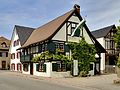
- Nomination Hausen im Wiesental: Hebel house (museum) --Taxiarchos228 19:18, 8 May 2011 (UTC)
- Promotion Very good. --Cayambe 07:31, 9 May 2011 (UTC)
-

- Nomination Hausen im Wiesental: catholic church --Taxiarchos228 19:18, 8 May 2011 (UTC)
- Promotion Good quality. --Mbdortmund 19:52, 8 May 2011 (UTC)
-

-
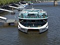
-

-

- Nomination The Bell Tower of St Iliya Church, Sevlievo. --MrPanyGoff 18:09, 8 May 2011 (UTC)
- Promotion Good quality. --Taxiarchos228 19:33, 8 May 2011 (UTC)
-

- Nomination A 5th century BCE grave relief, Krito (the daughter) is mourning her dead mother (Timarista).--Jebulon 17:48, 8 May 2011 (UTC)
- Promotion Good quality. --Taxiarchos228 19:33, 8 May 2011 (UTC)
-

-

- Nomination Tower on a building in Korntal, Southern Germany --Harke 17:13, 8 May 2011 (UTC)
- Promotion Good quality. --Taxiarchos228 19:33, 8 May 2011 (UTC)
-

- Nomination Flattichhaus in Korntal, Southern Germany --Harke 17:12, 8 May 2011 (UTC)
- Promotion Good quality. --Taxiarchos228 19:33, 8 May 2011 (UTC)
-

- Nomination The Rape of Persephone by Girardon, Versailles. --Coyau 16:13, 8 May 2011 (UTC)
- Promotion very good composition --Mbdortmund 19:54, 8 May 2011 (UTC)
-
-
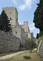
- Nomination The moats of the medieval fortifications at Rhodes, Greece.--Jebulon 15:46, 8 May 2011 (UTC)
- Promotion Good quality. --Mbdortmund 22:40, 8 May 2011 (UTC)
-
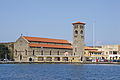
- Nomination The cathedral of Rhodes, Greece.--Jebulon 15:20, 8 May 2011 (UTC)
- Promotion Good quality. --Mbdortmund 04:32, 9 May 2011 (UTC)
-

- Nomination Red moki. --Avenue 15:06, 8 May 2011 (UTC)
- Promotion Good quality. --Mbdortmund 19:54, 8 May 2011 (UTC)
-
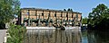
- Nomination A building at a river (second try) --Carschten 13:49, 8 May 2011 (UTC)
- Promotion Good quality. --Taxiarchos228 19:37, 8 May 2011 (UTC)
-
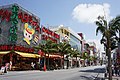
- Nomination Kokusai-dori Street in Naha, Okinawa, Japan --663highland 11:39, 8 May 2011 (UTC)
- Promotion Good quality. --Taxiarchos228 19:37, 8 May 2011 (UTC)
-
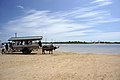
- Nomination at Yubu Island in Okinawa, Japan --663highland 11:39, 8 May 2011 (UTC)
- Promotion Good --Jebulon 14:10, 8 May 2011 (UTC)
-

- Nomination The three Kranhaus buildings in Cologne. --Rolf H. 09:57, 8 May 2011 (UTC)
- Promotion Good quality. --Mbdortmund 12:14, 8 May 2011 (UTC)
-

- Nomination Helsinki Main Train Staition --Ralf Roletschek 09:18, 8 May 2011 (UTC)
- Promotion Good quality. --Mbdortmund 12:15, 8 May 2011 (UTC)
-

-

- Nomination Cessna/Reims F150. --Airwolf 20:52, 6 May 2011 (UTC)
- Promotion Just making sure, you are the author and you own that website linked from the image page, right? --King of Hearts 03:41, 8 May 2011 (UTC)
Indeed, I am and I do. Airwolf 10:33, 8 May 2011 (UTC)
The lighting could be better, but I'll be more forgiving of things in motion. --King of Hearts 05:38, 9 May 2011 (UTC)
-

- Nomination Mandryka at the Geneva book fair 2011 -- Rama 18:04, 6 May 2011 (UTC)
- Promotion Meets the criteria, imo.--MrPanyGoff 11:14, 9 May 2011 (UTC)
-

- Nomination Bassin de Flore, Versailles. --Coyau 00:02, 6 May 2011 (UTC)
- Promotion Meets the criteria, imo.--MrPanyGoff 18:46, 8 May 2011 (UTC)
-

- Nomination A flower in South-Africa. -- --Nicolas M. Perrault 02:02, 5 May 2011 (UTC)
- Decline Nice picture. But no taxa naming and a very unspecific description. --Elektroschreiber 21:02, 5 May 2011 (UTC) Question Do you know how I could find the name of the species? -- Nicolas M. Perrault 00:26, 6 May 2011
I am sorry. I cannot help. --Elektroschreiber 20:35, 7 May 2011 (UTC)
I withdraw my nomination You're right then, my bad. -- Nicolas M. Perrault 14:55, 8 May 2011 (UTC)
-

- Nomination Sculpture of Manuel Vázquez Figueroa, park of Santiago de Compostela, Galicia (Spain)--Lmbuga 23:47, 4 May 2011 (UTC)
- Promotion Meets the criteria, imo.--MrPanyGoff 18:50, 8 May 2011 (UTC)
-

- Nomination Tower of Hercules, A Coruña, Galicia--Lmbuga 23:08, 4 May 2011 (UTC)
- Promotion Good, informative QI, imo.--MrPanyGoff 18:55, 8 May 2011 (UTC)
-

- Nomination: Bust of Jean-Hippolyte Flandrin at the Père Lachaise Cemetery in Paris, France --~Pyb 08:49, 3 May 2011 (UTC)
- Review needed
-

- Nomination: A statue of the grave of Ferdinand Barbedienne, Cemetery Père-Lachaise, Paris --~Pyb 08:49, 3 May 2011 (UTC)
- Review needed
-

- Nomination: Taylor_Phinney. -- Ludo29 23:04, 2 May 2011 (UTC)
- Review needed
-

-

- Nomination: Old drug bottles line the shelves inside the recreated Sherbrooke drug store in Sherbrooke Village Museum--France3470 16:23, 2 May 2011 (UTC)
- Review needed
-

- Nomination: Rheinfelden: Saint Josephs church, bell tower --Taxiarchos228 14:18, 2 May 2011 (UTC)
- Review needed
-

- Nomination: Weil am Rhein: Saint Maria church, organ --Taxiarchos228 14:18, 2 May 2011 (UTC)
- Review Upper part is leaning, needs a correction IMO--Jebulon 16:50, 2 May 2011 (UTC)
-

- Nomination: Light groups in LuxRender. --Niabot 14:08, 2 May 2011 (UTC)
- Review needed
-
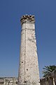
- Nomination Capernaum, a pillar of the Synagogue --Berthold Werner 12:28, 2 May 2011 (UTC)
- Decline Needs less sky above, and more infos at bottom, IMO...--Jebulon 16:16, 2 May 2011 (UTC)
Now with less sky. --Berthold Werner 14:19, 5 May 2011 (UTC) Green and magenta CA left side the wall and there are 3 dustspots left and right side tower --Ritchyblack 04:37, 9 May 2011 (UTC)
-

- Nomination: Juggler. Third quarter of the 12th century CE. -- Rama 12:13, 2 May 2011 (UTC)
- Review needed
-

-

- Nomination lake Miélan, Gers, France -- Florent Pécassou 12:08, 30 April 2011 (UTC)
- Decline Tilted, please fix. --King of Hearts 08:40, 1 May 2011 (UTC)
No reaction. --King of Hearts 22:52, 8 May 2011 (UTC)
-

- Nomination lake Miélan, Gers, France -- Florent Pécassou 12:08, 30 April 2011 (UTC)
- Decline Tilted, please fix. --King of Hearts 08:40, 1 May 2011 (UTC)
No reaction. --King of Hearts 22:52, 8 May 2011 (UTC)
-

- Nomination lake Miélan, Gers, France -- Florent Pécassou 12:08, 30 April 2011 (UTC)
- Decline Tilted, please fix. --King of Hearts 08:40, 1 May 2011 (UTC)
No reaction. --King of Hearts 22:52, 8 May 2011 (UTC)
-

- Nomination Laboratory gloves for cryoprotection --Przykuta 10:56, 8 May 2011 (UTC)
- Promotion Good quality. Could perhaps be cropped a little bit --Mbdortmund 11:08, 8 May 2011 (UTC)
-

- Nomination Centricon centrifugal filter device --Przykuta 10:56, 8 May 2011 (UTC)
- Decline CA and strange effect on the upper left --Mbdortmund 11:09, 8 May 2011 (UTC)
-

- Nomination 50ml Falcon tubes --Przykuta 10:56, 8 May 2011 (UTC)
- Promotion only one is really crisp, but still QI --Mbdortmund 11:14, 8 May 2011 (UTC)
-

- Nomination Four-spotted Chaser. --Quartl 06:04, 8 May 2011 (UTC)
- Promotion Good quality. --Mbdortmund 08:16, 8 May 2011 (UTC)
-

- Nomination Four-spotted Chaser. --Quartl 06:04, 8 May 2011 (UTC)
- Promotion Good quality. --Mbdortmund 08:16, 8 May 2011 (UTC)
-

- Nomination Meadow Brown. --Quartl 06:04, 8 May 2011 (UTC)
- Promotion Good quality. --Mbdortmund 08:16, 8 May 2011 (UTC)
-

- Nomination Blue-Tailed Damselfly. --Quartl 06:04, 8 May 2011 (UTC)
- Promotion Good quality. --Mbdortmund 08:17, 8 May 2011 (UTC)
-

- Nomination Blue-Tailed Damselfly. --Quartl 06:04, 8 May 2011 (UTC)
- Promotion Wirklich schöne Makros --Mbdortmund 08:17, 8 May 2011 (UTC)
-

- Nomination Another Marsh Frog. --Quartl 06:04, 8 May 2011 (UTC)
- Promotion Good quality. --Mbdortmund 11:57, 8 May 2011 (UTC)
-
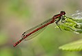
- Nomination Large Red Damselfly. --Quartl 06:04, 8 May 2011 (UTC)
- Promotion Good quality. --Mbdortmund 08:18, 8 May 2011 (UTC)
-

-

- Nomination The Pottenmakersstraat (Potter's street) in Bruges, Belgium -- MJJR 21:10, 7 May 2011 (UTC)
- Promotion Good quality. --Mbdortmund 22:59, 7 May 2011 (UTC)
-

- Nomination Schloss Kastelbell, Tschars --Böhringer 20:52, 7 May 2011 (UTC)
- Promotion Good quality. --Mbdortmund 22:59, 7 May 2011 (UTC)
-

- Nomination Kurhaus 1874 Meran --Böhringer 20:49, 7 May 2011 (UTC)
- Promotion Good quality. --Mbdortmund 23:01, 7 May 2011 (UTC)
-

- Nomination Matteo Thun in Meran --Böhringer 20:44, 7 May 2011 (UTC)
- Promotion Beschreibung könnte besser sein. --Mbdortmund 23:01, 7 May 2011 (UTC)
-

- Nomination Hl Johann Nepomuk in Lana --Böhringer 20:38, 7 May 2011 (UTC)
- Promotion Good quality. --Mbdortmund 23:03, 7 May 2011 (UTC)
-

- Nomination Ilarion Makariopolski Memorial, Sofia. --MrPanyGoff 20:35, 7 May 2011 (UTC)
- Promotion Good quality. --Mbdortmund 23:03, 7 May 2011 (UTC)
-
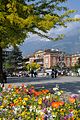
- Nomination Passerpromenade, Meran --Böhringer 20:29, 7 May 2011 (UTC)
- Promotion Good quality. --Mbdortmund 23:04, 7 May 2011 (UTC)
-

-

- Nomination Jerusalem, Church of all nations --Berthold Werner 17:48, 7 May 2011 (UTC)
- Promotion Meets the criteria, imo.--MrPanyGoff 20:20, 7 May 2011 (UTC)
-

- Nomination Strasbourg-Basel railway view --Jeriby 17:43, 7 May 2011 (UTC)
- Decline Great composition and sky, but your camera's technical quality is not very good. It threw on some nasty noise reduction, blurring subtle details. -- King of Hearts 03:37, 8 May 2011 (UTC)
-

-

- Nomination Moscow. Tomer T 16:23, 7 May 2011 (UTC)
- Promotion Good quality. --Mbdortmund 23:22, 7 May 2011 (UTC)
-

- Nomination Kuleli Askeri Lisesi, Istanbul. --Eusebius 15:52, 7 May 2011 (UTC)
- Promotion Meets the criteria, imo.--MrPanyGoff 20:21, 7 May 2011 (UTC)
-

-

- Nomination Calopteryx splendens on my finger. --ComputerHotline 04:24, 6 May 2011 (UTC)
- Promotion Nice :-). --Quartl 06:17, 8 May 2011 (UTC)
-

- Nomination Platycnemis pennipes portrait --ComputerHotline 04:24, 6 May 2011 (UTC)
- Promotion Good closeup, she's a beauty! --Quartl 06:20, 8 May 2011 (UTC)
-

-
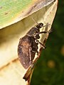
-

-

-

-
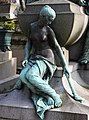
-

- Nomination: Jürgen Vahlberg from euronews --Ralf Roletschek 11:08, 2 May 2011 (UTC)
- Review needed
-

- Nomination: Mandryka at the Salon du Livre in Geneva, 2001. -- Rama 06:42, 2 May 2011 (UTC)
- Review needed
-

- Nomination: Anne Cuneo at the Salon du Livre in Geneva, 2001. -- Rama 06:42, 2 May 2011 (UTC)
- Review needed
-

-
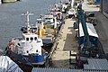
- Nomination: Ships in Stockholm --Ankara 20:49, 1 May 2011 (UTC)
- Review needed
-
- Nomination: The Kochelsee with the houses of Raut (district of Schlehdorf) in Upper Bavaria, Germany.--Schlaier 20:14, 1 May 2011 (UTC)
- Review needed
-
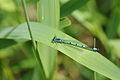
- Nomination: Coenagrion puella --ComputerHotline 16:54, 1 May 2011 (UTC)
- Review Comment Good quality, but the composition looks random, maybe try a tighter crop. --Quartl 17:53, 1 May 2011 (UTC)
-

-

- Nomination: Claude Monet, water lilies (Nymphéas), 1915 – displayed in the Museum "Neue Pinakothek" in Munich. --Schlaier 14:15, 1 May 2011 (UTC)
- Review needed
-

- Nomination: Alfred Sisley, The Road to Hampton Court, 1874, Neue Pinakothek, Munich --Schlaier 14:13, 1 May 2011 (UTC)
- Review needed
-

- Nomination: Botanic Garden Munich in the district Neuhausen-Nymphenburg (main building of the university) --Schlaier 14:11, 1 May 2011 (UTC)
- Review needed
-

- Nomination: The castle "Schloss Possenhofen" at the Lake Starnberg in Bavaria, Germany. --Schlaier 14:07, 1 May 2011 (UTC)
- Review needed
-

- Nomination: The Flaucher (river: Isar) in Munich. --Schlaier 14:01, 1 May 2011 (UTC)
- Review needed
-
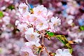
- Nomination: Flowers of Japanese cherry (Prunus serrulata). --Ankara 13:37, 1 May 2011 (UTC)
- Review needed
-

- Nomination: Heavy shower in the distance. View from Estremoz, Portugal, to the west. -- Alvesgaspar 12:58, 1 May 2011 (UTC)
- Review needed
-

- Nomination Weil am Rhein: Three country bridge --Taxiarchos228 12:02, 7 May 2011 (UTC)
- Promotion Good quality --Badener 10:19, 5 May 2011 (UTC)
-

- Nomination Wehranlage Grosshesselohe, Munich, Germany. Different Viewpoint Richard Bartz 14:28, 30 April 2011 (UTC)
- Promotion more than QI --Taxiarchos228 14:06, 7 May 2011 (UTC)
-
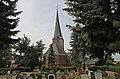
-

- Nomination Villecomtal-sur-Arros city gate --Florent Pécassou 17:34, 29 April 2011 (UTC)
- Decline unsharp, blown out background with curved transitions --Carschten 20:06, 7 May 2011 (UTC)
-

-

-

-
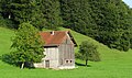
- Nomination Stable close to Schnifis (Vorarlberg, Austria). --Schlaier 09:41, 29 April 2011 (UTC)
- Decline slightly tilted ccw --Mbdortmund 14:40, 29 April 2011 (UTC) Oppose tilted --Carschten 20:06, 7 May 2011 (UTC)
-
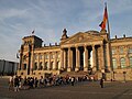
- Nomination Queue in front of the Reichstagsgebäude of the Deutsche Bundestag (parliament of Germany) in Berlin, Germany. --Schlaier 09:38, 29 April 2011 (UTC)
- Decline perspective correction needed --Archaeodontosaurus 07:37, 30 April 2011 (UTC) Oppose no reaction --Carschten 20:06, 7 May 2011 (UTC)
-

- Nomination Men on the slag heap in Łaziska Górne (Ober Laziska), Upper Silesia --Pudelek 10:54, 7 May 2011 (UTC)
- Promotion Good quality. --Mbdortmund 11:12, 7 May 2011 (UTC)
-
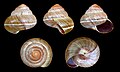
- Nomination Shell of an Indonesian land snail, Asperitas trochus sparsa --Llez 07:41, 7 May 2011 (UTC)
- Promotion Good quality. --Mbdortmund 09:52, 7 May 2011 (UTC)
-
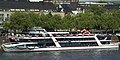
- Nomination RheinFantasie at the day of her Maiden voyage in Cologne. --Rolf H. 04:16, 7 May 2011 (UTC)
- Decline crop to tight --Mbdortmund 09:54, 7 May 2011 (UTC)
-
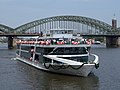
- Nomination RheinFantasie at the day of her Maiden voyage in Cologne. --Rolf H. 04:16, 7 May 2011 (UTC)
- Promotion Good quality. --Mbdortmund 09:51, 7 May 2011 (UTC)
-

- Nomination Bell tower of the monastery of Panormitis, Symi island, Greece.--Jebulon 23:36, 6 May 2011 (UTC)
- Promotion Good!! --Berthold Werner 07:55, 7 May 2011 (UTC)
-

- Nomination The "abolition of privileges", night of 4th August 1789. Bronze relief, Monument "to the Republic", Paris.--Jebulon 22:11, 6 May 2011 (UTC)
- Promotion Good quality. --Mbdortmund 00:03, 7 May 2011 (UTC)
-

- Nomination Masada cableway. Tomer T 21:44, 6 May 2011 (UTC)
- Promotion Good quality. --Mbdortmund 11:42, 7 May 2011 (UTC)
-
- Nomination The profile of a head of a donkey.--Jebulon 21:32, 6 May 2011 (UTC)
- Decline disturbing background --Mbdortmund 11:43, 7 May 2011 (UTC)
-
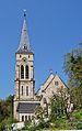
- Nomination Johanneskirche, Horb, Baden-Württemberg. Felix Koenig 19:50, 6 May 2011 (UTC)
- Promotion Good quality. --Taxiarchos228 20:50, 6 May 2011 (UTC)
-

- Nomination Paris. Tomer T 19:11, 6 May 2011 (UTC)
- Promotion not everything is sharp but composition is nice --Mbdortmund 00:09, 7 May 2011 (UTC)
-

- Nomination Perepechino Cemetery near Moscow. A.Savin 18:08, 6 May 2011 (UTC)
- Promotion Great perspective. That's what an ultrawide is for! :-) King of Hearts 19:36, 6 May 2011 (UTC)
-

- Nomination Young male inflorescence of Salix caprea. --Bff 16:08, 6 May 2011 (UTC)
- Promotion Good quality. --Mbdortmund 00:07, 7 May 2011 (UTC)
-

- Nomination Germanz, Freinsheim, Haintor --Berthold Werner 14:53, 6 May 2011 (UTC)
- Promotion schöne Beleuchtung. Das linke Haus und das Auto müßten freilich noch entfernt werden ;) --Ralf Roletschek 15:31, 6 May 2011 (UTC)
Ich hatte wieder mal kein Dynamit zur Hand ;-) --Berthold Werner 07:50, 7 May 2011 (UTC)
-

- Nomination Germany, Frankenthal, Speyer gate --Berthold Werner 13:33, 6 May 2011 (UTC)
- Promotion Good quality. --Mbdortmund 09:56, 7 May 2011 (UTC)
-

- Nomination Kasteel van Breda, Netherlands --Ralf Roletschek 12:57, 6 May 2011 (UTC)
- Promotion Good quality. --Taxiarchos228 13:00, 6 May 2011 (UTC)
-

- Nomination young photomodel at Wikimania 2010 --Ralf Roletschek 12:49, 6 May 2011 (UTC)
- Promotion Good quality. --Taxiarchos228 13:00, 6 May 2011 (UTC)
-

- Nomination Stained glass window in Stirling castle. --Eusebius 11:52, 6 May 2011 (UTC)
- Promotion Good quality. --Taxiarchos228 12:02, 6 May 2011 (UTC)
-
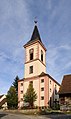
- Nomination Wittlingen: Saint Michael church --Taxiarchos228 09:06, 6 May 2011 (UTC)
- Promotion Good quality. --Mbdortmund 13:15, 6 May 2011 (UTC)
-

- Nomination Ducati 748 Studioaufnahme. --Ritchyblack 07:54, 6 May 2011 (UTC)
- Promotion ?!? Why propose it here when it's already a Featured Picture? Sting 11:22, 6 May 2011 (UTC)
why not? --Taxiarchos228 11:36, 6 May 2011 (UTC)Good quality. --Taxiarchos228 11:36, 6 May 2011 (UTC) Yes why not ? FP is not more than QI, but different...--Jebulon 10:07, 7 May 2011 (UTC)
-
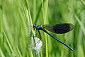
- Nomination Calopteryx splendens --ComputerHotline 04:24, 6 May 2011 (UTC)
- Promotion Good quality. --Mbdortmund 00:05, 7 May 2011 (UTC)
-
- Nomination Platycnemis pennipes is eating an insect. --ComputerHotline 04:24, 6 May 2011 (UTC)
- Promotion Nice. I was just eating my spaghetti while checking this out :) --Ximonic 14:28, 6 May 2011 (UTC)
-

- Nomination Bassin de Flore, Versailles. --Coyau 00:02, 6 May 2011 (UTC)
- Promotion Good quality. --Mbdortmund 00:06, 7 May 2011 (UTC)
-

-

- Nomination Shell of a Golden Apple Snail, Pomacea canaliculata --Llez 15:42, 5 May 2011 (UTC)
- Promotion Good quality. --Mbdortmund 09:58, 7 May 2011 (UTC)
-
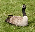
- Nomination Canadian goose, sitting. --King of Hearts 01:04, 5 May 2011 (UTC)
- Promotion Good quality. --Mbdortmund 10:03, 7 May 2011 (UTC)
-

-

- Nomination Detail of a roof in Wen Wu Temple, Taiwan --Bgag 21:40, 4 May 2011 (UTC)
- Promotion Good quality. --Mbdortmund 10:05, 7 May 2011 (UTC)
-

-

-

-

- Nomination Breisach Minster high altar detail (Mary's coronation and God the Father) --Taxiarchos228 07:43, 4 May 2011 (UTC)
- Promotion Good quality. --Mbdortmund 10:02, 7 May 2011 (UTC)
-

- Nomination: 1st of May celebrations in Stockholm --Ankara 11:59, 1 May 2011 (UTC)
- Review needed
-

- Nomination: St-Alphonsus statue in Luxemb. City. --Cayambe 11:14, 1 May 2011 (UTC)
- Review needed
-
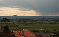
- Nomination: View from the castle of Estremoz, Portugal -- Alvesgaspar 11:11, 1 May 2011 (UTC)
- Review needed
-

- Nomination: Bark of Juglans regia, the Common Walnut --Llez 10:53, 1 May 2011 (UTC)
- Review needed
-

- Nomination: Wilfried Lupano at the Salon du Livre 2011 in Geneva. -- Rama 09:17, 1 May 2011 (UTC)
- Review needed
-

- Nomination: Panorama of Quarry Lakes Regional Recreation Area. --King of Hearts 08:30, 1 May 2011 (UTC)
- Review needed
-

- Nomination: Jean-Louis Grosmaire at the Salon du Livre 2011 in Geneva. -- Rama 07:45, 1 May 2011 (UTC)
- Review needed
-

- Nomination: Derib at the Salon du Livre 2011 in Geneva. -- Rama 05:56, 1 May 2011 (UTC)
- Review needed
-

- Nomination: Campanula erinus in bloom. --Gidip 22:09, 30 April 2011 (UTC)
- Review needed
-

- Nomination: Leopoldia longipes negevensis in fruit. --Gidip 21:58, 30 April 2011 (UTC)
- Review needed
-

- Nomination: Tombstones at the jewish cemetery of Endingen --LuFiLa 20:17, 30 April 2011 (UTC)
- Review needed
-
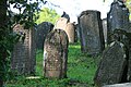
- Nomination: Tombstones at the jewish cemetery of Endingen --LuFiLa 20:17, 30 April 2011 (UTC)
- Review needed
-
- Nomination: A lion as gravestone. Hellenistic period. Rhodes, Greece.--Jebulon 16:36, 30 April 2011 (UTC)
- Review needed
-
- Nomination: stapped gables in the Walstraat in Vlissingen, the Netherlands - Basvb 16:15, 30 April 2011 (UTC)
- Review needed
-

- Nomination: Single Casemate VIII, Den Oever, the Netherlands. - Basvb 16:15, 30 April 2011 (UTC)
- Review needed
-

- Nomination: Fort Saint-Nicolas at Mandraki Harbour, by night, Rhodes, Greece.--Jebulon 16:10, 30 April 2011 (UTC)
- Review needed
-

- Nomination: A lots of TV antennas on a roof. --Vomirencostard 15:38, 30 April 2011 (UTC)
- Review needed
-
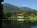
-

- Nomination Paris Metro sign. --Tomer T 11:18, 6 May 2011 (UTC)
- Decline strong CA, poor quality --Taxiarchos228 11:25, 6 May 2011 (UTC)
-

- Nomination The Examiner newspaper building, Launceston, Tasmania. --Tomer T 10:36, 6 May 2011 (UTC)
- Decline too dark, strong distortion --Taxiarchos228 11:25, 6 May 2011 (UTC)
-

- Nomination Tower of the St Johannes church, Münchingen in Southern Germany --Harke 06:43, 6 May 2011 (UTC)
- Promotion Good quality. --Taxiarchos228 06:59, 6 May 2011 (UTC)
-

- Nomination The Old Castle, Münchingen in Southern Germany --Harke 06:41, 6 May 2011 (UTC)
- Promotion Good quality. --Taxiarchos228 06:59, 6 May 2011 (UTC)
-
- Nomination Church St Joseph, Korntal --Harke 06:39, 6 May 2011 (UTC)
- Promotion Good quality. --Taxiarchos228 06:59, 6 May 2011 (UTC)
-

- Nomination Windmill near Gastins, France --Pline 21:26, 5 May 2011 (UTC)
- Promotion Good quality. --Taxiarchos228 08:19, 6 May 2011 (UTC)
-

- Nomination Castle Burg Dinslaken (NRW/GER) --Carschten 20:51, 5 May 2011 (UTC)
- Promotion I like the composition even though there is more green than castle. A QI for me. --Elektroschreiber 20:56, 5 May 2011 (UTC)
-

-

- Nomination Catholic academy Die Wolfburg in Mülheim (NRW/GER) --Carschten 14:28, 5 May 2011 (UTC)
- Promotion in general QI but a good example that totaly straightening gives the impression that the building is tilting over --Taxiarchos228 14:39, 5 May 2011 (UTC)
-
- Nomination The Red Star, Chkalovsky district, Pereslavl.--PereslavlFoto 13:40, 5 May 2011 (UTC)
- Promotion Good quality. --Taxiarchos228 14:39, 5 May 2011 (UTC)
-
- Nomination Berliner Dom and the television tower --Berthold Werner 12:36, 5 May 2011 (UTC)
- Promotion not as sharp but good enough --Taxiarchos228 14:39, 5 May 2011 (UTC)
-

- Nomination View at Eiffel Tower and surrounding --Taxiarchos228 11:47, 5 May 2011 (UTC)
- Promotion Great picture --Schlaier 19:14, 5 May 2011 (UTC)
-

- Nomination Lörrach-Stetten vom Tüllinger hill in winter time --Taxiarchos228 11:47, 5 May 2011 (UTC)
- Promotion Looks washed out but then I realized it's winter. OK. --King of Hearts 19:54, 5 May 2011 (UTC)
-
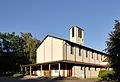
- Nomination Lörrach: Protestant church --Taxiarchos228 11:47, 5 May 2011 (UTC)
- Promotion Einwandfrei. --Berthold Werner 14:33, 5 May 2011 (UTC)
-

- Nomination Weil am Rhein: Three country bridge --Taxiarchos228 11:47, 5 May 2011 (UTC)
- Promotion Great picture! --Schlaier 19:36, 5 May 2011 (UTC)
-

-

- Nomination Vorsäss, Maisäss Schönenbach. Tomer T 05:36, 5 May 2011 (UTC)
- Promotion Some minor CA, but overall great picture. --King of Hearts 19:55, 5 May 2011 (UTC)
-
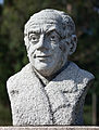
-

- Nomination Manuel Reimóndez Portela, A Estrada, Galicia (Spain)--Lmbuga 23:50, 4 May 2011 (UTC)
- Promotion Good. --King of Hearts 19:56, 5 May 2011 (UTC)
-

-

-

- Nomination Statue of Frederick William IV of Prussia at the "Hohenzollernbrücke" in Cologne, Germany, sculpted by Gustav Blaeser. --Superbass 18:48, 4 May 2011 (UTC)
- Decline ?!? What is that post-processed oval on the chest and nose of the horse ?!? rofl Sting 13:24, 5 May 2011 (UTC)
Honestly: No idea, how I messed that up any more. Anyway, that was a good idea :-( --Superbass 14:27, 5 May 2011 (UTC)
-

- Nomination Benedictine Convent of Saint John --Taxiarchos228 11:19, 3 May 2011 (UTC)
- Promotion Good quality. --Cayambe 18:31, 5 May 2011 (UTC)
-

-
- Nomination: Hydroelectric Power Plant Wasserkraftwerk Kahlenberg in Mülheim an der Ruhr (GER) --Carschten 10:50, 30 April 2011 (UTC)
- Review needed
-

- Nomination: Mercedes-Benz AMG logo --AngMoKio 09:54, 30 April 2011 (UTC)
- Review needed
-

- Nomination: Danilov monastery in Pereslavl, the bell-tower, Easter 2011.--PereslavlFoto 13:10, 29 April 2011 (UTC)
- Review needed
-
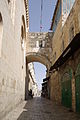
- Nomination Jerusalem, Ecce homo bow --Berthold Werner 13:03, 29 April 2011 (UTC)
- Promotion Good to me.--Jebulon 16:41, 5 May 2011 (UTC)
-

- Nomination: The Musikpavillon on the Schlossplatz in Stuttart in front of the Königsbau. --Schlaier 09:47, 29 April 2011 (UTC)
- Review The background is very dominant. On small size you can hardly see the Musikpavillon. Maybe a crop makes it better, but I'm afraid it doesn't. Mvg, Basvb 15:26, 29 April 2011 (UTC)
I tried to correct the main problems, if you don'tr like the new version, delete it, please --Mbdortmund 20:58, 29 April 2011 (UTC)
-

-
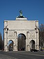
- Nomination Siegestor, Munich --Schlaier 09:28, 29 April 2011 (UTC)
- Promotion IMO acceptable but could be sharper with an other combination as 1/2.000 Sekunden (0,0005), Blende f/4 Such buildings don't move... --Mbdortmund 14:37, 29 April 2011 (UTC) Ja, aber genug gut für QI, meine ich --Jebulon 16:39, 5 May 2011 (UTC)
-

-

-

-
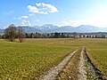
-

- Nomination Benediktbeuern Abbey in Benediktbeuern, Upper Bavaria, Germany. --Schlaier 09:15, 29 April 2011 (UTC)
- Decline Sorry, to much chromatic aberration in the corner left above (trees)--Jebulon 16:32, 5 May 2011 (UTC)
-

-
- Nomination: Toronto: Roy Thomson Hall --Taxiarchos228 07:18, 29 April 2011 (UTC)
- Review perspective correction needed --Archaeodontosaurus 07:29, 30 April 2011 (UTC)
-

- Nomination Edgar Froese from Tangerine Dream --Ralf Roletschek 12:02, 28 April 2011 (UTC)
- Promotion Good quality. Cool picture :) --Schlaier 05:52, 6 May 2011 (UTC)
-

- Nomination Photograph of a Turmeric Flower. -- Sankarshansen 04:52, 28 April 2011 (UTC)
- Decline I like the dramatic lighting, but too much at the top of the flower is out of focus, and the crop is too tight on top. Promising, but not QI IMO. --Avenue 16:19, 5 May 2011 (UTC)
-
- Nomination Myotsuji in Obama, Fukui Pref., Japan --663highland 21:57, 27 April 2011 (UTC)
- Promotion some CAs, but very interesting and good quality --Carschten 12:49, 5 May 2011 (UTC)
-

- Nomination Statue of Liberty, Sevlievo. --MrPanyGoff 21:54, 27 April 2011 (UTC)
- Promotion Please increase the brightness a little more. --Jovianeye 05:26, 5 May 2011 (UTC) Done-Brightness increased.--MrPanyGoff 10:54, 5 May 2011 (UTC) Support figure on the statue still a bit dark, but otherwise very good --Carschten 12:49, 5 May 2011 (UTC)
-

-

- Nomination The building is part of the ensemble Wiedenbrunn, which for the major parts is a cultural heritage monument now. --Herzi Pinki 21:23, 27 April 2011 (UTC)
- Decline underexposed, WB --Carschten 12:49, 5 May 2011 (UTC)
-

-

- Nomination French musician Jean Pacalet --Ralf Roletschek 18:27, 27 April 2011 (UTC)
- Decline noise and motion blur is even ok to me, but posterized vignetting in the corners. Maybe you can corrected it!? --Carschten 12:49, 5 May 2011 (UTC) Die Vignettierung gehört dazu und ist mit dem Abgebildeten abgesprochen, ebenso wie die abgeschwächten Farben. Von mir gibts keine andere Version. --Ralf Roletschek 10:58, 6 May 2011 (UTC)
-
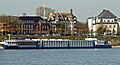
-
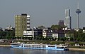
-
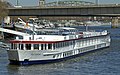
-
-
- Nomination Church spire of the Kamp Abbey church --Carschten 18:40, 23 April 2011 (UTC)
- Decline Tilted ? + the "Uhr" is not circular enough+ not sure with the color balance (blue)... All correctible.--Jebulon 21:50, 29 April 2011 (UTC). Oppose Because of no answer nor improvement... a lot of days after review.--Jebulon 15:58, 5 May 2011 (UTC)
Ja, ich hab zwar noch einiges probiert, richtig besser wurde es aber leider nicht... --Carschten 11:47, 6 May 2011 (UTC)
-
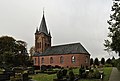
- Nomination: Woquard church, East Frisia --Carschten 18:40, 23 April 2011 (UTC)
- Review The tower isnt straight (need a small perspective correction?)--Ankara 09:45, 24 April 2011 (UTC) Comment Yes, it isn't too straight. I made some tries, but I can't make it better, sorry. --Carschten 08:48, 30 April 2011 (UTC)
I uploaded a new version. Please feel free to restore the original version.--Ankara 09:06, 30 April 2011 (UTC)
Wow, very good, thanks! But have you the distortion correction without a tone changing? Looks a bit too grey imo now... --Carschten 09:12, 30 April 2011 (UTC) It was not my intention to change anything other than perspective. Perhaps I chose by mistake 96 percent quality when I saved from GIMP. Anyway, here is a new version saved in 100% and without any changes other than perspective.--Ankara 09:33, 30 April 2011 (UTC)
-

- Nomination Landscape in Southern Germany --Harke 08:45, 5 May 2011 (UTC)
- Promotion Good quality. --Taxiarchos228 09:37, 5 May 2011 (UTC)
-

- Nomination Church tower St Joseph, Germany --Harke 08:43, 5 May 2011 (UTC)
- Promotion Good quality. --Taxiarchos228 09:37, 5 May 2011 (UTC)
-

- Nomination St Joseph church, Germany --Harke 08:41, 5 May 2011 (UTC)
- Promotion Good quality. --Taxiarchos228 09:37, 5 May 2011 (UTC)
-

- Nomination Tiffany Schneuwly a the Geneva book fair of 2011. -- Rama 08:11, 5 May 2011 (UTC)
- Promotion Good quality. --Ralf Roletschek 11:23, 5 May 2011 (UTC)
-

- Nomination The Great wall of China at Mutianyu, near Beijing. -- --Nicolas M. Perrault 02:02, 5 May 2011 (UTC)
- Promotion Good. --King of Hearts 09:44, 5 May 2011 (UTC)
-

-
- Nomination Virgin in the church of Panxón by Antonio Palacios, Panxón, Nigrán, Galicia (Spain)--Lmbuga 22:53, 4 May 2011 (UTC)
- Promotion Kitsch sculpture IMO, but very good picture --Jebulon 07:42, 5 May 2011 (UTC)
-

- Nomination Interior of the church of Panxón, by Antonio Palacios, Panxón, Nigrán, Galicia (Spain)--Lmbuga 22:53, 4 May 2011 (UTC)
- Promotion Good--Jebulon 08:15, 5 May 2011 (UTC)
-

-
- Nomination The Storming of the Bastille, Bronze relief at the "Monument to the Republic" in Paris.--Jebulon 20:44, 4 May 2011 (UTC)
- Promotion Good quality. --Taxiarchos228 10:45, 5 May 2011 (UTC)
-

- Nomination The Siebenröhrenbrunnen at Heilbronn, Baden-Württemberg. -- Felix Koenig 19:06, 4 May 2011 (UTC)
- Promotion I don"t understand why it was unassessed in november 2010. Good for QI IMO.--Jebulon 20:45, 4 May 2011 (UTC)
-

-

- Nomination Römerberg in Frankfurt am Main, Germany in blue hour -- Der Wolf im Wald 14:14, 4 May 2011 (UTC)
- Promotion Wonderful. I love it :) --Schlaier 15:02, 4 May 2011 (UTC)
-

- Nomination Cross at the head of the Presentation of Jesus church in Pereslavl--PereslavlFoto 13:37, 4 May 2011 (UTC)
- Promotion Good quality. --Schlaier 15:02, 4 May 2011 (UTC)
-

-

-

-

- Nomination Listed building in Dortmund. --Smial 10:59, 4 May 2011 (UTC)
- Promotion Good quality. --Mbdortmund 17:04, 4 May 2011 (UTC)
-
-
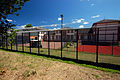
- Nomination "closed area" of the Martin Gropius Hospital, Eberswalde, Germany --Ralf Roletschek 10:31, 4 May 2011 (UTC)
- Promotion Many dust spots. --Smial 11:08, 4 May 2011 (UTC)
right, its corrected. --Ralf Roletschek 11:13, 4 May 2011 (UTC)
Now good. -- Smial 07:18, 5 May 2011 (UTC)
-

- Nomination Michael Ignatieff (photographer: Georges Alexandar/ flickR) --Taxiarchos228 09:04, 4 May 2011 (UTC)
- Decline Not shot by wikimedian. --Jovianeye 12:48, 4 May 2011 (UTC)
-

- Nomination Breisach Minster organ --Taxiarchos228 07:43, 4 May 2011 (UTC)
- Promotion
Very noisy I'm afraid.--Jebulon 09:05, 4 May 2011 (UTC)Not perfect especially above (sharpness), but far much better after denoising, thank you. QI now, IMO.--Jebulon 20:49, 4 May 2011 (UTC)
-

- Nomination Car free living in Münster, Westphalia. --Elektroschreiber 22:12, 3 May 2011 (UTC)
- Promotion Tilted to the left. A.Savin 07:08, 4 May 2011 (UTC)
Done Rotated 1.6° to the right. --Elektroschreiber 14:18, 4 May 2011 (UTC) OK now. - A.Savin 10:47, 5 May 2011 (UTC)
-

- Nomination Old house with the turret in 2006. -- George Chernilevsky 20:20, 3 May 2011 (UTC)
- Promotion please correct perspective on the left --Mbdortmund 20:39, 3 May 2011 (UTC)
Done Fixed -- George Chernilevsky 20:37, 4 May 2011 (UTC)
Good quality now. --Mbdortmund 22:59, 4 May 2011 (UTC)
-
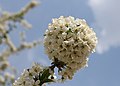
- Nomination Cherry tree blossom -- George Chernilevsky 17:29, 3 May 2011 (UTC)
- Promotion Good quality. --Mbdortmund 23:02, 4 May 2011 (UTC)
-

- Nomination Israel, Banias, Place where a roman pan temple stood --Berthold Werner 11:33, 3 May 2011 (UTC)
- Promotion Good quality. --Cayambe 13:33, 4 May 2011 (UTC)
-

- Nomination Hiking trail in southern California, with Simi Valley in background. --King of Hearts 07:18, 3 May 2011 (UTC)
- Promotion A little soft too for my taste but also good enough for a QI. --Ximonic 13:53, 4 May 2011 (UTC)
-
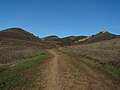
- Nomination Hiking trail in southern California, with mountains. --King of Hearts 07:18, 3 May 2011 (UTC)
- Promotion Quality is a little bit on the soft side but good enough IMO. --Ximonic 13:53, 4 May 2011 (UTC)
-

- Nomination Rümmingen: Protestant Church --Taxiarchos228 14:18, 2 May 2011 (UTC)
- Decline Too much blue sky for me. Also there some lines doubled. Please look at the right windows of the church in the lower half. This can also be seen at the roof tiles at the same height. --Elektroschreiber 20:45, 3 May 2011 (UTC)
too much sky can be easily fixed by crop --Taxiarchos228 06:32, 4 May 2011 (UTC)
But there is still the described scan error from left to right. --Elektroschreiber 20:15, 4 May 2011 (UTC)
-
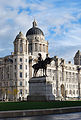
- Nomination Port of Liverpool Building and statue of King Edward VII at the Pier Head, Liverpool, England--France3470 11:30, 2 May 2011 (UTC)
- Promotion A QI for me. It is just a very little bit tilted. --Elektroschreiber 20:32, 3 May 2011 (UTC)
I think that might just be the composition or angle. When I brought it into photoshop and put some guidelines on it all the verticals are perfectly straight.--France3470 10:12, 5 May 2011 (UTC)
-
- Nomination The park of the Georg-von-Vollmar-Akademie on the Aspensteinbichl in Kochel am See, Upper Bavaria, Germany. --Schlaier 13:52, 1 May 2011 (UTC)
- Decline Good composition, but there is strong Chromatic aberration even at thumbnail size. --Jovianeye 14:10, 4 May 2011 (UTC)
-

- Nomination Israel, Church of the Primacy of St. Peter at the Sea of Galilee --Berthold Werner 12:21, 1 May 2011 (UTC). Does the building really become wider upwards, as seen mainly at the right... or is this due to a perspective distortion? Otherwise good. --Cayambe 17:18, 2 May 2011 (UTC)
This was an error, made during perspective correction. Now corrected. --Berthold Werner 17:51, 3 May 2011 (UTC) - Promotion Good now. :-) --Cayambe 20:13, 4 May 2011 (UTC)
- Nomination Israel, Church of the Primacy of St. Peter at the Sea of Galilee --Berthold Werner 12:21, 1 May 2011 (UTC). Does the building really become wider upwards, as seen mainly at the right... or is this due to a perspective distortion? Otherwise good. --Cayambe 17:18, 2 May 2011 (UTC)
-

- Nomination A pond scene with two mallard ducks. --King of Hearts 04:59, 1 May 2011 (UTC)
- Promotion See image note for crop suggestion. Jovianeye 17:10, 2 May 2011 (UTC)
Done. --King of Hearts 17:20, 3 May 2011 (UTC)
Better now. Jovianeye 14:05, 4 May 2011 (UTC)
-

- Nomination The Peres House for Peace. --Tomer T 21:06, 30 April 2011 (UTC) Tilted IMO.--Ankara 22:52, 1 May 2011 (UTC)
- Promotion The right front corner is not tilted at all. The darker parts of the front are a little bit too noisy. But in my opinion this is a QI. I like it. --Elektroschreiber 20:24, 4 May 2011 (UTC)
-
-

-

- Nomination: drain in a former leather tannery in Oisterwijk, the Netherlands - Basvb 11:29, 29 April 2011 (UTC)
- Review needed
-
-

- Nomination: The Neue Schloss at the Schlossplatz in the city centre of Stuttgart with a fountain in the foreground. --Schlaier 09:50, 29 April 2011 (UTC)
- Review needed
-
- Nomination: The Baltic Sea at the Bay of Puck close to Rzucewo in Poland. --Schlaier 09:35, 29 April 2011 (UTC)
- Review needed
-
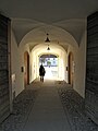
- Nomination: Benediktbeuern Abbey in Benediktbeuern, Upper Bavaria, Germany. --Schlaier 09:14, 29 April 2011 (UTC)
- Review needed
-

- Nomination: 357046 at Upminster station. Mattbuck 09:09, 29 April 2011 (UTC)
- Review needed
-

- Nomination: 158774 arrives at Bingham. Mattbuck 09:09, 29 April 2011 (UTC)
- Review needed
-

- Nomination: The Długa Street in Gdansk, Poland. --Schlaier 08:53, 29 April 2011 (UTC)
- Review needed
-

- Nomination: The Artus Court in the Długa Street in Gdansk, Poland. --Schlaier 08:52, 29 April 2011 (UTC)
- Review needed
-

- Nomination: Herd of cows close to Gargellen in Montafon (Vorarlberg, Austria). --Schlaier 08:50, 29 April 2011 (UTC)
- Review needed
-

- Nomination: Toronto: Eaton Centre --Taxiarchos228 07:18, 29 April 2011 (UTC)
- Review needed
-

- Nomination: Houses in Spas-Klepiki, Russia. A.Savin 06:21, 29 April 2011 (UTC)
- Review needed
-
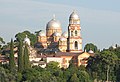
- Nomination: New Athos monastery (Abkhazia) --Art-top 05:51, 29 April 2011 (UTC)
- Review needed
-

- Nomination: The Hubertushüsli in Gargellen with the Schmalzberg in the background (Vorarlberg, Austria)--Schlaier 22:09, 28 April 2011 (UTC)
- Review needed
-

- Nomination: The Blankaart nature reserve and castle in Woumen (West Flanders, Belgium) -- MJJR 21:37, 28 April 2011 (UTC)
- Review needed
-
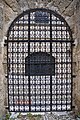
- Nomination: A wrought iron gate, Rhodes, Greece.--Jebulon 20:29, 28 April 2011 (UTC)
- Review needed
-
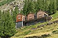
- Nomination: Some apartment building in Saastal --Ximonic 19:31, 28 April 2011 (UTC)
- Review needed
-

- Nomination: Nativity, Lorenzo Costa, c. 1490. -- Rama 17:25, 28 April 2011 (UTC)
- Review imo colours lean to red, compared to other pictures on the net --Mbdortmund 00:47, 29 April 2011 (UTC)
-
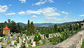
- Nomination: cementery of Smržovka, Czechia --Ralf Roletschek 12:17, 28 April 2011 (UTC)
- Review needed
-

- Nomination: Giant Mountains, Czechia --Ralf Roletschek 12:17, 28 April 2011 (UTC)
- Review needed
-
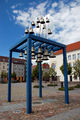
- Nomination: Bells in Pasewalk, Germany --Ralf Roletschek 12:17, 28 April 2011 (UTC)
- Review needed
-
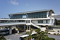
- Nomination Naha-kuko Station in Naha, Okinawa Pref., Japan --663highland 21:57, 27 April 2011 (UTC)
- Promotion QI. --Jovianeye 05:30, 5 May 2011 (UTC)
-
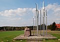
-

- Nomination Park named Niendorfer Gehege in Hamburg, Germany --Cb22hh 15:35, 27 April 2011 (UTC)
- Decline Branch blurred foreground is very disturbing. --Archaeodontosaurus 17:01, 27 April 2011 (UTC)
Also, sky is over-exposed. --Jovianeye 05:08, 5 May 2011 (UTC)
-

- Nomination Toronto Fire Aerial 312 --Taxiarchos228 12:17, 27 April 2011 (UTC)
- Decline Foreground is over-exposed. --Jovianeye 05:08, 5 May 2011 (UTC)
-

-
- Nomination Stockholm Globe Arena seen from Slakthusområdet (The slaughterhouse area). --Ankara 08:16, 23 April 2011 (UTC)
- Promotion Comment interesting and good, but please fix the dust --Carschten 20:07, 29 April 2011 (UTC) Thank you. The problem here is I do not know how I can do to remove the dust without destroying the power line. It is located directly on the power line.--Ankara 21:50, 29 April 2011 (UTC) I think user:Pro2 (thanks!) have removed dust spot now.--Ankara 10:08, 4 May 2011 (UTC) Done I've removed another dust spot from the globe and I also edited the lighting (or the exposure) a little, if you don't mind. Please, revert if you don't like it! :) --Ximonic 14:43, 4 May 2011 (UTC) Thank you very mutch for your help! Best regards--Ankara 09:07, 5 May 2011 (UTC)
-

- Nomination Historical school building, Korntal, Germany --Harke 07:40, 4 May 2011 (UTC)
- Promotion Good quality. --Taxiarchos228 07:43, 4 May 2011 (UTC)
-

- Nomination Emmaus church, Kallenberg, Germany --Harke 07:38, 4 May 2011 (UTC)
- Promotion Good quality. --Taxiarchos228 07:43, 4 May 2011 (UTC)
-
- Nomination St John church in Korntal, Germany --Harke 07:36, 4 May 2011 (UTC)
- Promotion Good quality. --Taxiarchos228 07:43, 4 May 2011 (UTC)
-

- Nomination Portrait of Agnes Milowka, Internationally-renowned underwater cave technical diver, double stunt on Sanctum movie blockbuster, who recently died in similar circumstances --Cm224 11:17, 4 May 2011 (UTC)
- Promotion Good quality. --Taxiarchos228 07:11, 4 May 2011 (UTC)
-
- Nomination Fremont city limits sign. --King of Hearts 06:51, 4 May 2011 (UTC)
- Decline aslope and bad crop --Taxiarchos228 07:04, 4 May 2011 (UTC)
-

- Nomination Ivan Vazov street, Veliko Tarnovo. --MrPanyGoff 06:39, 4 May 2011 (UTC)
- Promotion Good quality. --Taxiarchos228 07:11, 4 May 2011 (UTC)
-

- Nomination Fox Sparrow --Cephas 22:39, 3 May 2011 (UTC)
- Promotion Good quality. --Mbdortmund 03:59, 4 May 2011 (UTC)
-

- Nomination Purple Finch --Cephas 22:39, 3 May 2011 (UTC)
- Promotion Good quality. --Mbdortmund 03:59, 4 May 2011 (UTC)
-

- Nomination Aiguilles de Chamonix highlighted by evening sun, Haute-Savoie, France in 2010 July --Ximonic 22:00, 3 May 2011 (UTC)
- Promotion very good --Taxiarchos228 08:12, 4 May 2011 (UTC)
-

- Nomination Aiguille Verte and les Drus highlighted by evening sun, Haute-Savoie, France in 2010 July --Ximonic 22:00, 3 May 2011 (UTC)
- Promotion very good --Taxiarchos228 08:12, 4 May 2011 (UTC)
-

- Nomination Old house with the turret in 2011. -- George Chernilevsky 20:20, 3 May 2011 (UTC)
- Promotion Good quality. --Mbdortmund 20:39, 3 May 2011 (UTC)
-

- Nomination de:Parsteiner See in Germany, near Angermünde --Ralf Roletschek 19:57, 3 May 2011 (UTC)
- Promotion Nice composition, in spite of the strange stick in the middle - A.Savin 20:17, 3 May 2011 (UTC)
-

- Nomination Easter fire at Göttingen city --ElHeineken 19:49, 3 May 2011 (UTC)
- Promotion The subject itself, the fire, seems to be accurate enough so I feel the picture is worthy of QI status --Ximonic 20:31, 3 May 2011 (UTC)
-

-

- Nomination Atlantic mackerel Scomber scombrus. --Tomer T 17:57, 3 May 2011 (UTC)
- Promotion Technically nearly flawless --ElHeineken 19:46, 3 May 2011 (UTC)
-
- Nomination French Socialist Party meeting. --Tomer T 17:57, 3 May 2011 (UTC)
- Decline Unfortunately below minimum size requirement. --ElHeineken 19:16, 3 May 2011 (UTC)
-

- Nomination Coat of arms Lion on a gate of the Grand Ducal Palace in Luxemb City. --Cayambe 16:45, 3 May 2011 (UTC)
- Promotion Good quality -- George Chernilevsky 17:30, 3 May 2011 (UTC)
-

- Nomination High scool in Korntal in Southern Germany --Harke 10:38, 3 May 2011 (UTC)
- Decline I find the composition unclear. --Elektroschreiber 22:30, 3 May 2011 (UTC)
-
- Nomination Spring landscape in Southern Germany --Harke 10:36, 3 May 2011 (UTC)
- Promotion A QI for me. Good composition. I like the image. --Elektroschreiber 22:30, 3 May 2011 (UTC)
-

- Nomination Saint Peters Church in Lörrach --Taxiarchos228 10:04, 3 May 2011 (UTC)
- Promotion Nicely framed, good quality. --ElHeineken 19:46, 3 May 2011 (UTC)
-

- Nomination Auditorio de Tenerife --Taxiarchos228 09:00, 3 May 2011 (UTC)
- Promotion Good quality and impressiv building --Badener 14:12, 3 May 2011 (UTC)
-
- Nomination Hiking trail in southern California, with oak tree. --King of Hearts 07:18, 3 May 2011 (UTC)
- Promotion Very nice composition. --Elektroschreiber 22:22, 3 May 2011 (UTC)
-

- Nomination Diagram depicting formation of cross-links in the bacterial cell wall by a penicillin binding protein (PBP, an enzyme) and subsequent suicide inhibition by penicillin. --Mcstrother 04:17, 3 May 2011 (UTC)
- Promotion Good diagram. --King of Hearts 17:37, 3 May 2011 (UTC)
-

-

-
-

-

- Nomination Flower of a Crown Daisy -- Alvesgaspar 18:44, 2 May 2011 (UTC)
- Promotion Good quality. --Cayambe 15:34, 3 May 2011 (UTC)
-

- Nomination Coreus marginatus (prepare to fly) --Holleday 18:21, 2 May 2011 (UTC)
- Promotion Good quality. --Elektroschreiber 16:47, 3 May 2011 (UTC)
-

-

-
- Nomination The churchtower of St. Nikolaus in Bludesch (Vorarlberg, Austria). --Schlaier 16:54, 2 May 2011 (UTC)
- Promotion Habe es gerade selber ausprobiert: Beschnitt unten (ober dem störenden Verkehrszeichen) und am linken Bildrand würde dem Bild meiner Ansicht nach gut tun - dann gibt's von mir ein OK --Haneburger 06:11, 3 May 2011 (UTC) --- Vielen Dank für den Hinweis. Ich hab es gleich umgesetzt und hochgeladen, jetzt gefällt es mir besser. Wie findest Du es? Herzliche Grüße --Schlaier 11:29, 3 May 2011 (UTC) So passt es gut, Danke.--Haneburger 14:02, 3 May 2011 (UTC)
-
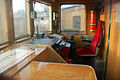
- Nomination Inside of a EN57-1776, Poland --Ralf Roletschek 11:23, 2 May 2011 (UTC)
- Promotion I like this very much. A QI for me. --Elektroschreiber 20:32, 3 May 2011 (UTC)
-

- Nomination National Theatre in Belgrade, Serbia --Михајло Анђелковић 06:03, 2 May 2011 (UTC)
- Promotion Good, and lucky point of view.--Jebulon 08:39, 4 May 2011 (UTC)
-
-

- Nomination My favorite Nikon FM--Ankara 13:07, 1 May 2011 (UTC)
- Decline Not good enough for a studio shot. Look here for some examples: User:Berthold Werner/Photographische Geraete --Berthold Werner 18:01, 3 May 2011 (UTC)
-
- Nomination Detail of church and roof. Estremoz, Portugal -- Alvesgaspar 11:11, 1 May 2011 (UTC)
- Promotion Good. QI and FP to me.--Jebulon 08:34, 4 May 2011 (UTC)
-

-

-

-

-

- Nomination Weil am Rhein: Tree Country Bridge --Taxiarchos228 07:18, 29 April 2011 (UTC)
- Promotion Well done. A.Savin 15:53, 3 May 2011 (UTC)
-

- Nomination: Caesarion waving sistrums before Queen Isis. Roman era, mid-1st century BCE. -- Rama 10:09, 28 April 2011 (UTC)
- Review needed
-

- Nomination: Nijojo-ninomaru-garden in Kyoto, Japan --663highland 21:57, 27 April 2011 (UTC)
- Review needed
-

- Nomination The protestant church in Berndorf, Lower Austria --Herzi Pinki 21:23, 27 April 2011 (UTC)
- Promotion Good quality. --Taxiarchos228 06:34, 4 May 2011 (UTC)
-

- Nomination: Bronze relief "Strandgut" (stranded goods) --Herzi Pinki 21:23, 27 April 2011 (UTC)
- Review needed
-

-

- Nomination: Higashi-Obama Station in Obama, Fukui Pref., Japan --663highland 14:45, 27 April 2011 (UTC)
- Review Need to correct the perspective --Archaeodontosaurus 17:04, 27 April 2011 (UTC)
-

- Nomination: Kusatsujuku town in Kusatsu, Shiga Pref., Japan --663highland 14:45, 27 April 2011 (UTC)
- Review needed
-

- Nomination: Asahi-machi town view, Naha, Okinawa Pref., Japan --663highland 14:45, 27 April 2011 (UTC)
- Review needed
-

- Nomination: Black Tower (Černá věž) by night, České Budějovice (Budweis) --Pudelek 14:03, 27 April 2011 (UTC)
- Review needed
-

-
-

- Nomination: Pont Valentré, Cahors, France --France64160 21:01, 26 April 2011 (UTC)
- Review Necessity to correct the perspective --Archaeodontosaurus 17:26, 27 April 2011 (UTC)
-

-
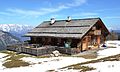
- Nomination Alpine hut "Saukaralm" in Austria. --High Contrast 21:19, 25 April 2011 (UTC)
- Decline Very sorry, great composition, but blown-out snow. --King of Hearts 07:03, 4 May 2011 (UTC)
-

- Nomination Thomas-Bernhardweg near Zell am See, Austria --Chmee2 19:47, 24 April 2011 (UTC)
- Promotion Comment could you name the mountains, please? --Herzi Pinki 21:49, 24 April 2011 (UTC) CommentI will be glad to give there names, however it's difficult to me find right names of all hills because my German is not well. However I found that one of these mountains range is called "Drei Brüder". With the rest I have problem (but GPS and direction of view is given, so anyone can add it :) --Chmee2 08:27, 25 April 2011 (UTC) Good quality. --Schlaier 16:51, 2 May 2011 (UTC) I add one summit by using this as a ref - Schwarzkopf (2,764 m) --Ximonic 20:03, 3 May 2011 (UTC)
-

- Nomination Students home in Korntal in Southern Germany --Harke 10:40, 3 May 2011 (UTC)
- Promotion Good quality. --Taxiarchos228 11:08, 3 May 2011 (UTC)
-
- Nomination Portrait of Agnes Milowka, underwater cave diver, stunt on Sanctum movie blockbuster, who recently died in similar circumstances --Cm224 11:17, 3 May 2011 (UTC)
- Decline nice but below 1 MP resolution --Taxiarchos228 07:07, 3 May 2011 (UTC)
-

- Nomination Side view of a black-headed gull. --Grand-Duc 06:17, 3 May 2011 (UTC)
- Promotion Good quality. --Taxiarchos228 07:07, 3 May 2011 (UTC)
-

-

-

- Nomination Cultivated Marguerite -- Alvesgaspar 18:44, 2 May 2011 (UTC)
- Promotion Please remove the little stain (marked) --Mbdortmund 22:08, 2 May 2011 (UTC)
-

- Nomination The church St. Johannisrain in St. Johannisrain close to Penzberg, Upper Bavaria, Germany. --Schlaier 17:08, 2 May 2011 (UTC)
- Promotion QI for me--Haneburger 06:11, 3 May 2011 (UTC)
-

- Nomination Drummer Henrik Ohlsson of Scar Symmetry. --V-wolf 17:03, 2 May 2011 (UTC)
- Decline Red-eye effect. I don't like the lightning. --Elektroschreiber 20:10, 2 May 2011 (UTC)
-

- Nomination Oktoberfest in September 2009: Bierzelt (Beertent) of the Löwenbräu Brewery. --Schlaier 15:33, 2 May 2011 (UTC)
- Promotion so richtig typisch, fehlt nur noch die Kellnerin mit 10 Maß... --Ralf Roletschek 17:03, 2 May 2011 (UTC)
-
- Nomination Alma (New Brunswick), Canada --Taxiarchos228 14:18, 2 May 2011 (UTC)
- Promotion tolle Farben & Stimmung --Ralf Roletschek 17:03, 2 May 2011 (UTC)
-

- Nomination Lörrach: City Hall, view from southeast --Taxiarchos228 14:18, 2 May 2011 (UTC)
- Promotion Good quality. --Cayambe 20:25, 2 May 2011 (UTC)
-

- Nomination Lörrach: prison --Taxiarchos228 14:18, 2 May 2011 (UTC)
- Promotion QI, in spite of the (unavoidable, IMO) shadow.--Jebulon 16:53, 2 May 2011 (UTC)
-

- Nomination Rümmingen: Protestant Church, bell tower --Taxiarchos228 14:18, 2 May 2011 (UTC)
- Decline Very bright white/pink part of the building doesn't work with ver dark left side of the tower. Mvg, Basvb 16:11, 2 May 2011 (UTC)
-

- Nomination Paris: bell tower of Sacré-Cœur de Montmartre --Taxiarchos228 14:18, 2 May 2011 (UTC)
- Decline The top of this cream-cake seems to be unsharp--Jebulon 16:52, 2 May 2011 (UTC)
-

-

- Nomination Plaster work on the side of a building in Modena, Italy.
- Promotion Good quality. --Mbdortmund 22:10, 2 May 2011 (UTC)
-
- Nomination Altenbeken Viaduct --KlausFoehl 13:00, 2 May 2011 (UTC)
- Promotion some artifacts, but overall very good and QI --Carschten 14:25, 2 May 2011 (UTC)
-
- Nomination Train SA136 in Stettin Main Staition, Poland --Ralf Roletschek 11:23, 2 May 2011 (UTC)
- Promotion It's tilted. Easy to fix. --Richard Bartz 12:28, 2 May 2011 (UTC)
support, good quality --Taxiarchos228 14:29, 2 May 2011 (UTC) Changed to promotion Richard Bartz 07:38, 3 May 2011 (UTC)
-

- Nomination Mumified male head. The face is partially covered with gold or electrum. -- Rama 11:19, 2 May 2011 (UTC)
- Promotion Good quality. --Richard Bartz 12:30, 2 May 2011 (UTC)
-

-

- Nomination The Elisabeth Church at Schneeberg in Lower Austria. --Hendric Stattmann 10:32, 2 May 2011 (UTC)
- Promotion Good quality. --Schlaier 17:24, 2 May 2011 (UTC)
-

- Nomination An Alpine Ibex (Capra ibex) in Gornergrat, Wallis, Switzerland --Ximonic 03:39, 2 May 2011 (UTC)
- Promotion Very good. --Richard Bartz 12:28, 2 May 2011 (UTC)
-

- Nomination Dark-eyed Junco, female --Cephas 00:47, 2 May 2011 (UTC)
- Promotion VERY GOOD! --Richard Bartz 12:30, 2 May 2011 (UTC)
-

- Nomination Dark-eyed Junco, male --Cephas 00:47, 2 May 2011 (UTC)
- Promotion Very good. --Richard Bartz 12:30, 2 May 2011 (UTC)
-
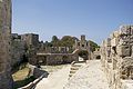
- Nomination The "Saint-Paul Gate", old city of Rhodes, Greece--Jebulon 16:22, 1 May 2011 (UTC)
- Promotion There are some thin red/green chromatic aberration stripes by some vertical edges on the left side. I would appreciate if they were hidden. O'h well, I still think it is a QI already. --Ximonic 23:47, 2 May 2011 (UTC)
-

- Nomination A windmill on the harbour of Rhodes, Greece.--Jebulon 16:02, 1 May 2011 (UTC)
- Promotion Good quality. --Schlaier 16:17, 1 May 2011 (UTC) Thank you ! In FPC it is a very bad picture...--Jebulon 09:58, 2 May 2011 (UTC) Oh dear, I cannot believe what I read on FPC. I just love this picture and think you did a great job! All the best --Schlaier 12:17, 2 May 2011 (UTC)
-
- Nomination Theatinerkirche, Munich, inside (cupola) --Schlaier 14:20, 1 May 2011 (UTC)
- Promotion Some correctible magenta CA near the windows and the statues. Info French caption added. Now used in french WP. --Jebulon 16:31, 1 May 2011 (UTC) --- You are right. Unfortunately I don't have a tool to correct it :( Thanks for the french caption and adding it to french WP :) --Schlaier 19:42, 1 May 2011 (UTC)
- Lens deformations, CA and tilt corrected - Supporting the current corrected version. Sting 15:21, 2 May 2011 (UTC)Yes, very good now !--Jebulon 16:09, 2 May 2011 (UTC)
-

-

- Nomination Building in the old part of Munich at the St. Jakobsplatz. --Schlaier 13:41, 1 May 2011 (UTC)
- Promotion Ok. --Berthold Werner 13:14, 2 May 2011 (UTC)
-
- Nomination View of Hornisgrinde plateau with transmission tower in the background. -- Felix Koenig 13:16, 1 May 2011 (UTC)
- Promotion Good quality and nice --Taxiarchos228 11:20, 3 May 2011 (UTC)
-

-

- Nomination View from the top of Almirante Brown Antarctic Base, Paradise Bay, Antarctica.--France3470 01:06, 1 May 2011 (UTC)
- Promotion The sky has The sky has strange Colour?--Ankara 22:49, 1 May 2011 (UTC)
Uploaded a new version now. Is this an improvement? --France3470 00:42, 2 May 2011 (UTC)Better now IMO.--Ankara 10:09, 3 May 2011 (UTC)
-

-

-

-

-

-

-

-

- Nomination Danilov monastery in Pereslavl, church of Praise of Virgin Mary (XVII century).--PereslavlFoto 14:38, 28 April 2011 (UTC)
- Promotion Good --Jebulon 16:00, 2 May 2011 (UTC)
-

-
-

- Nomination Order For Merit (Romania, 1933 y.), Badge of the 1st Class, Army Museum Žižkov --Pudelek 14:03, 27 April 2011 (UTC)
- Promotion The left side of the ribbon is overexposed --Archaeodontosaurus 17:09, 27 April 2011 (UTC) Agree, a bit. But encyclopaedically useful and technically QI nevertheless IMO--Jebulon 15:54, 2 May 2011 (UTC)
-

- Nomination: Performing beluga whale with the trainer --Art-top 10:43, 27 April 2011 (UTC)
- Review needed
-

- Nomination: Open top bus passing the Winter Gardens, Weston-super-Mare --Geof Sheppard 07:23, 27 April 2011 (UTC)
- Review needed
-

- Nomination Lörrach: Protestant church --Taxiarchos228 07:14, 27 April 2011 (UTC)
- Promotion Good. Basvb 16:53, 2 May 2011 (UTC)
-

- Nomination: Ferry at Saguenay River nearby Tadoussac --Taxiarchos228 07:14, 27 April 2011 (UTC)
- Review needed
-

- Nomination The village of São Martinho do Porto, Portugal -- Alvesgaspar 00:27, 27 April 2011 (UTC)
- Promotion There are four dustspots in the lower sky at right. :-) Otherwise good. --Cayambe 03:15, 28 April 2011 (UTC) -- Fixed (they were hard to find though!) -- Alvesgaspar 20:42, 1 May 2011 (UTC) Good, QI --Jebulon 15:51, 2 May 2011 (UTC)
-

- Nomination: Häckler Weiher, South West Germany. -- R-bitzer 00:44, 27 April 2011 (UTC)
why do you stitched a panorama and reduced the resolution to 2 MP? --Taxiarchos228 09:45, 27 April 2011 (UTC) Comment Decided for use it as overview photo in the article -- R-bitzer 11:40, 27 April 2011 (UTC)} - Review needed
- Nomination: Häckler Weiher, South West Germany. -- R-bitzer 00:44, 27 April 2011 (UTC)
-

- Nomination: Orminge centre. --Ankara 22:07, 26 April 2011 (UTC)
- Review needed
-

- Nomination: Captieux church, France --France64160 21:01, 26 April 2011 (UTC)
- Review needed
-

- Nomination: Pont Valentré, Cahors, France --France64160 21:01, 26 April 2011 (UTC)
- Review Tilted--Ankara 21:04, 26 April 2011 (UTC)
-

- Nomination: Pont Valentré, Cahors, France --France64160 21:01, 26 April 2011 (UTC)
- Review needed
-
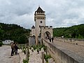
- Nomination: Pont Valentré, Cahors, France --France64160 21:01, 26 April 2011 (UTC)
- Review Tilted.--Ankara 21:06, 26 April 2011 (UTC)
-

- Nomination: Papilio cresphontes --ComputerHotline 18:29, 26 April 2011 (UTC)
- Review needed
-

- Nomination: Danaus plexippus --ComputerHotline 18:29, 26 April 2011 (UTC)
- Review needed
-

- Nomination: The East Beach in Yubu Island, Okinawa, Japan --663highland 14:15, 26 April 2011 (UTC)
- Review needed
-

- Nomination Kabira Bay in Ishigaki Island, Okinawa, Japan --663highland 14:15, 26 April 2011 (UTC)
- Promotion Good quality. --Cayambe 15:56, 2 May 2011 (UTC)
-

- Nomination: Todai-ji in Nara, Japan--663highland 14:15, 26 April 2011 (UTC)
- Review needed
-

- Nomination: Frankfurt/O, b/w analog Photo 2006 --Ralf Roletschek 13:27, 26 April 2011 (UTC)
- Review needed
-

- Nomination Lörrach: lake Grütt at winter time --Taxiarchos228 07:04, 26 April 2011 (UTC)
- Promotion Good quality. Please add geotag. --Cayambe 15:59, 2 May 2011 (UTC)
done --Taxiarchos228 08:25, 3 May 2011 (UTC)
-

- Nomination Abies sp. pollen cones, Marki, Poland. --Crusier 10:09, 25 April 2011 (UTC)
- Promotion Support ...and I kind of like this one too. The 'subject' is sharp enough. --Ximonic 01:11, 30 April 2011 (UTC) Needs tighter cropping around the sharp subject. --Gidip 14:56, 1 May 2011 (UTC) Done Now? --Crusier 18:25, 1 May 2011 (UTC) OK --Gidip 13:00, 2 May 2011 (UTC)
-

- Nomination Lesser periwinkle (Vinca minor). -- George Chernilevsky 20:06, 24 April 2011 (UTC)
- Promotion Quality is ok, but the image looks tilted to the right by 3-4 degrees. It would also benefit by a tighter crop to the left. See alternative in history. --Quartl 09:43, 1 May 2011 (UTC) Accepted. --Quartl 08:09, 3 May 2011 (UTC)
-

- Nomination School Buses in Canada --Taxiarchos228 10:58, 23 April 2011 (UTC)
- Promotion Comment ccw tilted --Carschten 20:07, 29 April 2011 (UTC)
this picture is not tilted --Taxiarchos228 13:59, 2 May 2011 (UTC)If I'm not wrong, we have an horizontal line behind the trees left: no tilt then. QI furthermore--Jebulon 15:41, 2 May 2011 (UTC)
-

- Nomination Jerusalem, Ziongate, Fieldside --Berthold Werner 12:13, 21 April 2011 (UTC)
- Decline blurry, a lot of chromatic aberrations, bad comp. (cutted off at top, right, bottom), a bit too grey imo --Carschten 18:22, 29 April 2011 (UTC) + dust spot and stitching error (please see notes)--Jebulon 13:34, 1 May 2011 (UTC)
Tried to correct stiching error, dustspot and ca --Berthold Werner 17:47, 2 May 2011 (UTC)
-

- Nomination Samsung i5800 --Crusier 11:18, 2 May 2011 (UTC)
- Decline Unsharp and bad lightning. --Berthold Werner 11:34, 2 May 2011 (UTC)
-
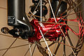
- Nomination Bicycle hub with reverse Spokes --Ralf Roletschek 11:04, 2 May 2011 (UTC)
- Promotion Good quality. A.Savin 11:31, 2 May 2011 (UTC)
-

- Nomination Bicycle hub with reverse Spokes --Ralf Roletschek 11:04, 2 May 2011 (UTC)
- Promotion Very good, and an interesting motive. A.Savin 11:31, 2 May 2011 (UTC)
-

-

-
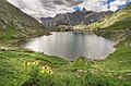
- Nomination Lac du Great St Bernard Pass, Valais, Switzerland --Ximonic 03:39, 2 May 2011 (UTC)
- Promotion Good picture, QI for me.--Haneburger 06:59, 2 May 2011 (UTC)
-

- Nomination A rainy day in Lötschental (valley), Wallis, Switzerland --Ximonic 22:22, 1 May 2011 (UTC)
- Promotion Nice picture, Geocoding would be nice --Haneburger 07:02, 2 May 2011 (UTC) Done Geocode added after searching for the right spot. --Ximonic 07:34, 2 May 2011 (UTC) Thanks!--Haneburger 08:54, 2 May 2011 (UTC)
-
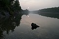
-
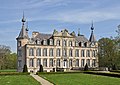
-

- Nomination Saint John the Baptist church in Houthulst, West Flanders, Belgium -- MJJR 21:12, 1 May 2011 (UTC)
- Promotion Good quality, nice picture --Taxiarchos228 07:09, 2 May 2011 (UTC)
-

-
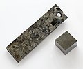
- Nomination Yttrium --Alchemist-hp 20:42, 1 May 2011 (UTC)
- Promotion Good quality --Ximonic 22:50, 1 May 2011 (UTC)
-

- Nomination Tegenaria atrica (female/feeding)--Holleday 19:31, 1 May 2011 (UTC)
- Withdrawn Crop is too tight-> Cut-off legs. --AngMoKio 10:52, 2 May 2011 (UTC)
-

-

- Nomination Libellula quadrimaculata --ComputerHotline 16:54, 1 May 2011 (UTC)
- Decline Nice capture, but the subject is partially obscured. --Quartl 17:48, 1 May 2011 (UTC)
-

- Nomination Libellula quadrimaculata --ComputerHotline 16:54, 1 May 2011 (UTC)
- Decline Low dof (head, not wings), also partially obscured. --Quartl 17:48, 1 May 2011 (UTC)
-

- Nomination Shell of a Chocolate Cowry, Mauritia mauritiana --Llez 15:41, 1 May 2011 (UTC)
- Withdrawn Comment To me it looks like that the shell on top right corner is somewhat unsharp, isn't it? --Ximonic 23:00, 1 May 2011 (UTC) Comment I admit, that some teeth of the left row are not completely sharp. Maybe one of the reasons: The shell has a very glossy surface which produces a lot of reflections under normal conditions. To avoid this, the photo was taken under very dark conditions (8 sec exposure time with f/4,5!). So I have restricted the reflectoions, but perhaps on the cost of sharpness in some parts --Llez 10:17, 2 May 2011 (UTC)
-

-

-

-

-
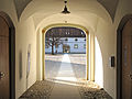
-
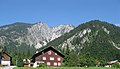
- Nomination Houses of the village Sankt Anton in Montafon (Vorarlberg, Austria) --Schlaier 13:42, 1 May 2011 (UTC)
- Promotion Good quality. --Ralf Roletschek 10:34, 2 May 2011 (UTC)
-

-

- Nomination The ruines of the castle of Kastelos, 14th century, island of Rhodes, Greece.--Jebulon 13:06, 1 May 2011 (UTC)
- Promotion crop at the bottom a bit tight, but good view, light and quality. -- Felix Koenig 13:16, 1 May 2011 (UTC) Thank you. Agree about bottom crop, but it was an unfortunate roof of a car in foreground :) ...--Jebulon 13:25, 1 May 2011 (UTC)
-

-

- Nomination "Chagas" church and convent. Vila Viçosa, Portugal. Alvesgaspar 11:11, 1 May 2011 (UTC)
- Promotion Good quality. --Schlaier 15:41, 1 May 2011 (UTC)
-

-

-

- Nomination Wacom Intuos4 Pen Tablet --Jovianeye 03:10, 1 May 2011 (UTC)
- Promotion A bit dark, please lighten. -- King of Hearts 08:37, 1 May 2011 (UTC)
Increased brightness by 15. --Jovianeye 13:30, 1 May 2011 (UTC)
Still not too interesting, but I guess that's the tablet's fault, not yours. --King of Hearts 07:42, 2 May 2011 (UTC)
-

-

-

-

-
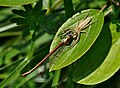
-

-

- Nomination Southern part of Haslital and Räterichsbodensee (lake), Bern, Switzerland --Ximonic 14:06, 30 April 2011 (UTC)
- WARNING: third template parameter added – please remove.
-
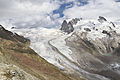
- Nomination Upper part of Gornergletscher (glacier), Wallis, Switzerland --Ximonic 14:06, 30 April 2011 (UTC)
- WARNING: third template parameter added – please remove.
-

-

- Nomination Germany, Trier, St. George well --Berthold Werner 08:26, 28 April 2011 (UTC)
- Promotion Good. French translation added --Jebulon 14:00, 1 May 2011 (UTC)
-
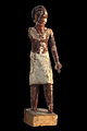
-

- Nomination The bust of Arthur Krupp in Berndorf, Lower Austria. It is located in the Theaterpark and is classified as cultural heritage monument.Work of Fritz Klimsch. --Herzi Pinki 21:23, 27 April 2011 (UTC)
- Promotion Good and sharp, but there is a strong magenta CA.--Jebulon 21:24, 27 April 2011 (UTC) Comment Tried to correct the CA, uploaded a hopefully better version --Herzi Pinki 17:46, 28 April 2011 (UTC) Better around the head (acceptable for QI), but you forgot the pedestal...--Jebulon 13:44, 1 May 2011 (UTC) Comment hi Jebulon, last try, hope it's good enough now (but I'm learning a lot) --Herzi Pinki 15:10, 1 May 2011 (UTC) Yes it is !--Jebulon 21:15, 1 May 2011 (UTC)
-

- Nomination Australian Pelican at Weltvogelpark. -- Fiorellino 23:39, 27 April 2011 (UTC)
- Decline Nice perspective but the head & back are over-exposed. --Jovianeye 21:50, 1 May 2011 (UTC)
-

- Nomination: Bas-relief dedicated to Manenos, the rider-god -- Rama 11:37, 26 April 2011 (UTC)
- Review needed
-

- Nomination: Tripple machine gun casemate X, Den Oever, the Netherland - Basvb 11:12, 26 April 2011 (UTC)
- Review needed
-
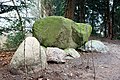
- Nomination: Fake Dolmen near Jagtlust, 's Graveland, the Netherlands - Basvb 09:22, 26 April 2011 (UTC)
- Review needed
-

- Nomination: Jewish wooden grave at the Jewish cemetary at the Amersfoortsestraatweg, Bussum, the Netherlands - Basvb 09:22, 26 April 2011 (UTC)
- Review needed
-
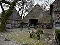
- Nomination: Farm in Oud-Aalden, the Netherlands - Basvb 09:22, 26 April 2011 (UTC)
- Review needed
-

- Nomination: Lörrach: police department --Taxiarchos228 07:04, 26 April 2011 (UTC)
- Review needed
-

- Nomination: Lüneburg: chapel at Saint Johannis church --Taxiarchos228 07:04, 26 April 2011 (UTC)
- Review needed
-

- Nomination Lörrach: Housing Area "Stadion" --Taxiarchos228 07:04, 26 April 2011 (UTC)
- Promotion I like the composition very much! QI --Schlaier 15:32, 1 May 2011 (UTC)
-

- Nomination: Lörrach: Baptist church --Taxiarchos228 07:04, 26 April 2011 (UTC)
- Review needed
-

- Nomination: River cruise ship Scenic Emerald in cologne. --Rolf H. 19:35, 25 April 2011 (UTC)
- Review needed
-
- Nomination: River cruise ship Scenic Sapphire in cologne. --Rolf H. 19:35, 25 April 2011 (UTC)
- Review needed
-

- Nomination: Liriodendron - Tulip tree --Vitold Muratov 19:40, 25 April 2011 (UTC)
- Review needed
-
- Nomination Västra Orminge --Ankara 11:01, 25 April 2011 (UTC)
- Promotion CommentSee image note. Jovianeye 21:55, 1 May 2011 (UTC) Why not? Actually I made a crop even on the left side. The grass in the foreground is important, it is part of the area's architecture. But what is left should be enough. Thanks for your input, I think the picture turned out better now.--Ankara 22:16, 1 May 2011 (UTC)
Better now! Jovianeye 00:33, 2 May 2011 (UTC)
-

-

- Nomination Young leaves of Sambucus racemosa. --Bff 16:23, 23 April 2011 (UTC)
- Decline Very tight crop left above. The second leaf from the right in the bottem has a weird whit dot below it (mold?). Some parts of the main subject seem to be unsharp (centre of the leaves and tips). Mvg, Basvb 16:23, 1 May 2011 (UTC)
-

- Nomination Philippe Bercovici at the Salon du Livre 2011 in Geneva. -- Rama 06:23, 1 May 2011 (UTC)
- Promotion Good quality. --Mbdortmund 09:35, 1 May 2011 (UTC)
-

-

-

-

-

-
-
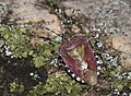
-

-

-

-

-

-

-

- Nomination Grimselsee (lake), Bern, Switzerland --Ximonic 14:06, 30 April 2011 (UTC)
- Promotion Good quality. --Mbdortmund 15:25, 30 April 2011 (UTC)
-

- Nomination Weil am Rhein: Tree country bridge --Taxiarchos228 13:49, 30 April 2011 (UTC)
- Promotion interesting --Mbdortmund 15:28, 30 April 2011 (UTC)
-

- Nomination Wehranlage Grosshesselohe.Munich, Germany Richard Bartz 13:22, 30 April 2011 (UTC)
- Promotion Great shot!. --AngMoKio 13:28, 30 April 2011 (UTC) Comment Bitte noch schnell den Sensorfleck eliminieren! --Carschten 13:37, 30 April 2011 (UTC) Erledigt Richard Bartz 14:21, 30 April 2011 (UTC)
-
- Nomination Rhizoma Curcumae javanicae. --Bartiebert 12:08, 30 April 2011 (UTC)
- Decline Die Schärfentiefe ist viel zu klein. Nimm mal eine Blende um f/20 oder noch mehr. Alternativ kannst du natürlich auch Focus stacking probieren, ist nur wesentlich aufwendiger. Außerdem solltest du auf den Weißabgleich achten, der Untergrund wirkt nicht mehr richtig weiß. Den ISO-Wert auch möglichst auf 100 halten, und zusammen mit einem Stativ bekommst du das sicher besser hin! --Carschten 13:32, 30 April 2011 (UTC)
-
- Nomination Mercedes-Benz; CLK DTM --AngMoKio 09:59, 30 April 2011 (UTC)
- Promotion Good quality. --Mbdortmund 15:32, 30 April 2011 (UTC)
-

- Nomination Mercedes-Benz; CLK DTM --AngMoKio 09:59, 30 April 2011 (UTC)
- Decline crop on the top + bachground --Mbdortmund 15:31, 30 April 2011 (UTC)
-

- Nomination Mercedes-Benz star --AngMoKio 09:59, 30 April 2011 (UTC)
- Promotion Good quality. --Mbdortmund 15:31, 30 April 2011 (UTC)
-
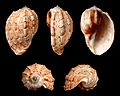
-

- Nomination Supporters of the Wedding of Prince William of Wales and Kate Middleton --Schlaier 22:00, 29 April 2011 (UTC)
- Decline Seasonal and so british ! I like the focus on the face of the lady.--Jebulon 22:57, 29 April 2011 (UTC)
QIs must be the work of a Wikimedian, sorry! --King of Hearts 11:06, 30 April 2011 (UTC) you are right, sorry.--Jebulon 15:13, 30 April 2011 (UTC)
-

- Nomination Heraclides androgeus. --ComputerHotline 18:01, 29 April 2011 (UTC)
- Promotion For me a QI --Holleday 18:27, 30 April 2011 (UTC)
-
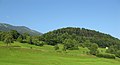
-

-

-

- Nomination Papilio memnon --ComputerHotline 18:29, 26 April 2011 (UTC)
- Promotion For me a QI --Holleday 18:52, 30 April 2011 (UTC)
-

-

- Nomination Abies sp. pollen cones, Marki, Poland. --Crusier 10:09, 25 April 2011 (UTC)
- Promotion I would suggest to crop of a small part at the right and the bottem. - Basvb 15:23, 29 April 2011 (UTC) Done OK now? --Crusier 06:20, 30 April 2011 (UTC)
Yes best from the series now. Mvg, Basvb 12:17, 30 April 2011 (UTC)
-
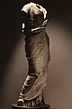
- Nomination: Satue of a draped woman, 2nd century CE. Roman art. -- Rama 08:28, 25 April 2011 (UTC)
- Review needed
-

- Nomination: Neckarturm (Neckar tower) in the centre of Heilbronn, Baden-Württemberg. -- Felix Koenig 07:58, 25 April 2011 (UTC)
- Review needed
-

- Nomination: Mercedes-Benz C 111 nomination inspired by Taxiarchos ;-) --AngMoKio 20:33, 24 April 2011 (UTC)
- Review needed
-

- Nomination: Iris vartanii in bloom. --Gidip 20:24, 24 April 2011 (UTC)
- Review needed
-
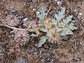
- Nomination: Neurada procumbens, fruit. -- Gidip 20:19, 24 April 2011 (UTC)
- Review needed
-
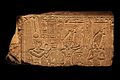
- Nomination: Emperor Nero making offerings to the Gods: offering of the lunar eye to Min and Osiris; offering of the olibanum bottle to Shu -- Rama 20:03, 24 April 2011 (UTC)
- Review needed
-

- Nomination: Church from Windesheim, the Netherlands, former brewery from monastery - Basvb 18:45, 24 April 2011 (UTC)
- Review needed
-

- Nomination: Wooden sluice gate in Tienhoven, the Netherlands - Basvb 18:45, 24 April 2011 (UTC)
- Review needed
-
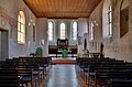
- Nomination: Fischingen: interior of protestant church --Taxiarchos228 18:38, 24 April 2011 (UTC)
- Review needed
-
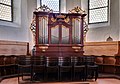
- Nomination: Fischingen: organ at protestant church --Taxiarchos228 18:38, 24 April 2011 (UTC)
- Review needed
-

- Nomination: Old electric device inside an old NATO base. --ComputerHotline 15:26, 24 April 2011 (UTC)
- Review needed
-

- Nomination: Inside an old NATO base. --ComputerHotline 15:26, 24 April 2011 (UTC)
- Review needed
-

- Nomination: Near the material entry airlock inside an old NATO base. --ComputerHotline 15:26, 24 April 2011 (UTC)
- Review needed
-
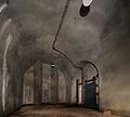
- Nomination: Near the personal entry airlock inside an old NATO base. --ComputerHotline 15:26, 24 April 2011 (UTC)
- Review needed
-

- Nomination: An object in Giant Mountains, PL --Kozuch 14:47, 24 April 2011 (UTC)
- Review needed
-

- Nomination: Wire vine in flower. --Avenue 14:16, 24 April 2011 (UTC)
- Review needed
-

-

- Nomination: Inside the fort du Bois d'Oye, near Bermont, France. --ComputerHotline 06:44, 23 April 2011 (UTC)
- Review The Perspective could be corrected on the right side. --Archaeodontosaurus 07:46, 25 April 2011 (UTC)
-

- Nomination Mercedes Benz W116 --Taxiarchos228 15:53, 22 April 2011 (UTC)
- Promotion QI. --Jovianeye 04:11, 1 May 2011 (UTC)
-

- Nomination Orthoptera sp. on a Taraxacum sp. flower. --ComputerHotline 17:58, 21 April 2011 (UTC)
- Decline Comment needs id. --Quartl 20:50, 23 April 2011 (UTC)
main object too small --Mbdortmund 15:05, 30 April 2011 (UTC)
-

- Nomination: Poland and Lithuania in 1569--Grandiose 14:35, 17 April 2011 (UTC)
- Review This seems to reflect the source well. The most glaring problem to me is that Bornholm and southern Sweden are missing, making the Baltic look huge. Also, in the opposite corner, the southern border of Lithuania doesn't always track the Dnieper where it should, although that's a relatively minor issue. --Avenue 07:22, 25 April 2011 (UTC)
-

-

-

-

-
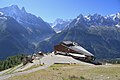
-

- Nomination Ruins of a byzantine church on the acropolis of Lindos, island of Rhodes, Greece--Jebulon 23:38, 29 April 2011 (UTC)
- Promotion Comment nice light and comp. But seems not really sharp to me... --Carschten 09:23, 30 April 2011 (UTC) You are right, I uploaded a wrong file. Corrected now by uploading another picture (sharper IMO) of the same subject. Better ? --Jebulon 10:14, 30 April 2011 (UTC) Support yes! Maybe a bit underexposed, but very good now! --Carschten 10:54, 30 April 2011 (UTC)
-

-
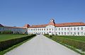
- Nomination Nymphenburg Palace in Munich. --High Contrast 23:21, 29 April 2011 (UTC)
- Promotion great pic - love it! --Schlaier 08:24, 30 April 2011 (UTC)
-

- Nomination An ottoman tombstone in Rhodes, Greece.--Jebulon 23:17, 29 April 2011 (UTC)
- Promotion QI and userful --Herzi Pinki 06:25, 30 April 2011 (UTC)
-

- Nomination The tombstone of a Knight of Rhodes, Greece.--Jebulon 22:55, 29 April 2011 (UTC)
- Promotion QI for me --Archaeodontosaurus 07:35, 30 April 2011 (UTC)
-

- Nomination Radio Kootwijk, main building, the Netherlands - Basvb 21:23, 29 April 2011 (UTC)
- Decline imo too much foreground and low contrast --Herzi Pinki 06:34, 30 April 2011 (UTC)
-
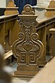
-

-

-

- Nomination Cross to remember Otto van Scherpenzeel near Rumpt, the Netherlands - Basvb 21:07, 29 April 2011 (UTC)
- Promotion Good quality. sharp main subject --Herzi Pinki 06:39, 30 April 2011 (UTC)
-

- Nomination Heliconius clysonymus montanus. --ComputerHotline 18:01, 29 April 2011 (UTC)
- Promotion Support QI for me --Archaeodontosaurus 07:15, 30 April 2011 (UTC)
-

- Nomination Fisherman's Bastion, Budapest --AngMoKio 17:54, 29 April 2011 (UTC)
- Promotion Good quality. --Taxiarchos228 19:54, 29 April 2011 (UTC)
-

- Nomination Diagram of arteries of thigh and upper leg --Mcstrother 16:26, 29 April 2011 (UTC)
- Promotion Support QI and Useful --Archaeodontosaurus 07:19, 30 April 2011 (UTC)
-

- Nomination detail from a farm in Soest, the Netherlands - Basvb 11:29, 29 April 2011 (UTC)
- Promotion nice still life --Mbdortmund 14:30, 29 April 2011 (UTC)
-

- Nomination The Volksbühne (theatre) in Berlin, Germany - facing the main entrance. --Schlaier 10:00, 29 April 2011 (UTC)
- Decline Oppose Quality too low. Blurry, chromatic error and background noise --Archaeodontosaurus 07:31, 30 April 2011 (UTC)
-

- Nomination The artwork "Sweet Brown Snail" by the us-american artists Jason Rhoades and Paul McCarthy at the Bavariapark and the Verkehrszentrum of the Deutsche Museum in Munich (district: Schwanthalerhöhe - also called: Westend) at the Theresienhöhe. --Schlaier 09:53, 29 April 2011 (UTC)
- Promotion OK --Mbdortmund 14:33, 29 April 2011 (UTC)
-

- Nomination The Staatstheater Stuttgart in the Schlossgarten in the city centre of Stuttgart. --Schlaier 09:51, 29 April 2011 (UTC)
- Promotion perspective must be corrected, try Shift-N --Mbdortmund 14:39, 29 April 2011 (UTC)
I have tried to correct it. --Mbdortmund 22:05, 29 April 2011 (UTC)* Support Good now --Archaeodontosaurus 07:22, 30 April 2011 (UTC)
-

- Nomination The "Jubiläumssäule" on the Schlossplatz in Stuttgart with the Neues Schloss in the background. --Schlaier 09:45, 29 April 2011 (UTC)
- Decline tilted, strange haze in the upper part --Mbdortmund 14:26, 29 April 2011 (UTC)
The picture is most likely made from the Kunstmuseum next to the Schlossplatz, so the upper strange part is a reflection from the museums windows. --AngMoKio 22:37, 29 April 2011 (UTC)
-
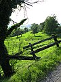
-

-

-

- Nomination The Golden Gate in the Główne Miasto (Main Town) of Gdańsk, Poland. --Schlaier 08:55, 29 April 2011 (UTC)
- Decline tilted, distorted --Mbdortmund 14:28, 29 April 2011 (UTC)
-

- Nomination Stanislav Govorukhin, a Russian actor + movie maker. A.Savin 06:21, 29 April 2011 (UTC)
- Promotion Good quality. --Mbdortmund 14:41, 29 April 2011 (UTC)
-

-
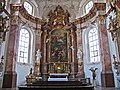
-

- Nomination So there you have an actual view to Vispertal valley in Switzerland (hard to find any photos of the subject from Commons) --Ximonic 21:49, 28 April 2011 (UTC)
- Promotion Very nice, but some green CA on the top of mountains, and magenta CA in the clouds should be removed--Jebulon 22:03, 28 April 2011 (UTC) Done I've done some repairs now. --Ximonic 23:55, 28 April 2011 (UTC) Thank you. Good now.--Jebulon 23:42, 29 April 2011 (UTC)
-

- Nomination Giant Mountains, Czechia --Ralf Roletschek 12:17, 28 April 2011 (UTC)
- Promotion Good enough --Ximonic 19:37, 29 April 2011 (UTC)
-
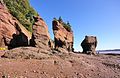
- Nomination Canada: Hopewell Rocks at low tide --Taxiarchos228 07:51, 28 April 2011 (UTC)
- Promotion Good enough --Ximonic 19:50, 29 April 2011 (UTC)
-

- Nomination Weil am Rhein: Tree Country Bridge --Taxiarchos228 07:51, 28 April 2011 (UTC)
- Promotion A Quality image. --Ximonic 20:03, 29 April 2011 (UTC)
-

- Nomination Composer Jexper Holmen --Villy Fink Isaksen 15:49, 27 April 2011
- Promotion To bad from the to tight crop on the left. For the rest very nice so I would say QI. Basvb 16:45, 29 April 2011 (UTC)
-
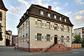
- Nomination Lörrach: Local Labour Court --Taxiarchos228 07:14, 27 April 2011 (UTC)
- Promotion The birds are not so sharp but otherwise it is good enough IMO.--Ximonic 20:09, 29 April 2011 (UTC)
-

- Nomination Kakabeak flowers. --Avenue 03:31, 27 April 2011 (UTC)
- Withdrawn Very interesting topic, but the center part is overexposed, can you correct it? --Archaeodontosaurus 17:22, 27 April 2011 (UTC)
I've tried reworking it from the RAW file, but I don't think it's improved the overexposure very much. I'll try reshooting there again next year. --Avenue 05:43, 28 April 2011 (UTC) Bravo for fairplay --Archaeodontosaurus 07:47, 30 April 2011 (UTC)
-
-

-
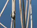
- Nomination Hyla arborea sitting on a reed. --Von.grzanka 12:31, 25 April 2011 (UTC)
- Promotion Good quality --Ximonic 20:23, 29 April 2011 (UTC)
-

-
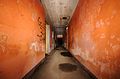
- Nomination Inside an old NATO base. --ComputerHotline 15:26, 24 April 2011 (UTC)
- Promotion Also good. --Ximonic 01:15, 30 April 2011 (UTC)
-

- Nomination To access inside an old NATO base. --ComputerHotline 15:26, 24 April 2011 (UTC)
- Promotion Good. --Ximonic 01:15, 30 April 2011 (UTC)
-
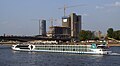
- Nomination: River cruise ship Alina in cologne --Rolf H. 04:22, 24 April 2011 (UTC)
- Review needed
-
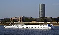
- Nomination: River cruise ship Heinrich Heine in cologne --Rolf H. 04:22, 24 April 2011 (UTC)
- Review needed
-

- Nomination: River cruise ship Heinrich Heine in cologne --Rolf H. 04:22, 24 April 2011 (UTC)
- Review needed
-
-

-

-

-

-

-

- Nomination Portal to Broich Castle in Mülheim an der Ruhr --Carschten 18:40, 23 April 2011 (UTC)
- Promotion Needs some crops out imo: the cropped window above, the wooden structure right, the light on ground below, and the uninteresting part of the wall left...--Jebulon 09:51, 24 April 2011 (UTC) Done --Carschten 11:10, 26 April 2011 (UTC) Not perfect, but much better IMO. QI--Jebulon 21:39, 29 April 2011 (UTC)
-
-

- Nomination Rhine flood in Duisburg (blue hour) --Carschten 18:40, 23 April 2011 (UTC)
- Decline WB a bit too cool. I haven't seen grass this blue even during the blue hour. --King of Hearts 22:54, 27 April 2011 (UTC) Done new version uploaded. Better now? --Carschten 11:32, 29 April 2011 (UTC) Too noisy for my taste --Jebulon 21:39, 29 April 2011 (UTC)
-

-

-

-

-

- Nomination Hersbrucker Schweiz.Houbirg montain --Vitold Muratov 13:50, 23 April 2011 (UTC)
- Decline Distortions: the edges are falling down --Carschten 20:07, 29 April 2011 (UTC)
-

- Nomination A mobile post office of the Austrian Post in the Mercedes-Benz Museum in Stuttgart. --Taxiarchos228 10:58, 23 April 2011 (UTC)
- Promotion Good quality. --Carschten 20:07, 29 April 2011 (UTC)
-

- Nomination Brockville: First Presbyterian Church --Taxiarchos228 10:58, 23 April 2011 (UTC)
- Promotion it's perspective distorted and the brance is bad, but for that motive it's okay --Carschten 20:07, 29 April 2011 (UTC)
-
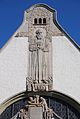
- Nomination Bern: Paulus church (detail) --Taxiarchos228 10:58, 23 April 2011 (UTC)
- Promotion Good quality. --Carschten 20:07, 29 April 2011 (UTC)
-
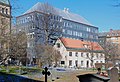
- Nomination ABF-house, seen from Adolf Fredrik's cementary. --Ankara 09:11, 23 April 2011 (UTC)
- Promotion Comment the two buidlings are a bit overexposed, could you darken them/the image plaese? --Carschten 20:07, 29 April 2011 (UTC) New version. Maybe to dark? --Ankara 21:06, 29 April 2011 (UTC) Support maybe, but it's much better now! QI imo --Carschten 08:48, 30 April 2011 (UTC)
-
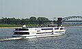
-
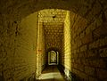
- Nomination Inside the fort du Bois d'Oye, near Bermont, France. --ComputerHotline 06:44, 23 April 2011 (UTC)
- Decline dark foreground, cw tilted --Carschten 20:07, 29 April 2011 (UTC)
-
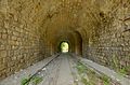
- Nomination The entry corridor inside the fort du Bois d'Oye, near Bermont, France. --ComputerHotline 06:44, 23 April 2011 (UTC)
- Promotion Good quality. --Carschten 20:07, 29 April 2011 (UTC)
-
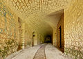
- Nomination Near the powder room, inside the fort du Bois d'Oye, near Bermont, France. --ComputerHotline 06:44, 23 April 2011 (UTC)
- Promotion Good quality. --Carschten 20:07, 29 April 2011 (UTC)
-

- Nomination Inside the fort du Bois d'Oye, near Bermont, France. --ComputerHotline 06:44, 23 April 2011 (UTC)
- Promotion Good quality. --Carschten 20:07, 29 April 2011 (UTC)
-

- Nomination Mulhouse: Railway station --Taxiarchos228 15:53, 22 April 2011 (UTC)
- Promotion Good quality. --Carschten 16:35, 29 April 2011 (UTC)
-

- Nomination Acer platanoides, Marki, Poland. --Crusier 14:59, 22 April 2011 (UTC)~
- Promotion a perspective distortion correction would make it better, but it's a QI imo though --Carschten 16:35, 29 April 2011 (UTC) Comment Like that? --Crusier 06:43, 30 April 2011 (UTC)
-

-

-

-

- Nomination The Tanner scale (also known as the Tanner stages/staging) --M.Komorniczak 19:09, 22 April 2011 (UTC)
- Promotion Good quality. --Carschten 16:35, 29 April 2011 (UTC)
-
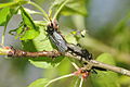
- Nomination: Bibionidae sp. copulation. --ComputerHotline 17:58, 21 April 2011 (UTC)
- Review Comment Caption too poor (this does not scream in QI) --Archaeodontosaurus 13:46, 23 April 2011 (UTC)
-

- Nomination: Syrphidae sp. --ComputerHotline 17:58, 21 April 2011 (UTC)
- Review Comment needs id. --Quartl 20:50, 23 April 2011 (UTC)
-

- Nomination Orthoptera sp. --ComputerHotline 17:58, 21 April 2011 (UTC)
- Decline Comment needs id (and isn't orthoptera sp). --Quartl 20:50, 23 April 2011 (UTC) Oppose oor quality, no ID --Carschten 16:44, 29 April 2011 (UTC)
-

- Nomination Kabira Bay in Ishigaki Island, Okinawa, Japan --663highland 14:27, 21 April 2011 (UTC)
- Decline Chromatic Aberattion on the right side of the heads and the boat. Mvg, Basvb 15:12, 29 April 2011 (UTC)
-

- Nomination Hoshizuna-no-hama in Iriomote Island, Okinawa, Japan --663highland 14:27, 21 April 2011 (UTC)
- Decline The island is a bit to unsharp, I see the island as the main subject, and think it should be sharper. Mvg, Basvb 15:12, 29 April 2011 (UTC)
-

- Nomination Okayama Symphony Hall --663highland 14:27, 21 April 2011 (UTC)
- Promotion good --Carschten 18:22, 29 April 2011 (UTC)
-

- Nomination Statue of a maenad in the park of Versailles. --Coyau 09:54, 21 April 2011 (UTC)
- Decline Comment Nice picture and good enough for QI anyway, but I would prefer a little darker exposure of the sculpture to show all details and the surface. This one could profit from a better white balance, colours are imo a bit cold/blueish --Mbdortmund 16:50, 21 April 2011 (UTC) Oppose Main motive is too bright, should be darkened (s bit per Mbdortmund) --Carschten 18:22, 29 April 2011 (UTC)
-

- Nomination little Bridge in Ter hejde, Netherlands --Ralf Roletschek 13:27, 20 April 2011 (UTC)
- Promotion Please clone out the dust spots from the sky. Jovianeye 05:35, 24 April 2011 (UTC) I have only seen and corrected one?--Ralf Roletschek 11:55, 26 April 2011 (UTC)
See image notes for more. Jovianeye 16:20, 26 April 2011 (UTC) right, there was 4 more dust spots, it is corrected. --Ralf Roletschek 10:58, 28 April 2011 (UTC) Support good, but maybe you could reduce the chromatic aberrations --Carschten 16:55, 29 April 2011 (UTC)
-

- Nomination Villa in Saltsjö-Duvnäs. --Ankara 12:20, 19 April 2011 (UTC)
- Promotion Spot in sky, over the roof. --Archaeodontosaurus 13:28, 23 April 2011 (UTC) Done thank you!--Ankara 15:54, 23 April 2011 (UTC) Comment good, but needs some contrast --Carschten 16:47, 29 April 2011 (UTC) New version uploaded.--Ankara 18:41, 29 April 2011 (UTC) * Support QI for me --Archaeodontosaurus 07:58, 30 April 2011 (UTC)
-
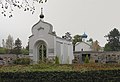
- Nomination Sainte-Genevieve-des-Bois Russian Cemetery--Vitold Muratov 18:15, 15 April 2011 (UTC)
- Decline Perspective distortion IMO--Ankara 22:33, 19 April 2011 (UTC) Oh God! There is no "Perspective distortion "! This is the antique russian architetural style! Correction makes all ugly!Vitold Muratov 10:35, 22 April 2011 (UTC) I'm sorry if I'm wrong, and if so i will promote. Please se image note. Best regards --Ankara 15:44, 22 April 2011 (UTC) French and english captions added. Category corrected. Sorry, but it needs really a perspective correction: look for example at the cross on the black-marble tomb at right: the "vertical" branch is strongly leaning, due to the distortion --Jebulon 16:00, 22 April 2011 (UTC)--I suppose all of them are simply sinked in the ground--Vitold Muratov 23:55, 22 April 2011 (UTC) Oppose Insufficient quality: heavily posterized, artifacts, poor details --Carschten 16:40, 29 April 2011 (UTC)
-

-

- Nomination Landtag of Baden-Württemberg in the Schlossgarten in the city centre of Stuttgart. --Schlaier 09:49, 29 April 2011 (UTC)
- Decline overexposed sky, needs perspective correction, only a part of the building --Taxiarchos228 10:00, 29 April 2011 (UTC)
-
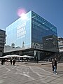
-
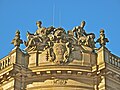
- Nomination Sculptures on the roof of the Alte Börse in Munich (city centre). --Schlaier 08:45, 29 April 2011 (UTC)
- Promotion a little bit noisy, but good enough for QI --Taxiarchos228 08:56, 29 April 2011 (UTC)
-

- Nomination Torontos Skyline at dusk --Taxiarchos228 07:18, 29 April 2011 (UTC)
- Promotion Good quality. --Schlaier 08:41, 29 April 2011 (UTC)
-

- Nomination Stairway at the Glashalle in the Gasteig (cultural centre of the city of Munich) --Schlaier 22:11, 28 April 2011 (UTC)
- Decline The Gasteig was opened in 1985. The arcitects are still alive or not 70 years dead. The picture was made from inside, so there is nor freedom of panorama. --Elektroschreiber 07:26, 29 April 2011 (UTC)
-

- Nomination Hygieia. 2nd century C.E. statue in Rhodes, Greece.--Jebulon 22:00, 28 April 2011 (UTC)
- Promotion Good quality. --Mbdortmund 00:45, 29 April 2011 (UTC)
-

-

- Nomination Statues on the St. Peter's Basilica --AngMoKio 19:20, 28 April 2011 (UTC)
- Promotion Good quality. --Mbdortmund 00:07, 29 April 2011 (UTC)
-

- Nomination Details of Trevi Fountain, --AngMoKio 19:20, 28 April 2011 (UTC)
- Promotion Good quality. --Mbdortmund 00:07, 29 April 2011 (UTC)
-

- Nomination Jamkaran Mosque - Photo of User:Fabienkhan - for me are Mood rain, reflections, clouds excellent. --Ralf Roletschek 18:26, 28 April 2011 (UTC)
- Decline Very nice composition. But the quality (especially of the left side) is not good (unsharp, heavy CAs)) --AngMoKio 19:23, 28 April 2011 (UTC)
-
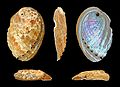
- Nomination Shell of a Variously Coloured Abalone, Haliotis diversicolor --Llez 16:42, 28 April 2011 (UTC)
- Promotion Good quality. --Mbdortmund 18:17, 28 April 2011 (UTC)
-

- Nomination Sundial in Dornstetten, Baden-Württemberg. -- Felix Koenig 16:15, 28 April 2011 (UTC)
- Promotion ich bin doch ein wenig über deine scheinbare Unerfahrenheit beim Fotografieren erschüttert; bei den KEB hättest du schon lernen müssen bzw. weißt du auch eigentlich, wie man mit Baustellen im Hintergrund umzugehen hat (Stichwort Sprengstoff etc.)... --Carschten 16:38, 28 April 2011 (UTC)
-

- Nomination Sitting man. Painted wood, Old Empire, 3rd Dynasty (2686 – 2613 BCE). -- Rama 15:48, 28 April 2011 (UTC)
- Promotion Good quality. --Mbdortmund 18:17, 28 April 2011 (UTC)
-
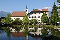
- Nomination Hl Martin im Lorenzerhof, Lana --Böhringer 14:46, 28 April 2011 (UTC)
- Promotion tadellos! --Ralf Roletschek 14:53, 28 April 2011 (UTC)
-

- Nomination Sunset at Agta Beach Resort, Biliran, the Philippines - Basvb 12:29, 28 April 2011 (UTC)
- Promotion Tilted?--Ankara 12:39, 28 April 2011 (UTC) *The black line seems only 1 mm lower on the left then on the right (I doubt whether that's a straight line), so maybe very little tilted, sadly I'm not able to correct that. Mvg, Basvb 12:50, 28 April 2011 (UTC) I uploaded a new version. Regards--Ankara 12:57, 28 April 2011 (UTC)
Lovely. --King of Hearts 20:46, 28 April 2011 (UTC)
-

- Nomination An appendectomy in progress --Ralf Roletschek 12:04, 28 April 2011 (UTC)
- Promotion Good quality. --AngMoKio 19:25, 28 April 2011 (UTC)
-

- Nomination Peggy’s Cove --Taxiarchos228 07:51, 28 April 2011 (UTC)
- Promotion Good quality. --Ralf Roletschek 12:04, 28 April 2011 (UTC)
-

- Nomination Canada: Peggy's Point Lighthouse --Taxiarchos228 07:51, 28 April 2011 (UTC)
- Promotion Good quality. --Berthold Werner 15:48, 28 April 2011 (UTC)
-
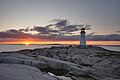
- Nomination Canada: Peggy's Point Lighthouse at sunset --Taxiarchos228 07:51, 28 April 2011 (UTC)
- WARNING: third template parameter added – please remove.
-

- Nomination German Artist --Ralf Roletschek 16:17, 27 April 2011 (UTC)
- Promotion Good quality. --Berthold Werner 15:52, 28 April 2011 (UTC)
-
- Nomination Shoebill at Weltvogelpark. -- Fiorellino 23:28, 27 April 2011 (UTC)
- Decline Really not a bad work, but several flaws that in addition led to my opposing. The crop is a (small) bit too tight on the sides, making the picture somewhat imbalanced, there are some CA on the beak and the sharpness is not the best. You could try a lighter denoising to adress the sharpness issue. Ah, and the icing on the cake could be a RAW development with less saturation as I feel the green of the grass a little bit too exaggerated, but it could be admittedly due to the lighting. Grand-Duc 04:12, 29 April 2011 (UTC)
-
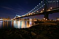
-

- Nomination Pistenbully PB 160D snow groomer in Austria. --High Contrast 14:26, 25 April 2011 (UTC)
- Promotion Good quality. --Ralf Roletschek 13:54, 28 April 2011 (UTC)
-

- Nomination Ruins of a 14th century church in Rhodes, Greece.--Jebulon 23:02, 24 April 2011 (UTC)
- Decline Poor lighting, would be better frontlit. --King of Hearts 20:56, 28 April 2011 (UTC). Agree...--Jebulon 07:33, 29 April 2011 (UTC)
-

- Nomination: Mercedes-Benz C111 --Taxiarchos228 10:58, 23 April 2011 (UTC)
- Review needed
-

- Nomination: Inside the fort du Bois d'Oye, near Bermont, France. --ComputerHotline 06:44, 23 April 2011 (UTC)
- Review needed
-
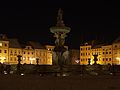
- Nomination Náměstí Přemysla Otakara II. in České Budějovice by night --Pudelek 17:44, 22 April 2011 (UTC)
- Promotion Good quality. --Ralf Roletschek 13:50, 28 April 2011 (UTC)
-

- Nomination České Budějovice (Budweis) - footbridge over railway tracks --Pudelek 17:44, 22 April 2011 (UTC)
- Promotion sometimes we need no much colors, very good. --Ralf Roletschek 13:50, 28 April 2011 (UTC)
-

- Nomination: Mulhouse: Tower --Taxiarchos228 15:53, 22 April 2011 (UTC)
- Review needed
-


_-_Weltvogelpark_Walsrode_2011.jpg)


.jpg)


.JPG)
.JPG)


.jpg)


.jpg)
,_2011_Budape%C5%A1%C5%A5_0272.jpg)

.jpg)


.jpg)


_flower.jpeg)
.jpg)
.jpg)
.jpg)
.jpg)


.jpg)

.jpg)


.jpg)


.jpg)


.jpg)


.jpg)


.jpg)


.jpg)
.jpg)
.jpg)
.jpg)
.jpg)


.jpg)
.jpg)


.jpg)
.jpg)


,_Indonesia_(2010).jpg)


.jpg)


.jpg)


.JPG)


_001.jpg)


_031.jpg)
_017.jpg)


.JPG)


_004.JPG)


.jpg)


.jpg)


_010.JPG)
_013.JPG)


.jpg)


.jpg)
.jpg)


_006.jpg)
_007.jpg)


.jpg)


_-_train_station.jpg)
_Infobox.JPG)
_052.JPG)


.jpg)


_-_Farn%C3%AD_kostel_Nanebevzet%C3%AD_Panny_Marie.jpg)
_-_hlavn%C3%AD_silnice_(II-369).JPG)


.jpg)

_flying,_side-on.jpg)


.JPG)
.JPG)
.jpg)


-2-2.jpg)
.jpg)


.jpg)


.jpg)


.jpg)
.jpg)


.jpg)


_009.JPG)


.jpg)


_05.jpg)


_en_Gare_de_Bollwiller.jpg)


.JPG)


_061.JPG)
_055.JPG)


_03.jpg)


.jpg)


.jpg)


_005.jpg)
_017.jpg)
_010.jpg)


.jpg)

.jpg)


.jpg)


.JPG)


_012.JPG)

.JPG)
.jpg)


.jpg)


.png)


.jpg)


.jpg)


_Weltvogelpark_Walsrode_2010.jpg)


_002.JPG)
_004.jpg)


,_Krkono%C5%A1e,_object.jpg)


.jpg)


_at_Auckland_Zoo.jpg)


_033.jpg)
_009.jpg)
_008.jpg)


.jpg)

_014.jpg)


_-_footbridge_over_railway_tracks.jpg)


Consensual review[edit]
File:Jamkaran Mosque-3855.jpg[edit]

- Nomination Iran, Jamkaran mosque Fabienkhan 09:47, 28 April 2011 (UTC)
- Decline
- Oppose Sorry, but the sky's all burnt out. Is that the original of the photograph? Also, a bit tilted, but that can be easily arranged. -- Rama 10:08, 28 April 2011 (UTC)
- Comment May I ask for a review? If the sky's is burnt out, this is because the sky isn't the principal subject, and that post-treatment was used to highlight the mosque's architecture. English's not my mother tongue, I don't understand what you mean by tilted. Fabienkhan 10:42, 28 April 2011 (UTC)
- Titled = de travers. Si tu as fait du post-traitement pour mettre l'architecture en valeur, il y a peut-être moyen de trouver un traitement qui perde moins d'information dans le ciel. Tu as uploadé l'original ? QICbot (talk) ~
- Non, mais c'est maintenant fait : File:Jamkaran Mosque original-3855.jpg. Fabienkhan 15:08, 28 April 2011 (UTC)
- Oppose per Rama --Taxiarchos228 14:10, 28 April 2011 (UTC)
- Oppose sorry, this colors and sky --Ralf Roletschek 14:12, 28 April 2011 (UTC)
- Info I have nominate the original Version because its a very nice photo. --Ralf Roletschek (talk) 18:28, 28 April 2011 (UTC)
File:Pelican portrait.jpg[edit]

- Nomination Pelican --Nico&Co 22:46, 26 April 2011 (UTC)
- Decline
- Oppose CA-Background noise - the whole bit to be corrected --Archaeodontosaurus 17:30, 27 April 2011 (UTC)
- Support I don't see any significant noise, and CA is very minor. However, it should be brightened. --King of Hearts 20:51, 28 April 2011 (UTC)
- Oppose Visible fringe all around the animal. Lacks detail from denoising. --Quartl 14:36, 29 April 2011 (UTC)
File:Nuphar lutea 02 by-dpc.jpg[edit]

- Nomination Spatterdock (Nuphar lutea) fruit in Burgos (Spain). --David Perez 12:00, 20 April 2011 (UTC)
- Decline
- Support Very good. Cookie 21:10, 27 April 2011 (UTC)
- Oppose I think the photo lacks sharpness and there is too harsh flash light visible. Composition is soso. --AngMoKio 11:09, 29 April 2011 (UTC)
- Oppose Agree with AngMoKio concerning sharpness and flash. --Quartl 14:23, 29 April 2011 (UTC)
File:Famous tree near Libějovice in 2011 (2).JPG[edit]
.JPG)
- Nomination Famous tree near Libějovice, Czech Republic--Chmee2 19:47, 24 April 2011 (UTC)
- Decline
- Support Good quality. --Cayambe 09:08, 25 April 2011 (UTC)
- Oppose May I ask for a discussion, please, due to the lot of CA, and the general lack of sharpness ? This picture is particularly well composed, and the thumbnail is attractive, but the maxi-size view is disappointing to me. Sorry. --Jebulon 09:24, 25 April 2011 (UTC)
- Support Corrected CA and sharpness. -- King of Hearts 05:07, 26 April 2011 (UTC)
- Oppose the CA reducing makes the image much better now, but nonetheless the picture is completely unsharp --Carschten 08:23, 26 April 2011 (UTC)
- Oppose Beautiful composition and colors, but lacks sharpness at full res. I'm also not happy with the lens distortion. --Quartl 14:48, 29 April 2011 (UTC)
File:Space Needle 360 Panorama.jpg[edit]
![]()
- Nomination Seattle by A. Hornung. --Bartiebert 09:55, 24 April 2011 (UTC)
- Decline
- Oppose Nice but please fix first the posterized clouds. --Sting 21:51, 24 April 2011 (UTC)
- Support The clouds look natural to me. -- King of Hearts 23:27, 24 April 2011 (UTC)
- You should better check. I've added notes on the image for the most obvious problems. Sting 11:58, 25 April 2011 (UTC)
- Oppose yes, posterized clouds --Carschten 13:14, 25 April 2011 (UTC)
- Support no problem with the clouds --Taxiarchos228 08:58, 26 April 2011 (UTC)
- Support no problem with the clouds -- R-bitzer 01:00, 27 April 2011 (UTC)
- lol. Guys, I think you should change your monitor. Sting 01:57, 27 April 2011 (UTC)
- Oppose Badly posterised clouds, especially on the left. --Avenue 05:48, 28 April 2011 (UTC)
- Oppose Clouds. --Quartl 14:20, 29 April 2011 (UTC)
File:Duisburg, Toeppersee, 2009-12 CN-01.jpg[edit]

- Nomination Way next to the lake Toeppersee in Duisburg --Carschten 12:37, 20 April 2011 (UTC)
- Promotion
- Rather unsharp, and the overcast day is unappealing. Let's see what the others say. --King of Hearts 07:06, 21 April 2011 (UTC)
- Sun does not always shine. And I think the focussed middle of the picture, the way, is sharp enough. --Carschten 17:39, 21 April 2011 (UTC)
- Hmm, still
 Neutral. -- King of Hearts 19:31, 21 April 2011 (UTC)
- SupportGood enough for QI, IMO.--Jebulon 21:24, 29 April 2011 (UTC)
File:Vincent van Gogh Ebene bei Auvers 1890 Neue Pinakothek Munich.JPG[edit]

- Nomination Vincent van Gogh, Plain close to Auvers, painted in 1890 – displayed in the Museum "Neue Pinakothek" in Munich. --Schlaier 14:16, 1 May 2011 (UTC)
- Withdrawn Support QI. --Jovianeye 15:55, 1 May 2011 (UTC)
![]() Question picture of a Wikipedian? --Ralf Roletschek 03:24, 2 May 2011 (UTC)
Question picture of a Wikipedian? --Ralf Roletschek 03:24, 2 May 2011 (UTC)
![]() Comment Vincent van Gogh is not a Wikipedian but the person who took the picture of the painting is a Wikipedian (me) --Schlaier 04:43, 2 May 2011 (UTC)
Comment Vincent van Gogh is not a Wikipedian but the person who took the picture of the painting is a Wikipedian (me) --Schlaier 04:43, 2 May 2011 (UTC)
- Claiming copyright ownership of two-dimensional public domain material is w:Copyfraud. --Ralf Roletschek 16:56, 2 May 2011 (UTC)
- Where did Schlaier claim copyright ownership? He just said he took the photo, meaning it is eligible to be a QI candidate. "Photographical reproductions of two-dimensional works of art, made by Wikimedians, are eligible" --Avenue 17:10, 2 May 2011 (UTC)
- Photographical reproductions of two-dimensional works of art, made by Wikimedians, are eligible <-- thats new for me. Excuse me please, i have`nt said anythink! --Ralf Roletschek 05:48, 3 May 2011 (UTC)
- Where did Schlaier claim copyright ownership? He just said he took the photo, meaning it is eligible to be a QI candidate. "Photographical reproductions of two-dimensional works of art, made by Wikimedians, are eligible" --Avenue 17:10, 2 May 2011 (UTC)
- Claiming copyright ownership of two-dimensional public domain material is w:Copyfraud. --Ralf Roletschek 16:56, 2 May 2011 (UTC)
- Oppose It seems that all four edges are cropped a bit too tightly, when I compare it to the version linked here (fourth from bottom). --Avenue 17:28, 2 May 2011 (UTC)
- Oppose I change my vote after seeing the original. The crop is an issue and the dynamic range of the image is not satisfactory. --Jovianeye 17:37, 3 May 2011 (UTC)
- Oppose I agree now that I had also a look at the other pic. I take back my nomination and will give it another try when I am at the Neue Pinakothek the next time. --Schlaier 20:36, 3 May 2011 (UTC)
File:Oleander April 2011-1.jpg[edit]

- Nomination Leaf of an Oleander -- Alvesgaspar 18:48, 24 April 2011 (UTC)
- Decline
- Oppose If you want to do this kind of work it is best done in the studio. And mount the entire leaf.--Archaeodontosaurus 08:07, 25 April 2011 (UTC)
- Support I don't find anything in the QIC that it doesn't satisfy. --King of Hearts 20:52, 28 April 2011 (UTC)
- Oppose Agree with Archaeodontosaurus, the image lacks crispness and the crop is unfortunate. The colors are beautiful, though. --Quartl 14:29, 29 April 2011 (UTC)
- Oppose Same as above + bad crop --Sreejithk2000 07:45, 4 May 2011 (UTC)
File:HahnEcho GWM.gif[edit]

- Nomination Spin echo animation. --GavinMorley 13:36, 15 April 2011 (UTC)
- Promotion
- Support good, accurate image --Kingbish3 14:41, 17 April 2011 (UTC)
- Oppose Does not meet the minimum 2Mpix size requirement. The above promotion attempt from an account with this as the only edit in its history raises concerns. --Elekhh 21:06, 19 April 2011 (UTC)
- Support 2 MP requirement does not apply to animated GIFs. --King of Hearts 09:54, 20 April 2011 (UTC)
- I only see exception in the guidelines for SVG, not for GIF. --Elekhh 21:40, 20 April 2011 (UTC)
- Well, there ought to be an exception for GIFs, because this is a clear oversight. Do you know how large an animated image with dozens of 2 MP frames would be? -- King of Hearts 19:35, 21 April 2011 (UTC)
- All of the animations I checked in the Quality_Images/animations have less than 2Mpix image size: http://commons.wikimedia.org/wiki/Commons:Quality_images/Subject/Animated --GavinMorley 20:57, 21 April 2011 (UTC)
- Well, there ought to be an exception for GIFs, because this is a clear oversight. Do you know how large an animated image with dozens of 2 MP frames would be? -- King of Hearts 19:35, 21 April 2011 (UTC)
- I only see exception in the guidelines for SVG, not for GIF. --Elekhh 21:40, 20 April 2011 (UTC)
- Oppose I agree with there not being a 2MPx requirement for animated GIFs (size issue). This is however really too small for viewing on a largish screen. Rendering a larger copy (let's say double size?) shouldn't be that hard. Qiqritiq 09:16, 24 April 2011 (UTC)
- I originally uploaded a version that is identical except for being more than twice as large: http://commons.wikimedia.org/wiki/File:GWM_HahnEcho.gif. However, the animation for this does not work in Wikipedia: because you have to scale it down to fit onto the screen you hit a Wikipedia bug: http://en.wikipedia.org/wiki/Wikipedia:Village_pump_(technical)/Archive_87#animated_gif_not_playing --GavinMorley (talk) 08:46, 26 April 2011 (UTC)
- Shall I nominate the larger animation that does not animate on Wikipedia? Should I do that fresh or change this nomination? --GavinMorley (talk) 19:59, 28 April 2011 (UTC)
- I originally uploaded a version that is identical except for being more than twice as large: http://commons.wikimedia.org/wiki/File:GWM_HahnEcho.gif. However, the animation for this does not work in Wikipedia: because you have to scale it down to fit onto the screen you hit a Wikipedia bug: http://en.wikipedia.org/wiki/Wikipedia:Village_pump_(technical)/Archive_87#animated_gif_not_playing --GavinMorley (talk) 08:46, 26 April 2011 (UTC)
- Support for me the image meets quality criteria, reason for small size is given by GavinMorley --J. Lunau 13:01, 29 April 2011 (UTC)
- Support --Jovianeye 03:57, 1 May 2011 (UTC)
File:St._Johannis_Lüneburg_-_Langhaus.jpg[edit]

- Nomination Lüneburg: nave of Saint Johannis church --Taxiarchos228 07:04, 26 April 2011 (UTC)
- Decline
- Oppose Two-headed ghost on the left side.--PereslavlFoto 17:01, 26 April 2011 (UTC)
- Support Great picture and light --Schlaier 10:11, 29 April 2011 (UTC)
- Oppose Agreed, faced are moved. Mvg, Basvb 16:30, 29 April 2011 (UTC)
- Oppose Benches are very noisy, and the central window is blown up, IMO.--Jebulon 13:29, 1 May 2011 (UTC)
File:Larva_002.JPG[edit]

- Nomination Larva --Raghith 05:04, 4 May 2011 (UTC)
- Decline
- Oppose very noisy at 100%-view --Taxiarchos228 07:11, 4 May 2011 (UTC)
- Support Not sure I agree - Noise can be seen in 100% view, but IMHO it is not distracting --S nova 18:17, 4 May 2011 (UTC)
- Oppose Unsharp and noisy. --Bgag 13:06, 5 May 2011 (UTC)
- Oppose See Commons:Image guidelines - identification needed for promotion by rules. Also really noised. -- George Chernilevsky 13:13, 5 May 2011 (UTC)
File:Schloss_Steinau,_3.jpg[edit]

- Nomination The castle of Steinau, picture by Rainer Lippert --Grand-Duc 18:46, 2 May 2011 (UTC)
- Promotion
- Support more than QI --Taxiarchos228 18:48, 8 May 2011 (UTC)
- I disagree: Quality images must be categorized, this is not categorized. But this can be done easily. --Elektroschreiber 09:20, 5 May 2011 (UTC)
- I catched it up, but you could add it too in the same time you have written this commend :-) --Taxiarchos228 09:35, 5 May 2011 (UTC)
- I disagree: Quality images must be categorized, this is not categorized. But this can be done easily. --Elektroschreiber 09:20, 5 May 2011 (UTC)
- SupportShame of the crop of the building left, which appears to be a part of the complex, but QI otherwise.--Jebulon 15:49, 5 May 2011 (UTC)
- SupportCategorized QI.Sorry, but I didn't want to search the category. I didn't even start.--Elektroschreiber 16:40, 5 May 2011 (UTC)
- Support -- Raghith 08:27, 6 May 2011 (UTC)
File:SMC Pentax-M 50mm.jpg[edit]

- Nomination Lens SMC Pentax-M 1:1.4 50mm --Fabienkhan 13:56, 3 May 2011 (UTC)
- Decline
- Oppose Distorted WB & lack of sharpness. A.Savin 14:27, 3 May 2011 (UTC)
- fixed. --King of Hearts 17:35, 3 May 2011 (UTC)
- Better, but still unsharp IMO A.Savin 19:47, 3 May 2011 (UTC)
- Oppose colors are very good now, but the DOF is too low and the image is not really sharp --Carschten 14:16, 4 May 2011 (UTC)
File:Winborg_ättiksprit.jpg[edit]

- Nomination Spirit Vinegar --Ankara 00:16, 2 May 2011 (UTC)
- Promotion
- Crop on top and bottom is too tight. --King of Hearts 02:51, 2 May 2011 (UTC)
- New version with more space.--Ankara 05:05, 2 May 2011 (UTC)
- Better. --King of Hearts 08:08, 3 May 2011 (UTC)
- New version with more space.--Ankara 05:05, 2 May 2011 (UTC)
- Product packaging: I think the design of the bottle and the label are protected by copyright. --Elektroschreiber 20:21, 3 May 2011 (UTC)
- The bottle design are very simular to to the bottle from 1909, and the company have used simular bottles from 1861. Although the text and logo are similar to those from 1909. Additionally, the logotype may not meet Sweden's high threshold of originality.--Ankara 09:45, 4 May 2011 (UTC)
- Support I think the picture is good enough for QI. So if there is no copyright problem I support. --Elektroschreiber 09:12, 5 May 2011 (UTC)
- The bottle design are very simular to to the bottle from 1909, and the company have used simular bottles from 1861. Although the text and logo are similar to those from 1909. Additionally, the logotype may not meet Sweden's high threshold of originality.--Ankara 09:45, 4 May 2011 (UTC)
- Support King of Hearts 21:11, 4 May 2011 (UTC)
- Support --
 aghith 08:29, 6 May 2011 (UTC)
File:Neuhauser Straße München Altstadt Innenstadt Nacht1.jpg[edit]

- Nomination The Neuhauser Straße in the city centre of Munich at night with the wooden sculpture "The Traveller" by Arne Quinze. --Schlaier 14:18, 1 May 2011 (UTC)
- Decline
- Oppose I'm sorry, but I think the picture is too noisy to be a QI. --Ximonic 23:57, 2 May 2011 (UTC)
- Denoised+fixed perspective--Pro2 19:50, 3 May 2011 (UTC)
- Oppose The Traveller was just a temporary object of art. The sculture was build November 12th, 2008. It was removed January 24th, 2009. In Germany this does not fit freedom of panorama. So Arne Quinze has the copyright. See also Versteigerung der Arne Quinze Skulptur "The Traveller" am 24.02.2009 zu einem guten Zweck. It was the same with the Wrapped Reichstag by Christo und Jeanne-Claude. --Elektroschreiber 19:57, 5 May 2011 (UTC)
- Comment If you think the depicted object is copyrighted, please file a deletion request. --Quartl (talk) 09:01, 8 May 2011 (UTC)
File:Saint Nicolas Fort Rhodes Harbour night.jpg[edit]

- Nomination The lighthouse of Fort Saint Nicolas, Harbour of Rhodes, Greece, by night, as seen from the city embankment.--Jebulon 13:14, 1 May 2011 (UTC)
- Promotion
- Oppose too noisy to me --Carschten 14:30, 1 May 2011 (UTC)
- Support I think the noise is fine. --King of Hearts 23:58, 1 May 2011 (UTC)
- Support I looks good to me. I support it. QI. --Schlaier 15:24, 2 May 2011 (UTC)
- Support I support also QI. --Ralf Roletschek 16:58, 2 May 2011 (UTC)
- didn't you see the fine (?!?) grainy parts which were very heavy imo? I annotated them. This is Insufficient to me for a QI... --Carschten 14:40, 3 May 2011 (UTC)
- That is what I call obstinacy ;) !!--Jebulon 19:44, 3 May 2011 (UTC)
- Please don't to take voters to task, Carschten. --Mbdortmund 20:43, 3 May 2011 (UTC)
- That is what I call obstinacy ;) !!--Jebulon 19:44, 3 May 2011 (UTC)
- didn't you see the fine (?!?) grainy parts which were very heavy imo? I annotated them. This is Insufficient to me for a QI... --Carschten 14:40, 3 May 2011 (UTC)
File:Vila Viçosa April 2011-3a.jpg[edit]

- Nomination Convent and church of Saint Augustin, Vila Viçosa, Portugal. Alvesgaspar 12:20, 1 May 2011 (UTC)
- Promotion
- Support Good quality. --Schlaier 15:41, 1 May 2011 (UTC)
- Oppose I like this picture very much, and I love the sky, but the red roof is pixelated and there are strange pixel-borders around a lot of borders of the buildings --Carschten 17:46, 1 May 2011 (UTC)
- You are quite right, I suppose that is an unexpected result of the stitching process. I will try to do it again. Also, this lens (Nikkor 18-200) is not very sharp. -- Alvesgaspar 20:36, 1 May 2011 (UTC)
- Info -- New version uploaded. Alvesgaspar 17:01, 2 May 2011 (UTC)
- Support The problems have gone away. -- King of Hearts 07:30, 3 May 2011 (UTC)
- Support King John is maybe a bit dark, but the picture is a QI to me.--Jebulon 07:32, 3 May 2011 (UTC)
- Comment a cropping at top would be nice ;-) --Carschten 17:33, 3 May 2011 (UTC)
- Done Alvesgaspar 16:55, 5 May 2011 (UTC)
- SupportFor me this is a QI.--Elektroschreiber 19:55, 5 May 2011 (UTC)
File:RougeGorge.jpg[edit]

- Nomination Rouge gorge (Sainte Néomaye, France). --Nico&Co 12:38, 29 April 2011 (UTC)
- Promotion
- Support Lovely setting and composition. At full size, it looks a bit noisy and over-processed, but this is not obtrusive at QI minimum size. On balance, QI to me. --Avenue 14:30, 29 April 2011 (UTC)
- Oppose Too many problems with overprocessing --Mbdortmund 14:32, 29 April 2011 (UTC)
- Oppose Quite lovely at thumbnail, but as Avenue mentions it does seem to be over-processed. Jovianeye 04:02, 1 May 2011 (UTC)
- Support Agree with Avenue.--Jebulon 15:37, 2 May 2011 (UTC)
- Support Honestly I can't see 2 many overproc. Richard Bartz 15:13, 3 May 2011 (UTC)
- Support Quite nice. --King of Hearts 19:59, 5 May 2011 (UTC)
File:2009-06-12-berlin-ba-RalfR-07.jpg[edit]

- Nomination Brandenburg Gate Berlin by night --Ralf Roletschek 12:17, 28 April 2011 (UTC)
- Decline
- Oppose Imho too dark, night shots should be done before the sky is black. --Berthold Werner 15:39, 28 April 2011 (UTC)
- Support I disagree with the opinion above, night shots are night shots and must be judged as night shots. No night shots could be promotted as QI, never ? This pic needs maybe a perspective correction, but I think it is good, and I put it in CR.--Jebulon 07:41, 29 April 2011 (UTC)
- May be you're right, but I think nightshots like this one are better:
 .
. - Additionally Ralf's insn't sharp. --Berthold Werner 16:40, 29 April 2011 (UTC)
- Yes your "Black Gate" is better (far much !), but... it is not a "night" shot, but an evening one !!--Jebulon 21:28, 29 April 2011 (UTC)
- I do this according to an old book about photography: make your night shoots as soon as the streetlight are on. :-) --Berthold Werner 10:58, 30 April 2011 (UTC)
- I don't mind that the picture of the Brandenburg Gate was taken when the sky was already black. I like the shot very much but I wouldn't consider it as a QI because it is not sharp. --Schlaier 08:32, 30 April 2011 (UTC)

.JPG)
_011.jpg)
.jpg)
.svg)
.jpg)
_at_Takapuna.jpg)
- Oppose nice composition, the dark sky is also fine with me, but I agree the photo is not sharp enough for a QI. --AngMoKio 09:33, 30 April 2011 (UTC)
- OpposeI agree: Not sharp enough for QI. --Elektroschreiber 19:44, 5 May 2011 (UTC)
File:Botanischer Garten Meran 57.JPG[edit]

- Nomination Wheat in Botanischer Garten Meran --Böhringer 19:51, 29 April 2011 (UTC)
- Decline
- Support Good quality. --Herzi Pinki 06:39, 30 April 2011 (UTC)
- Oppose Not identified --Carschten 09:18, 30 April 2011 (UTC)
- Oppose Should be identified. In addition, no ear appears to be truly in focus. Nice colors, though. --Quartl 08:06, 1 May 2011 (UTC)
File:2010-06-16-gropius-by-RalfR-24.jpg[edit]

- Nomination Main Entry of the Martin Gropius Hospital, Eberswalde, Germany --Ralf Roletschek 10:31, 4 May 2011 (UTC)
- Promotion
- Oppose Ein schönes Bild. Nur kippt alles (auch die Mitte) sehr stark nach rechts und der linke Teil ist im Vergleich zum Rest ziemlich unscharf. --Niabot 11:24, 4 May 2011 (UTC)
- da kippt nichts, das ist nur 11er Brennweite ;) --Ralf Roletschek 11:36, 4 May 2011 (UTC)
- Support Finde das Bild gut. Das Kippen sehe ich nicht als Problem. Kleinigkeiten sind nur der Dustspot etwas rechts oberhalb der Hausmitte und die Abschattungen in den Ecken --Haneburger 07:00, 5 May 2011 (UTC)
- Support Sehr gutes Bild. Interessanter Blick, sehr schöner Himmel, gute Farben. Die geringen, durch die extreme Brennweite verursachten möglicherweise stürzenden Linien - das Bild ist insoweit nach glaubhafter Aussage des Bildautors nicht nachbearbeitet! - stören den postiven Gesamteindruck nur vernachlässigbar. Korrekturversuche führen zu keiner sichtbaren Verbesserung, wohl eher Verschlechterung der Gesamtqualität. Außerdem ist durch nichts belegt, daß nicht u. U. das abgebildete Gebäudeensemble evtl. teilweise über nicht hundetprozentig lotrechte Senkrechten verfügt. Perspektivische Transformationsversuche sind daher hochgradig gefährdet, Theoriefindung zu sein. --Alupus 20:36, 6 May 2011 (UTC)
File:Bellriva (ship, 1971) 011.jpg[edit]
_011.jpg)
- Nomination River cruise ship Bellriva --Rolf H. 07:10, 23 April 2011 (UTC)
- Decline
- Support Good quality. --Carschten 20:07, 29 April 2011 (UTC)
- Oppose Sorry but this is what I call a very bad composition with the ship in the centre obscuring the main pylon and the bridge cropped randomly - all too busy and aleatory. --Elekhh 01:10, 30 April 2011 (UTC)
- Oppose I agree to Elekhh.--Elektroschreiber 19:51, 5 May 2011 (UTC)
File:Nikkor_PC-E_1-3.5_D_ED.jpg[edit]

- Nomination Nikon PC-E Objektiv in Tilt-Shift Stellung. --Ritchyblack 07:56, 6 May 2011 (UTC)
- Promotion
- Support Very good. A.Savin 08:12, 6 May 2011 (UTC)
- Oppose Sorry, there are two dustspots and a strong blue ca at the right end of the lens --Berthold Werner 13:47, 6 May 2011 (UTC)
- Support Good now. --Berthold Werner 06:44, 9 May 2011 (UTC)
- Dustspots and CA removed. --Ritchyblack 04:54, 9 May 2011 (UTC)
- Support Good now. --Jovianeye 05:03, 9 May 2011 (UTC)
File:Schaloen .jpg[edit]

- Nomination Castle Schaloen, Oud-Valkenburg, the Netherlands - Basvb 18:45, 24 April 2011 (UTC)
- Promotion
- Support The crop below is a bit tight, but it is a good picture nevertheless.--Jebulon 15:46, 2 May 2011 (UTC)
- Oppose crop at bottom, CAs, seems not really sharp to me --Carschten 16:04, 4 May 2011 (UTC)
- Support per Jebulon --Mbdortmund 13:09, 8 May 2011 (UTC)
File:Pigeon April 2011-1.jpg[edit]

- Nomination City pigeon (Columba livea) dead -- Alvesgaspar 23:52, 24 April 2011 (UTC)
- Promotion
- Oppose Unsharp, from the paws to the tail feathers. Bad DoF ?--Jebulon 13:40, 1 May 2011 (UTC)
- Can I have a second opinion, please? Alvesgaspar 21:53, 1 May 2011 (UTC)
- Comment I probably looked more often at this image than I would've liked to. In a picture of a live animal I probably wouldn't mind the slight unsharpness. For a picture of a still subject, the dof could be better since the photographer has more time to adjust the settings. Nevertheless I'll abstain from voting. Poor creature. --Quartl (talk) 07:02, 3 May 2011 (UTC)
- Support Sufficiently sharp. -- King of Hearts 07:29, 3 May 2011 (UTC)
- Support --Mbdortmund 12:23, 8 May 2011 (UTC)
File:Perlacher Mugl.jpg[edit]

- Nomination The Perlacher Mug is a buried anti-air-bunker from WWII Richard Bartz 15:57, 8 May 2011 (UTC)
- Promotion
- Oppose Looks oversatured to me. Not really sharp, a dustspot (visible only at high resolution), too much empty sky for my taste, bad categorization ("Munich" ?) --Jebulon 17:55, 8 May 2011 (UTC)
- Support I see nothing oversatured --Taxiarchos228 19:35, 8 May 2011 (UTC)
- Support Neither do I, just looks like the standard -2/3 EV for landscapes. --King of Hearts 22:50, 8 May 2011 (UTC)
- Support -- Raghith 10:57, 12 May 2011 (UTC)
File:2010-06-04-lueneburg-by-RalfR-17.jpg[edit]

- Nomination Entry of the "Ratsapotheke" Lüneburg, Germany --Ralf Roletschek 20:03, 3 May 2011 (UTC)
- Decline
- Support Good quality and very nice --Taxiarchos228 08:11, 4 May 2011 (UTC)
- Oppose Severe barrel distortion and disturbing reflection in the centre. The file name is also not sufficiently descriptive of the subject. --Elekhh 23:37, 4 May 2011 (UTC)
- Oppose Per Elekhh technical reasons. I'm not sure if the file name problem is sufficient for a "decline" vote, but I strongly agree with Elekkh here too. I think that QIC nominators are (generally speaking) no careful enough with the names of files and the categories. Maybe theyre photos could technically deserve the QI label, but they are useless in "Commons" as an encyclopaedical repository. Only an opinion--Jebulon 15:55, 5 May 2011 (UTC)
- Barrel distortion is out. But for a list of the best file names this photo is very poor. --Ralf Roletschek 12:16, 6 May 2011 (UTC)
- Oppose Almost every straight line is wonky due to the wide angle. Looking at the category, this picture seems to be of the least interesting parts of the building. Also agree that the filename is very poor, especially incorporating the name of the uploader. --Colin 19:52, 9 May 2011 (UTC)
File:Krefeld, Geismühle, 2011-04 CN-01.jpg[edit]

- Nomination Geismühle in Krefeld --Carschten 20:30, 23 April 2011 (UTC)
- Decline
- Oppose And how could it breathe, above ??? The crop is very tight IMO...--Jebulon 09:07, 24 April 2011 (UTC)
- Support Good quality. --Ralf Roletschek 21:16, 28 April 2011 (UTC)
- Please discuss (the tight crop...)--Jebulon 14:56, 29 April 2011 (UTC)
- Oppose Cropped too tightly above. Needs room to revolve IMO. --Avenue 05:25, 7 May 2011 (UTC)
- Support I can not see any poor quality, even not in the narrow crop, cause main subject "Mühle" is not cropped --J. Lunau 17:53, 8 May 2011 (UTC)
- Oppose The extremely tight framing on the top is really hurting. --Elekhh 23:09, 8 May 2011 (UTC)
File:Kyrkans_hus_april_2011.jpg[edit]

- Nomination Boo parish centre. --Ankara 10:26, 18 April 2011 (UTC)
- Withdrawn
- Tilted right. Two spots in sky. All can be corrected. --Archaeodontosaurus 13:26, 23 April 2011 (UTC)
- Done removed dustspote, rotate -0,4.--Ankara 16:00, 23 April 2011 (UTC)
- there is a Spot (see note) --Archaeodontosaurus 07:56, 30 April 2011 (UTC)
- New version uploaded!--Ankara 08:00, 30 April 2011 (UTC)
- there is a Spot (see note) --Archaeodontosaurus 07:56, 30 April 2011 (UTC)
- Support ok (please kill the driver of the car next time ;-) ) --Carschten 16:42, 29 April 2011 (UTC)
- Oppose I don't understand the composition: I miss the right and the left parts of the building. The cars are really disturbing furthermore.--Jebulon 15:30, 2 May 2011 (UTC)
- I had no zoom lens with me. And there was no more space (I was already far away from the building). Poor excuse (I know).--Ankara 16:28, 2 May 2011 (UTC)
- No need of excuse ! My comment was a friendly one, even if it is an opposition vote !--Jebulon 07:29, 3 May 2011 (UTC)
- I had no zoom lens with me. And there was no more space (I was already far away from the building). Poor excuse (I know).--Ankara 16:28, 2 May 2011 (UTC)
- Comment A photo taken at an angle, from nearer the steps might be more interesting. If you could catch a blue sky through the skylights above the entrance, to contrast with the orange window frames, it would be a much more colourful image. --Colin (talk) 18:42, 9 May 2011 (UTC)
- Good point (and thank you Jebulon for your review). I I withdraw my nomination my nomination and will try again to take a better photo. Regards--Ankara 12:50, 11 May 2011 (UTC)
- Good point (and thank you Jebulon for your review). I
File:2010-07-09-gdansk-by-RalfR-173.jpg[edit]

- Nomination Tower of the main-hall of Gdansk, Poland --Ralf Roletschek 12:53, 6 May 2011 (UTC)
- Promotion
- Support Good quality, did I already say that I love towers? ;-) --Taxiarchos228 13:00, 6 May 2011 (UTC)
- ist erledigt. --Ralf Roletschek 09:02, 7 May 2011 (UTC)
- Da sind noch einige übrig, hab meine gefunden möglich genau markiert. --Carschten 12:47, 7 May 2011 (UTC)
- Jetzt müßte ich eigentlich alle erwischt haben. --Ralf Roletschek 10:38, 9 May 2011 (UTC)
- Danke für die Fleißarbeit, jetzt Support, hervorragende Arbeit. -- Felix Koenig 18:50, 9 May 2011 (UTC)
- Danke für die Fleißarbeit, jetzt
- Support for me a good QI, even the first version. Ich sehe jetzt keine Sensorflecken mehr und finde sie in diesem Fall auch nicht sehr störend. --J. Lunau 17:58, 9 May 2011 (UTC)
- Support Great picture. QI --Schlaier 15:14, 10 May 2011 (UTC)
- Comment Please remove notices --Mbdortmund 05:58, 11 May 2011 (UTC)
File:Isis-Hathor with Osiris-IMG 0176.jpg[edit]

- Nomination Isis-Hathor giving milk to Osiris. -- Rama 10:09, 10 May 2011 (UTC)
- Promotion Support Good quality. --Jovianeye 23:05, 11 May 2011 (UTC)
* Oppose I disagree sorry. There is a strong de-saturation problem IMO (only "gray" and "orange" colors visible, must be corrected before promotion. --Jebulon 09:43, 12 May 2011 (UTC)
Uploaded the original version. I find the reflections of the environment on the saide of the base a bit disturbing, but my attempts at removing them were obviously clumsy. I don't know what you chaps think about it and can make out of it. Thanks in any case for the reviews and cheers! Rama 20:33, 12 May 2011 (UTC)
- Support OK for me. --Mbdortmund 20:50, 12 May 2011 (UTC)
- Support Far much better. I remove my opposition, and support now.--Jebulon (talk) 21:37, 12 May 2011 (UTC)
File:Hausen_im_Wiesental_-_Evangelische_Kirche13.jpg[edit]

- Nomination Hausen im Wiesental: protestant church (organ) --Taxiarchos228 08:24, 10 May 2011 (UTC)
- Decline
- Oppose Nothing much interessant here: crop perspective, etc. Sting 00:39, 12 May 2011 (UTC)
- "not interessting" is not a valid argument for QI. picture is showing the organ of a church standing on a gallery. don't see what's wrong with the crop or perpective --Taxiarchos228 08:41, 12 May 2011 (UTC)
- Oppose I don't think the composition is very good: it makes the railing in front of the organ appear more prominent in the image than the organ itself, and the tilt just looks haphazard rather than adding to the image. —David Eppstein 22:27, 14 May 2011 (UTC)
File:Viola x wittrockiana (Pansy).jpg[edit]
.jpg)
- Nomination Viola x wittrockiana (Pansy). --MrPanyGoff 18:51, 7 May 2011 (UTC)
- Promotion
- Oppose Red channel in the petals severely blown. --Quartl 06:32, 8 May 2011 (UTC)
- Can you explain what exactly are you talking about?--MrPanyGoff 07:04, 8 May 2011 (UTC)
- If you look at the color histogram, you see that there is no red information in large parts of the petals, because it is all 255. If you still have the raw file you can try converting the image into a different color space such as Adobe RGB. --Quartl 07:09, 8 May 2011 (UTC)
- I don't see a valid ground of opposition. Do you try to say that the colours are not real?--MrPanyGoff 18:17, 8 May 2011 (UTC)
- All I'm saying is that red is overexposed, but let's hear some other opinions. --Quartl 19:13, 8 May 2011 (UTC)
- I don't see a valid ground of opposition. Do you try to say that the colours are not real?--MrPanyGoff 18:17, 8 May 2011 (UTC)
- If you look at the color histogram, you see that there is no red information in large parts of the petals, because it is all 255. If you still have the raw file you can try converting the image into a different color space such as Adobe RGB. --Quartl 07:09, 8 May 2011 (UTC)
- Can you explain what exactly are you talking about?--MrPanyGoff 07:04, 8 May 2011 (UTC)
- Support QI imo --David Perez 10:24, 12 May 2011 (UTC)
- Support -- Raghith 11:03, 12 May 2011 (UTC)
- Support Good quality. Harrison49 23:16, 14 May 2011 (UTC)
File:Chrysler Pacifica red.jpg[edit]

- Nomination Chrysler Pacifica. --Airwolf 20:52, 6 May 2011 (UTC)
- Promotion
- Oppose Unfortunately not the work of a Commons user. Sting 15:38, 7 May 2011 (UTC)
- Support to balance the apparently unjustified oppose. --Quartl 16:38, 11 May 2011 (UTC)
- Support -- Raghith 11:05, 12 May 2011 (UTC)
File:Map of Poland and Lithuania after the Union of Lublin (1569).svg[edit]
.svg)
- Nomination Poland and Lithuania in 1569--Grandiose 14:35, 17 April 2011 (UTC)
- Promotion
- This seems to reflect the source well. The most glaring problem to me is that Bornholm and southern Sweden are missing, making the Baltic look huge. Also, in the opposite corner, the southern border of Lithuania doesn't always track the Dnieper where it should, although that's a relatively minor issue. --Avenue 07:22, 25 April 2011 (UTC)
- Not promoted through the usual channel, with no opposition nor support – the above comment, which suggests a change I don't think is necessary, was all. Grandiose 16:58, 7 May 2011 (UTC)
- Not promoted through the usual channel, with no opposition nor support – the above comment, which suggests a change I don't think is necessary, was all. Grandiose 16:58, 7 May 2011 (UTC)
- I've put in the amount there was in the original, which isn't much. I also altered the scale box to fit the area removed from the original for the title. Grandiose 16:46, 9 May 2011 (UTC)
- A big improvement, and I've struck my oppose vote above. It's still missing the islands of Bornholm, Rügen, Usedom and Rolin (all present in the original), which makes the western Baltic look too expansive. Maybe it doesn't need all the detail of the original here, but completely removing the islands seems to deviate too much. --Avenue 00:33, 10 May 2011 (UTC)
![]() Support for me now it is QI, even with some lack of detail and it is usefull for wikipedia --J. Lunau 16:05, 12 May 2011 (UTC)
Support for me now it is QI, even with some lack of detail and it is usefull for wikipedia --J. Lunau 16:05, 12 May 2011 (UTC)
![]() Comment I guess, you used Incscape to create this file, so you could tagg it with
Comment I guess, you used Incscape to create this file, so you could tagg it with
File:2011-04-18-insecte-3.jpg[edit]

- Nomination Syrphidae sp. --ComputerHotline 17:58, 21 April 2011 (UTC)
- Decline
- Comment needs id. --Quartl 20:50, 23 April 2011 (UTC)
- Support Good quality. --Mbdortmund 15:05, 30 April 2011 (UTC)
- Oppose Still needs id. --Quartl 21:00, 30 April 2011 (UTC)
- Support id.? Good Quality -> QI --Ralf Roletschek 17:00, 2 May 2011 (UTC)
- A QI requirement: "Quality images must be categorized, have a meaningful title and description. This should include the Taxa naming for organisms." --Avenue 17:46, 2 May 2011 (UTC)
- Oppose. Still needs id, or at least some explanation of why id beyond family level is difficult to provide here. --Avenue 17:46, 2 May 2011 (UTC)
- Comment I'm no expert in hoverflies, but the genus is probably Sphaerophoria. Beyond that I can't tell. --Quartl (talk) 07:37, 3 May 2011 (UTC)
- Comment Did you try: http://de.wikipedia.org/wiki/Wikipedia:Redaktion_Biologie/Bestimmung ? --Mbdortmund 12:22, 8 May 2011 (UTC)
- Oppose Caption too imprecise. --Archaeodontosaurus 08:35, 15 May 2011 (UTC)
File:Cheena Vala Uyarthiyathu.jpg[edit]

- Nomination Raised chinese fishing nets in Kochi --Sreejithk2000 12:48, 29 April 2011 (UTC)
- Decline
- Support Good quality. --Schlaier 17:08, 29 April 2011 (UTC)
- Comment I think CA should be corrected. --Crusier 05:36, 30 April 2011 (UTC)
- Support -- Raghith 05:16, 4 May 2011 (UTC)
- Support - CA is okay -- Pro2 17:38, 7 May 2011 (UTC)
- Oppose CA, too many over- and underexposed parts (wood, sky), strange colors --Carschten 11:48, 10 May 2011 (UTC)
- Oppose CA.--Jebulon 15:23, 10 May 2011 (UTC)
- Oppose I think the colours, over- and under-exposure are valid creative choices. Too much CA, though, and cropped a bit tightly at the sides. --Avenue 23:53, 12 May 2011 (UTC)
- Oppose Colors inappropriate --Archaeodontosaurus 08:32, 15 May 2011 (UTC)
File:Toronto_-_ON_-_TD_Canada_Trust_Tower.jpg[edit]

- Nomination Toronto: TD Canada Trust Tower --Taxiarchos228 06:51, 19 April 2011 (UTC)
- Decline Comment hazy, needs some contrast --Carschten 09:39, 19 April 2011 (UTC)
more contrast now, but also more shadow of course --Taxiarchos228 13:15, 20 April 2011 (UTC)
that's too much contrast in my taste now. Maybe you can make a halfway version between before and now. --Carschten 21:25, 22 April 2011 (UTC) Oppose too much contrast --Carschten 16:47, 29 April 2011 (UTC)
new version uploaded --Taxiarchos228 09:36, 30 April 2011 (UTC) - Support OK --Mbdortmund 14:56, 30 April 2011 (UTC)
- Oppose The bottom crop is very disturbing to me, because it makes the building looking tilted (I know it is not). A "frontal" shot should have been better IMO.--Jebulon 15:34, 2 May 2011 (UTC)
- Support its ok so for me. --Ralf Roletschek 17:01, 2 May 2011 (UTC)
- Oppose From looking on Google, this is only the top-left quarter of the building. I'd expect the ground to be in view, or else whatever obscures the ground. Buildings don't just appear in mid-space. --Colin 19:29, 9 May 2011 (UTC)
- Sure, it is the top part of the building. There was already a candidate at QI from the whole building. So: what´s wrong (architectural) to show the spire of a skyscraper? --Taxiarchos228 20:15, 9 May 2011 (UTC)
File:Kids_in_Rishikesh,_India.jpg[edit]

- Nomination Kids on a road near Rishikesh, India. They are probably siblings and hanging around while their parents are busy building the road. --Broc 21:55, 11 May 2011 (UTC)
- Decline
- Support Good quality. --Jovianeye 22:31, 11 May 2011 (UTC)
- Oppose Overexposure between the two heads, as in the december 2010 discussion in FPC.--Jebulon 10:17, 12 May 2011 (UTC)
- SupportI like this image. And maybe this is not a featured picture, I think it is a quality image. I read the discussion for the featured picture candidates in December 2010. I find the overexposure between the heads not so distracting. --Elektroschreiber 21:04, 12 May 2011 (UTC)
- Support Good quality. Harrison49 22:58, 12 May 2011 (UTC)
- Oppose interesting topic but the area is overexposed too strong --Archaeodontosaurus 17:08, 15 May 2011 (UTC)
- Oppose where is the permission of the parents? --Ralf Roletschek 12:37, 16 May 2011 (UTC)
- Oppose Without permission from the parents this image should be deleted instead. --Niabot 12:39, 16 May 2011 (UTC)
File:Jean-Marie Roland de La Platière-Joseph Chinard-MBA Lyon B1490-IMG 0442.jpg[edit]

- Nomination Jean-Marie Roland de La Platière, by Jean-Baptiste Stouf. -- Rama 18:09, 16 May 2011 (UTC)
- Promotion
- Support Good quality. --Raghith 06:47, 17 May 2011 (UTC)
- Sorry, it needs a correction of the masking over the head, near the upper edge --Jebulon 07:25, 17 May 2011 (UTC)
Thank you, corrected. -- Rama 10:00, 17 May 2011 (UTC) Support Thank you, corrected too. I like this "vénérable vieillard" que sa femme aimait "comme un père"--Jebulon 14:43, 17 May 2011 (UTC).
- Sorry, it needs a correction of the masking over the head, near the upper edge --Jebulon 07:25, 17 May 2011 (UTC)
- Support --Mbdortmund 22:22, 17 May 2011 (UTC)
File:Allegory of theological dispute-Abraham van der Eyk-MBA Lyon H1151-IMG 0428.jpg[edit]

- Nomination Allegory of the theological dispute between the Arminianists and their opponents. Abraham van der Eyk, 1721. -- Rama 12:46, 15 May 2011 (UTC)
- Promotion
- Support QI & Useful --Archaeodontosaurus 16:46, 15 May 2011 (UTC)
- I like this picture very much, but it seems to me that something is missing below. I think the crop of the feet looks strange. May we have a certainty before promotion ? --Jebulon 09:29, 16 May 2011 (UTC)
- Hello, and sorry for the delay in my reply, I though it made no sense answering without the backups of the raw material. I've uploaded the original file, before post-processing, at File:Allegory of theological dispute-Abraham van der Eyk-MBA Lyon H1151-IMG 0428-original.jpg. It seems to me that the feet are indeed cut in the original, but it is possible that we'd had lost some more due to post-processing. The chap in fancy suit is the Stadtholder ; since the dispute occurred in 1618, it should be Maurice of Nassau, Prince of Orange (consistent with the mugshot that we already have). Cheers ! Rama 17:11, 16 May 2011 (UTC)
- Support Je remballe mes remontrances.--Jebulon 21:45, 16 May 2011 (UTC)
File:Tucker's Genus Two Group.jpg[edit]
- Nomination Mathematical sculpture of a genus two group. —David Eppstein 14:46, 12 May 2011 (UTC)
- Withdrawn
- Oppose Nice subject and composition. Significant noise in the shadows, though, and shallow DOF. Lumpy looking background on the left, and two possible dust spots near the sculpture upper centre and mid right. Some of these problems are fixable, but I suspect not enough. --Avenue 08:50, 13 May 2011 (UTC)
- Um, can you try looking again? the "lumpy background" and "dust spots" are not technical flaws, but part of the scene: they are both actually the plaster wall immediately behind the sculpture. —David Eppstein 15:53, 13 May 2011 (UTC)
- Okay, if the "dust spots" are features of the wall, then that adds to the distracting nature of the background. However the noise and DOF were more important reasons for declining it. Having looked again, I still feel that despite its strengths, it's not a QI. But let's get some more opinions. --Avenue 04:26, 14 May 2011 (UTC)
- I'm sure it would be possible to reduce the noise, if that were the only issue, but dof is not something that can be changed later. So I agree, let's get some more opinions. —David Eppstein 15:59, 14 May 2011 (UTC)
- Oppose I don't mind the dof, but the noise is an issue, especially in the shadows. --Quartl 17:16, 16 May 2011 (UTC)
- Withdraw nomination. I went back to the original image to find out why it was so noisy (the original ISO was not high). It turns out it was severely underexposed and I had to push it more than a stop in converting raw to jpeg. I can get rid of most of the noise, but not enough of it to really satisfy myself that this meets the QI standards. So at this point I agree with the previous two voters. —David Eppstein 14:29, 19 May 2011 (UTC)
File:Bridleway sign Hillingdon.JPG[edit]

- Nomination Bridleway sign in Hillingdon --Harrison49 21:51, 8 May 2011 (UTC)
- Decline
- Oppose Poor lighting. --King of Hearts 22:47, 8 May 2011 (UTC)
- Support I like the lighting, everything is visible --Taxiarchos228 06:25, 9 May 2011 (UTC)
- Oppose - As per King of Hearts --Sreejithk2000 10:43, 10 May 2011 (UTC)
- Support everything is visible --Ralf Roletschek 20:29, 10 May 2011 (UTC)
- Oppose Poor lighting --Archaeodontosaurus 08:37, 15 May 2011 (UTC)
- Comment It's natural lighting. The other side would have had the sun obstructing the view. Harrison49 12:38, 15 May 2011 (UTC)
- Oppose Like Archaeodontosaurus. --Chmee2 18:24, 17 May 2011 (UTC)
- Oppose If the sign is soooo dark, could you please make it a bit lighter for we could see its details? Also, perspective distortion.--PereslavlFoto 19:22, 17 May 2011 (UTC)
- Oppose The lighting is not great and the composition is not particularly interesting. —David Eppstein 01:14, 20 May 2011 (UTC)
File:Butterfly unnamed.JPG[edit]

- Nomination Caligo eurilochus, -- Pro2 18:56, 4 May 2011 (UTC)
- Promotion
- Support Good quality. --Schlaier 19:55, 5 May 2011 (UTC)
- Oppose Overexposed hindwing. --Quartl 06:22, 8 May 2011 (UTC)
- Support Good view of the butterfly. -- Harrison49 20:17, 10 May 2011 (UTC)
- Oppose per Quartl --Mbdortmund 06:10, 12 May 2011 (UTC)
- Support QI imo. --David Perez 10:21, 12 May 2011 (UTC)
- Support Good quality. -- Raghith 01:41, 17 May 2011 (UTC)
- Support Cannot see overexposure anywhere. -- PereslavlFoto 21:30, 17 May 2011 (UTC)
- Support 1% of pixels are saturated in the red channel and the other channels have fewer. Detail is apparent on the hind wing bright band in the stretched image. Criteria satisfied, in my opinion. --Wsiegmund 22:36, 19 May 2011 (UTC)
File:Montreal_-_QC_-_Sendemast_Mont_Real2.jpg[edit]

- Nomination Montreal, Canada: Tower on Mont Royal --Taxiarchos228 08:58, 18 May 2011 (UTC)
- Decline Top third of tower is out of focus --Saffron Blaze 09:05, 18 May 2011 (UTC)
sharp enough for QI IMO, more than ever because of this difficult angle --Taxiarchos228 09:09, 18 May 2011 (UTC)
I just wondered if you had shot at a smaller apereature would you have got the whole tower. As it is even on page resolution you can see the top is out of focus. Saffron Blaze 09:15, 18 May 2011 (UTC)
File:Gm-lampost-6629.jpg[edit]

- Nomination Lampost in Pereslavl museum--PereslavlFoto 14:11, 17 May 2011 (UTC)
- Decline
![]() Oppose unfortunate lighting --Mbdortmund 17:01, 17 May 2011 (UTC)
Oppose unfortunate lighting --Mbdortmund 17:01, 17 May 2011 (UTC)
- What do you mean? How does it make the quality of this photo worse?--PereslavlFoto 17:25, 17 May 2011 (UTC)
![]() Oppose Top of the lamp is unsharp. Sorry --Chmee2 18:36, 17 May 2011 (UTC)
Oppose Top of the lamp is unsharp. Sorry --Chmee2 18:36, 17 May 2011 (UTC)
- Chmee2, please check again, I made it sharper.--PereslavlFoto 12:55, 18 May 2011 (UTC)
The upper left part of the picture is overexposured. --Mbdortmund 22:05, 17 May 2011 (UTC)
The lamp looks sharp to me but I am not too happy that the surrounding is so blurred... Sometimes this has a great effect but here I find it disturbing. --Schlaier 20:27, 20 May 2011 (UTC)
File:Magistrat krakowski (noc).jpg[edit]
.jpg)
- Nomination Wielopolski Palace in Cracow, Poland --Pudelek 21:39, 16 May 2011 (UTC)
- Decline
![]() Oppose Not sharp, hot spots, colour noise.--PereslavlFoto 18:57, 17 May 2011 (UTC)
Oppose Not sharp, hot spots, colour noise.--PereslavlFoto 18:57, 17 May 2011 (UTC)
![]() Oppose On second regard I have to agree. This photo could be improved with some processing. --Saffron Blaze 12:36, 18 May 2011 (UTC)
Oppose On second regard I have to agree. This photo could be improved with some processing. --Saffron Blaze 12:36, 18 May 2011 (UTC)
File:Fluffed-up tui, side view.jpg[edit]

- Nomination Tui displaying fluffed-up feathers. --Avenue 01:12, 13 May 2011 (UTC)
- Decline
- Oppose Lack of contrast, imo overexposured --Mbdortmund 06:06, 13 May 2011 (UTC)
- Curves adjusted to increase contrast; probably hasn't helped the overexposure though. --Avenue 10:28, 13 May 2011 (UTC)
- Support Good exposition, the bird is well visible. Maybe you can add some contrast with "unsharp mask" tool, but please be accurate :-).--PereslavlFoto 19:07, 17 May 2011 (UTC)
- Sorry, while I agree the original was light on contrast, the new version already seems to me to have gone far enough (perhaps a bit too far) on that front. So I will not push it any further. --Avenue 22:58, 18 May 2011 (UTC)
- Oppose Lack of contrast --Archaeodontosaurus 16:49, 18 May 2011 (UTC)
File:Tissue glass Dounce homogenizer-08.jpg[edit]

- Nomination Glass tissue Dounce homogenizers --Przykuta 17:13, 14 May 2011 (UTC)
- Decline
- Oppose Could be sharper in the foreground.--.--PereslavlFoto 17:29, 18 May 2011 (UTC)
- Oppose Insufficient quality for studio work --Archaeodontosaurus 16:41, 19 May 2011 (UTC)
File:Hillingdon bridleway.JPG[edit]

- Nomination Bridleway in Hillingdon --Harrison49 20:37, 12 May 2011 (UTC)
- Decline
- Support Good quality. --Raghith 17:00, 17 May 2011 (UTC)
- Oppose Overexposure, CA and probably slight left tilt. --Elekhh 08:48, 19 May 2011 (UTC)
- Oppose per Elekhh --Mbdortmund 21:01, 19 May 2011 (UTC)
File:Roman Weidenfeller 2011.jpg[edit]

- Nomination Roman Weidenfeller -- Pro2 21:27, 17 May 2011 (UTC)
- Decline
![]() Support Good quality. --Mbdortmund 22:11, 17 May 2011 (UTC)
Support Good quality. --Mbdortmund 22:11, 17 May 2011 (UTC)
![]() Oppose Hair is not sharp.--PereslavlFoto 22:24, 17 May 2011 (UTC)
Oppose Hair is not sharp.--PereslavlFoto 22:24, 17 May 2011 (UTC)
- Oppose Face not sharp, including eyes. Over-exposed shirt. Severe CA on railing across his midriff. Not bad, but not QI. --Avenue 13:45, 21 May 2011 (UTC)
- You're right ;-) -- Pro2 16:50, 21 May 2011 (UTC)
- I'm glad you don't seem offended. :-) It's actually an appealing photo, despite my list of complaints. --Avenue 23:01, 21 May 2011 (UTC)
File:Pierre-Auguste Renoir Portrait of a Young Woman 1876 Neue Pinakothek Munich München.JPG[edit]

- Nomination Pierre-Auguste Renoir, Portrait of a Young Woman, 1876, Neue Pinakothek, Munich --Schlaier 13:51, 1 May 2011 (UTC)
- Withdrawn
- Good detail. (See image note for possible stuck pixel.) Colours differ somewhat from the gallery's photo, not in a bad way IMO. But the crop, while okay below, seems a little too tight on the other three sides (compare shot with frame), and this troubles me near the hands. Any chance of a wider crop? --Avenue 17:10, 5 May 2011 (UTC)
- Unfortunately I don't have a different version at hand. I will have to make another picture and make a new crop. --Schlaier 15:26, 10 May 2011 (UTC)
- Support Good quality. --Raghith 06:44, 17 May 2011 (UTC)
- Oppose Sorry, I agree the technical quality is good, but I still feel too much has been cropped off for this to be a QI. --Avenue 13:50, 17 May 2011 (UTC)
- Avenue is right. I want to withdraw my nomination and will put a picture with a better crop here as soon as I have the chance :) Take care --Schlaier 19:20, 19 May 2011 (UTC)
File:KRAZ 257 front.jpg[edit]

.jpg)
- Nomination Automixer KrAZ-257 front.--Vizu 15:43, 10 May 2011 (UTC)
- Decline
- Support sky overexp. but main object very good --Ralf Roletschek 17:29, 10 May 2011 (UTC)
- Oppose Overexposure, tight framing, busy composition, graininess - Not QI for me. --Elekhh 07:59, 11 May 2011 (UTC)
- Oppose The crop is too tight on both sides. The sky overexposed. Not a QI for me. But I like the subject. --Elektroschreiber 21:20, 12 May 2011 (UTC)
- Support Per Ralf --Archaeodontosaurus 08:41, 15 May 2011 (UTC)
- Oppose Per Elekhh --Chmee2 18:25, 17 May 2011 (UTC)
- Support The shadows tell us that the sky was white because of colourless clouds. May be cropped at the top. Needs denoise procedure, and after that denoise I support the image. Please, please denoise it.--PereslavlFoto 19:28, 17 May 2011 (UTC)
- Cropped this file (metal constructions)? --Vizu 17:14, 18 May 2011 (UTC)
- I mean: this photo may be cropped at the top, the car photo will look better without metal constructions and useless cloudy sky.--PereslavlFoto 19:56, 18 May 2011 (UTC)
- Cropped this file (metal constructions)? --Vizu 17:14, 18 May 2011 (UTC)
- Oppose per Elekhh --Tlusťa 09:41, 18 May 2011 (UTC)
- Info I uploaded new version. This is cropped image without overexposed sky. If this discussion will be closed please nominate my version separately. --Butko (talk) 03:51, 19 May 2011 (UTC)
- Oppose Too tight crop and busy composition. --Slaunger 21:56, 19 May 2011 (UTC)
File:Berlin_Brandenburger_Tor_BW_3.jpg[edit]

- Nomination Berlin, Brandenburg Gate, quadriga from east --Berthold Werner 13:01, 19 May 2011 (UTC)
- Promotion SupportGood quality. --Saffron Blaze 17:27, 19 May 2011 (UTC) Oppose The composition violates the usual rule of not placing the subject in the center of a larger field of view, and has unnecessarily wide margins around the subject with nothing of interest to catch the eye in these margins. The net effect of this composition is to make what should be a dynamic subject (moving horses) look weak and static. —David Eppstein 00:31, 20 May 2011 (UTC)
Notwithstanding that the rule you quote is not a rule, it is odd that you slam a picture for croping issues when that is the very problem with yours. Despite the fact I agree this picture could improve with additional cropping it is still QI. As such, your review comes across as rather petulant. Saffron Blaze 08:09, 20 May 2011 (UTC)
I should have written "rule of thumb" rather than "rule"; there are plenty of good photos with centered subjects, but more often centered compositions don't work so well and to me this is an example of one that does not work. In any case, how about we discuss the actual picture and not make ad-hominem arguments here? —David Eppstein 15:15, 20 May 2011 (UTC) - Support QI to me (after reading the discussion above)--Jebulon 15:51, 20 May 2011 (UTC).
File:Rialto Bridge Grand Canal.jpg[edit]

- Nomination Rialto Bridge on the Grand Canal, Venice, Italy -- Saffron Blaze 19:05, 18 May 2011 (UTC)
- Promotion
* --Avenue 12:46, 19 May 2011 (UTC)![]() Oppose Too tightly cropped at left IMO. Buildings also lean inward.
Oppose Too tightly cropped at left IMO. Buildings also lean inward.
- Comment I gave your suggestions a shot (no pun). --Saffron Blaze 16:39, 19 May 2011 (UTC)
- Support Nicely composed with the boat and the perspective lines on the bank all converging on the bridge. The deep focus is appropriate to the scene, I don't see any noise, the exposure is good, and the lighting is a little flat but otherwise not bad. —David Eppstein 16:44, 20 May 2011 (UTC)
- Support Looks good to me now. --Avenue 15:32, 20 May 2011 (UTC)
File:Église Sainte-Foy de Chartres, façade occidentale.jpg[edit]

- Nomination Église Sainte-Foy, Chartres. --Coyau 16:01, 18 May 2011 (UTC)
- Promotion
The sky is pixelated, and there is a problem on the antenna (see note)--Archaeodontosaurus 16:21, 18 May 2011 (UTC)
Antenna fixed. I don't see pixels in the sky. --Coyau 16:47, 18 May 2011 (UTC) - Oppose Oversharped borders, also CA on the cross.--PereslavlFoto 17:34, 18 May 2011 (UTC)
- SupportGood for me. --M0tty 06:10, 19 May 2011 (UTC)
- Support QI now Archaeodontosaurus
- Support I think it is quite a striking photo now. Saffron Blaze 17:48, 19 May 2011 (UTC)
- Support I find it very impressive. A QI for me. --Elektroschreiber 19:01, 20 May 2011 (UTC)
File:GermanyMuensterWestphaliaGeistWaterTowerFromPlayground.jpg[edit]

- Nomination Water tower in Münster, Westphalia. --Elektroschreiber 06:39, 10 May 2011 (UTC)
- Promotion
tilt oder perspective...--Jebulon 14:48, 17 May 2011 (UTC)
- Neutral I remove my opp. because of the rotation (it's better now), but I'm still not convinced enough for support...--Jebulon 21:11, 21 May 2011 (UTC)
- Oppose Image has a CCW tilt of about 1.2° Moreover, there are some distracting foreground elements. --Slaunger 20:19, 17 May 2011 (UTC)
- Comment There is a chance to repair the tilt, else good picture --Mbdortmund 21:04, 19 May 2011 (UTC)
- Info New version uploaded with rotation of 1.2°
- Support --Mbdortmund 21:54, 20 May 2011 (UTC)
- Support I particularly like the composition. Saffron Blaze 01:28, 21 May 2011 (UTC)
File:Weil_am_Rhein_-_Friedenskirche.jpg[edit]

- Nomination Freedom Church in Weil am Rhein --Taxiarchos228 07:27, 18 May 2011 (UTC)
- Decline
- Support Good quality. --Saffron Blaze 08:38, 18 May 2011 (UTC)
- Oppose, too strong distortion as the tower appears tilted and a bit too much noise. Grand-Duc 03:35, 19 May 2011 (UTC)
- Oppose for now. Very nice lighting and color, and good overall composition, but the leaning tower is just too distracting. A perspective crop might improve things, but the top of the tower is a bit too unsharp for my taste as well. —David Eppstein 00:40, 20 May 2011 (UTC)
File:Скорая помощь ГАЗ.JPG[edit]

- Nomination Ambulance GAZelle.--Vizu 17:10, 14 May 2011 (UTC)
- Promotion
![]() Comment Innatural proportions.--PereslavlFoto 17:29, 18 May 2011 (UTC)
Comment Innatural proportions.--PereslavlFoto 17:29, 18 May 2011 (UTC)
- Comment did not see unnatural proportions --Taxiarchos228 07:39, 19 May 2011 (UTC)
- Comment I think there is barrel distortion in the foreground.--PereslavlFoto 12:55, 19 May 2011 (UTC)
- Comment and I think this is the shape of this car. --Taxiarchos228 13:09, 19 May 2011 (UTC)
- Comment I will not insist then. Many men, many minds.--PereslavlFoto 14:34, 20 May 2011 (UTC)
- 9 May - Victory Day - many people). --Vizu 18:06, 20 May 2011 (UTC)
![]() Support Background shows no barrel distortion, so the foreground neither. --Niabot 20:42, 20 May 2011 (UTC)
Support Background shows no barrel distortion, so the foreground neither. --Niabot 20:42, 20 May 2011 (UTC)
File:St._Peter_-_Glockenturm3.jpg[edit]

- Nomination Lörrach: Catholic Church Saint Peter (Bell tower) --Taxiarchos228 07:27, 18 May 2011 (UTC)
- Promotion
![]() Support Good quality. --Saffron Blaze 08:44, 18 May 2011 (UTC)
Support Good quality. --Saffron Blaze 08:44, 18 May 2011 (UTC)
![]() Oppose Bad composition.--Elekhh 13:15, 18 May 2011 (UTC)
Oppose Bad composition.--Elekhh 13:15, 18 May 2011 (UTC)
- because you can see the upper part of the tower clearly? --Taxiarchos228 13:27, 18 May 2011 (UTC)
- Because there is no relationship between the building and the tree. Could have chosen a different angle or the same angle in winter, but this angle, at this time of the year, with such a random framing, is all bad choice to illustrate the building or a detail of it. You made half a dozen good images of this building, this is not one of them. --Elekhh 08:40, 19 May 2011 (UTC)
- The relationship is the fact that the trees stand in front of the church. In fact this church is difficult to shot absolutely free of trees. This pictures shows the front concrete surface, the abat-son and the remarkable cross on top of the bell tower and denotes the aspired silhouette. If you find a better picture showing all these details I would like to see it. --Taxiarchos228 08:49, 19 May 2011 (UTC)
- This is much better illustration of the tower. If all this image adds is the cross from the other angle than crop it. Otherwise I reckon that winter is a better time to take the shot. --Elekhh 23:52, 19 May 2011 (UTC)
- No, this picture is not showing all the aspects I listed above. --Taxiarchos228 11:16, 21 May 2011 (UTC)
- This is much better illustration of the tower. If all this image adds is the cross from the other angle than crop it. Otherwise I reckon that winter is a better time to take the shot. --Elekhh 23:52, 19 May 2011 (UTC)
- The relationship is the fact that the trees stand in front of the church. In fact this church is difficult to shot absolutely free of trees. This pictures shows the front concrete surface, the abat-son and the remarkable cross on top of the bell tower and denotes the aspired silhouette. If you find a better picture showing all these details I would like to see it. --Taxiarchos228 08:49, 19 May 2011 (UTC)
- Because there is no relationship between the building and the tree. Could have chosen a different angle or the same angle in winter, but this angle, at this time of the year, with such a random framing, is all bad choice to illustrate the building or a detail of it. You made half a dozen good images of this building, this is not one of them. --Elekhh 08:40, 19 May 2011 (UTC)
![]() Support Now I think the image is fine. Even the details in shade are visible, wow! But if Elekhh explains the problem, I may change my mind.--PereslavlFoto 14:03, 18 May 2011 (UTC)
Support Now I think the image is fine. Even the details in shade are visible, wow! But if Elekhh explains the problem, I may change my mind.--PereslavlFoto 14:03, 18 May 2011 (UTC)
![]() Support The trees are part of the scenary. Maybe we should buy some more dynamite for our photographers. The quality is good. I have no reason to oppose. --Niabot 08:55, 19 May 2011 (UTC)
Support The trees are part of the scenary. Maybe we should buy some more dynamite for our photographers. The quality is good. I have no reason to oppose. --Niabot 08:55, 19 May 2011 (UTC)
- No need to cut out any tree. The choice of the angle, the time of the day or year and the framing are part of what photography is. This image is all bad choice, even if done with a good camera. Are we going to promote images of people taken from the back and with cut off legs? --Elekhh 23:44, 19 May 2011 (UTC)
- You are right, there may be different angles. And the question is: this photo that shows the church from this angle in this day and this lightning, in it technically fine, does it have photographic quality? Is it sharp, with details in shade and light, does it have no aberrations?--PereslavlFoto 12:29, 20 May 2011 (UTC)
- Support QI for me --Archaeodontosaurus 06:22, 21 May 2011 (UTC)
File:A_red_rose_with_dewdrops_2.jpg[edit]

- Nomination A red red rose with dewdrops on it. --Broc 19:57, 10 May 2011 (UTC)
- Decline
- Support Good quality. Harrison49 23:01, 17 May 2011 (UTC)
- Oppose Bad background. --Elekhh 13:08, 18 May 2011 (UTC)
- Support The background does indeed make the composition too left-centered, but I still think it's a QI. --King of Hearts 18:45, 19 May 2011 (UTC)
- Oppose per Elekh + only small parts are sharp --Mbdortmund 20:57, 19 May 2011 (UTC)
- Oppose per Elekhh. --Jovianeye 17:16, 20 May 2011 (UTC)
- Oppose per Elekhh. --Archaeodontosaurus 06:22, 21 May 2011 (UTC)
File:Hausen_im_Wiesental_-_Evangelische_Kirche1.jpg[edit]

- Nomination Hausen im Wiesental: protestant church --Taxiarchos228 12:39, 17 May 2011 (UTC)
- Promotion
Needs more sharpness!--PereslavlFoto 18:26, 17 May 2011 (UTC)
this picture is sharp --Taxiarchos228 19:12, 17 May 2011 (UTC)
It's as sharp as my lampost, and they say it is not sharp enough. Same with the top of your building.--PereslavlFoto 21:24, 17 May 2011 (UTC)
He's on a mission to take revenge because I voted against one of his pictures... --Mbdortmund 22:40, 17 May 2011 (UTC)
Not polite from yours. Compare this photo to the Hausen im Wiesental bell tower photo, then compare it to my lampost. It looks as sharp as a lampost, less sharp than a belltower. This is my logic, and if I am not right, I beg you to tell me the reason (this is a discussion). Thanks.--PereslavlFoto 22:55, 17 May 2011 (UTC) - Support Sharp enough for QI. It has 7 MP. Scale it down to the resolution of other QI images and it is perfectly sharp. At top as well as on the post. --Niabot 06:45, 19 May 2011 (UTC)
- Support Sharp enough for me as well. QI. I have the feeling that Mbdortmund has a point. This is now the 3rd picture I review where PereslavlFoto is opposing because another picture of his was declined (by Mbdortmund?). And for the 3rd time I think the picture is QI. Please PereslavlFoto don't take it personal when someone declines your picture. If you want to discuss about the "decline" of one of your pictures please to it there and not here. Take care. --Schlaier 19:15, 19 May 2011 (UTC)
File:Sainte-Sophie - vierge à l'enfant.jpg[edit]

- Nomination The Virgin and Child mosaic in Hagia Sophia. I know the windows are blown, but they're too close to be cropped out and the light in the apse is very dim. --Eusebius 06:36, 17 May 2011 (UTC)
- Promotion
- Comment
Maybe add some crop at the bottom, and defringe blue windows?--PereslavlFoto 18:26, 17 May 2011 (UTC) - Info Updated. I did my best to make the colours in the window look natural. I understand if the exposure is a motive for opposition. --Eusebius 19:23, 18 May 2011 (UTC)
- Support The mosaic looks fine. The window cannot be transferred without clipping, but it may be further cropped. All obvious technical troubles are solved by the author.--PereslavlFoto 19:53, 18 May 2011 (UTC)
- I would like to keep the 3:2 ratio. --Eusebius 20:49, 18 May 2011 (UTC)
- Comment I did not made oppose voting, it was just a comment, so the QICtotal with one oppose vote was not correct!--PereslavlFoto 19:53, 18 May 2011 (UTC)
- My comment was generic and also directed to future reviewers. --Eusebius 20:49, 18 May 2011 (UTC)
- Support--Jebulon 15:40, 20 May 2011 (UTC)
File:Lacerta_agilis_male_2011_G2.jpg[edit]

- Nomination Sand Lizard male (Lacerta agilis) -- George Chernilevsky 19:49, 16 May 2011 (UTC)
- Promotion
- Support Good quality. --Mbdortmund 21:07, 16 May 2011 (UTC)
- Oppose Eye not in focus -- Saffron Blaze 21:38, 16 May 2011 (UTC))
- Support--Jebulon 14:44, 17 May 2011 (UTC)
- Support Good photograph. Harrison49 16:32, 17 May 2011 (UTC)
- Support --Llez 19:44, 17 May 2011 (UTC)
- Support --Archaeodontosaurus 16:46, 18 May 2011 (UTC)
- Support --Cayambe 07:26, 21 May 2011 (UTC)
- Oppose per Saffron Blaze --Carschten 18:10, 20 May 2011 (UTC)
- Support --Cowenby 22:48, 22 May 2011 (UTC)
File:Fischingen_-_Evangelische_Kirche6.jpg[edit]

- Nomination Fischingen: Organ at protestant church --Taxiarchos228 09:09, 19 May 2011 (UTC)
- Promotion This is a nice composition and it is sharp but I find it is rather drab due to the lighting. Can you brighten it a bit so the organ stands out more? --Saffron Blaze 17:52, 19 May 2011 (UTC)
yes I can, but I do it tomorrow --Taxiarchos228 19:53, 19 May 2011 (UTC)
done, I guess it is ok now --Taxiarchos228 10:59, 21 May 2011 (UTC)
![]() Support Rather difficult lighting yet despite this it came out well. I am happy with the adjustments. It certainly looks more like the eye would perceive it. Saffron Blaze 20:19, 21 May 2011 (UTC)
Support Rather difficult lighting yet despite this it came out well. I am happy with the adjustments. It certainly looks more like the eye would perceive it. Saffron Blaze 20:19, 21 May 2011 (UTC)
File:Palazzo Vecchio - grand hall.jpg[edit]

- Nomination A difficult picture (for me). I think it is good enough but I'm open to the critique... --Eusebius 20:17, 12 May 2011 (UTC)
- Promotion CommentI think it is a very well done HDR under difficult light conditions. Good DOF and colors. Being pedantic I noticed that there seems to be some barrel and or tilt in the photo. At the lower edge the row of chairs is not exactly aligned with the edge of the photo, and the upper line in the ceiling close to the upper edge bends up a little near the upper corners in the photo. I think it is good enough for QI as it is, but if it is easy to fix... --Slaunger 19:38, 20 May 2011 (UTC) Comment There's a tiny cushion (not barrel) distorsion visible on the top corners (I'll see if I can do something), but since I cannot guarantee that the chair rows are perfectly aligned with the architecture, I won't act on this part (because the walls are verticals, the ceiling is horizontal and I consider the perspective to be decently corrected already). --Eusebius 21:47, 20 May 2011 (UTC)
- Info I have updated the file, but it didn't seem to work?? --Eusebius 08:56, 21 May 2011 (UTC)
- Strange indeed. Is it wiki problem, the update by Rama next to this nom did not seem to work either. On second inspection I noticed the ghost to the lower right. It is unavaoidable (I suppose it is a HDR stitch)? --Slaunger 09:08, 21 May 2011 (UTC)
- Yes it is a HDR picture. Honestly this kind of ghost, at least at this place, does not bother me at all and I won't try anything to remove it. --Eusebius 17:21, 21 May 2011 (UTC)
- I agree the ghosting is not a huge thing, I just thought that if it was a stitch there might have been other possible seams, with which it could have been avoided. --Slaunger 19:39, 21 May 2011 (UTC)
- Yes it is a HDR picture. Honestly this kind of ghost, at least at this place, does not bother me at all and I won't try anything to remove it. --Eusebius 17:21, 21 May 2011 (UTC)
- Strange indeed. Is it wiki problem, the update by Rama next to this nom did not seem to work either. On second inspection I noticed the ghost to the lower right. It is unavaoidable (I suppose it is a HDR stitch)? --Slaunger 09:08, 21 May 2011 (UTC)
- Support The above was just some minor stuff, definately QI, and well done. I like it. --Slaunger 19:41, 21 May 2011 (UTC)
- Support The sense of depth on the screen is wonderful. Saffron Blaze 20:25, 21 May 2011 (UTC)
- Support Agree with all comments above.--Jebulon 21:15, 21 May 2011 (UTC)
File:JohnHooperBalancing.jpg[edit]

- Nomination "Balancing", by John Hooper. —David Eppstein 17:33, 19 May 2011 (UTC)
- Decline OpposeUnfortunate crop leaving the OOF grass in the foreground. Otherwise the subject matter is well captured. --Saffron Blaze 20:37, 19 May 2011 (UTC)
You declined this one based on its composition but at the same time promoted this one and this one? You have odd ideas about what makes for a good composition, I think, because to me those other two are utterly boring and static. —David Eppstein 21:40, 19 May 2011 (UTC)
Those two you identified may be of somewhat boring subject matter but they are technically competent and indeed well composed. Your picture I like for its artfullness but it is not technically well composed with that distracting grass in the foreground. I think a different crop could make it a QI. Saffron Blaze 22:25, 19 May 2011 (UTC) - Comment ad-hominem... oh, is that something like saying someone has "odd ideas" because they conflict with yours? That aside, let me offer this as a suggestion only: Sample Crop
- Thanks for the suggestion. I prefer my crop for a few reasons: (1) the foreground grass fixes the figures into the landscape rather than having them just floating in space in front of something that might as well be stars instead of the leaves of the background, (2) the point of the image is to emphasize the isolation of the female figure against the men ogling her, and cropping more tightly around her eliminates the negative space that causes her to look isolated, and (3) in your crop, when I analyze how it affects where my eye travels, I find my eye drawn to the head in the bottom left, because it is a little brighter and your crop places it in a bit more prominent a location (the corner rather than the edge), when really I want the direction of motion to be the other way, from left to right. So to me, the new crop doesn't work as well. But if you find the foreground grass distracting, you find it distracting; I'm not going to try to claim that it is anything other than what it is. —David Eppstein 01:30, 21 May 2011 (UTC)
- Fair enough. I took the title of the image as an indication of the main theme or focus and cropped accordingly. Saffron Blaze 07:58, 21 May 2011 (UTC)
- Thanks for the suggestion. I prefer my crop for a few reasons: (1) the foreground grass fixes the figures into the landscape rather than having them just floating in space in front of something that might as well be stars instead of the leaves of the background, (2) the point of the image is to emphasize the isolation of the female figure against the men ogling her, and cropping more tightly around her eliminates the negative space that causes her to look isolated, and (3) in your crop, when I analyze how it affects where my eye travels, I find my eye drawn to the head in the bottom left, because it is a little brighter and your crop places it in a bit more prominent a location (the corner rather than the edge), when really I want the direction of motion to be the other way, from left to right. So to me, the new crop doesn't work as well. But if you find the foreground grass distracting, you find it distracting; I'm not going to try to claim that it is anything other than what it is. —David Eppstein 01:30, 21 May 2011 (UTC)
- Oppose I prefer the original crop, but IMO the OOF grass is too distracting. --Avenue 13:14, 21 May 2011 (UTC)
File:Eichsel_-_St._Gallus_Chorseite.jpg[edit]

- Nomination Rheinfelden-Eichsel: Saint Gallus Church --Taxiarchos228 07:27, 18 May 2011 (UTC)
- Decline
- Oppose Over exposed in parts --Saffron Blaze 08:38, 18 May 2011 (UTC)
- not to deny, but is this here really significant for the quality of this picture? --Taxiarchos228 08:50, 18 May 2011 (UTC)
- Support Overexposed on the bright cross, as it was in real life. Everything else seems OK.--PereslavlFoto 13:15, 18 May 2011 (UTC)
- Oppose Poor lighting --Archaeodontosaurus 16:54, 18 May 2011 (UTC)
- Comment What lighting would be better? Thanks.--PereslavlFoto 17:00, 18 May 2011 (UTC)
- Comment the contrast between the right side very dark and the roof too clear, is unesthetic. --Archaeodontosaurus 17:18, 19 May 2011 (UTC)
- Support I think we should distinguish between high key (the many bright surfaces in the image) and overexposed (washed out and not showing any detail). This doesn't look overexposed to me, except maybe for some unimportant walls in the background behind the church on the right side. I like the composition, I think the bright lighting works well for the subject, and technically it's adequate though not perfect. I don't think the woman in the foreground really adds to the photo but she's not too much of a distraction either. —David Eppstein 00:47, 20 May 2011 (UTC)
- Oppose Per Avenue. I didn't see that glare spot before but now I can't unsee it. —David Eppstein 20:35, 20 May 2011 (UTC)
- Oppose Large round glare spot over much of the right half of the dark part of the orange roof, visible even in thumbnail here. I would tend towards opposing for the unnecessarily high key too (technically not overexposed, true), but that's a moot point given the other flaw. --Avenue 16:19, 20 May 2011 (UTC)
- CommentI am not convinced that is a glare spot. It looks more like a collection of discoloured tiles. Regardless, this picture is more than salvagable with a bit of post processing. Saffron Blaze 20:29, 21 May 2011 (UTC)
- Well, it's not possible to be absolutely certain, but I am pretty convinced. There is some discolouration elsewhere (e.g. dark tiles near the roof's bottom edge), but nothing that looks remotely like this. And why would discolouration follow such a pattern? But yes, all the problems here seem salvageable. --Avenue 22:50, 21 May 2011 (UTC)
File:2011-05-15-mt-vaudois-2.jpg[edit]

- Nomination Inside the fort du Mont Vaudois, Héricourt, France --ComputerHotline 14:11, 17 May 2011 (UTC)
- Promotion
![]() Support distortion imoi acceptable --Mbdortmund 15:08, 17 May 2011 (UTC)
Support distortion imoi acceptable --Mbdortmund 15:08, 17 May 2011 (UTC)
![]() Oppose Wide angle distortions are not less than mine with a winter night photo; that one was rejected, so this one may be rejected also.--PereslavlFoto 18:31, 17 May 2011 (UTC)
Oppose Wide angle distortions are not less than mine with a winter night photo; that one was rejected, so this one may be rejected also.--PereslavlFoto 18:31, 17 May 2011 (UTC)
![]() Support I have the feeling that this picture could only be taken like this if you are willing to accept that here will be this kind of distortion. I like this picture very much and think that the quality (light, sharpness, resolution) is also very good. QI for me. @PereslavlFoto: I don't know the photo you are referring to. If it was also a good quality I am sorry that your photo was declined but I don't think that it is wise to focus too much on past discussions when we want to talk about this particular picture here. --Schlaier 18:45, 19 May 2011 (UTC)
Support I have the feeling that this picture could only be taken like this if you are willing to accept that here will be this kind of distortion. I like this picture very much and think that the quality (light, sharpness, resolution) is also very good. QI for me. @PereslavlFoto: I don't know the photo you are referring to. If it was also a good quality I am sorry that your photo was declined but I don't think that it is wise to focus too much on past discussions when we want to talk about this particular picture here. --Schlaier 18:45, 19 May 2011 (UTC)
![]() Support good photo for me - Pudelek 12:32, 20 May 2011 (UTC)
Support good photo for me - Pudelek 12:32, 20 May 2011 (UTC)
![]() Support The composition and the lighting create a wondeful mood and the detail makes it quite valuable as a study piece.Saffron Blaze (talk) 01:25, 21 May 2011 (UTC)
Support The composition and the lighting create a wondeful mood and the detail makes it quite valuable as a study piece.Saffron Blaze (talk) 01:25, 21 May 2011 (UTC)
![]() Support Really very good. Unusual sense of expansiveness for an underground shot. --Avenue 23:11, 21 May 2011 (UTC)
Support Really very good. Unusual sense of expansiveness for an underground shot. --Avenue 23:11, 21 May 2011 (UTC)
File:2011-05-15-mt-vaudois-1.jpg[edit]

- Nomination Inside the fort du Mont Vaudois, Héricourt, France --ComputerHotline 14:11, 17 May 2011 (UTC)
- Promotion
![]() Support Good quality. --Mbdortmund 15:08, 17 May 2011 (UTC)
Support Good quality. --Mbdortmund 15:08, 17 May 2011 (UTC)
![]() OpposeTwo light glares. Also, when I did the same night photo, Mbdortmund said "blown lights, white balance off". Completely the same is here.--PereslavlFoto 18:23, 17 May 2011 (UTC)
OpposeTwo light glares. Also, when I did the same night photo, Mbdortmund said "blown lights, white balance off". Completely the same is here.--PereslavlFoto 18:23, 17 May 2011 (UTC)
![]() Support I like this picture – great atmosphere, high resultion, sharp. QI for me. I am troubled about the argument of PareslavlFoto: I have the feeling that you are angry with Mbdortmund because he declined some of your pictures. In a way I can understand you: It also hurt me a bit when some of my pictures were declined for the first time. But I have to admit: This taught me how I can take better pictures. So I started to see a "decline" as a good thing because it helps me to find out how I can do better. Also Mbdortmund declined a picture of mine or two (or more?) - and after all he was right when I read his arguments. Right now I have not a good feeling when I see that you decline this particular picture with arguments Mbdortmund used to decline some of your pictures. Is this really your opinion or do you want to get back at Mbdortmund? Well, after all I would prefer if you would just tell us here what you think about a picture and let other users out of it. I want to discuss about the quality of pictures here. I think it is not the right place to show your frustration you have with a particular user. I think it would be better if you would discuss your disagreement or frustration open and fair with this user on your or his page and keep this site clean of it. Again: I know it hurts a bit when a picture you like is declined - but it is not against you personally. I hope I could help. Have a good day. Best regards --Schlaier 19:06, 19 May 2011 (UTC)
Support I like this picture – great atmosphere, high resultion, sharp. QI for me. I am troubled about the argument of PareslavlFoto: I have the feeling that you are angry with Mbdortmund because he declined some of your pictures. In a way I can understand you: It also hurt me a bit when some of my pictures were declined for the first time. But I have to admit: This taught me how I can take better pictures. So I started to see a "decline" as a good thing because it helps me to find out how I can do better. Also Mbdortmund declined a picture of mine or two (or more?) - and after all he was right when I read his arguments. Right now I have not a good feeling when I see that you decline this particular picture with arguments Mbdortmund used to decline some of your pictures. Is this really your opinion or do you want to get back at Mbdortmund? Well, after all I would prefer if you would just tell us here what you think about a picture and let other users out of it. I want to discuss about the quality of pictures here. I think it is not the right place to show your frustration you have with a particular user. I think it would be better if you would discuss your disagreement or frustration open and fair with this user on your or his page and keep this site clean of it. Again: I know it hurts a bit when a picture you like is declined - but it is not against you personally. I hope I could help. Have a good day. Best regards --Schlaier 19:06, 19 May 2011 (UTC)
- Besides approving what Schlaier said above, I would like to further propose the idea that quality criteria should never have the effect to ban an entire photographic genre from getting the label in practice. For instance, indoor sports will intrinsically generate images with more noise than museum macro on a tripod ; the genre must yield adaptation of the criteria -- lest we'd be to gradually label only a very narrow type of photographs. -- Rama 19:13, 19 May 2011 (UTC)
- 1) Indoor sports will not have much noise because of denoising software. 2) I have nothing about Mbdortmund himself; the problem is that the photo has completely the same problems: blown out lights, unusual white balance settings. You may compare. Even more, here are two light glares that could be retouched.--PereslavlFoto 12:41, 20 May 2011 (UTC)
- Denoising software is not magical. What you remove in noise, you also lose in details. It makes no sense having photographs that look like oil painting for the sake of having "no colour noise". Rama 22:05, 20 May 2011 (UTC)
- 1) Indoor sports will not have much noise because of denoising software. 2) I have nothing about Mbdortmund himself; the problem is that the photo has completely the same problems: blown out lights, unusual white balance settings. You may compare. Even more, here are two light glares that could be retouched.--PereslavlFoto 12:41, 20 May 2011 (UTC)
- Support off course --Pudelek 12:31, 20 May 2011 (UTC)
- With blown out lights, false white balance and two glares?--PereslavlFoto 12:41, 20 May 2011 (UTC)
- Comment The troublesome glares should go. I am not concerned about the white balance as what is important is that the photographer captures what is most real not what the sesnor sees. The only way to not blow the lights would be HDR or bring in large lighting gear, which is not always possible. Saffron Blaze 10:44, 22 May 2011 (UTC)
File:Berlin_Konzerthaus_BW_1.jpg[edit]

- Nomination Berlin, Konzerthaus --Berthold Werner 12:35, 17 May 2011 (UTC)
- Promotion
- Support Imo QI --Mbdortmund 23:18, 17 May 2011 (UTC)
- Support QI for me --Archaeodontosaurus 17:14, 19 May 2011 (UTC)
- Comment I wasn't so much opposed as believing the picture could be improved with some sharpening. Saffron Blaze 10:47, 22 May 2011 (UTC)
File:Tony Truant IMG 4598.jpg[edit]

- Nomination Tony Truant (Les Wampas) at Balelec 2011 -- Rama 21:31, 16 May 2011 (UTC)
- Decline good stage picture --Mbdortmund 05:41, 17 May 2011 (UTC)
Not sharp.--PereslavlFoto 18:57, 17 May 2011 (UTC)
Oppose As PereslavlFoto. Noised--Lmbuga 17:03, 21 May 2011 (UTC)
File:Hausen_im_Wiesental_-_Evangelische_Kirche8.jpg[edit]

- Nomination Hausen im Wiesental: protestant church --Taxiarchos228 08:24, 10 May 2011 (UTC)
- Promotion
- OpposeThe technical quality is good, but I think the view to the church is too obstructed by trees. --Slaunger 20:22, 17 May 2011 (UTC) Commentthis picture is showing the surrounding of the church, other picture without trees of this church I have made too --Taxiarchos228 20:38, 17 May 2011 (UTC)
- SupportI like the composition--Jebulon 15:36, 20 May 2011 (UTC)
- Support QI for me --Archaeodontosaurus 09:38, 22 May 2011 (UTC)
File:White-fronted terns (Sterna striata) at Takapuna.jpg[edit]
_at_Takapuna.jpg)
- Nomination White-fronted terns. --Avenue 17:43, 17 May 2011 (UTC)
- Promotion
- Oppose Not one part of the image appears in focus...perhaps motion blur issues. --Saffron Blaze 08:46, 18 May 2011 (UTC)
- Sorry, something went wrong there. New version uploaded, sharp in parts at least. --Avenue 15:44, 18 May 2011 (UTC)
- The new version is darker than the original. Could you lighten it? --King of Hearts 06:31, 20 May 2011 (UTC)
- Now brightened. --Avenue 16:03, 20 May 2011 (UTC)
- Support Sufficient quality and most useful image.--Archaeodontosaurus 09:42, 22 May 2011 (UTC)
- Support Good now. --King of Hearts 22:38, 22 May 2011 (UTC)
File:The mad woman-Theodore Gericault-MBA Lyon B825-IMG 0477.jpg[edit]

- Nomination Portrait of a demented woman, by Géricault. -- Rama 12:35, 17 May 2011 (UTC)
- Promotion
- There are numerous "hot pixel" like artefacts. Fix those and its good. --Saffron Blaze 18:36, 17 May 2011 (UTC)
- Oppose Hot spots, numerous dust. Needs to pass the "unsharp mask" filter.--PereslavlFoto 18:26, 17 May 2011 (UTC)
- Tried to clean up a bit. Thank you for your input. Rama 21:42, 17 May 2011 (UTC)
- There is no need to crop. Thanks for hot pixels fixing. Next steps are: remove dust, add sharpness with "unsharp mask" tool.--PereslavlFoto 22:21, 17 May 2011 (UTC)
- Tried to clean up a bit. Thank you for your input. Rama 21:42, 17 May 2011 (UTC)
- Support I think the improvements make this QI now.Saffron Blaze 20:54, 19 May 2011 (UTC)
- Support Tomer T 18:54, 22 May 2011 (UTC)
File:Den Haag Pellenaerstraat 4.jpg[edit]

- Nomination Paviljoen von Wied - Pellenaerstraat 4, The Hague, the Netherlands. - Basvb 16:12, 30 April 2011 (UTC)
- Decline
- Comment Good... but needs a strong perspective correction. --Cayambe 11:26, 8 May 2011 (UTC)
- Support QI - but only without correction --Ralf Roletschek 11:30, 10 May 2011 (UTC)
- Oppose Sorry, but it seems to me that there's a consensus here that perspective distortions should be corrected. So, let's discuss. --Cayambe 11:36, 11 May 2011 (UTC)
- well, I think it's a bad style, desperately distorting everything --Ralf Roletschek 16:44, 11 May 2011 (UTC)
- Support I think we must keep our minds open. The evident distortion, as it is not a lack of care, is in this specific case a part of the quality of this image (IMO).--Jebulon 09:32, 12 May 2011 (UTC)
- Support I like the image as it is. And for me this is also a quality image. --Elektroschreiber 20:48, 12 May 2011 (UTC)
- Oppose Crop on both sides to tight, distortion imo too strong --Mbdortmund 20:51, 12 May 2011 (UTC)
- Support In this case I believe that the lack of perspective correction is a valid compositional choice. It pulls the viewer into the scene, whereas if it were corrected it would look more static. —David Eppstein 22:32, 14 May 2011 (UTC)
- Support Good quality as it is. Harrison49 23:14, 14 May 2011 (UTC)
- Oppose Aberrant perspective. --Archaeodontosaurus 08:39, 15 May 2011 (UTC)
- Oppose massive CA and zigzag lamp poles. Too strong distortion for neoclassical architecture. Barrel distortion. --Elekhh 13:23, 16 May 2011 (UTC)
- Oppose Per others. --Bgag 11:44, 17 May 2011 (UTC)
- Oppose This is a very vivid example of distortions. And it needs more sharpness.--PereslavlFoto 19:24, 17 May 2011 (UTC)
- Oppose I think the perspective distortion plays a useful role here, per David Eppstein. The barrel distortion does detract, though, and it seems too tightly cropped at the sides. --Avenue 03:32, 18 May 2011 (UTC)
- Oppose per Elekhh and others. --Slaunger 21:53, 19 May 2011 (UTC)
- Oppose I can't believe that here are existing support votes... --Carschten 18:01, 20 May 2011 (UTC)
- Comment I can't believe that here are existing such unhelpful reviews...--Jebulon 21:03, 21 May 2011 (UTC)
- Oppose As Avenue and others--Lmbuga 21:26, 23 May 2011 (UTC)
File:Bessa Myftiu IMG 2859.jpg[edit]

- Nomination Bessa Myftiu at the Salon du Livre 2011 in Geneva -- Rama 12:47, 5 May 2011 (UTC)
- Decline
- Oppose Lot of chromatic noise due to the high ISO, shallow DoF, dead pixels not corrected. I think it will be a great picture if you improve the noise problem and reduce its size to 60 or 50% to hide the lack of focus, while it will still remain a big picture. Sting 13:18, 5 May 2011 (UTC)
- Support If it is a QI at half size, logically (quality is not what one see on a screen), if someone needs to reduce size to juge quality, let him do it, no need to downsize files here.--Coyau 10:15, 8 May 2011 (UTC)
- Support for me QI --Ralf Roletschek 10:37, 9 May 2011 (UTC)
- Support--Ankara 10:25, 11 May 2011 (UTC)
- Support I like this picture very much. QI --Schlaier 16:43, 11 May 2011 (UTC)
- Oppose eyes not in focus, poor composition --Carschten 12:18, 15 May 2011 (UTC)
- Oppose Hot pixels (hair), wrong focus (nose and one eye, not both eyes), shining nose (has to be retouched), colour noise (in shadows). Possibly wrong balance (too yellow skin), useless foreground (something unsharp in the bottom of the image). ISO 3200 images can hardly be quality images because of the noise, but you could make serial shooting and take more sharp picture. Generally speaking, with 1/200 in this situation, you could set 1 step underexposure, get less ISO, and make correct colours with RAW converting program.--PereslavlFoto 23:19, 17 May 2011 (UTC)
- Oppose Focus is incorrect. --Jovianeye 17:09, 20 May 2011 (UTC)
- Oppose Appealing, but not QI IMO for reasons given above (especially the intrusive foreground). --Avenue 16:34, 22 May 2011 (UTC)
File:Weil_am_Rhein_-_Peter_und_Paul3.jpg[edit]

- Nomination Weil am Rhein: Peter-and-Pauls-Church --Taxiarchos228 06:23, 16 May 2011 (UTC)
- Promotion
- Support Sharp and clear --Saffron Blaze 15:15, 18 May 2011 (UTC)
- Support I don't think the dark foreground is a problem — it keeps it from distracting from the subject — and everything else looks good. The centered composition works well with the way that the left hand side almost seems to be a negative of the right (walls light one side, dark the other; roof with the reversed lighting; and one tree bare and the other lush). The color, sharpness, and lack of noise is good. —David Eppstein 20:43, 20 May 2011 (UTC)
- I have improved it, now it is brighter --Taxiarchos228 11:51, 22 May 2011 (UTC)
- Better now.--Jebulon 12:57, 23 May 2011 (UTC)
- Support good now --Archaeodontosaurus 17:11, 23 May 2011 (UTC)
File:Villingen Rathaus Münsterplatz7.jpg[edit]

- Nomination Town hall of Villingen, Germany, during carnival (with three ladies in traditional local local costume as passers-by). --AndreasPraefcke 23:59, 15 May 2011 (UTC)
- Promotion
- Support Good quality. --Raghith 08:59, 16 May 2011 (UTC)
- Comment please correct the perspective first --Taxiarchos228 06:39, 17 May 2011 (UTC)
- Support not the best time and angle for making a good photography of this building but good enough now for QI -Taxiarchos228 20:41, 17 May 2011 (UTC)
- Oppose Extremely strong contrast.--PereslavlFoto 21:16, 17 May 2011 (UTC)
- Oppose per PereslavlFoto --Archaeodontosaurus 16:44, 19 May 2011 (UTC)
- Support I can't see any quality limitations - shot is perspective corrected and even with its high contrast no CA - for me QI --J. Lunau 16:53, 22 May 2011 (UTC)
- Support QI for me. --Slaunger 18:13, 23 May 2011 (UTC)
File:IIT_Hermann_Hall 1.jpg[edit]

- Nomination Hermann Hall at IIT --Jovianeye 14:52, 22 May 2011 (UTC)
- Promotion
- Oppose Left side is cut-off (also, barrel distortion). --King of Hearts 05:01, 23 May 2011 (UTC)
- Comment Distortion has been fixed. It is not possible to cover the entire building. This photo shows half the structure. Take a look at the satellite view. --Jovianeye 15:53, 23 May 2011 (UTC)
- Ah, I see. I thought the left side was right around the corner. Support -- King of Hearts 17:40, 24 May 2011 (UTC)
- Support --Archaeodontosaurus 20:30, 24 May 2011 (UTC)
File:Nikomekl River bank.JPG[edit]

- Nomination Some grass growing on the bank of the Nicomekl River. --The High Fin Sperm Whale 02:48, 26 May 2011 (UTC)
- Withdrawn Support Good quality. --Raghith 05:03, 26 May 2011 (UTC)
The blown cloud on top and the general lack of detail makes me question this as QI. The right side of the photo adds little to the composition. --Saffron Blaze 08:08, 26 May 2011 (UTC)  Weak oppose For the blown sky. Tomer T 09:15, 27 May 2011 (UTC)
- OpposeDoF too short, a too small part of the pic is really sharp, and not the river.--Jebulon 16:06, 27 May 2011 (UTC)
- I withdraw my nomination I had doubts about this one to start with. You guys are right, thank you for your comments. --The High Fin Sperm Whale 17:11, 28 May 2011 (UTC)
File:Paris_-_Eiffelturm3.jpg[edit]

- Nomination Paris: Eiffel Tower --Taxiarchos228 11:27, 25 May 2011 (UTC)
- Decline Oppose The distortion is rather apparent in this one. Might be salvageable with something like PTLens. --Saffron Blaze 09:19, 26 May 2011 (UTC)
can't see a significant distortion --Taxiarchos228 09:26, 26 May 2011 (UTC) Comment Perhaps an illusion resulting from the angle but it appears this is curved to the left. Saffron Blaze 11:38, 26 May 2011 (UTC)
File:David O Russell 2011 Shankbone.JPG[edit]

- Nomination David O. Russell. --Tomer T 19:27, 22 May 2011 (UTC)
- Decline
- Support Good quality. --Raghith 07:21, 23 May 2011 (UTC)
- Oppose I'm sorry, but the shadow and the blue square destroys the composition.--Ankara 22:24, 24 May 2011 (UTC)
- Oppose per Ankara. --Avenue 14:12, 25 May 2011 (UTC)
File:Weil_am_Rhein_-_Evangelische_Kirche_Märkt3.jpg[edit]

- Nomination Weil am Rhein-Märkt: bell tower of protestant church --Taxiarchos228 08:58, 18 May 2011 (UTC)
- Promotion
- Comment No geocode, no English description, tilted to the right.--PereslavlFoto 14:41, 24 May 2011 (UTC)
- Comment geocode and discription added, the tower is not tilted, please look exactly --Taxiarchos228 20:11, 24 May 2011 (UTC)
- Support Let us say it's a tiny perspective distortion then. I support this sympathetic photo.--PereslavlFoto 18:26, 25 May 2011 (UTC)
File:Viborg_kraftvarmeværk_end_view_at_night_2010-12-08_edit_crop.jpg[edit]

- Nomination Viborg Kraftvarmeværk - a combined heat and power plant in Denmark. PTGui stitch of two long exposure Sonyα 300 shots using tripod in misty frost @ -5 °C. Its supposed to be so dark. Makes an excellent desktop background :-) --Slaunger 20:38, 19 May 2011 (UTC)
- Withdrawn
- Has an interesting, slightly unearthly feel. Could maybe use some perspective correction, and there's a hot blue pixel above the snow towards lower right. Also some CA around lights. --Avenue 13:09, 23 May 2011 (UTC)
- Thanks for your thorough review, Avenue. I have uploaded a new version, which is perspective corrected, and where the dead pixels have been fixed (there was another one). Are you sure about the CA? I do not see it myself (and would not know how to correct it). --Slaunger 18:09, 23 May 2011 (UTC)
- I'm fairly sure there is CA around at least the two bright lights towards the bottom right of the main building, with blue fringing on one side, and orange on the other. Some localised desaturation might improve this. There might be some CA on the other side of the building too, although it isn't as clear there. (BTW, I think the red spot you removed above the sign wasn't a hot pixel - see the line of similar lights to its right. Not that it needs to come back.) --Avenue 09:38, 24 May 2011 (UTC)
- Ahh, now I see what you meant. Thanks for being so specific. I have tried doing some selective desaturation as you suggested (never tried that before), which dampens most of the fringing, I believe. Yes, you might be right about the red spot I removed. I just do not understand what should have been the source of red light in that area as there were no light sources there. --Slaunger 18:31, 24 May 2011 (UTC)
- Thanks, that helped. The fringing around lights at the building's bottom left also seems unpleasant, CA or not. And I think there is a stitching problem at the upper right corner of the final K in the blue sign, and in the fence just above and to the right of this. Sorry I didn't see this earlier. --Avenue 02:38, 25 May 2011 (UTC)
- Sigh, you are right! I thought the replicated "K" was a reflection from the plane behind the neon letter, but on inspecting the original photos used for the stitch, I realize you are right, also about the fence on top of that. Again, thank you for reviewing it so careful. OK, this will be major work redoing it. I found some other shots in my archive from the same scene which might give a better starting point. I will try to start from scratch again. I have learned a great deal from the reviews here, thanks. --Slaunger 18:51, 25 May 2011 (UTC)
- You're welcome. Sorry I didn't catch the stitching error earlier. I initially thought the same as you, that it was some sort of reflection. --Avenue 07:29, 26 May 2011 (UTC)
- No problem at all
 . I would have hated to get a pic QI promoted which had a serious stitching error. --Slaunger 10:03, 27 May 2011 (UTC)
- No problem at all
- Oppose Sorry, but I decline. It is too blurry and noisy too. --Tomer T 05:18, 24 May 2011 (UTC)
- The blurriness, at least in the upper parts obscured by mist, is part of what gives the photo its atmosphere. Some noise is not unusual in a dark night shot (see e.g. the winneer of POTY's first round), and it's not really noticeable at QI minimum size anyway. I'm still leaning towards supporting this. --Avenue 09:38, 24 May 2011 (UTC)
- So make it a Consensual Review. --Tomer T 09:49, 24 May 2011 (UTC)
- I would prefer that, as this is a photo which means a lot to me, and which I have done my upmost to make as good as possible. (ISO 100, setting up a tripod while freezing, stitch of raws, selective denoising of sky, good DOF, perspective correction, curves, dead pixels,assistance by a fellow Wikimedian to improve exposure on the blue neon sign..... --Slaunger 18:31, 24 May 2011 (UTC))
- Oppose due to the dead pixels. --A.Ceta 11:28, 25 May 2011 (UTC)
- Question Where? --Slaunger 18:51, 25 May 2011 (UTC)
![]() I agree with the critique, and think I should start from scratch again from my raw photos. --Slaunger 18:51, 25 May 2011 (UTC)
I agree with the critique, and think I should start from scratch again from my raw photos. --Slaunger 18:51, 25 May 2011 (UTC)
File:Gary Cole 2011 Shankbone 4.JPG[edit]

- Nomination Gary Cole. --Tomer T 19:27, 22 May 2011 (UTC)
- Decline
- Support Good quality. --Raghith 07:20, 23 May 2011 (UTC)
- Oppose Very tight crop, bad angle, distracting background, harsh light. --Elekhh 13:50, 23 May 2011 (UTC)
- Oppose per Elekhh, especially the crop. --Avenue 14:09, 26 May 2011 (UTC)
- Oppose Background and angle in my opinion OK. But the flash or somewhat else artifical ligth is too harsh. The eyes look in my eyes fishy, the eyebrows however partially are sharp; i am not sure, whether the focus point was wrong or the harsh ligths causes the effect. --Alupus 21:00, 28 May 2011 (UTC)
File:Shiloh Strong 2011 Shankbone.JPG[edit]

- Nomination Shiloh Strong. --Tomer T 19:27, 22 May 2011 (UTC)
- Decline
- Support Good quality. --Raghith 07:21, 23 May 2011 (UTC)
- Oppose Cluttered background. Flash shadow a bit distracting too. --Avenue 13:12, 23 May 2011 (UTC)
- Oppose Not sharp enough.--PereslavlFoto 14:36, 24 May 2011 (UTC)
File:Sable03-2.JPG[edit]

- Nomination Standardized sand texture. --M0tty 16:36, 22 May 2011 (UTC)
- Decline
- Support Good quality. --Coyau 00:07, 23 May 2011 (UTC)
- Oppose Sorry, unsharp, especially for the annotated parts.--Jebulon 12:19, 23 May 2011 (UTC)
- Oppose per Jebulon. A new Framing could be a solution --Archaeodontosaurus 20:29, 24 May 2011 (UTC)
File:Toplite.JPG[edit]

- Nomination TOPLITE optronic sensor. Photo taken by myself. --Airwolf 14:33, 22 May 2011 (UTC)
- Decline
- Oppose
no meaningful title and description,CA on edge of housing, overexposed backround (sky?), let's see, what others thinking --J. Lunau 20:35, 22 May 2011 (UTC) - Oppose The strong reflection on the glass is highly disturbing. The interior - the what-is-behind - is not visible. --A.Ceta 11:33, 25 May 2011 (UTC)
- It's not meant to be visible. That's exactly the way this lens ought to behave. Airwolf 18:53, 25 May 2011 (UTC)
File:Kropidlo.JPG[edit]

- Nomination Aspergillum -- Albertus teolog 13:00, 22 May 2011 (UTC)
- Decline
- Support Good quality. --Saffron Blaze 14:36, 22 May 2011 (UTC)
- Oppose it is very noise --Taxiarchos228 15:53, 22 May 2011 (UTC)
- Oppose Useful, but the crop is too tight.--Jebulon 12:53, 23 May 2011 (UTC)
File:Spanien - Nationalmannschaft 20091118.jpg[edit]

- Nomination Spanish national football team. --Tomer T 20:03, 21 May 2011 (UTC)
- Decline
- Support Great! --King of Hearts 21:06, 21 May 2011 (UTC)
- Oppose Too strongly overprocessed for my taste (saturation) --Jebulon 21:48, 21 May 2011 (UTC)
- If you look at the grass, it's not the nasty bright green typical of oversaturation. I think the Spanish team's shirts really are that red. --King of Hearts 20:29, 22 May 2011 (UTC)
- One can select the colors to be saturated with postprocessing tools... Furthermore, it is globally unsharp and the background is noisy.--Jebulon 12:52, 23 May 2011 (UTC)
- If you look at the grass, it's not the nasty bright green typical of oversaturation. I think the Spanish team's shirts really are that red. --King of Hearts 20:29, 22 May 2011 (UTC)
- Support Personally, I like it! --Cowenby 01:38, 23 May 2011 (UTC)
- Comment So do I, but the quality is not good IMO.--Jebulon 12:52, 23 May 2011 (UTC)
- Oppose same as Jebulon --Taxiarchos228 09:55, 24 May 2011 (UTC)
- Oppose Noisy in shadows, low DOF, oversaturated places lack any details.--PereslavlFoto 14:32, 24 May 2011 (UTC)
- Oppose This is a very useful photo and a very good contribution for the Commons. But the quality is not good enough for a QI. --A.Ceta 11:34, 25 May 2011 (UTC)
File:Captain Simmi on saxophone.jpg[edit]

- Nomination Heimaey's Captain Simmi. --Avenue 15:36, 15 May 2011 (UTC)
- Decline Support Good quality. --Raghith 17:47, 15 May 2011 (UTC) Oppose Small depth of focus, only small foreground part of the beard is sharp, and the eyes and the nose are not.--PereslavlFoto 23:08, 17 May 2011 (UTC)
- Oppose unfortunately. I myself would have put the focus on the mouthpiece. --King of Hearts 18:40, 19 May 2011 (UTC)
- Yes, in hindsight, so would I. Thank you all for your reviews. --Avenue 12:24, 21 May 2011 (UTC)
- Support good to me (2,827 × 4,664 pixels)--Lmbuga 16:58, 21 May 2011 (UTC)
- Oppose DOF issues and too harsh
flashlight. --Slaunger 18:18, 23 May 2011 (UTC)
- No flash was used. If I had, I wouldn't have needed to go down to f2.8. --Avenue 08:50, 24 May 2011 (UTC)
File:Puffin taking off from sea.jpg[edit]

- Nomination Puffin about to take off from the water. --Avenue 08:08, 14 May 2011 (UTC)
- Decline
- Support Good... for a difficult take off. :-) --Cayambe 19:24, 16 May 2011 (UTC)
- Oppose Unsharp due to moving, also splashing water is disturbing. Sorry --Chmee2 18:21, 17 May 2011 (UTC)
- No need to be sorry. But I do think all the splashing helps demonstrate how hard the little guy has to work to take off, and the photo would not be nearly as useful without it. --Avenue 00:36, 18 May 2011 (UTC)
- Oppose This is certainly a difficult capture, but for this kind of action shots a shorter aperture is necessary to avoid motion blur. --Quartl 11:34, 24 May 2011 (UTC)
File:Helmhornvogel_WVP2010.jpg[edit]

- Nomination Sulawesi Wrinkled Hornbill at Weltvogelpark Walsrode. -- Fiorellino 22:03, 23 May 2011 (UTC)
- Decline
- Support I know the bokeh is a bit busy but this still is an extraordinary photo. --Saffron Blaze 23:35, 23 May 2011 (UTC)
- OpposeAs in FPC, the picture is overprocessed and the distortions from the caging too distracting, also for QI. Sorry, --Quartl 10:08, 24 May 2011 (UTC)
- Comment Having looked at other images of this species the concerns raised by Quartl have merit. Moreover if the image was a FPC and rejected it would be useful to see that discussion.Saffron Blaze 12:08, 24 May 2011 (UTC)
- Oppose per Quartl --Archaeodontosaurus 20:24, 24 May 2011 (UTC)
- Support borderline, but ok. --A.Ceta 11:29, 25 May 2011 (UTC)
- Comment I have uploaded a corrected version regarding the overprocessed saturation... At this time the IE had problems with color profiles, so I tried to compensate this way. -- Fiorellino 20:30, 25 May 2011 (UTC)
- Oppose Very impressive, but the mesh-patterned background is too distracting IMO. --Avenue 14:17, 26 May 2011 (UTC)
- Comment I'd be inclined to apply some blur to moderate the mesh effect to salvage what is otherwise a striking photo.
- Comment I added a new - almost similar - photo (File:Aceros_cassidix_-_Weltvogelpark_Walsrode_2011-03.jpg) to the cadidate list. --Fiorellino 18:16, 27 May 2011 (UTC)
File:Fischingen_-_Evangelische_Kirche12.jpg[edit]

- Nomination Fischingen: Protestant church (fresco) --Taxiarchos228 09:09, 19 May 2011 (UTC)
- Decline
- Oppose Should be cropped at the top. Tomer T 20:19, 23 May 2011 (UTC)
- the crop is easy done but than is also a fure of the fresco croped, is this really intended? --Taxiarchos228 09:53, 24 May 2011 (UTC)
- Oppose Bad crop (I miss the cross), bad name of file, bad categorization and wrong description in the file page. It does not show a "protestant church" but a fresco, or a wall painting, representing probably the burial of Jesus. This picture has a great EV, but is in fact unusable in "Commons" for encyclopedical use as it is --Jebulon 15:52, 27 May 2011 (UTC)
File:Boîte Marcolini.JPG[edit]
- Nomination: Box of Marcolini's chocolate.--M0tty 12:29, 20 May 2011 (UTC)
- Review Simple and elegant. --Saffron Blaze 12:49, 20 May 2011 (UTC)
What does it illustrate anyway? There are cropping errors at the top. The logo itself might be a copyright violation. --Niabot 12:53, 20 May 2011 (UTC)
Comment I assumed it was to represent the world famous master chocolatier. But you are right the little glitch in the top right should be fixed. Absent that it is a QI by all technical matters.Saffron Blaze 13:00, 20 May 2011 (UTC) Comment I have fixed the cropting error. better ? --M0tty 13:16, 20 May 2011 (UTC)<br? Comment I took the liberty of showing what I meant... fixed spots, cropped 1:1, edited out artefact in top right at full res: http://commons.wikimedia.org/wiki/File:Bo%C3%AEte_Marcolini_edit.jpg Saffron Blaze 15:04, 20 May 2011 (UTC)
--Cayambe 07:32, 21 May 2011 (UTC)
The words are mine (sorry, but...I can't understand what it has happened). To me, the image is a copyvio--Lmbuga 16:40, 21 May 2011 (UTC)
- @ Lmbuga: ok, no problem. Thanks for the feedback. --Cayambe 19:28, 21 May 2011 (UTC)
The possible copyright issue aside, there is still a black line at the top of the right border. --Niabot 01:03, 21 May 2011 (UTC)
File:Lörrach_-_Galluskirche_-_Chorgestühl1.jpg[edit]

- Nomination: Lörrach: choir stalls at Church of Rötteln --Taxiarchos228 12:39, 17 May 2011 (UTC)
- Review Just needs levelling --Saffron Blaze 09:03, 18 May 2011 (UTC)
I will improve this --Taxiarchos228 06:11, 20 May 2011 (UTC)
done, should be better now --Taxiarchos228 11:13, 21 May 2011 (UTC)
![]() Support It was fine to begin with. I shouldn't have declined it just made a comment about the levelling. I will remember that in the future. That said I am not certain the adjusted image was uploaded. The current and previous images look the same... cache issue?Saffron Blaze (talk) 20:22, 21 May 2011 (UTC)
Support It was fine to begin with. I shouldn't have declined it just made a comment about the levelling. I will remember that in the future. That said I am not certain the adjusted image was uploaded. The current and previous images look the same... cache issue?Saffron Blaze (talk) 20:22, 21 May 2011 (UTC)
- Oppose Barrel (or pincushion) distorsion IMO, and bad light: some parts are overexposed, some are underexposed--Jebulon 21:18, 21 May 2011 (UTC)
File:Ötlingen_-_Rathaus.jpg[edit]

- Nomination Weil am Rhein-Ötlingen: town hall --Taxiarchos228 12:51, 12 May 2011 (UTC)
- Decline
- Support Fine photo.
I support ONLY if you add geocode!Geocoded and supported.--PereslavlFoto 19:09, 17 May 2011 (UTC) - now with geocode --Taxiarchos228 12:01, 18 May 2011 (UTC)
- Oppose Right part of the picture is too dark --Archaeodontosaurus 06:19, 21 May 2011 (UTC)
- Exactly, in daytime that part of the scenery is really dark. That is true and that is shown in the photo.--PereslavlFoto 10:37, 23 May 2011 (UTC)
- besides: the dark part has nothing significant to do with the subject (town hall) --Taxiarchos228 11:05, 23 May 2011 (UTC)
- Exactly, in daytime that part of the scenery is really dark. That is true and that is shown in the photo.--PereslavlFoto 10:37, 23 May 2011 (UTC)
- Oppose Too dark at right, and too tight crop at left--Jebulon 15:45, 27 May 2011 (UTC)
File:St Pancras railway station MMB 32 373217.jpg[edit]

- Nomination 373217 at St Pancras. Mattbuck 04:03, 26 May 2011 (UTC)
- Decline
- Support - Good quality. --Raghith 05:03, 26 May 2011 (UTC)
- Oppose - Bad composition :-( --M0tty 16:38, 26 May 2011 (UTC)
- How so Motty? Mattbuck 17:10, 26 May 2011 (UTC)
- Because the barrier is in front of the train, and because it hides lighthouses. --M0tty 18:29, 27 May 2011 (UTC)
- Hiding lighthouses? And yes, that's where the barrier is, but I liked the image as a whole, not just the train. Mattbuck 10:13, 28 May 2011 (UTC)
- Lighthouses are headlights, the lights on the front of the train. Saffron Blaze 10:25, 28 May 2011 (UTC)
- Hiding lighthouses? And yes, that's where the barrier is, but I liked the image as a whole, not just the train. Mattbuck 10:13, 28 May 2011 (UTC)
- Because the barrier is in front of the train, and because it hides lighthouses. --M0tty 18:29, 27 May 2011 (UTC)
- How so Motty? Mattbuck 17:10, 26 May 2011 (UTC)
- Oppose The front of the train is obscured. The image seems to have been shot through glass and there are reflections of light strips. The image has quite a lot of chroma noise. Colin (talk) 17:38, 28 May 2011 (UTC)
- Yes, it's St Pancras International, so us plebs aren't allowed to get to the platforms in case we try and run off to France. Mattbuck 19:05, 28 May 2011 (UTC)
- Then take a ticket and come visit me ! We have many wonderful train stations in Paris !! And one is now a museum (The musée d'Orsay, what a scandal !! A nice old train station used as a museum for impressionist painters ! No more trains ! Shame ! )--Jebulon 09:45, 29 May 2011 (UTC)
- Then take a ticket and come visit me ! We have many wonderful train stations in Paris !! And one is now a museum (The musée d'Orsay, what a scandal !! A nice old train station used as a museum for impressionist painters ! No more trains ! Shame !
- Yes, it's St Pancras International, so us plebs aren't allowed to get to the platforms in case we try and run off to France. Mattbuck 19:05, 28 May 2011 (UTC)
- Oppose Technically: Noised and glass reflections. Composition: barrier and foreground man are disturbing, sorry -- George Chernilevsky 19:00, 28 May 2011 (UTC)
- I liked having the guy there :( Oh well, thanks. Mattbuck 19:05, 28 May 2011 (UTC)
- My opinion is only opinion, not a high judgment. Very friendly -- George Chernilevsky 21:34, 28 May 2011 (UTC)
- I liked having the guy there :( Oh well, thanks. Mattbuck 19:05, 28 May 2011 (UTC)
File:Chrysochroa rajah thailandica MHNT.ZOO.2004.0.520 .jpg[edit]

- Nomination Chrysochroa rajah --Archaeodontosaurus 20:15, 24 May 2011 (UTC)
- Promotion
- Support Very nice and useful.--Jebulon 23:28, 24 May 2011 (UTC). Oppose very low DOF, and not sharp at all. --Niabot 13:41, 26 May 2011 (UTC)
Support I think there is sufficient detail to make this both useful and QI. --Saffron Blaze 13:09, 27 May 2011 (UTC) - Support Tomer T 14:50, 27 May 2011 (UTC)
- Support The important parts of the insect are sharp enough imo. --Cayambe 21:07, 27 May 2011 (UTC)
- Support -- George Chernilevsky 18:53, 28 May 2011 (UTC)
File:Willis and LLoyd's.jpg[edit]

- Nomination The Willis Building and the Lloyd's building in the City of London. --Colin 20:44, 22 May 2011 (UTC)
- Promotion Weak oppose for the jet contrail on the left and the overexposure on the right. Saffron Blaze 11:55, 27 May 2011 (UTC) Comment I've removed the jet contrail. I don't see a problem with exposure: could you be specific? The sky on the right isn't blown but is very bright because the sun is just off-camera. Only a thin area on the metal surfaces of the buildings is saturated and arguably there is no detail to capture from polished surfaces facing the sun (which really were blindingly bright). A lower exposure would put the centre of the Lloyd's building in darkness. --Colin 17:45, 27 May 2011 (UTC)
- Support -- Raghith 18:09, 27 May 2011 (UTC)
- Support I am happy to support now. Saffron Blaze 20:56, 27 May 2011 (UTC)
File:Coscoroba_coscoroba_-_Weltvogelpark_2011-02.jpg[edit]

- Nomination Coscoroba coscoroba --Raghith 08:39, 23 May 2011 (UTC)
- Decline
- Support Exceptional detail and a cute photo. --Saffron Blaze 10:24, 23 May 2011 (UTC)
- Oppose Focus anywhere but on the eye, too short DOF and some CA. That detail is also standard at the camera btw. --Carschten 12:12, 23 May 2011 (UTC)
- Support Good quality. The sharpness quality is not too big. --A.Ceta 11:31, 25 May 2011 (UTC)
- Oppose As Carschten--Lmbuga 21:21, 26 May 2011 (UTC)
- Oppose For a close-up like this, the focus should be on the eye and I agree that a greater DOF would result in the whole head being in focus which rather than just a tiny portion of the beak. --Colin 18:53, 28 May 2011 (UTC)
File:Abigail Breslin 2011 Shankbone.JPG[edit]

- Nomination Abigail Breslin (by David Shankbone). --Tomer T 19:27, 22 May 2011 (UTC)
- Promotion
- Support Good quality. --Raghith 07:20, 23 May 2011 (UTC)
- Oppose Wrong colours, needs white balance correction. Otherwise fine. Will support if WB changed.--PereslavlFoto 14:37, 24 May 2011 (UTC)
- Support Better WB, and a good photo in general.--PereslavlFoto 11:16, 30 May 2011 (UTC)
- CommentI'd just like to point out that I don't think my colors were necessarily off, as she was very pale and is currently filming a vampire movie with Julianne Moore. If you look at this montage of Breslin photos from that night you'll see many different interpretations of her skin tone, hair color, etc. This situation exists for most of my event photography - there rarely is a discernible baseline if you compare multiple photographs from the same event. Anyway, I like Avenue's interpretation. --David Shankbone 04:06, 27 May 2011 (UTC)
- A fair point, I think. Should we revert my change and upload the new version separately? --Avenue 07:52, 27 May 2011 (UTC)
- Support I definitely prefer the warm version. --King of Hearts 11:55, 28 May 2011 (UTC)
- Support White balance correction is partly an adjustment to what the eye thinks is natural rather than what the camera actually saw. I support Avenue's warmed up version, though I take David's point that she may well have been that pale on the night. Colin 07:05, 29 May 2011 (UTC)
- Support the warmed-up "Trying again..." version. —David Eppstein 07:40, 29 May 2011 (UTC)