Commons:Quality images candidates/Archives March 09 2018
Jump to navigation
Jump to search

-

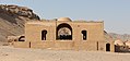
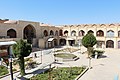
- Nomination Building at Tower of Silence, Yazd, Iran --Bgag 00:07, 7 March 2018 (UTC)
- Promotion Good quality. -- Johann Jaritz 03:10, 7 March 2018 (UTC)
-
- Nomination Building at Tower of Silence, Yazd, Iran --Bgag 00:07, 7 March 2018 (UTC)
- Promotion Good quality. -- Johann Jaritz 03:10, 7 March 2018 (UTC)
-

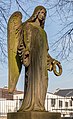
- Nomination Christ Church Cathedral, Darwin, Australia --Bgag 00:07, 7 March 2018 (UTC)
- Promotion Good quality. -- Johann Jaritz 03:10, 7 March 2018 (UTC)
-
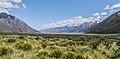
- Nomination Valley of Tasman River in Aoraki/Mount Cook National Park, New Zealand. --Tournasol7 00:02, 7 March 2018 (UTC)
- Promotion Good quality. --Jacek Halicki 00:08, 7 March 2018 (UTC)
-

- Nomination Saint John the Baptist Church of La Malene, Lozere, France. --Tournasol7 00:02, 7 March 2018 (UTC)
- Promotion Good quality. --Jacek Halicki 00:08, 7 March 2018 (UTC)
-
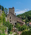
- Nomination House of Henri Martin in Saint-Cirq-Lapopie, Lot, France. --Tournasol7 00:02, 7 March 2018 (UTC)
- Promotion Good quality. --Jacek Halicki 00:08, 7 March 2018 (UTC)
-
- Nomination Forester's lodge in Nowy Gierałtów 1 --Jacek Halicki 00:00, 7 March 2018 (UTC)
- Promotion Good quality. --Bgag 00:25, 7 March 2018 (UTC)
-

- Nomination Forester's lodge in Nowy Gierałtów 2 --Jacek Halicki 00:00, 7 March 2018 (UTC)
- Promotion Good quality, Tournasol7 00:06, 7 March 2018 (UTC)
-

- Nomination Monument of the Holy Trinity in Lądek-Zdrój 1 --Jacek Halicki 00:00, 7 March 2018 (UTC)
- Promotion Good quality, Tournasol7 00:06, 7 March 2018 (UTC)
-

- Nomination Monument of the Holy Trinity in Lądek-Zdrój 2 --Jacek Halicki 00:00, 7 March 2018 (UTC)
- Promotion Good quality --Halavar 00:20, 7 March 2018 (UTC)
-

- Nomination Monument of the Holy Trinity in Lądek-Zdrój 3 --Jacek Halicki 00:00, 7 March 2018 (UTC)
- Promotion Good quality, Tournasol7 00:06, 7 March 2018 (UTC)
-

- Nomination Investiture of the German team for Winter Olympics 2018 in Pyeonchang: Natalie Geisenberger --Sandro Halank 22:14, 6 March 2018 (UTC)
- Promotion Good quality. --Bgag 00:27, 7 March 2018 (UTC)
-

- Nomination Benedikt Lux (Bündnis 90/Die Grünen) --Sandro Halank 22:14, 6 March 2018 (UTC)
- Promotion Good quality. --Bgag 00:27, 7 March 2018 (UTC)
-

- Nomination Church of the Dormition, Argeș monastery, Romania --Pudelek 19:56, 6 March 2018 (UTC)
- Promotion Good quality. --Jacek Halicki 23:55, 6 March 2018 (UTC)
-

-

- Nomination Church of the Dormition, Argeș monastery, Romania --Pudelek 19:56, 6 March 2018 (UTC)
- Promotion Main object is quiet sharp, but a little deformed. Quality is for me high enough for Q1 --Michielverbeek 22:07, 6 March 2018 (UTC)
-

-

-

- Nomination Ketchikan, Alaska, United States --Poco a poco 18:43, 6 March 2018 (UTC)
- Promotion Good quality. --Ermell 21:34, 6 March 2018 (UTC)
-

- Nomination Totem pole, Anchorage, Alaska, United States --Poco a poco 18:43, 6 March 2018 (UTC)
- Promotion Nice.--Famberhorst 19:19, 6 March 2018 (UTC)
-

- Nomination De Havilland Canada DHC-2 Beaver, Ketchikan, Alaska, United States --Poco a poco 18:43, 6 March 2018 (UTC)
- Promotion Good quality. --Ermell 21:33, 6 March 2018 (UTC)
-
- Nomination Cumulus cloud, Portage, Alaska, USA --Poco a poco 18:43, 6 March 2018 (UTC)
- Promotion Good quality. --Ermell 21:32, 6 March 2018 (UTC)
-

- Nomination Robinson R44 helicopter, Chugah State Park, Alaska, USA --Poco a poco 18:43, 6 March 2018 (UTC)
- Promotion Good quality --Halavar 19:56, 6 March 2018 (UTC)
-

- Nomination The Vltava, Charles Bridge, Old Town Bridge Tower and Church of St. Francis of Assisi. Prague, Czech Republic --Ввласенко 18:26, 6 March 2018 (UTC)
- Promotion Photo could have been slightly sharper. and less noise. But still good enough for me. (did you use a tripod?)--Famberhorst 18:43, 6 March 2018 (UTC)
 Comment I did not use a tripod. Increase the sharpness - increase the noise. Thank you. -- Ввласенко 21:59, 6 March 2018 (UTC)
-

- Nomination Leaking wooden sheet piling due to too high frozen water level.
--Famberhorst 16:51, 6 March 2018 (UTC) - Promotion Good quality. --Poco a poco 18:48, 6 March 2018 (UTC)
- Nomination Leaking wooden sheet piling due to too high frozen water level.
-

- Nomination Penny ice into the lake.
--Famberhorst 16:51, 6 March 2018 (UTC) - Promotion Interesting photo. It looks like noise, but it's not. It's ice and the photo is sharp --Michielverbeek 17:49, 6 March 2018 (UTC)
- Nomination Penny ice into the lake.
-

- Nomination Italy, Alberobello, Trullo (Trulli) --Berthold Werner 16:20, 6 March 2018 (UTC)
- Promotion
 Support Good quality.--Famberhorst 16:40, 6 March 2018 (UTC)
-

- Nomination Wayside cross in Vigo. Galicia (Spain). --Lmbuga 15:39, 6 March 2018 (UTC)
- Promotion Good quality. --Jacek Halicki 16:36, 6 March 2018 (UTC)
-

- Nomination Litle lighthouse. Museum of Sea of Galicia, Alcabre, Vigo, Galicia (Spain) --Lmbuga 15:35, 6 March 2018 (UTC)
- Promotion Not the most beautiful background. But good image quality for me.--Famberhorst 16:39, 6 March 2018 (UTC)
-
-

-

- Nomination Cultural heritage monuments in Kalkar: Markt 14 --Pelikana 10:58, 6 March 2018 (UTC)
- Promotion Good quality. --Poco a poco 18:49, 6 March 2018 (UTC)
-

-
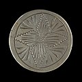
- Nomination engraved round ring --Ercé 07:28, 6 March 2018 (UTC)
- Promotion Good quality. --Jacek Halicki 10:24, 6 March 2018 (UTC)
-
- Nomination St. Wendelinus in Bramberg near Ebern --Ermell 07:14, 6 March 2018 (UTC)
- Promotion Good quality, Tournasol7 08:26, 6 March 2018 (UTC)
-

-

-

- Nomination War memorial in Seußling --Ermell 07:14, 6 March 2018 (UTC)
- Promotion Good quality. --Jacek Halicki 10:23, 6 March 2018 (UTC)
-

- Nomination Walks through the low moorland marshes De Deelen. Frozen draw hole.
--Agnes Monkelbaan 06:11, 6 March 2018 (UTC) - Promotion Good quality. --XRay 06:14, 6 March 2018 (UTC)
- Nomination Walks through the low moorland marshes De Deelen. Frozen draw hole.
-

- Nomination Rue Rapide - Sète --Christian Ferrer 06:07, 6 March 2018 (UTC)
- Promotion Right moment tot take a photo of such a narrow street, unfortunately the car is a bit blurred but Q1 for me --Michielverbeek 06:53, 6 March 2018 (UTC) thank you, indeed, I only saw the car on the picture when I got home --Christian Ferrer 11:44, 6 March 2018 (UTC)
-

- Nomination Waves on the Théâtre de la Mer --Christian Ferrer 06:06, 6 March 2018 (UTC)
- Promotion Good quality. --XRay 06:10, 6 March 2018 (UTC)
-

- Nomination Johan León, 2018 Valparaíso Cerro Abajo, Chile --Carlos yo 04:56, 6 March 2018 (UTC)
- Promotion Acceptable quality. Shadows a little bit too dark. --XRay 06:09, 6 March 2018 (UTC) I will try to keep that in mind for the next time. Thanks for the review. --Carlos yo 20:44, 6 March 2018 (UTC)
-

- Nomination Guillermo Vargas, 2018 Valparaíso Cerro Abajo, Chile --Carlos yo 04:56, 6 March 2018 (UTC)
- Promotion Support good quality --Christian Ferrer 06:03, 6 March 2018 (UTC)
-
-
-

- Nomination Old cemetery (Tomb Böselager), Bonn, North Rhine-Westphalia, Germany --XRay 04:26, 6 March 2018 (UTC)
- Promotion Support Good quality. -- Johann Jaritz 06:35, 6 March 2018 (UTC)
-

- Nomination “Watt-Welten”, Norderney, Lower Saxony, Germany --XRay 04:26, 6 March 2018 (UTC)
- Promotion Support Good quality.--Agnes Monkelbaan 05:57, 6 March 2018 (UTC)
-
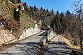
- Nomination Western part of the Almweg in Leonstein, Pörtschach, Carinthia, Austria --Johann Jaritz 03:10, 6 March 2018 (UTC)
- Promotion Support Good quality.--Agnes Monkelbaan 05:55, 6 March 2018 (UTC)
-

- Nomination Bench at the forest track Glorietteweg, Pörtschach, Carinthia, Austria --Johann Jaritz 03:10, 6 March 2018 (UTC)
- Promotion Good quality. IMO the FoP template is not necessary. --XRay 06:12, 6 March 2018 (UTC)
-

- Nomination Leonstain way, Pörtschach, Carinthia, Austria --Johann Jaritz 03:10, 6 March 2018 (UTC)
- Promotion Good quality. --Carlos yo 19:40, 6 March 2018 (UTC)
-

- Nomination Door of the church in La Bessenoits, commune of Firmi, Aveyron, France. --Tournasol7 00:12, 6 March 2018 (UTC)
- Promotion Support good quality --Christian Ferrer 06:06, 6 March 2018 (UTC)
-
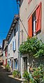
- Nomination Rue du Terrier in Monestiés, Tarn, France. --Tournasol7 00:12, 6 March 2018 (UTC)
- Promotion Good quality. --Ermell 13:43, 6 March 2018 (UTC)
-
-

- Nomination Beach of A Fonte, Vigo, Galicia (Spain). --Lmbuga 22:10, 5 March 2018 (UTC)
There is a small cw tilt Poco a poco 23:03, 5 March 2018 (UTC)
 Done Thanks--Lmbuga 23:40, 5 March 2018 (UTC)
 - Promotion Good quality. --Poco a poco 18:50, 6 March 2018 (UTC)
- Nomination Beach of A Fonte, Vigo, Galicia (Spain). --Lmbuga 22:10, 5 March 2018 (UTC)
-
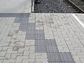
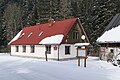
- Nomination Tactile paving at Bahnhof Waidhofen an der Ybbs. --GT1976 21:58, 5 March 2018 (UTC)
- Promotion Photo could have been sharper (used tripod?) But good enough for me.--Agnes Monkelbaan 06:03, 6 March 2018 (UTC)
-

- Nomination Three BR 185 (two at the front, one at the rear) are working hard to get the Winner train up to Göschenen. Pictured at Wassen, Switzerland. By User:Kabelleger --JoachimKohlerBremen 21:40, 5 March 2018 (UTC)
- Promotion Good quality. --Moroder 14:07, 6 March 2018 (UTC)
-

-

-

-

- Nomination Guards sculptures in front of the entrance. Preah Khan. Siem Reap Province, Cambodia. --Halavar 12:47, 5 March 2018 (UTC)
- Promotion Weak Pro. Really good quality, I only don´t like such straight crops --Hans-Jürgen Neubert 19:30, 6 March 2018 (UTC)
-

- Nomination White-winged snowfinch (Montifringilla nivalis), little bird visiting me at about 2600 m altitude. --D4m1en 20:46, 4 March 2018 (UTC)
- Promotion Nice, high-quality picture, but I'm not seeing geographic coordinates. Could you add them? -- Ikan Kekek 02:02, 5 March 2018 (UTC)
Dammit I totally forgot about coordinates, it is now Done -- D4m1en 19:17, 5 March 2018 (UTC)
Great. Support. -- Ikan Kekek 06:59, 6 March 2018 (UTC)
-

- Nomination Dredging activities on the Langwarder Wheels. Dredging work from Motorvrachtschip Hector.
--Famberhorst 07:33, 2 March 2018 (UTC) Comment Is A little bit noisy and tilted, can you fixit? --Cvmontuy 19:31, 2 March 2018 (UTC) Done. reduced noise reduction and perspective correction. Thank you. for your reviews.--Famberhorst 06:38, 3 March 2018 (UTC) CommentFlotation line should be horizontal but is not regards --Cvmontuy 18:05, 5 March 2018 (UTC) Done. Small correction. Thanks for your reviews. --Famberhorst 06:31, 6 March 2018 (UTC) - Promotion Good quality. --Cvmontuy 12:32, 6 March 2018 (UTC)
- Nomination Dredging activities on the Langwarder Wheels. Dredging work from Motorvrachtschip Hector.
-

- Nomination: Street sign of Allée de Tournaz in Saint-Cyr-sur-Menthon, France. --Chabe01 02:53, 1 March 2018 (UTC)
- Review needed
-

- Nomination: A view from University Beach, Pondicherry --Satdeep Gill 02:09, 1 March 2018 (UTC)
- Review needed
-

-

- Nomination: New Holland Island in Saint Petersburg. The Bottle House - Former Military Prison --Florstein 17:41, 28 February 2018 (UTC)
- Review needed
-

-

- Nomination: common moorhen (Gallinula chloropus) (also known as the waterhen and as the swamp chicken) --DmitriyGuryanov 11:55, 28 February 2018 (UTC)
Good but there is purple CA in the body --Poco a poco 19:57, 28 February 2018 (UTC) - Review needed
- Nomination: common moorhen (Gallinula chloropus) (also known as the waterhen and as the swamp chicken) --DmitriyGuryanov 11:55, 28 February 2018 (UTC)
-

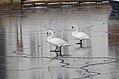
- Nomination: Mute swans on the ice in Risør harbour.--Peulle 11:36, 28 February 2018 (UTC)
- Review Comment Warum laden Sie innerhalb von zwei Tagen neun Bilder mit den gleichen Motiven hoch?? --Fischer.H 16:06, 28 February 2018 (UTC) Comment I shot a series of around a dozen shots, I just put them all up as a series. :) --Peulle 22:22, 28 February 2018 (UTC)
-

- Nomination: Mute swans on the ice in Risør harbour.--Peulle 11:36, 28 February 2018 (UTC)
- Review needed
-
- Nomination: Mute swans on the ice in Risør harbour.--Peulle 11:36, 28 February 2018 (UTC)
- Review needed
-

- Nomination: Cross from "Holy Cross Church" in Erlangen, taken at sommer storm --Hans-Jürgen Neubert 09:27, 28 February 2018 (UTC)
- Review needed


_02.jpg)
_03.jpg)
_01.jpg)
.jpg)
.jpg)


_Tactile_paving_at_Bahnhof_Waidhofen_an_der_Ybbs.jpg)

_Narrow_gauge_rail_wagon_Bi-s_3860_at_train_station_Kienberg-Gaming.jpg)

.jpg)
.jpg)
_-_les_Arcs_2018_2.jpg)
_61.jpg)


.jpg)
.jpg)

.jpg)
.jpg)
.jpg)
.jpg)
.jpg)
_Fulda_EcoControl_195-65_R_15_91_T_tire_at_Park_and_Ride_am_Bahnhof_Purgstall_an_der_Erlauf.jpg)
Consensual review[edit]
File:5._Civil_braided_shoulder_boards_(1876-1885).jpg[edit]
.jpg)
- Nomination Civil braided shoulder marks of the Russian Empire (1876—1885). By User:Serapo1 --Niklitov 15:21, 1 March 2018 (UTC)
- Promotion
 Oppose It doesn't fulfill the QI rules: not the work of a Commoner --Poco a poco 16:17, 1 March 2018 (UTC)
- Done Dear Poco a poco! This is the work of a Commoner User:Serapo1 (Sergei Popov). The author's answer is this User:Serapo1 this. Best Regards, — Niklitov 12:18, 2 March 2018 (UTC)
- Dear Basile Morin! Done. — Niklitov 08:40, 4 March 2018 (UTC)
- Dear Basile Morin!
- Invalid vote. Only users other than the author and the nominator can review a nomination. -- Basile Morin 11:50, 3 March 2018 (UTC)
- Support and every Creative Commons work is copyrightet. --Ralf Roletschek 21:45, 3 March 2018 (UTC)
- Support, now that the watermark is gone. -- Ikan Kekek 02:11, 5 March 2018 (UTC)
Total: 2 support (excluding the nominator), 1 oppose →  Promoted --Basotxerri 17:09, 8 March 2018 (UTC)
File:Ambigram_Free.png[edit]

- Nomination Ambigram Free, rotational symmetry of 180 degrees --Basile Morin 14:55, 22 February 2018 (UTC)
- Promotion
- Oppose Too simple a pattern for QI, IMO. --Peulle 09:40, 25 February 2018 (UTC)
- I disagreee, there is huge work behind this, and like any logo it's never as "simple" as it seems. Similar creations http://www.johnlangdon.net/#ambigrams by typographer John Langdon -- Basile Morin 13:46, 25 February 2018 (UTC)
- Comment I can understand how difficult it is to determine wether or not this kind of document is considered as a Quality Image, especially for the uninitiated. But before taking such a decision just because a "simple patterns should not be promoted", please start by accepting the fact that many simple vector designs already are QIs on Commons in this category Commons:Quality_images/Subject/Non_photographic_media. You can find for example :
- a single unicode character like this File:ख_Devnagari_letter_in_Unicode.svg
- a very simple monochrome logo NF like this File:Nordisk_Familjebåt,_NF.svg
- a pair of basic arrows like this File:Biochem_reaction_arrow_reversible_NYNY_horiz_med.svg
- a black and white minimalist drawing like this File:Hieroglyph_egyptian-Sa-Ra.svg
- a chemistry symbol like this File:1,4-dibromobenzene.svg
- a simple signature like this File:Signature-Eric-Aumonier-2014-1.svg
- a planar geometrical figure like this File:Triangle-heronian.svg
- another ambigram like this File:AmbigramJAG.svg, since 2009.
- After all these examples of successful QIs on Commons, I don't find acceptable to hear that this ambigram (like the 4 others below) is of insufficient quality. This Mondrian's painting File:Piet_Mondriaan,_1921_-_Composition_en_rouge,_jaune,_bleu_et_noir.jpg is not too simple, even if it's only composed of very elementary shapes and colors, and one would never say this shot of a flower is too "simple" to become a QI, even if the composition is not very elaborated. Thus, there's no reason to consider this black and white ambigram "too simple for QI". It is a high resolution images of 17,3 Mpix (5100 x 3400 pixels), vectorized with smooth curves. It shows what it is without any error in the symmetry. This is a unique piece elaborated from a complex process of development, and minutely improved in its graphic design stage. As a consequence, I think this media is as good as those Commons:Quality_images/Subject/Non_photographic_media. An insufficient quality would be for example this work File:Tantrix-ambigram-bw.svg, or this File:Light_Warrior_Ambigram_name.jpg, or this File:SaulAmbigram.JPG. This is different -- Basile Morin 08:32, 26 February 2018 (UTC)
- Support per Basile. There may be images that are too simple, but these are not, IMO. -- Ikan Kekek 10:06, 26 February 2018 (UTC)
- Support Good quality. -- Johann Jaritz 13:17, 26 February 2018 (UTC)
- @DerFussi: PNG and SVG are both valid format for vector documents. See this Template:BadJPEG. But I've uploaded a new version with calibrated and 100% opaque black. Thanks -- Basile Morin 02:04, 1 March 2018 (UTC)
- Can somebody else check it? I still see the transparency in these two parts (Screenshot)-- DerFussi 06:47, 1 March 2018 (UTC)
- Certainly due to your cache. Then, to display the last version click here [https://upload.wikimedia.org/wikipedia/commons/a/a7/Ambigram_Free.png?action=purge]. The syntax of the address will purge the cache from your computer and display the right file -- Basile Morin (
talk) 11:20, 1 March 2018 (UTC)
- I have striked it out but not turned into pro. I have intentionally downloaded the second version but now on travel and nobody was so kind to recheck it. -- DerFussi 16:42, 5 March 2018 (UTC)
- Certainly due to your cache. Then, to display the last version click here [https://upload.wikimedia.org/wikipedia/commons/a/a7/Ambigram_Free.png?action=purge]. The syntax of the address will purge the cache from your computer and display the right file -- Basile Morin (
talk) 11:20, 1 March 2018 (UTC)
- Can somebody else check it? I still see the transparency in these two parts (Screenshot)-- DerFussi 06:47, 1 March 2018 (UTC)
- Support --Trougnouf 14:24, 2 March 2018 (UTC)
- Oppose Per Peulle Poco a poco 10:15, 3 March 2018 (UTC)
- Support --Florstein 13:09, 4 March 2018 (UTC)
- Oppose Per Peulle --Lmbuga 22:03, 5 March 2018 (UTC)
Total: 4 support (excluding the nominator), 3 oppose → Promoted --Basotxerri 17:10, 8 March 2018 (UTC)
File:Ambigram_Two_in_One.png[edit]

- Nomination Ambigram Two in One, rotational symmetry of 180 degrees --Basile Morin 14:55, 22 February 2018 (UTC)
- Promotion
- OpposeToo simple for QI, IMO. --Peulle 09:40, 25 February 2018 (UTC)
- I disagreee, there is huge work behind this, and like any logo it's never as "simple" as it seems -- Basile Morin 13:46, 25 February 2018 (UTC)
- Support per Basile. There may be images that are too simple, but these are not, IMO. -- Ikan Kekek 10:07, 26 February 2018 (UTC)
- Support Good quality. -- Johann Jaritz 13:15, 26 February 2018 (UTC)
- Support This one would be QI to me, initial design and the execuation look complex enough for QI to me Poco a poco 10:16, 3 March 2018 (UTC)
Total: 3 support (excluding the nominator), 1 oppose → Promoted --Basotxerri 17:11, 8 March 2018 (UTC)
File:2017-09-08 (159) Fulda EcoControl 195-65 R 15 91 T tire at Park and Ride am Bahnhof Purgstall an der Erlauf.jpg[edit]
_Fulda_EcoControl_195-65_R_15_91_T_tire_at_Park_and_Ride_am_Bahnhof_Purgstall_an_der_Erlauf.jpg)
- Nomination Fulda EcoControl 195-65 R 15 91 T tire at Park and Ride am Bahnhof Purgstall an der Erlauf. --GT1976 22:06, 22 February 2018 (UTC)
- Decline
- Support Good quality. -- Johann Jaritz 05:05, 23 February 2018 (UTC)
- Oppose I disagree Abba ehrligg, dadd grenzt für mi an Perversion. Ok, Augenhöhe, ok sachlich, aber vom Shift spricht hier niemand?? Ich kann vom Reifen nur ULDA lesen., tss --Hans-Jürgen Neubert 19:34, 24 February 2018 (UTC)
- @Hans-Jürgen Neubert: Ein Kontra sollte sich auch sachlich begründen lassen, auch von einem Berufsfotografen oder jemandem, der sich mit einem solchen vergleicht. -- Spurzem 20:43, 25 February 2018 (UTC)
- Support - Looks like good quality to me, too. And Hans, even after running your words thought Google Translate, I have no idea what you are trying to say. -- Ikan Kekek 08:44, 25 February 2018 (UTC)
- I'm German, and I also don't understand the comment completely... --Smial 23:49, 25 February 2018 (UTC)
- Support Good quality. --Sandro Halank 11:15, 25 February 2018 (UTC)
- Support --Cvmontuy 02:56, 26 February 2018 (UTC)
- There is absolute no sense and value at this kind of pics. Es geht um Reifen, dazu braucht man zwei. Einen flach, einen hochkant, ineinandergelegt (bekommt man vom Reifenhändler) = Profil plus Größe. Man kann das auch mit Felgen fotografieren, dann ohne Auto. Dann sollte das Foto die Felge präsentieren. Wie hier, ich kann ja nicht einmal den Hersteller richtig lesen (ULDA statt Fulda) Das Foto müsste "Standard-Stahlfelge mit Logo VW Kunststoff-Radkappe" heißen. Wenn ich den Radkasten abbilde muss der Freiraum sichtbar sein (paßt die Größe in den Radkasten?), zusätzlich eingeschlagen am Vorderrad. Ich sehe hier nur einen "sehr faul" aufgenommenen Schnappschuss, mit angeschnittenen Radkasten ohne Sinn und Wert (weder künstlerisch, noch handwerklich, noch mit Bedeutung (Dokumentation) in Richtung Wikipedia). In meiner Gegend hätte man noch angemerkt. Buck Di, gfälligsdǃ ;-)(Geh´ halt wenigstens in die Hocke, sonst sieht der Reifen platt aus). Hier pervertiert sich die QI-Sternchen Sammlerei und macht sich außerhalb sogar lächerlich.--Hans-Jürgen Neubert 06:49, 26 February 2018 (UTC)
- Comment Google translation for the lazies: There is no sense and value for this kind of pics. It's about tires, you need two. A flat, an upright, nested (you get from the tire dealer) = profile plus size. You can also shoot with rims, then without a car. Then the photo should present the rim. Like here, I can not even read the manufacturer correctly (ULDA instead of Fulda) The photo should be "standard steel rim with logo VW plastic hubcap" hot. If I depict the wheel arch, the clearance must be visible (does the size fit in the wheel arch?), Additionally hammered on the front wheel. All I can see here is a snapshot taken "very lazily", with a truncated wheel arch without meaning and value (neither artistic, nor craftsmanship, nor meaning (documentation) in the direction of Wikipedia). In my area you would have noticed. Buck Di, gfälligsd!; -) (At least squat down, otherwise the tire will look flat). Here, the QI-Sternchen collector is perverting himself and even makes himself ridiculous outside. - Hans-Jürgen Neubert 06:49, 26 February 2018 (UTC)
- By the way Hans-Jürgen Neubert did you mean to oppose? --Trougnouf 19:29, 26 February 2018 (UTC)
- YES, pls. decline from my side Hans-Jürgen Neubert
- Was für ein Glück, dass uns endlich ein großer Fotograf sagt, wie das Rad eines Autos fotografiert werden muss, wenn er auch in seinen detaillierten Ausführungen die Begriffe Rad und Felge verwechselt! – Luckily a great photographer finally tells us how to photograph the wheel of a car, even though he confuses the terms wheel and rim in his detailed remarks! - Spurzem 13:45, 26 February 2018 (UTC)-- Spurzem 13:41, 26 February 2018 (UTC)
- Wenn ich Reifen fotografiere sieht das sicher anders ausː) dabei ist die Anmerkung ironisch, nicht werbetechnisch gemeint. Ich versteh´ auch nicht was ich verwechselt hab´, vom Reifen erkennt man ja kaum was - und bildwichtig scheint er rein von der prozentualen Bildfläche her auch nicht zu sein. Es ist schlicht ein Foto einer montierten Radkappe. Hat mit Fotograf und "Great" noch viel weniger zu tun. Das konnten die schon vor 100 Jahren besser. Als Architektur-Foto hätte die Gemeinschaft das hier zerissen, dabei reicht es schon technisch qualitativ. Die ganze Serie ist halt wirklich schlecht und zudem billig aufgenommen (ganz anders wie die Eier-Serie, die Käsesorten oder die Tonfiguren aus einem Museum/auch mit heftigen Außreisern). Was wirklich schade ist, ist die ignorierte öffentliche Meinung (eine Realität), da wird "derartiges" weniger nett und vor allem viel weniger detailliert kommentiert, es reicht da meist ein Wort. Ich möchte das wirklich mal von Außen, nach Innen transportieren (ich werde immer gefragt warum ich das hier überhaupt mache). In vielen Fällen wird hier nicht nur ein Eindruck einer angeblich elitären Gruppe erzeugt, es wird einfach nur albern, da sich diese Teilnehmer selber multiplizieren und Neulinge diesen Stil anzüchten (klingt nicht nur nach Inzucht). Btw, ich bin für ganz anderes bekannt, auf Commons findet sich davon gar nix. Ich mag halt Denkmäler, Architektur, Bäume oder eine Sicht der Dinge die in unserer Zeit untergeht und auch sonst keine Sau interessiert. Darf ja mein Problem bleiben.-) --Hans-Jürgen Neubert 21:13, 26 February 2018 (UTC)
- Sehr aufschlussreich; das versteht jetzt wahrscheinlich jeder. ;-) -- Spurzem 21:31, 26 February 2018 (UTC)
- Oppose kein QI für mich --Fischer.H 17:46, 26 February 2018 (UTC)
- Oppose Tire not well lit and not well depicted. Characteristics of the tire not shown. Random composition. Low local contrast. --Smial 22:01, 26 February 2018 (UTC)
- Oppose I agree that a random snapshot in mediocre quality of a useless motif should not be a QI. --Palauenc05 09:51, 27 February 2018 (UTC)
- Oppose Low local contrast and in that case I would expect a straight upright "VW" symbol. -- DerFussi 16:38, 5 March 2018 (UTC)