Commons:Quality images candidates/Archives June 26 2016
Jump to navigation
Jump to search

-

- Nomination Beekdal Linde Bekhofplas. A valuable nature of Staatsbosbeheer. Location profince Friesland in the Netherlands.
--Agnes Monkelbaan 04:20, 24 June 2016 (UTC) - Promotion Good quality. --Johann Jaritz 04:23, 24 June 2016 (UTC)
- Nomination Beekdal Linde Bekhofplas. A valuable nature of Staatsbosbeheer. Location profince Friesland in the Netherlands.
-

- Nomination Melalap, Sabah, Malaysia: Kilometrage at the Keningau-Tenom Road --Cccefalon 03:58, 24 June 2016 (UTC)
- Promotion Good quality. --Johann Jaritz 04:03, 24 June 2016 (UTC)
-
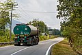
- Nomination Melalap, Sabah, Malaysia: A palmful tank truck on the Keningau-Tenom Road --Cccefalon 03:58, 24 June 2016 (UTC)
- Promotion Good quality. --Johann Jaritz 04:11, 24 June 2016 (UTC)
-

- Nomination Kg. Pulong, Sabah: A Case 580M excavator in in Kg Pulong --Cccefalon 03:58, 24 June 2016 (UTC)
- Promotion
 Support Good quality.--Agnes Monkelbaan 04:31, 24 June 2016 (UTC)
-
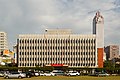
- Nomination Taipei City, Taiwan: National development Council. --Cccefalon 03:58, 24 June 2016 (UTC)
- Promotion Good quality. --Johann Jaritz 04:01, 24 June 2016 (UTC)
-
-
- Nomination Astrakhan. Pond "Lebedinoye ozero" --Alexxx1979 03:56, 24 June 2016 (UTC)
- Promotion Good quality. --Johann Jaritz 04:12, 24 June 2016 (UTC)
-
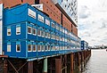
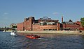
- Nomination Building container an der Elbphilharmonie, Hamburg, Germany --XRay 03:39, 24 June 2016 (UTC)
- Promotion Good quality. --Johann Jaritz 04:04, 24 June 2016 (UTC)
-
-

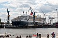
- Nomination Wasserschloss at Wandrahmsfleet (und Holländischbrookfleet (left)) in the Speicherstadt, Hamburg, Germany --XRay 03:39, 24 June 2016 (UTC)
- Promotion Support Good quality.--Agnes Monkelbaan 04:28, 24 June 2016 (UTC)
-
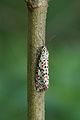
- Nomination Utetheisa pulchella --Vengolis 03:04, 24 June 2016 (UTC)
- Promotion Good quality. --Johann Jaritz 04:06, 24 June 2016 (UTC)
-
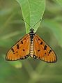
- Nomination Acraea terpsicore --Vengolis 03:04, 24 June 2016 (UTC)
- Promotion
 Comment Please remove the stains first, elsewhere good. --Johann Jaritz 03:24, 24 June 2016 (UTC)
Comment cropped for now -- Vengolis 03:55, 24 June 2016 (UTC) Comment Thank you! OK now. Good quality. --Johann Jaritz 03:59, 24 June 2016 (UTC)
-

- Nomination Danaus chrysippus --Vengolis 03:04, 24 June 2016 (UTC)
- Promotion Good quality. --Johann Jaritz 03:27, 24 June 2016 (UTC)
-

- Nomination Parish church Holy Trinity in Unterloibl, Ferlach, Carinthia, Austria --Johann Jaritz 02:18, 24 June 2016 (UTC)
- Promotion Good quality. --Vengolis 03:58, 24 June 2016 (UTC)
-
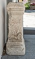
- Nomination Roman ara consecrated to the local goddess Belestis (ILLPRON 654) in front of the parish church Holy Trinity in Unterloibl, Ferlach, Carinthia, Austria --Johann Jaritz 02:18, 24 June 2016 (UTC)
- Promotion Good quality. --Cccefalon 03:59, 24 June 2016 (UTC)
-

- Nomination Wayside shrine at Sapotnica on Loiblpass road, Ferlach, Carinthia, Austria --Johann Jaritz 02:18, 24 June 2016 (UTC)
- Promotion Good quality. --Vengolis 03:58, 24 June 2016 (UTC)
-

- Nomination Cemetery gate at Saint Leonard in Loibltal, Ferlach, Carinthia, Austria --Johann Jaritz 02:18, 24 June 2016 (UTC)
- Promotion Support Good quality.--Agnes Monkelbaan 04:24, 24 June 2016 (UTC)
-
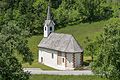
- Nomination Subsidiary church Saint Magdalene at Sapotnica on Loiblpass road, Loibltal,, Ferlach, Carinthia, Austria --Johann Jaritz 02:18, 24 June 2016 (UTC)
- Promotion Good quality. --Cccefalon 04:00, 24 June 2016 (UTC)
-

- Nomination Edelgard Bulmahn, deutsche Politikerin (SPD). 1998 - 2005 Bundesministerin für Bildung und Forschung. --Steschke 21:15, 23 June 2016 (UTC)
- Promotion Good quality. --Ermell 22:20, 23 June 2016 (UTC)
-

- Nomination Duke of Burgundy (Hamearis lucina) male, Ivinghoe Beacon, Buckinghamshire --Charlesjsharp 20:45, 23 June 2016 (UTC)
- Promotion Good enough for QI, although the DoF could be a little bit deeper so you don't lose sharpness on the top of the wing. --Peulle 23:12, 23 June 2016 (UTC)
-

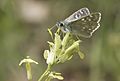
- Nomination Adonis blue butterfly (Polyommatus bellargus) female, Yoesden Bank, Buckinghamshire --Charlesjsharp 20:45, 23 June 2016 (UTC)
- Promotion Good quality. --Ermell 22:29, 23 June 2016 (UTC)
-

- Nomination Adonis blue butterfly (Polyommatus bellargus) female, Yoesden Bank, Buckinghamshire --Charlesjsharp 20:45, 23 June 2016 (UTC)
- Promotion Good quality. All your butterfly pictures are perfect but how come the file size is hardly 2mb? Do you crop or enlarge them? --Ermell 22:27, 23 June 2016 (UTC)
-

- Nomination Adonis blue butterfly (Polyommatus bellargus) female, aberration obsoleta, Yoesden Bank, Buckinghamshire --Charlesjsharp 20:45, 23 June 2016 (UTC)
- Promotion Good quality. --Peulle 23:13, 23 June 2016 (UTC)
-

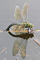
- Nomination Chuy Province of Kyrgyzstan: Ata-Beyit memorial cemetery near Bishkek --A.Savin 19:20, 23 June 2016 (UTC)
- Promotion Good quality. --Johann Jaritz 04:14, 24 June 2016 (UTC)
-

-

- Nomination Flowers and buds of Foxglove (Digitalis purpurea). Location, Tuinreservaat Jonkervallei in the Netherlands.
--Famberhorst 15:57, 23 June 2016 (UTC) - Promotion Support Good quality. --XRay 16:15, 23 June 2016 (UTC)
- Nomination Flowers and buds of Foxglove (Digitalis purpurea). Location, Tuinreservaat Jonkervallei in the Netherlands.
-
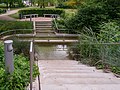
- Nomination View over the Bekhofplas. Location, nature Beekdal Linde Bekhofplas in the Netherlands.
--Famberhorst 15:57, 23 June 2016 (UTC) - Promotion Support Good quality. --XRay 16:15, 23 June 2016 (UTC)
- Nomination View over the Bekhofplas. Location, nature Beekdal Linde Bekhofplas in the Netherlands.
-

- Nomination Panorama of the Puente Nuevo reservoir, close to Villaviciosa in Cordoba, Spain. The Puente Nuevo power plant is included in the picture. --ElBute 15:54, 23 June 2016 (UTC)
- Promotion Good quality.--Famberhorst 16:05, 23 June 2016 (UTC)
-
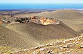
- Nomination Crater west of Islote de Hilario, Timanfaya National Park, Lanzarote --Llez 15:01, 23 June 2016 (UTC)
- Promotion Comment Please have a look to the image. Are the blue dots natural? --XRay 15:47, 23 June 2016 (UTC)
 Done It was the same problem as described in the
  Info here --Llez 16:46, 23 June 2016 (UTC) Support IMO accaptable now. Thanks. --XRay 17:25, 23 June 2016 (UTC)
-
-

- Nomination Praterstern Vienna, forecourt of the railwaystation Praterstern --Hubertl 14:22, 23 June 2016 (UTC)
- Promotion Sehr schön! Good quality. --Johann Jaritz 15:34, 23 June 2016 (UTC)
-

- Nomination The Tegetthoff-Monument in Vienna --Hubertl 14:22, 23 June 2016 (UTC)
- Promotion Good quality. --Johann Jaritz 15:35, 23 June 2016 (UTC)
-

-

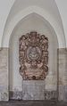
- Nomination Dr. Karl Lueger-Monument, Vienna. Halfrelief at the basement --Hubertl 14:22, 23 June 2016 (UTC)
- Promotion Well done! Good quality. --Johann Jaritz 15:36, 23 June 2016 (UTC)
-

-

-
-
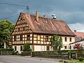
- Nomination Litzendorfer street in Schammelsdorf --Ermell 13:19, 23 June 2016 (UTC)
- Promotion Good quality.--Famberhorst 16:00, 23 June 2016 (UTC)
-

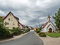
- Nomination Roscheider Hof, Rosengarten --Berthold Werner 12:06, 23 June 2016 (UTC)
- Promotion Good quality. --Ermell 13:20, 23 June 2016 (UTC)
-

- Nomination 2016.05.10 : Manifestation à Toulouse, France, contre l'usage de l'article constitutionnel 49-3 par le premier ministre Manuel Valls afin de faire passer de force sa réforme du code du travail dite "loi travail". --Pablo029 10:48, 23 June 2016 (UTC)
- Promotion Non neutral description. I disagree with the "de force", the french Constitution is just...legal!--Jebulon 12:56, 23 June 2016 (UTC) Support But it is a good picture.--Jebulon 12:59, 23 June 2016 (UTC)
-

- Nomination 2016.05.10 : Manifestation à Toulouse, France, contre l'usage de l'article constitutionnel 49-3 par le premier ministre Manuel Valls afin de faire passer de force sa réforme du code du travail dite "loi travail". --Pablo029 10:48, 23 June 2016 (UTC)
- Promotion Support Good.--Jebulon 12:59, 23 June 2016 (UTC)
-

-

-

-

-
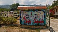
- Nomination Ymerawdwr, benywaidd yn dodwy. gwarchodfa natur Glascoed, Llanelwy. By User:Alun Williams333 --Llywelyn2000 08:41, 23 June 2016 (UTC)
- Promotion Good quality. --Ermell 13:23, 23 June 2016 (UTC)
-

- Nomination Picellwr praff, gwrywaidd, gwarchodfa natur Glascoed, Llanelwy. By User:Alun Williams333 --Llywelyn2000 08:41, 23 June 2016 (UTC)
- Decline It's poorly focused. Btw, specified category is missing --A.Savin 19:13, 23 June 2016 (UTC)
-
- Nomination brych y coed, ardal y Brenig. By User:Alun Williams333 --Llywelyn2000 08:41, 23 June 2016 (UTC)
- Promotion Good quality. --Ermell 13:22, 23 June 2016 (UTC)
-

- Nomination House number 127 in Wilkanów 1 --Jacek Halicki 08:39, 23 June 2016 (UTC)
- Promotion Good quality --Halavar 08:57, 23 June 2016 (UTC)
-

- Nomination House number 127 in Wilkanów 2 --Jacek Halicki 08:39, 23 June 2016 (UTC)
- Promotion Good quality --Halavar 10:14, 23 June 2016 (UTC)
-

- Nomination House number 127 in Wilkanów 3 --Jacek Halicki 08:39, 23 June 2016 (UTC)
- Promotion Good quality. --Johann Jaritz 15:38, 23 June 2016 (UTC)
-

- Nomination House number 130 in Wilkanów 1 --Jacek Halicki 08:39, 23 June 2016 (UTC)
- Promotion Good quality. --Johann Jaritz 15:38, 23 June 2016 (UTC)
-
- Nomination House number 130 in Wilkanów 2 --Jacek Halicki 08:39, 23 June 2016 (UTC)
- Promotion Good quality. --Ermell 13:25, 23 June 2016 (UTC)
-

- Nomination traffic sign in Vienna --Ralf Roletschek 07:37, 23 June 2016 (UTC)
- Promotion Good quality --Halavar 08:57, 23 June 2016 (UTC)
-

- Nomination Lentoaseman rautatieasema Helsinki-Vantaan --Ralf Roletschek 07:37, 23 June 2016 (UTC)
- Decline
 Oppose Sorrry, but the right side of the image is blurred. --Halavar 08:57, 23 June 2016 (UTC)
-

- Nomination Oldtimertreffen Eberswalde, Škoda 14Tr --Ralf Roletschek 07:37, 23 June 2016 (UTC)
- Promotion Good quality. --Jacek Halicki 08:43, 23 June 2016 (UTC)
-

-

-
- Nomination Moscow. The former factory buildings of the Red October confectionery. --Dmitry Ivanov 03:55, 23 June 2016 (UTC)
- Promotion Lovely. --Peulle 07:29, 23 June 2016 (UTC)
-

-

- Nomination '49 TRally de Ourense ' in 2016, in the city of Ourense, scoring for the CERA. --Harpagornis 23:56, 22 June 2016 (UTC)
- Promotion Good enough. The movement control is well done. --Peulle 23:16, 23 June 2016 (UTC)
-

-
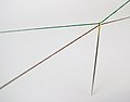
- Nomination Gold-tipped sewing needle with green and brown threads. --W.carter 13:17, 22 June 2016 (UTC)
- Decline Good composition but with a motiv like this it should be easy to take in higher resolution --Ermell 20:33, 22 June 2016 (UTC)
Yes it is, if you can afford such a camera. ;) --W.carter 07:02, 23 June 2016 (UTC)
-

- Nomination Joachim Gauck --Sandro Halank 11:10, 22 June 2016 (UTC)
- Decline Insufficient quality. Sorry --A.Savin 19:03, 23 June 2016 (UTC)
-

-

-

- Nomination: Gagea serotina, Cwm Du'r Arddu, Snowdonia, Wales (14 others nearby). -- Llywelyn2000 14:16, 17 June 2016 (UTC)
- Review Taken by Alun Williams333 --A.Savin 14:28, 17 June 2016 (UTC)
-

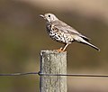
- Nomination Hirundo rustica, Nebo, LLanrwst, North Wales; May 2016. -- Llywelyn2000 14:16, 17 June 2016 (UTC)
- Decline Taken by Alun Williams333 --A.Savin 14:28, 17 June 2016 (UTC)
Oversharpened and noisy. --Peulle 20:30, 23 June 2016 (UTC)
::Up to you, but I suspect you mistake shallow DOF for "not sharp enough". The "lighted" eye is plenty sharp. --Bep 18:52, 17 June 2016 (UTC)
-
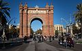
- Nomination: Arc de Triomf --Bep 13:36, 17 June 2016 (UTC)
- Review Maybe QI when all the following is done: perspective correction, removal of
 chromatic aberrations, lightening of shadows, crop of the bottom part. --A.Savin 14:25, 17 June 2016 (UTC)
::Well, that's not gonna happen -- as most of what you're saying would destroy a fine and interesting shot. --Bep 18:53, 17 June 2016 (UTC)
-

- Nomination Blausee, Bern, Switzerland --MartynovRussia 22:44, 17 June 2016 (UTC)
- Promotion Good quality. --Billy69150 08:50, 23 June 2016 (UTC)
-
-
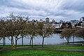
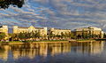
- Nomination Vancouver Skyline from Ron Basford Park, Granville Island. --Xicotencatl 15:57, 16 June 2016 (UTC)
- Decline Sorry, insufficient quality on the buildings. --Billy69150 08:49, 23 June 2016 (UTC)
-
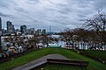
- Nomination Vancouver Skyline from Ron Basford Park, Granville Island. --Xicotencatl 15:57, 16 June 2016 (UTC)
- Decline Messy composition, vertical lines, light conditions and too generic file description, sorry --Moroder 18:40, 23 June 2016 (UTC)
-
- Nomination Kneipp installation in Bad Laer. Osnabrück Land, Low Saxony, Germany --Basotxerri 15:24, 16 June 2016 (UTC)
- Decline Unbalanced composition, makes me nervous. Sorry --Moroder 18:43, 23 June 2016 (UTC)
-

-

-

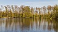
- Nomination Lake Renkenörener See. Osnabrück Land, Low Saxony, Germany --Basotxerri 15:35, 15 June 2016 (UTC)
- Promotion Good quality. --Moroder 18:32, 23 June 2016 (UTC)
-

- Nomination: Magnetic dipole field around a small current loop. --Geek3 14:56, 11 June 2016 (UTC)
- Review Could you add some text about the meaning of the cross and the dot in the image description? --Basotxerri 17:18, 17 June 2016 (UTC)


_male_underside.jpg)


._Locatie,_Tuinreservaat_Jonkervallei_02.jpg)


.jpg)


.jpg)


_by_Sandro_Halank%E2%80%935.jpg)

,_park_Oborskich_-_Kroton_003.JPG)


.jpg)
.jpg)
Consensual review[edit]
File:Ephèbe Antikythera NAMA Χ13396.jpg[edit]

- Nomination The Ephebe of Antikythera, bronze statue larger than life found in a shipwreck, NAMAthens, Greece. Three versions availbale: natural, black bg, and .png version with transparent bg.--Jebulon 08:04, 22 June 2016 (UTC)
- Withdrawn
- Comment Sorry, but even before I checked the versions, I knew this background was artificially added. The result is not where you want it to be; it looks like those movies where you can see actors are standing in front of a green-screen. I'd revert it, or get a version with fewer people nearby.--Peulle 12:34, 22 June 2016 (UTC)
 Question Oh really ? Of course it is an artificial background ! Like many other of my museum pictures ! I don't really understand your comment. The goal is to emphazise the quality of the work, without disturbing surroundings elements, like marble statues here, small objects here, marble busts here, red background here or, closer, grey-reworked here. We have a bronze (metal) statue, so the light is particularily difficult to manage, it is easier for marble. See this or this. I don't know what do you mean, or what to do. There are very few "inside" pictures in QIC, and none museum pictures but mine right now. Please ask yourself: "why ?".--Jebulon 16:00, 22 June 2016 (UTC)
- Oppose I take it you wish to move the image to CR, then - consider it done. My opinion stands: I think this particular background creates a contrast which makes the image look artificial and overly edited. There is also no mention of the edit in the image description, which the guidelines say there should be. --Peulle 19:46, 22 June 2016 (UTC)
- Please have a look to the upload history of the file...--Jebulon 09:50, 23 June 2016 (UTC)
- Comment I disagree about the artificiality, but the cut out is a bit sloppy (see note). And maybe some curves will help to brighten the statue. --C messier 11:44, 24 June 2016 (UTC)
![]() I withdraw my nomination Thanks for comments, I'll try something different.--Jebulon 10:21, 25 June 2016 (UTC)
I withdraw my nomination Thanks for comments, I'll try something different.--Jebulon 10:21, 25 June 2016 (UTC)
File:Lübbenau_-_Marstall_0001_(infrared_and_partly_coloured).jpg[edit]
.jpg)
- Nomination Royal studs of the Lübbenau castle, Lübbenau/Spreewald, Brandenburg, Deutschland --DerFussi 15:56, 19 June 2016 (UTC)
- Decline
- Oppose The picture is unsharp and I don't get the educational purpose of such partial color/BW process? --A.Savin 14:02, 20 June 2016 (UTC)
- Comment Is an educational purpose a part of the guidelines here? Discussion please -- DerFussi 18:12, 21 June 2016 (UTC)
- Comment @DerFussi Ich nehme zu Kenntnis, dass du dich zu der eigentlichen Frage nicht äußern magst. --A.Savin 10:02, 22 June 2016 (UTC)
- Comment I have to admit. Its my old camera (haven't been satisfied with it). I have had the photo printed 3 years ago for my wall and didn't re-check it before uploaded it here. I admit. I should have done it. But still don't get the reason for the second comment. Painting a layer mask for the infrared layer took some days. I did it because it's just nice and focuses on the main object. So I am more puzzled abou the second comment. Thats why I have answered. -- DerFussi 15:07, 22 June 2016 (UTC)
- Comment Sorry, the bot was faster than me (I just wanted to decline it by myself). I should not dig out my old photos. -- DerFussi 05:09, 23 June 2016 (UTC)
- Support das Haus ist scharf. --Ralf Roleček 14:19, 23 June 2016 (UTC)
- This is not true. --A.Savin 19:01, 23 June 2016 (UTC)
- Oppose The house is definitely not sharp. Don't sell your reputation, Ralf. --Cccefalon 20:04, 23 June 2016 (UTC)
- Sorry, wo nicht? Ich bin ja lernfähig. Bei 100% ist alles Farbige bei mir scharf? Was übersehe ich? --Ralf Roletschek 22:57, 23 June 2016 (UTC)
File:Phalaenopsis_(01).jpg[edit]
.jpg)
- Nomination Fleur de Phalaenopsis (orchidée) --Lepsyleon 20:02, 21 June 2016 (UTC)
- Decline
- Support Good quality -- Spurzem 21:00, 21 June 2016 (UTC)
- Oppose I disagree: See the annotation (someone left them already, but I agree with those notes) --Cccefalon 21:16, 21 June 2016 (UTC)
- Oppose I´m afraid, it´s not. See additional notes.
- Comment Bad separation ? Jpg errors ? I deleted them with the new version. I don't understand... --Lepsyleon 07:18, 22 June 2016 (UTC)
- Comment The issues are still present. I stand my oppose. --Cccefalon 07:56, 22 June 2016 (UTC)
- Oppose The focus is OK (the stem being out of focus is no problem since it's the flower petals that are the main subject), but the big problem for me is the extreme white glare from the background, which spills over into the edges of the flower. It's just too bright for me. --Peulle 12:52, 22 June 2016 (UTC)
- Oppose Agreeing Peulle -- DerFussi 06:43, 23 June 2016 (UTC)
Total: 1 support (excluding the nominator), 4 oppose →  Declined -- DerFussi 06:43, 23 June 2016 (UTC)