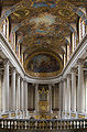
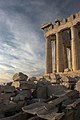
Promotion Good example of quality not rectiliearized architectural image. Cut tower in the right seems unavoidable "clone tool" in photo editing sw. --Wikimol 19:59, 31 July 2006 (UTC)
Promotion Wonderful demostration of timing, additional sequence in the description is fantastic, a smaller field of view and it's a FP Gnangarra 11:28, 30 July 2006 (UTC)
Nomination Ponds in Samothraki. --Adamantios 09:25, 22 July 2006 (UTC)
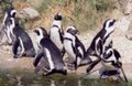
Decline The colour are washed out, the use of a ND or polarised filter is recommended. the subject is well presented and the people add size Gnangarra 11:30, 30 July 2006 (UTC)
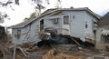
Nomination New Orleans Lower 9th Ward after Katrina, by Infrogmation
Promotion The documentation value outweighs the minor tech flaws IMO --IbRas 08:16, 27 July 2006 (UTC)
Decline Resolution too low (< 2MP) --IbRas 11:25, 26 July 2006 (UTC)
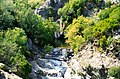
Nomination River Cam by User:Jdforrester 11:55, 24 July 2006 (UTC)
Decline I can't find anything in this image that looks sharp --IbRas 18:15, 24 July 2006 (UTC)
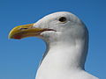
Nomination Sterna Hirundo - missed dive for a catch--Thermos 12:20, 24 July 2006 (UTC)
Promotion I like it. -- Infrogmation 03:54, 26 July 2006 (UTC)
Nomination Good illustration, also can illustrate how the color of the bird mathes environment. --Wikimol 21:49, 24 July 2006 (UTC)
Promotion Good detail on the bird. -- Infrogmation 03:54, 26 July 2006 (UTC)
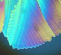
Nomination Microphotograph. --Wikimol 21:49, 24 July 2006 (UTC)
Decline There is a white haze over this image, that I don't think there should be in a quality microphoto. --IbRas 08:00, 27 July 2006 (UTC)
Nomination Telegraph pole --Wikimol 20:06, 23 July 2006 (UTC)
Decline The foreground weeds are a distraction that may have been avoidable Gnangarra 12:41, 24 July 2006 (UTC)
Nomination Mayan architecture at Uxmal --Drini 01:24, 20 July 2006 (UTC)
Decline For example the right wall in shadow is much blurred and lacks detail. I cant' tell why, possibly too heavy noise reductuion / in-camera processing? --Wikimol 21:34, 24 July 2006 (UTC)
Decline Nobody seems willing to touch this one, and I have my doubts about it myself, but we can't have it hanging around forever, so I'm gonna let the doubt benefit quality, and decline it. --IbRas 19:58, 27 July 2006 (UTC)
Nomination Garden Kyoto, Japan by User:Fg2.. Gnangarra 05:59, 23 July 2006 (UTC)
Promotion Fantastic colors. --20:06, 23 July 2006 (UTC)
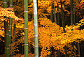
Nomination Maples and bamboo in autumn by User:Fg2..
Decline Nice colours, but way too much graininess/noise for my taste. --IbRas 20:55, 23 July 2006 (UTC)
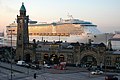
Nomination Elbe ship --Wikimol 20:06, 23 July 2006 (UTC)
Nomination Painted building facades in Berlin. --Adamantios 09:25, 22 July 2006 (UTC)
Decline Too flat and not really sharp. --IbRas 17:33, 22 July 2006 (UTC)
Nomination Good church by Shauni --Thermos 05:39, 21 July 2006 (UTC)
Promotion very good lighting the surface features of the white walls are clear, minor composition fault with the spire just in the image Gnangarra 01:20, 23 July 2006 (UTC)
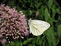
Nomination Butterfly by Nemo5576 --Thermos 05:29, 21 July 2006 (UTC)
Promotion very good detail looks blurred at thumbnail but its the fine hairs on the subject Gnangarra 01:29, 23 July 2006 (UTC)
Decline burnt sky CyrilB 10:23, 15 July 2006 (UTC)
Nomination Maple leaves --MRB 06:50, 14 July 2006 (UTC)
Promotion good illustration CyrilB 10:23, 15 July 2006 (UTC)
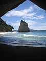
Nomination Beach of Cathedral Cove, New Zealand--Chakal 20:55, 13 July 2006 (UTC)
Decline Bad jpeg compression CyrilB 21:34, 13 July 2006 (UTC)
Nomination Walking among Autumn trees, by User:Fg2
PromotionThe scan is not really good (dust, lack of sharpness) CyrilB 20:53, 13 July 2006 (UTC) This issue has now been corrected. Changed from decline to promotionCyrilB 09:25, 15 July 2006 (UTC)
Nomination Ojiya balloon festival --Wikimol 11:27, 13 July 2006 (UTC)
Promotion Amazing image CyrilB 20:58, 13 July 2006 (UTC)
Nomination Two menhirs in Brittany --China Crisis 08:33, 13 July 2006 (UTC)
Promotion Clear and illustrative CyrilB 21:05, 13 July 2006 (UTC)
Nomination Baltic Herring Market, Helsinki by User:Frieda
Decline The photo is nice, the scan is with noticeable dirt and dust. If better scan could be made or this improved... --Wikimol 20:58, 17 July 2006 (UTC)
Nomination (educational) Detail of Helianthus annuus by User:Vdegroot
Decline The raised petal lower right of centre distracts too much at sizes above thumb, other than that very nice detail Gnangarra 14:52, 13 July 2006 (UTC)
Well, I think I'm still thinking with the way I'm used to post e-mail attachements: keep the data load as low as possible without compromising the image quality. Yet, Commons doesn't seem to be in memory space trouble, :-). I'll try to upload a version with a larger resolution. Thanks... --Doruk Salancı09:41, 10 July 2006 (UTC)[reply]
|
Nomination 'Famous' Honeywell thermostat for building by User:Vdegroot
Promotion Image size on lower end of requirement, composition and presentation of subject very good Gnangarra 14:52, 13 July 2006 (UTC)
The glare on the plastic (probably due to using flash aligned with the camera's main axis) significantly detracts from the quality of the image. The use of off-axis and/or indirect lighting would have been a significant improvement. Kelly Martin20:30, 15 July 2006 (UTC)[reply]
Nomination Clear diagram CyrilB 10:14, 9 July 2006 (UTC)
Promotion I cant get this image to appear on image page, or here Gnangarra 14:56, 13 July 2006 (UTC)
I promise I was visible when I nominated it! I suppose this is a problem with the thumbnail generation, as I can see the original diagram with firefox. This is a shame because this diagram is very professional CyrilB21:19, 13 July 2006 (UTC)[reply]
I cleaned the cache, and now I can see it. Will you change your mind? Also, if you prefer, a version without captions is available CyrilB21:32, 13 July 2006 (UTC)[reply]
Nomination Statue Rape of Polyxena by Fedi from 1865 Thermos 15:44, 11 July 2006 (UTC)
Promotion Very detailled picture
This is image was promoted more than two days ago, but unfortunately, the promoter did not sign his promotion. What we should do with this kind of situations? Please notice that this issue will also affect (to lesser extent) the "Geysir Bubble" image from 9th of July, where promotion does not have the time stamp (and sorry, if this came to wrong place) --Thermos00:10, 14 July 2006 (UTC)[reply]
For now suggest that if this occurs and the date cant be established from a quick check of history, then you just add current date/time and the 48 hours is applied from then, as this continues to grow it may better to remove the result and return it a nomination. Gnangarra10:30, 15 July 2006 (UTC)[reply]
Should have thought about that. I found the promotion to be from 18:47, 11 July 2006, made by CyrilB in a post where he promoted four images. Thank you Gnangarra for the tip. As we now know where the promotion originates and the time, per your message I think that the image should now be considered as QI. --Thermos11:13, 15 July 2006 (UTC)[reply]
No damage done and thank you for promotion. More skilled user than me should have thought what Gnangarra suggested... But good thing is that this got sorted... --Thermos12:26, 15 July 2006 (UTC)[reply]
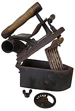
Nomination (historical importance) Charcoal iron by User:Vdegroot
Decline Good subject presentation Gnangarra 14:52, 13 July 2006 (UTC)
There are problems with isolation. QI dont have specific guideline yet, so we shall probably set some. What I mean... this image was proabably made using using the "magic wand" or similar tool. You can see that clearly when you magnify the image to 200% - observe for example the contour of the nut, or remaining pixels not background near the hinge. Top quality isolations are usualy done by hand, which produces natural smooth contours. +the selection should be adjusted by "feather", so the edges arent so hard.
So, there is the question, where to set the bar. Its possible to promote this one and similar in the future, or to the oposite. Personally, I'd be for the later alternative -this woundn't pass in comercial image agency. --Wikimol15:54, 13 July 2006 (UTC)[reply]
While I agree that the isolation is not perfect, I think it is good enough for most uses, and most of the damage can be corrected by smoothing some transitions. The overall quality of the image is good, and the resolution enough for printing. I support the nomination of this image.
I think we have to found the "threshold" for the quality images. For example, I honestly think that with a proper isolation, this image could have been featured. IMO, quality images should be defined as "good" images for further use, nothing more.CyrilB21:13, 13 July 2006 (UTC)[reply]
Promotion Illustrative and good resolution. --Wikimol 11:27, 13 July 2006 (UTC)
I feel that this image is cropped too closely; I feel "scrunched" when I look at it. The photographer (or, more likely, the photoeditor) failed to observe the "rule of thirds" when framing the image. Kelly Martin20:19, 15 July 2006 (UTC)[reply]
While I agree with you that this image would be better with more "breathing space", especially on top and bottom, I find that the so-called "rule of thirds" (which, of course, is by no means a law) is observed: the eyes of the animal are perfectly positioned! As far as I'm concerned, I think that this picture is good enough to get the "quality picture" label, by its illustrative value. CyrilB12:15, 16 July 2006 (UTC)[reply]
Crops are allways question of intent and desired expression... some people like very tight crops, cropping even parts of the subject to achive dramatic effect, others like lot of space to put subject into environment, which causes other people argue the subject is lost, and so on... I think QI review should go some middle way, decline pictures with important parts missing, but otherwise be tolerant. IMO in this this pictures the crop doesnt spoil the illustrative purpose. After some thought I think it even has some +, how the animal fills the whole space adds a bit to the feeling of its size, at least for me. --Wikimol20:56, 17 July 2006 (UTC)[reply]
I totally agree. We have to draw a line between quality and featured images. This one is informative, has not big technical flaw, IMO that's enough. CyrilB21:42, 17 July 2006 (UTC)[reply]
Authorship and copyright info is unclear. As a source is given user Bouba. If it is the case, than license {{self|...}} included by Thierry Caro is invalid. If it can be sorted out, I would be for promotion.--Wikimol14:12, 13 July 2006 (UTC)[reply]
Nomination Impressive work CyrilB 21:41, 13 July 2006 (UTC)
Decline Impressive but I feel theres too much information and the colour variants are too similar
Another format that needs a definative set of criteria, how do we assess these - I know there are colour combinations that colour blind people cant distinguish should this be part of the criteria. Gnangarra15:06, 18 July 2006 (UTC)[reply]
Nomination Headstone at Garnisons Church Copenhagen by User:IbRas
Promotion It's still boring, but technically OK. --IbRas 08:43, 22 July 2006 (UTC)
QI don't need to be impressive or particulary interesting. I don't see any technical flaws, so I would promote the image. --Wikimol10:04, 23 July 2006 (UTC)[reply]
I nominated this image as its very good example of the presentation of the subject, the simplists subjects are sometimes the hardest do well and the easiest to fault, I couldn't find any technical faults. Gnangarra15:24, 23 July 2006 (UTC)[reply]
I completely agree with Wikimol and Gnangarra. In encyclopedic sense, the project needs images that may be dull, but which are needed to illustrate the subject. --Thermos15:39, 23 July 2006 (UTC)[reply]
Nomination Ménara Garden, Marrakech, Morocco, by User:Wanted..
Decline Resolution too low (< 2MP) --IbRas 11:25, 26 July 2006 (UTC) I like this image a lot. If author could provide an image with 1600x1200 resolution or bigger as per guidelines, I would would promote this one immediately. --Thermos 11:59, 26 July 2006 (UTC)
I have placed a request with the uploader for a larger version, editor hasn't been active for 2 weeks so we'll see what happens. Gnangarra15:22, 26 July 2006 (UTC)[reply]
Nomination Mayan architecture at Uxmal --Drini 05:50, 19 July 2006 (UTC)
Promotion Only a part of the building is visible CyrilB 22:26, 19 July 2006 (UTC)
I'm moving this to consensual review since it was intended to show only part of the building (it was a very large building so displaying it all would miss detail. --Drini15:32, 27 July 2006 (UTC) }}[reply]
Note: The view is from the interior of a quadrangle of low buildings, with the pyramid-temple in background outside of the quadrangle. From the architectural lay out of the site, I don't think a single photo showing "all" could be made, unless possibly from the air. -- Infrogmation13:40, 28 July 2006 (UTC)[reply]
I think that the composition displays the subject as intended, when working with buildings balancing between structure and detail is difficult, as the purpose is detail not structure the composition is good, the question for me light/colour Gnangarra11:38, 30 July 2006 (UTC)[reply]
Promotion Great details and DOF. -Keqs 22:24, 26 July 2006 (UTC)
I have moved this down here, because the image does not fulfill the size requirements, but it is a borderline case, and if the rest of you like it enough to make an exception, I won't be difficult about it. --IbRas19:53, 27 July 2006 (UTC)[reply]
Yes, even thought it's a bit less than 2MP, the image is very sharp and clear. So I agree it may be a hi-res image cropped to frame only the intended part. Drini18:22, 31 July 2006 (UTC)[reply]


.jpg)


.jpg)