Commons:Quality images candidates/Archives January 24 2024
Jump to navigation
Jump to search

-

-
-

- Nomination Commercial and residential building Marienecke on Hauptstraße #185, Pörtschach, Carinthia, Austria -- Johann Jaritz 03:15, 22 January 2024 (UTC)
- Promotion
 Support Good quality. --Bgag 03:58, 22 January 2024 (UTC)
-

- Nomination Commercial und residential building on Hauptstraße #177, Pörtschach, Carinthia, Austria -- Johann Jaritz 03:15, 22 January 2024 (UTC)
- Promotion Support Good quality. --Bgag 03:58, 22 January 2024 (UTC)
-
- Nomination Commercial und residential building on Hauptstraße #177, Pörtschach, Carinthia, Austria -- Johann Jaritz 03:15, 22 January 2024 (UTC)
- Promotion Support Good quality. --Tagooty 03:54, 22 January 2024 (UTC)
-

- Nomination Windows at the commercial und residential building on Hauptstraße #177, Pörtschach, Carinthia, Austria -- Johann Jaritz 03:15, 22 January 2024 (UTC)
- Promotion Support Good quality. --Tagooty 03:54, 22 January 2024 (UTC)
-
- Nomination Apartment building on Khevenhüllerweg #1, Pörtschach, Carinthia, Austria -- Johann Jaritz 03:15, 22 January 2024 (UTC)
- Promotion Support Good quality. --Bgag 03:58, 22 January 2024 (UTC)
-

- Nomination Boat with pilgrims rowing in to Quila Ghat, Triveni Sangam, Allahabad, UP, India --Tagooty 02:05, 22 January 2024 (UTC)
- Promotion Support Good quality. --Rjcastillo 02:13, 22 January 2024 (UTC)
-

- Nomination Brown-headed gulls (Chroicocephalus brunnicephalus) mobbing a boat for food, Triveni Sangam, Allahabad, --Tagooty 02:05, 22 January 2024 (UTC)
- Promotion Support Good quality. --Rjcastillo 02:13, 22 January 2024 (UTC)
-

- Nomination Brown-headed gull (Chroicocephalus brunnicephalus) landing on the river, Triveni Sangam, Allahabad --Tagooty 02:05, 22 January 2024 (UTC)
- Promotion Support Good quality. --Rjcastillo 02:13, 22 January 2024 (UTC)
-

- Nomination Seagulls perched in the sun on a floating barrier, Triveni Sangam, Allahabad --Tagooty 02:05, 22 January 2024 (UTC)
- Promotion Support Good quality. --Rjcastillo 02:13, 22 January 2024 (UTC)
-

- Nomination Brown-headed gull (Chroicocephalus brunnicephalus) swimming on the river, Triveni Sangam --Tagooty 02:05, 22 January 2024 (UTC)
- Promotion Support Good quality. --Rjcastillo 02:13, 22 January 2024 (UTC)
-

- Nomination Jazmin Renée Jones at the premiere of the movie Seeking Mavis Beacon at the 40th Sundance Film Festival --Frank Schulenburg 23:13, 21 January 2024 (UTC)
- Promotion Support Good quality. --Tagooty 03:11, 22 January 2024 (UTC)
-

- Nomination An European robin (Erithacus rubecula) in Gennevilliers, France. --Alexis Lours 22:43, 21 January 2024 (UTC)
- Promotion Support Good quality. --Frank Schulenburg 23:42, 21 January 2024 (UTC)
-

- Nomination An European robin (Erithacus rubecula) in Gennevilliers, France. --Alexis Lours 22:43, 21 January 2024 (UTC)
- Promotion Support Good quality. --Tagooty 03:11, 22 January 2024 (UTC)
-

- Nomination View from Laufenburg (Switzerland) to Laufenburg (Germany) --JoachimKohler-HB 20:35, 21 January 2024 (UTC)
- Promotion Support Good quality. --C messier 20:50, 21 January 2024 (UTC)
-

- Nomination Petrobeis Mavromihalis house, Limeni, Mani. --C messier 20:33, 21 January 2024 (UTC)
- Promotion Support Good quality. --JoachimKohler-HB 20:37, 21 January 2024 (UTC)
-
- Nomination The byzantine church of Saint Barbara near Erimos, Mani. --C messier 20:33, 21 January 2024 (UTC)
- Promotion Support Good quality. --Frank Schulenburg 23:42, 21 January 2024 (UTC)
-

- Nomination Timber-framed houses at the Melanchthonstrasse nos. 32, 34, 36 in Bretten, Germany. —Aristeas 18:25, 21 January 2024 (UTC)
- Promotion Support Good quality. --JoachimKohler-HB 19:48, 21 January 2024 (UTC)
-

- Nomination View of Schloss Urach over the river Erms in Bad Urach, Germany. —Aristeas 18:25, 21 January 2024 (UTC)
- Promotion Support Good quality. --JoachimKohler-HB 19:48, 21 January 2024 (UTC)
-

- Nomination Listed timber-framed building Schulstrasse no. 8 in Herrenberg, Germany. —Aristeas 18:25, 21 January 2024 (UTC)
- Promotion Support Good quality. --JoachimKohler-HB 19:48, 21 January 2024 (UTC)
-

- Nomination 189 064 of DB Cargo with a train No. 46601 of Arriva vlaky carrier with aluminium oxide from Rotterdam Botlek to Žiar nad Hronom; Zámrsk station, Czech Republic. By User:Cmelak770 --MIGORMCZ 17:55, 21 January 2024 (UTC)
- Promotion Support Good quality. --JoachimKohler-HB 19:53, 21 January 2024 (UTC)
-

- Nomination Agfa Box camera with leather case --Berthold Werner 17:27, 21 January 2024 (UTC)
- Promotion Support Good quality. --Thi 18:46, 21 January 2024 (UTC)
-
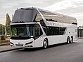
- Nomination Neoplan Skyliner Diamond Edition at Busworld Europe 2023 --MB-one 17:02, 21 January 2024 (UTC)
- Promotion Support Good quality. --Alexander-93 19:00, 21 January 2024 (UTC)
-
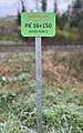
- Nomination Panneau PK16+150 à Miribel (Ain), ligne ferroviaire Perrache-Genève (janvier 2024). --Benoît Prieur 16:23, 21 January 2024 (UTC)
- Promotion Good quality. --MB-one 17:02, 21 January 2024 (UTC)
-

- Nomination Castel Sant'Angelo in Rome (by Tournasol7) --Sebring12Hrs 14:36, 21 January 2024 (UTC)
- Promotion Good quality. --Berthold Werner 17:31, 21 January 2024 (UTC)
-

- Nomination Castel Sant'Angelo in Rome (by Tournasol7) --Sebring12Hrs 14:36, 21 January 2024 (UTC)
- Promotion Good quality. --Berthold Werner 17:31, 21 January 2024 (UTC)
-
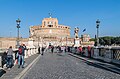
- Nomination Castel Sant'Angelo in Rome (by Tournasol7) --Sebring12Hrs 14:36, 21 January 2024 (UTC)
- Promotion Good quality. --Berthold Werner 17:31, 21 January 2024 (UTC)
-

- Nomination Capitolio, Toulouse, Francia, 2023-01-06 (by Poco a poco) --Sebring12Hrs 14:34, 21 January 2024 (UTC)
- Promotion Support Good quality. --Aristeas 18:28, 21 January 2024 (UTC)
-
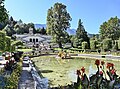
- Nomination Terraces of Linderhof Palace in Bavaria, Germany. --Cayambe 13:53, 21 January 2024 (UTC)
- Promotion Support Good quality.--Famberhorst 16:41, 21 January 2024 (UTC)
-

- Nomination Vue des piliers de la Passerelle de Miribel en janvier 2024. --Benoît Prieur 13:00, 21 January 2024 (UTC)
- Promotion Good quality. --Cayambe 22:39, 21 January 2024 (UTC)
-

- Nomination Australian fur seals (Arctocephalus pusillus doriferus) --Charlesjsharp 10:39, 21 January 2024 (UTC)
- Promotion Support Good quality. --Plozessor 10:43, 21 January 2024 (UTC)
-

- Nomination New Zealand fur seal (Arctocephalus forsteri) male --Charlesjsharp 10:39, 21 January 2024 (UTC)
- Promotion Support Good quality. --GoldenArtists 11:19, 21 January 2024 (UTC)
-

- Nomination Kangaroo Island Western grey kangaroo (Macropus fuliginosus) --Charlesjsharp 10:39, 21 January 2024 (UTC)
- Promotion Support Good quality. --Plozessor 10:42, 21 January 2024 (UTC)
-

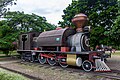
- Nomination LV-0233 steam locomotive at the station "Taganrog-II" --Alexxx1979 10:29, 21 January 2024 (UTC)
- Promotion Support Good quality. --Plozessor 10:43, 21 January 2024 (UTC)
-
- Nomination Crimea. Feodosia. Art Gallery named after I.K. Aivazovsky --Alexxx1979 10:29, 21 January 2024 (UTC)
- Promotion Support Good quality. --GoldenArtists 11:20, 21 January 2024 (UTC) Support Good quality. --Svetlov Artem 11:28, 21 January 2024 (UTC)
-

- Nomination Boeing 777 aircraft engine above clouds over Brasil --Mike Peel 10:23, 21 January 2024 (UTC)
- Promotion Support Good quality. --GoldenArtists 11:20, 21 January 2024 (UTC)
-

- Nomination CPEF 193 “Jiboia” at Catavento, São Paulo --Mike Peel 10:23, 21 January 2024 (UTC)
- Promotion Support Good quality. --Svetlov Artem 11:28, 21 January 2024 (UTC)
-
- Nomination Dubs 2351 Locomotive at Catavento, São Paulo --Mike Peel 10:23, 21 January 2024 (UTC)
- Promotion Support Good quality. --Svetlov Artem 11:28, 21 January 2024 (UTC)
-

- Nomination Peter Hrivňák performing in concert in Jihlava, Czech Republic. By User:Littleomig --MIGORMCZ 09:41, 21 January 2024 (UTC)
- Decline
Needs more noise reduction --Plozessor 10:46, 21 January 2024 (UTC)
@Plozessor: This photo in this form won the Czech Wiki Photo 2022 competition in the famous personality category. For this reason, I will not edit the photo in any way. The expert jury had a different opinion on the quality of this photo. --MIGORMCZ 11:11, 21 January 2024 (UTC) Oppose Understandable, but QI guidelines read "images should not have distracting amount of noise when viewed in full size", thus IMO this cannot be QI. --Plozessor 11:40, 21 January 2024 (UTC)
-

- Nomination Roman base at Pasohlávky: Hradisko Hill, where a military fortress of the Roman army stood 2,000 years ago, photos from the Roman-Barbarian festival GERMANIA SUBACTA 2022, a Roman soldier during the reconstruction of the Roman-Barbarian battle. By User:Pavel21kriz --MIGORMCZ 09:41, 21 January 2024 (UTC)
- Promotion
Good picture, but needs more description. What is this, who is that depicting, what does the sign say, etc. --Plozessor 10:46, 21 January 2024 (UTC)
@Plozessor: I have added the information I managed to find. --MIGORMCZ 11:40, 21 January 2024 (UTC) Support Good quality. --Plozessor 11:52, 21 January 2024 (UTC)
-

- Nomination morning above the fog. By User:Lukas.stas --MIGORMCZ 09:41, 21 January 2024 (UTC)
- Promotion Support Good quality. --Plozessor 10:46, 21 January 2024 (UTC) Support Good quality. --Ermell 10:57, 21 January 2024 (UTC)
-

- Nomination Hawfinch (Coccothraustes coccothraustes). By User:GabrielaZelenkova --MIGORMCZ 09:41, 21 January 2024 (UTC)
- Promotion Support Good quality. --Charlesjsharp 10:35, 21 January 2024 (UTC)
-

- Nomination BMW iX1 in Gerlingen --Alexander-93 09:13, 21 January 2024 (UTC)
- Promotion Support Good quality. --Mike Peel 10:30, 21 January 2024 (UTC)
-
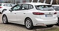
- Nomination BMW 218i Active Tourer in Gerlingen --Alexander-93 09:13, 21 January 2024 (UTC)
- Promotion Support Good quality. --Mike Peel 10:30, 21 January 2024 (UTC)
-
- Nomination Abandoned restaurant, Rue de Roubaix, in Mouvaux, France --Velvet 07:51, 21 January 2024 (UTC)
- Promotion Support Good quality. --Svetlov Artem 12:50, 21 January 2024 (UTC)
-
-

- Nomination Henschel & Sohn plaque on the Jiboia Locomotive, Catavento, São Paulo, Brazil. By User:Mike Peel --XRay 07:18, 21 January 2024 (UTC)
- Promotion Support Good quality, filename should be better --Plozessor 08:22, 21 January 2024 (UTC)
-

- Nomination Siproeta stelenes on a flower at Chester Zoo. By User:Mike Peel --XRay 07:18, 21 January 2024 (UTC)
- Promotion Support OK quality. --Charlesjsharp 10:37, 21 January 2024 (UTC)
-

- Nomination White rose at Hyde Park, London. By User:Mike Peel --XRay 07:18, 21 January 2024 (UTC)
- Promotion Support Good quality. --Johann Jaritz 10:48, 21 January 2024 (UTC)
-

- Nomination Echinocactus grusonii at Jardin de Cactus 2022. By User:Mike Peel --XRay 07:18, 21 January 2024 (UTC)
- Promotion Support Good quality. --Johann Jaritz 10:48, 21 January 2024 (UTC)
-

- Nomination Bust of Samuel Blixen Claret. By User:Mike Peel --XRay 07:18, 21 January 2024 (UTC)
- Promotion Support Good quality. --Plozessor 08:23, 21 January 2024 (UTC)
-

-

- Nomination Church tower of Santa Maria Formosa in Venice --Ermell 06:50, 21 January 2024 (UTC)
- Promotion Good quality. --Berthold Werner 08:07, 21 January 2024 (UTC)
-

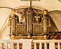
- Nomination Organ of the Catholic Church of the Holy Family in Breitenlesau --Ermell 06:50, 21 January 2024 (UTC)
- Promotion
Wondering why some pipes seem noisy while others do not. Is this a stitch of multiple pictures? --Plozessor 06:55, 21 January 2024 (UTC)
No stitching but maybe some automatic masking by denoising Software. I'll try to fix that. --Ermell 08:03, 21 January 2024 (UTC) Done Check out the new version--Ermell 11:05, 21 January 2024 (UTC) Support Good now! --Plozessor 11:38, 21 January 2024 (UTC)
-

- Nomination Pulpit in the Catholic Church of the Holy Family in Breitenlesau --Ermell 06:50, 21 January 2024 (UTC)
- Promotion Support Good quality.--Famberhorst 16:38, 21 January 2024 (UTC)
-

-

-

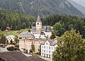
- Nomination Marktstraße 52-54 in Landau in der Pfalz, Rhineland-Pal., Germany. --Tournasol7 06:24, 21 January 2024 (UTC)
- Promotion Support Good quality. --Johann Jaritz 10:48, 21 January 2024 (UTC)
-

- Nomination Equestrian statue of Luitpold of Bavaria in Landau in der Pfalz, Rhineland-Palatinate, Germany. --Tournasol7 06:24, 21 January 2024 (UTC)
- Promotion Support Good quality. --Plozessor 06:34, 21 January 2024 (UTC)
-
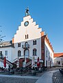
- Nomination Altes Kaufhaus in Landau in der Pfalz, Rhineland-Pal., Germany. --Tournasol7 06:24, 21 January 2024 (UTC)
- Promotion Support Good quality. --GoldenArtists 11:20, 21 January 2024 (UTC)
-

- Nomination Langstraße 3 in Landau in der Pfalz, Rhineland-Palatinate, Germany. --Tournasol7 06:24, 21 January 2024 (UTC)
- Promotion Support Good quality. --Plozessor 06:34, 21 January 2024 (UTC)
-

- Nomination Marktstraße 89 in Landau in der Pfalz, Rhineland-Pal., Germany. --Tournasol7 06:24, 21 January 2024 (UTC)
- Promotion Support Good quality. --XRay 07:22, 21 January 2024 (UTC)
-

- Nomination Stained glass window of the Protestant (Evangelisch-Reformiert) Baselga de Arlez in Ardez.
--Agnes Monkelbaan 05:29, 21 January 2024 (UTC) - Promotion Support Quite noisy wall, but not really an issue as the window is good. --Plozessor 05:32, 21 January 2024 (UTC)
- Nomination Stained glass window of the Protestant (Evangelisch-Reformiert) Baselga de Arlez in Ardez.
-
- Nomination Organ of the Protestant (Evangelisch-Reformiert) Baselga de Arlez in Ardez.
--Agnes Monkelbaan 05:29, 21 January 2024 (UTC) - Promotion Support Good quality. --XRay 07:22, 21 January 2024 (UTC)
- Nomination Organ of the Protestant (Evangelisch-Reformiert) Baselga de Arlez in Ardez.
-
- Nomination Tarasp municipality Scuol gemeente Scuol in Lower Engadin, Graubünden.
--Agnes Monkelbaan 05:29, 21 January 2024 (UTC) - Promotion Support Forest is a bit noisy but it's not the subject, so this is ok. --Plozessor 05:32, 21 January 2024 (UTC)
- Nomination Tarasp municipality Scuol gemeente Scuol in Lower Engadin, Graubünden.
-

-

- Nomination Natural monument "Field oak near Ballingshausen" (the tree stands slightly crooked) --Plozessor 04:41, 21 January 2024 (UTC)
- Promotion Support Good quality.--Agnes Monkelbaan 05:25, 21 January 2024 (UTC)
-
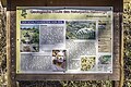
- Nomination Natural monument and geotope "Lug ins Land" ("peek into the land") near Fichtelberg --Plozessor 04:41, 21 January 2024 (UTC)
- Promotion
Please check for CAs. --XRay 07:21, 21 January 2024 (UTC)
@XRay: Done Thx, already removed some in the morning (were you looking at cached version?), but now removed some more and also resorted to a tighter crop. Please check again! --Plozessor 07:27, 21 January 2024 (UTC) Support Good quality now. May be I've seen the former image. --XRay 10:36, 21 January 2024 (UTC)
-

-
- Nomination 1695 wayside shrine near Obertheres --Plozessor 04:41, 21 January 2024 (UTC)
- Promotion Support Good quality.--Tournasol7 06:26, 21 January 2024 (UTC)
-

-

- Nomination Ancient roman city of Pompeii, Italy --Poco a poco 04:20, 21 January 2024 (UTC)
- Promotion Support Good quality. --XRay 07:20, 21 January 2024 (UTC)
-

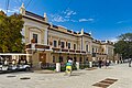
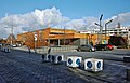
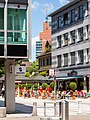
- Nomination Corso with the restaurant Da FranCo on Hauptstraße #193, Pörtschach, Carinthia, Austria -- Johann Jaritz 03:16, 21 January 2024 (UTC)
- Promotion Support Good quality.--Agnes Monkelbaan 05:19, 21 January 2024 (UTC)
-
-

-
- Nomination Ancient Roman city of Herculaneum, Italy --Poco a poco 10:37, 20 January 2024 (UTC)
- Promotion Support Good quality. --Velvet 07:57, 21 January 2024 (UTC)
-

- Nomination Ancient Roman city of Herculaneum, Italy --Poco a poco 10:37, 20 January 2024 (UTC)
- Promotion Support Good quality. --Velvet 07:56, 21 January 2024 (UTC)
-

- Nomination Australian fur seal (Arctocephalus pusillus doriferus) male --Charlesjsharp 09:57, 20 January 2024 (UTC)
- Promotion Support Good quality. --Velvet 07:55, 21 January 2024 (UTC)
-

-

-
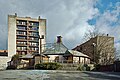
- Nomination Small square between Stadthausstrasse 10 & 12 in Winterthur --JoachimKohler-HB 07:25, 20 January 2024 (UTC)
- Promotion Support Good quality. --Velvet 07:53, 21 January 2024 (UTC)
-

- Nomination Manhansett (ship) seen from the deck of Fire Fighter (ship), Long Island --Mike Peel 01:06, 20 January 2024 (UTC)
- Promotion Support Good quality. --Palauenc05 08:43, 21 January 2024 (UTC)
-

- Nomination Popova Šapka Mosque, North Macedonia. --Kallerna 19:57, 18 January 2024 (UTC)
- Promotion Support Good quality. --Svetlov Artem 12:50, 21 January 2024 (UTC)
-

- Nomination Place Massenet street in the middle forming the boundary. --Touam 07:05, 18 January 2024 (UTC)
- Promotion Support Good quality. --Svetlov Artem 12:50, 21 January 2024 (UTC)
-

- Nomination A church in Michigan --Nheyob 13:19, 17 January 2024 (UTC)
- Promotion Support Good quality. --Svetlov Artem 12:50, 21 January 2024 (UTC)
-

- Nomination Bridge on Zückshuter Straße over the Nuremberg Erfurt dual carriageway in Breitengüßbach --Ermell 09:00, 17 January 2024 (UTC)
- Promotion Support Good quality. --Svetlov Artem 12:50, 21 January 2024 (UTC)
-

- Nomination Castle of Sibirana, Uncastillo, Zaragoza, Spai --Poco a poco 07:16, 16 January 2024 (UTC)
- Promotion Support Good quality. --C messier 20:51, 21 January 2024 (UTC)
-

- Nomination La pointe de Tsevalire et les becs de Bosson vus depuis la corne de Sorebois. --Espandero 17:47, 15 January 2024 (UTC)
- Promotion Support In full resolution there are some spots which aren't as sharp as others, but given the large resolution IMHO it is good enough for QI. --C messier 20:44, 21 January 2024 (UTC)
-

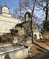
- Nomination Grave of Constantin Tănase in the Bellu Cemetery in Bucharest, Romania --Neoclassicism Enthusiast 17:13, 15 January 2024 (UTC)
- Promotion Support Good quality. --Mike Peel 10:42, 21 January 2024 (UTC)
-

-
-
-

-
- Nomination: Grave of Atanasie Stolojan in the Bellu Cemetery in Bucharest, Romania --Neoclassicism Enthusiast 16:26, 7 January 2024 (UTC)
- Review
It's too soft and blurry. It would be nice to crop out the shadow of the photographer. --Draceane 12:26, 15 January 2024 (UTC)


_auf_Laufenburg_(Deutschland).jpg)


.jpg)
.jpg)
.jpg)


.jpg)
,_ligne_ferroviaire_Perrache-Gen%C3%A8ve_(janvier_2024).JPG)
.jpg)
.jpg)
.jpg)


_Bruny.jpg)
_male_Kangaroo_Island.jpg)
_male.jpg)


.jpg)


.jpg)
.jpg)
.jpg)
.jpg)
.jpg)
_Baselga_de_Arlez_in_Ardez._17-09-2023._(actm.)_13.jpg)
_Baselga_de_Arlez_in_Ardez._17-09-2023._(actm.)_09.jpg)
_02.jpg)


.jpg)


_male_Bruny_2.jpg)


.jpg)


_-_exterior_1.jpg)


.jpg)
.jpg)


.jpg)
.jpg)
Consensual review[edit]
File:Risstal_03_–_Richtung_Almdorf_Eng.jpg[edit]

- Nomination: Rißtal (valley of the river Riss) in Tyrol, Austria. --Cayambe 09:24, 12 January 2024 (UTC)
- Review
- Support Good quality. --Ercé 09:33, 12 January 2024 (UTC)
- Oppose Blue hue doesn't look natural. --Draceane 10:02, 12 January 2024 (UTC)
weakIndeed the sky is a bit purple, should be easy to fix in raw conversion. --Plozessor 05:56, 13 January 2024 (UTC) Oppose
- Removing my vote as I have retouched the file. --Plozessor 11:18, 16 January 2024 (UTC)
- Done Blue hue reduced. Better now?--Cayambe 19:44, 14 January 2024 (UTC)
- @Cayambe: Unfortunately not, now it's really bad. You somehow reduced the saturation of the mountains and sky, but also of a part of the trees. Now the trees below the mountain are green at the bottom and grey at the top. You should take the original version and change purple to blue. In Photoshop you'd do that with selective color adjustment, select purple tones and adjust the tone to be more blue and less purple. --Plozessor 19:49, 14 January 2024 (UTC)
- Thank you Plozessor. The 'selective color adjustment' works best for the RAW file, which inadvertently I had deleted and is lost now. I was not successful in performing the purple-blue toning correction in the tiff-version in PS. Best regards,--Cayambe 11:07, 16 January 2024 (UTC)
- @Cayambe: @Draceane: Gave it a try myself, what do you think? --Plozessor 11:18, 16 January 2024 (UTC)
 Comment Why and in which cases should "selective colour adjustment" actually be necessary for landscape photos? (Serious question. With this photo here, it seems to have gone thoroughly wrong, in every version.) --Smial 13:41, 16 January 2024 (UTC)
- @Smial: I guess something went wrong in raw conversion. In any case, in the original picture, all colors looked fine except for shades of blue, those appeared slightly purple. Adjusting brightness and hue for shades of blue improved the appearance. Of course it would have been better to adjust colors during raw conversion, but unfortunately the author does not have the raw file anymore. --Plozessor 14:10, 16 January 2024 (UTC)
- @Smial: @Plozessor: It still appears a bit strange, we're not used to see neither colors in the reality. It's a pity, the capture is really nice, but I cannot get over the bluish hues. --Draceane 20:34, 16 January 2024 (UTC)
- Thank you Plozessor. The 'selective color adjustment' works best for the RAW file, which inadvertently I had deleted and is lost now. I was not successful in performing the purple-blue toning correction in the tiff-version in PS. Best regards,--Cayambe 11:07, 16 January 2024 (UTC)
- Hi all of you :-), distant rocky mountains always appear with a bluish hue in photos... and also in TV cameras and screens, this simply because these mountains appear in reality like that. If we don't see that hue, it is because our brain corrects it to a greyish colour, similarly to the correction of the reddish hue of a white sheet of paper under a lamp with reddish light. I agree that this hue should be corrected... similarly to the perspective correction. --Cayambe 16:56, 18 January 2024 (UTC)
Total: 1 support (excluding the nominator), 1 oppose →  Inconclusive result after 8 consensual review days --Robert Flogaus-Faust 21:43, 23 January 2024 (UTC)