Commons:Quality images candidates/Archives February 21 2023
Jump to navigation
Jump to search

-
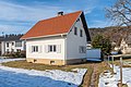
- Nomination Residential house on 10. Oktober Straße #57, Pörtschach, Carinthia, Austria -- Johann Jaritz 03:01, 19 February 2023 (UTC)
- Promotion
 Support Good quality. --Fabian Roudra Baroi 04:13, 19 February 2023 (UTC)
-

- Nomination Residential house on 10. Oktober Straße #49, Pörtschach, Carinthia, Austria -- Johann Jaritz 03:01, 19 February 2023 (UTC)
- Promotion Support Good quality. --Basile Morin 04:27, 19 February 2023 (UTC)
-
- Nomination Apartment building on 10. Oktober Straße #35, Pörtschach, Carinthia, Austria -- Johann Jaritz 03:01, 19 February 2023 (UTC)
- Promotion Support Good quality. --Basile Morin 04:27, 19 February 2023 (UTC)
-

- Nomination Apartement building on 10.-Oktober-Straße #23, Pörtschach, Carinthia, Austria -- Johann Jaritz 03:01, 19 February 2023 (UTC)
- Promotion Support Good quality. --Basile Morin 04:27, 19 February 2023 (UTC)
-

- Nomination Apartement building on 10.-Oktober-Straße #11, Pörtschach, Carinthia, Austria -- Johann Jaritz 03:01, 19 February 2023 (UTC)
- Promotion Support Good quality. --Fabian Roudra Baroi 04:13, 19 February 2023 (UTC)
-

- Nomination Foam core of a bouldering mat, OutDoor 2018 --MB-one 22:13, 18 February 2023 (UTC)
- Withdrawn
 I withdraw my nomination has already been rejected earlier. Sorry for the inconvenience. --~~~~
-

- Nomination Mounted specimens and genitalia slides of known subspecies of Ourapteryx yerburii. --Tiouraren 20:44, 18 February 2023 (UTC)
- Promotion Support Good quality. --Der Angemeldete 23:47, 18 February 2023 (UTC)
-

- Nomination Old houses in Galaxidi. --C messier 19:51, 18 February 2023 (UTC)
- Promotion Support Good quality. --Fabian Roudra Baroi 23:56, 18 February 2023 (UTC)
-

- Nomination The southeast port of Galaxidi. --C messier 19:51, 18 February 2023 (UTC)
- Promotion Good quality --Michielverbeek 23:04, 18 February 2023 (UTC)
-

- Nomination Neoclassical houses in Galaxidi. --C messier 19:51, 18 February 2023 (UTC)
- Promotion Support Good quality. --Der Angemeldete 23:47, 18 February 2023 (UTC)
-
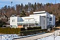
- Nomination University in Lyon, campus of La Doua: Charles-Darwin building. --Cayambe 18:34, 18 February 2023 (UTC)
- Promotion Support Good quality. --Poco a poco 19:55, 18 February 2023 (UTC)
-

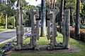
- Nomination Swings and Dado para 13 sculpture at Parque García Sanabria, Tenerife --Mike Peel 16:24, 18 February 2023 (UTC)
- Promotion Support Good quality. --Rjcastillo 17:46, 18 February 2023 (UTC)
-

- Nomination Eladio de la Cruz: Adolescente --Mike Peel 16:24, 18 February 2023 (UTC)
- Decline
 Oppose Wrong focus, I'm afraid --Poco a poco 19:55, 18 February 2023 (UTC)
-

- Nomination Eladio de la Cruz: Adolescente --Mike Peel 16:24, 18 February 2023 (UTC)
- Promotion Good quality. --NorbertNagel 17:33, 18 February 2023 (UTC)
-
- Nomination Federico Assler: Sin título --Mike Peel 16:24, 18 February 2023 (UTC)
- Promotion Support Good quality. --Rjcastillo 17:46, 18 February 2023 (UTC)
-

- Nomination leaf salads of the variety Lollo Rosso in open-air cultivation --Augustgeyler 15:15, 18 February 2023 (UTC)
- Promotion Good quality. --NorbertNagel 17:33, 18 February 2023 (UTC)
-

- Nomination red leaf salad of the variety Lollo Rosso in open-air cultivation --Augustgeyler 15:15, 18 February 2023 (UTC)
- Promotion Support Good quality. --Rjcastillo 17:47, 18 February 2023 (UTC)
-

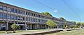
- Nomination The tax office in Hof, Germany. --PantheraLeo1359531 15:14, 18 February 2023 (UTC)
- Promotion Good quality. --NorbertNagel 17:35, 18 February 2023 (UTC)
-

- Nomination The Ernst-Reuter street with the tax office in Hof, Germany. --PantheraLeo1359531 15:11, 18 February 2023 (UTC)
- Promotion Good quality. --NorbertNagel 17:36, 18 February 2023 (UTC)
-

- Nomination Cupra Leon Mk4 ST in Stuttgart.--Alexander-93 15:03, 18 February 2023 (UTC)
- Promotion Support Good quality. --Mike Peel 16:27, 18 February 2023 (UTC)
-

- Nomination Hyundai i20 (BC3) in Stuttgart.--Alexander-93 15:03, 18 February 2023 (UTC)
- Promotion Support Good quality. --Mike Peel 16:27, 18 February 2023 (UTC)
-
- Nomination View of a car dealer in Hof, Germany. --PantheraLeo1359531 14:49, 18 February 2023 (UTC)
- Promotion Support Good quality. --Mike Peel 16:27, 18 February 2023 (UTC)
-
- Nomination Handle of entry of the church Saint Christophe of en:Eybens --Touam 13:33, 18 February 2023 (UTC)
- Promotion Support Good quality. --Augustgeyler 15:18, 18 February 2023 (UTC)
-

- Nomination BMW Compact E36 in Stuttgart.--Alexander-93 13:18, 18 February 2023 (UTC)
- Promotion Support Good quality. --Mike Peel 16:30, 18 February 2023 (UTC)
-

- Nomination Dacia Sandero III in Stuttgart.--Alexander-93 13:18, 18 February 2023 (UTC)
- Promotion Support Good quality. --Mike Peel 16:30, 18 February 2023 (UTC)
-

- Nomination Jeep Compass (MP) PHEV Facelift in Stuttgart.--Alexander-93 13:18, 18 February 2023 (UTC)
- Promotion Support Good quality. --Mike Peel 16:30, 18 February 2023 (UTC)
-
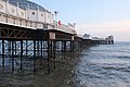
- Nomination Brighton Pier. --Kallerna 12:44, 18 February 2023 (UTC)
- Promotion Support Good quality. --Rjcastillo 18:04, 18 February 2023 (UTC)
-

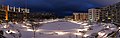
- Nomination Residential buildings in Seongdong-gu, seen from Maebong Mountain. --Kallerna 12:39, 18 February 2023 (UTC)
- Promotion Support Good quality. --Poco a poco 19:55, 18 February 2023 (UTC)
-
- Nomination Uutela Canal. --Kallerna 12:39, 18 February 2023 (UTC)
- Promotion Good quality. --NorbertNagel 17:52, 18 February 2023 (UTC)
-

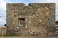
- Nomination The building at the Feldmannstraße 1/3 in Sankt Arnual as seen from the other side of the road --FlocciNivis 12:06, 18 February 2023 (UTC)
- Decline Sky is blown out (overexposed).. --NorbertNagel 17:38, 18 February 2023 (UTC)
-

- Nomination View on the protestant church in Wahlschied --FlocciNivis 12:06, 18 February 2023 (UTC)
- Promotion Support Good quality. --Rjcastillo 18:00, 18 February 2023 (UTC)
-

- Nomination View to the school building in Heusweiler-Wahlschied --FlocciNivis 12:06, 18 February 2023 (UTC)
- Promotion Support Good quality. --Rjcastillo 18:00, 18 February 2023 (UTC)
-

- Nomination Children playing in park at khilgaon, Dhaka --Wasiul Bahar 11:24, 18 February 2023 (UTC)
- Decline Oppose Sorry, but the child is not sharp and the image ist rotated --Augustgeyler 15:18, 18 February 2023 (UTC)
-

- Nomination Abandoned community center at khilgaon, Dhaka --Wasiul Bahar 11:24, 18 February 2023 (UTC)
- Decline Oppose Unsharp, tilted, overexposed areas ,CA, sorry, definitely not a QI --Poco a poco 19:55, 18 February 2023 (UTC)
-

- Nomination Sapodilla in roof farm --Wasiul Bahar 11:24, 18 February 2023 (UTC)
- Decline Oppose noisy and not sharp --FlocciNivis 11:58, 18 February 2023 (UTC)
-
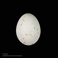
- Nomination egg of azure tit - Oeuf de Mésange azurée --Ercé 10:01, 18 February 2023 (UTC) Support Good quality. --FlocciNivis 11:57, 18 February 2023 (UTC)
- Promotion {{{2}}}
- Nomination egg of azure tit - Oeuf de Mésange azurée --Ercé 10:01, 18 February 2023 (UTC)
-

- Nomination Houses, Rue Henri Carette 4 to 10, in Wasquehal, France --Velvet 08:21, 18 February 2023 (UTC)
- Promotion Support Good quality. --FlocciNivis 11:57, 18 February 2023 (UTC)
-
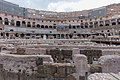
- Nomination Colosseum, Rome, Italy --Poco a poco 07:40, 18 February 2023 (UTC)
- Promotion Support Good quality. --Augustgeyler 15:18, 18 February 2023 (UTC)
-
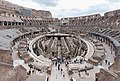
- Nomination Colosseum, Rome, Italy --Poco a poco 07:40, 18 February 2023 (UTC)
- Promotion Support Good quality. --SHB2000 08:07, 18 February 2023 (UTC)
-
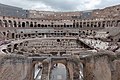
- Nomination Colosseum, Rome, Italy --Poco a poco 07:40, 18 February 2023 (UTC)
- Promotion Support Good quality. --SHB2000 08:07, 18 February 2023 (UTC)
-

- Nomination Colosseum, Rome, Italy --Poco a poco 07:40, 18 February 2023 (UTC)
- Promotion Support Good quality. --Palauenc05 09:20, 18 February 2023 (UTC)
-

- Nomination Colosseum, Rome, Italy --Poco a poco 07:40, 18 February 2023 (UTC)
- Promotion Support Good quality. --Palauenc05 09:20, 18 February 2023 (UTC)
-

- Nomination Cluster of Breath roots (pneumatophores) of a Taxodium distichum at the water's edge. Focus stack of 4 photos.
--Famberhorst 06:51, 18 February 2023 (UTC) - Promotion Support Good quality. --Rjcastillo 07:11, 18 February 2023 (UTC)
- Nomination Cluster of Breath roots (pneumatophores) of a Taxodium distichum at the water's edge. Focus stack of 4 photos.
-

- Nomination Bamberg Hospital construction site helipad, aerial view. --Ermell 06:37, 18 February 2023 (UTC)
- Promotion Support Good quality -- Johann Jaritz 06:46, 18 February 2023 (UTC)
-

- Nomination Bamberg Hospital construction site helipad, aerial view. --Ermell 06:37, 18 February 2023 (UTC)
- Promotion Support Good quality -- Johann Jaritz 06:46, 18 February 2023 (UTC)
-

- Nomination Door handles in Jade Buddah temple in Shanghai --Ermell 06:37, 18 February 2023 (UTC)
- Promotion Support Good quality -- Johann Jaritz 06:46, 18 February 2023 (UTC)
-
- Nomination Emporium paintings in the Protestant branch church in Trumsdorf from the middle of the 18th century --Ermell 06:37, 18 February 2023 (UTC)
- Promotion Support Good quality.--Famberhorst 06:45, 18 February 2023 (UTC)
-

- Nomination Tree gnawed by beaver on the bank of the Wiesent river --Ermell 06:37, 18 February 2023 (UTC)
- Promotion Support Good quality.--Famberhorst 06:49, 18 February 2023 (UTC)
-

- Nomination Shell of an olive snail, Oliva keenii --Llez 06:16, 18 February 2023 (UTC)
- Promotion Support Good quality.--Agnes Monkelbaan 06:19, 18 February 2023 (UTC)
-

- Nomination Breil-Brigels Outflow of river Flem in Lag da Breil
--Agnes Monkelbaan 06:15, 18 February 2023 (UTC) - Promotion Support Good quality. --Ermell 06:28, 18 February 2023 (UTC)
- Nomination Breil-Brigels Outflow of river Flem in Lag da Breil
-

- Nomination Breil-Brigels.View of the surroundings of Breil/Brigels.
--Agnes Monkelbaan 06:08, 18 February 2023 (UTC) - Promotion Support Good quality -- Johann Jaritz 06:48, 18 February 2023 (UTC)
- Nomination Breil-Brigels.View of the surroundings of Breil/Brigels.
-

- Nomination Breil-Brigels Outflow of river Flem in Lag da Breil
--Agnes Monkelbaan 06:15, 18 February 2023 (UTC) - Promotion Support Good quality -- Johann Jaritz 06:47, 18 February 2023 (UTC)
- Nomination Breil-Brigels Outflow of river Flem in Lag da Breil
-

- Nomination Gravesite “Johanna and Abraham Wolff” in the Jewish cemetery in Dülmen, North Rhine-Westphalia, Germany --XRay 06:00, 18 February 2023 (UTC)
- Promotion Support Good quality.--Agnes Monkelbaan 06:04, 18 February 2023 (UTC)
-

- Nomination Jewish cemetery in Dülmen, North Rhine-Westphalia, Germany --XRay 06:00, 18 February 2023 (UTC)
- Promotion Support Good quality.--Agnes Monkelbaan 06:03, 18 February 2023 (UTC)
-

- Nomination Jewish cemetery in Dülmen, North Rhine-Westphalia, Germany --XRay 06:00, 18 February 2023 (UTC)
- Promotion Support Good quality.--Agnes Monkelbaan 06:02, 18 February 2023 (UTC)
-
- Nomination Clock Tower of old Post Office, Old Quebec City --Fabian Roudra Baroi 05:44, 18 February 2023 (UTC)
- Promotion Support Good quality.--Agnes Monkelbaan 06:18, 18 February 2023 (UTC)
-

- Nomination Fairmont Le Château Frontenac --Fabian Roudra Baroi 05:44, 18 February 2023 (UTC)
- Promotion Support Good quality -- Johann Jaritz 06:47, 18 February 2023 (UTC)
-

- Nomination One of the last captivated Dolphins of Canada --Fabian Roudra Baroi 05:44, 18 February 2023 (UTC)
- Decline Oppose Tight crop, unfortunately. --SHB2000 08:19, 18 February 2023 (UTC)
-
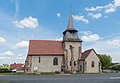
- Nomination Saint Praejectus church in Saint-Priest-en-Murat, Allier, France. --Tournasol7 05:05, 18 February 2023 (UTC)
- Promotion Support Good quality -- Johann Jaritz 05:08, 18 February 2023 (UTC)
-
- Nomination Windows of the Saints Michael and Blaise church in Saint-Angel, Allier, France. --Tournasol7 05:05, 18 February 2023 (UTC)
- Promotion Support Good quality -- Johann Jaritz 05:08, 18 February 2023 (UTC)
-

- Nomination Town hall of Deneuille-les-Mines, Allier, France. --Tournasol7 05:05, 18 February 2023 (UTC)
- Promotion Support Good quality. --Rjcastillo 06:12, 18 February 2023 (UTC)
-
- Nomination Saint Martial church in Deneuille-les-Mines, Allier, France. --Tournasol7 05:05, 18 February 2023 (UTC)
- Promotion Support Good quality.--Agnes Monkelbaan 06:01, 18 February 2023 (UTC)
-

- Nomination Town hall of Saint-Sornin, Allier, France. --Tournasol7 05:05, 18 February 2023 (UTC)
- Promotion Support Good quality.--Agnes Monkelbaan 06:00, 18 February 2023 (UTC)
-

- Nomination Outfall pipe of the sewerage at the bottom of a bridge support of the motorway A2 on Gaisrückenstraße in Winklern, Pörtschach, Carinthia, Austria -- Johann Jaritz 03:00, 18 February 2023 (UTC)
- Promotion Support Good quality. --Tournasol7 05:09, 18 February 2023 (UTC)
-

- Nomination Graffiti on a bridge support of the motorway A2 on Gaisrückenstraße in Winklern, Pörtschach, Carinthia, Austria -- Johann Jaritz 03:00, 18 February 2023 (UTC)
- Promotion Support Good quality. --Tournasol7 05:09, 18 February 2023 (UTC)
-
- Nomination Avión Bristol M1C. --Rjcastillo 23:25, 17 February 2023 (UTC)
- Promotion Support Good quality. --Fabian Roudra Baroi 05:37, 18 February 2023 (UTC)
-

- Nomination Northop F-5 E 'TIGER II'. --Rjcastillo 23:25, 17 February 2023 (UTC)
- Promotion Support Good quality. --Fabian Roudra Baroi 05:37, 18 February 2023 (UTC)
-

- Nomination Fairmont Le Château Frontenac --Fabian Roudra Baroi 22:14, 17 February 2023 (UTC)
- Decline Oppose The perspective is very nice, but this has preventable noise. ISO 400 with exposure time 1/800s. You could have set it to ISO 100 no probs --FlocciNivis 12:01, 18 February 2023 (UTC)
-
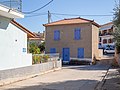
- Nomination Old house in Galaxidi. --C messier 21:07, 17 February 2023 (UTC)
- Promotion Support Good quality. --FlocciNivis 12:02, 18 February 2023 (UTC)
-
- Nomination Castillo de San Felipe, Puerto de la Cruz --Mike Peel 20:38, 17 February 2023 (UTC)
- Promotion Support Good quality. --Fabian Roudra Baroi 05:38, 18 February 2023 (UTC)
-

- Nomination Colosseum, Rome, Italy --Poco a poco 15:57, 17 February 2023 (UTC)
- Withdrawn
Not all frames are sharp. Fixable? --Ermell 22:38, 17 February 2023 (UTC)
Nope, I take it back. Thanks. Poco a poco 07:46, 18 February 2023 (UTC)
-

- Nomination Sultan Ahmed Mosque, Istanbul. --Kallerna 13:45, 17 February 2023 (UTC)
- Promotion
At least 2 dust spots (middle left, top right) --Poco a poco 16:05, 17 February 2023 (UTC)
Thanks, fixed. --Kallerna 18:15, 17 February 2023 (UTC) Support Good quality. --Poco a poco 07:53, 18 February 2023 (UTC)
-

- Nomination Bamberg Hospital construction site helipad, aerial view. --Ermell 11:17, 17 February 2023 (UTC)
- Promotion Support Good quality. --Fabian Roudra Baroi 04:15, 19 February 2023 (UTC)
-

- Nomination emergency road barrier --Wasiul Bahar 19:20, 16 February 2023 (UTC)
- Promotion
Please, enter at least one category about what we see here --Poco a poco 20:27, 16 February 2023 (UTC)
@Poco a poco Done-- Wasiul Bahar 16:35, 17 February 2023 (UTC) Support Good quality. --Poco a poco 07:50, 18 February 2023 (UTC)
-

- Nomination Porsche 992 Targa 4 GTS in Filderstadt.--Alexander-93 16:51, 16 February 2023 (UTC)
- Promotion Support Good quality. --Fabian Roudra Baroi 04:16, 19 February 2023 (UTC)
-

- Nomination Audi RS3 8Y Sedan in Stuttgart.--Alexander-93 15:37, 16 February 2023 (UTC)
- Promotion Support Good quality. --Fabian Roudra Baroi 23:55, 18 February 2023 (UTC)
-

- Nomination Kia XCeed (Facelift) in Stuttgart.--Alexander-93 15:37, 16 February 2023 (UTC)
- Promotion Support Good quality. --Fabian Roudra Baroi 04:23, 19 February 2023 (UTC)
-
- Nomination Statue of Alexander von Humboldt, La Orotava --Mike Peel 07:34, 16 February 2023 (UTC)
- Promotion Support Good quality. --Fabian Roudra Baroi 23:55, 18 February 2023 (UTC)
-

- Nomination Stairs going up to El Peñón del Fraile, Puerto de la Cruz --Mike Peel 20:32, 15 February 2023 (UTC)
- Promotion Support Good quality. --Fabian Roudra Baroi 23:53, 18 February 2023 (UTC)
-

- Nomination Crinum asiaticum var. pedunculatum --Mike Peel 21:18, 14 February 2023 (UTC)
- Promotion Support Good quality. --Fabian Roudra Baroi 23:52, 18 February 2023 (UTC)
-

- Nomination Lake Marble Falls in Marble Falls, Texas, United States. --Nv8200pa 19:06, 14 February 2023 (UTC)
- Promotion
There are some dust spots that need to be removed (one above the building on the left e.g.) --FlocciNivis 15:51, 15 February 2023 (UTC)
Removed dust spots Nv8200pa 20:00, 15 February 2023 (UTC) Support Good quality. --FlocciNivis 11:56, 18 February 2023 (UTC)
-

- Nomination Central Shaheed Minar situated in Saltha, Faridpur, Bangladesh. By User:কৌশিক বিশ্বাস --Yahya 18:00, 14 February 2023 (UTC)
- Promotion Support Good quality. --Fabian Roudra Baroi 04:22, 19 February 2023 (UTC)
-

- Nomination Vada - Livorno – The lighthouse. --PROPOLI87 20:15, 13 February 2023 (UTC)
- Promotion Good quality. --NorbertNagel 17:44, 18 February 2023 (UTC)
-

- Nomination Argyranthemum frutescens Magarza --Mike Peel 07:26, 13 February 2023 (UTC)
- Decline Oppose The flowers are over exposed as it is white and captured under direct sunlight. --Fabian Roudra Baroi 23:49, 18 February 2023 (UTC)
-

- Nomination Comet Neowise on July 21, 2020. By User:Davrou. --C messier 19:50, 12 February 2023 (UTC)
- Promotion Good quality, looks like a galaxy in the background :) --PantheraLeo1359531 16:12, 18 February 2023 (UTC)
-
- Nomination Cupra Leon Mk4 ST in Stuttgart.--Alexander-93 19:14, 12 February 2023 (UTC)
- Promotion Support Good quality. --Fabian Roudra Baroi 23:46, 18 February 2023 (UTC)
-

- Nomination Spider webs at Pyramids of Güímar --Mike Peel 08:36, 12 February 2023 (UTC)
- Promotion Support Good quality. --Fabian Roudra Baroi 23:47, 18 February 2023 (UTC)
-

- Nomination View of Port of Piriapolis, Uruguay --Ezarate 13:54, 11 February 2023 (UTC)
- Promotion Good quality. --NorbertNagel 17:45, 18 February 2023 (UTC)
-

- Nomination Door in the Kapuzinerstraße --Ermell 10:17, 11 February 2023 (UTC)
- Promotion Support Good quality. --Palauenc05 09:25, 18 February 2023 (UTC)
-
-

- Nomination Street photography in bookfair 2023,Dhaka --Wasiul Bahar 13:41, 10 February 2023 (UTC)
- Decline Oppose Sorry, sharpness missing. CAs. Half of the image only trees. The main subject should be visible as main subject. --XRay 07:28, 18 February 2023 (UTC)
-

- Nomination Street photography in bookfair 2023,Dhaka --Wasiul Bahar 13:41, 10 February 2023 (UTC)
- Decline Oppose Sorry. Sharpness missing. F/1.8 is not a good choice for these kind of images. Waste in the background is disturbing too. --XRay 07:30, 18 February 2023 (UTC)
-

- Nomination Ragwall of CUET batch 17, Shongborto --Wasiul Bahar 13:41, 10 February 2023 (UTC)
- Decline Oppose Sorry. A lot of JPEG artifacts. Sharpness could be better. Geo location missing. --XRay 07:25, 18 February 2023 (UTC)
-

- Nomination Close wing Nectaring of Catochrysops strabo (Fabricius, 1793) - Forget-me-not --Sandipoutsider 01:23, 11 February 2023 (UTC)
- Decline Oppose Sorry, JPEG artifacts or similar. Sharpness/Details missing. --XRay 07:26, 18 February 2023 (UTC)
-
-

- Nomination View to the water tower of Neuweiler (Sulzbach/Saar) --FlocciNivis 10:03, 10 February 2023 (UTC)
- Promotion Support Good quality. --C messier 20:08, 18 February 2023 (UTC)
-

- Nomination View from the small path Höllengässchen on the commune Frauenberg --FlocciNivis 10:49, 28 January 2023 (UTC)
- Decline
 Comment Needs better crop to the left. --C messier 18:21, 5 February 2023 (UTC)
 Done Is this what you've imagined or is the branch on the left too disturbing? I fear, I would destroy the view on the cow pasture, if I removed it --FlocciNivis 17:26, 6 February 2023 (UTC) The spruce branches on the right edge prevent a promotion, I'm afraid. --Milseburg 16:34, 11 February 2023 (UTC) Oppose
  Not done within a week. --XRay 07:16, 18 February 2023 (UTC)


.jpg)


_1X7A6488.jpg)


_PHEV_Facelift_1X7A0139.jpg)


_van_een_moerascipres_(Taxodium_distichum)_09-02-2023_(d.j.b.).jpg)


_10.jpg)
_04.jpg)
_03.jpg)


.jpg)
.jpg)
.jpg)
.jpg)
.jpg)


_1X7A6476.jpg)


.jpg)


_-_Forget-me-not_WLB_WLB_IMG_3910.jpg)


Consensual review[edit]
File:At_Manchester_2018_097.jpg[edit]

- Nomination Faraday Building, Manchester, UK --Mike Peel 09:23, 29 January 2023 (UTC)
- Decline
 Question Can you remove the leaves/tree brunch from the right-middle part ? --Fabian Roudra Baroi 23:50, 6 February 2023 (UTC)
- @Fabian Roudra Baroi: Thanks for the review. I've cropped the image slightly to remove them. Thanks. Mike Peel 21:26, 8 February 2023 (UTC)
- Ok, but the crop at the top is too tight and perspective needs to be improved. --Sebring12Hrs 18:43, 12 February 2023 (UTC)
- @Sebring12Hrs: Not much more I can do, see the 1st uploaded image for the original version. If these are issues, probably best to oppose? Thanks. Mike Peel 21:20, 14 February 2023 (UTC)
- Ok, but the crop at the top is too tight and perspective needs to be improved. --Sebring12Hrs 18:43, 12 February 2023 (UTC)
- Support Good enough for me. --Fabian Roudra Baroi 03:08, 17 February 2023 (UTC)
- Oppose I disgree. --Sebring12Hrs 17:01, 17 February 2023 (UTC)
- Oppose It is impossible to make from this position a QIphoto because it is impossible to get a good perspective. Take more distance to the object or standing in a much higher position might be the solution. --Michielverbeek 07:07, 18 February 2023 (UTC)
- Support Oh, User Sebring12Hrs disagrees. Interesting. So let's have a look at this masterpiece of quality: https://commons.wikimedia.org/wiki/File:Tourcoing_usine_masurel_rue_de_paris.jpg Since nobody cropped branches there, because really sharp big fat shadows on buildings are quality, I'll go here for pro. However you can arguee about the perspective, since it's not really sharp on the top.--Der Angemeldete 08:41, 18 February 2023 (UTC)
- Oppose with Michielverbeek --Augustgeyler 15:27, 18 February 2023 (UTC)
- Oppose crop too tight --NorbertNagel 18:48, 18 February 2023 (UTC)
- Comment If you have time, I'd suggest removing the tree brunches using lasso tool in photoshop, rather cropping it as many people are opposing the crop --Fabian Roudra Baroi (talk) 23:44, 18 February 2023 (UTC)
- @Fabian Roudra Baroi: Thanks for the suggestion, I tried doing something like that to start with, but it didn't work too well. I think it's the crop at the top that's the issue, rather than at the sides, anyway. Thanks. Mike Peel 09:17, 19 February 2023 (UTC)
Total: 2 support (excluding the nominator), 4 oppose →  Declined --Augustgeyler 19:23, 20 February 2023 (UTC)
File:Puer_tea,_Chinese_tea,_Rostov-on-Don,_Russia.jpg[edit]

- Nomination An assortment of ripe and raw Pu'er teas from Yunnan province of China. --Argenberg 13:39, 13 February 2023 (UTC)
- Decline
- Oppose The shadow in the foreground spoils the image, apart from that shadow on the right and lack of PC --Poco a poco 17:24, 13 February 2023 (UTC)
- I strongly disagree. To me the shadows do not spoil the image but rather add drama and intensity in these lighting conditions. It does not have to be sterile. Also I see no problems with perspective here. How could it be with a 50mm equivalent focal length? A balanced perspective of a 50mm (around 47 degrees diagonally) always gives a natural-looking perspective. I would like other reviewers to take a look. --Argenberg 18:14, 13 February 2023 (UTC)
- Oppose Given that this is a "still life" shot with inanimate objects placed on a fixed position, I think the lighting should be better. The shadow in the foreground is especially distracting.--Peulle 08:33, 14 February 2023 (UTC)
- Oppose per others. Sharpness and colours seem ok, but unfavorable frontal lighting with very hard shadows, shadowing in the foreground, disturbing table edge. --Smial 12:22, 14 February 2023 (UTC)
- Oppose Too much disturbing things: Shadow in the foreground, edge of the table, shadow at the right, verticals not Vertical, lighting. --XRay 18:47, 15 February 2023 (UTC)
- The “verticals” are not expected to be “vertical” here. They are shot from such an angle that their inclination is natural in the frame. Of all the issues raised in the discussion I can only second the table edge, less so the foreground shadow on the table. --Argenberg (talk) 11:03, 16 February 2023 (UTC)
- Support As the son of a still life painter, I find this fine. I don't know what the intention of the shadow in front is, but it has a psychological effect of encroachment to me, and I think the artist has license to do that. Everything is sharp, a black background is fine and the perspective of a still life is whatever the artist wants it to be. I guess the conventions in photography may be different from the freedom painters have. Also, the various packages are interesting, although I hope they don't run afoul of packaging copyright laws, which are a very annoying cause of lots of deletions on this site. -- Ikan Kekek 03:23, 17 February 2023 (UTC)
- Oppose IMO the image would be o.k. without the shadow in the foreground, but this shadow really ruins the composition. Sorry. --Robert Flogaus-Faust 14:06, 17 February 2023 (UTC)
Total: 1 support (excluding the nominator), 5 oppose → Declined --Peulle 11:18, 20 February 2023 (UTC)