Commons:Quality images candidates/Archives December 2010
Jump to navigation
Jump to search

-

- Nomination Dome and balconies of Galeries Lafayette store, lady section, in boulevard Haussmann, Paris, with Christmas decorations. --Spongie555 05:16, 29 December 2010 (UTC)
- Promotion
 Support QI for me --Archaeodontosaurus 08:18, 29 December 2010 (UTC)
-

-

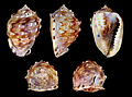
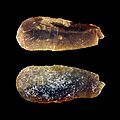
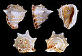
- Nomination Near-elegant Frog Shell Bufonaria perelegans. --George Chernilevsky 21:17, 28 December 2010 (UTC)
- Promotion good --Mbdortmund 02:39, 29 December 2010 (UTC)
-

- Nomination The Rur, a german river --Alupus 20:04, 28 December 2010 (UTC)
- Promotion nice view --Mbdortmund 02:40, 29 December 2010 (UTC)
-

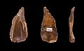
- Nomination Flint Burin of paleolithic --Archaeodontosaurus 18:32, 28 December 2010 (UTC))
- Promotion Good --George Chernilevsky 21:18, 28 December 2010 (UTC)
-

-
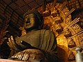
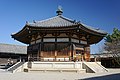
- Nomination Daibutsu of Todaiji in Nara, Nara Pref. --663highland 15:55, 28 December 2010 (UTC)
- Decline Too small and flickr. -- Smial 17:38, 28 December 2010 (UTC)
-

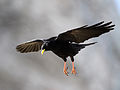
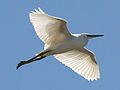
- Nomination White Stork (Ciconia ciconia) in Flight --Ken Billington 13:02, 28 December 2010 (UTC)
- Promotion Quite good in my opinion. --Ximonic 13:25, 28 December 2010 (UTC)
-

- Nomination Pereslavl museum, box office.--PereslavlFoto 11:59, 28 December 2010 (UTC)
- Promotion Good and nice. --Cayambe 16:27, 28 December 2010 (UTC)
-

- Nomination Agate enhydros (see notes) --Archaeodontosaurus 11:27, 28 December 2010 (UTC)
- Promotion Very good and very interesting. --Cayambe 16:22, 28 December 2010 (UTC)
-

- Nomination Cormorant (Phalacrocorax carbo) hangs its wings out to dry --Ken Billington 09:50, 28 December 2010 (UTC)
- Promotion Very good. --Cayambe 16:48, 28 December 2010 (UTC)
-
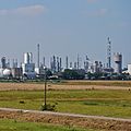
- Nomination Part of BASF Ludwigshafen plant, Rhineland-Palatinate. -- Felix Koenig 10:17, 28 December 2010 (UTC)
- Promotion Good. Please add geotag- --Cayambe 18:49, 28 December 2010 (UTC)
-

- Nomination Steampunk image of author G. D. Falksen. --Spongie555 05:15, 28 December 2010 (UTC)
- Promotion The crop at the bottom is a bit unfortunate, but otherwise very good. --Cayambe 20:38, 28 December 2010 (UTC)
-
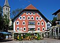
- Nomination The town hall of Saalfelden, Austria. -- Felix Koenig 14:37, 27 December 2010 (UTC)
- Promotion I think that this photo satisfies the QI criteria.--MrPanyGoff 14:33, 28 December 2010 (UTC)
-

- Nomination A church in St. Julian's, Malta. -- Felix Koenig 14:16, 27 December 2010 (UTC)
- Promotion Good. --Cayambe 20:40, 28 December 2010 (UTC)
-

-
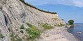
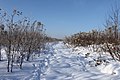
- Nomination Till cliff, lake Ontario, Clarington, Ontario, Canada --Óðinn 05:13, 27 December 2010 (UTC)
- Promotion The sky tends to be slightly noisy at full resolution, but in general a good picture. -- MJJR 19:55, 28 December 2010 (UTC)
-
- Nomination Alpine Chough (Pyrrhocorax graculus) in flight --Ken Billington 14:01, 26 December 2010 (UTC)
- Decline the beak is overexposed; impossible to correct --Archaeodontosaurus 14:42, 28 December 2010 (UTC)
-
-
- Nomination: Watanabe Okina Memorial Hall in Ube, Yamaguchi Pref. --663highland 15:28, 22 December 2010 (UTC)
- Review
 Comment I like the composition and light, but to the left and right the image is blurry and has visible CA. -- H005 17:26, 22 December 2010 (UTC)
-

-

- Nomination RF power attenuator. This is a renomination as the object has been reshot. (If you have viewed this file before, please make sure to purge the cache of your browser) --Jovianeye 05:32, 28 December 2010 (UTC)
- Promotion IMHO good now. --Berthold Werner 09:35, 28 December 2010 (UTC)
-

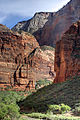
- Nomination Virgin River flowing in Zion National Park --LeavXC 23:03, 27 December 2010 (UTC)
- Promotion Nice job but missing geo coordinates --Borvan53 23:41, 27 December 2010 (UTC)
-

- Nomination The fountain of Neptune in Florence. --Eusebius 17:07, 27 December 2010 (UTC)
- Promotion body could imo a tick darker --Mbdortmund 02:26, 28 December 2010 (UTC)
-

- Nomination Alpine Chough (Pyrrhocorax graculus) in flight at Staubern, Switzerland --Ken Billington 15:54, 27 December 2010 (UTC)
- Promotion Good.--Mbz1 16:32, 27 December 2010 (UTC)
-

- Nomination Wild male Green Iguana (Iguana iguana) in Portoviejo, Ecuador. --Cayambe 14:57, 27 December 2010 (UTC)
- Promotion Very good!--LeavXC 22:57, 27 December 2010 (UTC)
-

-
- Nomination Sunset in Chodovlice, Litoměřice District, Czech Republic.--Juan de Vojníkov 11:26, 27 December 2010 (UTC)
- Decline too dark for me, boring composition --Pudelek 12:59, 27 December 2010 (UTC)
-

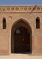
- Nomination A cave church near to the St. Anthony monastery, Egypt --Berthold Werner 10:12, 27 December 2010 (UTC)
- Promotion Good. --Cayambe 16:40, 27 December 2010 (UTC)
-
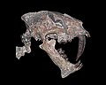
- Nomination Crane of the Sabertooth Hoplophoneus primaevus --Llez 07:34, 27 December 2010 (UTC)
- Promotion good --Mbdortmund 14:25, 27 December 2010 (UTC)
-

- Nomination The Silver Mining Road at Asago --663highland 02:05, 26 December 2010 (UTC)
- Promotion Good. --Cayambe 17:12, 27 December 2010 (UTC)
-

-
- Nomination Flint Blade - Paleolithic of Egypt - Collection of Georg August Schweinfurth --Archaeodontosaurus 17:53, 25 December 2010 (UTC)
- Promotion Someone marked some dust spots, else good --Mbdortmund 00:21, 26 December 2010 (UTC)*
 Done Correction made --Archaeodontosaurus 08:57, 26 December 2010 (UTC)
good and useful --Mbdortmund 14:15, 27 December 2010 (UTC)
-

-

- Nomination Tower of the church of Oberstenfeld, Baden-Württemberg. -- Felix Koenig 11:02, 24 December 2010 (UTC)
- Promotion OK to me. --Cayambe 17:07, 27 December 2010 (UTC)
-

-
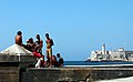
- Nomination Kids in the Malecón of Havana (Cuba) ----Elemaki 15:16, 23 December 2010 (UTC)
- Decline Noisy, unsharp. --King of Hearts 20:18, 27 December 2010 (UTC)
-

- Nomination Kitano Street in Kobe --663highland 14:18, 23 December 2010 (UTC)
- Promotion The cropping is a little tight (the top of the Christmas tree is cut off), but the overall composition is nice. --King of Hearts 20:20, 27 December 2010 (UTC)
-

- Nomination Sunset of Kasumi Port --663highland 14:18, 23 December 2010 (UTC)
- Promotion Spectacular sunset! --King of Hearts 20:21, 27 December 2010 (UTC)
-

- Nomination The nativity scene at the Weihnachtsmarkt Bloemersheim in Neukirchen-Vluyn, Germany --Carschten 22:35, 22 December 2010 (UTC)
- Decline Too many things in the composition. What are you trying to depict? --King of Hearts 18:34, 27 December 2010 (UTC)
-

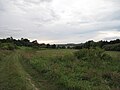
- Nomination Fog during sunset at fields in Moers --Carschten 17:35, 22 December 2010 (UTC)
- Promotion Beautiful. --King of Hearts 18:34, 27 December 2010 (UTC)
-
- Nomination Ibn Tulun Mosque, Kairo --Berthold Werner 14:30, 22 December 2010 (UTC)
- Promotion OK to me. --Cayambe 17:04, 27 December 2010 (UTC)
-

- Nomination Hooded Crow (Corvus cornix) at Bolle di Magadino TI, Switzerland --Ken Billington 13:10, 22 December 2010 (UTC)
- Decline Sadly, the focus is a little too soft. LeavXC 04:35, 26 December 2010 (UTC) Done image now corrected. --Ken Billington 13:02, 26 December 2010 (UTC)
Comment The dark feathers seem obscured in this version (too dark). The earlier version is better, IMO. LeavXC 17:17, 27 December 2010 (UTC) Done have now reverted to earlier version. --Ken Billington 18:51, 27 December 2010 (UTC)
-

- Nomination Ulvsunda castle.--Ankara 12:10, 21 December 2010 (UTC)
- Promotion Compositionally a little busy, but I like the color and contrast. --King of Hearts 18:30, 27 December 2010 (UTC)
-

-

- Nomination Menkaure's Pyramid in Giza. --kallerna 07:15, 21 December 2010 (UTC)
- Decline Undersaturated, gray colors. --King of Hearts 18:31, 27 December 2010 (UTC)
-

- Nomination Golden Hall of Yakushiji in Nara, Nara--663highland 14:51, 20 December 2010 (UTC)
- Decline Comment Chromatic aberration in the human figures of the left--Lmbuga 01:46, 21 December 2010 (UTC)
Also, perspective. --King of Hearts 18:20, 27 December 2010 (UTC)
-
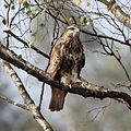
- Nomination Buzzard on the Rhine Delta patiently awaiting its next meal --Ken Billington 14:24, 20 December 2010 (UTC)
- Decline Not very sharp, distracting branches. --King of Hearts 18:26, 27 December 2010 (UTC)
-

- Nomination Boats near Paradise Island, Hurghada. --kallerna 11:37, 20 December 2010 (UTC)
- Promotion OK --King of Hearts 18:28, 27 December 2010 (UTC)
-

-

-

- Nomination Belfort, under the clouds. --ComputerHotline 19:14, 26 December 2010 (UTC)
- Promotion Why not ?!--Jebulon 00:43, 27 December 2010 (UTC)
-

- Nomination Near the Salbert fortification. --ComputerHotline 19:14, 26 December 2010 (UTC)
- Promotion Very good to me --Jebulon 00:45, 27 December 2010 (UTC)
-

- Nomination Endlichite Morocco --Archaeodontosaurus 18:08, 26 December 2010 (UTC)
- Promotion Oui.--Jebulon 00:48, 27 December 2010 (UTC)
-

- Nomination The Schozach at Ilsfeld, Baden-Württemberg. -- Felix Koenig 16:30, 26 December 2010 (UTC)
- Decline In my view: a bit too boring composition which is too dark either. --A.Ceta 17:25, 26 December 2010 (UTC)
"Boring composition" isn't a valid argument here, but I can understand your reasons. -- Felix Koenig 17:27, 26 December 2010 (UTC)
-

-

-

- Nomination Blue Tit (Parus caeruleus) collects caterpillars to feed its young. --Ken Billington 14:01, 26 December 2010 (UTC)
- Promotion Support QI & Useful --Archaeodontosaurus 18:06, 26 December 2010 (UTC)
-
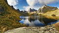
- Nomination Ågvatnet in Moskenesøya, Lofoten, Norway. -- Ximonic 10:57, 24 December 2010 (UTC)
- Promotion description could be better, e.g. say something about the strange racks around the city --Mbdortmund 23:20, 25 December 2010 (UTC) Done The description is a little better. :) --Ximonic 13:41, 26 December 2010 (UTC)
-

- Nomination Renewable energy on a farm in Horstedt by User:Florian Gerlach (Nawaro). --Elekhh 01:22, 23 December 2010 (UTC)
- Decline Poor composition and this image is misspelled. --A.Ceta 17:22, 26 December 2010 (UTC)
-

- Nomination Little Stint (Calidris minuta) makes stopover on the Rheinspitz in Austria during migration from Scandinavia to South Africa --Ken Billington 13:10, 22 December 2010 (UTC)
- Promotion Support QI & Useful --Archaeodontosaurus 12:05, 26 December 2010 (UTC)
-

- Nomination Crane (Grus grus) taken at Martins Mere, Lancashire, UK -- Ken Billington 18:47, 21 December 2010 (UTC)
- Promotion White feathers show a lack of detail, overexposured --Mbdortmund 23:25, 25 December 2010 (UTC) Done image now corrected. --Ken Billington 11:02, 26 December 2010 (UTC)
looks better --Mbdortmund 23:39, 26 December 2010 (UTC)
-

- Nomination Green-Veined White Butterfly feeds on Purple Flower --Ken Billington 14:15, 20 December 2010 (UTC)
- Promotion Nice shot. — Jagro 01:24, 27 December 2010 (UTC)
-

-

- Nomination Advent wreath with all four candles lit - Jonathunder 15:31, 19 December 2010 (UTC)
- Decline
1) anonymous nomination 2) the fourth candle is to be lit only sunday 19 dec.corrected now --Jebulon 18:15, 18 December 2010 (UTC) 1) Too late for advent wreaths
 , 2) The light on the table is not good (washed out in background).--Jebulon 00:57, 27 December 2010 (UTC)
-

- Nomination Bust of Carlo Goldoni under snow, Paris.--Jebulon 23:14, 25 December 2010 (UTC)
- Promotion Support QI & Useful --Archaeodontosaurus 09:02, 26 December 2010 (UTC)
-

-

- Nomination Vanadinite from Morocco --Archaeodontosaurus 17:37, 25 December 2010 (UTC)
- Promotion good quality and useful --Mbdortmund 17:42, 25 December 2010 (UTC)
-
- Nomination Little Egret (Egretta garzetta) --Ken Billington 14:22, 25 December 2010 (UTC)
- Promotion Support QI & Useful --Archaeodontosaurus 11:20, 26 December 2010 (UTC)
-
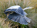
- Nomination Grey Heron (Ardea cinerea) --Ken Billington 14:19, 25 December 2010 (UTC)
- Promotion Support QI & Useful --Archaeodontosaurus 17:39, 25 December 2010 (UTC)
-

- Nomination Callospermophilus lateralis --LeavXC 08:56, 25 December 2010 (UTC)
- Promotion Support QI & Useful --Archaeodontosaurus 17:41, 25 December 2010 (UTC)
-

- Nomination Barn Swallow (Hirundo rustica) feeding young --Ken Billington 14:16, 25 December 2010 (UTC)
- Promotion Good QI action shot, even if it's not very sharp. LeavXC 02:42, 26 December 2010 (UTC)
-

- Nomination Večka kula (Starigrad, Croatia) in the evening --Pudelek 22:16, 24 December 2010 (UTC)
- Promotion Very nice, especially with the moon, but seems there is a CCW tilt, doesn't (or isn't) it? --Carschten 22:56, 24 December 2010 (UTC) Comment Right, I uploaded new version --Pudelek 12:04, 25 December 2010 (UTC) Good, but shame of the trash bin (remove it from the photo is an interesting challenge!). What is the orange thing? --Jebulon 17:04, 25 December 2010 (UTC)
-

- Nomination A bus stop in Styria --Herzi Pinki 16:54, 23 December 2010 (UTC)
- Promotion good--Jebulon 16:59, 25 December 2010 (UTC)
-

- Nomination House Martins (Delichon urbicum) gather on the Rheinspitz in Austria in preparation for their September migration --Ken Billington 13:10, 22 December 2010 (UTC).
- Promotion Good... only the cut-off head of another swallow at the lower left is a bit disturbing. --Cayambe 11:41, 25 December 2010 (UTC) Done image now corrected. --Ken Billington 14:46, 25 December 2010 (UTC). Well done. --Cayambe 21:54, 25 December 2010 (UTC)
-

- Nomination Great Crested Grebe teaches offspring to catch fish -- Ken Billington 10:24, 20 December 2010 (UTC)
- Promotion QI to me. --LeavXC 04:43, 26 December 2010 (UTC)
-
- Nomination Ivanhoe Christmas Lights Display Donaldytong 12:48, 14 December 2010 (UTC)
- Decline Comment Nice scene, but blown lights and dark shadows call for HDR tone-mapping. Do you have the material to accomplish that? -- H005 17:47, 22 December 2010 (UTC)
 Oppose Underexposed areas and overexposed areas per H005. I'd recommend exposure fusion. It's similar to HDR, but with more natural results. LeavXC 18:45, 25 December 2010 (UTC)
-

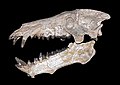
- Nomination The Permian Sauroctonus parringtoni --Llez 07:01, 25 December 2010 (UTC)
- Promotion Excellent! --George Chernilevsky 11:51, 25 December 2010 (UTC)
-

- Nomination St Patrick's Cathedral, Melbourne - Music Organ Donaldytong 12:19, 24 December 2010 (UTC)
- Decline Oppose Too overexposed areas and perspective problems --Archaeodontosaurus 11:07, 25 December 2010 (UTC)
-

-
-

-

- Nomination View of Cenobio de Valerón, archaeological site, Santa María de Guía, Gran Canaria. -- Felix Koenig 09:55, 24 December 2010 (UTC)
- Promotion Good. --Cayambe 11:26, 25 December 2010 (UTC)
-

- Nomination Unit of Heilbronn power plant, Baden-Württemberg. -- Felix Koenig 09:21, 24 December 2010 (UTC)
- Promotion very good quality --Carschten 13:33, 24 December 2010 (UTC)
-

- Nomination Wulfenite Mexico --Archaeodontosaurus 07:24, 24 December 2010 (UTC)
- Promotion Very good --Llez 06:53, 25 December 2010 (UTC)
-
-

-
-

- Nomination Pyramid of Djoser by Olaf Tausch. Nominated by --Berthold Werner 17:57, 22 December 2010 (UTC)
- Promotion Good. --Cayambe 11:33, 25 December 2010 (UTC)
-

- Nomination A downhill biker in the Bikepark Winterberg, Germany -- H005 15:09, 22 December 2010 (UTC)
- Promotion Who nominates ?--Jebulon 17:02, 22 December 2010 (UTC)
Sorry, forgot the sig, now added. -- H005 17:19, 22 December 2010 (UTC) Great angle, good composition. LeavXC 09:32, 25 December 2010 (UTC)
-
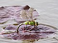
- Nomination Female Emperor Dragonfly (Anax imperator) --Ken Billington 18:55, 21 December 2010 (UTC)
- Promotion Could be sharper, but still a good QI. LeavXC 09:36, 25 December 2010 (UTC)
-

-
-
-
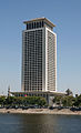
- Nomination: Office building from 1991.--Ankara 18:36, 18 December 2010 (UTC)
- Review needed
-

- Nomination: View of Cathedral of St Peter, Worms, Rhineland-Palatinate. -- Felix Koenig 17:01, 18 December 2010 (UTC)
- Review Good picture, but the vegetation in foreground is disturbing. French caption added. A geocode would help.--Jebulon 22:57, 18 December 2010 (UTC)
-

- Nomination: Southern tip of the the Schwafheimer Meer in Moers --Carschten 12:11, 18 December 2010 (UTC)
- Review needed
-

-

- Nomination Ulver in concert. --Patriot8790 16:26, 17 December 2010 (UTC)
- Decline Appears very noisy, especially in full res. LeavXC 09:21, 25 December 2010 (UTC)
-

-

- Nomination The church of Bedollo at night. -- Felix Koenig 14:49, 17 December 2010 (UTC)
- Decline Dust spots, composition and WB also not great, IMO. Sorry. --LeavXC 09:15, 25 December 2010 (UTC)
-

-

- Nomination Gornergletscher, Switzerland --Ximonic 09:13, 24 December 2010 (UTC)
- Promotion Excellent, very good and valuable image. Definately a qi. --High Contrast 09:28, 24 December 2010 (UTC)
-
-

-
- Nomination The Flame Helmet, Cassis flammea --Llez 11:40, 22 December 2010 (UTC)
- Promotion Support QI & Useful --Archaeodontosaurus 07:27, 24 December 2010 (UTC)
-

- Nomination Love padlocks, pont de l'Archevêché, Paris.--Jebulon 23:20, 21 December 2010 (UTC)
- Promotion Support QI and "charmant" --Archaeodontosaurus 14:42, 23 December 2010 (UTC)
-

- Nomination Bismuth with oxidefree surface. --Alchemist-hp 20:39, 20 December 2010 (UTC)
- Promotion QI. --Elekhh 05:06, 24 December 2010 (UTC)
-

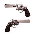
- Nomination .475 Wildey Magnum. Two views of the same object. --Rama 09:01, 20 December 2010 (UTC)
- Promotion Support QI for me --Archaeodontosaurus 10:37, 24 December 2010 (UTC)
-
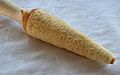
- Nomination Krumkake --Jonathunder 04:02, 20 December 2010 (UTC)
- Promotion interesting and good.--Jebulon 10:07, 24 December 2010 (UTC)
-

- Nomination: Bridgend station. Mattbuck 10:14, 18 December 2010 (UTC)
- Review needed
-

- Nomination: Paddington (circle southbound) underground platform. Mattbuck 10:14, 18 December 2010 (UTC)
- Review needed
-

- Nomination: Euston station. Mattbuck 10:14, 18 December 2010 (UTC)
- Review needed
-

- Nomination: Panorama of Pampas Marina, Stockholm.--Ankara 00:06, 18 December 2010 (UTC)
- Review needed
-

- Nomination: Castle ruin Nippenburg with the bridge, Germany --Harke 17:22, 17 December 2010 (UTC)
- Review needed
-
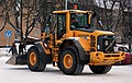
- Nomination: Volvo loader.--V-wolf 16:33, 17 December 2010 (UTC)
- Review needed
-

- Nomination Bamboo forest view from Okochi Sanso in Kyoto --663highland 13:50, 17 December 2010 (UTC)
- Decline Oppose too overexposed areas --Archaeodontosaurus 10:46, 24 December 2010 (UTC)
-
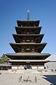
- Nomination: Pagoda of Horyu-ji in Ikaruga, Nara Pref --663highland 13:50, 17 December 2010 (UTC)
- Review Comment Would it be a good idea to crop the bottom of this image so as to get rid of that shadow at the bottom right? I think a perspective correction could also be beneficial. --Murdockcrc 20:39, 17 December 2010 (UTC)
-

- Nomination National Park Paklenica - peak Anića kuk (on the left) --Pudelek 12:53, 15 December 2010 (UTC)
- Decline too heavy
 chromatic aberrations --Carschten 15:10, 23 December 2010 (UTC)
-

-
-

- Nomination Parasteatoda tepidariorum and Cicadella viridis. Bastavales, Brión, Galicia (Spain)--Lmbuga 09:13, 23 December 2010 (UTC)
Comment New version of Archaeodontosaurus--Lmbuga 09:13, 23 December 2010 (UTC) - Promotion Very good and interesting. --Cayambe 11:46, 23 December 2010 (UTC)
- Nomination Parasteatoda tepidariorum and Cicadella viridis. Bastavales, Brión, Galicia (Spain)--Lmbuga 09:13, 23 December 2010 (UTC)
-

- Nomination The Neckartor (~ "Neckar gate") in Kirchheim/Neckar, Baden-Württemberg. -- Felix Koenig 20:25, 22 December 2010 (UTC)
- Promotion good, but shame on the car --Carschten 20:35, 22 December 2010 (UTC)
-

- Nomination Wild Iguana iguana at Portoviejo, Ecuador. The colour of this species varies from bright green to brown and red. --Cayambe 16:34, 22 December 2010 (UTC)
- Promotion Support nice and good composition. --Alchemist-hp 19:18, 22 December 2010 (UTC)
-

- Nomination Himeji Castle in Himeji, Hyogo Pref. --663highland 15:28, 22 December 2010 (UTC)
- Promotion Support Good composition and sufficient technical quality, although it could benefit from some noise reduction. -- H005 17:28, 22 December 2010 (UTC)
-

- Nomination Paratroopers of the Foreign Legion, patrol around Notre-Dame de Paris--Jebulon 00:09, 22 December 2010 (UTC)
- Promotion Good crop with interesting subject --Ken Billington 21:18, 22 December 2010 (UTC)
-

- Nomination Notre-Dame de Paris, snowy day.--Jebulon 22:57, 21 December 2010 (UTC)
- Promotion Good perspectives with excellent detail --Ken Billington 21:15, 22 December 2010 (UTC)
-

- Nomination East Precinct's Belfry of Horyu-ji in Ikaruga, Nara Pref. --663highland 16:23, 21 December 2010 (UTC)
- Promotion Support Some slight CA, but overall good quality. -- H005 17:52, 22 December 2010 (UTC)
-

-

-

- Nomination Monument at Puerto de las Nieves, Agaete, Gran Canaria. -- Felix Koenig 12:15, 19 December 2010 (UTC)
- Promotion As technical quality and composition it meets the criteria for QI, imo. MrPanyGoff 16:12, 20 December 2010 (UTC)...but needs really a better caption. Useless image without identifications (these men ? the sculptor ?), information (why this staue here ?), geocode (Where is it ?)...--Jebulon 16:59, 22 December 2010 (UTC)
-

-

- Nomination National Park Paklenica, Croatia --Pudelek 12:53, 15 December 2010 (UTC)
- Decline Nice landscape and good composition, but the rocky part is unsharp, there are some green CA, and the background looks noisy. The WB is not good enough IMO (too much "blue").--Jebulon 10:14, 23 December 2010 (UTC)
-

-

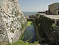
- Nomination Inside the fort d'Uxegney --ComputerHotline 17:48, 13 December 2010 (UTC)
- Promotion left side seems tilted / Distorted cw --Mbdortmund 18:14, 16 December 2010 (UTC) Support I can't see any tilt; these are old walls. -- H005 17:40, 22 December 2010 (UTC)
-

- Nomination The coal mixing plant of Altbach power plant, Baden-Württemberg. -- Felix Koenig 18:38, 12 December 2010 (UTC)
- Decline Slightly leans to the right, at least at the right side. Otherwise ok to me. --Cayambe 09:35, 21 December 2010 (UTC)
Very difficult, but I tried to rotate it. -- Felix Koenig 15:59, 21 December 2010 (UTC)
Oppose Sorry, but the composition doesn't work for me. It should depict either machine completely rather than parts of both. -- H005 17:42, 22 December 2010 (UTC)
-

- Nomination Marugame Genichiro-Inokuma Museum of Contemporary Art in Marugame, Kagawa --663highland 12:49, 11 December 2010 (UTC)
- Decline Needs a slight perspective correction. Otherwise good. --Cayambe 10:59, 17 December 2010 (UTC) Oppose More important than the very slight perspective correction is the visible pincushion distortion. If this is fixed, I'd rate it QI. -- H005 17:34, 22 December 2010 (UTC)
-

-

- Nomination White Stork on the Rheinspitz, Vorarlberg, Austria --Ken Billington 18:35, 21 December 2010 (UTC)
- Promotion Obvious QI to me --Jebulon 23:21, 21 December 2010 (UTC)
-

- Nomination Phoenix Hall of Byodo-in in Uji, Kyoto Pref. --663highland 16:23, 21 December 2010 (UTC)
- Promotion Crop a bit tight, acceptable CA in the tree right, otherwise deserves the QI status IMO.--Jebulon 23:24, 21 December 2010 (UTC)
-

- Nomination Nandaimon of Horyu-ji in Ikaruga, Nara Pref. --663highland 16:23, 21 December 2010 (UTC)
- Promotion QI--Jebulon 23:27, 21 December 2010 (UTC)
-
- Nomination View of Lugano and its surroundings from the top of Monte San Salvatore.
 Info Please keep in mind that, in order to achieve a 180 (almost) angle of view, an 8mm fisheye lens was used for this image. If you are looking for geometric distortions, you will certainly find them! --Murdockcrc 10:06, 21 December 2010 (UTC)
 - Promotion Comment EXIF-data says "Lens focal length: 50 mm". --kallerna 10:25, 21 December 2010 (UTC) Support Interesting enough anyways. --kallerna 10:26, 21 December 2010 (UTC) Comment The lens used was a Samyang 8mm manual lens. It has no communication whatsoever with the camera. I have no idea how it got that info on the EXIF, it's perhaps a default number. --Murdockcrc 10:54, 21 December 2010 (UTC) Comment Ok. --kallerna 15:36, 21 December 2010 (UTC)
- Nomination View of Lugano and its surroundings from the top of Monte San Salvatore.
-

- Nomination Sukashibori sculpture of Ninnaji's Chokushimon in Kyoto, Kyoto --663highland 14:51, 20 December 2010 (UTC)
- Decline Oppose The right side is blurred. The flash would have to see things more interesting. --Archaeodontosaurus 14:28, 21 December 2010 (UTC)
-

- Nomination East Pagoda of Yakushiji in Nara --663highland 16:47, 16 December 2010 (UTC)
- Decline Dark parts are very noisy at high resolution--Jebulon 23:39, 21 December 2010 (UTC)
-
-

- Nomination: Tenryuji in Kyoto, Kyoto --663highland 16:37, 15 December 2010 (UTC)
- Review needed
-

- Nomination: Mimurotoji in Uji, Kyoto --663highland 16:37, 15 December 2010 (UTC)
- Review needed
-

-

- Nomination Typical houses, Porto, Portugal -- Alvesgaspar 00:12, 14 December 2010 (UTC)
- Decline Sorry, but for qi there is imo too much CA and colour noise here, patricularly at the left side. --Cayambe 09:45, 21 December 2010 (UTC) Interesting and useful, but really too much CA for a QI--Jebulon 23:43, 21 December 2010 (UTC)
-
-

- Nomination Bismuth --Alchemist-hp 20:08, 20 December 2010 (UTC)
- Promotion QI sogar ich scheine mal hier nichts zu meckern zu haben :-) --Carschten 21:02, 20 December 2010 (UTC)
-

-

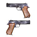
- Nomination SIG P210, two views of the same object, slide opened. -- Rama 07:11, 20 December 2010 (UTC)
- Promotion Good, EV. Jonathunder 17:42, 20 December 2010 (UTC)
-

- Nomination View from the top of the communications tower at Uetliberg, Zurich, Switzerland.--Murdockcrc 19:51, 19 December 2010 (UTC)
- Promotion Good! --kallerna 12:11, 20 December 2010 (UTC)
-
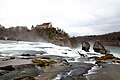
- Nomination View of the Rhein Falls, Europe's largest waterfall, as seen from the side in canton Schaffhausen, Switzerland. Info 1.3-second exposure done to achieve the creamy effect on the water. --Murdockcrc 12:34, 19 December 2010 (UTC)
- Decline Oppose Water and sky overexposed. Yann 11:01, 21 December 2010 (UTC)
- Nomination View of the Rhein Falls, Europe's largest waterfall, as seen from the side in canton Schaffhausen, Switzerland.
-

-

- Nomination Mertensia paniculata (Tall Bluebells) --Wsiegmund 22:04, 17 December 2010 (UTC)
- Promotion Support QI & Useful --Archaeodontosaurus 09:15, 21 December 2010 (UTC)
-

-

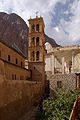
- Nomination Saint Catherine's Monastery, Sinai, Egypt --Berthold Werner 17:35, 15 December 2010 (UTC)
- Promotion Some CA towards corners (esp. upper right), and distortion (walls leaning away from centre). All correctable. --Avenue 19:34, 15 December 2010 (UTC) Info Tried to correct the issues. The small part of the sky is now cut (due to the perspective correction) --Berthold Werner 10:53, 18 December 2010 (UTC) Support - In my view it is perfect now.--MrPanyGoff 10:17, 21 December 2010 (UTC)
-

- Nomination: 221130 departs Bristol Temple Meads. Mattbuck 08:25, 15 December 2010 (UTC)
- Review needed
-

- Nomination A historic workhouse (Dihlströmska arbetsinrättningen) in Stockholm.--Ankara 19:41, 14 December 2010 (UTC)
- Promotion As technical quality and composition it meets the criteria for QI, imo. MrPanyGoff 16:16, 20 December 2010 (UTC)
-

- Nomination: Cows. --kallerna 18:06, 14 December 2010 (UTC)
- Review needed
-
- Nomination Sunset sky. Costa da Caparica, Portugal -- Alvesgaspar 00:12, 14 December 2010 (UTC)
- Promotion One more sunset image... but this one looks ok to me. Please add geotag. The camera data are missing. --Cayambe 09:42, 21 December 2010 (UTC)
-

- Nomination Inside the fort d'Uxegney --ComputerHotline 17:48, 13 December 2010 (UTC)
- Promotion Looks ok to me. --Cayambe 09:37, 21 December 2010 (UTC)
-

- Nomination Lead --Alchemist-hp 01:11, 20 December 2010 (UTC)
- Promotion Support QI & Useful --Archaeodontosaurus 07:36, 20 December 2010 (UTC)
-

- Nomination Alexander Nevsky Cathedral in Sofia. --MrPanyGoff 22:49, 19 December 2010 (UTC)
- Promotion Very good.--Ankara 23:00, 19 December 2010 (UTC)
-
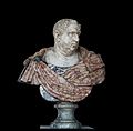
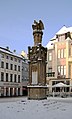
- Nomination Roman Emperor Vespasian (9-79)--Jebulon 17:32, 19 December 2010 (UTC)
- Promotion A white dot to the left of the base. Once it has disappeared I am pleased to promote the Emperor Vespasian --Archaeodontosaurus 17:51, 19 December 2010 (UTC) Aaargh ! Done Pecunia non olet--Jebulon 18:13, 19 December 2010 (UTC) Support--Murdockcrc 20:25, 19 December 2010 (UTC)
-

- Nomination Water tender TLF 16/25 --Carschten 11:55, 19 December 2010 (UTC)
- Promotion Gut --George Chernilevsky 18:01, 19 December 2010 (UTC)
-

- Nomination Fire station of Mahlow, Germany --Carschten 11:55, 19 December 2010 (UTC)
- Promotion Gut --George Chernilevsky 18:02, 19 December 2010 (UTC)
-

- Nomination Ringed Plover checks its reflection -- Ken Billington 10:13, 19 December 2010 (UTC)
- Promotion Support QI & Useful --Archaeodontosaurus 17:55, 19 December 2010 (UTC)
-
-
- Nomination: The Karuizawa Taliesin in Karuizawa, Nagano --663highland 13:58, 13 December 2010 (UTC)
- Review needed
-

- Nomination: National Park Paklenica - canyon Velika Paklenica --Pudelek 13:53, 13 December 2010 (UTC)
- Review needed
-

-

- Nomination Pagoda of Ninnaji in Kyoto --663highland 09:52, 19 December 2010 (UTC)
- Promotion Good--Jebulon 10:23, 19 December 2010 (UTC)
-
- Nomination Golden Hall of Ninnaji in Kyoto --663highland 09:52, 19 December 2010 (UTC)
- Promotion Some acceptable CA. Good picture--Jebulon 10:27, 19 December 2010 (UTC)
-

- Nomination Golden Hall of Ninnaji in Kyoto --663highland 09:52, 19 December 2010 (UTC)
- Promotion Some CA, but acceptable.--Jebulon 10:25, 19 December 2010 (UTC)
-
-

- Nomination Hilton Falls and mill ruins, Hilton Falls Conservation Area, Ontario, Canada. --Óðinn 03:52, 19 December 2010 (UTC)
- Promotion Yes.--Jebulon 10:31, 19 December 2010 (UTC)
-
-

-

-

- Nomination Praying statue of a french princess, 1629, Musée du Louvre--Jebulon 18:11, 18 December 2010 (UTC)
- Promotion Support QI and very good caption --Archaeodontosaurus 18:33, 18 December 2010 (UTC)
-

- Nomination Eastern Woolly Lemur skull --Archaeodontosaurus 10:35, 18 December 2010 (UTC)
- Promotion Very good --George Chernilevsky 20:10, 18 December 2010 (UTC)
-
-

- Nomination Catholic church in Schwieberdingen, Germany --Harke 17:24, 17 December 2010 (UTC)
- Promotion Der Himmel am oberen Bildrand und schattige Bereiche im Bild weisen (trotz ISO 100....) ein starkes Rauschen auf. Könntest Du diese Bereiche bitte entrauschen? Dann gibt's Pro von mir. --Carschten 18:10, 17 December 2010 (UTC) done --Harke 19:32, 18 December 2010 (UTC) Good for me. New categories added.--Jebulon 10:52, 19 December 2010 (UTC)
-

- Nomination Cow Dung Insulated Building in Brod, Kosovo -- Mdupont 18:34, 16 December 2010 (UTC)
- Decline
Oppose smaller than 2 million pixels. Wrong color temperature --Archaeodontosaurus 09:28, 19 December 2010 (UTC)
-

-

-
- Nomination: Yamaha Rhino in Yyteri, Pori, Finland. --kallerna 10:37, 13 December 2010 (UTC)
- Review needed
-

- Nomination: Michel Jourdain driving at Laajavuori special stage, Rally Finland 2010. --kallerna 10:37, 13 December 2010 (UTC)
- Review needed
-

- Nomination: Landscape with spruces from Yyteri. --kallerna 10:37, 13 December 2010 (UTC)
- Review needed
-
- Nomination: Ulvsunda castle --Ankara 23:17, 12 December 2010 (UTC)
- Review needed
-

- Nomination: Panorama over the northeast part of the Schwafheimer Meer in snow at sunset --Carschten 21:15, 12 December 2010 (UTC)
- Review needed
-

- Nomination: Instruments and silhouette of dist pedal.--V-wolf 14:17, 12 December 2010 (UTC)
- Review needed
-

- Nomination Solferino, Lombardy, Italy, where the Battle of Solferino took place and gave way for the Red Cross to be founded. --Murdockcrc 20:24, 17 December 2010 (UTC)
- Promotion a bit foggy in background, but otherwise good. Useful. French caption added.--Jebulon 01:26, 18 December 2010 (UTC) I added the geocode, requirement in VIC --Jebulon 01:41, 18 December 2010 (UTC)
-

- Nomination Bronze sculpture by L Wercollier in Lŭxembourg City.--Cayambe 17:10, 17 December 2010 (UTC)
- Promotion Support QI & Useful --Archaeodontosaurus 10:38, 18 December 2010 (UTC)
-

- Nomination The Midas Ear Abalone, Haliotis midae --Llez 14:37, 17 December 2010 (UTC)
- Promotion Support QI & Useful --Archaeodontosaurus 09:56, 18 December 2010 (UTC)
-

- Nomination Jinguji in Obama, Fukui Pref --663highland 13:50, 17 December 2010 (UTC)
- Decline Oppose Very harsh lighting, and the main subject is mostly under heavy shadows. --Murdockcrc 20:35, 17 December 2010 (UTC)
-

- Nomination Interior and the minbar of the Muhammad Ali Mosque. --kallerna 08:20, 17 December 2010 (UTC)
- Decline Technically very well done in difficult lighting conditions, but a perspective correction would be welcome.--Archaeodontosaurus 13:29, 17 December 2010 (UTC) Difficult shot, but very noisy, too dark, bad crop left (the lights), perspective distortion indeed. A geotag and other infos (where stays this mosque ?) should be welcome--Jebulon 01:23, 18 December 2010 (UTC)
-

- Nomination Boat near Paradise Island, Hurghada. --kallerna 08:20, 17 December 2010 (UTC)
- Promotion Support The boat is a little bit too on the right for me, but overall the quality is great. --Murdockcrc 20:41, 17 December 2010 (UTC)
-

-

- Nomination Monastery of Saint Anthony, Egypt --Berthold Werner 16:56, 16 December 2010 (UTC)
- Decline The shadow in foreground is too disturbing. But I'm sorry.--Jebulon 01:16, 18 December 2010 (UTC)
-

- Nomination West Pagoda of Yakushiji in Nara --663highland 16:47, 16 December 2010 (UTC)
- Promotion Support Yes, this one fits the QI requirements to me. I think a slight perspective correction is needed, but you still have my vote. --Murdockcrc 20:47, 17 December 2010 (UTC)
-

-
- Nomination: Byōdō-in's Phoenix Hall in Uji, Kyoto Pref..--663highland 00:24, 12 December 2010 (UTC)
- Review needed
-

- Nomination: Byōdō-in's Phoenix Hall in Uji, Kyoto Pref..--663highland 00:24, 12 December 2010 (UTC)
- Review needed
-

- Nomination: Senecio jacobaea, --Bartiebert 22:47, 11 December 2010 (UTC)
- Review needed
-

- Nomination: Salix caprea. --Bartiebert 17:11, 11 December 2010 (UTC)
- Review needed
-

- Nomination: Horyu-ji in Ikaruga, Nara Pref.. --663highland 13:31, 11 December 2010 (UTC)
- Review Please see annotations--Jebulon 16:51, 11 December 2010 (UTC)
-

- Nomination The old Reblandhalle (right), now demolished, and the construction site of the new building (left), Neckarwestheim, Baden-Württemberg. -- Felix Koenig 17:46, 10 December 2010 (UTC)
- Promotion Not sexy at all, but QI and useful. Could be better categorized IMO.--Jebulon 01:09, 18 December 2010 (UTC)
-

-

- Nomination Panoramic view as seen from Monte Generoso, Ticino, Switzerland.--Murdockcrc 20:55, 10 December 2010 (UTC)
- Promotion Good, IMO--Jebulon 01:03, 18 December 2010 (UTC)
-

- Nomination View of St. Moritz and the lake, as seen from Muottas da Schlarigna, Grisons. Switzerland.--Murdockcrc 20:55, 10 December 2010 (UTC)
- Promotion Comment Taken with Canon EOS 5D Mark II. Should have larger resolution. --kallerna 11:44, 13 December 2010 (UTC) Good IMO --Jebulon 01:04, 18 December 2010 (UTC)
-
- Nomination The small village Las Piletillas, Gran Canaria. -- Felix Koenig 20:45, 8 December 2010 (UTC)
- Decline Rather unsharp and a bit overexposed, but not worth of a decline. Further opinions? Mattbuck 04:36, 16 December 2010 (UTC) left part unsharp, please see annotations--Jebulon 01:02, 18 December 2010 (UTC)
-
- Nomination Church of St. Donatus in Zadar --Pudelek 13:39, 8 December 2010 (UTC)
- Decline Many chromatic aberration; That can be corrected in RAW --Archaeodontosaurus 08:30, 12 December 2010 (UTC) Info I don't have RAW for this picture --Pudelek 14:01, 13 December 2010 (UTC)
Could you not just use lens correction on it? Mattbuck 04:36, 16 December 2010 (UTC) Strong CA indeed. Tight crop above.--Jebulon 01:00, 18 December 2010 (UTC)
-
- Nomination M/T Juraj Dalmatinac in Zadar, Croatia --Pudelek 13:39, 8 December 2010 (UTC)
- Decline Slightly overexposed, and a bit too tight a crop maybe? Mattbuck 04:36, 16 December 2010 (UTC) Comment Is not overexposed --Pudelek 12:01, 16 December 2010 (UTC) I miss the bows...--Jebulon 00:58, 18 December 2010 (UTC)
-

-

-

- Nomination House in Quito. --Cayambe 18:33, 16 December 2010 (UTC)
- Promotion Support QI for me --Archaeodontosaurus 08:12, 17 December 2010 (UTC)
-
- Nomination at Mimurotoji in Uji, Kyoto Pref --663highland 16:47, 16 December 2010 (UTC)
- Promotion Support Fits all QI requirements to me. ありがとう。--Murdockcrc 21:13, 16 December 2010 (UTC)
-
- Nomination Rotating raytraced ball and stick model of an icosahedron --Kprateek88 15:25, 16 December 2010 (UTC). Dosn't run on my computer --Mbdortmund 18:11, 16 December 2010 (UTC). Comment Doesn't run either here. --Cayambe 18:36, 16 December 2010 (UTC) Comment I can see it (Win XP/FF 3.6), and it looks nice, but it takes a long while to load.--V-wolf 18:50, 16 December 2010 (UTC) Comment need some seconds to load but run without problems on my computer (XP/FF3.6, too) --Carschten 18:54, 16 December 2010 (UTC) Comment -- All players work fine. Java is slow but works. running linŭMdupont 05:09, 17 December 2010 (UTC)
- Promotion Works fine now here... therefore QI to me. --Cayambe 08:21, 17 December 2010 (UTC)
- Nomination Rotating raytraced ball and stick model of an icosahedron --Kprateek88 15:25, 16 December 2010 (UTC). Dosn't run on my computer --Mbdortmund 18:11, 16 December 2010 (UTC).
-

- Nomination Horyu-ji in Ikaruga, Nara --663highland 16:37, 15 December 2010 (UTC)
- Promotion Good. --Cayambe 17:27, 16 December 2010 (UTC)
-

- Nomination The Radish Murex, Hexaplex (Muricanthus) radix --Llez 12:05, 15 December 2010 (UTC)
- Promotion Support QI - Good choise of background --Archaeodontosaurus 15:21, 16 December 2010 (UTC)
-

-

-

- Nomination A clock tower at the Convent of Our Lady of Saidnaya, Syria --Bgag 02:09, 15 December 2010 (UTC)
- Promotion QI --Berthold Werner 16:58, 16 December 2010 (UTC)
-

- Nomination Boloria chariclea (Arctic Fritillary) --Wsiegmund 23:40, 14 December 2010 (UTC)
- Promotion Good. --Cayambe 18:39, 16 December 2010 (UTC)
-

- Nomination Rakan statue of Otagi nenbutsuji in Kyoto--663highland 13:07, 14 December 2010 (UTC)
- Promotion The crop is not perfect ( hard to do), a portrait orientation should be better. But good.--Jebulon 01:14, 16 December 2010 (UTC)
Comment To me, sharp and good details (good picture), but bad crop and bad colors (too green and a bit yellow) --Lmbuga 21:02, 16 December 2010 (UTC)
-

- Nomination Inside the fort d'Uxegney --ComputerHotline 17:48, 13 December 2010 (UTC)
- Promotion good -- Felix Koenig 18:51, 16 December 2010 (UTC)
-

- Nomination Chapel on the Walder Alm, Karwendel mountains, Tyrol --Haneburger 06:58, 12 December 2010 (UTC)
- Promotion
 Question It's tilted? --Pudelek 13:56, 13 December 2010 (UTC) Circa 2 degrees turned right. Better? --Haneburger 17:40, 13 December 2010 (UTC) Comment ok now --Pudelek 16:51, 16 December 2010 (UTC)
-

- Nomination Inside an old NATO base. --ComputerHotline 13:19, 11 December 2010 (UTC)
- Promotion Ok to me. --Cayambe 10:55, 17 December 2010 (UTC)
-

- Nomination An access to an airlock inside an old NATO base. --ComputerHotline 13:19, 11 December 2010 (UTC)
- Promotion Good. --Cayambe 10:57, 17 December 2010 (UTC)
-

- Nomination: Nicholai Georgiu driving at Laajavuori special stage, Rally Finland 2010. --kallerna 11:05, 11 December 2010 (UTC)
- Review needed
-

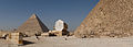
- Nomination: Giza pyramid complex. --kallerna 11:05, 11 December 2010 (UTC)
- Review needed
-
- Nomination: Old gantry crane in Stockholm.--Ankara 22:08, 10 December 2010 (UTC)
- Review needed
-

- Nomination: Hokkiji temple in Ikaruga, Nara. --663highland 16:21, 10 December 2010 (UTC)
- Review needed
-

- Nomination Hokkiji temple in Ikaruga, Nara. --663highland 16:21, 10 December 2010 (UTC)
- Promotion Good. Please add geotag. --Cayambe 11:01, 17 December 2010 (UTC)
-

- Nomination: Schloss Waldeck, Germany. (New version) --Bartiebert 14:27, 10 December 2010 (UTC)
- Review needed
-

- Nomination Bluebells on the island Tintagel Castle, Cornwall, UK. --DKrieger 23:07, 9 December 2010 (UTC)
- Promotion I love the composition, very good quality, nice colors. Maybe FP? --Carschten 17:22, 15 December 2010 (UTC)
Seed head (?) projecting over left edge would need tidying up first IMO. --Avenue 07:57, 17 December 2010 (UTC)
-

-

-
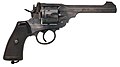
- Nomination Webley Mk VI Revolver. -- Rama 23:23, 15 December 2010 (UTC)
- Promotion C'est de ma faute, je t'ai réveillé...--Jebulon 01:11, 16 December 2010 (UTC)
-
-

-

-

- Nomination Ironmongery in Category:Ulvsunda industriområde --Ankara 13:37, 15 December 2010 (UTC)
- Decline Overexposed. --kallerna 14:01, 15 December 2010 (UTC)
-

- Nomination 150252 arrives at Tondu station. Mattbuck 08:25, 15 December 2010 (UTC)
- Promotion QI --Mbdortmund 07:32, 16 December 2010 (UTC)
-
- Nomination Cistern of Krak des Chevaliers, Syria --Bgag 02:09, 15 December 2010 (UTC)
- Promotion good --Mbdortmund 07:31, 16 December 2010 (UTC)
-
- Nomination Parasteatoda tepidariorum and Cicadella viridis. Bastavales, Brión, Galicia (Spain)
I'm not sure, perhaps bad clarity... --Lmbuga 18:30, 14 December 2010 (UTC) - Decline Very good - sharp and detailed - but the brightness ruins it for me. Mattbuck 08:26, 15 December 2010 (UTC) Comment Ok. Sorry, I haven't the RAW file--Lmbuga 08:43, 16 December 2010 (UTC)
- Nomination Parasteatoda tepidariorum and Cicadella viridis. Bastavales, Brión, Galicia (Spain)
-

- Nomination Myotsuji Garden in Obama, Fukui --663highland 13:58, 13 December 2010 (UTC)
- Decline An impressive image, of course, but IMHO oversaturated (unnatural colors) and not sharp (partially due to the very high ISO setting of 1,600). Sorry ... --Aristeas 14:15, 15 December 2010 (UTC)
-

- Nomination Pediment, church of Saint Nicolas de Bari in Burgos, Spain--Jebulon 17:53, 12 December 2010 (UTC
- Promotion Not the best light, but good composition and quality. -- Felix Koenig 21:27, 15 December 2010 (UTC))
-

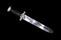
- Nomination Small pocket revolver, for ladies. End of 19th century. Could somebody help for ID ?--Jebulon 16:55, 12 December 2010 (UTC)
- Promotion Could it be related to File:Revolver St ETienne Small.jpg ? -- Rama 15:17, 14 December 2010 (UTC)
Support Nice photo. It is continental replica of Webley No. 2, "British Bulldog" --George Chernilevsky 20:53, 14 December 2010 (UTC)
I've got another photograph here: File:Revolver IMG 5069.jpg, looks like it indeed. Rama 12:51, 15 December 2010 (UTC)
-

- Nomination Underground tunnel inside an old NATO base. --ComputerHotline 13:19, 11 December 2010 (UTC)
- Promotion good --Pudelek 12:54, 15 December 2010 (UTC)
-

- Nomination: Ruins of a press-house in Serjilla, Syria --Bgag 23:50, 9 December 2010 (UTC)
- Review needed
-

- Nomination: Littaford Tor (on the right), seen from Longaford Tor, a typical barren Dartmoor landscape in the still dry springtime. Devon, UK. --DKrieger 22:56, 9 December 2010 (UTC)
- Review needed
-

- Nomination: St. Anna Church in Wilanów, Warsaw, by night, illuminated. --Dobromila 20:18, 9 December 2010 (UTC)
- Review needed
-

- Nomination: Quito, Ecuador, Good Friday, street procession. --Cayambe 18:08, 9 December 2010 (UTC)
- Review needed
-

- Nomination: Engraved antlers featuring horse representations. Magdalenian. Found in La Madelaine in 1863. Muséum de Toulouse. -- Rama 18:05, 9 December 2010 (UTC)
- Review needed
-

- Nomination: Bear teeth, part of a jewel. Found in Gourdan Cave. Muséum de Toulouse. -- Rama 18:05, 9 December 2010 (UTC)
- Review needed
-
- Nomination: Southern tip of the the Schwafheimer Meer in Moers --Carschten 17:03, 9 December 2010 (UTC)
- Review needed
-
- Nomination: Sunset at a snowy field in Moers --Carschten 17:03, 9 December 2010 (UTC)
- Review needed
-
- Nomination Middle gate, Varberg Fortress, Sweden --Wolfgangus Mozart 20:38, 8 December 2010 (UTC)
- Decline Overexposed in clouds and in some channels on the sky. Mattbuck 04:36, 16 December 2010 (UTC)
-

-

-

-

- Nomination Doubs river in spate, in Montbéliard, France. --ComputerHotline 11:50, 8 December 2010 (UTC)
- Decline I don't really like the composition on this - the red bleeds through too well, and while the light/dark contrast is interesting, it's not nice. Mattbuck 04:36, 16 December 2010 (UTC)
-

- Nomination Cairo, Art nouveau buildings at Midan Talaat Harb --Berthold Werner 09:24, 8 December 2010 (UTC)
- Decline Chromatic aberration on the right hand building (purple, left edge), and to me the man standing in the foreground spoils the composition. Mattbuck 04:36, 16 December 2010 (UTC)
-

-

- Nomination Völklinger Hütte, Germany by LoKiLeCh; nom by --JuTa 18:24, 7 December 2010 (UTC)
- Decline Some mild tilt and a bit unsharp, but I do like the composition. However, I am declining due to the severe blurring at the bottom left - what did you try and paint out? Mattbuck 19:55, 15 December 2010 (UTC)
-

-

-

- Nomination Surfers at sunset -- Alvesgaspar 00:12, 14 December 2010 (UTC)
- Promotion I like it--Lmbuga 18:55, 14 December 2010 (UTC)
-

- Nomination Surfers at sunset -- Alvesgaspar 00:12, 14 December 2010 (UTC)
- Promotion I like it--Lmbuga 18:56, 14 December 2010 (UTC)
-

- Nomination Sunset at Costa da Caparica, Portugal -- Alvesgaspar 00:12, 14 December 2010 (UTC)
- Promotion Good--Lmbuga 19:00, 14 December 2010 (UTC)
-

- Nomination Inside the fort d'Uxegney --ComputerHotline 17:48, 13 December 2010 (UTC)
- Promotion Good. Also illustrates the diffraction og light.:-) --Cayambe 08:18, 15 December 2010 (UTC)
-

- Nomination Castanopsis sieboldii of Jinguji in Obama, Fukui --663highland 13:58, 13 December 2010 (UTC)
- Promotion God. --Cayambe 08:18, 15 December 2010 (UTC)
-

-

- Nomination Byōdō-in's Phoenix Hall in Uji, Kyoto Pref..--663highland 00:24, 12 December 2010 (UTC)
- Promotion Good. --Cayambe 20:14, 14 December 2010 (UTC)
-

- Nomination The facade of Sant'Eustorgio in Milan. --High Contrast 00:01, 11 December 2010 (UTC)
- Promotion Good technical quality, composition and perspective correction are OK.--MrPanyGoff 15:11, 14 December 2010 (UTC)
-

- Nomination: Side of Khafre's Pyramid. --kallerna 11:11, 9 December 2010 (UTC)
- Review needed
-

- Nomination: Entrance in Gothenburg from 1893.--Ankara 01:44, 9 December 2010 (UTC)
- Review needed
-
-

-

- Nomination Great Pyramid of Giza. --kallerna 16:25, 6 December 2010 (UTC)
- Promotion Several dust spots. Please correct this. Mattbuck 08:34, 15 December 2010 (UTC) Info Fixed. --kallerna 08:46, 15 December 2010 (UTC)
Sorry, found 2 more. I have checked thoroughly, these are the last I can see. Mattbuck 08:55, 15 December 2010 (UTC)
I'm just going to promote now before I decide I don't like how pointy the pyramid is. Come to think of it... Mattbuck 09:05, 15 December 2010 (UTC)
-

-

-

- Nomination A chandelier in Sayyidah Ruqayya Mosque, Damascus --Bgag 04:38, 14 December 2010 (UTC)
- Promotion Support QI for me --Archaeodontosaurus 09:24, 14 December 2010 (UTC)
-
- Nomination 360 degree view of Giza pyramid complex. --kallerna 10:37, 13 December 2010 (UTC)
- Promotion Correct for me --ComputerHotline 17:48, 13 December 2010 (UTC)
-

- Nomination Augite from Rwanda --Archaeodontosaurus 08:25, 12 December 2010 (UTC)
- Promotion solid quality --Mbdortmund 20:34, 13 December 2010 (UTC)
-

- Nomination Nathan Phillips Square, Toronto. by Taxiarchos228 --Elekhh 06:29, 12 December 2010 (UTC)
- Promotion very good --Pudelek 13:56, 13 December 2010 (UTC)
-
- Nomination: Doubs river in spate, in Montbéliard, France. --ComputerHotline 11:50, 8 December 2010 (UTC)
- Review needed
-

- Nomination Different types of typical Swiss bread at a local bakery in St. Moritz, Grisons, Switzerland. --Murdockcrc 08:31, 8 December 2010 (UTC)
- Withdrawn
 I withdraw my nomination
-
- Nomination Tenerife: Punta de las Gaviotas -- MJJR 22:05, 12 December 2010 (UTC)
- Promotion For me QI and more. --Alchemist-hp 23:35, 12 December 2010 (UTC)
-

- Nomination Anas platyrhynchos.--V-wolf 21:35, 12 December 2010 (UTC)
- Promotion good --Mbdortmund 00:21, 13 December 2010 (UTC)
-

-

- Nomination Cimborrio of the Cathedral of Burgos, Spain--Jebulon 17:29, 12 December 2010 (UTC)
- Promotion Support QI for me --Archaeodontosaurus 19:15, 12 December 2010 (UTC)
-
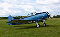
- Nomination North American AT6. --Alchemist-hp 15:08, 12 December 2010 (UTC)
- Promotion wenn der Flugplatz nicht an einem Berg liegt kippt das Bild deutlich nach links. Bitte korrigieren, vielleicht auch noch das Flugzeug leicht aufhellen, dann ist es ein klares QI --Carschten 15:37, 12 December 2010 (UTC) 1. Der Waldrand ist nicht paralell zum Horizont, er geht schräg rüber, siehe Google Maps, leichte Perspektive 2. bitte den alten Röhrenmonitor endlich verschrotten! Grüße, --Alchemist-hp 15:52, 12 December 2010 (UTC) Support eben weil ich mit dem Wald und dem Horizont nicht sicher war schrieb ich ja extra wenn der Flugplatz nicht an einem Berg liegt. Und vielleicht sollte ich mir zu Weihnachten einen neuen Monitor wünschen - eigentlich 'ne gute Idee, danke! :-) --Carschten 16:08, 12 December 2010 (UTC)
-

- Nomination Saint Catherine's Monastery, Sinai, Egypt --Berthold Werner 12:57, 12 December 2010 (UTC)
- Promotion I could support this in FPC...--Jebulon 17:04, 12 December 2010 (UTC)
Done ;-) --Berthold Werner 09:48, 13 December 2010 (UTC)
-

- Nomination Wulfenite Namibia --Archaeodontosaurus 11:43, 12 December 2010 (UTC)
- Promotion Comment I'm not quite sure about the masking and shadows, it looks two-dimensional, imho.--V-wolf 14:21, 12 December 2010 (UTC)
it's true, the appearance is too artificial. I remove the background --Archaeodontosaurus 18:04, 12 December 2010 (UTC) Support Much better.--V-wolf 20:20, 12 December 2010 (UTC)
-

- Nomination Canadian Museum of Civilization, Gatineau. by Taxiarchos228 --Elekhh 06:29, 12 December 2010 (UTC)
- Promotion QI! --Berthold Werner 12:55, 12 December 2010 (UTC)
-

- Nomination "Honor Courtyard" of the Invalides under sun and stormy sky, Paris--Jebulon 16:45, 11 December 2010 (UTC)
- Promotion Good --George Chernilevsky 11:36, 13 December 2010 (UTC)
-
- Nomination New building of the Monastery of Saint Moses the Abyssinian, Syria --Bgag 22:30, 10 December 2010 (UTC). Needs a slight perspective correction on the left. --Cayambe 09:28, 11 December 2010 (UTC) Done --Bgag 14:04, 11 December 2010 (UTC)
- Promotion Good now. --Cayambe 19:09, 12 December 2010 (UTC)
- Nomination New building of the Monastery of Saint Moses the Abyssinian, Syria --Bgag 22:30, 10 December 2010 (UTC). Needs a slight perspective correction on the left. --Cayambe 09:28, 11 December 2010 (UTC)
-

- Nomination Detail of a capital in Temple of Bel, Palmyra --Bgag 23:50, 9 December 2010 (UTC)
- Promotion Razor-sharp, great detail and great texture. --Murdockcrc 21:23, 10 December 2010 (UTC) But the sky is noisy--Jebulon 17:14, 11 December 2010 (UTC) Done --Bgag 00:27, 12 December 2010 (UTC) Thank you. Much better now. Could be FP ?--Jebulon 11:39, 13 December 2010 (UTC)
-
- Nomination Open day at the Newport Transporter Bridge, and a rare chance to climb up and across. --Andy Dingley 22:41, 8 December 2010 (UTC)
- Promotion Nice and interesting--Jebulon 16:40, 12 December 2010 (UTC)
-

- Nomination The Chapel Tower of Melbourne Grammar School --Donaldytong 10:45, 8 December 2010 (UTC)
- Decline The correction is too heavy, I'm sorry--Jebulon 16:39, 12 December 2010 (UTC)
-

- Nomination: Neolithic silex blade, three views of the same artefact. Toulouse muséum. -- Rama 11:41, 7 December 2010 (UTC)
- Review needed
-
- Nomination: Neolithic silex blade, two views of the same artefact. Toulouse muséum. -- Rama 11:41, 7 December 2010 (UTC)
- Review needed
-

-

- Nomination Old stained glass, Grace Episcopal, Decorah, Iowa -- Jonathunder 23:39, 6 December 2010 (UTC)
- Decline I think a perspective correction would help.--Jebulon 00:05, 8 December 2010 (UTC) I've tried something.--Jebulon 18:15, 11 December 2010 (UTC)
The reworked version is much better, but both suffer from an unfortunate crop at the bottom. --Avenue 00:35, 13 December 2010 (UTC)
-

- Nomination: landscape near Rendsburg by user:smial nominated by --Mbdortmund 03:50, 5 December 2010 (UTC)
- Review Comment It is slightly tilted CCW. This is easy to correct. --Murdockcrc 16:23, 6 December 2010 (UTC)
-

-

- Nomination Compsognathus longipes --Llez 08:31, 12 December 2010 (UTC)
- Promotion QI Damage to the framing right, even if the plate stops here --Archaeodontosaurus 08:49, 12 December 2010 (UTC)
-

- Nomination Walder Alm in the Karwendel with Hochnissl in the background, Tyrol --Haneburger 07:18, 12 December 2010 (UTC)
- Promotion Atemberaubend! --Cosmicdancer 11:59, 12 December 2010 (UTC)
-

- Nomination Wulfenite Morocco --Archaeodontosaurus 18:12, 11 December 2010 (UTC)
- Promotion good --Mbdortmund 22:24, 11 December 2010 (UTC)
-
-

-
- Nomination Royal Botanic Gardens (The National Herbarium Victoria - Founded in 1853) Donaldytong 15:14, 11 December 2010 (UTC)
- Decline Because of stitching errors (please see annotations), chromatic aberration overall the building, barrel distorsion.--Jebulon 17:38, 11 December 2010 (UTC)
-
- Nomination Nazaré, Portugal --MRB 14:15, 11 December 2010 (UTC)
- Promotion Breathtaking!--Murdockcrc 22:03, 11 December 2010 (UTC)
-
- Nomination Red Howler Skull --Archaeodontosaurus 13:24, 11 December 2010 (UTC)
- Promotion Very good--Jebulon 18:29, 11 December 2010 (UTC)
-

- Nomination Mimurotoji Garden in Uji, Kyoto --663highland 12:49, 11 December 2010 (UTC)
- Decline Unnatural colors (oversaturated), all channels blown out -- Alvesgaspar 13:16, 11 December 2010 (UTC)
-

- Nomination at Jojakkoji in Kyoto, Kyoto --663highland 12:49, 11 December 2010 (UTC)
- Decline Blown sky, general unsharpness, ugly dark foregroung -- Alvesgaspar 13:12, 11 December 2010 (UTC)
-

- Nomination Panorama with Great Pyramid of Giza. --kallerna 11:05, 11 December 2010 (UTC)
- Decline Light is not good, affecting the contrast and colors; the image is distorted on its right side (buildings leaning to right, horizon not horizontal); there is at lest one dust spot in the sky. -- Alvesgaspar 13:09, 11 December 2010 (UTC)
-

-

-
- Nomination Yumedono of Horyuji temple in Ikaruga, Nara. --663highland 16:21, 10 December 2010 (UTC)
- Promotion CommentThe composition is very good and the image is very sharp. My only big concern is that I think the lighting is not optimal. There are very strong shadows, particularly, about half the main subject (the Temple) is under shadow. Before promoting to QI I'd like to hear other people's opinion about this. --Murdockcrc 21:14, 10 December 2010 (UTC) It is good enough for QI IMO. They are some chromatic aberration too, but acceptable.--Jebulon 17:24, 11 December 2010 (UTC)
-

- Nomination Giza, Menkaure's Pyramid --Berthold Werner 15:55, 10 December 2010 (UTC)
- Promotion very
pollutednice --Jebulon 17:26, 11 December 2010 (UTC)
-

- Nomination Gannet colony at Muriwai. --Avenue 15:13, 10 December 2010 (UTC)
- Decline Comment Amazing lighting. My only concern is that I think that your camera focused for the foreground (the grass) because that seems to be the sharpest part of the image. This is pity, it should have focused on the rocks to make them pin-sharp (or you could have used a smaller aperture perhaps?) I don't see any stitching errors, but again, I'm not an expert evaluating panos, maybe someone can give some revision to that.--Murdockcrc 21:19, 10 December 2010 (UTC)
Good point. I think the camera I used may have trouble with sharpness at distance - see e.g. another example. I hope I'll get a chance to reshoot with a better camera sometime this summer. --Avenue 10:35, 11 December 2010 (UTC) Agree with Murdockcrc. The isolated rock at right is very unsharp and noisy too. But please give us another shot, because the place is very nice and interesting! --Jebulon 17:32, 11 December 2010 (UTC)
-

- Nomination Freudenberg, Germany. --Bartiebert 14:09, 10 December 2010 (UTC)
- Promotion Some acceptable chromatic aberration, but good.--Jebulon 17:10, 11 December 2010 (UTC)
-

-

-

- Nomination The West Facade of Memorial Hall, Melbourne Grammar School Donaldytong 13:43, 10 December 2010 (UTC)
- Promotion good details and colours but horizontal lines are tiltes / distorted on the right side --Mbdortmund 15:38, 10 December 2010 (UTC) Done Donaldytong 15:05, 11 December 2010 (UTC) Good for QI--Jebulon 16:57, 11 December 2010 (UTC)
-
-

-

- Nomination Church of St. Nicholas in Nin, Croatia --Pudelek 12:16, 7 December 2010 (UTC)
- Promotion Nice, but the 5° CCW tilt (based on the horizon and pylon behind the woman) was too strong IMO. I've tried to fix it; feel free to revert. --Avenue 14:58, 7 December 2010 (UTC) Comment yes, I know that old version was tilted (my artistic vision). New version is not bad --Pudelek 15:09, 7 December 2010 (UTC)
I've reverted to your artistic version. You should decide which version to use, not me. --Avenue 15:20, 7 December 2010 (UTC) Comment I choose your version --Pudelek 16:26, 7 December 2010 (UTC)
I would promote it, but think I've done too much to be seen as neutral, so will leave it for someone else to review. --Avenue 03:33, 9 December 2010 (UTC) Support Picture imperfect but sufficient to QI --Archaeodontosaurus 08:32, 12 December 2010 (UTC)
-

-
- Nomination The Memorial Hall, Melbourne Grammar School Donaldytong 13:24, 6 December 2010 (UTC)
- Promotion Comment The image is slightly tilted CW. This should be easily corrected. --Murdockcrc 16:14, 6 December 2010 (UTC). Done Donaldytong 08:33, 7 December 2010 (UTC) Good.--Jebulon 18:01, 11 December 2010 (UTC)
-

- Nomination: Pitch torches in roundabout, Hedemora, Sweden.--V-wolf 00:55, 5 December 2010 (UTC)
- Review tilt/distortions should be corrected --Carschten 09:57, 5 December 2010 (UTC) Done I have also made a darker version, is that to prefer?--V-wolf 15:46, 5 December 2010 (UTC)
-
- Nomination: 30db, 5W, DC-18GHz RF power attenuator. --Jovianeye 01:52, 2 December 2010 (UTC)
- Review Comment The left (front) part seems to be not really sharp. --Berthold Werner 14:21, 2 December 2010 (UTC)
I have reshot it, see if it is ok now? --Jovianeye 21:16, 4 December 2010 (UTC)
The front part is better, but not so good as it can be, and now the end is getting unsharp. Perhaps you may do focus stacking (or someone other would promote it as it is) --Berthold Werner 14:43, 5 December 2010 (UTC)
-

- Nomination Bâton de commandement, object PRE.2010.0.4.1 of the collection of prehistory of Toulouse museum. -- Rama 21:19, 1 December 2010 (UTC)
- Promotion I don't understand the gradient masking above, looks "washed out". Please have a look in the file page, there is something strange...--Jebulon 23:58, 2 December 2010 (UTC)
I've tried to improve things a bit, hope it's better now. Rama 20:00, 9 December 2010 (UTC) Good now. Boing-boing ? Copyrighted picture ?--Jebulon 17:57, 11 December 2010 (UTC)
-

- Nomination Harpoon blade carved in antlers. Magdalenian, Muséum de Toulouse. -- Rama 15:51, 1 December 2010 (UTC)
- Promotion Is it the same object ? The description in the file page is insufficient IMO...--Jebulon 23:55, 2 December 2010 (UTC)
Yes, two series of three views -- general and details of the tip. Better descriptions are pending for all objects of this series. -- Rama 22:12, 6 December 2010 (UTC) Good--Jebulon 17:58, 11 December 2010 (UTC)
-

- Nomination: Nin, Croatia - roman mosaic --Pudelek 14:59, 1 December 2010 (UTC)
- Review Comment Looks unsharp to me. --Murdockcrc 18:58, 5 December 2010 (UTC)
-

-

- Nomination Wulfenite Morocco --Archaeodontosaurus 10:51, 11 December 2010 (UTC)
- Promotion --Frankkas 11:05, 11 December 2010 (UTC)
-

-

-
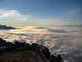
- Nomination Above the sea of fog --MRB 20:12, 10 December 2010 (UTC)
- Promotion Fantastic shot! --Murdockcrc 21:08, 10 December 2010 (UTC)
-

- Nomination Oberaar and Unteraar Glaciers --MRB 20:12, 10 December 2010 (UTC)
- Promotion --Murdockcrc 21:09, 10 December 2010 (UTC)
-

- Nomination Kali Gandaki river with rice fields --Przykuta 19:30, 10 December 2010 (UTC)
- Promotion The picture is a little bit too soft for my taste but the composition is so great and the lighting so spectacular that I still think it's QI. Great shot. --Murdockcrc 21:11, 10 December 2010 (UTC)
-

- Nomination The coat of arms of Georgian town Ambrolauri. IMO, the nicest COA I've drawn :).--Gaeser 18:48, 10 December 2010 (UTC)
- Promotion Good, therefore. :-) --Cayambe 09:25, 11 December 2010 (UTC) But there is a perspective problem with the brick walls of the crown: they may not be so vertical.--Jebulon 11:47, 11 December 2010 (UTC)
-

- Nomination A rock pool. --Avenue 14:37, 10 December 2010 (UTC)
- Promotion Support QI & Useful --Archaeodontosaurus 11:01, 11 December 2010 (UTC)
-

- Nomination Cathedral of St. Anastasia in Zadar - tower --Pudelek 14:08, 10 December 2010 (UTC)
- Promotion QI imho --Berthold Werner 15:59, 10 December 2010 (UTC)
-
-

- Nomination Feathers made into quills. --Jonathunder 23:49, 8 December 2010 (UTC)
- Promotion Nice and interesting--Jebulon 11:49, 11 December 2010 (UTC)
-
- Nomination The Giant Helmet, Cassis cornuta --Llez 12:57, 8 December 2010 (UTC)
- Promotion Support QI & Useful --Archaeodontosaurus 10:58, 11 December 2010 (UTC)
-
- Nomination: View from Stadlerberg on Zurich Airport -- Simisa 11:35, 5 December 2010 (UTC)
- Review needed
-

- Nomination Off-shore wind farm in the Irish Sea --Andy Dingley 22:18, 8 December 2010 (UTC)
- Decline Tilted, noisy and bit blurry, sorry. --kallerna 12:42, 9 December 2010 (UTC)
-
-

-

-

- Nomination Aconitum columbianum (Columbian Monkshood) -- Wsiegmund 23:21, 3 December 2010 (UTC)
- Decline Flowers are blurred (and color changing effect caused by the flash?). Sorry. --Bartiebert 20:39, 9 December 2010 (UTC)
-

-

-

- Nomination Hypericum perforatum. --Bartiebert 18:54, 8 December 2010 (UTC)
- Decline Sorry, but the flower lacks sharpness --Llez 19:23, 8 December 2010 (UTC)
-

-

- Nomination Quito, patio of the Archbishop's Palace. --Cayambe 17:26, 8 December 2010 (UTC)
- Promotion Support QI for me --Archaeodontosaurus 07:55, 9 December 2010 (UTC)
-

-

- Nomination Parthenos sylvia --Butko 14:00, 8 December 2010 (UTC)
- Decline It is too noisy.--Murdockcrc 17:40, 8 December 2010 (UTC)
-

- Nomination Church of St. Donatus in Zadar, Croatia - interior --Pudelek 13:39, 8 December 2010 (UTC)
- Decline Sorry, there is too much CA on the high-contrast lines. I added some notes to illustrate. --Murdockcrc 17:38, 8 December 2010 (UTC)
-
- Nomination Winter in Marki, Poland. --Crusier 13:23, 8 December 2010 (UTC)
- Promotion
There is some noticeable CA on the bottom corners when looked at 100%, but not enough to justify a decline. I like the excellent contrast of the snow, white balance is good. Great picture. --Murdockcrc 17:44, 8 December 2010 (UTC)
-

-

- Nomination Historic rallycar in Laajavuori special stage, Rally Finland. --kallerna 09:09, 8 December 2010 (UTC)
- Promotion Seems a bit too tight but overall fits QI criteria IMO. --Murdockcrc 17:49, 8 December 2010 (UTC)
-

-

- Nomination Primstalsperre near Nonnweiler, Germany by Kelsaka; nom by --JuTa 18:24, 7 December 2010 (UTC)
Comment It would be so much better if you crop out that underexposed tree on the left. --Murdockcrc 07:49, 8 December 2010 (UTC) Done I uploaded the cropped version with a dfferent name and updated the file link here. --JuTa 17:13, 8 December 2010 (UTC) - Promotion Looks QI to me. --Murdockcrc 17:51, 8 December 2010 (UTC)
- Nomination Primstalsperre near Nonnweiler, Germany by Kelsaka; nom by --JuTa 18:24, 7 December 2010 (UTC)
-

-

-

- Nomination Freudenberg, Germany. --Bartiebert 11:28, 6 December 2010 (UTC)
- Promotion Comment Too dark; could you try to correct this? The image will look much better then. --Aristeas 16:50, 6 December 2010 (UTC) DoneA little bit brightened. Still more? --Bartiebert 17:23, 6 December 2010 (UTC)
Difficult to say. Is the darkness caused by the daytime (evening?) or by the exposure? (Most auto-exposure programs have problems with snow.) I would prefer an even brighter version more like that. What do you mean? --Aristeas 19:20, 7 December 2010 (UTC)
I would agree, it really looks better. Can you transfer your example? I am not very talented with editing pictures and other stuff of that kind :-(--Bartiebert 19:47, 7 December 2010 (UTC) Done --Aristeas 10:01, 8 December 2010 (UTC) Support schönes Bild, interessante Ansicht! --Carschten 19:54, 8 December 2010 (UTC)
-

- Nomination Tourist and fishing base "Berezka" ("Betula") --George Chernilevsky 19:41, 5 December 2010 (UTC)
- Promotion Nice place, good image. --Cayambe 15:15, 8 December 2010 (UTC)
-

- Nomination Île d'Or, France, as seen from Cap Esterel, Var, France. --Murdockcrc 18:09, 5 December 2010 (UTC) Comment Too much sky and too little subject: I don't like the composition and the color of the sky--Lmbuga 20:12, 6 December 2010 (UTC)
- Decline Main subject too small. --kallerna 11:04, 9 December 2010 (UTC)
- Nomination Île d'Or, France, as seen from Cap Esterel, Var, France. --Murdockcrc 18:09, 5 December 2010 (UTC)
-
- Nomination Church tower of Saint Catherine's Monastery, Sinai, Egypt --Berthold Werner 14:47, 5 December 2010 (UTC)
- Promotion Very nice. --Avenue 15:44, 8 December 2010 (UTC)
-

- Nomination Horyu-ji in Ikaruga, Nara. --663highland 14:30, 5 December 2010 (UTC)
- Promotion Good, please add geotag. --Cayambe 15:17, 8 December 2010 (UTC)
-

-

- Nomination Blue Tit by Powerhauer; nom by --JuTa 09:46, 4 December 2010 (UTC). It is a juvenile, this and the scientific name and also a geotag should be added to the file description. Will promote when done. --Cayambe 15:21, 8 December 2010 (UTC)
Description updated, exact geotag not possible for me because I didn't took it but I added the town where it was made to to descr. --JuTa 16:32, 8 December 2010 (UTC) - Promotion Ok now. --Cayambe 17:44, 8 December 2010 (UTC)
- Nomination Blue Tit by Powerhauer; nom by --JuTa 09:46, 4 December 2010 (UTC). It is a juvenile, this and the scientific name and also a geotag should be added to the file description. Will promote when done. --Cayambe 15:21, 8 December 2010 (UTC)
-

-
- Nomination: Residues of Magdalenian industry. -- Rama 19:36, 2 December 2010 (UTC)
- Review needed
-
- Nomination: Lenticular clouds over Lake Tahoe--Mbz1 18:56, 2 December 2010 (UTC)
- Review needed
-

- Nomination: 43131 and 43139 pass at Bristol Parkway. Mattbuck 15:05, 2 December 2010 (UTC)
- Review needed
-

- Nomination Altenburg - train station by Aka nominated by --Berthold Werner 10:30, 8 December 2010 (UTC)
- Promotion QI. --kallerna 10:31, 8 December 2010 (UTC)
-

-
- Nomination A delicious meal. --LunaHunting 09:44, 8 December 2010 (UTC)
- Decline Sorry, too noisy. --kallerna 10:20, 8 December 2010 (UTC)
-

-
- Nomination Church in in Pachten, Germany by LoKiLeCh; nom by --JuTa 18:24, 7 December 2010 (UTC)
- Decline Oppose Too overexposed areas --Archaeodontosaurus 08:18, 8 December 2010 (UTC)
-

-
-

-

-

- Nomination Resubmitted with an original size. Look for the same info with the date, 6th December 2010. --LunaHunting 12:51, 7 December 2010 (UTC)
- Decline Still too small. --kallerna 12:53, 7 December 2010 (UTC)
For an image to be QI, it has to be at minimum 2 megapixels, eg the product of the number of pixels wide and high must exceed 2 million. 1024*768 does not even reach 1 million. Mattbuck 01:00, 8 December 2010 (UTC)
-

-

- Nomination The church St. Martin und Kastulus in Landshut, Germany. --High Contrast 21:47, 6 December 2010 (UTC)
- Decline Comment Please add Geocoding. Maybe oversaturated? --Aristeas 08:53, 7 December 2010 (UTC) Done Location added. --High Contrast 15:28, 7 December 2010 (UTC)
Oppose Sorry, but this image has several important quality faults: 1) There are overexposed areas (white building at left, 2) lost of texture in shadow areas and 3) the sky is very noisy. I added notes to illustrate the point. --Murdockcrc 17:23, 7 December 2010 (UTC)
-
- Nomination Monastery of Saint Anthony, Egypt --Berthold Werner 08:42, 6 December 2010 (UTC)
- Promotion Comment The top of the arc has some strong CA, as well as the shadow on the very bottom. I guess these are part of the soft spots of the lens. Do you think you can correct this? I added some notes to the image to illustrate what I mean. --Murdockcrc 16:18, 6 December 2010 (UTC)
Better now? --Berthold Werner 17:08, 7 December 2010 (UTC) Support The arc still has CA, but minor. This pic meets the QI requirements IMO. --Murdockcrc 17:20, 7 December 2010 (UTC)
-
- Nomination Metallic column under the junction of two parts (?) (portées) of a glider truss bridge of the parisian subway.--Jebulon 18:47, 5 December 2010 (UTC)
- Promotion The technical quality is good, but the composition lets it down IMO. A simple crop could fix this, e.g. by taking away half the brickwork on top, and enough from the right to centre the column. --Avenue 12:06, 7 December 2010 (UTC) Thanks. Good Idea. Better now ?--Jebulon 23:58, 7 December 2010 (UTC)
Yes, much better. Small overexposed areas and minor CA acceptable, QI IMO. --Avenue 05:58, 8 December 2010 (UTC)
-

- Nomination One of the two entries of an old NATO station. --ComputerHotline 16:48, 5 December 2010 (UTC)
- Promotion Good perspective, correctly exposed. --Daniel Case 07:13, 8 December 2010 (UTC)
-
- Nomination Rotten apple(s) eaten by birds.--V-wolf 23:55, 3 December 2010 (UTC)
- Decline Unsharp, noisy and the color balance is a bit too much on the blue side.--Andrei Stroe 21:11, 6 December 2010 (UTC) Comment Outdoor light this time of year at this latitude is quite blue, even for the bare eye.--V-wolf 16:06, 7 December 2010 (UTC)
-
- Nomination: Tellem village (Teli) in the Bandiagara Escarpment, Mali. -- Kirua 20:59, 1 December 2010 (UTC)
- Review needed
-

- Nomination: Nin, Croatia - remains of Roman temple from 1 Cent. --Pudelek 14:59, 1 December 2010 (UTC)
- Review needed
-
- Nomination All pyramids of Giza and the boat shaped museum. --kallerna 13:52, 30 November 2010 (UTC)
- Decline Sorry, but the composition is not that good: the corner of the Khufu pyramid at the right side looks round (this is irritating), the pyramid itself looks somehow flat because the direction of the light is unfortunate, the Solar Bark Museum looks like an intermodal container from this point of view, the technical construction (?) at the left side distracts and disturbs the eye. Your other images like this are better. --Aristeas 10:25, 8 December 2010 (UTC)
-
-
- Nomination A Glass Bottom Ferry near Puerto Rico, Gran Canaria. -- Felix Koenig 19:10, 28 November 2010 (UTC)
- Promotion WB is a bit off. Please fix it --Carschten 18:06, 29 November 2010 (UTC)
Kam mir eigentlich nicht so vor, aber ich habe noch etwas daran gebastelt. -- Felix Koenig 19:08, 3 December 2010 (UTC) Besser.--Jebulon 23:51, 7 December 2010 (UTC)
-

- Nomination Historic rallycar in Laajavuori special stage, Rally Finland. --kallerna 16:25, 6 December 2010 (UTC)
- Promotion Good composition. Andrei Stroe 21:03, 6 December 2010 (UTC)
-

- Nomination A neighbourhood tree, West, Singapore --LunaHunting 10:14, 6 December 2010 (UTC)
- Decline below size minimum, poor WB --Carschten 14:01, 6 December 2010 (UTC)
-
- Nomination Sitch at Bugis, Singapore --LunaHunting 14:44, 6 December 2010 (UTC)
- Decline Size. --kallerna 16:05, 6 December 2010 (UTC)
-
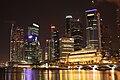
- Nomination Night shot of the Singapore Skyline as seen from the Esplanade – Theatres on the Bay --ElHeineken 20:47, 5 December 2010 (UTC)
- Decline Oppose Beatiful, but strong perspective distortion and, for me, some areas overexposed--Lmbuga 17:58, 6 December 2010 (UTC)
-

- Nomination Panorama of the main part of a Memorial complex "Khatyn", Belarus. --Ivengo(RUS) 20:07, 5 December 2010 (UTC)
- Promotion Good. --Cayambe 10:01, 7 December 2010 (UTC)
-

- Nomination Panorama of moclay open pit mine on the island Fur, Denmark. --Slaunger 22:54, 4 December 2010 (UTC)
- Decline I like it - an interesting scene. However there are various stitching problems visible, the most glaring being the variable brightness in the sky, especially about 2/3 of the way across. I'll annotate a few smaller problems too. --Avenue 08:38, 7 December 2010 (UTC)
-

- Nomination Chapel in Friedrichsthal, Germany by Elmar Ersch; nom by --JuTa 09:46, 4 December 2010 (UTC)
- Promotion Good. --Cayambe 10:05, 7 December 2010 (UTC)
-

-
-

-

- Nomination Shipyards in Gothenburg.--Ankara 18:18, 3 December 2010 (UTC)
- Promotion The picture is very good, but needs a little more detailed description.--Andrei Stroe 21:08, 6 December 2010 (UTC) Thanks! I have added a detailed descriptionAnkara 21:55, 6 December 2010 (UTC).
-

-

- Nomination Pohutukawa flower, from behind. --Avenue 13:41, 2 December 2010 (UTC)
- Promotion Support The flower is not overexposed in the red channel. That is often difficult to avoid for such subjects. A little fill flash might have brought out details in the leaves behind the flower, but that is a matter of taste. QI, in my opinion. Wsiegmund 16:38, 6 December 2010 (UTC)
-
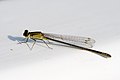
- Nomination Ischnura elegans f. infuscans --Loz 10:10, 1 December 2010 (UTC)
- Promotion Good sharpness on the wings.--Andrei Stroe 21:14, 6 December 2010 (UTC)
-
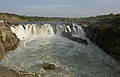
- Nomination: Marble Rocks, Madhya Pradesh, India. Yann 07:08, 1 December 2010 (UTC)
- Review needed
-

- Nomination: Marble Rocks, Madhya Pradesh, India. Yann 07:08, 1 December 2010 (UTC)
- Review needed
-
- Nomination: Michel Jourdain driving at Laajavuori special stage, Rally Finland 2010. --kallerna 13:52, 30 November 2010 (UTC)
- Review needed
-
- Nomination: Boats near Paradise Island, Hurghada. --kallerna 13:52, 30 November 2010 (UTC)
- Review needed
-

- Nomination Panorama seen from the Arpison belvedere Berrucomons 12:49, 30 November 2010 (UTC)
- Promotion Ok. --kallerna 16:09, 6 December 2010 (UTC)
-

-

-

- Nomination Moss. --Bartiebert 18:53, 27 November 2010 (UTC)
- Decline I like it, but it needs taxonomic identification. Also not to be called "Moos". Mattbuck 18:34, 5 December 2010 (UTC)
Needs taxo. --kallerna 16:11, 6 December 2010 (UTC)
-

- Nomination The Great Sphinx of Giza in Egypt. --Alchemist-hp 23:42, 5 December 2010 (UTC)
- Promotion Good --George Chernilevsky 07:38, 6 December 2010 (UTC)
-
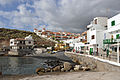
- Nomination La Caleta, Tenerife -- MJJR 22:15, 5 December 2010 (UTC)
- Promotion good --George Chernilevsky 07:39, 6 December 2010 (UTC)
-

- Nomination Thulium, a rare earths metal. --Alchemist-hp 20:06, 5 December 2010 (UTC)
- Promotion Very good --George Chernilevsky 21:19, 5 December 2010 (UTC)
-

-
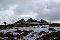
- Nomination Hound Tor on eastern Dartmoor in winter and with some snow around. --Herbythyme 18:00, 5 December 2010 (UTC)
- Withdrawn underexposed --Carschten 18:12, 5 December 2010 (UTC)
There is some minor underexposure, but no big deal. I've altered the levels to increase brightness at the lower end, is this any better? Mattbuck 18:29, 5 December 2010 (UTC)
better, but tsill too dark (imo) --Carschten 18:35, 5 December 2010 (UTC)
It really is not worth it - I shouldn't have changed my policy on this appearing on this page. The image should be reverted and the decline should stand. The image is the way it should be. --Herbythyme 19:08, 5 December 2010 (UTC)
I actually like the original one better. The image is not underexposed,it represents the real light conditions. It is definitely QI image IMO.--Mbz1 19:23, 5 December 2010 (UTC)
Image duly reverted. Uploaded my version as a derivative to keep it around. Mattbuck 19:29, 5 December 2010 (UTC)
I intended to stay away from here and should have done so. Those with a real interest in exposure might look at Michael Freeman's book Perfect Exposure. --Herbythyme 09:02, 6 December 2010 (UTC)
-

- Nomination Ex-SDJR loco number 88 at Minehead station. Mattbuck 17:21, 5 December 2010 (UTC)
- Promotion OK --Mbdortmund 05:39, 6 December 2010 (UTC)
-

- Nomination 150208 arrives at Maesteg (Ewenny Road). Mattbuck 17:21, 5 December 2010 (UTC)
- Decline Trees on the foreground are very unsharp, it is also underexposed. Sorry. --Murdockcrc 21:32, 5 December 2010 (UTC)
-

- Nomination Reliquary of Saint Teresa, 17th century, Cathedral of Guadix, Spain.--Jebulon 17:10, 5 December 2010 (UTC)
- Promotion Color temperature too high --Archaeodontosaurus 17:25, 5 December 2010 (UTC) OK. J'ai réduit la saturation. Better now ?--Jebulon 17:35, 5 December 2010 (UTC)
QI now --Archaeodontosaurus 18:49, 5 December 2010 (UTC)
-

- Nomination The fossil tortoise Chelydropsis murchisoni --Llez 07:42, 5 December 2010 (UTC)
- Promotion Support QI & Useful --Archaeodontosaurus 15:48, 5 December 2010 (UTC)
-
- Nomination Intel core i7-970 bottom by user:smial nominated by --Mbdortmund 03:50, 5 December 2010 (UTC)
- Promotion Interesting and good.--Jebulon 10:40, 5 December 2010 (UTC) Support Nice and simple, straight to the point.--ElHeineken 20:52, 5 December 2010 (UTC)
-

-

- Nomination South front of the castle at Schloss Bloemersheim --Carschten 17:18, 4 December 2010 (UTC)
- Promotion Good --George Chernilevsky 07:41, 6 December 2010 (UTC)
-

- Nomination Monastery of Saint Anthony, Egypt. --Berthold Werner 11:10, 4 December 2010 (UTC)
- Promotion Comment I tilted it ccw.--V-wolf 01:39, 5 December 2010 (UTC). Just two suggestions: 1) the exposure could be increased a little bit and 2) there is some CA on the vertical posts against the white background (bottom right part of the image), but not enough to justify a decline IMO. Great shot. --Murdockcrc 19:26, 5 December 2010 (UTC)
-

- Nomination Skeleton of Dimetrodon incisivum --Llez 06:26, 4 December 2010 (UTC)
- Promotion Support QI & Useful --Archaeodontosaurus 15:43, 5 December 2010 (UTC)
-
- Nomination Ghorfas of Medenine, Tunisia --Bgag 23:59, 3 December 2010 (UTC)
- Promotion Great contrast with those shadows on the bottom.--Murdockcrc 19:23, 5 December 2010 (UTC)
-

- Nomination A cyclist walks away from the train at Bridgend. Mattbuck 19:16, 3 December 2010 (UTC)
- Decline The composition is interesting but it is very unsharp. It seems to me that the camera focused for the background.--Murdockcrc 19:20, 5 December 2010 (UTC)
-
- Nomination Geolocical layers of Moclay and vulcanic ash, Fur Formation, Fur (Island), Denmark. Shaped by glacial tectonics, age 54-55 mil years. --Slaunger 23:25, 2 December 2010 (UTC)
- Promotion Nice composition and contrasts. Some CA towards sides, but generally not on the main feature, so tolerable IMO. --Avenue 08:13, 6 December 2010 (UTC)
-

- Nomination Flint dagger - Different views of the same specimen. Upper Neolithic (-1800 Before the Current Era). Denmark. Muséum of Toulouse. -- Rama 19:36, 2 December 2010 (UTC)
- Promotion The ID tag and a couple of highlights are overexposed, but good nonetheless. --Avenue 08:49, 6 December 2010 (UTC)
-

- Nomination Popeye Village in Anchor Bay, Malta, scenery of Popeye film. -- Felix Koenig 20:21, 1 December 2010 (UTC)
- Promotion Great shot. --Murdockcrc 18:57, 5 December 2010 (UTC)
-
- Nomination Three views of a silex blade. Toulouse Muséum. -- Rama 08:35, 30 November 2010 (UTC)
- Promotion good --Mbdortmund 00:18, 6 December 2010 (UTC)
-

- Nomination: Raytraced red sphere (I'm nominating the 5000x3750 version) --Kprateek88 06:58, 30 November 2010 (UTC)
- Review needed
-

- Nomination: Tourists walking in the beach of the Paradise Island of Hurghada. --kallerna 19:32, 29 November 2010 (UTC)
- Review needed
-
- Nomination: Engraved bone featuring a horse, Magdalenian (17,000 BP to 9,000 BP). About 2 cm diametre. -- Rama 19:23, 29 November 2010 (UTC)
- Review needed
-

- Nomination Cockroach in copal from Madagascar --Archaeodontosaurus 08:33, 28 November 2010 (UTC)
- Promotion interesting --Mbdortmund 00:20, 6 December 2010 (UTC)
-
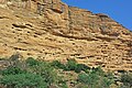
- Nomination Toloy village in the Bandiagara escarpment, Mali --Kirua 20:23, 27 November 2010 (UTC)
- Decline Comment problem in the sky --Archaeodontosaurus 10:45, 28 November 2010 (UTC)
Artifacts in the sky, and the boundary of cliff and sky seems a bit weird. Mattbuck 18:34, 5 December 2010 (UTC)
-

-

- Nomination memorial at Bergen-Belsen concentration camp by user:smial nominated by --Mbdortmund 03:50, 5 December 2010 (UTC)
- Promotion good --Carschten 09:57, 5 December 2010 (UTC) There is a little strange thing to be removed in the extreme left below corner --Jebulon 10:41, 5 December 2010 (UTC)
-
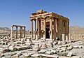
-

-

-

-

- Nomination Volvo lorry/truck.--V-wolf 18:25, 4 December 2010 (UTC)
- Promotion Comment cw tilt, see houses in background. Please correct it --Carschten 18:31, 4 December 2010 (UTC) Done The ironic part is that it was something like this from the beginning, but I looked at the wrong landscape markers. Cropped a bit, also. --V-wolf 18:44, 4 December 2010 (UTC) Support ok now --Carschten 18:58, 4 December 2010 (UTC)
-

- Nomination Diana. 16th century. Musée du Louvre.--Jebulon 18:13, 4 December 2010 (UTC)
- Promotion very nice as (almost) always. But please look at my note --Carschten 18:25, 4 December 2010 (UTC) Thanks. The depressions are here, because the marble is a bit broken here. I could mask with a straight line, but it should be untruth.--Jebulon 18:42, 4 December 2010 (UTC)
I can't now that it real. Thanks for the information --Carschten 18:58, 4 December 2010 (UTC)
-

- Nomination Lutetium a rare earths metal. --Alchemist-hp 17:24, 4 December 2010 (UTC)
- Promotion great picture, as always! --Brackenheim 17:49, 4 December 2010 (UTC)
-

- Nomination Völklinger Hütte, Germany by Rainer Lippert/Hilberts 25. Problem; nom by --JuTa 09:46, 4 December 2010 (UTC)
- Decline we still have a QI version which is made from the same single frames like this candidate --Carschten 17:18, 4 December 2010 (UTC)
-

-

-

-

-

-

-

-

-

-

- Nomination Moers: Neumarkt --Carschten 18:42, 2 December 2010 (UTC)
- Decline looks tilted --Mbdortmund 03:58, 5 December 2010 (UTC)Yes. Bad perspective correction, bad crop right and above (antenna). The shadow right is disturbing, lack of details in this area.--Jebulon 10:28, 5 December 2010 (UTC)
-

-

-
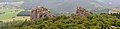
-

- Nomination: Bruges (Belgium): northern entrance of St Salvator's cathedral -- MJJR 22:37, 28 November 2010 (UTC)
- Review needed
-

- Nomination: Mustard and crispbread in a Christmas market stall, Säter, Sweden.--V-wolf 20:33, 28 November 2010 (UTC)
- Review needed
-

-

- Nomination Promenade at Playa de Fañabé, Tenerife -- MJJR 22:43, 3 December 2010 (UTC)
- Promotion good composition --Mbdortmund 15:50, 4 December 2010 (UTC)
-
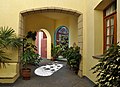
- Nomination Covered passage at Playa El Duque, Tenerife -- MJJR 22:43, 3 December 2010 (UTC)
- Promotion like to be there --Mbdortmund 15:49, 4 December 2010 (UTC)
-

- Nomination: Phellinus igniarius in natural monument Tůně u Hájské, Czech Republic --Chmee2 15:50, 28 November 2010 (UTC)
- Review needed
-
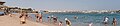
- Nomination: Panorama of the Beach of Makadi Bay, Egypt. --kallerna 13:06, 28 November 2010 (UTC)
- Review needed
-
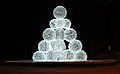
-
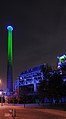
-

-

-

-

- Nomination Panoramic image of Könnigsbau, Stuttgart. -- Felix Koenig 20:21, 1 December 2010 (UTC)
- Promotion Nice Alofok 14:18, 3 December 2010 (UTC)
-
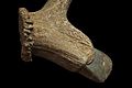
-

- Nomination 150278 at Westbury. Mattbuck 22:24, 30 November 2010 (UTC). Very good. Please clone away the cut-off lamp at the upper right... and I'll promote the image. --Cayambe 18:17, 2 December 2010 (UTC) Done Mattbuck 19:11, 3 December 2010 (UTC)
- Promotion Ok now. --Cayambe 23:17, 3 December 2010 (UTC)
- Nomination 150278 at Westbury. Mattbuck 22:24, 30 November 2010 (UTC). Very good. Please clone away the cut-off lamp at the upper right... and I'll promote the image. --Cayambe 18:17, 2 December 2010 (UTC)
-
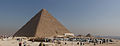
-

- Nomination Muhammad Ali Mosque in Cairo Citadel. --kallerna 19:32, 29 November 2010 (UTC)
- Promotion there are some distortions and some lacks in composition, but otherwise a really great image! Very nice --Carschten 19:42, 30 November 2010 (UTC) Yes, fascinating image. Correct the optical distortion and you'll have my vote. --Murdockcrc 06:16, 1 December 2010 (UTC) Comment Sorry, dunno how to do that. Could somebody help? --kallerna 11:20, 3 December 2010 (UTC) Done I've tried something for you, my friend. --Jebulon 23:30, 3 December 2010 (UTC) Support there are some lacks in composition, but otherwise a really great image! Very nice, clearly QI --Carschten 10:25, 4 December 2010 (UTC)
-

- Nomination Photothèque de la Ville de Luxembourg. --Cayambe 11:40, 29 November 2010 (UTC)
- Promotion Needs a perspective correction IMO--Jebulon 23:31, 2 December 2010 (UTC). Done Merci! Comment n'avais-je pas pu voir ce défaut? J'ai aussi élargi un peu le cadre. --Cayambe 10:00, 3 December 2010 (UTC)Très bien, now.--Jebulon 15:08, 3 December 2010 (UTC)
-

- Nomination Inside the Râşnov fort, Braşov County, Romania.Andrei Stroe 12:39, 28 November 2010 (UTC)
- Decline oversaturated --Carschten 15:22, 3 December 2010 (UTC)
-

-

- Nomination: Wadi Rum in Jordan early in the morning. --High Contrast 01:50, 28 November 2010 (UTC)
- Review needed
-

- Nomination: Closeup of growing petals of Zinnia elegans. ZooFari 01:05, 28 November 2010 (UTC)
- Review needed
-
- Nomination: Zinnia elegans. ZooFari 00:55, 28 November 2010 (UTC)
- Review needed
-

- Nomination: Zinnia elegans. ZooFari 00:34, 28 November 2010 (UTC)
- Review needed
-

- Nomination Crab Spider (Thomisus onustus) capturing mating flies -- Alvesgaspar 17:30, 27 November 2010 (UTC)
- Promotion A nightmare! Sex and violence in the same picture ! Yeah ! (technically very good, QI)--Jebulon 15:05, 3 December 2010 (UTC)
-

-

- Nomination Corroded iron tank at abandoned sulphur mine. --Avenue 03:06, 3 December 2010 (UTC)
- Promotion Very good --George Chernilevsky 06:58, 3 December 2010 (UTC)
-
- Nomination Geolocical layers of Moclay and vulcanic ash, Fur Formation, Fur (Island), Denmark. Shaped by glacial tectonics, age 54-55 mil years. --Slaunger 23:25, 2 December 2010 (UTC)
- Promotion Very interesting, I miss a scale, but it is a very good picture--Jebulon 00:09, 3 December 2010 (UTC)
Good point regarding scale: I have considered that as well. I have another shot, where the is a car standing in front of it, and a sign. I might upload that as well as an informative "other version". --Slaunger 07:26, 3 December 2010 (UTC)
-

- Nomination Moers: Neumarkt statue --Carschten 18:42, 2 December 2010 (UTC)
- Promotion Qi, but file description could be more informative --Berthold Werner 07:52, 3 December 2010 (UTC)
-
-
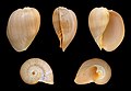
- Nomination The Crowned Baler, Melo aethiopica --Llez 16:52, 2 December 2010 (UTC)
- Promotion Very good --George Chernilevsky 06:54, 3 December 2010 (UTC)
-

- Nomination 150252 arrives at Tondu. Mattbuck 15:05, 2 December 2010 (UTC)
- Promotion good --George Chernilevsky 07:00, 3 December 2010 (UTC)
-

- Nomination Two monks in the St. Antony monastery in Egypt. --Berthold Werner 13:37, 2 December 2010 (UTC)
- Promotion Good, please add the name of the country to the file description. --Cayambe 18:09, 2 December 2010 (UTC)
-

- Nomination The church St. Martin in Landshut, Bavaria. --High Contrast 21:57, 1 December 2010 (UTC)
- Promotion Good color and detail. --Daniel Case 19:15, 2 December 2010 (UTC)
-

-
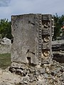
-

-
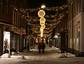
- Nomination Christmas illumination in midtown Viborg, Denmark. The ghosted pedestrians are intentional, but if they are not "fancied", I accept that. --Slaunger 21:04, 30 November 2010 (UTC)
- Promotion
* Support Good quality with effective use of available light. Pedestrians are illustrated without being obtrusive or raising personality rights issues. I think it is important to include pedestrians, in some manner, in such a picture, and the photographer's decision is reasonable. QI in my opinion. -Wsiegmund 04:14, 3 December 2010 (UTC)
-

- Nomination Kyoto cemetery, Japan. -- Kirua 19:48, 30 November 2010 (UTC)
- Promotion Comment Appears oversaturated to me. Otherwise good. --Slaunger 21:46, 30 November 2010 (UTC)
Thanks for the comment. I've changed the saturation. Hope it is better now. --Kirua 20:23, 30 November 2010 (UTC) Question Hmm... It still appears very green to me. Was it really like that? On close inspection I also notice a peculiar soft area in the dark part of the trees bordering the graveyard. Bad stitch? Moreover what is that green line seen around the edges of many tombstones? Is it chromatic abberation? It looks like an artifact. --Slaunger 18:36, 2 December 2010 (UTC). Saturation looks good to me. Picture meets technical guidelines (there is some CA present, but not enough to justify a decline). Good illustrative value. --Murdockcrc 22:18, 2 December 2010 (UTC)
-

- Nomination Grave in the Kyoto cemetery -- Kirua 04:14, 3 December 2010 (UTC)a
- WARNING: third template parameter added – please remove.
-

-
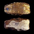
-

-

-

- Nomination Midtown in Moers --Carschten 13:37, 29 November 2010 (UTC)
- Promotion Could be cropped, IMO. Please have a look on annotations. (Maybe left too). The sky looks a bit overexposed to me.--Jebulon 17:51, 29 November 2010 (UTC)
I cropped a bit at the right. Yeah, the sky has some blown out parts, but I can't displace the sun and imo they aren't too heavy --Carschten 18:00, 29 November 2010 (UTC) Thanks for cropping. Better now. I'm disappointed you cannot displace the sun. Blown out parts are acceptable. QI --Jebulon 23:33, 2 December 2010 (UTC)
-

-

-

-

- Nomination Zoo Berlin. --Bartiebert 18:38, 27 November 2010 (UTC)
- Decline Sky blow out, trees washed out, needs a better centering. Sorry--Jebulon 23:19, 2 December 2010 (UTC)
-

- Nomination Reichstag building, Berlin. --Bartiebert 18:38, 27 November 2010 (UTC)
- Decline Bad composition, sorry--Jebulon 23:20, 2 December 2010 (UTC)
-

- Nomination Panorama of Lake Brunnsviken.--Ankara 16:22, 27 November 2010 (UTC)
- Decline Nice scene, with a lovely soft light in most places. I like the clouds too. But the overexposed sky at right and the noise near transitions in the sky mean this is not a QI IMO. --Avenue 07:06, 3 December 2010 (UTC)
-

- Nomination Female Wolf Spider (cf. Alopecosa sp.) carrying a sac of eggs -- Alvesgaspar 13:32, 27 November 2010 (UTC)
- Decline Very interesting and useful, but not sharp enough, with a confusing and distracting background, IMO.--Jebulon 23:26, 2 December 2010 (UTC)
-

- Nomination: Smoothener made of deer antler. Magdalenian. Muséum de Toulouse. -- Rama 08:38, 27 November 2010 (UTC)
- Review needed
-

-
-

- Nomination 323214 departs Birmingham New Street. Mattbuck 14:37, 25 November 2010 (UTC)
- Promotion Bad crop at right (orange half cone). Too central too - a much tighter righthand crop would help IMO. --Avenue 17:32, 1 December 2010 (UTC) DoneMattbuck 15:16, 2 December 2010 (UTC)
Much better, thanks. --Avenue 16:45, 2 December 2010 (UTC)
-

- Nomination The anemone Isocradactis magna hiding under seashells. --Avenue 02:00, 25 November 2010 (UTC)
- Promotion good --George Chernilevsky 06:50, 3 December 2010 (UTC)
-

- Nomination 175005 at Newport railway station. Mattbuck 23:40, 24 November 2010 (UTC)
- Promotion Clockwise tilt (see lampposts, building verticals). Otherwise good. --Avenue 13:19, 1 December 2010 (UTC)
Fixed, also removed some CA. Mattbuck 15:13, 2 December 2010 (UTC)
Looks good now. --Avenue 16:42, 2 December 2010 (UTC)
-

- Nomination Mantokuji Garden in Obama --663highland 13:39, 24 November 2010 (UTC)
- Decline Comment White balance doesn't seem right. Also slight left tilt. --Elekhh 20:05, 25 November 2010 (UTC) Decline, since no further comments or corrections. --Elekhh 07:29, 3 December 2010 (UTC)
-

- Nomination Swedish Volvo FL 10 fire engine. --V-wolf 14:12, 21 November 2010 (UTC)
- Decline CommentThere is a strong chromatic abberation to the left.--Juan de Vojníkov 22:34, 26 November 2010 (UTC)
Decline on grounds of CA and being grainy yet unsharp. Mattbuck 15:07, 2 December 2010 (UTC)
-

- Nomination: famous stone in Stromberg-Heuchelberg --Brackenheim 17:27, 15 November 2010 (UTC)
- Review Was previously undecided (in July 2010 if I'm not wrong). The background is strongly overexposed. Correctible IMO with a post processing work.--Jebulon 22:36, 20 November 2010 (UTC)
I have blackened the background. Rama 10:29, 27 November 2010 (UTC)
-
- Nomination Ancient Roman theatre of Palmyra --Bgag 01:02, 2 December 2010 (UTC)
- Promotion Support QI for me --Archaeodontosaurus 08:38, 2 December 2010 (UTC)
-

- Nomination Reconstitution of a prehistoric tumb. Two women in the twenties or early thirties, both featuring traumatic injuries to the skull. One believed to have been buried while still alive. Characteristic floor covered with shellfishes and antler roof. -- Rama 21:19, 1 December 2010 (UTC)
- Promotion One woman not entirely sharp, but this adds depth. Very good, probable FP IMO. --Avenue 01:10, 2 December 2010 (UTC)
-

-

- Nomination Vinciguerra Glacier and De Los Tempanos Lake - Tierra del Fuego, Patagonia, Argentina. Butterfly austral 16:30, 1 December 2010 (UTC)
- Promotion QI --Carschten 18:55, 1 December 2010 (UTC)
-

- Nomination Cairo, Art Nouveau building at the Midan Talaat Harb --Berthold Werner 12:36, 1 December 2010 (UTC)
- Promotion Beautiful building, QI image. --Elekhh 22:34, 1 December 2010 (UTC)
-

- Nomination Mission Santa Clara. --Spongie555 04:21, 1 December 2010 (UTC)
- Promotion obvious --Carschten 13:20, 1 December 2010 (UTC)
-

- Nomination Fishing boat, placed as monument at La Enramada, Costa Adeje, Tenerife -- MJJR 22:04, 30 November 2010 (UTC)
- Promotion QI imho --Berthold Werner 15:03, 1 December 2010 (UTC)
-

- Nomination Goat with kids in village near Sainte-Anne (Guadeloupe). --Slaunger 21:44, 30 November 2010 (UTC)
- Promotion I would be happy to support an authetinc creole goat, but otherwise good --Jebulon 11:17, 2 December 2010 (UTC)
-

- Nomination Rhinoceros unicornis in the Tierpark Hellabrunn in Munich. --High Contrast 21:42, 30 November 2010 (UTC)
- Decline Poor composition for a Zoo image. --Elekhh 22:31, 1 December 2010 (UTC)
-

-

- Nomination Hemerocallis, cultivar. --Bartiebert 20:19, 24 November 2010 (UTC)
- Decline Very nice, except for the dark fringe just beyond some petal edges. Oversharpened? --Avenue 16:24, 1 December 2010 (UTC)
-

-

- Nomination Marble Rocks, Madhya Pradesh, India. Yann 07:08, 1 December 2010 (UTC)
- Promotion Good --George Chernilevsky 07:15, 1 December 2010 (UTC)
-
- Nomination The Lower Battery in St John's, Newfoundland--Nilfanion 23:07, 30 November 2010 (UTC)
- Promotion good --George Chernilevsky 07:14, 1 December 2010 (UTC)
-

- Nomination Detail of 9351's driving wheels. Mattbuck 22:24, 30 November 2010 (UTC)
- Decline Underexposed, no details on shadow areas. Uninteresting composition. --Murdockcrc 06:12, 1 December 2010 (UTC)
-

- Nomination Costa Adeje, Tenerife: Playa El Duque in the evening -- MJJR 22:19, 30 November 2010 (UTC)
- Promotion good --George Chernilevsky 07:11, 1 December 2010 (UTC)
-
- Nomination Beach near Punta de las Gaviotas, Costa Adeje, Tenerife -- MJJR 22:04, 30 November 2010 (UTC)
- Promotion Very good --George Chernilevsky 07:10, 1 December 2010 (UTC)
-

- Nomination Face of Gal Vihara, Sri Lanka. --High Contrast 22:01, 30 November 2010 (UTC)
- Promotion Good --George Chernilevsky 07:06, 1 December 2010 (UTC)
-

- Nomination Silex blade. Found at the Dolmen du Viala, Saint Léons, Aveyron. Formerly collection of Émile Cartailhac -- Rama 16:11, 30 November 2010 (UTC)
- Promotion Support QI & Useful --Archaeodontosaurus 10:09, 1 December 2010 (UTC)
-

- Nomination The Alabaster Murex, Siratus alabaster --Llez 15:55, 30 November 2010 (UTC)
- Promotion Support QI & Useful --Archaeodontosaurus 16:16, 30 November 2010 (UTC)
-

- Nomination Whaler Shipwreck at Grytviken, South Georgia. Butterfly austral 11:41, 30 November 2010 (UTC)
- Promotion Good photo --George Chernilevsky 07:01, 1 December 2010 (UTC)
-

- Nomination Porto Covo, Portugal. detail of the coast. -- Alvesgaspar 11:55, 30 November 2010 (UTC)
- Promotion Very good! --Kirua 19:55, 30 November 2010 (UTC)
-

- Nomination Lenticular Clouds (Altocumulus lenticularis) and Sunrise, Leith Harbour, Stromness Bay, South Georgia --Butterfly austral 10:45, 30 November 2010 (UTC)
- Promotion Support Good now --Archaeodontosaurus 12:39, 30 November 2010 (UTC) Comment yes, very good now! --Carschten 15:47, 30 November 2010 (UTC)
-

- Nomination The Museum of Benesse House in Naoshima Island.--663highland 12:54, 29 November 2010 (UTC)
- Promotion Great composition! -- Kirua 19:58, 30 November 2010 (UTC)
-

- Nomination Cairo, Ibn Tulun Mosque --Berthold Werner 07:49, 29 November 2010 (UTC)
- Promotion Good --Sfu 20:39, 30 November 2010 (UTC)
-
- Nomination: Tourte aux Pommes. --Jonathunder 03:58, 25 November 2010 (UTC)
- Review needed
-

- Nomination South nave of the Ulm Minster. Variant, technically seen inferior, but maybe more interesting. --Aristeas 19:26, 21 November 2010 (UTC)
- Promotion Nice and interesting, but needs a perspective correction IMO.--Jebulon 01:18, 27 November 2010 (UTC) I will try … --Aristeas 12:28, 27 November 2010 (UTC) Done --Aristeas 20:26, 30 November 2010 (UTC) Support Good now --Archaeodontosaurus 10:12, 1 December 2010 (UTC)
-

- Nomination Wild rose, South West Coast Path, Tintagel, UK. --DKrieger 13:59, 19 November 2010 (UTC)
- Withdrawn Good, but needs taxo identification. Mattbuck 08:01, 26 November 2010 (UTC)
Withdrawn, I have to ask someone --Loz 10:10, 1 December 2010 (UTC)
-
- Nomination: power station Plessa (Erlebnis-Kraftwerk),--LutzBruno 10:03, 16 November 2010 (UTC)
- Review Perspective distortion (left side). --Ankara 12:44, 16 November 2010 (UTC)
Thank you, I have no tool to do this correction, but if you mean the trees in left, they are not straight, you can see at the house left side --LutzBruno 14:44, 23 November 2010 (UTC)
Nee, das Ding hat schlicht und einfach stürzende Linien. Ich kann dir da als Programm nur ShiftN ans Herz legen, ist Freeware und macht meist hervorragende Arbeit (und ist leicht zu bedienen). -- Felix Koenig 16:26, 24 November 2010 (UTC)
Danke für den Tip, aber die Ergebnisse sind eher schlimmer als Besser, da der Strommast krum wird, ein Haus, oder der Schornstein, alle linien kannst Du einfach nicht gerade bekommen, aber warum den? stört das so sehr? Ich finde das ehrlich nicht so dramatisch... Aber wenn das Bild so nicht gut genug ist, dann eben nicht, ich kannst leider nicht ändern... Grüße --LutzBruno 17:10, 24 November 2010 (UTC)
-

- Nomination Castle (old town) in Varaždin, Croatia --Pudelek 11:18, 14 November 2010 (UTC)
- Promotion Not bad, but underexposed IMO. The copses are too dark. Fixable.--Jebulon 22:44, 20 November 2010 (UTC)
I've lightened the green channel a tad. Rama 09:13, 27 November 2010 (UTC)
I've tried other improvements.--Jebulon 18:45, 28 November 2010 (UTC)
Final result looks nice.--Kirua 20:03, 30 November 2010 (UTC)
-

- Nomination Pond in an Oregon (U.S.) state park near the Wallowa Mountains. --Finetooth 02:58, 30 November 2010 (UTC)
- Promotion Good --George Chernilevsky 06:34, 30 November 2010 (UTC)
-

-

- Nomination Quito: Plaza de la Independencia in the very centre of the city. --Cayambe 21:28, 29 November 2010 (UTC)
- Promotion Good --George Chernilevsky 06:36, 30 November 2010 (UTC)
-

- Nomination Yellow Baboon Skull --Archaeodontosaurus 20:39, 29 November 2010 (UTC)
- Promotion Good & useful picture --George Chernilevsky 06:37, 30 November 2010 (UTC)
-

- Nomination Engraved coasts, Magdalenian (17,000 BP to 9,000 BP). Muséum de Toulouse. -- Rama 19:29, 29 November 2010 (UTC)
- Promotion Very good and great project! --AFBorchert 21:46, 29 November 2010 (UTC)
-

- Nomination The Branched Murex, Chicoreus ramosus --Llez 18:23, 29 November 2010 (UTC)
- Promotion Very good --George Chernilevsky 19:23, 29 November 2010 (UTC)
-

- Nomination Detail of a 19th-century stained glass window depicting the Nativity in the pilgrimage church at Our Lady's Island, County Wexford, Ireland. --AFBorchert 17:40, 29 November 2010 (UTC)
- Promotion Quite good. -- Alvesgaspar 19:25, 29 November 2010 (UTC)
-

- Nomination Sunset on the border of Port Talbot and Bridgend. Mattbuck 12:49, 29 November 2010 (UTC)
- Promotion Looks good enough though I'm not fond of the central composition -- Alvesgaspar 19:29, 29 November 2010 (UTC)
-

- Nomination Bridgnorth railway station. Mattbuck 12:49, 29 November 2010 (UTC)
- Promotion Very good --George Chernilevsky 06:32, 30 November 2010 (UTC)
-

-

-

- Nomination Restored old archer of Emperor Darius 1st of Persia, ca.500 BCE, Musée du Louvre.--Jebulon 23:58, 28 November 2010 (UTC)
- Promotion Good --George Chernilevsky 14:30, 29 November 2010 (UTC)
-

- Nomination Bruges (Belgium): 17th Century houses -- MJJR 22:37, 28 November 2010 (UTC)
- Promotion Correct picture and good enough quality despite the weird exposure choice (automatic mode?). With a smaller aperture the image would probably be sharper. -- Alvesgaspar 19:36, 29 November 2010 (UTC)
-

- Nomination A square in the city of Telde, Gran Canaria. -- Felix Koenig 18:55, 28 November 2010 (UTC)
- Decline Nothing really different from october declined version, IMO...--Jebulon 00:15, 29 November 2010 (UTC) Agree, is not a quality composition, in particular the main feature in the centre - the sculpture- is obscured. --Elekhh 19:46, 29 November 2010 (UTC)
-

-

-

- Nomination Rolls-Royce in Prague --High Contrast 22:19, 25 November 2010 (UTC)
- Decline Seems to be a Phantom II. Rama 16:57, 26 November 2010 (UTC) Overexposition (visible on the tourists white shirts too) IMO.--Jebulon 17:26, 29 November 2010 (UTC)
-

-

- Nomination a debris flow barrier in the state of Salzburg, Austria. -- Felix Koenig 16:48, 23 November 2010 (UTC)
- Decline I'm not a fan of the cmposition here, but not enough to decline. Anyone else got an opinion? Mattbuck 01:15, 28 November 2010 (UTC)
Feels a bit crammed in to me too, and the side angle doesn't seem ideal. Otherwise it seems fine, except it's a little soft on the far side. On balance, not quite QI IMO. --Avenue 15:55, 29 November 2010 (UTC)
-

-

- Nomination Temporal bone. Late nineteenth --Archaeodontosaurus 17:54, 28 November 2010 (UTC)
- Promotion Très bien. --Cayambe 11:03, 29 November 2010 (UTC)
-

-

- Nomination Pyramids of Khufu and Khafre --Berthold Werner 11:48, 28 November 2010 (UTC)
- Promotion No need for me to go there, now ! --Jebulon 17:41, 28 November 2010 (UTC)
-

-
-

- Nomination Unidentified species of an antique cypriot fish, 5th century BCE, Musée du Louvre --Jebulon 22:55, 27 November 2010 (UTC)
- Promotion Support Good version --Archaeodontosaurus 15:27, 28 November 2010 (UTC)
-
-

-

- Nomination 150208 at Maesteg railway station. Mattbuck 14:37, 25 November 2010 (UTC)
- Promotion Nice straight and generally good composition.Andrei Stroe 12:41, 28 November 2010 (UTC)
-

- Nomination Berries of European rowan.--PereslavlFoto 17:18, 24 November 2010 (UTC)
- Promotion Not perfect, but QI to me.--Jebulon 00:47, 27 November 2010 (UTC)
Autumn photo; how to add some perfection?--PereslavlFoto 08:54, 29 November 2010 (UTC)
-

- Nomination Coenagrion pulchellum, mating --Loz 14:42, 24 November 2010 (UTC)
- Promotion Good and informative. Even though the wings of one of the insects are out of focus, the general sharpness seems ok IMO. Andrei Stroe 12:46, 28 November 2010 (UTC)
-
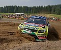
-
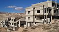
- Nomination: Unfinished hotels in Maaloula. --High Contrast 14:34, 21 November 2010 (UTC)
- Review Composition is really good. But there is relatively strong chromatic CA (green fringes) on both sides. Can you improve this? --Cayambe 17:46, 22 November 2010 (UTC)
-

- Nomination: Etang de la Véronne, Sermamagny, France --ComputerHotline 18:43, 16 November 2010 (UTC)
- Review Nice lighting and detail, but stitching errors are visible in two places along the coastline, in line with changes in the brightness of the sky. --Avenue 11:31, 23 November 2010 (UTC)


.jpg)


_(4).jpg)


_(14).JPG)


_(5).JPG)


_(8).jpg)


.jpg)


.JPG)


_(11).jpg)


_(14).JPG)


_(13).JPG)

_(1).jpg)
_(3).JPG)
.JPG)


_(4).jpg)
_(3).jpg)

_(10).jpg)
_in_the_evening.JPG)

_(1).jpg)
_(14).JPG)


.jpg)


_(5).jpg)


.jpg)


_(12).JPG)


.JPG)


_at_the_water%27s_edge.jpg)


_branch.jpg)


_T2i_IMG_101_5940.jpg)


,_circling.jpg)


.jpg)


,_Turku,_11.7.2010_(2).JPG)
.jpg)


.jpg)


.jpg)


_on_a_tree_in_the_Cashew_Road_vicinity,_Singapore_-_20101112.jpg)


.jpg)

.jpg)


_railway_station_MMB_06_150208.jpg)


.png)


.JPG)


.jpg)
.jpg)
.jpg)


,_backlit.jpg)


.jpg)


.jpg)
.jpg)
Consensual review[edit]
File:Panorama_of_Rainbow_in_Hawaii_Volcanoes_National_Park.jpg[edit]

- Nomination Rainbow in Hawaii Volcanoes National Park--Mbz1 21:20, 28 November 2010 (UTC)
- Withdrawn
- Support Good and useful--Jebulon 21:29, 28 November 2010 (UTC)
- Oppose Seems too strongly stretched on right side. --Avenue 00:33, 29 November 2010 (UTC)
- Come on now, Avenue, it is just a very special rainbow , but to tell you the truth I have no idea why it looks the way it is.--Mbz1 03:05, 29 November 2010 (UTC)
- It looks very nice too, except for the stretching. I've had similar problems when stitching hasn't worked well or an inappropriate projection is selected. You could restitch or try to correct the distortion manually. --Avenue (talk) 07:44, 29 November 2010 (UTC)
- Come on now, Avenue, it is just a very special rainbow
- Oppose -- Strongly stretched in the horizontal direction , horizon curved. -- Alvesgaspar 18:47, 29 November 2010 (UTC)
- To be fair, some curvature might be expected on the side of a volcano. Kilauea generally slopes up towards the north, so the curvature seen here isn't too surprising for an afternoon photo shot away from the sun. --Avenue 22:35, 29 November 2010 (UTC)
- Well, it is to be fair . Anyway, Avenue, you are right. When I have a time I might fix it, or I might not, but for now I --Mbz1 01:17, 1 December 2010 (UTC)
- Well, it is to be fair
- To be fair, some curvature might be expected on the side of a volcano. Kilauea generally slopes up towards the north, so the curvature seen here isn't too surprising for an afternoon photo shot away from the sun. --Avenue 22:35, 29 November 2010 (UTC)
Running total: 1 support (excluding the nominator), 2 oppose → Decline? --Elekhh 19:42, 29 November 2010 (UTC)
File:Skatteskrapan from Bondegatan 2010BW.jpg[edit]

- Nomination Former Tax Authority building in Stockholm. --Ankara 15:54, 20 November 2010 (UTC)
- Withdrawn
- Support Nice and good. --Cayambe 20:30, 23 November 2010 (UTC)
- Oppose I think it is to noisy and the bright areas are overexposed, even if i like the composition. --Niabot 21:52, 24 November 2010 (UTC)
- Oppose Because of the bottom crop. A bit noisy too. I would really like it otherwise. --Kirua 17:38, 27 November 2010 (UTC)
- Oppose -- Por image quality (noise) due to lack of light. -- Alvesgaspar 18:44, 29 November 2010 (UTC)
![]() I withdraw my nomination I will try again.Ankara (talk) 10:17, 1 December 2010 (UTC)
I withdraw my nomination I will try again.Ankara (talk) 10:17, 1 December 2010 (UTC)
Running total: 1 support (excluding the nominator), 3 oppose → Decline? --Elekhh 19:41, 29 November 2010 (UTC)
File:Casa Batlló 12.JPG[edit]

- Nomination Detail Casa Batlló, Barcelona --Böhringer 21:09, 17 November 2010 (UTC)
- Decline
- Oppose Too overexposed areas --Archaeodontosaurus 17:12, 18 November 2010 (UTC)
- Comment I disagree. Check the histogram and the curves (highlights) on Photoshop and you'll see that few areas are blown out.-- --DKrieger 09:45, 20 November 2010 (UTC)
- Support If you have a close look, you will see that only very small parts are blown out. IMO a pretty good image -- --DKrieger 17:48, 21 November 2010 (UTC) , sorry, I dont know what happened to my signature, thank you, Wsiegmund!
*Please sign your review. --Wsiegmund 05:55, 21 November 2010 (UTC)
- Support A nice image, superb lighting. --Aristeas 09:57, 22 November 2010 (UTC)
- Oppose This is a complicated façade, and the patchy lighting makes it harder to comprehend. The framing appears a bit random, and there are some minor technical issues, with blown out areas and a bit of CA. All add up to an oppose for me. --Elekhh 23:18, 23 November 2010 (UTC)
- Oppose -- A difficult shot. Some parts are overexposed, other are too noisy due to high ISO setting. -- Alvesgaspar 18:46, 29 November 2010 (UTC)
Running total: 2 support (excluding the nominator), 3 oppose → Decline? --Elekhh 22:28, 1 December 2010 (UTC)
File:TortoiseshellCat.JPG[edit]

- Nomination A tortoiseshell cat, taken with a hidden camera. Rehman 02:07, 2 December 2010 (UTC)
- Withdrawn
- Oppose. Sorry, too dark.--Mbz1 02:31, 2 December 2010 (UTC)
- It is black fur after all, perhaps see the full size? --Rehman 03:28, 2 December 2010 (UTC)
- I did see the full size. Anyway I posted your image for the discussion for you. Let's see what other editors will say, but I cannot change my vote.--Mbz1 07:18, 2 December 2010 (UTC)
- Thanks! I agree with you now, per consensus below. :) Rehman 14:08, 2 December 2010 (UTC)
- I did see the full size. Anyway I posted your image for the discussion for you. Let's see what other editors will say, but I cannot change my vote.--Mbz1 07:18, 2 December 2010 (UTC)
- It is black fur after all, perhaps see the full size? --Rehman 03:28, 2 December 2010 (UTC)
- Oppose underexpose --Archaeodontosaurus 08:37, 2 December 2010 (UTC)
- Oppose Nicely exposed for the background, but not for the subject. The black fur isn't the problem; it's the eyes. Interesting though. --Avenue 13:31, 2 December 2010 (UTC)
- Thanks for your time, everyone. I guess it is a bit underexposed. Rehman 14:08, 2 December 2010 (UTC)
File:Signal Hill Tattoo.jpg[edit]

- Nomination Signal Hill Tattoo in St John's, Newfoundland--Nilfanion 23:07, 30 November 2010 (UTC)
- Promotion
- Support nice --Pudelek 16:39, 1 December 2010 (UTC)
- Comment Were ladies allowed to be enlisted in the New-Foundland Regiment in 1795 ? I'm sorry it is not your fault, but the protective plastic glasses and the harsh-yellow earplugs are positively ridiculous and make like if this picture were a joke ... I'm not sure if it is a good reason to decline in QI, but I put it in CR anyway. --Jebulon 17:32, 1 December 2010 (UTC)
- Comment I agree the protective gear is silly looking, but that actually is "part" of the composition. The subject is the modern Signal Hill Tattoo not the historical regiment - and the modern event has such things as women participants and health and safety...--Nilfanion 21:29, 1 December 2010 (UTC)
- Support QI to me. --Avenue 13:39, 2 December 2010 (UTC)
- Support Jebulon's comment was useful, it led to Nilfanion's explanation, which I accept. --Cayambe (talk) 17:05, 2 December 2010 (UTC)
- Comment Please notice that I didn't decline... But i'm sorry, I cannot promote...--Jebulon 23:14, 2 December 2010 (UTC)
Running total: 3 support (excluding the nominator), 0 oppose → Promote? --Elekhh 05:15, 5 December 2010 (UTC)
File:Swepac FB 465, RV70, with passing lorry.jpg[edit]

- Nomination Swepac vibro plate at roadworks in evening.--V-wolf 18:16, 26 November 2010 (UTC)
- Decline
- Oppose The metallic electric (?) box in background is confusing & ruins the composition IMO. Sorry.--Jebulon 17:33, 29 November 2010 (UTC)
- Comment Confusing? That was a culture clash for me. It's a perfecly normal electric cabinet they have put up at the roadworks for light and charging of excavators, I thought it was more or less the same all around the globe. --V-wolf 19:46, 29 November 2010 (UTC)
- Support there are some points which you could make better, but I think the composition is okay (I like the long exposure with the cars in background) and the quality reachs QI status imo, too. --Carschten 14:15, 1 December 2010 (UTC)
- Oppose I think the road roller and the box in the background are too distracting for the composition to be QI. Like the cars and long exposure too. Main subject is also good. --Slaunger 18:56, 2 December 2010 (UTC)
Running total: 1 support (excluding the nominator), 2 oppose → Decline? --Elekhh 05:14, 5 December 2010 (UTC)
File:Van covered by snow in Boreal California.jpg[edit]

- Nomination Van covered by snow in Boreal California--Mbz1 04:28, 1 December 2010 (UTC)
- Promotion
- Oppose no details on shadows. Uninteresting composition for QI standards. --Murdockcrc 06:08, 1 December 2010 (UTC)
- Disagree.--Mbz1 06:20, 1 December 2010 (UTC)
- Support As do I. --The High Fin Sperm Whale 20:58, 1 December 2010 (UTC)
- Support The composition could perhaps be improved, e.g. by cropping a third of the dark trees off the top, but IMO this is good enough to be QI. --Avenue 00:56, 2 December 2010 (UTC)
- Info I uploaded an original image with no post processing at all. I was in hurry to show to slaunger I saw snow too . Another interesting detail: While taking this image I was standing up to my knees in the snow, slowly getting deeper and deeper.--Mbz1 01:35, 2 December 2010 (UTC)
- Support --QI what is certain: that I do not lend you my car!Archaeodontosaurus 08:50, 2 December 2010 (UTC)
- Support "Boreal" is a nice name for this place... Is all the world, except Paris, under snow today ? There is (very much) snow over all France, except Paris. It is unfair !--Jebulon 23:12, 2 December 2010 (UTC)
Running total: 4 support (excluding the nominator), 1 oppose → Promote? --Elekhh 05:11, 5 December 2010 (UTC)
File:M-gorici-sw-9588.jpg[edit]

- Nomination South-west tower of Goritsky monastery. PereslavlFoto 19:11, 14 November 2010 (UTC)
- Decline
- Comment The exposition is not very good and beware, there is a ghost on the roof !--Jebulon 22:38, 20 November 2010 (UTC)
- Oppose Tilded, ghost, etc. Possibly fixable, though. Rama 17:48, 26 November 2010 (UTC)
- The tower itself is NOT directly vertical. "Ghost" is a person working on the roof, so it is a part of reality.--PereslavlFoto 08:51, 29 November 2010 (UTC)
- Oppose -- Distorted (at left), unsharp, weird leight. -- Alvesgaspar 18:41, 29 November 2010 (UTC)
- What do you mean - distorted? Where?--PereslavlFoto 21:21, 29 November 2010 (UTC)
- "Weird leight" means "weird light"? Where?--PereslavlFoto 21:21, 29 November 2010 (UTC)
- Info Weird light all over the building, geometric distortion(tilt) at left -- Alvesgaspar 23:33, 29 November 2010 (UTC)
- What do you mean by "weird light", as this is a night photo?! Also, there is tilt at left side, but let us imagine some other position of the camera, without that tilt. Then the tilt will appear on the wall to the right side. The trouble is that the tower and the wall are not vertical. It is a compromise to make the wall less falling. PereslavlFoto 15:02, 30 November 2010 (UTC)
- Info -- The geometric disortion is easily fixable. -- Alvesgaspar 19:37, 30 November 2010 (UTC)
- It costs too much to rebuild the wall and the falling tower, to fix those distortions of reality. I cannot. If you thought about recalculation in some graphical editor, any rotation spoils the photo converting straight line of pixels (taken from camera's matrix) into come curved infelicity. And what about "weird light"?--PereslavlFoto 21:59, 30 November 2010 (UTC)
- Oppose The modern house in the background is probably vertical, and it appears very tilted in the image. --Ikar.us 19:48, 2 December 2010 (UTC)
- It costs too much to rebuild the wall and the falling tower, to fix those distortions of reality. I cannot. If you thought about recalculation in some graphical editor, any rotation spoils the photo converting straight line of pixels (taken from camera's matrix) into come curved infelicity. And what about "weird light"?--PereslavlFoto 21:59, 30 November 2010 (UTC)
- What do you mean by "weird light", as this is a night photo?! Also, there is tilt at left side, but let us imagine some other position of the camera, without that tilt. Then the tilt will appear on the wall to the right side. The trouble is that the tower and the wall are not vertical. It is a compromise to make the wall less falling. PereslavlFoto 15:02, 30 November 2010 (UTC)
Running total: 0 support (excluding the nominator), 3 oppose → Decline? --Elekhh 05:10, 5 December 2010 (UTC)
File:Snow on black tire swing 2010-11-30 3.jpg[edit]

- Nomination Snow on tire swing, Denmark, November 30, 2010. --Slaunger 12:29, 30 November 2010 (UTC)
- Promotion
- Comment Good, but the tight is crop left and right, IMO. Thoughts ?--Jebulon 17:50, 1 December 2010 (UTC)
- Comment Well, the local newspaper liked it, as they have just published it as the picture of today. And tires do not need to breath. . --Slaunger 18:29, 1 December 2010 (UTC)
- Support V-wolf's argument convinced me. True, there isn't snow, tire swings (or snowy tire swings, for that matter!) everywhere. The value argument was the only thing holding back my support vote for your picture, so now you got it. I'm sorry to have delayed your QI promotion. --Murdockcrc 07:57, 6 December 2010 (UTC)
- Comment Well, did you notice that one swing has less snow on the sunny side of the black tire? It is educational as illustrating heat absorbance of black bodies and heat transport. Moreover, it has an appealing composition, which can make the layman interested in such basic physics subjects. --Slaunger 23:28, 2 December 2010 (UTC).
- Then discuss.--Jebulon 23:42, 2 December 2010 (UTC)
- Support A bit tight, but QI IMO, on "value" as well as technical quality. --Avenue 07:18, 3 December 2010 (UTC)
- Support I can't understand the value argumentation. There is neither snow nor tire swings everywhere. Good and clear depiction. V-wolf 09:46, 4 December 2010 (UTC)
Running total: 3 support (excluding the nominator), 0 oppose → Promote? George Chernilevsky 09:56, 6 December 2010 (UTC)
File:Mitträckestrailer rv70.jpg[edit]

- Nomination Installation of median separators, Swedish national road 70.--V-wolf 16:36, 25 November 2010 (UTC)
- Decline
- Comment The vehicle at the left is a bit distracting. Also: there is too much of snow here IMO. Would promote if half of it at the bottom would be cropped away. Regards. --Cayambe 21:25, 1 December 2010 (UTC)
 Fixed I saved a little room for the poor plant in the lower left corner, should it be even tighter? --V-wolf 20:21, 2 December 2010 (UTC)
- Support Yes, the plant is really unimportant here, it has nothing to do with the subject. But the image is good enough for QI now imo. --Cayambe 23:04, 2 December 2010 (UTC)
- Oppose too hard chromatic aberrations imo. Should be discussed --Carschten 10:31, 4 December 2010 (UTC)
- Oppose per Carschten. Mattbuck 17:59, 4 December 2010 (UTC)
Running total: 1 support (excluding the nominator), 2 oppose → Decline? Elekhh 21:49, 6 December 2010 (UTC)
File:Buste femme nue Iran Suse Louvre Sb 17851.jpg[edit]

- Nomination Naked bust of a woman, Susa, Persia, 14th century BCE, Musée du Louvre.--Jebulon 02:07, 5 December 2010 (UTC)
- Withdrawn
- Oppose unsharp to me --Carschten 09:57, 5 December 2010 (UTC)
- sorry, disagree.--Jebulon 10:14, 5 December 2010 (UTC)
- Comment this reaction doesn't wonder me ;-) But fell free to get some other reviews! --Carschten 10:25, 5 December 2010 (UTC)
-
- never mind... --Carschten 12:47, 5 December 2010 (UTC)
 Neutral for now. Seems sharp enough to me. I'm a bit puzzled by the white edging visible along parts of the shady side and bottom of the object - maybe a sharpening artifact? --Avenue 22:06, 5 December 2010 (UTC)
- Comment The “white edging” mentioned by Avenue at the bottom of the bust looks to me like the artifacts caused by a free-form select with a path that doesn’t follow the contours of the object exactly enough. Maybe doing the free-form selection of the bust again with a new selection path and then using a smooth/soft selection margin (? I don’t know how this is called in English, the German PS edition calls it „weiche Auswahlkante“) before sharpening would fix these problems? --Aristeas 07:52, 7 December 2010 (UTC)
- Thanks for review. You all are right (Carschten too, in a way). I'm pretty sure this figure is sharp enough, but as noticed by Aristeas and Avenue, 1) the masking work and 2) the artificial blur, are not careful enough. I'll be back with this picture I have to rework, but for now, I withdraw my nomination--Jebulon (talk) 23:47, 7 December 2010 (UTC)
File:Lankatilaka temple 02.jpg[edit]

- Nomination Lankatilaka temple, Polonnaruwa, Sri Lanka.jpg --Bgag 23:59, 3 December 2010 (UTC)
- Decline
- Oppose too hard chromatic aberrations --Carschten 18:19, 4 December 2010 (UTC)
- Comment CA acceptable IMO. I wish a discussion regarding the (tight) crop left and right, IMO.--Jebulon 11:02, 5 December 2010 (UTC)
- So you think the picture should be decline with other reasons - and that is why so set discuss status o.O --Carschten 11:19, 5 December 2010 (UTC)
Running total: 0 support (excluding the nominator), 1 oppose → Decline? --Carschten 12:48, 5 December 2010 (UTC)
File:Rally Finland 2010 - shakedown - Patrik Sandell 1.jpg[edit]

- Nomination Photographers taking photos of Patrik Sandell at Rannakylä shakedown in Muurame. --kallerna 11:26, 3 December 2010 (UTC)
- Decline
- Support Good. Alofok 14:17, 3 December 2010 (UTC)
- Oppose I don't really like the composition of this one. Mattbuck 19:18, 3 December 2010 (UTC)
- Oppose composition not QI . --Elekhh 05:19, 5 December 2010 (UTC)
Running total: 1 support (excluding the nominator), 2 oppose → Decline? --Elekhh 05:19, 5 December 2010 (UTC)
File:Euston railway station MMB 17 390048.jpg[edit]

- Nomination 390048 departs Euston. Mattbuck 22:24, 30 November 2010 (UTC)
- Decline
- Support - Good. --Cayambe 18:17, 2 December 2010 (UTC)
- Oppose - Too tight crop. --Elekhh 07:22, 3 December 2010 (UTC)
- Oppose per Elekhh --Carschten 12:52, 5 December 2010 (UTC)
Running total: 1 support (excluding the nominator), 2 oppose → Decline? --Carschten 12:52, 5 December 2010 (UTC)
File:VespaScooterRouge.jpg[edit]

- Nomination Red Vespa --Nico&Co 21:06, 23 November 2010 (UTC)
- Decline
- Oppose Great angle, and I love the colour contrast. However the over-exposed highlight on the trim is just too strong, sorry. --Avenue 13:32, 27 November 2010 (UTC)
- The crop on the right seems too tight, too. --Avenue 21:31, 30 November 2010 (UTC)
- Support A highly reflective surface on a sunny day is expected to have this sort of lighting effect. It is an accurate representation of the subject, using correct camera settings. --Ianare 23:59, 29 November 2010 (UTC)
- Sometimes it can be helpful to use "incorrect" camera settings, e.g. to expose for the highlights, and then adjust for this later. I'm not sure I would call ISO 800 the correct setting for this subject, anyway, but I was judging the result, not the technique. --Avenue (talk) 21:46, 30 November 2010 (UTC)
- Oppose Great composition and colors. Do not mind the reflection, but too noisy for my taste. Could easily have been avoided by using lower ISO and longer exposure. --Slaunger 19:04, 2 December 2010 (UTC)
- Oppose - noise generated by ISO800 for a 1000th of a second shot is rather a waste of a great composition. Mattbuck 01:25, 5 December 2010 (UTC)
- Comment would be nice to retake the picture with another ISO --Mbdortmund 04:04, 5 December 2010 (UTC)
Running total: 1 support (excluding the nominator), 3 oppose → Decline? Mattbuck 01:25, 5 December 2010 (UTC)
File:Some standard blood testing equipment on Swedish vårdcentral.jpg[edit]

- Nomination Vacuette tubes and other stuff at a Swedish health centre.--V-wolf 17:37, 21 November 2010 (UTC)
- Decline
- Support The out-of-focus stuff is a bit strange and noisy, but I love this. Mattbuck 23:24, 27 November 2010 (UTC)
- Oppose I don't like the crop of the box below. Let's discuss.--Jebulon 17:12, 29 November 2010 (UTC)
- I think the crop as is is better than if it were cropped to show the entire corner. Mattbuck 04:26, 5 December 2010 (UTC)
- Oppose nice colors, but DOF too shallow and the image is too noisy. Photographs like this should be always taken with a tripod and manual settings (ISO 100, f8.0 - something like that) --Carschten 10:03, 5 December 2010 (UTC)
Running total: 1 support (excluding the nominator), 2 oppose → Decline? --Carschten 10:03, 5 December 2010 (UTC)
File:Dynapac CA 151.jpg[edit]

- Nomination Road roller Dynapac CA151.--V-wolf 11:54, 21 November 2010 (UTC)
- Promotion
- Support A bit bright maybe, but good. Mattbuck 23:24, 27 November 2010 (UTC)
- Oppose The composition is an issue IMO. Let's discuss it! --Kirua 23:04, 29 November 2010 (UTC)
- Question Should I crop it more? --V-wolf 13:42, 1 December 2010 (UTC)
- Support looks good to me --Carschten 09:58, 5 December 2010 (UTC)
- Support The background is disturbing, in a way. But otherwise, it is normal, and relevant for the subject, which is clear, sharp and well taken. Furthermore I think this is an useful picture.--Jebulon 17:15, 5 December 2010 (UTC)
Running total: 3 support (excluding the nominator), 1 oppose → Promote? ----Jebulon 17:15, 5 December 2010 (UTC)
File:Icicles on motel's roof in Tahoe, California.jpg[edit]

- Nomination Icicles--Mbz1 03:40, 2 December 2010 (UTC). Nice ice :-) Needs a perspective correction on the left side, easy to do. --Cayambe 18:08, 2 December 2010 (UTC)
Thank you for review. I am not sure how to fix it. It should be rotated?--Mbz1 03:07, 5 December 2010 (UTC). Comment No, e.g.: edit>transform>distort in PS. I've uploaded a 'corrected' version over the original file. If you don't like it, please revert it. I'll promote the image if you accept the 'new' version. Kindest regards, --Cayambe 16:23, 5 December 2010 (UTC)
Your version is fine. Thank you for working on the image.--Mbz1 19:16, 5 December 2010 (UTC) - Decline Ok now. --Cayambe 19:22, 5 December 2010 (UTC) Oppose I thought it was about the car. --kallerna 15:23, 6 December 2010 (UTC)
- What was about the car?--Mbz1 17:46, 6 December 2010 (UTC)
- Oppose dont like composition, sorry. --Swissalps 22:33, 6 December 2010 (UTC)
- And what exactly a new user does not like in the composition ? Any suggestions on improvements? --Mbz1 04:58, 7 December 2010 (UTC)
File:Pyramids of Giza and boat pit.jpg[edit]

- Nomination All pyramids of Giza and the boat shaped museum. --kallerna 11:26, 3 December 2010 (UTC)
- Promotion
- Comment I would like to hear another opinion. --kallerna 13:50, 5 December 2010 (UTC)
- strike vote because of my new version --Carschten 14:06, 6 December 2010 (UTC)
- My Support for QI. I know the wether in Kairo: the image isn't grey, it is simply dusty air. --Alchemist-hp 22:52, 5 December 2010 (UTC)
- hast du meine neue Version gesehen oder die alte bewertet? --Carschten 14:06, 6 December 2010 (UTC)
- It was your new version. It looks much better. --Alchemist-hp 15:30, 6 December 2010 (UTC)
- okay, denn jetzt denke ich auch, dass das Bild nicht mehr grau ist. --Carschten 15:49, 6 December 2010 (UTC)
- Support Looks QI to me. Maybe we don't like the dusty (polluted?) air on the image, but the matter of fact is that a photographer has to capture the reality. If the air in Cairo is dusty, then you did a good job portraying that fact into the image. --Murdockcrc 19:17, 6 December 2010 (UTC)
- Support I remember the sky near Kairo as dusty as on this image and the light in the desert of Giza like on the photograph. --Aristeas (talk) 07:44, 7 December 2010 (UTC)
Running total: 3 support (excluding the nominator), 0 oppose → Promote? --Aristeas 07:45, 7 December 2010 (UTC)
File:Dronte dodo Raphus cucullatus.jpg[edit]

- Nomination Raphus cucullatus (Dodo), wax and plaster model of an extinct species ca.1660. Museum National d'Histoire Naturelle, Paris.--Jebulon 00:34, 4 December 2010 (UTC)
- Promotion
- Support QI and useful --Llez 06:29, 4 December 2010 (UTC)
- Oppose I'm sorry, I like this artwork a lot, but the lack of any detail in the grey patches on its back and especially the upper part of the wing is unfortunate. --Avenue 10:53, 4 December 2010 (UTC)
- Support Good enough for QI to me. --Cayambe 07:29, 7 December 2010 (UTC)
- Support I agree with Cayambe. --Aristeas 08:02, 7 December 2010 (UTC)
Running total: 3 support (excluding the nominator), 1 oppose → Promote? --Cayambe 07:29, 7 December 2010 (UTC)
File:Coast path DSC 8920.jpg[edit]

- Nomination South West Coast Path, app. between Treligga and Pendogget, Cornwall, UK --DKrieger 21:24, 25 November 2010 (UTC)
- Decline
- Support perhaps a bit noisy but I really enjoy the atmosphere!--Kirua 17:58, 27 November 2010 (UTC)
- Comment Nice place indeed, but there is a slight tilt, the noise needs a discussion, and the tight crop below too. Let's have other opinions, please.--Jebulon 17:18, 29 November 2010 (UTC)
- --DKrieger 18:45, 29 November 2010 (UTC) minor update
- Oppose It think it is too noisy and the crop below is indeed unfortunate. --Slaunger 19:01, 2 December 2010 (UTC)
- Comment Great view but I dislike the crop and the white parts are a bit overexposured, sorry --Mbdortmund 04:06, 5 December 2010 (UTC)
![]() Weak support per Kirua. Noise isn't too hard imo and otherwise a nice image. I think the composition is good as it is --Carschten 10:08, 5 December 2010 (UTC)
Weak support per Kirua. Noise isn't too hard imo and otherwise a nice image. I think the composition is good as it is --Carschten 10:08, 5 December 2010 (UTC)
- Oppose per above--Jebulon 17:17, 5 December 2010 (UTC)
- Oppose Crop. --kallerna 10:52, 6 December 2010 (UTC)
- Oppose Nice apart from crop at bottom. --Avenue 08:55, 9 December 2010 (UTC)
Running total: 2 support (excluding the nominator), 4 oppose → Decline? --Avenue 08:55, 9 December 2010 (UTC)
File:Hamandir Sahib (Golden Temple).jpg[edit]
.jpg)
- Nomination The Harmandir Sahib or Darbar Sahib informally referred to as The Golden Temple is the holiest shrine in Sikhism. --Oleg 16:27, 9 December 2010 (UTC)
- Promotion
- Support good --Carschten 17:03, 9 December 2010 (UTC)
- Oppose "This media file is uncategorized." Support now. Good big size, althought not the sharpest photo. --kallerna 06:17, 10 December 2010 (UTC)
- does this really need discuss status? It took me maybe thirty seconds to add even just two categories... --Carschten 13:52, 10 December 2010 (UTC)
- Carschten, thank you for adding categories - I appreciate it! Kallerna, I apologize - this is my first submission of images and I was unaware that images must have categories (similar to articles) - I'll do so from now on. If I understand correctly, if any issues that are raised are taken care of it should allow revisiting the decision that was made based on a fact that is now taken care of. Kallerna, do you stil oppose? Thanks. --Oleg 17:41, 10 December 2010 (UTC)
- Support - very good. Felix Koenig 18:58, 10 December 2010 (UTC)
- Support --Elekhh 20:42, 10 December 2010 (UTC)
- I added a geolocalization. Please correct if wrong. Thank you.--Jebulon 17:55, 11 December 2010 (UTC)
Running total: 4 support (excluding the nominator), 0 oppose → Promote? George Chernilevsky 11:33, 13 December 2010 (UTC)
File:ST1 Hedemora 01.jpg[edit]

- Nomination Filling station ST1, Hedemora, Sweden (slightly longer exposure than the version nominated yesterday).--V-wolf 20:47, 7 December 2010 (UTC)
- Promotion
- Support very good for me --Pudelek 21:39, 7 December 2010 (UTC)
- Oppose Sorry, still too dark for me. The exposure is right on the lamp, but too dark everywhere else. Photos like this need to be HDR IMO. --kallerna 09:25, 8 December 2010 (UTC)
- Comment HDR photos look like digital cartoons imho.--V-wolf 11:04, 8 December 2010 (UTC)
- Support night time photographs arent required to be HDR, it technically good for a night time shot Gnangarra 13:39, 8 December 2010 (UTC)
- Neutral because I agree totally with Kallerna and V-wolf. I'm not a fan of HDRs, the most aren't very useful. But it's a fact that everything apart from illumination is underexposed. That's why I abstain. --Carschten 13:45, 8 December 2010 (UTC)
Running total: 2 support (excluding the nominator), 1 oppose → Promote? George Chernilevsky 11:31, 13 December 2010 (UTC)
File:Chipping Sodbury MMB 02 primula vulgaris.jpg[edit]

- Nomination primula vulgaris near Chipping Sodbury. Mattbuck 12:49, 29 November 2010 (UTC)
- Promotion
- Comment -- Something wrong with the white balance or just the green light reflected from the leaves? -- Alvesgaspar 19:28, 29 November 2010 (UTC)
- I think the WB is fine - from what I remember that is the colour they were. Mattbuck 18:34, 1 December 2010 (UTC)
{{Oppose}}I like it, but too green (as Alvergaspar)--Lmbuga 23:54, 6 December 2010 (UTC)- Comment - OK, degreened it somewhat, is that better? Mattbuck 21:48, 7 December 2010 (UTC)
- Support I agree now. Good--Lmbuga 03:07, 9 December 2010 (UTC)
Running total: 1 support (excluding the nominator), 0 oppose → Promote? George Chernilevsky 11:31, 13 December 2010 (UTC)
File:Trees_covered_by_snow_in_Boreal,_California.jpg[edit]

- Nomination Trees covered by snow--Mbz1 02:30, 2 December 2010 (UTC)
- Promotion
- Sharp when looked at 100%. Look particularly at the trees on the far left. They are very unsharp. --Murdockcrc 19:02, 5 December 2010 (UTC)
- Disagree.--Mbz1 19:17, 5 December 2010 (UTC)
- The errors are fixed.--Mbz1 17:45, 6 December 2010 (UTC)
- Support Yes, errors effectively fixed, great landscape! You have my vote. --Murdockcrc 18:41, 6 December 2010 (UTC)
- Oppose heavy distortions. I'm not really delighted of the lightning, too, but that's a matter of taste. --Carschten 14:00, 7 December 2010 (UTC)
- Where do you distortions?--Mbz1 16:16, 7 December 2010 (UTC)
- Support Ok IMO, althought the composition is bit dull. --kallerna 06:19, 10 December 2010 (UTC)
Running total: 2 support (excluding the nominator), 1 oppose → Promote? George Chernilevsky 11:30, 13 December 2010 (UTC)
File:Monte San Salvatore LCD.jpg[edit]

- Nomination View of Monte San Salvatore, as seen from Piazza Luini, Lugano, Switzerland. --Murdockcrc 13:50, 26 November 2010 (UTC)
- Promotion This is already QI, but I contest the promotion. Support Really nice.--Gaeser 16:28, 27 November 2010 (UTC) Oppose Much too small. Such a motif needs the required resolution. --Ikar.us 00:51, 1 December 2010 (UTC)
- Has been replaced with a highres of the same image. --Elekhh 21:46, 6 December 2010 (UTC)
- Oppose -- Strongly agree with Elekhh. Makes much more sense to delist a QI than a FP. -- Alvesgaspar 22:48, 1 December 2010 (UTC)
- Thanks for clarifying and uploading the correct version. But the quality is not good enough: unsharpness, strong chromatic aberration and geometric distortion. Sorry, but I keep the oppose vote. -- Alvesgaspar 19:32, 5 December 2010 (UTC)
- Hi Alvesgaspar. Could you please elaborate on the geometric distortion? thanks --Murdockcrc 07:12, 6 December 2010 (UTC)
- The buildings are leaning towards the center. Alvesgaspar 09:33, 6 December 2010 (UTC)
- Alvesgaspar, I appreciate your technical input very much but let me please remind you that this picture was already promoted as QI by another reviewer. If this picture is being discussed on this ad-hoc delisting process, it is on grounds of the low-resolution problem this image had, which has already been corrected. I strongly disagree with your position on opposing this image on other grounds apart from low-resolution. If you did not like the picture, you had the time to oppose it during the nomination voting period, which may I remind you, already passed. --Murdockcrc (talk) 10:43, 7 December 2010 (UTC)
- Hi Alvesgaspar. Could you please elaborate on the geometric distortion? thanks --Murdockcrc 07:12, 6 December 2010 (UTC)
- Thanks for clarifying and uploading the correct version. But the quality is not good enough: unsharpness, strong chromatic aberration and geometric distortion. Sorry, but I keep the oppose vote. -- Alvesgaspar 19:32, 5 December 2010 (UTC)
- Question I don't understand. Is this nomination or review a way to delist this picture as QI ? In my opinion, it is a question of fact. Even if this picture has been previously elected as a Quality Image, if it doesn't meet the requirements, we only have to record this, and delist, without a vote.--Jebulon 23:08, 2 December 2010 (UTC)
- As Elekhh explains below, this in an informal process since we don't have the possibility of delisting QIs. I just wanted to help with my opinion. Alvesgaspar 17:57, 7 December 2010 (UTC)
- We don't have a formal delist process, and this present approach is also informal (i.e. no rules or previous consensus on this). I suggest moving this discussion to the talk page. --Elekhh 07:26, 3 December 2010 (UTC)
- Comment Hi. Thank you all for pointing out this mistake. This was indeed a mistake of mine while exporting the file from its original TIFF. In the meantime, I have uploaded the same picture but in the original resolution.
Please indicate if this corrects the mistake or if I have to register this new image as another candidate for QI.Thanks. --Murdockcrc 19:09, 5 December 2010 (UTC)
File:Monte San Salvatore LCD2.jpg
- I supported once, will do it again. And, BTW I was right - the misunderstanding shouldn't become a point of delisting.--Gaeser 19:21, 5 December 2010 (UTC)
- Comment Would have been better I think if you would have uploaded the highres on the top of the lowres image, not as a separate file. Otherwise we still need to delist the first promotion and discuss separately the new version. --Elekhh 22:33, 5 December 2010 (UTC)
- Ok, I have substituted the original low-res file with the new one. I hope this solves the issue for this nomination. --Murdockcrc (talk) 07:49, 6 December 2010 (UTC)
![]() Support - schaut gross genug für mich aus. --Swissalps 22:28, 6 December 2010 (UTC)
Support - schaut gross genug für mich aus. --Swissalps 22:28, 6 December 2010 (UTC)
- Support --Frankkas 11:04, 7 December 2010 (UTC)
- Neutral it's QI and it isn't too bad that I would immediately support a delisting, but today I wouldn't support it because of the poor quality (heavy distortions and chromatic aberration, noisy too) --Carschten 13:54, 7 December 2010 (UTC)
Running total: 3 support (excluding the nominator), 2 oppose → Promote? George Chernilevsky 11:29, 13 December 2010 (UTC)
File:Tondu railway station MMB 07 150252.jpg[edit]

- Nomination 150252 arrives at Tondu railway station. Mattbuck 14:37, 25 November 2010 (UTC)
- Promotion
- Oppose - While the quality is good, the station is backlighted, the signalman is in the shadow, and 150252 is too distant. The intersection of two tracks, one disused, is well-depicted, but may not be notable. Wsiegmund 17:23, 3 December 2010 (UTC)
- Notability is not a criteria for Commons. So, if the image were called "Tondu Junction" or something that would be better? Because technically the station is behind the camera, I was standing on the footbridge. Mattbuck 19:08, 3 December 2010 (UTC)
- "Value" is a criterion. A notable junction would have more value, in my opinion, but no such claim is made. I'll change my evaluation to discuss. Perhaps others will see it differently. In the file description, please mention the junction of the tracks. Also, please identify the structure left of the tracks that I thought was part of the station, if that is possible. Wsiegmund 22:57, 3 December 2010 (UTC)
- File description amended. No offence as to your value judgements, but I don't see much value in most of the images which come through here - generic streets or buildings. At least this one includes some transport infrastructure and could be used to illustrate something about signal boxes, the Maesteg Line, Tondu station, etc. Mattbuck 14:07, 4 December 2010 (UTC)
- "Value" is a criterion. A notable junction would have more value, in my opinion, but no such claim is made. I'll change my evaluation to discuss. Perhaps others will see it differently. In the file description, please mention the junction of the tracks. Also, please identify the structure left of the tracks that I thought was part of the station, if that is possible. Wsiegmund 22:57, 3 December 2010 (UTC)
- Notability is not a criteria for Commons. So, if the image were called "Tondu Junction" or something that would be better? Because technically the station is behind the camera, I was standing on the footbridge. Mattbuck 19:08, 3 December 2010 (UTC)
- Support --Carschten 20:44, 7 December 2010 (UTC)
- Support --Kirua 12:42, 9 December 2010 (UTC)
Running total: 2 support (excluding the nominator), 1 oppose → Promote? George Chernilevsky 10:26, 14 December 2010 (UTC)
File:Bokeh in text.JPG[edit]

- Nomination Shallow depth of field presented in text. --PetarM 15:09, 3 December 2010 (UTC)
- Decline
- Comment There is a spot to be removed IMO.--Jebulon 15:26, 3 December 2010 (UTC)
- Oppose Easily reshootable, not that good. Why just that "t" is highlighted? Bit noisy, dark and the sharp part is not horisontal. Should be more like this IMO. --kallerna 13:28, 4 December 2010 (UTC)
- Info kallerna, did you read text...and than you ask why just T is highligthed (try wikipedia ---> bokeh, DOF) ? Should be more like ... ? Really, why ? Have you heard for diagonalization. I dont copy others, so no, its shouldnt be like ... WB is good, since is shot at nigth reading ligth. --PetarM 10:23, 6 December 2010 (UTC)
- Oppose WB seems off, underexposed, noisy. --Carschten 12:51, 5 December 2010 (UTC)
- Support good for me. --Kirua 16:21, 6 December 2010 (UTC)
- Neutral Would be good for me if the image 1) was not that dark and 2) the color was not just brown but more like the color of ordinary paper (neutral/grey or, even better, beige, chamois, or something like that, but not brown). Can you fix this? --Aristeas 08:00, 7 December 2010 (UTC)
- Oppose Per kallerna --Archaeodontosaurus 07:40, 13 December 2010 (UTC)
Running total: 2 support (excluding the nominator), 3 oppose → Decline? --Carschten 12:51, 5 December 2010 (UTC)
File:Ulm - Altstadt - Ulmer Münster - Südschiff - Ansicht aus OG des SO-Turms (2).jpg[edit]
.jpg)
- Nomination South nave of the Ulm Minster. I know the image is not perfect from a technical point of view, but it is rather difficult to take a photograph from this point of view (not regularly accessible!). --Aristeas 19:26, 21 November 2010 (UTC)
- Promotion
- A perspective correction would help, IMO.--Jebulon 01:17, 27 November 2010 (UTC)
- I will try … --Aristeas 12:28, 27 November 2010 (UTC)
- Oppose on perspective grounds after no change for several days. Mattbuck 15:07, 2 December 2010 (UTC)
- Sorry, I had absolutely no time this week. This happens, doesn’t it? Now I have tried a perspective correction, but it’s to late?! OK, if you think so ... --Aristeas 20:20, 4 December 2010 (UTC)
- Comment I changed to discuss, I don't have the skills to judge this image.--V-wolf 20:29, 4 December 2010 (UTC)
- Comment Thanks for giving the image another chance! — Again: I’m sorry that I could not respond earlier to Jebulon’s discussion. But I had much urgent work to do last week (and didn’t know that before), and the perspective correction needed much time and several attempts. Now I think the image is at least better. What do you think? (Please take into consideration that it is a rather difficult shot: the room from which this photograph has been taken is not regularly accessible, only with special guidance, and it is not possible to use a tripod etc.) --Aristeas (talk) 09:36, 6 December 2010 (UTC)
- A perspective correction would help, IMO.--Jebulon 01:17, 27 November 2010 (UTC)
- Support Composition maybe not perfect IMO, but QI otherwise, good perspective correction.--Jebulon 23:39, 7 December 2010 (UTC)
- Thanks! Hint regarding composition: I had to press the camera agains the window-sill to stabilize the camera (a tripod was not allowed); therefore I could not vary the composition much. --Aristeas (talk) 10:12, 8 December 2010 (UTC)
- Support sehr gut, I like even the composition. Felix Koenig 19:00, 10 December 2010 (UTC)
- Comment regarding the composition, my question is : need of a crop left and right, or not ?--Jebulon 17:43, 11 December 2010 (UTC)
- Comment I will crop it at the left and right side, if you think it is better then. But as nobody has answered to Jebulon’s question for some days , I’m not sure about it and have just left the image untouched in order to preserve as much information as possible … --Aristeas 08:01, 14 December 2010 (UTC)
- Support now it's fixed. Mattbuck 08:28, 15 December 2010 (UTC)
Running total: 3 support (excluding the nominator), 0 oppose → Promote? --Elekhh 20:44, 10 December 2010 (UTC)
File:Lifeguard August 2010-3.jpg[edit]

- Nomination Lifegard and kids -- Alvesgaspar 00:43, 11 December 2010 (UTC)
- Promotion
- Oppose Bad lightning, too hard shadows --Carschten 12:37, 11 December 2010 (UTC) -- I disagree, the photo was taken in late afternoon -- Alvesgaspar 12:38, 11 December 2010 (UTC)
you disagree that there are hard shadows??? --Carschten 13:03, 11 December 2010 (UTC)- Info -- No, I disagree that the lighting is bad. New version uploaded (horizon, dust spots, noise) --Alvesgaspar 13:58, 11 December 2010 (UTC)
- Support An obvious QI to me.--Jebulon 16:34, 12 December 2010 (UTC)
- Oppose Sorry, I don't like the composition + too dark. --kallerna 17:14, 12 December 2010 (UTC)
- Support The people work fine in this composition as near silhouettes, so the shadows don't bother me. Maybe I would feel differently if they were facing the camera. The composition could be slightly better IMO (e.g. with people placed per rule of thirds), but the shoreline makes a nice diagonal. Good enough for QI. --Avenue 23:43, 12 December 2010 (UTC)
- Support imo QI --Mbdortmund 00:23, 13 December 2010 (UTC)
Running total: 3 support (excluding the nominator), 2 oppose → Promote? -Elekhh 05:49, 18 December 2010 (UTC)
File:South Wharf Foot Bridge.jpg[edit]

- Nomination Night view of South Wharf foot bridge, Melbourne Donaldytong 14:54, 3 December 2010 (UTC)
- Promotion
- Support QI for me. --Makele-90 18:14, 3 December 2010 (UTC)
- Nice subject, difficult shot. But very noisy in sky, and strong CA. Please let's discuss.--Jebulon 23:12, 3 December 2010 (UTC)
- Neutral The titled left areas mentioned by Lmbuga should be fixed, of course. I would accept the noise in the sky and in the lights because it’s a night view. But maybe someone could denoise the image a bit? I remember there were special applications/filters for that job, and this beautiful image deserves some work. --Aristeas (talk) 08:25, 7 December 2010 (UTC)
- Comment New version. I'm not sure if it's better, it's very dificult to me. (I think that I can't vote)--Lmbuga 03:54, 9 December 2010 (UTC)
- Support Good work with the "teamwork" of shot and improvements! --V-wolf (talk) 22:02, 13 December 2010 (UTC)
- Support - I like this now. Mattbuck 08:56, 15 December 2010 (UTC)
Running total: 3 support (excluding the nominator), 0 oppose → Promote? -Elekhh 05:26, 18 December 2010 (UTC)
File:Unryuin Kyoto17s4290.jpg[edit]

- Nomination The Satorinomado Window of Unryuin in Kyoto--663highland 13:07, 14 December 2010 (UTC)
- Decline SupportVery good! The same with the missing geolocation data. --Kuli 13:48, 16 December 2010 (UTC) Oppose Good composition but too overexposed areas --Archaeodontosaurus 17:23, 16 December 2010 (UTC) OpposeUs Archaeodontosaurus--Lmbuga 20:49, 16 December 2010 (UTC)
Running total: 1 support (excluding the nominator), 2 oppose → Decline? --Elekhh 01:28, 23 December 2010 (UTC)
File:All pyramids of Giza panorama 2.jpg[edit]

- Nomination Panorama of All pyramids of Giza. --kallerna 11:11, 9 December 2010 (UTC)
- Promotion
- Support Great!! Quality and valuable. Much more than a simple IQ for me. --Kirua 14:49, 9 December 2010 (UTC)
- Oppose Looks heavily cw tilted (or wraped) too me. --Berthold Werner 14:04, 9 December 2010 (UTC)
- Support sufficient to QI --Archaeodontosaurus 08:37, 12 December 2010 (UTC)
- Support --Pudelek 14:25, 13 December 2010 (UTC)
- Support In deser it will be hard to make it more sharp. APTOC 03:51, 19 December 2010 (UTC)
- Sockpuppet -- Alvesgaspar 09:48, 20 December 2010 (UTC)
Running total: 3 support (excluding the nominator), 1 oppose → Promote? Elekhh 01:26, 23 December 2010 (UTC)
File:Colonial Building, St John's.jpg[edit]

- Nomination Colonial Building in St John's, Newfoundland--Nilfanion 23:07, 30 November 2010 (UTC)
- Decline
- Support Ok. --kallerna 16:09, 6 December 2010 (UTC)
- Oppose too tight crop imo --Carschten 15:52, 7 December 2010 (UTC)
- Question WHile like the image and the compositin is ok, though a perspective distortion on the right side of the building my question that another image of the building shows the building as being a grey where as in this image its a sandy colour, it unusual to have such a significant colour variation which one is closer to the natural color? Gnangarra 13:51, 8 December 2010 (UTC)
- Oppose Agree with Carschten--Lmbuga 01:58, 21 December 2010 (UTC)
Running total: 1 support (excluding the nominator), 2 oppose → Decline? Elekhh 01:59, 23 December 2010 (UTC)
File:Tenryuji Kyoto31n4592.jpg[edit]

- Nomination Interior of Tenryuji's ohojo in Kyoto --663highland 13:07, 14 December 2010 (UTC)
- Decline
- Very good! Can you add geolocation data? --Kuli 13:48, 16 December 2010 (UTC)
- Oppose Perhaps good, but not very good to me: Poor clarity, poor luminosity and poor contrast (see the central area). Overexposed areas --Lmbuga 21:11, 16 December 2010 (UTC) OpposePer Lmbuga. Then discuss --Jebulon 11:05, 17 December 2010 (UTC)
- Oppose And it's tilted. (I'd also appreciate geocode.)- H005 13:15, 22 December 2010 (UTC)
Running total: 0 support (excluding the nominator), 3 oppose → Decline? --H005 18:06, 22 December 2010 (UTC)
File:Umayyad Square, Damascus.jpg[edit]

- Nomination Umayyad Square, Damascus --Bgag 01:32, 11 December 2010 (UTC)
- Promotion -- Support Frankkas 11:04, 11 December 2010 (UTC)
- Oppose -- The image is distorted, as if skewed in the vertical direction -- Alvesgaspar 13:05, 11 December 2010 (UTC)
- Support What I see is not distortion but perspective and this gives the picture an interesting composition. -- Xorx 12:18, 17 December 2010 (UTC)
- I'm talking about the buildings, not the avenue! -- Alvesgaspar 12:00, 18 December 2010 (UTC)
Running total: 2 support (excluding the nominator), 1 oppose → Promote? Yann 09:12, 14 December 2010 (UTC)
File:Reinheim Festungsturm.jpg[edit]

- Nomination Reinheim Festungsturm, Germany by LoKiLeCh; nom by --JuTa 18:24, 7 December 2010 (UTC)
- Decline Ok, but too much minor flaws: partially bit overexposed, lacks detail and composition. --kallerna 09:32, 8 December 2010 (UTC)
There is no overexposure. It is a bit low on details, but the benchmark resolution here is 2MP. --Dschwen 15:38, 8 December 2010 (UTC)
? The image has more than 2MP (4,823,856 px). --Aristeas 19:10, 8 December 2010 (UTC)
Support QI but please take care of your captions: no geocoding and we do not know what I look! --Archaeodontosaurus 08:40, 12 December 2010 (UTC) Support Maybe not the greatest image ever (composition a bit boring IMHO), but QI to me if you add geocoding. --Aristeas 08:02, 14 December 2010 (UTC) Oppose Overexposed. Andy Dingley 20:26, 14 December 2010 (UTC)
![]() Oppose The sky looks noisy to me.--Jebulon 00:52, 18 December 2010 (UTC)
Oppose The sky looks noisy to me.--Jebulon 00:52, 18 December 2010 (UTC)
![]() Oppose Sorry, to me, poor detail--Lmbuga 02:03, 21 December 2010 (UTC)
Oppose Sorry, to me, poor detail--Lmbuga 02:03, 21 December 2010 (UTC)
Running total: 2 support (excluding the nominator), 4 oppose → Decline? --Jebulon 00:52, 18 December 2010 (UTC)
File:Lottery stalls, Hedemora julskyltning.jpg[edit]

- Nomination Lotteries at at Swedish christmas market.--V-wolf 23:47, 4 December 2010 (UTC)
- Decline Support - Nice glow, good composition and quality. Motion blur on people in background is tolerable IMO. --Avenue 11:30, 13 December 2010 (UTC)
Weak Oppose - I'm not convinced by the composition, the bright area top right irks me. Let's discuss it. Mattbuck 08:30, 15 December 2010 (UTC) - Oppose Too much going on. --kallerna 12:30, 15 December 2010 (UTC)
- Question How do you mean? Some people buying lottery tickets. A lot less activities than many beach or street photos shown here previously (N.B. Just for curiosity, feelings are difficult to show in text, and no harm intended).--V-wolf 20:25, 15 December 2010 (UTC)
- I just mean that there's too much stuff in the frame. Less is more. ;) --kallerna 11:34, 20 December 2010 (UTC)
- Question Do you think it would be better if I cut the upper third? --V-wolf 11:21, 21 December 2010 (UTC)
- I'm talking about the buildings, not the avenue! -- Alvesgaspar 12:00, 18 December 2010 (UTC)
- Oppose Actually I don't like the composition. The left part shows very much that doesn't matter, and to the right it's cut off. Sorry, doesn't work for me. -- H005 17:59, 22 December 2010 (UTC)
Running total: 1 support (excluding the nominator), 3 oppose → Decline? Elekhh 21:01, 24 December 2010 (UTC)