Commons:Quality images candidates/Archives August 2011
Jump to navigation
Jump to search

-

- Nomination Washington Dulles International Airport at Night --Jovianeye 02:33, 29 August 2011 (UTC)
- Withdrawn Good quality. --Taxiarchos228 07:16, 29 August 2011 (UTC)
-
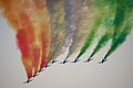
- Nomination Frecce Tricolori acrobatic group at Radom Air Show 2011 -- Jakubhal 19:19, 28 August 2011 (UTC)
- Promotion Nice picture. -- Jean-Pol GRANDMONT 22:50, 28 August 2011 (UTC)
-
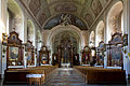
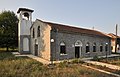
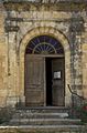
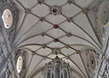
- Nomination interior of the church in Rywald. --Czonek 17:19, 28 August 2011 (UTC)
- Promotion Good quality. --Brackenheim 20:15, 28 August 2011 (UTC)
-

- Nomination Coronet 3-D camera. Takes rather interesting photos, but the film is hard to get hold of. :) -- Bilby 23:54, 27 August 2011 (UTC)
- Promotion Nice! --Brackenheim 20:15, 28 August 2011 (UTC)
-

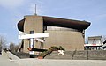
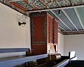
- Nomination Kraków: The Lord's Ark church --Taxiarchos228 12:01, 26 August 2011 (UTC)
- Promotion Good quality. Please add geotag. --Cayambe 15:24, 28 August 2011 (UTC)
-

-

-
-

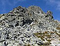
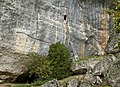
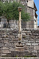
- Nomination: Stone stairway, Tatra mountains, Slovakia. --Podzemnik 11:56, 23 August 2011 (UTC)
- Review needed
-

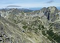
- Nomination: Slavkovský nos mountain, Tatra mountains, Slovakia. --Podzemnik 11:56, 23 August 2011 (UTC)
- Review needed
-
- Nomination: Slavkovský nos mountain, Tatra mountains, Slovakia. --Podzemnik 11:56, 23 August 2011 (UTC)
- Review needed
-

- Nomination: Široká veža mountain, Tatra mountains, Slovakia. --Podzemnik 11:56, 23 August 2011 (UTC)
- Review needed
-
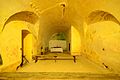
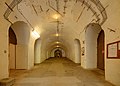
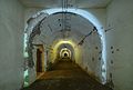
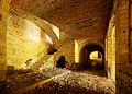
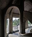
- Nomination: Chapel inside the Fort Frère, Oberhausbergen, France. --ComputerHotline 11:03, 23 August 2011 (UTC)
- Review needed
-
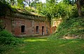
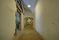
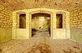
- Nomination: Fort Frère, Oberhausbergen, France. --ComputerHotline 11:03, 23 August 2011 (UTC)
- Review needed
-

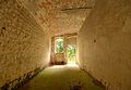
- Nomination: Fort Frère, Oberhausbergen, France. --ComputerHotline 11:03, 23 August 2011 (UTC)
- Review needed
-

- Nomination: Fort Frère, Oberhausbergen, France. --ComputerHotline 11:03, 23 August 2011 (UTC)
- Review needed
-

- Nomination: Fort Frère, Oberhausbergen, France. --ComputerHotline 11:03, 23 August 2011 (UTC)
- Review needed
-

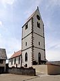
- Nomination: Lüneburg: side chapel at Saint Johannis church --Taxiarchos228 08:10, 23 August 2011 (UTC)
- Review needed
-

- Nomination: Wehr: Saint Martin Church, crossing --Taxiarchos228 08:10, 23 August 2011 (UTC)
- Review needed
-

- Nomination: Wehr: Saint Martin Church, main portal --Taxiarchos228 08:10, 23 August 2011 (UTC)
- Review needed
-

- Nomination The Cathedral of Passau with the river Inn. --High Contrast 00:32, 23 August 2011 (UTC)
- Promotion Good quality. --Cayambe 15:32, 28 August 2011 (UTC)
-

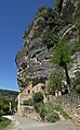
- Nomination: The tower of the cathedral of Sarlat, Dordogne, France.--Jebulon 23:11, 22 August 2011 (UTC)
- Review needed
-
- Nomination: Canoe livery in Dordogne, France.--Jebulon 22:43, 22 August 2011 (UTC)
- Review needed
-
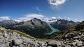
- Nomination: Mount Norra (North) Gröndörrsstöten (detail, west side). --Ankara 22:23, 22 August 2011 (UTC)
- Review needed
-

- Nomination: A panoramic view over Passau as seen from the city tower of Passau. --High Contrast 21:41, 22 August 2011 (UTC)
- Review needed
-

- Nomination: A Russian military radar during the MAKS airshow in Moscow. (by User:Doomych) --High Contrast 20:50, 22 August 2011 (UTC)
- Review needed
-

- Nomination: Italian Army Iveco VM90 Personal Carrier on it:Monte Piana, Dolomiti --Riotforlife 19:04, 22 August 2011 (UTC)
- WARNING: third template parameter added – please remove.
-
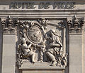
- Nomination: Detail of Nancy (France) town hall Léna 18:47, 22 August 2011 (UTC)
- Review Nice, but some
 chromatic aberration, and need of a perspective correction. All correctible.--Jebulon 21:27, 22 August 2011 (UTC)
-

- Nomination: Fort Frère, Oberhausbergen, France. --ComputerHotline 18:33, 22 August 2011 (UTC)
- Review needed
-
- Nomination: Fort Frère, Oberhausbergen, France. --ComputerHotline 18:33, 22 August 2011 (UTC)
- Review needed
-
- Nomination: Fort Frère, Oberhausbergen, France. --ComputerHotline 18:33, 22 August 2011 (UTC)
- Review needed
-

- Nomination: Fort Frère, Oberhausbergen, France. --ComputerHotline 18:33, 22 August 2011 (UTC)
- Review needed
-
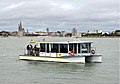
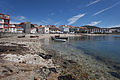
- Nomination: Fishing boat underneath a lamppost. Vilagarcía de Arousa. Galicia (Spain)--Lmbuga 18:10, 22 August 2011 (UTC)
- Review needed
-

-

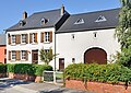
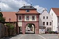
- Nomination Germany, Göllheim, Hauptstraße 64 --Berthold Werner 17:48, 22 August 2011 (UTC)
- Promotion QI to me. --Cayambe 15:37, 28 August 2011 (UTC)
-

- Nomination: The church of Saint Metropolitan Peter, Pereslavl. --PereslavlFoto 12:54, 22 August 2011 (UTC)
- Review needed
-

-
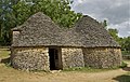
- Nomination Group "1" of the "Cabanes du Breuil, Dordogne, France.--Jebulon 20:20, 20 August 2011 (UTC)
- Promotion Good quality --Llez 16:37, 28 August 2011 (UTC)
-

- Nomination Atrophaneura aristolochiae--Archaeodontosaurus 07:00, 28 August 2011 (UTC)
- Promotion Very good -- George Chernilevsky 07:48, 28 August 2011 (UTC)
-
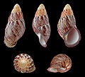
- Nomination Shell of a Philippine landsnail, Chrysallis rollei --Llez 04:25, 28 August 2011 (UTC)
- Promotion Very good -- George Chernilevsky 07:49, 28 August 2011 (UTC)
-

- Nomination Common fig -- MJJR 21:33, 27 August 2011 (UTC)
- Promotion Nice -- George Chernilevsky 07:45, 28 August 2011 (UTC)
-

-
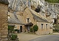
- Nomination Troglodyte house in La Roque-Gageac, Dordogne, France.--Jebulon 15:44, 27 August 2011 (UTC)
- Promotion Good quality --Llez 16:01, 27 August 2011 (UTC)
-

- Nomination The different leaf forms of the Common Hop, Humulus lupulus --Llez 15:11, 27 August 2011 (UTC)
- Promotion
 Support QI & Useful --Archaeodontosaurus 07:02, 28 August 2011 (UTC)
-

- Nomination Climbers checking the solidity of the cliff and the erosion, La Roque-Gageac, Dordogne, France.--Jebulon 14:09, 27 August 2011 (UTC)
- Promotion Good quality --Llez 16:03, 27 August 2011 (UTC)
-

- Nomination Cliff, castle, village, canoeists, Dordogne river. Dordogne, France.--Jebulon 13:07, 27 August 2011 (UTC)
- Promotion Support QI for me --Archaeodontosaurus 07:03, 28 August 2011 (UTC)
-
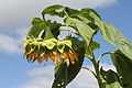
- Nomination Sunflower head -- George Chernilevsky 09:10, 27 August 2011 (UTC)
- Promotion High quality, very detailed.--Jebulon 12:08, 27 August 2011 (UTC)
-
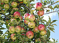
- Nomination Apples on an apple-tree -- George Chernilevsky 09:10, 27 August 2011 (UTC)
- Promotion Support QI & Useful --Archaeodontosaurus 07:05, 28 August 2011 (UTC)
-

- Nomination An Agfa Optima 1a camera by Agfa, with film. - Bilby 03:10, 27 August 2011 (UTC)
- Promotion well executed.... and its a camera vice a bug. --Saffron Blaze 17:11, 27 August 2011 (UTC)
-
- Nomination special Drill bit --Brackenheim 12:54, 26 August 2011 (UTC)
- Promotion Support QI & Useful but there should be the size in the caption --Archaeodontosaurus 07:08, 28 August 2011 (UTC)
-

-

-
-
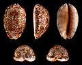
- Nomination Shell of an Arabian Cowry, Mauritia arabica --Llez 05:11, 26 August 2011 (UTC)
- Promotion Support QI, lot of work.--Archaeodontosaurus 07:12, 28 August 2011 (UTC)
-

- Nomination Reconstruction of a bronze-age tomb found here, La Roque Saint-Christophe, Dordogne, France. --Jebulon 17:40, 24 August 2011 (UTC)
- Promotion Support QI & Useful --Archaeodontosaurus 07:15, 28 August 2011 (UTC)
-

- Nomination A natural stone middle-ages staircase, carved in the cliff, La Roque Saint-Christophe, Dordogne, France.--Jebulon 16:56, 24 August 2011 (UTC)
- Promotion Support QI & Useful --Archaeodontosaurus 07:15, 28 August 2011 (UTC)
-

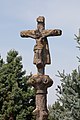
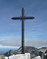
- Nomination Cross in Miélan (Gers, France) --Florent Pécassou 12:34, 23 August 2011 (UTC)
- Decline Too noisy and unsharp, IMO.--Jebulon 16:53, 27 August 2011 (UTC)
-
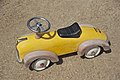
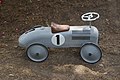
- Nomination A children's yellow car.--Jebulon 09:28, 22 August 2011 (UTC)
- Promotion Support QI for me --Archaeodontosaurus 07:18, 28 August 2011 (UTC)
-

- Nomination: The Dordogne river in summer, from terrace of Château de Castelnaud--Jebulon 09:23, 22 August 2011 (UTC)
- Review needed
-
- Nomination: Obereggenen: Protestant Church --Taxiarchos228 07:02, 22 August 2011 (UTC)
- Review needed
-

- Nomination: Obereggenen: Protestant Church, epitaph --Taxiarchos228 07:02, 22 August 2011 (UTC)
- Review needed
-

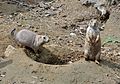
- Nomination: The Chipmunk in North America -- Steven Pavlov 21:52, 21 August 2011 (UTC)
- Review needed
-
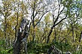
- Nomination: Montane Birch forests in Ljungdalen, in Bergs municipality, Härjedalen (Sweden). Altitude approximately 850 m. --Ankara 19:02, 21 August 2011 (UTC)
- Review needed
-

- Nomination: Festung Ehrenbreitstein in Koblenz. --Schängel 17:06, 21 August 2011 (UTC)
- Review needed
-

- Nomination Fagus sylvatica in the Logne castle
- Decline Jean-Pol GRANDMONT 16:06, 21 August 2011 (UTC)Not sharp + CA, désolé. --Jebulon 16:39, 27 August 2011 (UTC)
-

- Nomination: Panoramic view of quai Franklin in Port Saint-Goustan, Auray, France. This is where Franklin landed in 1776 to negociate an alliance with France. --D4m1en 14:01, 21 August 2011 (UTC)
- Review needed
-
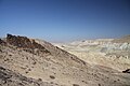
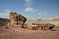
- Nomination: Wadi Hawarim in Negev desert, Israel --Chmee2 13:33, 21 August 2011 (UTC)
- Review needed
-

-

-

- Nomination Self timer --Berthold Werner 08:57, 27 August 2011 (UTC)
- Promotion Gut -- George Chernilevsky 09:10, 27 August 2011 (UTC)
-

- Nomination A cretaceous ammonite, Pachydiscus duelmensis --Llez 04:01, 27 August 2011 (UTC)
- Promotion Good -- George Chernilevsky 09:11, 27 August 2011 (UTC)
-

- Nomination St. Basil's Cathedral, Moscow. View from northwest. Alvesgaspar 22:08, 26 August 2011 (UTC)
- Promotion Good quality. - A.Savin 06:16, 27 August 2011 (UTC)
-

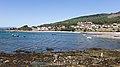
- Nomination Porto Covo, Portugal. View of the coast. Alvesgaspar 19:56, 26 August 2011 (UTC)
- Promotion Good quality. - A.Savin 06:16, 27 August 2011 (UTC)
-

- Nomination Self timer --Berthold Werner 17:40, 26 August 2011 (UTC)
- Promotion Good (something for my old Nikon FM maybe).--Ankara 17:45, 26 August 2011 (UTC)
-
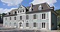
- Nomination House in Luxembourg. --Cayambe 14:06, 26 August 2011 (UTC)
- Promotion Good quality. --Berthold Werner 15:32, 26 August 2011 (UTC)
-

- Nomination Another house in Luxembourg City. --Cayambe 14:04, 26 August 2011 (UTC)
- Promotion Good quality. There is something wrong with the nomination time. --Berthold Werner 15:32, 26 August 2011 (UTC)
 Comment Thanks for noticing, now corrected, something's going wrong in my computer... I'll try to fix it.--Cayambe 18:04, 26 August 2011 (UTC)
-

-

- Nomination Schwörstadt: Protestant Church --Taxiarchos228 19:50, 25 August 2011 (UTC)
- Promotion Good quality. Please add geotag. --Cayambe 16:58, 26 August 2011 (UTC)
-

- Nomination Kaltenbach: Protestant Church, war memorial --Taxiarchos228 19:50, 25 August 2011 (UTC)
- Promotion Good quality. Please add geotag. --Cayambe 16:58, 26 August 2011 (UTC)
-
-

-

-

- Nomination Diagram of alkaline mucous layer in stomach --M.Komorniczak 14:42, 23 August 2011 (UTC)
- Promotion Good quality. --Cayambe 22:56, 26 August 2011 (UTC)
-

-
-

- Nomination: Disney's Castaway Cay --Warfieldian 00:24, 21 August 2011 (UTC)
- Review needed
-
- Nomination: The confluence of the Vézère river and the Dordogne river in Limeuil, Dordogne department, France.--Jebulon 22:31, 20 August 2011 (UTC)
- Review -- Two ugly dust spots at left, blurgh -- Alvesgaspar 22:54, 20 August 2011 (UTC) You are wrong: I found three ! Better now ?--Jebulon 23:15, 20 August 2011 (UTC)
-

- Nomination: Mengusovská valley, Tatra Mountains, Slovakia, --Podzemnik 20:39, 20 August 2011 (UTC)
- Review needed
-

- Nomination: Banded Demoiselles, mating wheel. --Quartl 19:42, 20 August 2011 (UTC)
- Review needed
-

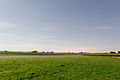
- Nomination: Ribnica field, Slovenija. --Sl-Ziga 19:24, 20 August 2011 (UTC)
- Review needed
-
- Nomination: Street pavement in Sarlat-la-Canéda, Dordogne, France.--Jebulon 19:13, 20 August 2011 (UTC)
- Review needed
-

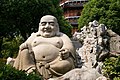
- Nomination: Buddha idol for sale in Shlparamam - Hyderabad,India Sankarshansen 19:03, 20 August 2011 (UTC)
- Review needed
-

- Nomination: Okhotny Ryad, Moscow. A.Savin 18:39, 20 August 2011 (UTC)
- Review needed
-
- Nomination: Mtsensk, Russia: Presentation Church. A.Savin 18:39, 20 August 2011 (UTC)
- Review needed
-

- Nomination: Plavsk, Russia: Building of administration. A.Savin 18:39, 20 August 2011 (UTC)
- Review needed
-

-
- Nomination: Castle of Coca --Harmonia Amanda 07:47, 13 August 2011 (UTC)
- Review Would need some perspective correction. The vertical lines are not quite vertical. --Ximonic 10:12, 17 August 2011 (UTC)
Do you prefer something like this file? Too many rotation makes the pillar look strange, in my opinion. --Nemoi 17:52, 20 August 2011 (UTC)
-

- Nomination: Goetheanum: western staircase --Taxiarchos228 08:27, 12 August 2011 (UTC)
- Review Great! But I think you have a small CW tilt here.--Ankara 16:33, 12 August 2011 (UTC)No tilt IMO, but probable need of a perspective correction (please se annotations). But this is a very nice picture of a detail of this fascinating building (even if not my architecural taste...)--Jebulon 09:33, 21 August 2011 (UTC)
-

- Nomination Front view of an Austrian-built diesel locomotive. --High Contrast 10:36, 26 August 2011 (UTC)
- Promotion Good quality.--Ankara 10:54, 26 August 2011 (UTC)
-
- Nomination Basilica di San Giorgio Maggiore in Venice --Jakubhal 07:05, 26 August 2011 (UTC)
- Promotion Good quality. --Berthold Werner 08:30, 26 August 2011 (UTC)
-

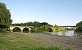
- Nomination Scaligero Bridge in Verona --Jakubhal 07:05, 26 August 2011 (UTC)
- Promotion Nice shot. --High Contrast 11:55, 26 August 2011 (UTC)
-

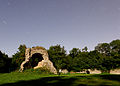
- Nomination Ruins of the castle in Bodzentyn, Poland --Jakubhal 06:41, 26 August 2011 (UTC)
- Promotion Good quality. --Berthold Werner 08:30, 26 August 2011 (UTC)
-

- Nomination The door of the church (14th century) of Plazac, Dordogne--Jebulon 22:36, 25 August 2011 (UTC)
- Promotion Sehr gut. --Berthold Werner 08:27, 26 August 2011 (UTC)
-

- Nomination Koolkerke (Bruges, Belgium): Saint Nicholas church -- MJJR 21:14, 25 August 2011 (UTC)
- Promotion Good quality. --Berthold Werner 08:27, 26 August 2011 (UTC)
-
-

-

- Nomination The floating torii gate in Miyajima, Japan --Jakubhal 18:23, 25 August 2011 (UTC)
- Promotion Good quality. --Taxiarchos228 20:04, 25 August 2011 (UTC)
-
- Nomination The old town hall and its surrounding area, Waiblingen, Baden-Württemberg. -- Felix Koenig 17:47, 25 August 2011 (UTC)
- Promotion Good quality. --Taxiarchos228 20:04, 25 August 2011 (UTC)
-

- Nomination Alpine Ibex (Capra ibex) in Gornergrat, Valais, Switzerland --Ximonic 15:16, 25 August 2011 (UTC)
- Promotion It was a lucky day ! Very good, despite the disappearance of the bird (FPC page)! --Jebulon 16:40, 25 August 2011 (UTC) Actually, the bird was in this picture also – but in so bizarre flight position that someone could have recognized it as a trash or something... Therefore I decided to remove it from the picture, I admit. :-) But if the bird was important I can upload a picture with the bird despite the position of him/her. --Ximonic 16:46, 25 August 2011 (UTC)
-
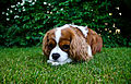
- Nomination A Cavalier King Charles Spaniel (Blenheim-coloured) lying in the grass Photo by User:Poxnar. --Ankara 14:15, 25 August 2011 (UTC)
- Promotion Good quality --Llez 16:30, 25 August 2011 (UTC)
-
-

-

-

-

-

- Nomination Germany, Göllheim, Dreisener Tor --Berthold Werner 13:25, 24 August 2011 (UTC)
- Promotion Good quality. Mit Katze oben links :-) --Cayambe 16:05, 25 August 2011 (UTC)
-
-

- Nomination Nova Zagora main square. --MrPanyGoff 19:32, 22 August 2011 (UTC)
- Promotion Good quality. --Cayambe 16:07, 25 August 2011 (UTC)
-

-

-

-

-

- Nomination: Roman funeral stele of Mazarelos, Oza dos Ríos, Galicia, Spain--Lmbuga 08:36, 20 August 2011 (UTC)
- Review needed
-

- Nomination: Interior of Tibães Church (by Joseolgon) --DarwIn 19:32, 19 August 2011 (UTC)
- Review Comment interesting but tilted, easy to fix.--Archaeodontosaurus 06:07, 20 August 2011 (UTC)
-
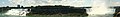
- Nomination: Panorama of the Niagara gorge, including the Bridal Veil and Horseshoe falls. --Relic38 15:33, 19 August 2011 (UTC)
- Review needed
-
-

- Nomination Val des Nymphes church, Drôme, France -- Remi Mathis 19:33, 18 August 2011 (UTC)
- Promotion Good quality, nice evening light. A geotag would be great. --Coyau 22:19, 25 August 2011 (UTC)
-

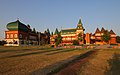
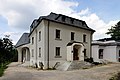
- Nomination City museum of Güstrow, Mecklenburg-Vorpommern. -- Felix Koenig 13:38, 18 August 2011 (UTC)
- Promotion CommentGood technical quality, but the tree on the right is disturbing (see image note)--Ankara 10:23, 23 August 2011 (UTC)
I think it's an important element of the composition. -- Felix Koenig 13:26, 23 August 2011 (UTC) I am not convinced so I will not review the image. I hope we get a second opinion. Regards--Ankara 13:29, 23 August 2011 (UTC)I agree with F.K. I do so sometimes. If well done (it is the case here), it fills empty spaces nicely, IMO. The main subject is not disturbed by the tree and is fully visible.--Jebulon 08:32, 26 August 2011 (UTC)
-

-

-

- Nomination People at the beach of Praia Pequena (Small Beach) at high water. Porto Covo, Portugal. -- Alvesgaspar 09:09, 25 August 2011 (UTC)
- Promotion Good quality. --Raghith 09:40, 25 August 2011 (UTC)
-
-

- Nomination Canned cod liver. A.Savin 05:42, 25 August 2011 (UTC)
- Promotion Good quality. --Raghith 08:53, 25 August 2011 (UTC)
 Info Now used in french WP.--Jebulon 09:35, 25 August 2011 (UTC) And in swedish WP. But canned cod liver is traumatic childhood memory for me, I hope the Russian taste better. Fresh cod liver is a delicacy!--Ankara 11:21, 25 August 2011 (UTC)
-

- Nomination The Koningsbrug (King's bridge) in Bruges, Belgium -- MJJR 21:01, 24 August 2011 (UTC)
- Promotion Nice composition - For me QI - Jean-Pol GRANDMONT 07:13, 25 August 2011 (UTC)
-
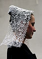
- Nomination Traditional hat of Bretagne, from the city of Melrand. --XIIIfromTOKYO 18:51, 24 August 2011 (UTC)
- Promotion Beautiful picture, QI for me--Riotforlife 10:54, 25 August 2011 (UTC)
-
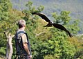
- Nomination Flying Black Kite. --Quartl 16:40, 24 August 2011 (UTC)
- Promotion Nice, but the profile of the face of the man is overexposed IMO.--Jebulon 16:59, 24 August 2011 (UTC)
Yes, I reduced the highlights as good as I could, better now? --Quartl 17:31, 24 August 2011 (UTC)I've tried something too, but without success. QI nevertheless. I'll support in FPC too.--Jebulon 09:07, 25 August 2011 (UTC)
-

-
-

-
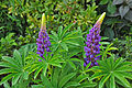
- Nomination Lupins -- MJJR 20:20, 22 August 2011 (UTC)
- Promotion Comment Can we get a more specific id? --Quartl 09:10, 24 August 2011 (UTC)
Purple Lupins. --Saffron Blaze 17:33, 24 August 2011 (UTC)
-

-
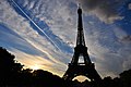
- Nomination: Eiffel Tower seen from Champ de Mars --Tobi 87 11:50, 19 August 2011 (UTC)
- Review needed
-

- Nomination: obelisk on the Place de la Concorde at sunny day --Tobi 87 11:50, 19 August 2011 (UTC)
- Review needed
-

- Nomination: Germany, Göllheim, main strret with townhall and church tower --Berthold Werner 09:43, 19 August 2011 (UTC)
- Review needed
-

- Nomination: Bas-relief in Cour Henri IV, Capitole de Toulouse. --PierreSelim 06:01, 19 August 2011 (UTC)
- Review needed
-

- Nomination: Laxe dos carballos petroglyph, in Campo Lameiro, Galicia (IV-II millemium BCE): Cup-and-ring mark and deer hunting scenes. By User:Froaringus 13:38, 18 August 2011 (UTC)--Lmbuga 16:43, 18 August 2011 (UTC)
- Review needed
-
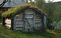
- Nomination House in Kesuvallen, a old fäbod outside Ljungdalen. --Ankara 11:40, 18 August 2011 (UTC)
- Decline Background disturbing, bad angle of light, sharpness not so good, sorry. The subject itself is interesting however. Maybe another shot is possible ? --Jebulon 09:48, 25 August 2011 (UTC) I'll try again next time I visit Ljungdalen. I used a lens with manual focus, and think I failed a bit.--Ankara 11:12, 25 August 2011 (UTC)
-

-

-

-

-

-
- Nomination Troglodyte houses, still in use, Dordogne, France.--Jebulon 23:13, 23 August 2011 (UTC)
- Promotion Nice. Reminds me of Cappadocia --Ankara 23:26, 23 August 2011 (UTC) Thank you. I've read there are troglodyte building there too, but I don't know Turkey.--Jebulon 23:43, 23 August 2011 (UTC)
-

-

- Nomination An abricot, Prunus armeniaca.--Jebulon 22:36, 23 August 2011 (UTC)
- Decline I am sorry, but the picture has a few problems: 1) the left part of the apricot is hidden behind a leaf: 2) top of the apricot is not completely in focus 3) the colorful background takes too much attention from apricot IMO.--Ankara 06:40, 24 August 2011 (UTC)
-
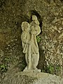
- Nomination Troglodyte statue of Saint-Christopher, La Roque Saint-Christophe, Dordogne, France.--Jebulon 22:28, 23 August 2011 (UTC)
- Promotion Good quality.--Ankara 22:32, 23 August 2011 (UTC)
-

- Nomination liquid nitrogen --Brackenheim 19:46, 23 August 2011 (UTC)
- Promotion Good and useful. French caption added.--Jebulon 08:34, 24 August 2011 (UTC)Used now in french WP--Jebulon 08:39, 24 August 2011 (UTC)
-

- Nomination The town hall of Schorndorf, Baden-Württemberg. -- Felix Koenig 18:02, 23 August 2011 (UTC)
- Promotion Good quality. --Berthold Werner 18:25, 23 August 2011 (UTC)
-

-
- Nomination Laugerie Basse, a prehistoric cave and a medieval site, Dordogne, France.--Jebulon 21:25, 22 August 2011 (UTC)
- Promotion Support QI & Useful --Archaeodontosaurus 17:18, 23 August 2011 (UTC)
-

-

-

- Nomination The most inclined tower in Venice.--Archaeodontosaurus 12:20, 21 August 2011 (UTC)
- Promotion Get yourself to Burano for a tower that really leans:) Saffron Blaze 16:29, 23 August 2011 (UTC)
-

- Nomination The main beach of Porto Covo (Praia Grande), Portugal, during the summer. -- Alvesgaspar 22:41, 20 August 2011 (UTC)
- Promotion QI to me. Geolocation and a description of the equipment you used would be interesting, too. --D4m1en 14:03, 23 August 2011 (UTC) --
 Done -- Alvesgaspar 17:20, 23 August 2011 (UTC)
-

-
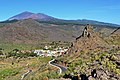
- Nomination Santiago del Teide and the Teide, Tenerife. --Florival fr 06:43, 19 August 2011 (UTC)
- Decline Tilted to the left, overexposed houses and oversaturated. --Quartl 08:57, 24 August 2011 (UTC)
-

-

- Nomination: Confederation Bridge, seen from New Brunswick --Taxiarchos228 08:01, 18 August 2011 (UTC)
- Review needed
-
- Nomination Panorama taken from the Trocadero, Paris- -- Alvesgaspar 23:40, 16 August 2011 (UTC)
- Promotion QI to me. There is a very small oddity I found and marked with a note : a stitching border caused a 3-wheeled car. Panoramas with moving objects are such a nightmare. --D4m1en 13:57, 23 August 2011 (UTC) -- Done - Thank you for letting me know about the horrible stitching error! -- Alvesgaspar 16:50, 23 August 2011 (UTC)
-

-

-
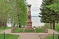
- Nomination Obelisk in memory of Emperor Peter I. Veskovo village, Botik estate. --PereslavlFoto 15:13, 16 August 2011 (UTC)
- Decline picture is aslope --Taxiarchos228 20:02, 16 August 2011 (UTC) Visibly Tilted. --Quartl 08:51, 24 August 2011 (UTC)
-

- Nomination An old house in the town of Apriltsi. --MrPanyGoff 06:55, 23 August 2011 (UTC)
- Promotion Good quality. --Taxiarchos228 08:01, 23 August 2011 (UTC)
-

-
-

- Nomination A window in a stone wall, Dordogne, France.--Jebulon 21:55, 22 August 2011 (UTC)
- Promotion QI for me--Riotforlife 09:42, 23 August 2011 (UTC)
-

-

- Nomination Container ship Umm Salal in the port of Zeebrugge, Belgium -- MJJR 20:20, 22 August 2011 (UTC)
- Promotion Very good. --High Contrast 21:42, 22 August 2011 (UTC)
-
- Nomination Fort Frère, Oberhausbergen, France. --ComputerHotline 18:33, 22 August 2011 (UTC)
- Promotion QI IMO. --Ankara 11:38, 23 August 2011 (UTC)
-

-

-

- Nomination Street artist at La Place du Tertre, Paris -- Alvesgaspar 17:01, 22 August 2011 (UTC)
- Promotion Good.--Ankara 09:55, 23 August 2011 (UTC)
-

- Nomination Yasna Polyana Village Hall. --MrPanyGoff 15:37, 22 August 2011 (UTC)
- Promotion QI.--Ankara 11:35, 23 August 2011 (UTC)
-

- Nomination Mt Cenis Lake, at the border between Italy and France. --JeanBono 12:03, 22 August 2011 (UTC) Sorry but overexposed background, unfortunate crop (se image note), and dark foreground. The idea is good, I think you should try again and come back.--Ankara 10:55, 23 August 2011 (UTC)
- Decline {{{2}}}
-

- Nomination Vancia fort near Lyon, Rhône, France. --JeanBono 12:01, 22 August 2011 (UTC)
- Decline Comment Sorry, too tight crop, especially at bottom. zones overexposed. Some chromatic aberrations.--Lmbuga 02:06, 23 August 2011 (UTC)
-
- Nomination Kraków: The Lord's Ark church, detail from North --Taxiarchos228 11:09, 22 August 2011 (UTC)
- Promotion QI for me--Lmbuga 16:20, 22 August 2011 (UTC)
-
-

-

-

-

- Nomination Playing in the waves. Porto Covo, Portugal. Alvesgaspar 22:50, 18 August 2011 (UTC)
- Promotion I like the picture, mainly thanks to the three people in the water. They make the image and composition interesting. --Ankara 10:20, 23 August 2011 (UTC)
-

- Nomination: Goetheanum: northern stairway --Taxiarchos228 07:14, 17 August 2011 (UTC)
- Review needed
-

- Nomination: Portal of Saint James church of O Carril, Vilagarcía de Arousa, Galicia, Spain--Lmbuga 23:14, 16 August 2011 (UTC)
- Review needed
-
- Nomination: Timelapse of clouds over Belfort, France. --ComputerHotline 17:26, 16 August 2011 (UTC)
- Review needed
-

- Nomination: Nightscape in Sermamagny, France. --ComputerHotline 17:26, 16 August 2011 (UTC)
- Review needed
-

- Nomination: Nightscape near a pond in Sermamagny, France. --ComputerHotline 17:26, 16 August 2011 (UTC)
- Review needed
-

- Nomination: Nightscape near a pond in Sermamagny, France. --ComputerHotline 17:26, 16 August 2011 (UTC)
- Review needed
-

- Nomination: A Perseid meteor. --ComputerHotline 17:26, 16 August 2011 (UTC)
- Review needed
-

- Nomination: Stars constellations. --ComputerHotline 17:26, 16 August 2011 (UTC)
- Review needed
-

- Nomination: Nightscape near a pond in Sermamagny, France. --ComputerHotline 17:26, 16 August 2011 (UTC)
- Review needed
-

- Nomination: Mayor of Pereslavl-Zalessky Andrey V. Okhapkin and director of the Yaroslavl culture department Larisa Yu. Sorokina at the festival «Night at the Museum». --PereslavlFoto 15:13, 16 August 2011 (UTC)
- Review needed
-
- Nomination: Båtsuoj sami center, Arvidsjaur Municipality, Sweden. --Rünno 14:30, 16 August 2011 (UTC)
- Review needed
-

- Nomination: Slettnes Nature Reserve, Finnmark, Norway --Rünno 13:32, 16 August 2011 (UTC)
- Review needed
-

- Nomination Panorama from O Carril with the Malveiras and Briñas islands, Vilagarcía de Arousa, Galicia--Lmbuga 01:47, 15 August 2011 (UTC)
- Promotion Very nice photograph. May be the location of the camera could be added? --A.Ceta 09:47, 22 August 2011 (UTC)
Geolocated--Lmbuga 16:37, 22 August 2011 (UTC)
-

- Nomination Border stone and Free State Bavaria sing on the Třístoličník/Dreisesselberg --Pudelek 14:45, 9 August 2011 (UTC)
- Decline Grass a bit oversaturated ?--Jebulon 18:04, 15 August 2011 (UTC) I dont like the composition (a bit messy, dark rocks behind). Clearly an educational value, but the overall quality is, in my opinion too low for QI.--Ankara 10:30, 23 August 2011 (UTC)
-

- Nomination Obereggenen: Protestant Church, interior --Taxiarchos228 07:02, 22 August 2011 (UTC)
- Promotion Good quality--Lmbuga 07:55, 22 August 2011 (UTC)
-
- Nomination Niedereggenen: Protestant Church, side portal --Taxiarchos228 07:02, 22 August 2011 (UTC)
- Promotion Good quality--Lmbuga 08:00, 22 August 2011 (UTC)
-
- Nomination The Town Gallery in Sozopol. --MrPanyGoff 06:30, 22 August 2011 (UTC)
- Promotion Good quality. --Taxiarchos228 06:54, 22 August 2011 (UTC)
-

- Nomination Bronze of a knight in 15th century tournament armour. --Quartl 06:04, 22 August 2011 (UTC)
- Promotion Good quality. --Taxiarchos228 06:54, 22 August 2011 (UTC)
-
- Nomination Shell of Spinucella tetragona, a Pliocene gastropod --Llez 05:38, 22 August 2011 (UTC)
- Promotion Good quality. --Taxiarchos228 06:54, 22 August 2011 (UTC)
-

- Nomination Library of Galicia, City of the Culture of Galicia. Santiago de Compostela. Peter Eisenman--Lmbuga 22:09, 21 August 2011 (UTC)
- Promotion Good -- George Chernilevsky 05:26, 22 August 2011 (UTC)
-
- Nomination Sculpture of Emilio Mosquera Porto (sculptor). The population of Vilagarcía de Arousa to Miguel Hernández--Lmbuga 22:09, 21 August 2011 (UTC)
- Promotion Very good -- George Chernilevsky 05:24, 22 August 2011 (UTC)
-
- Nomination Mural in the facade of the building of the Harbor Authority. Vilagarcía de Arousa. Galicia. Probably more than 12 meters in width--Lmbuga 22:09, 21 August 2011 (UTC)
- Promotion Very good -- George Chernilevsky 05:25, 22 August 2011 (UTC)
-

- Nomination Belgian electric multiple unit #624 -- MJJR 21:06, 21 August 2011 (UTC)
- Promotion Good -- George Chernilevsky 05:22, 22 August 2011 (UTC)
-

- Nomination A gyrocopter at Löchgau, Baden-Württemberg today. -- Felix Koenig 16:23, 21 August 2011 (UTC)
- Promotion Good. - A.Savin 16:41, 21 August 2011 (UTC)
-
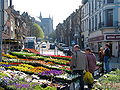
- Nomination The sunday flower market of Mons -- Jean-Pol GRANDMONT 15:49, 21 August 2011 (UTC)
- Promotion Very nice atmosphere; good sharpness and colors. Despite of some overexposed details (due to the contre-jour), this is QI for me. -- MJJR 09:33, 22 August 2011 (UTC)
-

- Nomination Giant cockroach --Archaeodontosaurus 14:27, 21 August 2011 (UTC)
- Promotion QI for me --Llez 15:55, 21 August 2011 (UTC)
-

- Nomination Jerusalem, Church of the Flagellation --Berthold Werner 09:13, 21 August 2011 (UTC)
- Promotion Well done. --Elekhh 13:23, 21 August 2011 (UTC)
-
- Nomination The Lantern of the dead in Sarlat-la-Canéda, Dordogne, France.--Jebulon 22:03, 20 August 2011 (UTC)
- Promotion Support QI & Useful (problème sur la licence)--Archaeodontosaurus 12:34, 21 August 2011 (UTC) DoneMerci. La faute à l'uploadouizare.--Jebulon 13:27, 21 August 2011 (UTC)
-

-

-
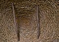
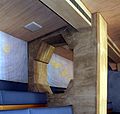
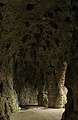
- Nomination Inside a Cabane du Breuil, Dordogne, France, the cantilevered vault. --Jebulon 20:46, 20 August 2011 (UTC)
- Promotion QI & very interesting --Tlusťa 09:27, 22 August 2011 (UTC)
-

-

-

-
- Nomination Typical walls and roofs in Porto Covo, Portugal. -- Alvesgaspar 18:33, 18 August 2011 (UTC)
- Decline In at least two areas (which I've marked with notes), stitching is visible due to big differences in sharpness between stitched images. --D4m1en 10:34, 22 August 2011 (UTC)
-
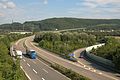
- Nomination The A98 highway near Lörrach --Taxiarchos228 13:21, 16 August 2011 (UTC)
- Promotion I'll promote after the removing of the dust spot(s)--Jebulon 13:54, 21 August 2011 (UTC)
removed --Taxiarchos228 16:28, 21 August 2011 (UTC)The one in the sky is still visible IMO, butQI nownevertheless--Jebulon 16:46, 21 August 2011 (UTC) Cache issue, sorry--Jebulon 16:49, 21 August 2011 (UTC)
-

-

- Nomination Gresgen: Protestant Church --Taxiarchos228 09:54, 16 August 2011 (UTC)
- Promotion Excellent! --A.Ceta 09:49, 22 August 2011 (UTC)
-
- Nomination Gresgen: Protestant Church, ridge turret --Taxiarchos228 09:54, 16 August 2011 (UTC)
- Promotion Excellent! --A.Ceta 09:49, 22 August 2011 (UTC)
-

- Nomination Lörrach-Brombach: Germanus Church --Taxiarchos228 09:47, 16 August 2011 (UTC)
- Promotion Excellent! --A.Ceta 09:49, 22 August 2011 (UTC)
-
-
-

- Nomination Røldalsvatnet, Hordaland, Norway, in 2011 August --Ximonic 13:18, 15 August 2011 (UTC)
- WARNING: third template parameter added – please remove.
-

- Nomination Gottgold House, Magen David Square, Tel Aviv. --Elekhh 07:47, 15 August 2011 (UTC)
- Decline at the bottom of the house too strong shadow, I guess this could be fixed --Taxiarchos228 08:12, 15 August 2011 (UTC) Comment It was early morning with smooth light and indeed a bit dark. Increased gamma a bit, hope is better, otherwise please revert. --Elekhh 08:18, 15 August 2011 (UTC) Too dark. A better version could have been taken if the photographer would have had taken this photogrpah later on. --A.Ceta 09:47, 22 August 2011 (UTC)
-

- Nomination Panoramic view over the town of Bodenmais (Germany) --High Contrast 00:06, 15 August 2011 (UTC)
- Promotion Good pano stitch! Nice details. --A.Ceta 09:47, 22 August 2011 (UTC)
-

-

- Nomination Iridium flares under the moonlight. --ComputerHotline 14:10, 14 August 2011 (UTC)
- Decline image quality is not sufficient --A.Ceta 09:34, 22 August 2011 (UTC)
-
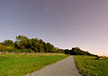
- Nomination Nightscape under the moonlight. --ComputerHotline 14:10, 14 August 2011 (UTC)
- Decline image quality is not sufficient --A.Ceta 09:34, 22 August 2011 (UTC)
-

- Nomination: Inside the North battery of the fort du Lomont. --ComputerHotline 16:56, 13 August 2011 (UTC)
- Review Maybe a little tilted clockwise. Would be easy to fix. --Ximonic 18:45, 14 August 2011 (UTC) I've processed this image with ShiftN. --ComputerHotline 12:37, 15 August 2011 (UTC)
-
- Nomination Beach of Boa Grande, Redondelo, Boa, Noia, Galicia, Spain--Lmbuga 21:04, 12 August 2011 (UTC)
Comment The vertical lines of the buildings are strights--Lmbuga 21:07, 12 August 2011 (UTC) - Promotion Needs (maybe) a crop below, but QI--Jebulon 09:21, 21 August 2011 (UTC)
Thanks. Cropped--Lmbuga 17:32, 21 August 2011 (UTC)
- Nomination Beach of Boa Grande, Redondelo, Boa, Noia, Galicia, Spain--Lmbuga 21:04, 12 August 2011 (UTC)
-
- Nomination Ljungris, August 2011. --Ankara 16:26, 12 August 2011 (UTC)
- Promotion Sorry, for me the description is not clear, I don't understand what is this tool looking like a guillotine :)--Jebulon 09:09, 21 August 2011 (UTC) It's actually a guillotine. It was built in the 1700s by French emigrants who came to Ljungdalen to start a revolution. There is a forgotten and unknown part of European history, ignored by both the French and Swedish historians. I really do not know, probably it is a ramp used to load the reindeer in a truck (if they are off to slaughter) --Ankara 10:33, 21 August 2011 (UTC)Thank you for historical explanations (I love history!)... But no need of guillotine nor revolution in Sweden: 1)choose a napoleonic marshal, 2)make him king. A good recipe too ! ;) By the way: it is a QI--Jebulon 13:42, 21 August 2011 (UTC)
-
- Nomination Upper Tumwater Falls, Tumwater, Washington. --Raghith 07:07, 9 August 2011 (UTC)
- Decline Comment Underexposed --Archaeodontosaurus 15:50, 16 August 2011 (UTC)+ Composition issues: the left corner above, the structure at the right edge. The water effect is nice, though. Sorry. --Jebulon 16:55, 21 August 2011 (UTC)
-

- Nomination Hornet sucking sap. --Quartl 07:50, 21 August 2011 (UTC)
- Promotion Good quality. --Berthold Werner 09:14, 21 August 2011 (UTC)
-

- Nomination Blue-tailed damselfly with prey. --Quartl 05:31, 21 August 2011 (UTC)
- Promotion Good quality. --Berthold Werner 09:14, 21 August 2011 (UTC)
-

- Nomination A (minimalist) wooden bench in Dordogne, France.--Jebulon 23:09, 20 August 2011 (UTC)
- Promotion Very nice. I would have increased light and saturation a bit but that is a question of taste. -- Alvesgaspar 10:48, 21 August 2011 (UTC)
-
- Nomination Impressive baroque portal of the early 18th century at a half-timber house in Korbach (Hesse) --Carschten 22:44, 20 August 2011 (UTC)
- Promotion Good quality.nice symmetry and colors --Warfieldian 01:29, 21 August 2011 (UTC)
-

- Nomination A dry stone wall in Limeuil, Dordogne, France.--Jebulon 22:41, 20 August 2011 (UTC)
- Promotion -- Good image quality and I love minimalism -- Alvesgaspar 22:51, 20 August 2011 (UTC)
-
- Nomination Flowers in a field, Dordogne, France.--Jebulon 21:46, 20 August 2011 (UTC)
- Decline Maybe I will reconsider my assessment when all the flowers are properly identified ;-). Now for serious: why this particular exposure choice, with a too small dof? -- Alvesgaspar 22:57, 20 August 2011 (UTC) Alas, you are right. My mistake.--Jebulon 23:15, 20 August 2011 (UTC)
-

- Nomination Mountain Prostredný hrot, Tatra Mountains, Slovakia, --Podzemnik 20:39, 20 August 2011 (UTC)
- Promotion Good quality.good composition and depth --Warfieldian 01:31, 21 August 2011 (UTC)
-

- Nomination Part of the "Cabanes du Breuil", Dordogne, France.--Jebulon 19:58, 20 August 2011 (UTC)
- Promotion Very nice. - A.Savin 08:42, 21 August 2011 (UTC)
-
- Nomination Mushroom and a half in Timna Park, Negev desert, Israel --Chmee2 14:33, 20 August 2011 (UTC)
- Promotion Hard too decide if it is tilted (it seems so when looking at the background) but good quality. --Berthold Werner 18:31, 20 August 2011 (UTC) 17:42, 20 August 2011 (UTC)
-
- Nomination Holy Trinity church in Novo Panicharevo village. --MrPanyGoff 12:15, 20 August 2011 (UTC)
- Promotion QI.--Ankara 14:21, 20 August 2011 (UTC)
-

-
-

- Nomination Window of Capitole de Toulouse and balcony with heraldry. --PierreSelim 09:15, 17 August 2011 (UTC)
- Decline Une composition bien centrée serait meilleure dans ce cas, à mon avis. Le découpage à droite est hasardeux.--Jebulon 09:24, 17 August 2011 (UTC)Per above, and the much better other version of the same place already promotted--Jebulon 09:59, 21 August 2011 (UTC)
-

- Nomination The main bus station of a city in Germany. --High Contrast 22:49, 15 August 2011 (UTC)
- Promotion QI, in spite of a little distorsion at left (buildings in background are leaning)--Jebulon 09:57, 21 August 2011 (UTC)
-

- Nomination Inside the North battery of the fort du Lomont. --ComputerHotline 16:56, 13 August 2011 (UTC)
- Decline Comment Strong yellow CAs. See notes (when you want, you can delete the notes)--Lmbuga 11:07, 14 August 2011 (UTC)Per Lmbuga --Jebulon 09:40, 21 August 2011 (UTC)
-

- Nomination St. John Chapel, Miélan, Gers, France--Florent Pécassou 16:24, 13 August 2011 (UTC)
- Promotion I think it needs some perspective correction to the not-so vertical walls. --Ximonic 10:15, 17 August 2011 (UTC) Thanks for your comment. Done. Florent Pécassou 16:49, 17 August 2011 (UTC) The light is not the best (façade in shadow), but QI--Jebulon 09:35, 21 August 2011 (UTC)
-

- Nomination Tripoint CZE-GER-AUT, Šumava (Böhmerwald) --Pudelek 17:22, 12 August 2011 (UTC)
- Promotion Comment Good quality and high encyclopedic value, but needs geocoding! -- MJJR 08:33, 13 August 2011 (UTC) Geocode is easy to find in this case, and if it is always recommended, it is not a mandatory. IMO, this picture is a QI.--Jebulon 09:15, 21 August 2011 (UTC)
-

-

- Nomination Pediment of Capitole de Toulouse --PierreSelim 08:34, 20 August 2011 (UTC).
- Promotion QI to me, bat a bit of perspective distortion--Lmbuga 08:39, 20 August 2011 (UTC)
-

-

-

-

-

-

-

-
-
-

-

-

-

-

-

- Nomination Hängebrücke am Berliner Höhenweg --Böhringer 19:40, 19 August 2011 (UTC)
- Promotion Super (Aus-)Blick, aber da wird mir mit Höhenangst ja nur beim Anschauen des Bildes schon schlecht... ;-) --Carschten 20:21, 19 August 2011 (UTC); wenn du eine Bildvariante im Weitwinkel sehen würdest, müsstest du lachen :-) --Böhringer 21:37, 19 August 2011 (UTC)
auf den Grund bin ich gespannt :) --Carschten 22:29, 19 August 2011 (UTC)
-

- Nomination A nightmare...--Jebulon 19:39, 19 August 2011 (UTC)
- Promotion Comment a real nightmare, but the picture looks underexposed. --Carschten 20:26, 19 August 2011 (UTC) You are right, thank you very much (und für deutsche Uebersetzung auch). I've tried something, Is it better now ?--Jebulon 21:03, 19 August 2011 (UTC)
Your version is really better, but I think it's not enough. I uploaded a version by myself, maybe that is better?!? --Carschten 22:29, 19 August 2011 (UTC) I don't remember well, but let's play with your version, thanks !--Jebulon 23:08, 19 August 2011 (UTC)
QI & Useful --Archaeodontosaurus 06:10, 20 August 2011 (UTC)
I Support, too: QI yes, useful, well... :-) --Carschten 10:49, 20 August 2011 (UTC)
-

- Nomination Ornithoptera goliath (une "Grande Dame")--Archaeodontosaurus 06:03, 20 August 2011 (UTC)
- Promotion Good quality--Lmbuga 08:04, 20 August 2011 (UTC)
-

- Nomination Fishing boat in Noia, Galicia--Lmbuga 16:08, 19 August 2011 (UTC)
- Promotion Nice object and high quality photo. -- George Chernilevsky 08:12, 20 August 2011 (UTC)
-

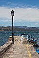
- Nomination Anchor, port of O Carril, Vilagarcía de Arousa, Galicia, Spain--Lmbuga 16:08, 19 August 2011 (UTC)
- Promotion Support QI & Useful --Archaeodontosaurus 09:17, 20 August 2011 (UTC)
-

- Nomination Library of Galicia, City of the Culture of Galicia. Santiago de Compostela. Peter Eisenman--Lmbuga 16:08, 19 August 2011 (UTC)
- Promotion Support QI and Useful --Archaeodontosaurus 09:14, 20 August 2011 (UTC)
-

-
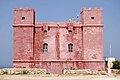
- Nomination St. Agatha's Tower (Red Tower), Malta. View from west. -- Felix Koenig 09:41, 19 August 2011 (UTC)
- Promotion Good quality. --Cayambe 00:33, 20 August 2011 (UTC)
-

-

- Nomination Plaque in Luxembourg City. --Cayambe 18:03, 19 August 2011 (UTC)
- Promotion Support QI & Useful --Archaeodontosaurus 10:45, 19 August 2011 (UTC)
-

-
- Nomination Kolomenskoe Museum, Moscow: Water mill. A.Savin 17:56, 18 August 2011 (UTC)
- Decline
 Oversaturated and underexposed. Color balance look unnatural -- George Chernilevsky 08:52, 20 August 2011 (UTC)
-
- Nomination River Ljusnan in Ljusnedal. --Ankara 08:35, 17 August 2011 (UTC)
- Promotion Nice, but the bridge is not perfectly horizontal. Slight clockwise tilt maybe ?--Jebulon 09:24, 17 August 2011 (UTC) Thank you. New version uploaded.--Ankara 10:57, 17 August 2011 (UTC)Good now, IMO.--Jebulon 08:14, 20 August 2011 (UTC)
-

- Nomination An old rusty plough.--Jebulon 23:37, 16 August 2011 (UTC)
- Promotion QI imo. Le géocode est là... mais je souhaite recommander de donner aussi la localité dans la description. --Cayambe 19:07, 18 August 2011 (UTC) Done, mais je ne saisis pas bien l'intérêt en l'espèce.--Jebulon 08:16, 20 August 2011 (UTC)
-

- Nomination The stone wall of an old farm in Dordogne, France.--Jebulon 21:39, 15 August 2011 (UTC)
- Promotion Technically very good Remi Mathis 17:08, 19 August 2011 (UTC)
-

-

- Nomination Elisabetta Soldini Montanaro by User:Riotforlife --Herzi Pinki 22:48, 13 August 2011 (UTC)
- Promotion Perhaps a bit oversaturated, but nevertheless QI to me. --Cayambe 17:46, 19 August 2011 (UTC)
-

-
- Nomination: Inside the North battery of the fort du Lomont. --ComputerHotline 16:56, 13 August 2011 (UTC)
- Review needed
-
- Nomination: Inside the North battery of the fort du Lomont. --ComputerHotline 16:56, 13 August 2011 (UTC)
- Review needed
-
- Nomination: Inside the North battery of the fort du Lomont. --ComputerHotline 16:56, 13 August 2011 (UTC)
- Review needed
-

-

-
-
- Nomination: Cityterminalen (Stockholm central bus station)--Ankara 23:05, 10 August 2011 (UTC)
- Review Comment this is a bus station?! Cool :-D The image is a bit ccw tilted and because of many white areas blinding, I think it would help if you would reduce the lights or darken the pic. Otherwise very interesting! --Carschten 15:02, 11 August 2011 (UTC) Thanks for your feedback. I have uploaded a new version, based on the JPG file. If necessary I can go back to the RAW file and try again.The bus terminal is inside the Stockholm World Trade Center, the entire complex was built in the 1980s above the railroad tracks next to Stockholm Central Station. To get permission to build the huge office building, they also had to build a bus terminal. Even if the building is not considered a real masterpiece, it has some architectural qualities. Both Ralph Erskine (EN/DE) and Anders Tengbom (DE) was involved in the project.--Ankara 16:32, 13 August 2011 (UTC)
-

- Nomination Plate. Spanish Inquisition. Ribadavia, Galicia, Spain: "In memory of the residents of this village condemned by the Inquisition for his beliefs four hundred years ago."--Lmbuga 04:59, 19 August 2011 (UTC)
- Promotion Good quality. --Taxiarchos228 07:26, 19 August 2011 (UTC)
-

- Nomination City of the Culture of Galicia. Santiago de Compostela. Peter Eisenman--Lmbuga 00:49, 19 August 2011 (UTC)
- Promotion Good quality. --Taxiarchos228 07:26, 19 August 2011 (UTC)
-
- Nomination City of the Culture of Galicia. Santiago de Compostela. Peter Eisenman--Lmbuga 00:49, 19 August 2011 (UTC)
- Promotion Good quality. --Taxiarchos228 07:26, 19 August 2011 (UTC)
-

- Nomination City of the Culture of Galicia. Santiago de Compostela. Peter Eisenman--Lmbuga 00:49, 19 August 2011 (UTC)
- Promotion Good quality. --Taxiarchos228 07:26, 19 August 2011 (UTC)
-

- Nomination City of the Culture of Galicia. Santiago de Compostela. Peter Eisenman--Lmbuga 00:49, 19 August 2011 (UTC)
- Promotion Good quality. --Taxiarchos228 07:26, 19 August 2011 (UTC)
-

-

- Nomination A little street in Montignac-sur-Vézère, Dordogne, France.--Jebulon 23:50, 18 August 2011 (UTC)
- Promotion Good quality. --Berthold Werner 09:55, 19 August 2011 (UTC)
-

- Nomination part of the ruins of the troglodyte medieval village of La Madeleine, in Dordogne, France.--Jebulon 23:35, 18 August 2011 (UTC)
- Promotion Good quality. --Berthold Werner 09:55, 19 August 2011 (UTC)
-

- Nomination Agave americana in bloom. Alvesgaspar 22:27, 18 August 2011 (UTC)
- Promotion Good quality. Bit tight on the right and file name could be more descriptive of content. --Elekhh 00:28, 19 August 2011 (UTC)
-

- Nomination The Sorcerer, rare magdalenian engraving of a man, ca.17.000 BP, fac-simile, Grotte du Roc de Saint-Cirq, Dordogne, France--Jebulon 22:13, 18 August 2011 (UTC)
- Promotion Support Good result for the shooting conditions difficult --Archaeodontosaurus 10:26, 19 August 2011 (UTC)
-

-

-
-

- Nomination Watermill in Fontaine-de-Vaucluse, France -- Remi Mathis 19:48, 18 August 2011 (UTC)
- Promotion Interesting and good quality. --Ximonic 23:45, 18 August 2011 (UTC)
-
- Nomination A russian «coulibiac». A.Savin 17:56, 18 August 2011 (UTC)
- Promotion There is nothing to claim. --High Contrast 10:04, 19 August 2011 (UTC)
-
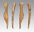
- Nomination female figure of reindeer bone, Magdalenian --Archaeodontosaurus 14:28, 18 August 2011 (UTC)
- Promotion Good quality, usefull and well described. --Coyau 16:02, 18 August 2011 (UTC)
-

- Nomination Jan Inghe-Hagströms square --Ankara 12:18, 18 August 2011 (UTC)
- Promotion Good quality. --Andrei Stroe 16:32, 18 August 2011 (UTC)
-
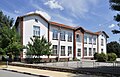
- Nomination School Hristo Botev primary section, Nova Zagora. --MrPanyGoff 12:11, 18 August 2011 (UTC)
- Promotion Good quality. --Andrei Stroe 16:32, 18 August 2011 (UTC)
-

- Nomination Dynastes hercules--Archaeodontosaurus 12:03, 18 August 2011 (UTC)
- Promotion Very good--Lmbuga 15:54, 18 August 2011 (UTC)
-
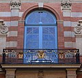
- Nomination Window of Salle des illustres in Capitole de Toulouse, and its balcony with heraldry. --PierreSelim 10:41, 18 August 2011 (UTC)
- Promotion A bit underexposed, but good enough for QI. Much better than previous.--Jebulon 13:47, 18 August 2011 (UTC)
-
-

- Nomination Library and Archive of Galicia. City of the Culture of Galicia. Santiago de Compostela. Peter Eisenman--Lmbuga 09:10, 18 August 2011 (UTC)
- Promotion Very good -- George Chernilevsky 19:19, 18 August 2011 (UTC)
-
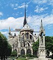
- Nomination Choir of Notre-Dame Cathedral, Paris. -- Alvesgaspar 22:49, 17 August 2011 (UTC)
very strange artefacts (pixels look like "stairs") at 100 % view, must be a development error because you make much more better pictures, otherwise good --Taxiarchos228 08:42, 18 August 2011 (UTC)
I see 2 dustsopts on the foreground pinacle. --Coyau 10:09, 18 August 2011 (UTC) -- Withdrawn. I will check what went wrong. Alvesgaspar 20:53, 18 August 2011 (UTC) - Withdrawn
- Nomination Choir of Notre-Dame Cathedral, Paris. -- Alvesgaspar 22:49, 17 August 2011 (UTC)
-

-
-

- Nomination Sculpture in the Saint James church of O Carril, Vilagarcía de Arousa, Galicia, Spain--Lmbuga 23:26, 16 August 2011 (UTC)
- Promotion Nice, but needs a better identification/description IMO--Jebulon 08:26, 17 August 2011 (UTC)
Geolocation. I don't know about saints. The next week I will go again to O Carril. I will speak with the neighbors about the sculptures. I have not found data on the author of the sculpture.--Lmbuga 14:42, 17 August 2011 (UTC)
QI for me -- George Chernilevsky 20:05, 18 August 2011 (UTC)
-
- Nomination Kraków: The Lord's Ark church, popes gallery --Taxiarchos228 07:25, 15 August 2011 (UTC)
- Promotion Good quality. --Cayambe 19:10, 18 August 2011 (UTC)
-

- Nomination General view of the village of Lissewege, Belgium -- MJJR 20:28, 14 August 2011 (UTC)
- Promotion Good quality. --Andrei Stroe 16:37, 18 August 2011 (UTC)
-

- Nomination View over Tadoussac from north --Taxiarchos228 16:07, 14 August 2011 (UTC)
- Promotion Good quality. --Andrei Stroe 16:37, 18 August 2011 (UTC)
-
- Nomination Kraków: House under the globe --Taxiarchos228 11:57, 14 August 2011 (UTC)
- Promotion Good quality.--Cayambe 19:13, 18 August 2011 (UTC)
-
- Nomination Kraków: The Lord's Ark church --Taxiarchos228 11:57, 14 August 2011 (UTC)
- Promotion Good quality.--Cayambe 19:13, 18 August 2011 (UTC)
-

- Nomination Popradské pleso and mountain hut, Tatra Mountains. --Podzemnik 11:40, 14 August 2011 (UTC)
- Promotion Good quality. --Andrei Stroe 16:38, 18 August 2011 (UTC)
-
- Nomination National nature reserve Studené doliny, Tatra Mountains. --Podzemnik 11:40, 14 August 2011 (UTC)
- Promotion Good quality. --Andrei Stroe 16:38, 18 August 2011 (UTC)
-

- Nomination: Goetheanum: western staircase --Taxiarchos228 10:25, 13 August 2011 (UTC)
- Review needed
-
- Nomination: Goetheanum: western staircase --Taxiarchos228 10:25, 13 August 2011 (UTC)
- Review needed
-

- Nomination: Šumava (Böhmerwald) - boundary "stone" between Czech Republic and Austria --Pudelek 17:22, 12 August 2011 (UTC)
- Review needed
-

- Nomination: Ljungris, August 2011. --Ankara 16:26, 12 August 2011 (UTC)
- Review needed
-
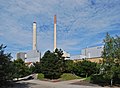
- Nomination: Pforzheim heating plant, Baden-Württemberg. -- Felix Koenig 15:49, 12 August 2011 (UTC)
- Review needed
-

-
- Nomination: The church of Saint Metropolitan Peter, Pereslavl --PereslavlFoto 14:39, 12 August 2011 (UTC)
- Review needed
-
- Nomination Germany, Göllheim, Dreisener Tor --Berthold Werner 11:52, 18 August 2011 (UTC)
- Promotion Good quality.--Ankara 11:56, 18 August 2011 (UTC)
-

- Nomination Cockles (Cerastoderma edule), fish market of O Carril, Vilagarcía de Arousa, Galicia, Spain --Lmbuga 09:07, 18 August 2011 (UTC)
- Promotion Good quality. --Taxiarchos228 09:10, 18 August 2011 (UTC)
-

- Nomination Library and Archive of Galicia. City of the Culture of Galicia. Santiago de Compostela. Peter Eisenman--Lmbuga 09:07, 18 August 2011 (UTC)
- Promotion Good quality. --Taxiarchos228 09:10, 18 August 2011 (UTC)
-

- Nomination Library and Archive of Galicia (detail). City of the Culture of Galicia. Santiago de Compostela. Peter Eisenman--Lmbuga 09:07, 18 August 2011 (UTC)
- Promotion Good quality. --Taxiarchos228 09:10, 18 August 2011 (UTC)
-

- Nomination Adam and Eve. Wayside cross, Saint James church of O Carril, Vilagarcía de Arousa, Galicia, Spain--Lmbuga 09:05, 18 August 2011 (UTC)
- Promotion Good quality. --Taxiarchos228 09:10, 18 August 2011 (UTC)
-

- Nomination Schwörstadt: Catholic Church, bell tower --Taxiarchos228 08:40, 18 August 2011 (UTC)
- Promotion QI for me, geolocalisation would be great. PierreSelim 08:53, 18 August 2011 (UTC)
-

- Nomination Dossenbach: Protestant Church, bell tower --Taxiarchos228 08:40, 18 August 2011 (UTC)
- Promotion Good quality--Lmbuga 08:59, 18 August 2011 (UTC)
-

- Nomination Schwörstadt: Protestant Church, bell tower --Taxiarchos228 08:40, 18 August 2011 (UTC)
- Promotion Good--Lmbuga 08:59, 18 August 2011 (UTC)
-

- Nomination Bell tower of Basilique Saint-Sernin in Toulouse, France. --PierreSelim 06:03, 18 August 2011 (UTC)
- Promotion very nice --Taxiarchos228 08:03, 18 August 2011 (UTC)
-

-

-

- Nomination Arc de Triomphe de l'Étoile, Paris -- Alvesgaspar 22:54, 17 August 2011 (UTC)
Dust spot on the very left edge, otherwise good. --Sfu 05:35, 18 August 2011 (UTC) - Promotion can not see the dust spot, but even with it QI --Taxiarchos228 09:08, 18 August 2011 (UTC)
- Nomination Arc de Triomphe de l'Étoile, Paris -- Alvesgaspar 22:54, 17 August 2011 (UTC)
-

- Nomination Northern door of the Dormition Cathedral in the Kremlin, Moscow -- Alvesgaspar 22:37, 17 August 2011 (UTC)
- Promotion Good--Lmbuga 09:03, 18 August 2011 (UTC)
-
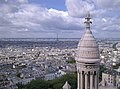
- Nomination View to southwest from the top of the Sacré-Coeur de Monmartre, Paris. -- Alvesgaspar 22:35, 17 August 2011 (UTC)
- Promotion Support QI for me --Archaeodontosaurus 05:31, 18 August 2011 (UTC)
-

- Nomination Saint James church of O Carril, Vilagarcía de Arousa, Galicia, Spain--Lmbuga 17:42, 17 August 2011 (UTC)
- Promotion Support QI for me --Archaeodontosaurus 05:31, 18 August 2011 (UTC)
-

- Nomination Prepona laertes - Both side of male specimen --Archaeodontosaurus 17:17, 17 August 2011 (UTC)
- Promotion Good quality--Lmbuga 17:36, 17 August 2011 (UTC)
-

-

- Nomination Bust of Secundino Garcia Ramos. O Carril, Vilagarcía de Arousa, Galicia--Lmbuga 14:59, 17 August 2011 (UTC)
- Promotion Very good -- George Chernilevsky 20:22, 17 August 2011 (UTC)
-

-
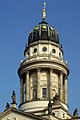
- Nomination Berlin, dome of the french cathdral --Berthold Werner 13:23, 17 August 2011 (UTC)
- Promotion QI for me--Lmbuga 15:02, 17 August 2011 (UTC)
-

- Nomination St. Petka church in Nova Zagora. --MrPanyGoff 12:03, 17 August 2011 (UTC)
- Promotion Good quality. --Taxiarchos228 13:22, 17 August 2011 (UTC)
-

- Nomination Gate of Collège de l'Esquile in Toulouse. --PierreSelim 09:15, 17 August 2011 (UTC)
- Decline The vertical lines of the left side aren't stright (distortion). Sorry, I don't like the composition, too tight at bottom--Lmbuga 15:05, 17 August 2011 (UTC)
-
- Nomination Goetheanum: English hall, supporting element --Taxiarchos228 07:14, 17 August 2011 (UTC)
- Promotion QI for me--Lmbuga 14:58, 17 August 2011 (UTC)
-

- Nomination High School Hristo Botev in Nova Zagora. --MrPanyGoff 11:38, 16 August 2011 (UTC)
tonality curve should be corrected --Taxiarchos228 11:51, 16 August 2011 (UTC)
What kind of correction is needed? Darks + or -? As a whole brightness +? Or what?--MrPanyGoff 11:39, 17 August 2011 (UTC)
picture is a little bit too dark and the red channel should be reduced --Taxiarchos228 11:45, 17 August 2011 (UTC)
The file is upgraded with some corrections. Hope this helps.--MrPanyGoff 12:14, 17 August 2011 (UTC) - Promotion Good quality now --Taxiarchos228 12:33, 17 August 2011 (UTC)
- Nomination High School Hristo Botev in Nova Zagora. --MrPanyGoff 11:38, 16 August 2011 (UTC)
-

- Nomination Fish market and crane, port of O Carril, Vilagarcía de Arousa, Galicia, Spain--Lmbuga 21:56, 15 August 2011 (UTC)
- Promotion OK -- George Chernilevsky 19:05, 17 August 2011 (UTC)
-

-

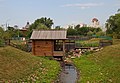
- Nomination A small river in Dordogne, France.--Jebulon 21:02, 15 August 2011 (UTC)
- Promotion Good -- George Chernilevsky 19:06, 17 August 2011 (UTC)
-

-

-

-

- Nomination Kringletjørn, Hordaland, Norway, in 2011 August --Ximonic 13:18, 15 August 2011 (UTC)
- Promotion Good -- George Chernilevsky 19:09, 17 August 2011 (UTC)
-

- Nomination Airbus A319. Airwolf 21:34, 14 August 2011 (UTC)
- Promotion Good -- George Chernilevsky 19:11, 17 August 2011 (UTC)
-
- Nomination Nightscape under the moonlight. --ComputerHotline 14:10, 14 August 2011 (UTC)
- Promotion Good quality. Please use more descriptive filenames in future, the date is not as relevant to this shot as the location or the subject. --99of9 04:36, 18 August 2011 (UTC)
-

- Nomination Lepiota clypeolaria --Holleday 09:35, 14 August 2011 (UTC)
- Promotion Support QI & Useful --Archaeodontosaurus 09:37, 18 August 2011 (UTC)
-

- Nomination Thelephora palmata --Holleday 09:02, 14 August 2011 (UTC)
- Promotion Support QI & Useful --Archaeodontosaurus 09:37, 18 August 2011 (UTC)
-

-

-

- Nomination: Germany, Bamberg, Altenburg --Berthold Werner 11:36, 12 August 2011 (UTC)
- Review needed
-

- Nomination: Summit of the Salbert hill under the moonlight, near Belfort, France. --ComputerHotline 09:28, 12 August 2011 (UTC)
- Review needed
-
- Nomination: Entry of the fort du Salbert, near Belfort, France. --ComputerHotline 09:28, 12 August 2011 (UTC)
- Review needed
-
- Nomination: French harbour transport Tibidy refitting in Concarneau harbour. -- Rama 21:04, 11 August 2011 (UTC)
- Review needed
-

- Nomination: detail of Goetheanum --Taxiarchos228 19:39, 11 August 2011 (UTC)
- Review needed
-

- Nomination: Goetheanum: western staircase, handrail --Taxiarchos228 19:39, 11 August 2011 (UTC)
- Review needed
-

- Nomination: Social Housing in Miélan, Gers, France --Florent Pécassou 18:06, 11 August 2011 (UTC)
- Review needed
-

- Nomination: Dome of hospital Saint-Joseph de la Grave in Toulouse after Sunset. --PierreSelim 17:23, 11 August 2011 (UTC)
- Review needed
-

- Nomination: A Saudi Hawk . --Airwolf 17:03, 11 August 2011 (UTC)
- Review needed
-

- Nomination: Pilatus P-3-05. --Airwolf 17:03, 11 August 2011 (UTC)
- Review needed
-

- Nomination: The training ship Lion of the French national Navy. -- Rama 17:00, 11 August 2011 (UTC)
- Review needed
-

- Nomination: Concrete tree stump in the parc des Buttes-Chaumont, Paris. --Coyau 16:55, 11 August 2011 (UTC)
- Review needed
-

- Nomination: Šumava (Böhmerwald) - border stone --Pudelek 16:53, 11 August 2011 (UTC)
- Review needed
-
- Nomination: Grottoe in the parc des Buttes-Chaumont, Paris. --Coyau 15:16, 11 August 2011 (UTC)
- Review needed
-

- Nomination: Hallenhaus on the spoil tip Halde Norddeutschland --Carschten 12:52, 11 August 2011 (UTC)
- Review needed
-
- Nomination: Ruin near the fort du Salbert under the moonlight. --ComputerHotline 12:42, 11 August 2011 (UTC)
- Review needed
-

- Nomination: Ruin near the fort du Salbert under the moonlight. --ComputerHotline 12:42, 11 August 2011 (UTC)
- Review needed
-
- Nomination: Summit of the Salbert hill under the moonlight. --ComputerHotline 12:42, 11 August 2011 (UTC)
- Review needed
-

- Nomination: Timber framed houses in Miélan, Gers, France --Florent Pécassou 12:28, 11 August 2011 (UTC)
- Review needed
-

- Nomination: Ram corbel, Miélan, Gers, France --Florent Pécassou 12:13, 11 August 2011 (UTC)
- Review needed
-

- Nomination Dreisesselberg (Třístoličník) - Hochstein peak --Pudelek 14:45, 9 August 2011 (UTC)
- Promotion Support a little underexposed, but interesting picture --Archaeodontosaurus 05:36, 18 August 2011 (UTC)
-

- Nomination Goetheanum: foyer --Taxiarchos228 07:14, 17 August 2011 (UTC)
- Promotion OK - A.Savin 07:26, 17 August 2011 (UTC)
-

- Nomination Goetheanum: Great hall --Taxiarchos228 07:14, 17 August 2011 (UTC)
- Promotion Good quality.--Ankara 08:37, 17 August 2011 (UTC)
-
- Nomination Brodbeck House --Taxiarchos228 07:14, 17 August 2011 (UTC)
- Promotion good quality; ça me plaît beaucoup -- M 93 10:19, 17 August 2011 (UTC)
-

- Nomination Playing in the breaking waves. Porto Covo, Portugal -- Alvesgaspar 23:56, 16 August 2011 (UTC)
- Promotion Good quality. --Taxiarchos228 07:15, 17 August 2011 (UTC)
-

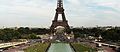
- Nomination Tour Eiffel, view from the Trocadero -- Alvesgaspar 23:40, 16 August 2011 (UTC)
- Promotion Good quality. --Taxiarchos228 06:08, 17 August 2011 (UTC)
-

- Nomination Tower of Saint James church of O Carril, Vilagarcía de Arousa, Galicia, Spain--Lmbuga 23:33, 16 August 2011 (UTC)
- Promotion Good quality. --Taxiarchos228 06:08, 17 August 2011 (UTC)
-

- Nomination Saint James church of O Carril, Vilagarcía de Arousa, Galicia, Spain--Lmbuga 23:31, 16 August 2011 (UTC)
- Withdrawn Tilted or distortion to me--Lmbuga 00:50, 17 August 2011 (UTC)
-

- Nomination Sculpture of Jesus in the Saint James church of O Carril, Vilagarcía de Arousa, Galicia, Spain--Lmbuga 23:29, 16 August 2011 (UTC)
- Promotion Good quality. --Taxiarchos228 06:08, 17 August 2011 (UTC)
-

-

-

- Nomination Belgian electric multiple unit #196 -- MJJR 21:45, 16 August 2011 (UTC)
- Promotion Good quality. --Taxiarchos228 07:16, 17 August 2011 (UTC)
-

- Nomination The Bonne Chiere windmill in Bruges, Belgium -- MJJR 21:08, 16 August 2011 (UTC)
- Promotion Good quality. --Taxiarchos228 07:16, 17 August 2011 (UTC)
-

-

- Nomination Amputation plates, surgical instrument --Orem 20:24, 16 August 2011 (UTC)
- Promotion Good quality. --Taxiarchos228 08:32, 17 August 2011 (UTC)
-

- Nomination Scheme of Sengstaken-Blakemore tube --Orem 20:24, 16 August 2011 (UTC)
- Promotion Good quality. --Taxiarchos228 08:32, 17 August 2011 (UTC)
-

- Nomination Gigli surgical saw --Orem 20:24, 16 August 2011 (UTC)
- Promotion Good quality. --Taxiarchos228 08:32, 17 August 2011 (UTC)
-

- Nomination Euphaedra (Xypetana) xypete Both side of female --Archaeodontosaurus 15:37, 16 August 2011 (UTC)
- Promotion Very good making and QI for me--Holleday 16:03, 16 August 2011 (UTC)
-
- Nomination Street sign at Priozerny street, Kriushkino village, Pereslavl district. --PereslavlFoto 15:13, 16 August 2011 (UTC)
- Promotion Good quality. --Taxiarchos228 20:02, 16 August 2011 (UTC)
-
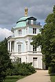
- Nomination The Belvedere in the park of Charlottenburg Palace --Llez 14:03, 16 August 2011 (UTC)
- Promotion Support QI for me --Archaeodontosaurus 15:42, 16 August 2011 (UTC)
-

- Nomination Berlin, french cathedral --Berthold Werner 13:02, 16 August 2011 (UTC)
- Promotion Dark foreground and not extremely sharp, but illustrative, and overall a good photo.--Ankara 09:09, 17 August 2011 (UTC)
-

- Nomination Lörrach-Brombach: Germans Church from West --Taxiarchos228 09:47, 16 August 2011 (UTC)
- Promotion Very good quality.--Ankara 09:09, 17 August 2011 (UTC)
-

- Nomination Composition with Optimists in foreground of the Tour de la Lanterne in La Rochelle, France.--Jebulon 20:43, 15 August 2011 (UTC)
- Promotion Ok (maybe some sharpening?)--Ankara 08:48, 17 August 2011 (UTC)Thank you. You mean To much, or need of sharpening ?--Jebulon 10:03, 17 August 2011 (UTC) "Need of". I'm sorry if I was unclear.--Ankara 10:11, 17 August 2011 (UTC)
-
- Nomination Javelin head from Magdalenian --Archaeodontosaurus 14:22, 15 August 2011 (UTC)
- Promotion Very good, interesting and useful --Jebulon 10:06, 17 August 2011 (UTC)
-
- Nomination Kraków: The Lord's Ark church, bells --Taxiarchos228 07:25, 15 August 2011 (UTC)
- Promotion Support QI for me --Archaeodontosaurus 15:45, 16 August 2011 (UTC)
-

-

- Nomination Dodecatheon pulchellum (Dark-throated Shooting Star), flower --Wsiegmund 18:50, 14 August 2011 (UTC)
- Promotion Comment The background is too noisy for me. Several dust spots (>2): See 2 notes (you can delete it when you want)--Lmbuga 11:36, 15 August 2011 (UTC)
Thanks Done --Wsiegmund 03:20, 16 August 2011 (UTC)
QI for me--Lmbuga 22:12, 16 August 2011 (UTC)
-

-

- Nomination Catholic tabernacle of the Collegiate church of Santa Maria de Sar, Santiago de Compostela--Lmbuga 21:50, 8 August 2011 (UTC)
- Promotion Support QI for me --Archaeodontosaurus 15:49, 16 August 2011 (UTC)
-
- Nomination detail of Goetheanum showing corrosion of steel reinforcements in concrete --Taxiarchos228 06:25, 6 August 2011 (UTC)
- Decline CommentThe technical quality is fine but I don't like the bottom crop. --Ankara 06:28, 10 August 2011 (UTC) The unfortunate bottom crop ruins the composition IMO--Jebulon 08:43, 17 August 2011 (UTC)
-

- Nomination Hechingen: Collegiate Church, fresco --Taxiarchos228 07:15, 2 August 2011 (UTC)
- Decline Comment Could you increase an exposure, fix a barrel distortion, and rotate it a little bit? —ViseMoD 14:01, 9 August 2011 (UTC) Per above. And this kind of picture needs symmetry IMO.--Jebulon 08:41, 17 August 2011 (UTC)
-

- Nomination Ljusnedal Church. --Ankara 09:49, 16 August 2011 (UTC)
- Promotion Good quality. --Taxiarchos228 09:54, 16 August 2011 (UTC)
-

- Nomination Shell of a Giant Sundial, Architectonica maxima --Llez 05:31, 16 August 2011 (UTC)
- Promotion Good quality. --Taxiarchos228 09:54, 16 August 2011 (UTC)
-
-
-

- Nomination Church of St.Blessed Xenia of Petersburg in Vinnytsya. The Southern Bug river bank. -- George Chernilevsky 20:38, 15 August 2011 (UTC)
- Promotion Good.--Jebulon 21:24, 15 August 2011 (UTC)
-

- Nomination Tour Saint-Nicolas, old harbor of La Rochelle, France.--Jebulon 19:55, 15 August 2011 (UTC)
- Promotion Good quality. --Berthold Werner 06:11, 16 August 2011 (UTC)
-

-

-

-

- Nomination Dormition of the Theotokos Church in Nova Zagora. --MrPanyGoff 12:23, 15 August 2011 (UTC)
- Promotion Good quality. --Taxiarchos228 06:14, 16 August 2011 (UTC)
-
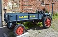
- Nomination Vintage Lanz Alldog tractor. --High Contrast 09:22, 15 August 2011 (UTC)
- Promotion Good quality. --Berthold Werner 17:12, 15 August 2011 (UTC)
-

- Nomination Spinning top --Berthold Werner 07:42, 15 August 2011 (UTC)
- Promotion Comment Good; but 2 spots see note --Archaeodontosaurus 14:26, 15 August 2011 (UTC)
Ok, dustspots removed. --Berthold Werner 17:00, 15 August 2011 (UTC) Support QI for me --Archaeodontosaurus 07:19, 16 August 2011 (UTC)
-

- Nomination A hand holding a hoopoe. --Tomer T 22:22, 14 August 2011 (UTC)
- Decline The hand partially obstructs the bird. The fabric pattern is distracting. The eye is closed and bill is damaged. Compare this image to File:Botbotik.jpg. --Wsiegmund 03:45, 16 August 2011 (UTC)
-

- Nomination Paxillus involutus --Holleday 14:11, 14 August 2011 (UTC)
- Promotion Support QI & Usefull --Archaeodontosaurus 14:29, 15 August 2011 (UTC)
-

- Nomination Boletus luridus --Holleday 10:05, 14 August 2011 (UTC)
- Promotion Support QI & Useful --Archaeodontosaurus 14:31, 15 August 2011 (UTC)
-

- Nomination Ria of Muros. Beach of Boa Grande, Redondelo, Boa, Noia, Galicia, Spain--Lmbuga 21:29, 12 August 2011 (UTC)
- Promotion CommentToo much water IMO, crop? --Ankara 21:30, 13 August 2011 (UTC)
Thanks Done--Lmbuga 01:26, 15 August 2011 (UTC) Thanks. Better now IMO. --Ankara 09:19, 16 August 2011 (UTC)
-

- Nomination Epitaph of Napoleon I behind the altar in Saint-Louis-des-Invalides church, Paris. --NonOmnisMoriar 20:55, 11 August 2011 (UTC)
- Decline I like this extrem angle but the picture is very noisy --Taxiarchos228 08:16, 12 August 2011 (UTC) Nice comp, but too much noise (1600 ISO...)--Jebulon 18:08, 15 August 2011 (UTC)
-

- Nomination Goetheanum: south terrace --Taxiarchos228 19:39, 11 August 2011 (UTC)
- Promotion good quality -- 320td 14:52, 15 August 2011 (UTC)
-
- Nomination Timber framing on Hofgut Mauer, Germany --Harke 18:44, 11 August 2011 (UTC)
- Promotion Comment rechts bitte noch das Fitzel Auto wegschneiden, dann ist es ohne Frage in QI --Carschten 20:28, 11 August 2011 (UTC) erledigt --Harke 20:04, 12 August 2011 (UTC) good! -- 320td 14:48, 15 August 2011 (UTC)
-

-

-

-

- Nomination Germany, Bamberg, Altenburg --Berthold Werner 12:40, 11 August 2011 (UTC)
- Promotion Good quality enough. --Coyau 18:02, 15 August 2011 (UTC)
-

- Nomination: Germany, Prichsenstadt, Schulinstraße 7 --Berthold Werner 08:32, 10 August 2011 (UTC)
- Review needed
-

- Nomination: Gresgen: Protestant Church, pulpit --Taxiarchos228 08:32, 10 August 2011 (UTC)
- Review needed
-

- Nomination: Gresgen: Protestant Church, altar --Taxiarchos228 08:32, 10 August 2011 (UTC)
- Review needed
-
- Nomination: Hechingen: Minster Saint Luzen, vault --Taxiarchos228 08:32, 10 August 2011 (UTC)
- Review needed
-

- Nomination: Town hall in Düsseldorf --Carschten 22:22, 9 August 2011 (UTC)
- Review needed
-

- Nomination: Schliengen: Saint Leodegar Church, main portal --Taxiarchos228 20:28, 9 August 2011 (UTC)
- Review needed
-
- Nomination: Gresgen: Protestant Church, pipe organ --Taxiarchos228 20:23, 9 August 2011 (UTC)
- Review needed
-

- Nomination: Mountain hostel Berggasthof Dreisessel, Dreisesselberg/Třístoličník , Bavaria/Czech Republic --Pudelek 14:45, 9 August 2011 (UTC)
- Review needed
-

- Nomination: Mountain hostel Berggasthof Dreisessel, Dreisesselberg/Třístoličník , Bavaria/Czech Republic --Pudelek 14:45, 9 August 2011 (UTC)
- Review needed
-

-

- Nomination: F-16 Demo, corrected and renominated. --Airwolf 12:55, 9 August 2011 (UTC)
- Review needed
-

- Nomination: Allébron, July 2011. --Ankara 12:12, 9 August 2011 (UTC)
- Review needed
-
- Nomination Panoramic view of the village of Zwankendamme (Bruges, Belgium) -- MJJR 21:25, 7 August 2011 (UTC)
- Promotion Nice contrast but the sky looks a little bit strange / violet --Mbdortmund 01:25, 8 August 2011 (UTC) Comment The picture was taken with 200 mm tele lens. As the result was rather hazy, contrast has been increased. Maybe is this the explanation for the color of the sky? -- MJJR 18:24, 9 August 2011 (UTC) Done Color corrected -- MJJR 14:30, 12 August 2011 (UTC) Good and illustrative. QI.--Jebulon 17:59, 15 August 2011 (UTC)
-
- Nomination Apollo Sauroktonos. Roman sculpture in marble. --M0tty 20:43, 7 August 2011 (UTC)
- Decline Comment Composition is really good, but strong CA around the eyes. --Mbdortmund 01:23, 8 August 2011 (UTC) Not sharp, masking not so good. Sorry--Jebulon 17:57, 15 August 2011 (UTC)
-

- Nomination Weissenburg.Small court at city wall --Vitold Muratov 22:00, 28 July 2011 (UTC)
- Promotion
 Question Can you delete the lens artefact in the top right corner? Gzzz 21:15, 2 August 2011 (UTC)
Done Thanks for reviewing. Corrections done.-- Vitold Muratov 08:00, 8 August 2011 (UTC)
Well, QI to me. -Gzzz 19:26, 15 August 2011 (UTC)
-

- Nomination The town hall of Grötzingen (part of Karlsruhe since 1974), Baden-Württemberg. -- Felix Koenig 09:09, 15 August 2011 (UTC)
- Promotion Good quality. --Taxiarchos228 09:10, 15 August 2011 (UTC)
-

- Nomination ACF Green Building, Melbourne --Elekhh 07:47, 15 August 2011 (UTC)
- Promotion Good quality. --Taxiarchos228 08:12, 15 August 2011 (UTC)
-
- Nomination Kraków: The Lord's Ark church, spire --Taxiarchos228 07:25, 15 August 2011 (UTC)
- Promotion QI for me--Lmbuga 10:21, 15 August 2011 (UTC)
-

- Nomination An Ordovician Nautilid, Estonioceras ariense --Llez 05:22, 15 August 2011 (UTC)
- Promotion Good quality. --Taxiarchos228 07:26, 15 August 2011 (UTC)
-

- Nomination Ruditapes philippinarum, O Carril, Vilagarcía de Arousa, Galicia, Spain--Lmbuga 02:39, 15 August 2011 (UTC)
- Promotion Good quality. --Taxiarchos228 07:26, 15 August 2011 (UTC)
-

- Nomination Beach of Portugalete and Compostela beach, O Carril, Vilagarcía de Arousa--Lmbuga 01:50, 15 August 2011 (UTC)
- Promotion Good quality. --Taxiarchos228 07:26, 15 August 2011 (UTC)
-

- Nomination Boat. Beach of Portugalete, O Carril, Vilagarcía de Arousa--Lmbuga 01:49, 15 August 2011 (UTC)
- Promotion Good quality. --Taxiarchos228 07:26, 15 August 2011 (UTC)
-

- Nomination Land Rover Defender station wagon --High Contrast 00:33, 15 August 2011 (UTC)
- Promotion Good quality. --Taxiarchos228 07:27, 15 August 2011 (UTC)
-

- Nomination Panoramic view of Blois as viewed from the south-east on the far side of the Loire River.Photographed by User:Diliff --Taxiarchos228 16:25, 14 August 2011 (UTC)
- Promotion Very nice. (I see some maybe-a-little-tilted vertical edges though, but otherwise very good) --Ximonic 18:23, 14 August 2011 (UTC) Or now when I look it again, I'm not sure, heh. I thought I saw some on the right side at some buildings or the bridge. Nothing too obvious probably. --Ximonic 18:29, 14 August 2011 (UTC)
-

- Nomination Panoramic view of the Loire River at Amboise, France. Photographed by User:Diliff --Taxiarchos228 16:25, 14 August 2011 (UTC)
- Promotion Same doubts as Ximonic about the next picture, but excellent work anyway: absolutely QI. -- MJJR 20:40, 14 August 2011 (UTC)
-

- Nomination A 360-degree panorama of New Richmond, Indiana. Huwmanbeing 15:10, 14 August 2011 (UTC)
- Decline Impressive. However, there are stitching errors at the red car in the centre and from the roof of the right-most car upward. You may be able to exclude the moving cars from one of the picture elements with your stitching software. There's some CA which could be removed from each element prior to stitching. The bright clouds look a wee bit like they've been recovered and lack detail but I imagine it must be very difficult with a 360. The verticals on the buildings are all out a bit -- is this something you can fix? --Colin 18:55, 14 August 2011 (UTC)
-
-

-

- Nomination ISS fly-by under the moonlight. --ComputerHotline 14:10, 14 August 2011 (UTC)
- Promotion Nice --Ximonic 18:23, 14 August 2011 (UTC)
-

- Nomination KKO house in Kraków --Taxiarchos228 11:57, 14 August 2011 (UTC)
- Promotion Well captured. --Elekhh 07:50, 15 August 2011 (UTC)
-
- Nomination Barbakan in Kraków --Taxiarchos228 11:57, 14 August 2011 (UTC)
- Promotion QI for me--Lmbuga 01:38, 15 August 2011 (UTC)
-

- Nomination Stolarska Tower in Kraków --Taxiarchos228 11:57, 14 August 2011 (UTC)
- Promotion Good quality for me--Lmbuga 01:35, 15 August 2011 (UTC)
-

-

-

- Nomination Coffee grinder from Zassenhaus --Berthold Werner 07:23, 14 August 2011 (UTC)
- Promotion QI for me--Lmbuga 01:23, 15 August 2011 (UTC)
-

-
-
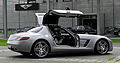
-

- Nomination Mercedes-Benz SLS AMG (C 197). -- M 93 22:13, 13 August 2011 (UTC)
- Promotion Good quality. --Taxiarchos228 16:17, 14 August 2011 (UTC)
-

-

-
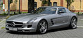
- Nomination Mercedes-Benz SLS AMG (C 197). -- M 93 22:13, 13 August 2011 (UTC)
- Promotion Good quality. --Taxiarchos228 16:17, 14 August 2011 (UTC)
-

-
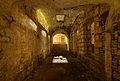
- Nomination Inside the North battery of the fort du Lomont. --ComputerHotline 16:56, 13 August 2011 (UTC)
- Promotion Nice! --Ximonic 18:35, 14 August 2011 (UTC)
-

- Nomination Inside the North battery of the fort du Lomont. --ComputerHotline 16:56, 13 August 2011 (UTC)
- Promotion Good quality and also interesting to me. --Ximonic 18:35, 14 August 2011 (UTC)
-

- Nomination Inside the North battery of the fort du Lomont. --ComputerHotline 16:56, 13 August 2011 (UTC)
- Promotion QI for me--Lmbuga 01:44, 15 August 2011 (UTC)
-
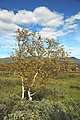
- Nomination Betula pubescens in Ljungdalen August 2011. --Ankara 15:44, 13 August 2011 (UTC)
- Promotion The white fringes probably strengthened by sharpening could be fixed in photoshop (if you just have). Using some darkening brush with the sky color would most probably do the trick. Yet good otherwise in my opinion. --Ximonic 18:41, 14 August 2011 (UTC)
-

-

-

-
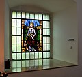
- Nomination Hechingen: Collegiate Church, window in side chapel --Taxiarchos228 08:32, 10 August 2011 (UTC)
- Promotion QI for me--Lmbuga 10:34, 15 August 2011 (UTC)
-

- Nomination: Startrails taken near Seloncourt, France. --ComputerHotline 09:39, 9 August 2011 (UTC)
- Review needed
-
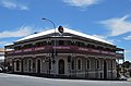
- Nomination: Grand Hotel in Millicent, South Australia. --Mattinbgn 22:30, 8 August 2011 (UTC)
- Review needed
-
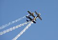
- Nomination: The Flying Bulls. --Airwolf 21:23, 8 August 2011 (UTC)
- Review needed
-

- Nomination: Osaka City view --663highland 15:56, 7 August 2011 (UTC)
- Review Tiled to the left, otherwise quite noisy, but acceptable IMO. --Sfu 20:35, 8 August 2011 (UTC)
-
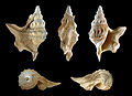
-

-

-

-
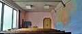
- Nomination Goetheanum: English hall --Taxiarchos228 10:25, 13 August 2011 (UTC)
- Promotion Good quality. Good composition for me--Lmbuga 00:12, 14 August 2011 (UTC)
-
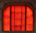
- Nomination Goetheanum: Red window --Taxiarchos228 10:25, 13 August 2011 (UTC)
- Promotion Good quality. --Carschten 13:40, 13 August 2011 (UTC)
-
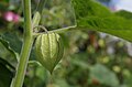
- Nomination Physalis peruviana, --Bartiebert 09:11, 13 August 2011 (UTC)
- Decline From a technical point of view, the dof is a little low and the lighting not optimal leaving half the calyx in shadow. From an aesthetical point of view, the lighting is actually interesting, but the pink spot in the background disturbing. --Quartl 08:33, 14 August 2011 (UTC)
-

-

-

-
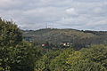
-

- Nomination Coffe grinder from KYM, about 1940 --Berthold Werner 07:19, 13 August 2011 (UTC)
- Promotion Good quality--Lmbuga 07:36, 13 August 2011 (UTC)
-

-
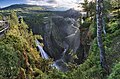
- Nomination Måbødalen, Hordaland, Norway, in 2011 August --Ximonic 23:02, 12 August 2011 (UTC)
- Promotion It looks like a fake or some weird panorama, but it's for real. Interesting and fascinating, and good use of wide angle. If I had the money, I would buy a large format camera and buy a ticket to Norway.--Ankara 21:38, 13 August 2011 (UTC) Comment Yup, I have to say this scene is quite difficult to capture as a whole. The landscape spreads wide around so a wide angle lens would be useful. The lighting kind of required the use of multiple exposures in every part. Considering the circumstances, I'm quite satisfied with this. (It's also quite dangerous to play near the insecure cliff edges.) --Ximonic 09:21, 14 August 2011 (UTC)
-

-

-
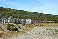
-
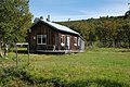
-

- Nomination Wicker basket in museum. --PereslavlFoto 14:39, 12 August 2011 (UTC)
- Promotion for me QI in all creterias --J. Lunau 21:01, 12 August 2011 (UTC)
-

- Nomination Woodcarved beggar 1900 by Rudolf Moroder. --moroder --Moroder 10:15, 12 August 2011 (UTC)09:28, 12 August 2011 (UTC)
- Decline Shadows are too dark --Berthold Werner 08:11, 14 August 2011 (UTC)
-

- Nomination Goetheanum: western staircase, portal to terrace --Taxiarchos228 08:27, 12 August 2011 (UTC)
- Promotion Good.--Ankara 16:52, 12 August 2011 (UTC)
-
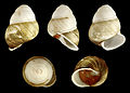
-

- Nomination Inkstain Bolete (Boletus pulverulentus). Ukraine -- George Chernilevsky 20:18, 11 August 2011 (UTC)
- Promotion Support QI & Useful --Archaeodontosaurus 14:12, 12 August 2011 (UTC)
-

-

-
![* Nomination Eunica mygdoni from Bolivia --Archaeodontosaurus 08:29, 11 August 2011 (UTC) * Promotion Comment The colors look strange, even for a pinned specimen, compare [1], [2]. --Quartl 16:10, 11 August 2011 (UTC) I confirm the proper color temperature. Specimen that is not old, acquired by the museum 4 years ago. Never exposed (not bleached). --Archaeodontosaurus 14:27, 12 August 2011 (UTC) Okay to me then. --Quartl 15:37, 12 August 2011 (UTC)](https://upload.wikimedia.org/wikipedia/commons/thumb/1/1e/Eunica_mygdonia_MHNT_ventre.jpg/120px-Eunica_mygdonia_MHNT_ventre.jpg)
- Nomination Eunica mygdoni from Bolivia --Archaeodontosaurus 08:29, 11 August 2011 (UTC)
- Promotion Comment The colors look strange, even for a pinned specimen, compare [1], [2]. --Quartl 16:10, 11 August 2011 (UTC)
I confirm the proper color temperature. Specimen that is not old, acquired by the museum 4 years ago. Never exposed (not bleached). --Archaeodontosaurus 14:27, 12 August 2011 (UTC)
Okay to me then. --Quartl 15:37, 12 August 2011 (UTC)
-

- Nomination The hospital Saint-Joseph de la Grave in Toulouse by night. --PierreSelim 23:33, 8 August 2011 (UTC)
- Promotion I am not entirely convinced about the composition but I think the quality is sufficient for Qi. --Ankara 15:35, 9 August 2011 (UTC)
CommentGeolocation would be welcome --Archaeodontosaurus 08:35, 11 August 2011 (UTC) Comment it's Done --PierreSelim 17:28, 12 August 2011 (UTC)
-
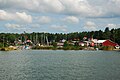
- Nomination: Husholmen, Resarö --Ankara 07:19, 8 August 2011 (UTC)
- Review needed
-

- Nomination: Normalized pavement texture. --M0tty 20:43, 7 August 2011 (UTC)
- Review needed
-
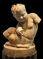
- Nomination: Roman sculpture, Children in marble. --M0tty 20:43, 7 August 2011 (UTC)
- Review needed
-
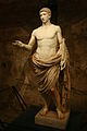
- Nomination: Statue of a youth, semi-nude, in heroic pose. --M0tty 20:46, 7 August 2011 (UTC)
- Review needed
-
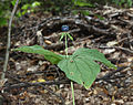
- Nomination Herb Paris, True-lover's Knot -- George Chernilevsky 19:56, 7 August 2011 (UTC)
- Promotion QI for me--Lmbuga 03:58, 13 August 2011 (UTC)
-

- Nomination: A set of Marcolini's Macarons. --M0tty 13:10, 7 August 2011 (UTC)
- Review needed
-

- Nomination: detail of Goetheanum (roof) --Taxiarchos228 12:22, 7 August 2011 (UTC)
- Review needed
-

- Nomination Newly created park in Bavaria --High Contrast 23:24, 6 August 2011 (UTC)
- Decline I think this picture is wrongly focused. The focus seems to be on the waterline in front rendering the main subject, the park, oof. In addition the right part of the image is leaning inwards. --Quartl 08:01, 14 August 2011 (UTC)
-
- Nomination: City museum of Güstrow, Mecklenburg-Vorpommern. -- Felix Koenig 15:56, 6 August 2011 (UTC)
- Review needed
-

- Nomination: Eastern pier of the Duisburg-Neuenkamp Bridge --Carschten 13:03, 5 August 2011 (UTC)
- Review the bridge pictures look oversaturated to me --Taxiarchos228 08:02, 8 August 2011 (UTC)
-

- Nomination Amphora neck from Brindisi. Mid-1st century BCE. Common ceramic. Musée des docks romains. Found at the shipwreck site of Planier III by J. Gelindo. -- Rama 09:44, 5 August 2011 (UTC)
- Promotion Support QI & Useful --Archaeodontosaurus 05:39, 13 August 2011 (UTC)
-
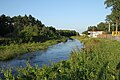
- Nomination River Czarna in Marki, Poland. Other white balance. --Crusier 12:19, 3 August 2011 (UTC)
- Decline Comment Not sharp. --PereslavlFoto 15:28, 9 August 2011 (UTC) Not sharp. --Quartl 05:38, 14 August 2011 (UTC)
-
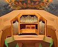
- Nomination Goetheanum: pipe organ with gallery --Taxiarchos228 08:27, 12 August 2011 (UTC)
- Promotion Good quality, very nice colors. --Carschten 11:47, 12 August 2011 (UTC)
-

- Nomination Goetheanum: Great hall and part of the fresco --Taxiarchos228 08:27, 12 August 2011 (UTC)
- Promotion der Beschnitt unten sagt mir nicht sonderlich zu, aber die Farben sind super, die Qualität sehr gut und außerdem finde ich den Flügel optimal eingebaut, denn durch diesen bekommt einen sehr guten Eindruck von Größe des Raumes! --Carschten 11:47, 12 August 2011 (UTC)
-

- Nomination Goetheanum: Remaining newel of first Goetheanum --Taxiarchos228 08:27, 12 August 2011 (UTC)
- Promotion Good quality. --Carschten 11:47, 12 August 2011 (UTC)
-

- Nomination Head shot of a black duck --Letartean 23:41, 11 August 2011 (UTC)
- Promotion Not sure about the composition (we can see a part of the back of the duck), however it looks like a QI for me. PierreSelim 00:28, 12 August 2011 (UTC)
-

- Nomination Another headshot of a black duck --Letartean 23:41, 11 August 2011 (UTC)
- Promotion QI for me (same remark for the composition). PierreSelim 00:28, 12 August 2011 (UTC)
-

- Nomination Modernist apartment building (1936) in Tel Aviv. --Elekhh 23:24, 11 August 2011 (UTC)
- Promotion Good quality. --Taxiarchos228 08:16, 12 August 2011 (UTC)
-
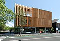
-

-

- Nomination The Blusher (Amanita rubescens). Ukraine -- George Chernilevsky 20:18, 11 August 2011 (UTC)
- Promotion QI, although with a crop at top it would be better --Carschten 20:28, 11 August 2011 (UTC)
-

- Nomination Goetheanum: suite in southern wing --Taxiarchos228 19:39, 11 August 2011 (UTC)
- Promotion Good quality for me--Lmbuga 08:59, 12 August 2011 (UTC)
-
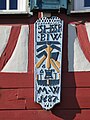
-
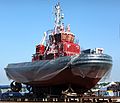
-
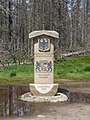
-
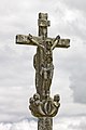
- Nomination Wayside cross in Laraño, Santiago de Compostela--Lmbuga 14:03, 11 August 2011 (UTC)
- Promotion Good quality. --Taxiarchos228 14:20, 11 August 2011 (UTC)
-

- Nomination Building next to the Aachen Cathedral at Katschhof square --Carschten 12:52, 11 August 2011 (UTC)
- Promotion Good quality. --Taxiarchos228 14:20, 11 August 2011 (UTC)
-

-

-

- Nomination look-out tower in Germany/Bavaria, picture done on request of German wikipedia - second run, photo sharpened as learnd from PereslavlFoto here --J. Lunau 17:02, 10 August 2011 (UTC)
- Promotion QI for me: clear, sharp, well-lit, geocoded, descripted, vivid.--PereslavlFoto 14:23, 11 August 2011 (UTC)
-
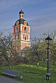
- Nomination Bell-tower in Pereslavl museum, Russia. Evening shot. --PereslavlFoto 13:21, 10 August 2011 (UTC)
- WARNING: third template parameter added – please remove.
-

- Nomination Yamanakako Lake by TigrouMeow --Elekhh 08:49, 10 August 2011 (UTC)
- Promotion quality not very good, but composition and light are stunning IMO --Carschten 15:02, 11 August 2011 (UTC)
-

- Nomination Hechingen: Collegiate Church, window in side chapel --Taxiarchos228 08:32, 10 August 2011 (UTC)
- Promotion QI --Carschten 15:02, 11 August 2011 (UTC)
-

- Nomination Wayside cross in Laraño. Santiago de Compostela--Lmbuga 08:20, 9 August 2011 (UTC)
- Withdrawn Comment sky a little bit overexposed at some parts (not disturbing to me), but the background is very, very distracting to me. Otherwise good quality, so I'm not sure if it can be QI --Carschten 14:16, 9 August 2011 (UTC)
New version less overexposed. I can't cut out the background --Lmbuga 23:04, 10 August 2011 (UTC).
Not QI. I will try it again with other image--Lmbuga 13:57, 11 August 2011 (UTC)
-
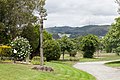
- Nomination Wayside cross and Pedroso mountain in Laraño. Santiago de Compostela--Lmbuga 08:19, 9 August 2011 (UTC)
- Promotion some overexposed areas, but very nice composition and very good quality --Carschten 14:11, 9 August 2011 (UTC)
New version, I think that it's better--Lmbuga 09:04, 12 August 2011 (UTC)
-

- Nomination Isidor church in Saint-Petersburg, former Russian capital. By A.Savin.--PereslavlFoto 20:36, 6 August 2011 (UTC)
- Promotion nice photo, very high saturation and sharpness but no CA, - I don't know the location, but I guess, the bit disturbing wires are unavoidable? --J. Lunau 15:54, 11 August 2011 (UTC)
-

- Nomination: Germany, Prichsenstadt, City tower --Berthold Werner 08:03, 6 August 2011 (UTC)
- Review needed
-

- Nomination Guy Novès, Rugby Union Coach, Toulouse, France PierreSelim 23:52, 5 August 2011 (UTC)
- Decline Blured face, disturbing background. —ViseMoD 19:22, 11 August 2011 (UTC)
-
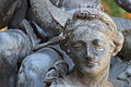
- Nomination: Détail of the Amphitrite fountain, place Stanislas, Nancy (France) Léna 21:54, 5 August 2011 (UTC)
- Review needed
-
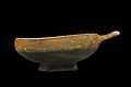
- Nomination: Cup, either Attic or imitation. Very late 5th or early 4th century BCE. Common ceramic. Musée des docks romains. Found at the shipwreck site of Plane II by M. Ouvrieu. -- Rama 19:17, 5 August 2011 (UTC)
- Review needed
-
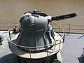
- Nomination: Forward AK-230 mount on finnish minelayer Keihässalmi. --Esquilo 15:28, 5 August 2011 (UTC)
- Review needed
-

- Nomination: Friedrich Ebert Bridge in Duisburg --Carschten 13:03, 5 August 2011 (UTC)
- Review needed
-

- Nomination: Karl Lehr Bridge in Duisburg --Carschten 13:03, 5 August 2011 (UTC)
- Review needed
-

- Nomination: Karl Lehr Bridge in Duisburg --Carschten 13:03, 5 August 2011 (UTC)
- Review needed
-

-

-
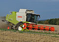
- Nomination Combine harvester at work. --Quartl 05:05, 11 August 2011 (UTC)
- Promotion Good quality. --Taxiarchos228 07:00, 11 August 2011 (UTC)
-

- Nomination Bench in the parc des Buttes-Chaumont, Paris. --Coyau 01:06, 11 August 2011 (UTC)
- Decline lacking sharpness --Taxiarchos228 07:00, 11 August 2011 (UTC)
-
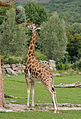
-

-

-

-

-

-

-

-

- Nomination Cornerstone in Miélan (Gers, France). --Florent Pécassou 17:03, 10 August 2011 (UTC)
- Promotion QI for me, in spite of chromatic aberrations (see edges of the shadow)--Lmbuga 07:56, 11 August 2011 (UTC)
-
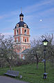
- Nomination Bell-tower in Pereslavl museum, Russia. Evening shot. --PereslavlFoto 13:21, 10 August 2011 (UTC)
- Promotion Good quality. --Raghith 07:39, 11 August 2011 (UTC)
-

-

- Nomination Blaue Brücke in Mülheim a.d. Ruhr --Carschten 12:28, 10 August 2011 (UTC)
- Promotion Good quality. --Andrei Stroe 12:30, 10 August 2011 (UTC)
-

- Nomination Castle Schloss Broich in Mülheim a.d. Ruhr --Carschten 12:28, 10 August 2011 (UTC)
- Promotion Good quality. --Andrei Stroe 12:30, 10 August 2011 (UTC)
-
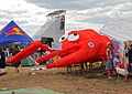
-

- Nomination Old ruin under the moonlight. --ComputerHotline 10:53, 10 August 2011 (UTC)
- Promotion Good quality. --Raghith 07:39, 11 August 2011 (UTC)
-
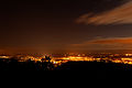
- Nomination City of Belfort, under the moonlight. --ComputerHotline 10:53, 10 August 2011 (UTC)
- Promotion Good quality. --Raghith 07:39, 11 August 2011 (UTC)
-

- Nomination Schliengen: Saint Leodegar Church, epitaph --Taxiarchos228 08:32, 10 August 2011 (UTC)
- Promotion QI for me--Lmbuga 08:08, 11 August 2011 (UTC)
-

-

- Nomination Polar panoramic from the top of Pico Sacro, in Boqueixón, Galicia, Spain. By User:Xosema--Lmbuga 09:26, 8 August 2011 (UTC)
- Promotion Good quality, very interesting --Tlusťa 08:52, 11 August 2011 (UTC)
-

- Nomination: Aphrodite with a dove, Eastern Greece. Mid-6th century BCE. Plastic terra cotta. Musée des docks romains. Found on site at the Roman docks, place Vivaux, Marseille. -- Rama 11:44, 5 August 2011 (UTC)
- Review needed
-

- Nomination: Goetheanum surroundings: door of memorial grove --Taxiarchos228 07:02, 5 August 2011 (UTC)
- Review needed
-

- Nomination: Fleur-de-lis on a gate of Place Stanislas in Nancy ----PierreSelim 21:19, 4 August 2011 (UTC)
- Review needed
-
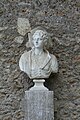
- Nomination: Bust of a shepherd, Versailles. --Coyau 15:49, 4 August 2011 (UTC)
- Review needed
-
- Nomination: Street sign at Priozerny street, Kriushkino village, Pereslavl district. PereslavlFoto 14:05, 4 August 2011 (UTC)
- Review needed
-

- Nomination: Dawlish. Mattbuck 13:28, 4 August 2011 (UTC)
- Review needed
-

- Nomination: Longbeck station. Mattbuck 13:28, 4 August 2011 (UTC)
- Review needed
-

- Nomination: 142021 at Longbeck. Mattbuck 13:28, 4 August 2011 (UTC)
- Review needed
-

- Nomination: 142066 approaches Redcar East. Mattbuck 13:28, 4 August 2011 (UTC)
- Review needed
-
- Nomination: The evolution of a thirsty "Ocimum basilicum" after watering. Movie made by stopmotion. --M0tty 12:06, 4 August 2011 (UTC)
- Review needed
-

- Nomination: Roemerthermen --Vitold Muratov 23:55, 28 July 2011 (UTC)
- Review needed
-

- Nomination Kanawa Island, Komodo National Park by TigrouMeow --Elekhh 08:49, 10 August 2011 (UTC)
- Promotion Good quality and very nice --Taxiarchos228 08:50, 10 August 2011 (UTC)
-
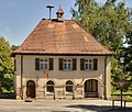
- Nomination Gresgen: Town hall --Taxiarchos228 08:32, 10 August 2011 (UTC)
- Promotion Good quality. --Berthold Werner 11:10, 10 August 2011 (UTC)
-

-

-

-
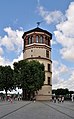
-

-

-

- Nomination Gresgen: Town hall --Taxiarchos228 20:23, 9 August 2011 (UTC)
- Promotion Good quality, although quite noisy. --Sfu 20:45, 9 August 2011 (UTC)
thx for your feedback, I will fix it as soon as possible --Taxiarchos228 06:03, 10 August 2011 (UTC)
-

- Nomination View of Gresgen in direction of Vally of Wiese and Basle --Taxiarchos228 20:23, 9 August 2011 (UTC)
- Promotion interesting view --Carschten 22:22, 9 August 2011 (UTC)
-
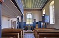
- Nomination Gresgen: Protestant Church: interior --Taxiarchos228 20:23, 9 August 2011 (UTC)
- Promotion Good. --Ankara 06:20, 10 August 2011 (UTC)
-

- Nomination Pančevo Bridge, upstream view from the right Danube riverside.--Михајло Анђелковић 16:48, 9 August 2011 (UTC)
- Promotion Some decrease of sharpness at the edges, but otherwise good picture. -- MJJR 21:36, 9 August 2011 (UTC)
-

- Nomination Head and shoulders of a cordulegaster boltonii. Crop of a larger image that has been found to be inferior. --De728631 16:31, 9 August 2011 (UTC)
- Promotion Nice closeup. --Quartl 17:34, 9 August 2011 (UTC) Question Is this a living animal? It looks like a mounted dead one! --Llez 17:50, 9 August 2011 (UTC)
-

- Nomination An image of a searchlight taken in the Mikhailovsky Garden, St. Petersburg, Russia. ——ViseMoD 14:26, 9 August 2011 (UTC)
- Promotion Please add geocode. Добавьте геокод и побольше деталей в описание предмета. Где именно стоит прожектор?--PereslavlFoto 15:22, 9 August 2011 (UTC)
-

- Nomination Weddell Seal sleeping, Pléneau Island, Antarctic --Butterfly austral 13:30, 9 August 2011 (UTC)
- Promotion some CA, but QI to me --Carschten 14:04, 9 August 2011 (UTC)
-

-

- Nomination Danaus plexippus. --ComputerHotline 10:42, 9 August 2011 (UTC)
- Decline Blown colors and I don't think the extreme format works. --Quartl 12:26, 9 August 2011 (UTC)
-

- Nomination Papilio memnon. --ComputerHotline 10:42, 9 August 2011 (UTC)
- Promotion Good. --Quartl 12:26, 9 August 2011 (UTC)
-
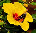
- Nomination Tropical butterfly inside a big flower. --ComputerHotline 10:42, 9 August 2011 (UTC)
- Decline Blown colors, needs id beyond subfamilia. --Quartl 12:26, 9 August 2011 (UTC)
-

- Nomination Danaus plexippus. --ComputerHotline 10:42, 9 August 2011 (UTC)
- Decline Blown colors. --Quartl 12:26, 9 August 2011 (UTC)
-
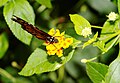
- Nomination Danaus plexippus. --ComputerHotline 10:42, 9 August 2011 (UTC)
- Decline Blown colors. You are overcontrasting your images. --Quartl 12:26, 9 August 2011 (UTC)
-

- Nomination Startrails taken in the twilight near Seloncourt, France. --ComputerHotline 09:39, 9 August 2011 (UTC)
- Promotion a bit noisy, but gorgeous colors --Carschten 14:11, 9 August 2011 (UTC)
-
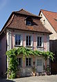
- Nomination Germany, Prichsenstadt, building at Karlsplatz --Berthold Werner 09:05, 9 August 2011 (UTC)
- Promotion Comment nur mal aus Interesse: bist du so eine Art Street View für Commons oder hat es tiefgründigere Gründe, dass du gefühlt sämtliche Häuser der Dörfer ablichtest :-)) ? --Carschten 14:11, 9 August 2011 (UTC)
Die Antwort --Berthold Werner 16:30, 9 August 2011 (UTC) Support Good quality. --Carschten 22:22, 9 August 2011 (UTC)
-

-

-

- Nomination Carrion crow on a tree in Nancy --PierreSelim 12:29, 8 August 2011 (UTC)
- Decline Im sorry but the bird is very dark. --Ankara 05:53, 10 August 2011 (UTC) Comment It might be because it's a black bird
 Do you find some parts indistinguishable ? Léna 07:58, 10 August 2011 (UTC) Comment To be more precise, the bird in the photo is not dark, but totally black (at least 80-90 percent of the bird) and it has no visible details with the exception of the head (but not sharp, and a very small part of the photo).--Ankara 08:39, 10 August 2011 (UTC)
-
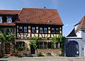
- Nomination Germany, Prichsenstadt, Karlsplatz 13 --Berthold Werner 09:17, 8 August 2011 (UTC)
- Promotion Good quality. --Taxiarchos228 14:13, 9 August 2011 (UTC)
-

-

- Nomination: Stars constellations. --ComputerHotline 10:50, 4 August 2011 (UTC)
- Review needed
-

- Nomination: Stars constellations. --ComputerHotline 10:50, 4 August 2011 (UTC)
- Review needed
-

- Nomination: Stars constellations. --ComputerHotline 10:50, 4 August 2011 (UTC)
- Review needed
-
- Nomination: Brodbeck House --Taxiarchos228 10:25, 4 August 2011 (UTC)
- Review needed
-

- Nomination: Set of eleven bowls, Lamboglia 27a shape. Late 2nd or early 3rd century CE. Campanian terra sigillata A. Musée des docks romains. Found on the shipwreck site Grand Congloué I by M. Christianini. -- Rama 10:14, 4 August 2011 (UTC)
- Review needed
-
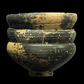
- Nomination: Set of eleven bowls, Lamboglia 27a shape. Late 2nd or early 3rd century CE. Campanian terra sigillata A. Musée des docks romains. Found on the shipwreck site Grand Congloué I by M. Christianini. -- Rama 10:14, 4 August 2011 (UTC)
- Review needed
-

- Nomination: Bowl from Megara. 2nd century BCE. Ceramic. Musée des docks romains. Found on the shipwreck site Grand Congloué II. -- Rama 10:14, 4 August 2011 (UTC)
- Review needed
-
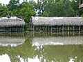
- Nomination: Bo Cap Vang ecotourism site --Prenn 07:06, 4 August 2011 (UTC)
- Review needed
-

- Nomination: Path at Dam Sen Cultural Park --Prenn 06:28, 4 August 2011 (UTC)
- Review needed
-

- Nomination: Candle flame --High Contrast 23:40, 3 August 2011 (UTC)
- Review needed
-

- Nomination: Bas-relief in the Cour Henry IV of Capitole de Toulouse --PierreSelim 23:24, 3 August 2011 (UTC)
- Review needed
-
- Nomination: Wicker basket in museum. --PereslavlFoto 21:45, 3 August 2011 (UTC)
- Review needed
-
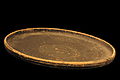
- Nomination: Plate. 2nd century BCE. Campanian terra sigillata B. Musée des docks romains. Found on the shipwreck site Canonnier du Sud by G. Bout and R. Portail. -- Rama 21:21, 3 August 2011 (UTC)
- Review DOF imo a little short --Mbdortmund 01:12, 4 August 2011 (UTC)
-
- Nomination: Xylocopa olivieri, female --Gidip 19:44, 3 August 2011 (UTC)
- Review Comment Underexposed, but to be corrected.--Archaeodontosaurus 07:29, 4 August 2011 (UTC) Comment OK now? --Gidip 09:07, 4 August 2011 (UTC)
-
- Nomination: The church of Saint Metropolitan Peter, Pereslavl --PereslavlFoto 19:12, 3 August 2011 (UTC)
- Review needed
-

- Nomination: Anchor from Peter the Great's ship. Veskovo village, Botik museum. --PereslavlFoto 19:12, 3 August 2011 (UTC)
- Review needed
-

- Nomination: Lampost in Pereslavl museum. Photo made with a tilt-shift lens. --PereslavlFoto 19:12, 3 August 2011 (UTC)
- Review needed
-

- Nomination: In front of Kobe Station --663highland 15:46, 3 August 2011 (UTC)
- Review needed
-
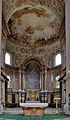
- Nomination: Ettal Abbey, altar and choir --Taxiarchos228 13:38, 3 August 2011 (UTC)
- Review needed
-
- Nomination: Cup. 2nd century BCE. Campanian terra sigillata B. Musée des docks romains. Found on the shipwreck site Canonnier du Sud by G. Bout and R. Portail. -- Rama 13:07, 3 August 2011 (UTC)
- Review needed
-

-

-
- Nomination Belgian Brewery Bockor --Dirk Van Esbroeck 06:26, 3 August 2011 (UTC)
- Decline Lacks geocode, has noise in shadows.--PereslavlFoto 15:28, 9 August 2011 (UTC)
-

- Nomination: Maserati Quattroporte --Bobak 04:59, 3 August 2011 (UTC)
- Review In my opinion, the picture is not a very good illustration of the car (and it is due to angle). Compare, for example with File:Maserati Quattroporte V.jpg (side view) or File:SAG2004_232_Maserati_Mk_IV.JPG (front view). Neither side is good here. The landscape is lovely but the car (main subject) is a small part of the photo.-- --Ankara 06:55, 4 August 2011 (UTC)
-

- Nomination Lissewege train station (Belgium) -- MJJR 21:26, 2 August 2011 (UTC)
- Promotion Good image, while the tint of clouds could be better.--PereslavlFoto 15:31, 9 August 2011 (UTC)
-
-

- Nomination Elisengarten in Aachen --Carschten 11:05, 1 August 2011 (UTC)
- Withdrawn Comment Between the leaves, the blue of the sky is different. I don't know if it's disturbing--Lmbuga 23:24, 1 August 2011 (UTC)
You're right; not a QI to me --Carschten 14:19, 9 August 2011 (UTC)
-
![* Nomination File:Marien Himmelfahrt.jpg --Vitold Muratov 11:05, 1 August 2011 (UTC) * Decline Commentlightning is good, but it seems there is a lack of details? [3] --Berthold Werner 13:28, 1 August 2011 (UTC) Oppose per above --Carschten 14:19, 9 August 2011 (UTC)](https://upload.wikimedia.org/wikipedia/commons/thumb/2/2b/Marien_Himmelfahrt.jpg/75px-Marien_Himmelfahrt.jpg)
- Nomination File:Marien Himmelfahrt.jpg --Vitold Muratov 11:05, 1 August 2011 (UTC)
- Decline Commentlightning is good, but it seems there is a lack of details? [3] --Berthold Werner 13:28, 1 August 2011 (UTC)
 Oppose per above --Carschten 14:19, 9 August 2011 (UTC)
-

- Nomination Germany, Dettelbach, Townhall --Berthold Werner 10:43, 30 July 2011 (UTC)
- Promotion Comment foreground and bottom of the town hall are a bit blurry, but overall good quality. Aber wäre es nicht besser, die Stange rechts wegzuschneiden (siehe Annotation)? --Carschten 12:53, 4 August 2011 (UTC)
Du hast recht, weg damit. --Berthold Werner 18:01, 4 August 2011 (UTC) Support Good quality. --Taxiarchos228 13:58, 9 August 2011 (UTC) Support auch von mir. Sorry, habe übersehen, dass du es korrigiert hattest. Viel besser nun! --Carschten 14:22, 9 August 2011 (UTC)
-
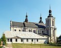
- Nomination: Church and sanctuary in Wola Gułowska, Lublin Voivodeship, Poland. --Sfu 11:41, 26 July 2011 (UTC)
- Review Question Overcorrected perspective. Can you fix it ? Gzzz 21:07, 2 August 2011 (UTC)
I've lost original file, and this one can't be used in that purpose without more cropping. But that's what I've actually done. --Sfu 22:35, 3 August 2011 (UTC)
-

-
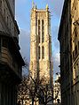
-
- Nomination Timelapse of clouds. --ComputerHotline 09:39, 9 August 2011 (UTC)
- Decline Oppose It's very nice but the wires really ruin the composition for me. Also, is it possible to avoid the "flashes" in the animation (exposure variations I guess)? --Eusebius 10:24, 9 August 2011 (UTC)
-

-

-

-

-

-

-

-

-

-
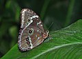
-

-
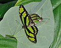
-

- Nomination Piece of fresco of the Collegiate church of Santa Maria de Sar (In this image you can see the context of the fresco).--Lmbuga 21:46, 8 August 2011 (UTC)
- Promotion Support QI & Useful --Archaeodontosaurus 09:00, 9 August 2011 (UTC)
-
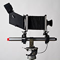
-
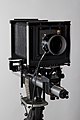
-

- Nomination Pycina zamba ♂ △ --Archaeodontosaurus 17:07, 8 August 2011 (UTC)
- Promotion Very good and for me a QI--Holleday 17:18, 8 August 2011 (UTC)
-

-

- Nomination Viewing through a Sinar F camera. The low light and contrast of the viewed image causes the overexposure of the background, which serves subject isolation in this kind of picture I think. --Eusebius 13:20, 8 August 2011 (UTC)
- Promotion Support QI & Useful --Archaeodontosaurus 16:57, 8 August 2011 (UTC)
-

-

- Nomination Lebăda hotel/restaurant, Pantelimon, Ilfov, Romania –Andrei Stroe 08:59, 8 August 2011 (UTC)
- Promotion Good quality. --Raghith 05:37, 9 August 2011 (UTC)
-

- Nomination Green-veined White (Pieris napi) on Wild Carrot (Daucus carota) at a retention basin in Ahlen, Germany by Quartl. --Raghith 06:00, 8 August 2011 (UTC)
- Promotion noisy, but this can be fixed --Taxiarchos228 06:17, 8 August 2011 (UTC) Denoised. --Quartl 06:58, 8 August 2011 (UTC)
Support QI & Useful --Archaeodontosaurus 16:52, 8 August 2011 (UTC)
-

- Nomination the Baths of Caracalla in Rome, by Harmonia Amanda. -- Rama 18:56, 5 August 2011 (UTC)
- Promotion Good. Shame that the leaves were there, but that's irrelevant for QI. W.S. 21:37, 8 August 2011 (UTC)
-

- Nomination Cordulegaster boltonii (female) found on a tree at a nearby meadow. (by Ude) --De728631 20:17, 4 August 2011 (UTC)
- Decline Comment Overexposed hand and clipped wings. I think a tighter crop would help here. --Quartl 08:10, 6 August 2011 (UTC) I've cropped it a lot: File:Cordulegaster boltonii Harriehausen_crop.png. --De728631 18:40, 6 August 2011 (UTC)
The aspect ratio is a bit too extreme, try a format more like 4:3. --Quartl 07:00, 7 August 2011 (UTC) And there I thought 16:9 was the new gold standard! (jk) But here's one with exactly 4:3 now: File:Cordulegaster boltonii Harriehausen_crop43.png. --De728631 17:31, 7 August 2011 (UTC)
That one would be ok to me. --Quartl 18:27, 7 August 2011 (UTC)
Blown hand and cropped left wings are not good. W.S. 21:41, 8 August 2011 (UTC)
-

- Nomination Goetheanum surroundings: Atelier --Taxiarchos228 10:25, 4 August 2011 (UTC)
- Promotion Good quality.--Ankara 12:36, 8 August 2011 (UTC)
-

- Nomination Female Flower Crab Spider by User:Morray. --Quartl 11:06, 3 August 2011 (UTC)
- Promotion QI for me--Lmbuga 08:43, 9 August 2011 (UTC)
-

- Nomination Female Flower Crab Spider by User:Morray. --Quartl 11:06, 3 August 2011 (UTC)
- Promotion QI for me--Lmbuga 08:43, 9 August 2011 (UTC)
-

- Nomination Female Flower Crab Spider by User:Lviatour. --Quartl 11:06, 3 August 2011 (UTC)
- Promotion QI for me--Lmbuga 08:43, 9 August 2011 (UTC)
-

- Nomination: Female Flower Crab Spider with hoverfly by User:Lviatour. --Quartl 11:06, 3 August 2011 (UTC)
- Review needed
-

- Nomination Female Flower Crab Spider by User:Lviatour. --Quartl 09:57, 3 August 2011 (UTC)
- Promotion QI for me--Lmbuga 08:47, 9 August 2011 (UTC)
-

- Nomination Female Flower Crab Spider by User:Lviatour. --Quartl 09:57, 3 August 2011 (UTC)
- Promotion QI for me--Lmbuga 08:47, 9 August 2011 (UTC)
-

- Nomination Female Flower Crab Spider by User:Lviatour. --Quartl 09:57, 3 August 2011 (UTC)
- Promotion QI for me--Lmbuga 08:49, 9 August 2011 (UTC)
-

- Nomination: Leaves of Syringa vulgaris. --High Contrast 22:06, 2 August 2011 (UTC)
- Review needed
-

- Nomination: Hydnum repandum --Holleday 17:45, 2 August 2011 (UTC)
- Review needed
-

- Nomination: Phallus impudicus --Holleday 17:44, 2 August 2011 (UTC)
- Review needed
-
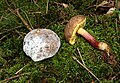
- Nomination: Boletus chrysenteron --Holleday 17:41, 2 August 2011 (UTC)
- Review needed
-

- Nomination: Germany, Dettelbach, Falterstraße 2, "Green tree" inn --Berthold Werner 12:32, 2 August 2011 (UTC)
- Review needed
-

- Nomination: Castle Burg Linn --Carschten 11:05, 1 August 2011 (UTC)
- Review Processing problem on the sky. --Archaeodontosaurus 13:54, 1 August 2011 (UTC) Done better now? --Carschten 17:30, 2 August 2011 (UTC)
-
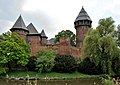
- Nomination: Castle Burg Linn --Carschten 11:05, 1 August 2011 (UTC)
- Review Processing problem on the sky. --Archaeodontosaurus 13:54, 1 August 2011 (UTC) Done better now? --Carschten 17:30, 2 August 2011 (UTC)
-

- Nomination: Orbiter main propulsion system --Malyszkz 08:43, 1 August 2011 (UTC)
- Review There's a liquid oxygen pipe lacking on the right engine, it can't work like this. Also, it'd be nice to draw at least part of the left structural beam, it looks a bit incomplete as it is now (do they say "port" and "starboard" at NASA?) -- Rama 19:21, 2 August 2011 (UTC)
So first, this graphic was based on the file http://upload.wikimedia.org/wikipedia/commons/7/7d/Orbiter_main_propulsion_system.png and its description comes from it. Secondly, oxygen delivery tube is not visible on this graphic and I decided that it is hidden by other elements of the engine (maybe I was wrong)Malyszkz 19:39, 2 August 2011 (UTC)
-

-

- Nomination Shell of a Little Fox Mitre, Vexillum vulpecula --Llez 06:12, 8 August 2011 (UTC)
- Promotion Good quality. --Taxiarchos228 06:17, 8 August 2011 (UTC)
-

- Nomination Santtu Hämäläinen, bassist of Mokoma, live at MTR 2011. --Cecil 01:37, 8 August 2011 (UTC)
- Promotion Good quality. --Taxiarchos228 06:04, 8 August 2011 (UTC)
-

- Nomination Lissewege train station (Bruges, Belgium) -- MJJR 21:25, 7 August 2011 (UTC)
- Promotion Good -- George Chernilevsky 05:05, 8 August 2011 (UTC)
-
- Nomination The Artist's Conk -- George Chernilevsky 19:56, 7 August 2011 (UTC)
- Promotion Support QI & Useful --Archaeodontosaurus 04:55, 8 August 2011 (UTC)
-
- Nomination Herb Paris, True-lover's Knot -- George Chernilevsky 19:56, 7 August 2011 (UTC)
- Promotion Good quality. --Mbdortmund 01:20, 8 August 2011 (UTC)
-

- Nomination Herb Paris, True-lover's Knot -- George Chernilevsky 19:56, 7 August 2011 (UTC)
- Promotion Good and useful --Mbdortmund 01:21, 8 August 2011 (UTC)
-

- Nomination Herb Paris, True-lover's Knot -- George Chernilevsky 19:56, 7 August 2011 (UTC)
- Promotion Support QI & Useful --Archaeodontosaurus 04:57, 8 August 2011 (UTC)
-

-
- Nomination Germany, Prichsenstadt, Luitpoldstraße 16 --Berthold Werner 14:52, 7 August 2011 (UTC)
- Promotion Gut -- George Chernilevsky 19:58, 7 August 2011 (UTC)
-

- Nomination Charaxes distanti- Malaysia --Archaeodontosaurus 13:58, 7 August 2011 (UTC)
- Promotion Good work.. --Berthold Werner 14:54, 7 August 2011 (UTC)
-

- Nomination National Arena stadium in Bucharest, Romania Andrei Stroe 12:54, 7 August 2011 (UTC)
- Decline Sorry, but the picture has stitching errors. --Makele-90 13:24, 7 August 2011 (UTC)
-

- Nomination Reddish Pink Pelargoniums --Nissim 14 12:56, 7 August 2011 (UTC)
- Decline Oppose Too many blurred areas --Archaeodontosaurus 14:17, 7 August 2011 (UTC)
-

-

- Nomination Goetheanum surroundings: Glas house --Taxiarchos228 12:22, 7 August 2011 (UTC)
- Promotion Support QI for me --Archaeodontosaurus 14:16, 7 August 2011 (UTC)
-

- Nomination Green form of the caterpillar of Deilephila elpenor --Holleday 08:35, 7 August 2011 (UTC)
- Promotion Support QI & Useful --Archaeodontosaurus 14:15, 7 August 2011 (UTC)
-
-
- Nomination Post Tower in Bonn. Info Improved version of a previously rejected image. -- H005 22:22, 3 August 2011 (UTC)
- Promotion for me QI, because I think, special color came by light of sunset, not because of CA (maybe you should mention sunset in file description --J. Lunau 23:22, 6 August 2011 (UTC)
You are right, I will change it. Thanks for your review! -- H005 19:49, 7 August 2011 (UTC)
- Nomination Post Tower in Bonn.
-

- Nomination Female Flower Crab Spider by User:Brandobras. --Quartl 09:57, 3 August 2011 (UTC)
- Promotion Support QI & Useful --Archaeodontosaurus 14:08, 7 August 2011 (UTC)
-

- Nomination Male Flower Crab Spider by User:Kulac. --Quartl 09:57, 3 August 2011 (UTC)
- Promotion Support QI & Useful --Archaeodontosaurus 14:08, 7 August 2011 (UTC)
-

-

- Nomination: Hechingen: Minster Saint Luzen, vault --Taxiarchos228 07:15, 2 August 2011 (UTC)
- Review needed
-
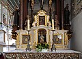
- Nomination: Hechingen: Minster Saint Luzen, detail of side altar --Taxiarchos228 07:15, 2 August 2011 (UTC)
- Review needed
-

- Nomination: Hechingen: Minster Saint Luzen, detail of main altar --Taxiarchos228 07:15, 2 August 2011 (UTC)
- Review needed
-

- Nomination: A female Hardhead duck, --99of9 05:20, 2 August 2011 (UTC)
- Review needed
-

- Nomination: Start of Schwarzenberský plavební kanál, Šumava --Pudelek 13:41, 1 August 2011 (UTC)
- Review needed
-

- Nomination: Jean David, Etigny Alleys, Auch, Gers, France --Florent Pécassou 15:36, 29 July 2011 (UTC)
- Review needed
-

-

-

-

-

-

- Nomination Street light in Stockholm, Sweden, with city hall in background, photo by Holger.Ellgaard. --Wolfgangus Mozart 20:10, 6 August 2011 (UTC)
- Decline Sorry, but the picture is too noisy and also the lightning is bad. --Makele-90 21:52, 6 August 2011 (UTC)
-

- Nomination Spanish Moon Moth--Archaeodontosaurus 15:09, 6 August 2011 (UTC)
- Promotion Wonderful. --Quartl 15:15, 6 August 2011 (UTC)
-

- Nomination Polygonatum odoratum --Myrabella 08:30, 6 August 2011 (UTC)
- Promotion Support QI & Useful --Archaeodontosaurus 16:27, 6 August 2011 (UTC)
-
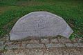
- Nomination memorial of Rudolf Steiner --Taxiarchos228 06:25, 6 August 2011 (UTC)
- Decline Bad lightning, need tonemapping correction.--Alchemist-hp 15:25, 6 August 2011 (UTC)
-

- Nomination Duldeck House --Taxiarchos228 06:25, 6 August 2011 (UTC)
- Promotion Good--Lmbuga 23:44, 6 August 2011 (UTC)
-
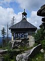
- Nomination Dreisesselberg (Třístoličník) - chapel near peak Hochstein --Pudelek 13:41, 1 August 2011 (UTC)
- Promotion Good quality. --Berthold Werner 14:30, 6 August 2011 (UTC)
-
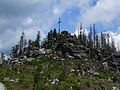
- Nomination Dreisesselberg (Třístoličník) - peak Hochstein --Pudelek 13:41, 1 August 2011 (UTC)
- Promotion Good quality. --Berthold Werner 14:30, 6 August 2011 (UTC)
-

- Nomination Dreisesselberg (Třístoličník) - rock near peak Hochstein --Pudelek 13:41, 1 August 2011 (UTC)
- Promotion Good quality. --Berthold Werner 14:30, 6 August 2011 (UTC)
-
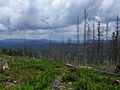
- Nomination Šumava (Böhmerwald) - trail to Třístoličník (Dreisesselberg) --Pudelek 13:41, 1 August 2011 (UTC)
- Decline This one looks unsharp --Berthold Werner 14:30, 6 August 2011 (UTC)
-
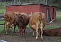
-
- Nomination: Oberon (1953-54). Bronze. Sculpture by en:Eric Grate, in Eric Grates park in Solna. --Ankara 21:10, 31 July 2011 (UTC)
- Review needed
-

- Nomination: Eric Grates park. --Ankara 21:10, 31 July 2011 (UTC)
- Review needed
-
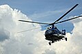
- Nomination: Mi-8 --Sfu 20:20, 31 July 2011 (UTC)
- Review needed
-
- Nomination: Hechingen: Collegiate Church, window in side chapel --Taxiarchos228 19:07, 31 July 2011 (UTC)
- Review needed
-

- Nomination: Hechingen: Collegiate Church, nave --Taxiarchos228 19:07, 31 July 2011 (UTC)
- Review needed
-
- Nomination: Hechingen: Minster Saint Luzen, vault --Taxiarchos228 19:07, 31 July 2011 (UTC)
- Review needed
-

- Nomination: Siamese fighting fish (Betta splendens), female, orange --Bernard Ladenthin 17:42, 31 July 2011 (UTC)
- Review needed
-
- Nomination: Aachen: municipal archive --Carschten 16:38, 31 July 2011 (UTC)
- Review needed
-

- Nomination: Aachen: Sparkasse at Münsterplatz --Carschten 16:38, 31 July 2011 (UTC)
- Review needed
-

- Nomination: Information center of Aachen Cathedral --Carschten 16:38, 31 July 2011 (UTC)
- Review needed
-

- Nomination: Alpenglow on Aiguille du Chardonnet, Haute-Savoie, France, in 2010 July --Ximonic 15:32, 31 July 2011 (UTC)
- Review needed
-
- Nomination: Turkey Vulture --Cephas 12:45, 31 July 2011 (UTC)
- Review needed
-

-

-

- Nomination The Is Aruttas beach, in the Sinis Peninsula (Sardinia, Italy). --Gzzz 21:00, 23 July 2011 (UTC)
- Withdrawn Comment Needs to be re-stitched because of fish-eye effect. -- H005 21:22, 30 July 2011 (UTC)
 I withdraw my nomination Impossible to correct it without losing most of the picture... --Gzzz 20:51, 6 August 2011 (UTC)
-

- Nomination Blasieholmstorg, July 2011. --Ankara 13:09, 5 August 2011 (UTC)
- Promotion Comment nice and good quality, but I don't like the crop at bottom and the shadows are a bit harsh IMO. I uploaded a new version in the file history. Maybe it's better? --Carschten 13:43, 5 August 2011 (UTC) I like your new version. Thanks!--Ankara 13:49, 5 August 2011 (UTC) Support no problem! QI to me (now) --Carschten 13:54, 5 August 2011 (UTC)
-

- Nomination Germany, Prichsenstadt, Luitpoldstraße 6 --Berthold Werner 10:25, 5 August 2011 (UTC)
- Promotion Good quality. --Carschten 13:03, 5 August 2011 (UTC)
-
- Nomination young Cortinarius violaceus --Holleday 18:44, 4 August 2011 (UTC)
- Promotion Good one. What may seem like blurry spots at first glance are actually reflections on the wet weeds and needles.
-

-

-

- Nomination A young Parasol mushroom. Photo by User:Aktron -- George Chernilevsky 20:14, 1 August 2011 (UTC)
- Promotion Good quality. Useful. --Wsiegmund 17:35, 5 August 2011 (UTC)
-

- Nomination: The Red Arrows --Airwolf 10:46, 31 July 2011 (UTC)
- Review needed
-

- Nomination: The Red Arrows --Airwolf 10:46, 31 July 2011 (UTC)
- Review needed
-

- Nomination: The Red Arrows --Airwolf 10:46, 31 July 2011 (UTC)
- Review needed
-

- Nomination: Stained glass skylight in Fordyce Bathhouse. --Ks0stm 03:22, 31 July 2011 (UTC)
- Review needed
-

- Nomination: "Bird's eye view of the port" by Hide Kawanishi (reproduction by stained glass) at Kobe --663highland 02:25, 31 July 2011 (UTC)
- Review needed
-
- Nomination: "Downtown Kobe with mountain range in background" by Hide Kawanishi (reproduction by stained glass) at Kobe --663highland 02:25, 31 July 2011 (UTC)
- Review needed
-

- Nomination: Stars constellations --ComputerHotline 19:30, 30 July 2011 (UTC)
- Review needed
-
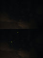
- Nomination: Stars constellations --ComputerHotline 19:30, 30 July 2011 (UTC)
- Review needed
-

- Nomination: Stars constellations --ComputerHotline 19:30, 30 July 2011 (UTC)
- Review needed
-

- Nomination: Light pollution over Mulhouse, France, near an astronomical observatory. --ComputerHotline 19:30, 30 July 2011 (UTC)
- Review needed
-

- Nomination: Fuse box. --ComputerHotline 17:26, 22 July 2011 (UTC)
- Review Comment Tilted, and I think it should be symmetrical. Can you do that? -- H005 21:08, 30 July 2011 (UTC)
-
- Nomination Ornament on a banister of Musée des Beaux-Arts in Nancy --PierreSelim 07:27, 5 August 2011 (UTC)
- Decline very nice picture, but lacking sharpness und strong CA --Taxiarchos228 08:57, 5 August 2011 (UTC)
-

- Nomination detail of Goetheanum --Taxiarchos228 07:02, 5 August 2011 (UTC)
- Promotion Technically a good quality for a QI. But why this clipping? What is the motivation for this cutout? On the other side I like this image. --Elektroschreiber 09:29, 5 August 2011 (UTC)
the motivation is to show a detail of the expansion gap of the column that that has no carrying fuction, a very important architectual detail --Taxiarchos228 09:46, 5 August 2011 (UTC)
I understand and found a little bit information about the expansion gap in the www.--Elektroschreiber 11:26, 5 August 2011 (UTC)
-

- Nomination Goetheanum surroundings: Glas house --Taxiarchos228 07:02, 5 August 2011 (UTC)
- Promotion Techincally a QI. Good composition. Also a nice red-green-contrast. --Elektroschreiber 09:29, 5 August 2011 (UTC)
-

- Nomination boiler house at Goetheanum --Taxiarchos228 07:02, 5 August 2011 (UTC)
- Promotion Good perspective. Technicaly also a QI. --Elektroschreiber 09:29, 5 August 2011 (UTC)
-

-

- Nomination File:Castle in Goessweinstain.jpg --Vitold Muratov 23:15, 4 August 2011 (UTC)
- Decline Sorry, but the picture is heavily tilted and too noisy, the crop is bad and also the lightning. --Berthold Werner 09:33, 5 August 2011 (UTC)
-

-

- Nomination Amanita fulva --Holleday 19:14, 4 August 2011 (UTC)
- Promotion Nice -- George Chernilevsky 19:35, 4 August 2011 (UTC)
-
- Nomination Street light and mascarons in Place Stanislas, Nancy (France) Léna 18:48, 4 August 2011 (UTC)
- Promotion QI for me. --Coyau 20:48, 4 August 2011 (UTC)
-
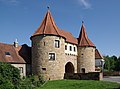
- Nomination Germany, Prichsenstadt, city gate --Berthold Werner 13:47, 4 August 2011 (UTC)
- Promotion Good quality. --Taxiarchos228 14:01, 4 August 2011 (UTC)
-

- Nomination The main road at Brottö, a small island in Stockholm archipelago --Ankara 13:27, 4 August 2011 (UTC)
- Promotion Good quality. --Taxiarchos228 14:01, 4 August 2011 (UTC)
-

- Nomination Brottö, July 2011. --Ankara 13:27, 4 August 2011 (UTC)
- Promotion Good quality. --Taxiarchos228 14:01, 4 August 2011 (UTC)
-

- Nomination White Plume Moth --Archaeodontosaurus 07:21, 4 August 2011 (UTC)
- Promotion Certainly difficult to photograph. --Quartl 12:15, 4 August 2011 (UTC)
-
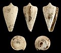
-

- Nomination Female Flower Crab Spider with honeybee by User:MichaD. --Quartl 09:57, 3 August 2011 (UTC)
- Promotion Good --Gidip 08:59, 5 August 2011 (UTC)
-

- Nomination Rolls-Royce Ghost --Bobak 04:59, 3 August 2011 (UTC)
- Decline Not really sharp and crop should be tighter. --Berthold Werner 15:08, 4 August 2011 (UTC)
-
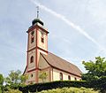
- Nomination Bad Bellingen: Saint Leodegar Church --Taxiarchos228 19:07, 31 July 2011 (UTC)
- Promotion Cannot see any problems. Please add geocode and some details about the church in description.PereslavlFoto 20:45, 4 August 2011 (UTC)
-

- Nomination Hechingen: Collegiate Church, side chapel --Taxiarchos228 10:26, 30 July 2011 (UTC)
- Promotion nice --Carschten 12:53, 4 August 2011 (UTC)
-
- Nomination: Hechingen: Collegiate Church, window of Saint Elisabeth in side chapel --Taxiarchos228 10:26, 30 July 2011 (UTC)
- Review needed
-

- Nomination: Zebra Tower office building, Warsaw, Poland. --Sfu 09:37, 30 July 2011 (UTC)
- Review needed
-

- Nomination: Kolomenskoe Museum in Moscow: St. George Church. A.Savin 18:38, 29 July 2011 (UTC)
- Review needed
-

- Nomination: Auch Town Hall --Florent Pécassou 14:50, 29 July 2011 (UTC)
- Review needed
-

- Nomination: Dassault Rafale --Airwolf 14:25, 29 July 2011 (UTC)
- Review needed
-

-

-

-

- Nomination Ettal Abbey: old bell tower between new bell tower and dome --Taxiarchos228 14:08, 28 July 2011 (UTC)
- Promotion Good quality. --Carschten 12:37, 4 August 2011 (UTC)
-
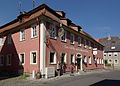
- Nomination Germany, Dettelbach, Bamberger Str. 15, "Golden eagle" inn --Berthold Werner 12:45, 28 July 2011 (UTC)
- Decline disturbing shadows in the bottom right corner and at left, tight cropped at top, chromatic aberrations, perspective distortions --Carschten 12:37, 4 August 2011 (UTC)
-
- Nomination Stuttgart: Main pod of the television tower --Taxiarchos228 11:16, 28 July 2011 (UTC)
- Promotion Good quality. --Carschten 12:37, 4 August 2011 (UTC)
-

-

- Nomination Kleiner Münsterplatz in Aachen --Carschten 21:44, 24 July 2011 (UTC)
- Promotion Question Is that downsampled? --Berthold Werner 08:55, 25 July 2011 (UTC)
Ja, aber erst nachdem ich die stürzenden Linien korrigiert, die Schatten aufgehellt und das Bild etwas beschnitten hatte. --Carschten 09:31, 25 July 2011 (UTC)
Hm, das ist aber gegen Commons:Image_guidelines --Berthold Werner 10:50, 25 July 2011 (UTC)
Immer noch groß genug, oder? --Mbdortmund 03:02, 1 August 2011 (UTC)
Schon, aber soweit ich das in Erinnerung habe, sollten Fotos nicht downsampled werden, weil so eine evtl. nicht vorhandene Schärfe vorgetäuscht werden kann. (?) --Berthold Werner 15:52, 1 August 2011 (UTC)
Mal abgesehen davon, dass mir das nicht bekannt war, ist diese Vorgabe sinnlos, da man sie nicht kontrollieren kann und hier schon unzählig viele kleinskalierte Bilder als QI und auch als FP gewählt wurden. Des weiteren finde ich es interessant, dass bei den IG unter Bildgröße das Foto File:European Common Frog Rana temporaria.jpg als positives Beispiel genannt wird... Zuletzt bin ich der Meinung, dass das Downsampling bei dem Bild keinen großen Nachteil erbracht hat. --Carschten 12:09, 4 August 2011 (UTC)
ich wollte es mal erwähnen ;-) --Berthold Werner 18:05, 4 August 2011 (UTC) Support Good quality. --Taxiarchos228 12:22, 4 August 2011 (UTC)
-

- Nomination Liel: Saint Vinzenz Church, pulpit --Taxiarchos228 07:59, 27 July 2011 (UTC)
- Promotion I support for I cannot see any troubles, but please add geocode. Thanks. PereslavlFoto 00:03, 5 August 2011 (UTC)
-

- Nomination Goetheanum surroundings: Glas house --Taxiarchos228 08:19, 4 August 2011 (UTC)
- Promotion Good quality. --Coyau 11:33, 4 August 2011 (UTC)
-
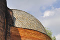
- Nomination Goetheanum surroundings: Glas house, dome --Taxiarchos228 08:19, 4 August 2011 (UTC)
- Promotion Good quality. --Coyau 11:33, 4 August 2011 (UTC)
-

- Nomination Goetheanum surroundings: Glas house, main entrance --Taxiarchos228 08:19, 4 August 2011 (UTC)
- Promotion Good quality. --Coyau 11:33, 4 August 2011 (UTC)
-

- Nomination A bee on a thistle --PierreSelim 22:11, 3 August 2011 (UTC)
- Decline Needs identification, but also sharpness and composition issues. --Quartl 09:12, 4 August 2011 (UTC)
-

- Nomination Statute of King Stanislas in Nancy --PierreSelim 22:09, 3 August 2011 (UTC)
- Decline Face unsharp and in the shadow --Mbdortmund 01:09, 4 August 2011 (UTC)
-

-

-

-

- Nomination Apartment buildings in Hedemora, Sweden.--V-wolf 21:23, 1 August 2011 (UTC)
- Promotion Comment Good quality but a small perspective distortion--Ankara 07:12, 3 August 2011 (UTC) Thank you! I will try to do something about it when I sit at my regular computer. --V-wolf 09:24, 3 August 2011 (UTC) New version up, better? --V-wolf 06:22, 4 August 2011 (UTC)Thank you. Ok now IMO.--Ankara 06:31, 4 August 2011 (UTC)
-

- Nomination Botallack Crowns engine house on the coast of Cornwall, UK--Nilfanion 21:24, 31 July 2011 (UTC)
- Promotion Support QI for me --Archaeodontosaurus 07:42, 4 August 2011 (UTC)
-

- Nomination Queen Adelaide's Grotto near Plymouth Sound, UK--Nilfanion 21:24, 31 July 2011 (UTC) Support QI for me --Archaeodontosaurus 07:40, 4 August 2011 (UTC)
- Promotion {{{2}}}
- Nomination Queen Adelaide's Grotto near Plymouth Sound, UK--Nilfanion 21:24, 31 July 2011 (UTC)
-
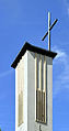
- Nomination Wehr: Protestant Church, bell tower --Taxiarchos228 19:07, 31 July 2011 (UTC)
- Promotion Good.--Ankara 07:08, 4 August 2011 (UTC)
-

-

-

-
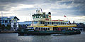
- Nomination: Sydney Harbour ferry --Gnangarra 07:26, 29 July 2011 (UTC)
very noisy --Taxiarchos228 08:54, 29 July 2011 (UTC) - Review needed
- Nomination: Sydney Harbour ferry --Gnangarra 07:26, 29 July 2011 (UTC)
-

- Nomination: Germany, Dettelbach, Bamberger Str. 5 --Berthold Werner 06:25, 29 July 2011 (UTC)
- Review needed
-

- Nomination: Hechingen: Minster Saint Luzen, pulpit --Taxiarchos228 06:16, 29 July 2011 (UTC)
- Review needed
-

- Nomination: Hechingen: Minster Saint Luzen, quire arch and vault --Taxiarchos228 06:16, 29 July 2011 (UTC)
- Review needed
-

- Nomination: Bosquet des rocailles, Versailles. --Coyau 03:49, 29 July 2011 (UTC)
- Review needed
-

- Nomination: South side of the Petit Trianon.--Coyau 03:33, 29 July 2011 (UTC)
- Review needed
-

-
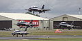
-

-

- Nomination Bulgarian city Sozopol --PL Przemek 15:52, 23 July 2011 (UTC).
- Decline Comment Unsharp and tilted. -- H005 21:22, 30 July 2011 (UTC) Per H005.--Ankara 07:33, 4 August 2011 (UTC)
-
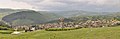
- Nomination Klisura town. --MrPanyGoff 06:30, 2 August 2011 (UTC)
- Promotion Good quality. --Taxiarchos228 06:37, 2 August 2011 (UTC)
-

- Nomination Shell of a Philippine land snail, Calocochlia cailliaudi --Llez 05:12, 2 August 2011 (UTC)
- Promotion Support QI & Usefull --Archaeodontosaurus 05:54, 2 August 2011 (UTC)
-

- Nomination Shield bug Carpocoris fuscispinus, top view. --Quartl 05:00, 2 August 2011 (UTC)
- Promotion Support QI & Usefull --Archaeodontosaurus 05:54, 2 August 2011 (UTC)
-

- Nomination A young Parasol mushroom -- George Chernilevsky 19:58, 1 August 2011 (UTC)
- Promotion QI for me--Lmbuga 23:28, 1 August 2011 (UTC)
-

- Nomination Boring Brown Bolete -- George Chernilevsky 19:58, 1 August 2011 (UTC)
- Promotion Support QI & Useful --Archaeodontosaurus 05:52, 2 August 2011 (UTC)
-

- Nomination Xylocopa pubescens, female with symbiotic mites (Dinogamasus sp.), foraging on basil --Gidip 18:42, 1 August 2011 (UTC)
- Decline Oppose Too dark --Archaeodontosaurus 05:50, 2 August 2011 (UTC)
-

-

- Nomination Melolontha melolontha - Ventral side --Archaeodontosaurus 07:31, 1 August 2011 (UTC)
- Promotion Support QI for me --Llez 09:58, 2 August 2011 (UTC)
-
- Nomination: Liel: Saint Vinzenz Church, pulpit --Taxiarchos228 07:59, 27 July 2011 (UTC)
- Review needed
-

- Nomination Wooden house in Gorki Pereslavskie village --PereslavlFoto 19:12, 3 August 2011 (UTC)
- Promotion Good quality. --Andrei Stroe 21:26, 3 August 2011 (UTC)
-

- Nomination Germany, church in Laub --Berthold Werner 17:45, 3 August 2011 (UTC)
- Promotion Good quality. --Andrei Stroe 21:31, 3 August 2011 (UTC)
-

-

- Nomination Neuschwanstein Castle from north --Taxiarchos228 13:38, 3 August 2011 (UTC)
- Promotion seems a bit too bluish to me, but QI though --Carschten 14:43, 3 August 2011 (UTC)
-

- Nomination Germany, Prichsenstadt bridge over the river Schwarzach --Berthold Werner 13:14, 3 August 2011 (UTC)
- Promotion Good quality. --Carschten 14:43, 3 August 2011 (UTC)
-
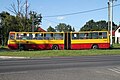
- Nomination Ikarus 280.70E (#5789), Marki, Poland. I know - shadow... --Crusier 12:33, 3 August 2011 (UTC)
- Decline A bit too much street and the bus is partly in the shadow. --High Contrast 14:11, 3 August 2011 (UTC)
-
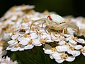
- Nomination Female Flower Crab Spider by User:Lviatour. --Quartl 09:57, 3 August 2011 (UTC)
- Promotion QI and good composition --Dirk Van Esbroeck 10:36, 3 August 2011 (UTC)
-

- Nomination Dormition of the Theotokos Church in Klisura. --MrPanyGoff 06:53, 3 August 2011 (UTC)
- Promotion Good.--Ankara 07:17, 3 August 2011 (UTC)
-
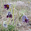
- Nomination Pulsatilla vulgaris var. costeana, Lozère, France. --Myrabella 06:52, 3 August 2011 (UTC)
- Promotion Support QI & Useful - Good caption --Archaeodontosaurus 07:58, 3 August 2011 (UTC)
-

- Nomination Flower Crab Spider, top view. --Quartl 06:25, 3 August 2011 (UTC)
- Promotion Support Very good work --Archaeodontosaurus 07:55, 3 August 2011 (UTC)
-

-

-
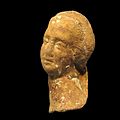
-

-

-

-

-

-
-

-
-

- Nomination Hechingen: Minster Saint Luzen, quire arch --Taxiarchos228 07:15, 2 August 2011 (UTC)
- Promotion Good quality. --Cayambe 14:12, 2 August 2011 (UTC)
-

-

-
-

-

- Nomination Interior view of a lateral halfdome of the Blue Mosque in Istanbul -- H005 21:45, 1 August 2011 (UTC)
- Promotion Good quality. --Mbdortmund 21:50, 2 August 2011 (UTC)
-

-

-

- Nomination Statue in the Temple de l'Amour, Petit Trianon. --Coyau 08:53, 1 August 2011 (UTC)
- Promotion a little bit more contrast would be even better --Mbdortmund 21:28, 2 August 2011 (UTC)
-

- Nomination Miltochrista miniata --Archaeodontosaurus 06:00, 31 July 2011 (UTC))
- Promotion Support Good --Llez 13:10, 2 August 2011 (UTC)
-

- Nomination Demolition of Lindgården, an old summer restaurant in Djurgården. The restaurant closed 1993, and has been closed and abandoned ever since. --Ankara 07:53, 30 July 2011 (UTC)
- Decline More or less a snapshot: photographing woman on the left and the supposed main subject is widely covered (hedge, pallets, warning sign). A different would have been better: the woman on the left is doing it correctly: she avoids to photograph the metal hoarding. --High Contrast 14:20, 3 August 2011 (UTC)
-

-

-

- Nomination: Lectoure, Gers, France --Florent Pécassou 21:27, 28 July 2011 (UTC)
- Review needed
-

- Nomination: Church, Tarsac, Gers, France --Florent Pécassou 21:27, 28 July 2011 (UTC)
- Review needed
-
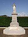
- Nomination: War memorial, Tarsac, Gers, France --Florent Pécassou 21:27, 28 July 2011 (UTC)
- Review needed
-

- Nomination: Tower, Termes-d'Armagnac, Gers, France --Florent Pécassou 21:27, 28 July 2011 (UTC)
- Review needed
-
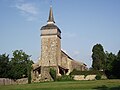
- Nomination: Church, Termes-d'Armagnac, Gers, France --Florent Pécassou 21:27, 28 July 2011 (UTC)
- Review needed
-

- Nomination: Šumava / Böhmerwald - Rosenauer memorial --Pudelek 21:02, 28 July 2011 (UTC)
- Review needed
-

- Nomination: Nové Údolí, Czech Republic. Pošumavská jížní dráha - shortest international railway in the world (Czech Republic - Germany - 105 m) --Pudelek 21:02, 28 July 2011 (UTC)
- Review needed
-

- Nomination: Weissenburg.City wall --Vitold Muratov 21:50, 28 July 2011 (UTC)
- Review needed
-

- Nomination: Sainte-Barbe Chapel, Le Faouët, Morbihan, France.--LPLT 17:08, 28 July 2011 (UTC)
- Review needed
-

-

-
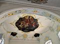
- Nomination Liel: Saint Vinzenz Church, fresco at choir --Taxiarchos228 14:29, 27 July 2011 (UTC)
- Promotion composition could be better, but good quality --Carschten 13:04, 3 August 2011 (UTC)
-
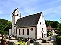
- Nomination Liel: Saint Vinzenz Church --Taxiarchos228 14:29, 27 July 2011 (UTC)
- Promotion Ok.--Ankara 07:04, 3 August 2011 (UTC)
-

-
- Nomination: Aachen: Building between the Cathedral and the Domsingschule --Carschten 12:51, 27 July 2011 (UTC)
- Review needed
-

- Nomination: Aachen: southwestern part of the city hall --Carschten 12:51, 27 July 2011 (UTC)
- Review needed
-
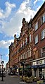
-

-
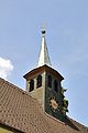
- Nomination Mauchen: Saint Nicolaus Chapel, ridge turret --Taxiarchos228 07:59, 27 July 2011 (UTC)
- Promotion Ok. --Ankara 07:04, 3 August 2011 (UTC)
-

- Nomination Obereggenen: Protestant Church, bell tower --Taxiarchos228 07:59, 27 July 2011 (UTC)
- Promotion Ok. --Ankara 07:04, 3 August 2011 (UTC)
-

- Nomination Shikinaen Garden in Naha, Okinawa --663highland 00:32, 27 July 2011 (UTC)
- Decline Harsh light, CA in trees and unsharp. -Gzzz 21:09, 2 August 2011 (UTC)
-
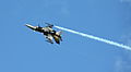
-

- Nomination Germany, Dettelbach, Townhall --Berthold Werner 19:58, 26 July 2011 (UTC)
- Promotion Ok.--Ankara 06:54, 3 August 2011 (UTC)
-

- Nomination Niedereggenen: Protestant Church, epitaph --Taxiarchos228 13:31, 26 July 2011 (UTC)
- Promotion QI to me.--Ankara 06:54, 3 August 2011 (UTC)
-

-

- Nomination Entrance to Illenau Cemetery --Metallissimus 12:09, 25 July 2011 (UTC)
- Promotion Good quality, geolocalisation would be nice. --Coyau 09:07, 3 August 2011 (UTC)
-

- Nomination Copris lunaris ♀ --Archaeodontosaurus 13:48, 1 August 2011 (UTC)
- Promotion Very good -- George Chernilevsky 19:59, 1 August 2011 (UTC)
-
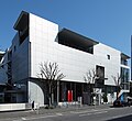
- Nomination TEPIA, Tokyo Japan, design by Fumihiko Maki by Wiiii --Elekhh 12:00, 25 July 2011 (UTC)
- Promotion Seems to be QI, but lacks geocode and explanation of what is TEPIA. Please add, thank you.--PereslavlFoto 20:36, 1 August 2011 (UTC)
-
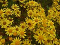
- Nomination Macro spot focus shot of a bee among flowers --Tyw7 03:25, 1 August 2011 (UTC)
- Decline good for a mobile phone, but colours and details not good enough for QI --Mbdortmund 06:57, 1 August 2011 (UTC)
-
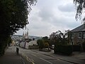
-
- Nomination Post Tower in Bonn 2009 -- H005 23:07, 31 July 2011 (UTC)
- Decline not sharp enough, strange reflections, CA --Mbdortmund 02:56, 1 August 2011 (UTC)
-

- Nomination The Coat of Arms of Duisburg on a leather-bound book -- H005 20:58, 31 July 2011 (UTC)
- Promotion Good quality. --Mbdortmund 02:54, 1 August 2011 (UTC)
-

- Nomination Hechingen: Collegiate Church, pipe organ and gallery --Taxiarchos228 19:07, 31 July 2011 (UTC)
- Promotion Good.--Ankara 07:01, 1 August 2011 (UTC)
-

- Nomination Chazara briseis. --Le.Loup.Gris 15:59, 31 July 2011 (UTC)
- Promotion Good --Ximonic 17:26, 31 July 2011 (UTC)
-
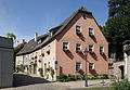
- Nomination Germany, Dettelbach, Ecke Bamberger Str. - Hirtengasse --Berthold Werner 14:48, 31 July 2011 (UTC)
- Promotion Good quality. --Sfu 21:22, 31 July 2011 (UTC)
-
- Nomination Pavement in Ca' d'Oro palace in Venice. --M0tty 09:04, 31 July 2011 (UTC)
- Promotion Support QI & Useful --Archaeodontosaurus 07:32, 1 August 2011 (UTC)
-
- Nomination Pavement in Ca' d'Oro palace in Venice. --M0tty 09:04, 31 July 2011 (UTC)
- Promotion Support QI & Useful --Archaeodontosaurus 07:32, 1 August 2011 (UTC)
-

- Nomination Wax museum in Międzyzdroje, West Pomeranian Voivodeship in the evening. -- Felix Koenig 08:31, 31 July 2011 (UTC)
- Promotion Good quality. --Berthold Werner 14:50, 31 July 2011 (UTC)
-

- Nomination Parts of a bell --Malyszkz 07:27, 31 July 2011 (UTC)
- Promotion Good quality. --Taxiarchos228 16:27, 31 July 2011 (UTC)
-

- Nomination Rinku Gate Tower Building, Osaka Pref. --663highland 02:21, 31 July 2011 (UTC)
- Promotion Good quality. --Taxiarchos228 16:27, 31 July 2011 (UTC)
-

- Nomination Light pollution over Mulhouse, France. --ComputerHotline 19:30, 30 July 2011 (UTC)
- Promotion Good quality. --Mbdortmund 02:58, 1 August 2011 (UTC)
-
- Nomination Church Maria Limbach --Berthold Werner 14:36, 30 July 2011 (UTC)
- Promotion top of the tower not perfect, but else good quality and composition --Mbdortmund 02:59, 1 August 2011 (UTC)
-

-

-
- Nomination Niedereggenen: Protestant Church, epitaph --Taxiarchos228 13:31, 26 July 2011 (UTC)
- Promotion A QI to me. --Ximonic 15:45, 31 July 2011 (UTC)
-
- Nomination Niedereggenen: Protestant Church, wodden part of the older church --Taxiarchos228 13:31, 26 July 2011 (UTC)
- Promotion A QI to me. --Ximonic 15:47, 31 July 2011 (UTC)
-

- Nomination: Dom Złotnika (Goldsmith's House) in Lublin, Poland. --Sfu 11:41, 26 July 2011 (UTC)
- Review needed
-

- Nomination: Lubomirskich Palace, Warsaw, Poland. --Sfu 11:41, 26 July 2011 (UTC)
- Review needed
-
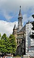
- Nomination: West tower of the Aachen City Hall --Carschten 11:07, 26 July 2011 (UTC)
- Review needed
-
- Nomination: Dutch F-16. --Airwolf 09:35, 26 July 2011 (UTC)
- Review needed
-

- Nomination: Frecce Tricolori. --Airwolf 09:35, 26 July 2011 (UTC)
- Review needed
-
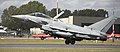
- Nomination: Eurofighter Typhoon. --Airwolf 09:33, 26 July 2011 (UTC)
- Review needed
-

- Nomination: Bombardier CRJ 900. --Airwolf 09:33, 26 July 2011 (UTC)
- Review needed
-
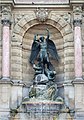
- Nomination: Fontaine Saint Michel, Paris. -- Alvesgaspar 08:39, 26 July 2011 (UTC)
- Review needed
-

- Nomination: Fontaine Saint Michel, Paris. -- Alvesgaspar 08:39, 26 July 2011 (UTC)
- Review needed
-

- Nomination: Jewish cemetery in Třebíč (Trebitsch) - old part --Pudelek 08:12, 26 July 2011 (UTC)
- Review needed
-

- Nomination: A "JQKA" hand in a card game. --Prenn 07:05, 26 July 2011 (UTC)
- Review needed
-

- Nomination: The Passage de l'Amphithéâtre in Metz, France -- MJJR 21:12, 25 July 2011 (UTC)
- Review needed
-

- Nomination: Air China's Airbus A330-243. --Airwolf 18:53, 25 July 2011 (UTC)
- Review needed
-
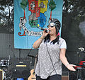
- Nomination: Milena performing at Flower for Gosho Fest 2011. --MrPanyGoff 17:29, 25 July 2011 (UTC)
- Review needed
-

-

- Nomination: Hung Kings' Temple Festival is celebrated at a secondary school in HCMC, Vietnam. --Prenn 16:03, 25 July 2011 (UTC)
- Review needed
-

- Nomination: Cormorant (Phalacrocorax carbo) --Raghith 15:18, 25 July 2011 (UTC)
- Review needed
-

- Nomination: African twin statues, The Children's Museum of Indianapolis. --Raghith 15:18, 25 July 2011 (UTC)
- Review needed
-

- Nomination: Female tennis player Anna-Lena Grönefeld --Carschten 14:50, 25 July 2011 (UTC)
- Review needed
-

- Nomination: Female tennis player Anna-Lena Grönefeld --Carschten 14:50, 25 July 2011 (UTC)
- Review needed
-

- Nomination: Female tennis player Anna-Lena Grönefeld --Carschten 14:50, 25 July 2011 (UTC)
- Review needed
-

- Nomination: Female tennis player Anna-Lena Grönefeld --Carschten 14:50, 25 July 2011 (UTC)
- Review needed
-
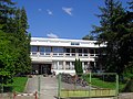
- Nomination: Kürt - alapiskola -- Raghith 14:48, 25 July 2011 (UTC)
- Review needed
-
- Nomination: The church of Saint Metropolitan Peter in Pereslavl. --PereslavlFoto 12:24, 25 July 2011 (UTC)
- Review needed
-

-

-

-
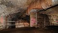
- Nomination Inside an old NATO base. --ComputerHotline 16:34, 24 July 2011 (UTC)
- Promotion Good. -Gzzz 11:40, 1 August 2011 (UTC)
-
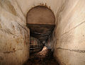
- Nomination Inside an old NATO base. --ComputerHotline 16:34, 24 July 2011 (UTC)
- Promotion Good. -Gzzz 11:40, 1 August 2011 (UTC)
-
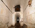
- Nomination Inside an old NATO base. --ComputerHotline 16:34, 24 July 2011 (UTC)
- Promotion Good. -Gzzz 11:40, 1 August 2011 (UTC)
-
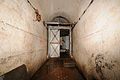
- Nomination Inside an old NATO base. --ComputerHotline 16:34, 24 July 2011 (UTC)
- Promotion Good. -Gzzz 11:40, 1 August 2011 (UTC)
-

-
- Nomination at Siseibyo in Naha, Okinawa --663highland 11:46, 24 July 2011 (UTC)
- Decline Many CA in the trees, and tilted anticlockwise imo. -Gzzz 11:33, 1 August 2011 (UTC)
-

- Nomination: Femme prenant des fruits --Vitold Muratov 23:25, 21 July 2011 (UTC)
- Review Question This picture she was taken to the Louvre? caption is very inadequate --Archaeodontosaurus 08:12, 23 July 2011 -- Yes, thats fragment (without frame of pictures) direct from wall in Louvre--Vitold Muratov 13:35, 25 July 2011 (UTC)
-

- Nomination The sea at Hyères, France. --ComputerHotline 17:15, 20 July 2011 (UTC)
- Decline Comment Uncovered areas at he lower end. A different crop should help. -- H005 13:55, 23 July 2011 (UTC) Oppose no answer --Carschten 17:17, 31 July 2011 (UTC)
-

- Nomination Grasse, Cathédrale Notre-Dame-du-Puy --Berthold Werner 10:47, 20 July 2011 (UTC)
- Promotion Has the top portion become blurry due to perspective correction? --Jovianeye 12:13, 25 July 2011 (UTC) Support I would say yes, but nonetheless a QI to me --Carschten 17:17, 31 July 2011 (UTC)
-

- Nomination Germany, Dettelbach, Eichgasse 2 --Berthold Werner 13:07, 1 August 2011 (UTC)
- Promotion Good.--Ankara 13:44, 1 August 2011 (UTC)
-

- Nomination Zehntscheune at Castle Burg Linn --Carschten 11:05, 1 August 2011 (UTC)
- Promotion Good quality. --Berthold Werner 13:43, 1 August 2011 (UTC)
-
- Nomination Fountain Vinzenzbrunnen in Aachen --Carschten 11:05, 1 August 2011 (UTC)
- Promotion Good quality. --Berthold Werner 13:42, 1 August 2011 (UTC)
-

- Nomination Basílica Nuestra Señora del Pilar (Recoleta, Buenos Aires). --Butterfly austral 02:02, 30 July 2011 (UTC)
- Promotion good. --Ankara 13:56, 1 August 2011 (UTC)
-

- Nomination: View to the Kremlin, across the Moscow River. -- Alvesgaspar 14:33, 26 July 2011 (UTC)
- Review needed
-
- Nomination: Schliengen: Saint Leodegar Church, epitaph --Taxiarchos228 13:31, 26 July 2011 (UTC)
- Review needed
-

- Nomination: Obereggenen: Protestant Church, war memorial --Taxiarchos228 13:31, 26 July 2011 (UTC)
- Review needed
-

- Nomination The Red square, Moscow, view from northwest -- Alvesgaspar 18:20, 22 July 2011 (UTC)
- Promotion I think it meets the criteria.--MrPanyGoff 09:47, 23 July 2011 (UTC)
-

- Nomination Skeleton of Glyptodon clavipes --Llez 06:06, 31 July 2011 (UTC)
- Promotion Support QI & Useful --Archaeodontosaurus 06:08, 31 July 2011 (UTC)
-

- Nomination Pavement in Ca' d'Oro palace in Venice. --M0tty 22:46, 30 July 2011 (UTC)
- Promotion Support QI & Useful --Archaeodontosaurus 06:07, 31 July 2011 (UTC)
-

- Nomination European Rhinoceros Beetle male -- George Chernilevsky 21:05, 30 July 2011 (UTC)
- Promotion Support QI & Useful --Archaeodontosaurus 05:48, 31 July 2011 (UTC)
-

- Nomination Hechingen: Minster Saint Luzen, altar --Taxiarchos228 10:26, 30 July 2011 (UTC)
- Promotion QI for me--Lmbuga 07:02, 31 July 2011 (UTC)
-

- Nomination Hechingen: Minster Saint Luzen, interior --Taxiarchos228 10:26, 30 July 2011 (UTC)
- Promotion Support QI for me --Archaeodontosaurus 05:51, 31 July 2011 (UTC)
-

- Nomination Hechingen: Collegiate Church, pulpit --Taxiarchos228 10:26, 30 July 2011 (UTC)
- Promotion Support QI for me --Archaeodontosaurus 05:47, 31 July 2011 (UTC)
-

- Nomination Transparent roof of Warsaw University of Technology Main Building. --Sfu 09:37, 30 July 2011 (UTC)
- Promotion Comment Great composition, the glass roof is of excellent quality, just the surrounding walls are very noisy. Can you do something about this? If so, I'd even support it for FP. -- H005 10:17, 30 July 2011 (UTC)
I uploaded version with some denoising done. --Sfu 11:49, 30 July 2011 (UTC)
OK, luminance noise is very low now, but there's still a lot of colour noise (usually easier to get rid of than luminance noise) - and you added a black line in the lower right corner. :-) -- H005 12:03, 30 July 2011 (UTC)
Wasn't easier fr me, but done. --Sfu 14:57, 30 July 2011 (UTC) Support Great work! -- H005 16:29, 30 July 2011 (UTC)
-

- Nomination Fossil more than 3 billion years --Archaeodontosaurus 08:40, 30 July 2011 (UTC)
- Promotion QI for me--Lmbuga 07:13, 31 July 2011 (UTC)
-

- Nomination Prades in Lozère, France. --Myrabella 07:38, 30 July 2011 (UTC)
- Promotion Support QI for me --Archaeodontosaurus 13:03, 30 July 2011 (UTC)
-
- Nomination Morning-glory Plume Moth --Archaeodontosaurus 05:58, 30 July 2011 (UTC)
- Promotion Support QI to me --Llez 09:24, 31 July 2011 (UTC)
-
![* Nomination Principle of a 2-stroke hot bulb engine (by Malyszkz 05:00, 30 July 2011 (UTC))]] --Malyszkz 05:00, 30 July 2011 (UTC) * Promotion Support Very good work - and very useful! --H005 14:23, 30 July 2011 (UTC)](https://upload.wikimedia.org/wikipedia/commons/thumb/1/14/T%C3%A4ndkulemotor.svg/86px-T%C3%A4ndkulemotor.svg.png)
-

-

- Nomination Hechingen: Collegiate Church, choir-fresco --Taxiarchos228 06:16, 29 July 2011 (UTC)
- Promotion Support QI for me --Archaeodontosaurus 13:17, 30 July 2011 (UTC)
-

- Nomination Headquarters of the Ministry of Foreign affairs, Russian Federation. One of the tenebrous Stalinist buildings in Moscow know as the Seven Sisters. A very difficult shot and processing, due to the obstacles in front of the subject. -- Alvesgaspar 14:26, 26 July 2011 (UTC)
- Promotion Just a pity it will soon be deleted - stupid Russian law! --H005 20:41, 30 July 2011 (UTC)
-

- Nomination Villa Ephrussi de Rothschild --Berthold Werner 08:15, 26 July 2011 (UTC)
- Promotion I opposed FP, but it's definitely a good QI. --H005 20:16, 30 July 2011 (UTC)
-

-

- Nomination: Calamintha grandiflora 'Variegata' --Captain-tucker 09:33, 25 July 2011 (UTC)
- Review needed
-

-

-

-

- Nomination Bud of Indian Lotus. Jardin des Plantes, Paris. -- Alvesgaspar 22:19, 24 July 2011 (UTC)
- Promotion Support QI for me --Archaeodontosaurus 08:13, 31 July 2011 (UTC)
-

- Nomination: Guy Novès, Stade toulousain coach Léna 21:50, 24 July 2011 (UTC)
- Review needed
-

- Nomination: Eurofighter Typhoon. --Airwolf 20:58, 24 July 2011 (UTC)
- Review needed
-

- Nomination: Eurofighter Typhoon. --Airwolf 20:58, 24 July 2011 (UTC)
- Review needed
-

- Nomination: Lilium 'Broadway' --Captain-tucker 20:39, 24 July 2011 (UTC)
- Review needed
-

- Nomination: Jewish cemetery in Třebíč (Trebitsch) - new part --Pudelek 20:36, 24 July 2011 (UTC)
- Review needed
-
- Nomination: Jewish cemetery in Třebíč (Trebitsch) - new part --Pudelek 20:36, 24 July 2011 (UTC)
- Review needed
-
- Nomination: Bird of Paradise. Jardin des Plantes, Paris. -- Alvesgaspar 18:36, 24 July 2011 (UTC)
- Review needed
-
- Nomination: Old dowel pins. DocteurCosmos 16:20, 24 July 2011 (UTC)
- Review needed
-

- Nomination: Rosa 'Tiffany', Duftrosengarten in Rapperswil by Roland zh; nominated by --Anna reg 13:35, 24 July 2011 (UTC)
- Review needed
-
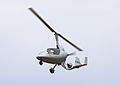
- Nomination: Autogyro. --Airwolf 12:25, 24 July 2011 (UTC)
- Review needed
-
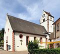
- Nomination: Liel: Saint Vinzenz Church --Taxiarchos228 09:42, 24 July 2011 (UTC)
- Review CommentPerspective looks overcorrected. Especially on the front wall. --Sfu 11:40, 25 July 2011 (UTC)
-

-

-
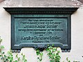
-

- Nomination Bolata rocky coast near Kaliakra cape. --MrPanyGoff 10:21, 23 July 2011 (UTC)
- Promotion OK --H005 21:25, 30 July 2011 (UTC)
-

-

-

-

-

-

-
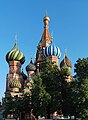
- Nomination Saint Basil's Cathedral, Moscow -- Alvesgaspar 18:59, 22 July 2011 (UTC)
- Decline Hidden by trees ... --H005 21:08, 30 July 2011 (UTC)
-
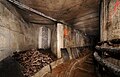
- Nomination inside an old NATO base. --ComputerHotline 17:26, 22 July 2011 (UTC)
- Promotion Good quality. --H005 21:08, 30 July 2011 (UTC)
-

-

-

- Nomination Gate with the Theotokos of Tikhvin church, Danilov monastery, Pereslavl. --PereslavlFoto 15:36, 22 July 2011 (UTC)
- Promotion OK --H005 21:08, 30 July 2011 (UTC)
-
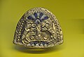
- Nomination Brooch found in a grave nearby Tell Halaf, now in the Pergamon museum, Berlin. --Genealogist 15:26, 22 July 2011 (UTC)
- Decline Noisy, unsharp --H005 21:08, 30 July 2011 (UTC)
-

- Nomination Schliengen: Saint Leodegar Church, fresco of Leodegar near quire arch, Christogram IHS below --Taxiarchos228 12:10, 22 July 2011 (UTC)
- Promotion Good quality. --H005 21:08, 30 July 2011 (UTC)
-
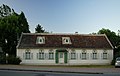
- Nomination Residential building at Wiener Straße in Unterwaltersdorf, municipality of Ebreichsdorf. --Herzi Pinki 23:27, 21 July 2011 (UTC)
- Decline Good, except for the violet fringes (chromatic aberration) on the trees. Can you fix it? --Gzzz 20:12, 23 July 2011 (UTC)
Oppose because of perspective / crop --H005 12:11, 30 July 2011 (UTC)
-
-
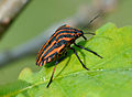
- Nomination Striped Shield Bug. --Quartl 05:46, 30 July 2011 (UTC)
- Promotion Support QI & Useful --Archaeodontosaurus 06:04, 30 July 2011 (UTC)
-
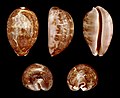
- Nomination Shell of a Map Cowry, Leporicypraea mappa --Llez 05:33, 30 July 2011 (UTC)
- Promotion Support QI & Useful --Archaeodontosaurus 06:02, 30 July 2011 (UTC)
-

-

- Nomination Igor Borisov, a Russian lawyer. A.Savin 18:38, 29 July 2011 (UTC)
- Promotion Good quality. --Tomer T 11:20, 30 July 2011 (UTC)
-

-
-

- Nomination Church of Saint-Hilliers, Ile de France. --Pline 19:52, 26 July 2011 (UTC)
- Promotion Seems to be too noisy and there is a strange effect between roof and sky (See annotation). --Berthold Werner 20:17, 26 July 2011 (UTC)
I check on the original picture and it seems to be something real, perhaps the sun reflecting on plaster like on the top of the roof. I apply a noise filter.--Pline 20:46, 26 July 2011 (UTC)
Good now --Berthold Werner 17:47, 29 July 2011 (UTC)
-

- Nomination Shrine in Stefanów, Masovian Voivodeship, Poland. --Sfu 11:41, 26 July 2011 (UTC)
- Promotion Good quality. --Berthold Werner 17:49, 29 July 2011 (UTC)
-
- Nomination: at Siseibyo in Naha, Okinawa --663highland 11:46, 24 July 2011 (UTC)
- Review needed
-
- Nomination: Obereggenen: Protestant Church, bell tower --Taxiarchos228 09:42, 24 July 2011 (UTC)
- Review needed
-

- Nomination: Iris vartanii. --Gidip 05:34, 24 July 2011 (UTC)
- Review needed
-
- Nomination: Interior view of a lateral halfdome of the Blue Mosque in Istanbul -- H005 22:10, 23 July 2011 (UTC)
- Review needed
-
- Nomination: Vidraru Lake, Romania, by User:Radu Ana Maria. Andrei Stroe 20:33, 18 July 2011 (UTC)
- Review Comment nice, but tilted and some light adjustment needed (too dark shadows and some too bright areas) --Carschten 09:19, 24 July 2011 (UTC)
-


.JPG)
.JPG)


.jpg)


.jpg)


_02.jpg)


.JPG)


.JPG)


_%E2%80%93_Frontansicht_(3),_10._August_2011,_D%C3%BCsseldorf.jpg)


.JPG)


.jpg)


,_Calocera_viscosa.JPG)


._O_pobo_de_Vilagarc%C3%ADa_de_Arousa_a_Miguel_Hern%C3%A1ndez-V2.jpg)


.JPG)


.JPG)


.JPG)


_in_Oldedalen,_2011_August.jpg)


_-_hrani%C4%8Dn%C3%ADk.jpg)


.JPG)
.JPG)


_-_hrani%C4%8Dn%C3%AD_%22k%C3%A1men%22_3.JPG)


_-_pohled_na_vrchol.jpg)


.JPG)


_-_hrani%C4%8Dn%C3%AD_%22k%C3%A1men%22_2.JPG)


.JPG)


_xypete_MHNT.jpg)


_%26_Mercedes-Benz_300_SL_(W_198)_%E2%80%93_Heckansicht,_10._August_2011,_D%C3%BCsseldorf.jpg)


_-_Hochstein_4.JPG)


_%E2%80%93_Innenraum_(1),_10._August_2011,_D%C3%BCsseldorf.jpg)
_%E2%80%93_Heckansicht_ge%C3%B6ffnet,_10._August_2011,_D%C3%BCsseldorf.jpg)
_%E2%80%93_Seitenansicht_ge%C3%B6ffnet,_10._August_2011,_D%C3%BCsseldorf.jpg)
_%E2%80%93_Frontansicht_ge%C3%B6ffnet,_10._August_2011,_D%C3%BCsseldorf.jpg)
_%E2%80%93_Frontansicht_(2),_10._August_2011,_D%C3%BCsseldorf.jpg)


.JPG)


.JPG)
b.jpg)
![* Nomination Eunica mygdoni from Bolivia --Archaeodontosaurus 08:29, 11 August 2011 (UTC) * Promotion Comment The colors look strange, even for a pinned specimen, compare [1], [2]. --Quartl 16:10, 11 August 2011 (UTC) I confirm the proper color temperature. Specimen that is not old, acquired by the museum 4 years ago. Never exposed (not bleached). --Archaeodontosaurus 14:27, 12 August 2011 (UTC) Okay to me then. --Quartl 15:37, 12 August 2011 (UTC)](/wiki/File:Eunica_mygdonia_MHNT_ventre.jpg)


_-_Mostra_di_Nerone_-_Palatin_hill.jpg)


.jpg)


_%26_Mercedes-Benz_300_SL_(W_198)_%E2%80%93_Frontansicht,_10._August_2011,_D%C3%BCsseldorf.jpg)


.JPG)


![* Nomination File:Marien Himmelfahrt.jpg --Vitold Muratov 11:05, 1 August 2011 (UTC) * Decline Commentlightning is good, but it seems there is a lack of details? [3] --Berthold Werner 13:28, 1 August 2011 (UTC) Oppose per above --Carschten 14:19, 9 August 2011 (UTC)](/wiki/File:Marien_Himmelfahrt.jpg)


.jpg)


.JPG)
.JPG)


.JPG)


_-_Hochstein_3_-_Kapelle.JPG)
_-_Hochstein_2.JPG)
_-_Hochstein_1.JPG)
_by_Pudelek.JPG)


_female_orange.JPG)


.JPG)


.jpg)

_Hedemora_03.jpg)
_Hedemora_01.jpg)


.JPG)


.JPG)

_-_%C5%A0umava_(B%C3%B6hmerwald).JPG)


.JPG)


_2.jpg)


_(17).jpg)


.jpg)


![* Nomination Principle of a 2-stroke hot bulb engine (by Malyszkz 05:00, 30 July 2011 (UTC))]] --Malyszkz 05:00, 30 July 2011 (UTC) * Promotion Support Very good work - and very useful! --H005 14:23, 30 July 2011 (UTC)](/wiki/File:T%C3%A4ndkulemotor.svg)


.jpg)


.jpg)


![[3]](https://commons.wikimedia.org/wiki/File:Bamberg_Brudermuehle_BW_1.JPG)
.jpg)
.jpg)
.jpg)
_–_Heckansicht_(2),_10._August_2011,_Düsseldorf.jpg)
Consensual review[edit]
File:GEnx-Jet-Engine_Le_Bourget_20110624.jpg[edit]

- Nomination: GEnx Jet-Engine --Tieum512 19:57, 17 July 2011 (UTC)
- Review
- Support Tight crop of the bottom, but otherwise good quality --Gzzz 08:57, 24 July 2011 (UTC)
- Oppose Top and bottom cropped off, dizzy light. You should improve clarity and black level. --H005 11:42, 24 July 2011 (UTC)
Running total: 1 support (excluding the nominator), 1 oppose → More votes? H005 12:43, 24 July 2011 (UTC)
File:Kolomenskoe Ascension Church and the bell tower of the George Church.jpg[edit]

- Nomination: Ascension Church, Kolomenskoe, Moscow. A.Savin 20:05, 20 July 2011 (UTC)
- Review
- Support Good quality. --Taxiarchos228 08:40, 21 July 2011 (UTC)
- Oppose Oversharped, visible light borders; CA. I have a sample of image declined with same CA. To avoid oversharpening bright borders you may use a separate layer with Lighten mode and less opacity (about 70%).--PereslavlFoto 15:41, 22 July 2011 (UTC)
- The image may imho not be oversharpened when it is not sharpened at all. Also, there are no longer any significant CA's present. A.Savin 20:11, 22 July 2011 (UTC)
- Проверьте башню справа. Её контуры с цветными аберрациями. Мне зарубили фото домика в Рыбной слободе, на котором были гораздо меньшие аберрации, то есть я опираюсь на прецедент. Или можем подождать: я выставлю фото церкви Петра митрополита, и мы посмотрим, будут ли её рубить за ХА. А резкость вполне может задирать ваша фотокамера, эффект виден по светящемуся контуру над крыльцом и справа от Вознесенской церкви.--PereslavlFoto 11:49, 25 July 2011 (UTC)
- The image may imho not be oversharpened when it is not sharpened at all. Also, there are no longer any significant CA's present. A.Savin 20:11, 22 July 2011 (UTC)
- Wow. You make your desicion whether we have here a CA or not dependent on whether someone will find some CA on your own QI candidate? That's really what I call expert's knowledge. LOL. - A.Savin 07:36, 26 July 2011 (UTC)
- Я вижу здесь ХА и обозначил места на фотографии. Сравнивая с другим прецедентом, я вижу, что здесь ХА гораздо сильнее. Вы правильно рассудили, это именно экспертная оценка после обучения на прецедентах. Я согласен, что экспертные оценки вообще неразумны, однако других тут нету :-))).--PereslavlFoto 10:45, 26 July 2011 (UTC)
- Wow. You make your desicion whether we have here a CA or not dependent on whether someone will find some CA on your own QI candidate? That's really what I call expert's knowledge. LOL. - A.Savin 07:36, 26 July 2011 (UTC)
Running total: 1 support (excluding the nominator), 1 oppose → More votes? --Quartl 12:28, 23 July 2011 (UTC)
File:Schwörstadt_-_Evangelische_Kirche1.jpg[edit]

- Nomination: Schwörstadt: Protestant Church --Taxiarchos228 07:14, 15 July 2011 (UTC)
- Review
- Oppose distortions, lots of overexposed parts --Carschten 18:55, 22 July 2011 (UTC)
- Support Exposure is very good (garage door is a bit too bright, but unimportant) and distortions are not really an issue. --H005 21:42, 22 July 2011 (UTC)
Running total: 1 support (excluding the nominator), 1 oppose → More votes? --Quartl 12:35, 23 July 2011 (UTC)
File:Bad_Bellingen_-_Evangelische_Kirche_Hertingen1.jpg[edit]

- Nomination: Bad Bellingen-Hertingen: Protestant Church --Taxiarchos228 13:52, 10 July 2011 (UTC)
- Review
- The halo behind the clock tower is disturbing IMO.--Jebulon 09:33, 16 July 2011 (UTC)
- Oppose Perspective: A good part of the building is covered by the tree and the building. Also all walls are in the shadow, despite the sun all around. --H005 20:23, 16 July 2011 (UTC)
- the tree covers nothing significant and the tower is symmetric, everything in the shadows is visible cleraly --Taxiarchos228 13:28, 18 July 2011 (UTC)
- Support For me this is a QI. I like the perspective. --Elektroschreiber 20:30, 19 July 2011 (UTC)
Running total: 1 support (excluding the nominator), 1 oppose → More votes? H005 17:12, 20 July 2011 (UTC)
File:Moscow July 2011-14a.jpg[edit]

- Nomination The Pashkov House, Moscow. View of the back side. ---- Alvesgaspar 18:44, 22 July 2011 (UTC)
- Decline
- Support OK --H005 21:08, 30 July 2011 (UTC)
- Oppose Unsharp and CA (see notes on picture). -Gzzz 10:56, 1 August 2011 (UTC)
- Oppose per Gzzz + cutted lampposts at right and left --Carschten 11:46, 1 August 2011 (UTC)
Running total: 1 support (excluding the nominator), 2 oppose → Decline? --Carschten 11:46, 1 August 2011 (UTC)
File:Thistle Closeup Falmouth.jpg[edit]

- Nomination Closeup of a thistle --Tyw7 13:59, 28 July 2011 (UTC)
- Decline
- Oppose Bad framing.--Archaeodontosaurus 08:43, 30 July 2011 (UTC)
- What do you mean bad framing? It is framed according to rule of thirds. --Tyw7 09:15, 30 July 2011 (UTC)
- Too many blurred areas that could be removed. -Archaeodontosaurus 08:09, 31 July 2011 (UTC)
- What do you mean bad framing? It is framed according to rule of thirds. --Tyw7 09:15, 30 July 2011 (UTC)
Running total: 0 support (excluding the nominator), 1 oppose → Decline? --Quartl 17:27, 2 August 2011 (UTC)
File:Thistle macro.jpg[edit]

- Nomination Macro of thistle --Tyw7 13:59, 28 July 2011 (UTC)
- Decline
- Oppose Tight crop at the bottom. --Gzzz 19:55, 28 July 2011 (UTC)
- I disagree isn't macro the closeup of the subject. The main focus is the subject and is positioned roughly using the rule of thirds (bottom corner) --Tyw7 16:38, 29 July 2011 (UTC)
- The rule of the thirds is applied for a landscape or for a picture in which most of the image is sharp. In this case, the main subject (the flower), in my opinion, should be centered. Here are some examples -Gzzz 16:48, 29 July 2011 (UTC)
- I disagree isn't macro the closeup of the subject. The main focus is the subject and is positioned roughly using the rule of thirds (bottom corner) --Tyw7 16:38, 29 July 2011 (UTC)
Running total: 0 support (excluding the nominator), 1 oppose → Decline? --Quartl 17:26, 2 August 2011 (UTC)
File:Falmouth harbor.jpg[edit]

- Nomination View of falmouth harbor --Tyw7 13:51, 28 July 2011 (UTC)
- Decline
- Oppose <2 mpx, unsharp, tilted. --Quartl 13:52, 28 July 2011 (UTC)
- I disagree It looks fairly straight and the camera is rated at 2 mps. --Tyw7 15:54, 28 July 2011 (UTC)
- Comments? --Tyw7 16:57, 28 July 2011 (UTC)
- Just look at the horizon, the image is tilted clockwise by roughly 1 deg. Rotating the image would further decrease image size and sharpness. --Quartl 07:31, 29 July 2011 (UTC)
- Comment I've rotated the img by 1 degree while maintaining the background. How is it? --Tyw7 16:01, 29 July 2011 (UTC)
- Sorry, there are now severe artifacts at the borders resulting from padding the emtpy space generated by the rotation. Look, for example, at the bottom right corner. You always need to crop an image after rotation. --Quartl 16:22, 29 July 2011 (UTC)
- Oppose Bad contrast, not sharp enough, and the landscape would be better without the fence. -Gzzz 13:12, 31 July 2011 (UTC)
Running total: 0 support (excluding the nominator), 2 oppose → Decline? --Quartl 17:26, 2 August 2011 (UTC)
File:Thistle closeup.jpg[edit]

- Nomination Closeup of a thistle plant --Tyw7 13:51, 28 July 2011 (UTC)
- Decline
- Oppose <2 mpx, unsharp, lacks id. --Quartl 13:52, 28 July 2011 (UTC)
- Oppose Unremarkable picture ; and a bit unsharp... -Gzzz 10:48, 1 August 2011 (UTC)
Running total: 0 support (excluding the nominator), 2 oppose → Decline? --Quartl 12:41, 29 July 2011 (UTC)
File:CH_Caterpillar_2.jpg[edit]

- Nomination Caterpillar of the Spurge Hawk-moth, seen in Kriegtal near Binn, Valais, Switzerland at approx. 2000m altitude --Raghith 15:18, 25 July 2011 (UTC)
- Decline
- Oppose The image is covered with spots --Archaeodontosaurus 20:07, 27 July 2011 (UTC)
- Support I disagree...I believe the spot is part of the caterpillar.... --Tyw7 16:59, 28 July 2011 (UTC)
- Oppose I agree with Archaeodontosaurus (we are talking about the little black stains, not the spots on the larvae). Maybe correctable, though. --V-wolf 21:36, 28 July 2011 (UTC)
- Comment I have removed most of the most alluring spots using the clone tool. But I think it may be dirt on the lenses causing the spots.--Tyw7 16:36, 29 July 2011 (UTC)
- Comment Thank you kindly acknowledge. There are several hundred spots including the animal itself. This image not yet possible not to be improved, except to a very heavy work.--Archaeodontosaurus (talk) 06:15, 30 July 2011 (UTC)
- Oppose Per Archaeodontosaurus. -Gzzz 20:50, 30 July 2011 (UTC)
Running total: 1 support (excluding the nominator), 3 oppose → Decline? --Quartl 17:25, 2 August 2011 (UTC)
File:Vappu 2011 Helsingissä 2.jpg[edit]

- Nomination Havis Amanda during the 2011 1st of May celebrations in Helsinki. --kallerna 06:24, 22 July 2011 (UTC)
- Decline
- Oppose The balloons hide most of the scene and the main subject is cut on the left. --Gzzz 20:18, 28 July 2011 (UTC)
- Comment I would like to hear another opinion, IMO it's very good image of typical finnish "vappu". The statue is in focus, in background celebrating students and balloons all over. --kallerna 11:03, 29 July 2011 (UTC)
Running total: 0 support (excluding the nominator), 1 oppose → Decline? George Chernilevsky 08:22, 3 August 2011 (UTC)
File:2011-07-21-cactaceae-1.jpg[edit]

- Nomination Rebutia minuscula --ComputerHotline 20:08, 21 July 2011 (UTC)
- Decline
- Support Good quality. --Carschten 09:57, 27 July 2011 (UTC)
- Oppose The red base is very disturbing --Archaeodontosaurus 19:55, 27 July 2011 (UTC)
- Oppose Disturbing back- and foreground. --Quartl 07:09, 28 July 2011 (UTC)
- Oppose Per Quartl. -Gzzz 10:41, 1 August 2011 (UTC)
Running total: 1 support (excluding the nominator), 3 oppose → Decline? --Quartl 17:24, 2 August 2011 (UTC)
File:Wirtshauschild Gerlingen.jpg[edit]

- Nomination Inn sign --Harke 14:47, 23 July 2011 (UTC)
- Promotion
- Support Good quality. --H005 17:24, 23 July 2011 (UTC)
- Oppose Tilted. Gidip 13:50, 25 July 2011 (UTC)
- Comment No tilt --Harke 06:30, 27 July 2011 (UTC)
- Support Difficult to make the difference between a tilt of the picture and a tilt of the sign... and impossible to tell from the houses. Anyway, the picture is good. --Gzzz 20:09, 28 July 2011 (UTC)
- Support Per Gzzz --Archaeodontosaurus 15:30, 29 July 2011 (UTC)
- Support - good quality and very typical of this nice region. -- Felix Koenig 18:34, 31 July 2011 (UTC)
Running total: 4 support (excluding the nominator), 1 oppose → Promote? --Quartl 17:24, 2 August 2011 (UTC)
File:Fly on plant (far).jpg[edit]
.jpg)
- Nomination Macro photography of fly on plant --Tyw7 12:34, 2 August 2011 (UTC)
- Decline
- Oppose Neither fly nor plant is identified or sharp. --Quartl 17:01, 2 August 2011 (UTC)
- I disagree The fly is right there on the stem of the plant. The plant is clearly identifiable so is the fly imo --Tyw7 17:10, 2 August 2011 (UTC)
- At least one of flower and fly have to be identified in the description and categorization. --Quartl 17:18, 2 August 2011 (UTC)
- By to identify, he means "to write the insect's and flower's specific latin names". -Gzzz 17:31, 2 August 2011 (UTC)
- I'm assuming its a common house fly. And do we need to know the flower's latin name for QI? If so can a biologist help me? --Tyw7 17:43, 2 August 2011 (UTC)
- Please read the guidelines. --Quartl 17:49, 2 August 2011 (UTC)
- There is nothing mention regarding providing the latin names of the plants/animals --Tyw7 17:58, 2 August 2011 (UTC)
- Quality images must be categorized, have a meaningful title and description. This should include the Taxa naming for organisms. --Quartl 18:43, 2 August 2011 (UTC)
- ... and whatever species the fly actually is, it isn't Musca domestica (see, for example, the wings) and I doubt it can be determined from this image. --Quartl 12:54, 3 August 2011 (UTC)
- There is nothing mention regarding providing the latin names of the plants/animals --Tyw7 17:58, 2 August 2011 (UTC)
- Please read the guidelines. --Quartl 17:49, 2 August 2011 (UTC)
- I'm assuming its a common house fly. And do we need to know the flower's latin name for QI? If so can a biologist help me? --Tyw7 17:43, 2 August 2011 (UTC)
- By to identify, he means "to write the insect's and flower's specific latin names". -Gzzz 17:31, 2 August 2011 (UTC)
- At least one of flower and fly have to be identified in the description and categorization. --Quartl 17:18, 2 August 2011 (UTC)
- I disagree The fly is right there on the stem of the plant. The plant is clearly identifiable so is the fly imo --Tyw7 17:10, 2 August 2011 (UTC)
- Oppose Missing identify isn't the only problem, in this picture. Macro standard for QI is too high --Cesco77 08:02, 3 August 2011 (UTC)
- Oppose per Quartl --Archaeodontosaurus 07:31, 4 August 2011 (UTC)
Running total: 0 support (excluding the nominator), 3 oppose → Decline? --Quartl 09:14, 6 August 2011 (UTC)
File:Río Avía en Ribadavia - Galiza (Spain).jpg[edit]
.jpg)
- Nomination Avia river in Ribadavia--Lmbuga 20:07, 28 July 2011 (UTC)
- Withdrawn
- Question It is not important for me that this photo can be QI. I think that it's not a very good image. I have proposed it to know if the dark zones are too dark. In my monitor I cannot see well those zones. I need references. Are the dark zones too dark? Thanks--Lmbuga 09:09, 2 August 2011 (UTC)
- Very few very dark areas. Your monitor is not properly calibrated. I put a note: you will remove. The image is contrasted against a little too for me. It is not to be the basic setting of your camera. --Archaeodontosaurus 13:16, 2 August 2011 (UTC)
- Thanks. I hope to be able to calibrate the monitor of a Mac of 13”. Now I cannot buy another computer.--Lmbuga 18:17, 3 August 2011 (UTC)
- Very few very dark areas. Your monitor is not properly calibrated. I put a note: you will remove. The image is contrasted against a little too for me. It is not to be the basic setting of your camera. --Archaeodontosaurus 13:16, 2 August 2011 (UTC)
- I withdraw my nomination--Miguel Bugallo 12:44, 6 August 2011 (UTC)
.jpg)
Running total: 0 support (excluding the nominator), 0 oppose → More votes? --Quartl 17:28, 2 August 2011 (UTC)
.jpg)
File:Dornach_-_Goetheanum_-_Fenster.jpg[edit]

- Nomination Goetheanum: window --Taxiarchos228 08:57, 5 August 2011 (UTC)
- Promotion
- Support Good quality. --Carschten 13:03, 5 August 2011 (UTC)
- Oppose I disagree. The middle bar in the window is not vertical as seen on Goetheanum von Süden.jpg. If you agree this can be easily fixed. --Elektroschreiber 16:56, 5 August 2011 (UTC)
- it is also not vertical in File:Goetheanum von Süden.jpg --Taxiarchos228 18:34, 5 August 2011 (UTC)
- Support Taxiarchos is right. Apart from that it is totally irrelevant if the bar is exactly vertical or not, this image lives off the clouds mirrored in the window. De728631 17:46, 6 August 2011 (UTC)
- it is also not vertical in File:Goetheanum von Süden.jpg --Taxiarchos228 18:34, 5 August 2011 (UTC)
Running total: 2 support (excluding the nominator), 1 oppose → Promote? De728631 (talk) 17:48, 6 August 2011 (UTC)
File:Kolomenskoe Falcon Yard.jpg[edit]

- Nomination Kolomenskoe Museum, Moscow: Falcon Yard. A.Savin 19:29, 2 August 2011 (UTC)
- Decline
- Support Good quality. --Sfu 20:40, 2 August 2011 (UTC)
- Oppose Colour moire at the climat controlling machine face panel.--PereslavlFoto 23:20, 1 August 2011 (UTC)
- Oppose as above and also quite a bit of CA. W.S. 09:50, 6 August 2011 (UTC)
Running total: 1 support (excluding the nominator), 2 oppose → Decline? --W.S. 09:50, 6 August 2011 (UTC)
File:Klabund - Dichtungen aus dem Osten (im Regal).jpg[edit]
.jpg)
- Nomination Klabund: Dichtungen aus dem Osten, 1929 -- H005 14:16, 31 July 2011 (UTC)
- Promotion
- Comment
Wrong WB (too yellow),small DOF (even the title name is not sharp). PereslavlFoto 23:54, 4 August 2011 (UTC)- Info Both is on purpose. I used a golden reflector to achieve that colour (IMO it fits better to old books than plain light), and wanted the books to the left and right as blurred as possible with the text on the book in the middle still being easy to read. But of course I accept that different people have different taste. -- H005 22:09, 5 August 2011 (UTC)
- Comment OK, now I am not opposing, while small DOF is a problem. Let others judge the case.--PereslavlFoto 13:21, 6 August 2011 (UTC)
- Support to me it is QI, especially with the given explanation from photographer H005 - usefull for wikipedia de as well --J. Lunau 13:30, 6 August 2011 (UTC)
- Support per J. Lunau. De728631 17:50, 6 August 2011 (UTC)~
Running total: 2 support (excluding the nominator), 0 oppose → Promote? --J. Lunau 13:30, 6 August 2011 (UTC)
File:Czech_Soldier.JPG[edit]

- Nomination Czech Guard soldier -- Raghith 11:06, 28 July 2011 (UTC)
- Decline
- Comment Visible colour noise (behind the head), not sharp (cap badge), not geocoded, lacks detailed description, too tight crop (at the top). PereslavlFoto 23:59, 4 August 2011 (UTC)
- Oppose as above. W.S. 09:46, 6 August 2011 (UTC)
- Oppose Somewhat unsharp and the roof of the shelter should have been visible. De728631 17:55, 6 August 2011 (UTC)
Running total: 0 support (excluding the nominator), 2 oppose → Decline? De728631 17:55, 6 August 2011 (UTC)
File:Rödkull2.jpg[edit]

- Nomination Rödkulla (aka SRB, Svensk Röd Boskap) a traditional swedish breed no longer used in commercial production. --Ankara 13:36, 1 August 2011 (UTC)
- Decline
- Support False side and unsharp tail tips, otherwise good. More opinons? V-wolf 20:39, 1 August 2011 (UTC))
- It is a natural behavior, they use the tail to protect each other from the insects. --Ankara 06:42, 2 August 2011 (UTC)
- Oppose The same as V-wolf. Also the red houses are disturbing. No real contrast to the brown cows. --Elektroschreiber 07:17, 5 August 2011 (UTC)
- Oppose underexposed parts, perspective distortion, blurred tail. --Carschten 13:52, 5 August 2011 (UTC)
- Oppose The red huts are disturbing. De728631 18:03, 6 August 2011 (UTC)
Running total: 1 support (excluding the nominator), 3 oppose → Decline? De728631 18:03, 6 August 2011 (UTC)
File:Monaco_BW_2011-06-07_16-04-17.JPG[edit]

- Nomination Monaco, Building at the Avenue Saint-Martin --Berthold Werner 10:29, 23 July 2011 (UTC)
- Promotion
- Support Good quality. --H005 21:22, 30 July 2011 (UTC)
- Oppose The perspective looks overcorrected... Gzzz 11:30, 1 August 2011 (UTC)
- Support I cannot find anything wrong with perspective. PereslavlFoto 00:06, 5 August 2011 (UTC)
- Support, but the perspective is in fact very narrow. De728631 18:00, 6 August 2011 (UTC)
Running total: 3 support (excluding the nominator), 1 oppose → Promote? De728631 18:00, 6 August 2011 (UTC)
File:Tower 185.jpg[edit]

- Nomination Tower 185 in Frankfurt, Germany -- Der Wolf im Wald 23:50, 3 August 2011 (UTC)
- Decline
- Support - Good quality. --Raghith 05:10, 4 August 2011 (UTC)
- Oppose - overexposed sky. Mattbuck 00:35, 6 August 2011 (UTC)
- Support I don't see how the sky is a problem, it's even this stark contrast between the almost white sky and the darker tower that makes this image valuable. De728631 17:43, 6 August 2011 (UTC)
- Oppose as Mattbuck. Sky should not be white: RGB(255,255,255). W.S. 18:31, 6 August 2011 (UTC)
- Skies are not always blue, e.g. when the sun is located right behind the building you'll have diffuse light and scattering. This is probably a natural phenomenon and should not be digitised away. De728631 01:13, 7 August 2011 (UTC)
- Oppose Overexposed sky, CA on right part --Archaeodontosaurus 14:04, 7 August 2011 (UTC)
Running total: 2 support (excluding the nominator), 3 oppose → Decline? --Elekhh 06:50, 10 August 2011 (UTC)
File:Tamias_striatus_juilllet_2011.jpg[edit]

- Nomination Tamias Striatus --Letartean 16:35, 4 August 2011 (UTC)
- Decline
- Support Good quality, interesting perspective. De728631 22:05, 4 August 2011 (UTC)
- Oppose I think the image has a greenish cast. --Quartl 08:05, 6 August 2011 (UTC)
- I tweaked the colors, better? Letartean 11:57, 6 August 2011 (UTC)
- Hm, I'm not convinced, the colors still seem to be off (too yellow?). For reference, take a look at File:Tamias striatus2.jpg. --Quartl 12:21, 6 August 2011 (UTC)
- Maybe something like File:Tamias striatus juilllet 2011-CN.jpg is better? --Carschten 14:53, 6 August 2011 (UTC)
- This version has better colors, but also a disturbing light hole in the background to the left. Maybe crop it away? --Quartl 15:07, 6 August 2011 (UTC)
- I'm strongly against cropping it. First of all I don't think the left bright spot is disturbing at all but it adds a good contrast and illustrates the natural surrounding. And cropping it away would leave you with a single light hole above the head which would then really be disturbing. And moreover you would totally loose the perspective of a tiny chipmunk on a big green background – that is really what makes this image special because you get an idea of the relation of size between the twig and the animal. Carschten's modifications look good though. De728631 (talk) 17:36, 6 August 2011 (UTC)
- This version has better colors, but also a disturbing light hole in the background to the left. Maybe crop it away? --Quartl 15:07, 6 August 2011 (UTC)
- Maybe something like File:Tamias striatus juilllet 2011-CN.jpg is better? --Carschten 14:53, 6 August 2011 (UTC)
- Hm, I'm not convinced, the colors still seem to be off (too yellow?). For reference, take a look at File:Tamias striatus2.jpg. --Quartl 12:21, 6 August 2011 (UTC)
- I tweaked the colors, better? Letartean 11:57, 6 August 2011 (UTC)
- Oppose White balance is definitely off (File:Tamias striatus juilllet 2011 HH.jpg). And crop would be nice. W.S. 18:53, 6 August 2011 (UTC)
- Now that really looks artificially whitened. And the one big light hole is much more distracting (what I feared above) than the two separate holes on the bigger image. De728631 01:09, 7 August 2011 (UTC)
Running total: 1 support (excluding the nominator), 2 oppose → Decline? --Quartl 05:56, 11 August 2011 (UTC)
File:Schliengen_-_St._Leodegar3.jpg[edit]

- Nomination Schliengen: Saint Leodegar Church, view from forecourt --Taxiarchos228 14:08, 28 July 2011 (UTC)
- Decline
- Oppose very clear perspective distortions. Vielleicht kann die de:WP:FWS helfen, denn die Qualität und Komposition sind ansonsten sehr gut und schön. --Carschten 12:37, 4 August 2011 (UTC)
- distortions arn't avoidable in this angle, don't see whats the point against QI --Taxiarchos228 12:57, 4 August 2011 (UTC)
- The point is that they look unreal and could be corrected. --Carschten 13:20, 4 August 2011 (UTC)
- can't see s.th. unreal --Taxiarchos228 13:31, 4 August 2011 (UTC)
- The point is that they look unreal and could be corrected. --Carschten 13:20, 4 August 2011 (UTC)
- distortions arn't avoidable in this angle, don't see whats the point against QI --Taxiarchos228 12:57, 4 August 2011 (UTC)
- Support Ich sehe da kein Problem mit der Verzerrung. De728631 17:52, 6 August 2011 (UTC)
- Oppose Needs perspective correction IMO. W.S. 21:49, 8 August 2011 (UTC)
Running total: 1 support (excluding the nominator), 2 oppose → Decline? --Quartl 05:55, 11 August 2011 (UTC)
File:Forsthaus Oberwaiz.JPG[edit]

- Nomination historical building "Forsthaus Oberwaiz", former hunting seat from "Plassenberger", now used by evang.-reform.-curch, built 1776 --J. Lunau 23:33, 5 August 2011 (UTC)
- Promotion
- Comment thank you for the review. I don't understand, why you decline because of "lack of sharpness and clarity". Photo was taken on cloudy day and the mood of light was exactly as shown. Building itself is made out of sandstone, maybe this looks "soft" to you?. I will check, if I can make any improvements (higher saturation, sharpening) on the shoot and than I 'll ask for other opinions. --J. Lunau 10:45, 8 August 2011 (UTC)
- Nikon D70 allows 3008×2000 px, so you may think about uploading the larger version than current 1947×1203 size. Check the sharpness of details.--PereslavlFoto 10:49, 8 August 2011 (UTC)
- Done new version: higher resolution, more details - thanks in advance to all reviews --J. Lunau (talk) 12:30, 8 August 2011 (UTC)
- Support Much better now, but you could make it even sharper with unsharp mask filter in photo editor.--PereslavlFoto 16:39, 8 August 2011 (UTC)
- Comment thank you once again for your detailed review - very helpful to learn more about photography. I already used slightly "unsharp mask" from gimp 2.6.11 on this photo, but I do not want to over process it. --J. Lunau 13:25, 9 August 2011 (UTC)
- Nikon D70 allows 3008×2000 px, so you may think about uploading the larger version than current 1947×1203 size. Check the sharpness of details.--PereslavlFoto 10:49, 8 August 2011 (UTC)
Running total: 1 support (excluding the nominator), 0 oppose → Promote? --Quartl 16:01, 11 August 2011 (UTC)
File:Vladimir Churov RN MOW 07-11.jpg[edit]

- Nomination Vladimir Churov, a Russian official. A.Savin 19:29, 2 August 2011 (UTC)
- Decline
- Comment Wrong WB (too yellow), too many lights on glasses and teeth (some can be retouched), the whole expression is not perfect (take other photo from this series of images), colour noise in background (can be reduced with denoising software).--PereslavlFoto 20:41, 4 August 2011 (UTC)
- Oppose WB should be corrected. —ViseMoD 13:46, 9 August 2011 (UTC)
Running total: 0 support (excluding the nominator), 1 oppose → Decline? --Quartl 16:00, 11 August 2011 (UTC)
File:El_Gouna_Three_Corners_R06.jpg[edit]

- Nomination El Gouna (Egypt): The Three Corners Resort -- MJJR 20:59, 23 July 2011 (UTC)
- Promotion
- Comment Tilted. -- H005 21:22, 30 July 2011 (UTC)
- Support Good quality. --Raghith 05:16, 5 August 2011 (UTC)
- Oppose As I said before - tilted. --H005 22:14, 5 August 2011 (UTC) Support New version is good. -- H005 07:10, 11 August 2011 (UTC)
- That can easily be fixed. De728631 17:56, 6 August 2011 (UTC)
- Done New (corrected & cropped) version uploaded! -- MJJR 22:01, 9 August 2011 (UTC)
- Support --Mbdortmund 03:56, 11 August 2011 (UTC)
Running total: 3 support (excluding the nominator), 0 oppose → Promote? --Quartl 05:40, 13 August 2011 (UTC)
File:Dornach_-_Heizhaus2.jpg[edit]

- Nomination boiler house (detail) --Taxiarchos228 06:25, 6 August 2011 (UTC)
- Decline
- Support QI & Useful --Archaeodontosaurus 14:12, 7 August 2011 (UTC)
- Oppose Too tightly cropped for me. W.S. 08:49, 9 August 2011 (UTC)
- all of the chimney is visible and here is not FPC --Taxiarchos228 11:53, 9 August 2011 (UTC)
- Oppose - areas of overexposure in the clouds. Mattbuck 22:59, 9 August 2011 (UTC)
- please explain me the difference between the clouds in this picture and in this one File:Clifton Down railway station MMB 14 143621 143620.jpg. Why are they here overexposed and in yours not? --Taxiarchos228 06:06, 10 August 2011 (UTC)
- You're quite right, I honestly would not have promoted mine, not sure why I nominated it. Mattbuck 12:45, 11 August 2011 (UTC)
- I don't see overexposed parts. White clouds are white, that's a fact and not an error. --Taxiarchos228 13:57, 11 August 2011 (UTC)
- You're quite right, I honestly would not have promoted mine, not sure why I nominated it. Mattbuck 12:45, 11 August 2011 (UTC)
- please explain me the difference between the clouds in this picture and in this one File:Clifton Down railway station MMB 14 143621 143620.jpg. Why are they here overexposed and in yours not? --Taxiarchos228 06:06, 10 August 2011 (UTC)
Running total: 1 support (excluding the nominator), 2 oppose → Decline? --Quartl 20:24, 13 August 2011 (UTC)
File:Dave_Bulthuis.JPG[edit]

- Nomination Dave Bulthuis a Dutch player for FC Utrecht --Ed Lane 08:53, 2 August 2011 (UTC)
- Decline
- Comment IMO, picture of soccer player during a match must be action shot with a ball --Cesco77 08:07, 3 August 2011 (UTC)
- Don't think thats relevant. Its about the picture, not how the picture could be if he had the bal. Ed Lane 21:01, 3 August 2011 (UTC)
- Support for me, the quality of this photo fulfills all given QI-creterias - the discussed issue about "action", is not covered by QI --J. Lunau 13:00, 6 August 2011 (UTC)
- Support Footballers do not have to be caught shooting a ball to be in a quality image. De728631 18:05, 6 August 2011 (UTC)
- Temporary oppose visible vignetting. A slight reframing would also allow to give a better place to the subject and to eliminate a few distracting objects near the borders. Otherwise ok for me given the circumstances of this kind of photograph. --Eusebius 10:55, 9 August 2011 (UTC)
- Oppose bad crop (per Eusebius), chromatic aberrations, very harsh shadows. --Carschten 12:01, 9 August 2011 (UTC)
- Oppose vignetting. --Elekhh 09:48, 11 August 2011 (UTC)
Running total: 2 support (excluding the nominator), 3 oppose → Decline? --Quartl 20:22, 13 August 2011 (UTC)
File:Duisburg, Rheinorange, 2011-08 CN-01.jpg[edit]

- Nomination Sculpture Rheinorange in Duisburg --Carschten 11:27, 11 August 2011 (UTC)
- Promotion
- Support QI for me--Lmbuga 15:09, 11 August 2011 (UTC)
- Oppose Composition isn't good. This version File:Duisburg,_Rheinorange,_2011-08_CN-02.jpg is better. —ViseMoD 19:15, 11 August 2011 (UTC)
- Please tell me what's wrong with the composition; and it's not forbidden to have several QIs of one motive. --Carschten 14:49, 12 August 2011 (UTC)
- Support some noise in the sky but still QI --Archaeodontosaurus 14:19, 12 August 2011 (UTC)
- Support - composition not perfect, but still okay and QI. Felix Koenig 10:52, 16 August 2011 (UTC)
Running total: 3 support (excluding the nominator), 1 oppose → Promote? --Quartl 16:30, 14 August 2011 (UTC)
File:2011.07.23 068a.jpg[edit]

- Nomination The Squaire - Airport Frankfurt --PS-2507 10:45, 10 August 2011 (UTC)
- Decline
- Support Good quality. --Raghith 07:39, 11 August 2011 (UTC)
- Oppose Strong CA and blown-out areas. Also bad file name. --Elekhh 09:42, 11 August 2011 (UTC)
- Oppose aberration of perspective --Archaeodontosaurus 14:22, 12 August 2011 (UTC)
Running total: 1 support (excluding the nominator), 2 oppose → Decline? --Quartl 16:29, 14 August 2011 (UTC)
File:Rainbow_Lorikeet_MacMasters.jpg[edit]

- Nomination Rainbow Lorikeet MacMasters --99of9 13:10, 7 August 2011 (UTC)
- Decline
- Support Wow...its wonderful!!! Its very colorful and bright as well. And its rare, these birds (right?) and birds usually shy away from pictures. Well done. Promoted. --Nissim 14 13:42, 7 August 2011 (UTC)
- Comment Actually, these are quite common in Australia and, when fed, not shy at all (see this image). --Quartl 07:02, 8 August 2011 (UTC)
- Comment Looks not too sharp. —ViseMoD 14:07, 9 August 2011 (UTC)
- Oppose not sharp --Tlusťa 09:00, 11 August 2011 (UTC)
- Oppose not sharp --Archaeodontosaurus 14:23, 12 August 2011 (UTC)
- Oppose Noisy. --PereslavlFoto 11:22, 15 August 2011 (UTC)
Running total: 1 support (excluding the nominator), 3 oppose → Decline? --Quartl 16:28, 14 August 2011 (UTC)
File:Dornach_-_Goetheanum_-_Grosser_Saal3.jpg[edit]

- Nomination Goetheanum: Great hall --Taxiarchos228 10:25, 13 August 2011 (UTC)
- Decline
- Oppose Ghosts. --Quartl 07:11, 14 August 2011 (UTC)
- don't think that the ghost degrade this picture --Taxiarchos228 09:33, 14 August 2011 (UTC)
- See Commons:Image guidelines: Motion blur should have a purpose. In this image the blurred people don't serve a purpose but are distracting. --Quartl 12:27, 14 August 2011 (UTC)
- I think persons, even when they are blured, can be a good measuring unit for this great hall. The persons could be retouched if they are really disturbig. Lets see some other votes. --Taxiarchos228 12:57, 14 August 2011 (UTC)
- If the ghosts were removed, I would, of course, reconsider my vote. --Quartl 13:43, 14 August 2011 (UTC)
- I think persons, even when they are blured, can be a good measuring unit for this great hall. The persons could be retouched if they are really disturbig. Lets see some other votes. --Taxiarchos228 12:57, 14 August 2011 (UTC)
- See Commons:Image guidelines: Motion blur should have a purpose. In this image the blurred people don't serve a purpose but are distracting. --Quartl 12:27, 14 August 2011 (UTC)
- don't think that the ghost degrade this picture --Taxiarchos228 09:33, 14 August 2011 (UTC)
- Support Good and interesting picture IMO. I think that the ghosts add. Matter of taste ?--Jebulon 17:53, 15 August 2011 (UTC)
- Oppose Ghosts distract attention from the subject. --99of9 04:24, 16 August 2011 (UTC)
Running total: 1 support (excluding the nominator), 2 oppose → Decline? ----99of9 04:24, 16 August 2011 (UTC)
File:Gm-lampost-6629.jpg[edit]

- Nomination Lampost in Pereslavl museum. Photo made with a tilt-shift lens. --PereslavlFoto 14:39, 12 August 2011 (UTC)
- Decline
- Oppose Before we get this picture again and again: I find the blurring towards the sides very disturbing. The image may have artistical merit but that is not what QI is about. It may be useful to illustrate the tilt-shift effect, but not every tilt-shift picture is automatically a QI. In this case, the blurring does not enhance but reduce the quality of the outcome. --Quartl 07:20, 14 August 2011 (UTC)
- Comment On the one hand, you think that the blurring effect of tilt lens is disturbing. That is about your preferences, not about the quality. On the other hand, the photographer thinks the details at the left and right sides of the photo have no sense and must be blurred. This speech is about "do like/do not like", not about the image quality.--PereslavlFoto 10:32, 14 August 2011 (UTC)
- Comment Disturbing elements in a picture decrease its quality. The left and right parts of the image could also be cropped away in case they have no sense. --Quartl 13:36, 14 August 2011 (UTC)
- Comment Thus, the photo will be better when cropped into a narrow vertical frame, cut from the context and scissored out of the scene? But that crop will be too tight, too close to the post itself. The trouble is, there are many other elements around the lampost: a bench, a swing, a tree, a bush; and they are all disturbing and they all have no sense when showing the lampost. But I cannot remove those disturbing elements. I can only blur them with a tilt lens, so to stress the lampost. This is, say, a portrait of the pole with a lamp on it.--PereslavlFoto 21:13, 14 August 2011 (UTC)
- Comment No, what I am saying is that context is important. This lamppost is in a park, and benches, trees, bushes and even red swings are its natural surroundings. There are many ways to portrait a lamp in a park and using a tilt-shift lens is not mandatory for this. The key point is composition: you should find a nice lamp (and I daresay there are many of those in the park), try to find a good angle that doesn't show any disturbing elements and nicely arrange the scene. --Quartl 05:16, 15 August 2011 (UTC)
- Comment And so, the tilt-lens can be used — in what case? When the blurred sides are suitable? (In my point of view, blurred sides are suitable in any case there is nothing sensible on those sides.)--PereslavlFoto 13:29, 15 August 2011 (UTC)
- Oppose Agree that this effect does not serve WP Commons purpose, if the image is of a lamp rather than a photographic effect. --Colin 19:12, 14 August 2011 (UTC)
- The purpose of quality image status is to recognize that at the moment of creation, a Commoner skillfully achieved a desirable level of quality. So the question is, did Commoner achieve a desirable level of tilt-lens photo quality, or he has to try more to gain a better level of tilt-lens photo? The lamp is vertical and direct and sharp. Everything else is not. The photographic effect serves to put emphasis on the pole.--PereslavlFoto (talk) 21:20, 14 August 2011 (UTC)
- Let me state a more general question: what image with blurred left and right sides will serve the Commons purpose? Thank you.--PereslavlFoto 21:13, 14 August 2011 (UTC)
Running total: 0 support (excluding the nominator), 2 oppose → Decline? --ELEKHHT 01:48, 18 August 2011 (UTC)
File:Orientalischer_Garten_Marzahn_01.jpg[edit]

- Nomination Oriental Garden, Berlin-Marzahn, Germany --Llez 05:15, 11 August 2011 (UTC)
- Decline
- Support Good quality. --Raghith 07:37, 11 August 2011 (UTC)
- Oppose lots of chromatic aberrations --Carschten 11:37, 11 August 2011 (UTC)
- Oppose Lots of CA indeed. A centered compo should work better in this case IMO.--Jebulon 17:46, 15 August 2011 (UTC)
Running total: 1 support (excluding the nominator), 2 oppose → Decline? --Elekhh 01:50, 18 August 2011 (UTC)
File:Woodpile_001.JPG[edit]

- Nomination A stack of firewood --Llez 06:32, 30 July 2011 (UTC)
- Decline
- Comment A bit unsharp in the corners, but otherwise good. However you should get rid of the strong CA in the lower left corner. -- H005 12:07, 30 July 2011 (UTC)
- Done Thanks for reviewing. Corrections done. --Llez 14:16, 30 July 2011 (UTC)
 Neutral I like the subject, but ... I don't know what it is, something doesn't feel right with the colours / contrast on a detailed view. -- H005 22:42, 7 August 2011 (UTC)
- Info It is not fresh wood, it was there a longer time, exposed to the weather, so the colours have changed and became darker. --Llez 16:20, 8 August 2011 (UTC)
- No, it is something that happened in postprocessing, I am pretty sure. I do not what it is, sharpening, contrast, s-curve, ... and also I still see a lot of CA. I fear it either has to be redone from scratch from the raw file or can't be helped at all - sorry! -- H005 21:48, 8 August 2011 (UTC)
- Support to me especially after the correction QI. I can not judge the tone for the wood, only Llez can tell, if it looks real --J. Lunau 17:25, 10 August 2011 (UTC)
- Oppose Sorry, chromatic aberrations at top, not sharp enough for me (poor details)--Lmbuga 08:46, 11 August 2011 (UTC)
- Oppose Per Lmbuga. But sorry.--Jebulon 17:39, 15 August 2011 (UTC)
Running total: 1 support (excluding the nominator), 2 oppose → Decline? ----Jebulon 17:39, 15 August 2011 (UTC)
File:Silver Tower.jpg[edit]

- Nomination: Silver Tower in Frankfurt, Germany -- Der Wolf im Wald 00:34, 4 August 2011 (UTC)
- Review
- Support Good quality. --Raghith 05:10, 4 August 2011 (UTC)
- Oppose - overexposed sky. Mattbuck 00:35, 6 August 2011 (UTC)
- I think that's not a problem here but an asset, the sky has almost the same colour as the tower which makes for an interesting composition. Support, De728631 17:38, 6 August 2011 (UTC)
- I think that's not a problem here but an asset, the sky has almost the same colour as the tower which makes for an interesting composition.
- Oppose A fault is an asset? W.S. 18:29, 6 August 2011 (UTC)
- In this context it is not a fault but could even regarded an artistical merit. And skies are not always blue. Do you personally know how the weather was on that day in Frankfurt? This looks like an overcast sky to me which is naturally white/grey. De728631 01:19, 7 August 2011 (UTC)
- Comment Colour moire in the vertical line right to red [DB] and down from there. Good overall, will support afret clearing the moire trouble.--PereslavlFoto 15:19, 9 August 2011 (UTC)
Running total: 2 support (excluding the nominator), 2 oppose → More votes? --W.S. 18:29, 6 August 2011 (UTC)
File:Grasse_BW_2011-06-08_11-32-49.JPG[edit]

- Nomination Grasse, Monument Honoré Fragonard --Berthold Werner 17:29, 23 July 2011 (UTC)
- Decline
- Oppose The main subject is OK, but in the corners there's horrible CA and blur. -- H005 21:22, 30 July 2011 (UTC)
- Support But who minds those corners... The monument itself is fine! PereslavlFoto 00:01, 5 August 2011 (UTC)
- Comment I also can see blur and CA on photos edge, especially upper right corner. I wonder about the reason for that. Is the photo postprocessed in any way? --J. Lunau 13:18, 6 August 2011 (UTC)
- Support over all, for me QI, because the main subject is OK --J. Lunau 13:32, 6 August 2011 (UTC)
- Support per Lunau and PereslavlFoto. De728631 17:57, 6 August 2011 (UTC)
- Support Its pretty impressive... --Nissim 14 13:53, 7 August 2011 (UTC)
- Oppose Sorry but the author (Auguste Maillard) is dead on 1944/19/08 and the sculpture is not already in public domain. -- Siren-Com 10:32, 9 August 2011 (UTC)
- Oppose Nice picture but as Siren-Com has written a copyright violation. --Elektroschreiber 08:01, 10 August 2011 (UTC)
- Oppose da es wirklich eine Urheberrechtsverletzung zu sein scheint, kann das Bild kein QI werden... --Carschten 11:50, 12 August 2011 (UTC)
- Oppose Copyright violation, indeed.--Jebulon 17:35, 15 August 2011 (UTC)
Running total: 4 support (excluding the nominator), 5 oppose → Decline? ----Elekhh 01:52, 18 August 2011 (UTC)
File:Botik-yakor-01.jpg[edit]

- Nomination Anchor from Peter the Great's ship. Veskovo village, Botik museum. --PereslavlFoto 14:39, 12 August 2011 (UTC)
- Decline
- Oppose Disturbing sunflare, window reflections and CA. --Quartl 07:23, 14 August 2011 (UTC)
- No sun and no flashlight used in this night photo. What do you mean by "sunflare"? Window reflections do not exist, there was no window between anchor and camera, the photo was done in the park. Where are the CAs? Thank you. --PereslavlFoto 10:32, 14 August 2011 (UTC)
- Well, wherever the bright spotlight in the top left is coming from, it is distracting. You see reflections from some windows in the bottom part of the image and the CA, for example, on the chain in front. --Quartl 13:32, 14 August 2011 (UTC)
- The spotlight is a garden lamp. I will check is anything can be done with it. The bottom part is lit with yellow house lights falling from the windows of a nearby house. This is a natural light for the place, it is not a fault of photographer but an indispensable part of the scene. What about the chain, I cannot see any CA. Are you speaking about orange elements? This part of the chain is lit with the same light coming from a nearby house.--PereslavlFoto 21:00, 14 August 2011 (UTC)
- The subject is the anchor and the light on it is artificial. There are cases where monuments are specially lit for artistic reasons, but this is not the case here. The light doesn't show the anchor in its natural coloring which should be a rusty grey. Have you tried taking the photo at day? --Quartl 05:29, 15 August 2011 (UTC)
- Thank you, now I see your idea. It will be good to shoot in daylight, and I plan to do it someday. In this case the photographer wanted to show the scene in night time. That is why the photographer will try to search for RAW file and to remake this picture keeping your warnings in mind :-). This monument is specially lit for no reason, just because it stays in the lit place.--PereslavlFoto 11:15, 15 August 2011 (UTC)
- Natural colour of the anchor depends on light. In cloudy day it is black. In sunny day it is bright with blue and green tint. At night in red light it is ogange and red. At night in green light it is dark-green. There is no natural colour without light.--PereslavlFoto 12:54, 16 August 2011 (UTC)
- The subject is the anchor and the light on it is artificial. There are cases where monuments are specially lit for artistic reasons, but this is not the case here. The light doesn't show the anchor in its natural coloring which should be a rusty grey. Have you tried taking the photo at day? --Quartl 05:29, 15 August 2011 (UTC)
- The spotlight is a garden lamp. I will check is anything can be done with it. The bottom part is lit with yellow house lights falling from the windows of a nearby house. This is a natural light for the place, it is not a fault of photographer but an indispensable part of the scene. What about the chain, I cannot see any CA. Are you speaking about orange elements? This part of the chain is lit with the same light coming from a nearby house.--PereslavlFoto 21:00, 14 August 2011 (UTC)
- Well, wherever the bright spotlight in the top left is coming from, it is distracting. You see reflections from some windows in the bottom part of the image and the CA, for example, on the chain in front. --Quartl 13:32, 14 August 2011 (UTC)
- No sun and no flashlight used in this night photo. What do you mean by "sunflare"? Window reflections do not exist, there was no window between anchor and camera, the photo was done in the park. Where are the CAs? Thank you. --PereslavlFoto 10:32, 14 August 2011 (UTC)
Running total: 0 support (excluding the nominator), 1 oppose → Decline? --Elekhh 00:22, 19 August 2011 (UTC)
File:Electric locomotive ChS2.jpg[edit]

- Nomination Electric locomotive ChS2. --PetarM 08:31, 11 August 2011 (UTC)
- Promotion
- Support Good quality. --Raghith 08:49, 11 August 2011 (UTC)
- Oppose noisy sky, chromatic aberrations, bad details. (See annotations) --Carschten 11:45, 11 August 2011 (UTC)
- Info Carsten, focus is on train,not stones. Noise, cause it full size, but yes i should lower to some 8 MPx. No use of 14 MPx anyway. And that dust spot is bird - even perfectly shaped. ;) --PetarM 11:52, 11 August 2011 (UTC)
- noise and CA are also an issue on the locomotive, not only at the sorrunding. And IMO we have to evaluate whole images, not only the main motives oon them. --Carschten 15:04, 12 August 2011 (UTC)
- Comment even to me the small noise does not disturb, you could use filter of photoshop or gimp to eliminate, but: --J. Lunau 14:48, 12 August 2011 (UTC)
- Do not downsize the image. Use noise reduction software instead.--PereslavlFoto 11:21, 15 August 2011 (UTC)
- noise and CA are also an issue on the locomotive, not only at the sorrunding. And IMO we have to evaluate whole images, not only the main motives oon them. --Carschten 15:04, 12 August 2011 (UTC)
- Info Do not ?! ;) Should i ask You ? Anyway, its not downsized, its croped, since made with pancake 16mm on APS-C. I made denoise. OK now. --PetarM 19:24, 16 August 2011 (UTC)
- Support QI to me, because main object is OK --J. Lunau 14:48, 12 August 2011 (UTC)
- Support (weak support) the main subject of the image - the locomotive - is shown in a good quality whereas the sky is indeed quite noisy. --High Contrast 23:47, 12 August 2011 (UTC)
too noisy sky, vivid CA in foregroundand to the right side (wires), so I oppose.--PereslavlFoto 11:20, 15 August 2011 (UTC) Weak oppose No noise now, no CA in foreground. Still CA on wires. A small step to be done :-).--PereslavlFoto 19:53, 16 August 2011 (UTC)
Running total: 3 support (excluding the nominator), 2 oppose → Promote? George Chernilevsky 08:48, 20 August 2011 (UTC)
File:Dornach_-_Glashaus4.jpg[edit]

- Nomination Goetheanum surroundings: Glas house --Taxiarchos228 12:22, 7 August 2011 (UTC)
- Promotion
- Oppose Crop seems tight and perspective looks lopsided. W.S. 21:34, 8 August 2011 (UTC)
- Not comprehensible argumentation --Taxiarchos228 07:20, 9 August 2011 (UTC)
- Oppose Maybe borderline, but the argumentation is clear to me even if succinct (tight crop at the top, composition unbalanced). Composition issues also posed by the tree randomly obscuring the subject and too prominent stick in foreground unlike frontal view). I also think -as expressed in the past- that is bad practice when nominators move their own images to CR: if the reviewers' opinion is not appreciated than why nominate here? --Elekhh 06:33, 10 August 2011 (UTC)
- As long I did not receive an answer of a question I will move the picture to CR. Don't see that this action is running against a rule of QIC. --Taxiarchos228 07:36, 10 August 2011 (UTC)
- Support Arguments too hard for QI, this picture is of good quality --Archaeodontosaurus 08:46, 11 August 2011 (UTC)
- Support the image is of above average quality --High Contrast 23:45, 12 August 2011 (UTC)
- Oppose I agree it's above average quality, but that doesn't make it a QI, that makes it one of our top 5 million! I agree that the crop is problematic here. I'm not concerned about the tree, but there's no reason to have so much road when it could be sky instead. --99of9 01:46, 13 August 2011 (UTC)
- It would be great to have 5 million photographs of such quality on Commons. --High Contrast 00:08, 15 August 2011 (UTC)
- I agree, this is a long way above average, but it needs to be even further above for QI IMO. --99of9 04:26, 16 August 2011 (UTC)
- It would be great to have 5 million photographs of such quality on Commons. --High Contrast 00:08, 15 August 2011 (UTC)
- Support QI to me. --Jebulon 17:42, 15 August 2011 (UTC)
- Support As Archaeodontosaurus--Lmbuga 15:12, 17 August 2011 (UTC)
Running total: 4 support (excluding the nominator), 3 oppose → Promote? George Chernilevsky 08:47, 20 August 2011 (UTC)
File:Rödkulla.jpg[edit]

- Nomination Rödkulla (aka SRB, Svensk Röd Boskap) a traditional swedish breed no longer used in commercial production. --Ankara 13:36, 1 August 2011 (UTC)
- Decline
- Support False side, otherwise good. More opinons? V-wolf 20:39, 1 August 2011 (UTC)
- Weak oppose False side. But I like this much better then Rödkulla2.jpg. Really nice picture but not a QI for me. --Elektroschreiber 07:21, 5 August 2011 (UTC)
- Support Good quality. "False side" is no valid oppose argument here; this is QI, not FP! --Carschten 13:51, 5 August 2011 (UTC)
- Comment I think there is value in showing the animal from all sides. This is not an artistic photo of a cow, but an encyclopedic illustration of a specific breed. The picture shows how the animals look like from the back. If the picture would have had a different angle, it had been completely useless for that purpose. We need pictures from other angles too, but there is no contradiction, and it does not make this photo worse.--Ankara 15:19, 5 August 2011 (UTC)
- Support Ankara got the point, false side is not an argument at all. There is educational merit in showing the rear sides of cattle. De728631 16:09, 5 August 2011 (UTC)
- Oppose Rear end (focus point?) is not in focus. whole image is underexposed too. W.S. 09:44, 6 August 2011 (UTC)
- Oppose underexposed --Archaeodontosaurus 13:59, 7 August 2011 (UTC)
- Oppose underexposed--Lmbuga 15:10, 17 August 2011 (UTC)
Running total: 3 support (excluding the nominator), 4 oppose → Decline? George Chernilevsky 08:47, 20 August 2011 (UTC)
File:Yannick Jauzion looking right before pass.jpg[edit]

- Nomination en:Yannick Jauzion during a Rugby union training session. --PierreSelim 11:51, 12 August 2011 (UTC)
- Decline
- Oppose unfortunate crop, try to get the whole player in field shots like this --99of9 04:31, 18 August 2011 (UTC)
Running total: 0 support (excluding the nominator), 1 oppose → Decline? --Quartl 06:09, 22 August 2011 (UTC)
File:Yann David Facing the viewer and looking right.jpg[edit]

- Nomination Rugby union training: Yann David training with the backs in foreground and the forwards training for scrum in the background. --PierreSelim 20:28, 11 August 2011 (UTC)
- Decline
- Oppose unfortunate crop, try to get the whole player in field shots like this... perhaps portrait format would have helped? --99of9 04:30, 18 August 2011 (UTC)
- Most professional Rugby photos are croped this way because feet are not important in Rugby handling and passing skills, what matter is the bust, the hands, the look and the ball. Bascially you have the entire player pictured in the photo when you want to show his motion or his kicking abilities (penalty, or drop), not for a pass. --PierreSelim 13:19, 18 August 2011 (UTC)
Running total: 0 support (excluding the nominator), 1 oppose → Decline? --Quartl 06:08, 22 August 2011 (UTC)
File:Dornach_-_Goetheanum_-_Englischer_Saal2.jpg[edit]

- Nomination Goetheanum: English hall --Taxiarchos228 07:14, 17 August 2011 (UTC)
- Decline
- Oppose Too much lens issues IMO. Please see annotations.--Jebulon 16:40, 21 August 2011 (UTC)
- IMO for QI not significant, picture was made under very difficult light conditions --Taxiarchos228 16:43, 21 August 2011 (UTC)
- Technical issues are very significant in QI. "Mitigating circumstances" are relevant in "FP" (which does not mean "better technical quality than QI", by the way), but not in QI. IMO.--Jebulon 15:17, 22 August 2011 (UTC)
- IMO for QI not significant, picture was made under very difficult light conditions --Taxiarchos228 16:43, 21 August 2011 (UTC)
Running total: 0 support (excluding the nominator), 1 oppose → Decline? --Quartl 06:23, 25 August 2011 (UTC)
File:Krakau_-_Arka_Pana5.jpg[edit]

- Nomination Kraków: The Lord's Ark church, entrance --Taxiarchos228 07:25, 15 August 2011 (UTC)
- Decline
- Oppose Composition: should be only "mineral" IMO, the two ladies are disturbing. The white cloth is overexposed. Perspective distorsion (see the window in background). Unfortunate crop at right, I miss something. Disturbing shadow at right. Lack of sharpness at upper left. --Jebulon 09:52, 21 August 2011 (UTC)
- I disagree in all points --Taxiarchos228 12:35, 21 August 2011 (UTC)
- I'm not surprised.--Jebulon 13:43, 21 August 2011 (UTC)
- Did not understand what a "mineral" composition should be; never heard about that. What is overexposed? Maybe you mean the coat, not cloth? But it is not, you can see different shades. Why is this crop unfortunately? This pictues shows the main entrance and two persons are entering the church. Why are the persons disturbing? So you can see where the entrance is. Significant lacking sharpness I can not amount and the tiny shadow in the edge? Come one where are here not at FPC. --Wladyslaw (talk) 13:06, 22 August 2011 (UTC)
- I'm not surprised.--Jebulon 13:43, 21 August 2011 (UTC)
- I disagree in all points --Taxiarchos228 12:35, 21 August 2011 (UTC)
Running total: 0 support (excluding the nominator), 1 oppose → Decline? --Quartl 06:22, 25 August 2011 (UTC)
File:Kolomenskoe Water Mill 02.jpg[edit]

- Nomination Kolomenskoe Museum, Moscow: Water mill. A.Savin 17:56, 18 August 2011 (UTC)
- Decline
- Support Good quality --Ximonic 23:47, 18 August 2011 (UTC)
- Oversaturated, unnatural colors -- George Chernilevsky 09:05, 20 August 2011 (UTC)
- Oppose Per George Chernilevsky over-processing --Archaeodontosaurus 12:40, 21 August 2011 (UTC)
- Oppose unnatural colors --A.Ceta 09:36, 22 August 2011 (UTC)
Running total: 1 support (excluding the nominator), 2 oppose → Decline? --Quartl 06:21, 25 August 2011 (UTC)
File:Mercedes-Benz SLS AMG (C 197) – Heckansicht (2), 10. August 2011, Düsseldorf.jpg[edit]
_%E2%80%93_Heckansicht_(2),_10._August_2011,_D%C3%BCsseldorf.jpg)
- Nomination Mercedes-Benz SLS AMG (C 197). -- M 93 22:13, 13 August 2011 (UTC)
- Decline
- Support good quality and no distracting background. -- 320td 16:26, 15 August 2011 (UTC)
- Oppose Definitely disagree about the background: parked cars on top, Volkswagen on right. --Elekhh 01:56, 18 August 2011 (UTC)
- Oppose Agree with Elekhh.--Jebulon 23:50, 22 August 2011 (UTC)
Running total: 1 support (excluding the nominator), 2 oppose → Decline? --Quartl 06:21, 25 August 2011 (UTC)
File:Embarcacións na praia de Portugalete - O Carril - Vilagarcía de Arousa-2.jpg[edit]

- Nomination Boats. Beach of Portugalete, O Carril, Vilagarcía de Arousa--Lmbuga 08:19, 13 August 2011 (UTC)
- Promotion
- Comment please see annotation --Carschten 13:40, 13 August 2011 (UTC)
- It's the sidewall of the building. There aren't windows. See this other image--Lmbuga 23:28, 13 August 2011 (UTC)
- Comment New version--Lmbuga 22:31, 21 August 2011 (UTC)
- It's the sidewall of the building. There aren't windows. See this other image--Lmbuga 23:28, 13 August 2011 (UTC)
- SupportWas and is QI, IMO--Jebulon 08:57, 25 August 2011 (UTC)
Running total: 1 support (excluding the nominator), 0 oppose → Promote? --Quartl 05:30, 28 August 2011 (UTC)
File:Mihailovsky sobor.jpg[edit]

- Nomination St. Michael's Golden-Domed Monastery in Kiev, Ukraine.--PetarM 19:12, 12 August 2011 (UTC)
- Promotion
- Comment I like the sky and the domes, but distorsion should be corrected, IMO.--Jebulon 09:23, 21 August 2011 (UTC)
- Support I personally like the dramatic effect created by the sky and the wide-angle distortion. --King of Hearts 00:41, 27 August 2011 (UTC)
Running total: 1 support (excluding the nominator), 0 oppose → Promote? --Quartl 19:56, 30 August 2011 (UTC)
File:Mecynorrhina torquata immaculicollis - Crop.jpg[edit]

- Nomination Mecynorrhina torquata immaculicollis male (wooden colors drawing). I'm not quite sure about the suitability of this but let's try :) --Ximonic 15:33, 15 August 2011 (UTC)
- Decline
- Oppose Sorry! The drawing is very good. I could never draw this good, but this drawing competes with good photographs and as such I think there cannot be a QI commendation. --A.Ceta 09:47, 22 August 2011 (UTC)
- Comment No worries! It's alright and I agree. Just had to test with a bit different kind of picture :) --Ximonic 11:15, 22 August 2011 (UTC)
- There cannot be competition between drawings and photos, IMO. Here we have something "different". I think in this case more opinions could be interesting, so I put this picture in CR, let's see !--Jebulon 10:25, 23 August 2011 (UTC)
Running total: 0 support (excluding the nominator), 1 oppose → Decline? --Quartl 04:54, 31 August 2011 (UTC)
File:Porto Covo July 2011-30a.jpg[edit]
![]()
- Nomination Porto Covo, Portugal. View from the beach of Cerca Nova (please pay attention to the details!) -- Alvesgaspar 22:58, 19 August 2011 (UTC)
- Promotion
- Comment Aooh ! Shocking ! --Jebulon 23:06, 19 August 2011 (UTC)
- Support QI to me--Lmbuga 08:43, 20 August 2011 (UTC)
- Oppose stitching errors, blurry(, uncensored
 ) --Carschten 17:47, 21 August 2011 (UTC)
 - Info -- The stitching errors in the sea were corrected to the best of my skill. But I couldn't force the naked people to dress... -- Alvesgaspar 22:11, 24 August 2011 (UTC)
- Support bela imagem da praia. Felix Koenig 16:30, 26 August 2011 (UTC)
- Vielen Danke, Felix, ist "meine" Strand :) -- Alvesgaspar 18:43, 26 August 2011 (UTC)
- Support good but I want more details next time--Ankara (talk) 07:05, 28 August 2011 (UTC)
- You mean like the label of the swimmimg suits, showing the brand and size?... Alvesgaspar 08:46, 28 August 2011 (UTC)
Running total: 3 support (excluding the nominator), 1 oppose → Promote? --Quartl 19:55, 30 August 2011 (UTC)
File:Eiffel tower from trocadero.jpg[edit]

- Nomination View from the Palais de Chaillot (Trocadéro), Paris. --NonOmnisMoriar 18:02, 18 August 2011 (UTC)
- Promotion
- SupportVery nice picture, QI for me. --PierreSelim 05:21, 19 August 2011 (UTC)
- Oppose Tild and oversaturation --Archaeodontosaurus 17:26, 19 August 2011 (UTC)
- Comment Can't really see how the image is tilted? Check at 100% on the Eiffel Tower levels or the statues on the bridge at its base with any image editor. --NonOmnisMoriar (talk) 20:06, 19 August 2011 (UTC)
- Mabe not the tower, but check the centered horizontal lines in front of it. This is probably the effect of lens distortion due to the small focal length. Alvesgaspar 20:44, 19 August 2011 (UTC)
- Well I still have to disagree. That is how the road and banks are built at this place, there is a "natural" unevenness to the left. Check the most horizontal lines of the ponds at the bottom end of the picture for instance: not tilted. Plus imagine if (only) the road lines in front of the tower were straight, the picture would look far more tilted. --NonOmnisMoriar 21:59, 19 August 2011 (UTC)
- There is indeed a feeling of tilt but maybe you are right about the uneveness of the structures. I'm removing my oppose vote because I can't be more precise. -- Alvesgaspar 22:50, 19 August 2011 (UTC)
- No tilt IMO, but little perspective distorsion at right (see the leaning streetlamps)--Jebulon 09:42, 20 August 2011 (UTC)
- Mabe not the tower, but check the centered horizontal lines in front of it. This is probably the effect of lens distortion due to the small focal length. Alvesgaspar 20:44, 19 August 2011 (UTC)
- Support I don't see any problems with this. --King of Hearts 00:38, 27 August 2011 (UTC)
- Support Very good! --High Contrast 23:22, 28 August 2011 (UTC)
Running total: 3 support (excluding the nominator), 1 oppose → Promote? --Quartl 04:53, 31 August 2011 (UTC)