Commons:Photography critiques/October 2015
 | This is an archive of past discussions. Do not edit the contents of this page. If you wish to start a new discussion or revive an old one, please do so on the current talk page. |
Help, please

This is my fist picture obtained from a RAW file, I am trying to learn to do it, I need your opinions, please Ezarateesteban 22:54, 8 October 2015 (UTC)
 Comment Your white balance is not correct -- it is too cyan. Usually you can use auto white balance in your RAW conversion software and then from there you can tweak it to your preference. A good way is to pick a spot in the photo which you know should be a certain colour (e.g. the white board should be a neutral shade of white) and then adjust your white balance so that is achieved. It helps to use a high quality monitor that has been calibrated to produce correct colours. As for photo quality: the person on the left is blurry and there are some issues with composition such as the object on the bottom left blocking part of the person. Also, there is some glowing effect on the bottom edge of the photo -- maybe something is blocking the camera. dllu (t,c) 10:17, 9 October 2015 (UTC)
- (Edit conflict) Hi Ezarate, the first thing I noticed is that the image appears to have a blue-ish color cast, so I'd start with adjusting the white balance. In Rawtherapee, I'd use the Spot WB-Eyedropper tool on the whiteboard in the background or the Wikipedia Logo on the T-shirt as a starting point and then adjust the Temperature and possibly Tint sliders for fine-tuning. See the White Balance Entry in Rawpedia for more information. I also fond this video on White Balance, which might help you a bit on that (only watched the beginning, note that there's no such thing as "degrees Kelvin", it's only "Kelvin"). After that, the whiteboard in the background should have a more or less neutral grey. Next thing I'd do is to use the Exposure section to lighten up the image and move the whiteboard more towards an actual white instead of a mid-tone grey. There are multiple ways to do this and it may take a bit of experimenting. I haven't really found a good tutorial for Rawtherapee to link here, but it works similar to Lightroom, so some of the instructional Videos on Youtube people made for Lightroom might help you with Rawtherapee as well. --El Grafo (talk) 10:18, 9 October 2015 (UTC)
Thanks to all --Ezarateesteban 22:25, 9 October 2015 (UTC)
Lighting help
I am pretty new to studio photography but ever since I found my tripod mounting plate (the darn thing had been hiding in my backpack all along!) I've been carried away shooting all kinds of random things around the house. I am still not very good with lighting though. I just took these six pictures of apples with different lighting:


Which lighting is the best, or are they all bad? Or should I use a convolutional neural network to create a new lighting? Are there any other obvious flaws in my photo? These photos were illuminated with a handheld LED lamp which I moved around during the 4 second exposure to achieve the desired softness in lighting. The apples are sitting on a white IKEA desk. Do I need better lighting equipment? Thanks!
Also, I will take off the stickers when shooting the second time round. dllu (t,c) 04:54, 12 October 2015 (UTC)
- Hi dllu, very interesting technique, never thought of moving the light source during exposure. When it comes to the direction of the light, I like the first one best, but the shadows could be a bit softer in that one. The camera position is a bit high for my taste. Tip: Get a large sheet of thick white (or black) paper/cardboard. Move the table to a wall. Tape the paper to the wall so that about half of it lies flat on the table and half of it follows the wall upward, making sure that it bends up in a smooth curve. Place your apple on the paper to get a nice even background at low angles (see for example this link or this video).
- I'd consider myself a slightly advanced beginner in this area, here are some of the experiences I've made so far:
- You don't really need a whole bunch of expensive equipment to get good results. Do-It-Yourself approaches can save you a pile of money here!
- In most scenarios you want to have at least two light sources. On the other hand, you usually don't need more than that when you use reflectors (e.g. a piece of white cardboard or styrofoam) efficiently.
- For smaller objects, a light tent is a good idea. It's easy and cheap to build yourself (see e.g. [1] or [2])
- continuous lighting is easier to handle than flash at the beginning, since you can see how it looks on your subject without taking a test shot. However, it makes for awfully long shutter speeds. A remote control is your friend here – a cheap corded one is fine, or just use a short (self-portrait) timer instead. At least with the α7 you can forget about mirror-lockup ;-)
- If you go for flash:
- Get some cheap/old used manual ones, as you want to adjust their strength yourself anyway instead of trusting TTL.
- You definitely need some way of diffusing them. A light tent is one option, but for larger objects you may want to have a en:Softbox. You can build them yourself as well, using some Pizza boxes, aluminium foil, white paper for the diffusion and loads of staples and duct tape.
- You definitely need to move your flash off-camera. Flash cords are a annoying and I can't trigger the old manual one I've got with the pop-up flash. Went for some very cheap Yongnuo RF603CII radio triggers instead.
- Get a bunch of small and medium sized spring clamps from the department store. They are cheap and a great solution for attaching stuff to other stuff. E.g. stand a sheet of styrofoam upright on its edge and attach one clamp to each bottom corner → tadaa: instant self-standing reflector.
- some links:
- strobist.blogspot.com has a lot of info
- the B&H Youtube channel has some great videos, some of them on studio lighting. Check out the Event Space section for some recordings of lectures by professionals.
- the CreativeLife channel might be worth checking out as well. For instance I found this video very interesting as well (that's where I got the clamps from). Edit: also have a look at this one …
- There's much more on Youtube, try "tabletop photography lighting" as a search term for starters …
- Just some random points, hope you find anything of that useful ;-) --El Grafo (talk) 10:01, 12 October 2015 (UTC)
- Wow, amazing information! Thank you so much for taking the time to write so much and share so many useful links. I am going to buy a large piece of paper now. Can't wait to get home and try this out! Anyway, moving around a light source during a long exposure is called w:light painting which can be quite fun, although it's not the best for studio work since the lighting is quite inconsistent and you can see strange reflections in shiny things (e.g. File:Tair 11A frontal view.jpg). Getting some cheap Yongnuo flashes and radio triggers is an excellent idea, I may just drop $225 on getting a pair of flashes and wireless flash transceivers. Thanks again! dllu (t,c) 18:21, 12 October 2015 (UTC)
- Well, you might want to wait a little before buying more gear: I'm just a beginner myself, maybe someone with more experience would give you different advice … --El Grafo (talk) 21:37, 12 October 2015 (UTC)
Obtaining appropriate sharpness
Hello all! I nominated the image on the left at FP candidates and the reactions were generally in the spirit of "it's great but oversharpened". The image was shot as a JPG with a maxed-out canon picture style sharpness preset (there's the problem) because at the time I didn't see anything wrong with that. So, in moving forward, does anybody have any tips or recommendations on achieving the right level of sharpness in an image? I'm shooting RAW these days, and my current workflow produces images like the one on the right. Is this of acceptable quality? If not, what can I improve on? Thanks. -- Thennicke (talk) 00:10, 13 October 2015 (UTC)
- Edit: the first image was taken with a 50mm prime, so lens quality should not be the issue. The second was taken with the 15-85 IS USM, so once again, that shouldn't be a problem. -- Thennicke (talk) 00:17, 13 October 2015 (UTC)
-
 Failed nomination
 -
 Current work


- The second one does not look oversharpened to me. Rule of thumb: Zoom in to about 100% on a sharp edge like the fence posts or branches in the first picture. When you see halos appearing along the edges, you know you've gone too far with your sharpening. In busy areas like the forest in the second image, the usual "unsharp masking" sharpening tools may not work that good. Carefully increasing the microcontrast (at least it's called that in Rawtherapee, called "detail" slider in Lightzone, may have different names in other software) a bit can help to increase the perceived sharpness in those areas. Again, move the slider(s) up until it looks really wrong. Move them back down until it looks normal again. Meanwhile you brain has adjusted to the wrong, oversharpened look, so move them down yet a bit more to compensate for that. Look at different portions of the image at high zoom levels, but also make sure the image still looks good if viewed as a whole. After a bit of practice, you 'll be able to recognize oversharpening much more easily. Well, at least that's my approach to sharpening … --El Grafo (talk) 08:19, 13 October 2015 (UTC)
- Thank you very much El Grafo. I'll keep practicing. -- Thennicke (talk) 11:42, 15 October 2015 (UTC)
Gates Hillman Complex

This was a photo taken by stitching 5 frames taken with the Sony a7R with the Cosina Voigtlander Nokton 50mm f/1.5. The stitching was done using Hugin with a rectilinear projection to preserve straight lines. In general I think sharpness is very good across the 80 megapixel image except in the far right where there is some stretching due to the rectilinear projection.
Is this photo close to Featured Picture quality? Are there compositional flaws? Is the lighting okay? Are there any other issues which I should be aware of and avoid if I were to retake this photo? Is the subject too ugly? dllu (t,c) 10:11, 9 October 2015 (UTC)
- I'd say it's pretty close to FP quality. Compositionally it's pretty good. Obviously it would be even better without the obscuring foreground bushes though. One little (very minor) problem is that there seems to be a stitching quirk in the middle where the middle pillar meets the grass. There's what looks like a partially cropped person through the leaves and the leaves seem to end at a seam line. I only noticed it because I was giving it a thorough examination though. I'd say the lighting is its weakest point. It's fairly dull. Well exposed, but dull. Some more interesting lighting would certainly make it easier to support (for me). Diliff (talk) 16:13, 9 October 2015 (UTC)
- Thanks. I noticed the bug where the middle pillar meets the grass too... it's caused by the guy in the red shirt on the reclining bicycle. I could probably get rid of that but I'm too lazy at the moment. I'll try retaking this with my sharper 55mm lens on a day with better lighting. Maybe a blue hour shot would be more interesting since the Pausch bridge lights up in colourful LEDs at night. dllu (t,c) 04:02, 10 October 2015 (UTC)

@Diliff: , I retook this photo on a sunnier day with somewhat more interesting lighting. Also, this version is higher resolution (I used my sharper 55mm lens instead of my 50mm lens) and has a slightly wider horizontal field of view. Short of bringing with me a step ladder, there's no way to get rid of the leaves though. I wonder, should I use a narrower crop? Thanks again! dllu (t,c) 19:14, 15 October 2015 (UTC)
- The lighting is definitely better and yes I would crop the sides as they don't add anything to the composition, but I think this version is hampered by the lack of foreground. To achieve a balanced composition, you need as much, if not more foreground than the original image. Even some leaves is probably better than such a tight crop at the bottom IMO. Perhaps bring that stepladder then. ;-) Diliff (talk) 20:30, 15 October 2015 (UTC)

- Thanks! I agree that the tight crop at the bottom is bad. I also took Version 3 which is made from two rows of landscape frames instead of one row of portrait frames. It could probably use even more foreground though. dllu (t,c) 22:07, 15 October 2015 (UTC)
I like Ver 2, but if it would be without white bldn on right side ant that on edge left. But I would prefer skyscraper to stay. Just to be more in centre, so if you could move more to right side with camera. Some meter higher would be helpful also. And part of day to make light not so hards, so more earlier or latter - watch shadows. --Mile (talk) 14:59, 17 October 2015 (UTC)
- Thanks Mile. Unfortunately, it is not possible to move right, and very difficult to move upwards. See this picture from Google maps: [3]. The camera location is on the ledge in the bottom right. dllu (t,c) 15:46, 17 October 2015 (UTC)
Image processing
I have edited these photos on my laptop using Lightroom. The screen of my laptop is not colour-calibrated and i am not sure how accurate it displays images. Does anyone notice anything upon looking at these pictures? --Liberaler Humanist (talk) 23:48, 24 October 2015 (UTC)
- @Liberaler Humanist: non-calibrated display here as well, but the colors look totally reasonable to me. White balance seems to tend more towards the cold side, but it looks perfectly natural. Wouldn't change anything in that regard. Cheers, --El Grafo (talk) 09:45, 28 October 2015 (UTC)
-
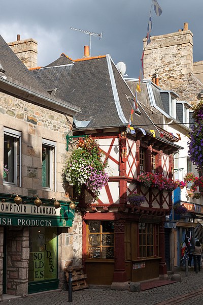 A historic building
 -
 A river
 -
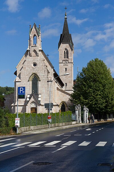 A church built out of granite.


![[3]](http://lawrence.lu/sc/c6567842ee.png)