Commons:Photography critiques/November 2018
Jump to navigation
Jump to search

 | This is an archive of past discussions. Do not edit the contents of this page. If you wish to start a new discussion or revive an old one, please do so on the current talk page. |
FP?
Haven't submitted an FP now for quite some time, @Ikan Kekek, Basile Morin, and Peulle: I was thinking of getting a D500 and was browsing through Cat:Taken with Nikon D500 when I came across this picture. Possible FP? Looks kinda nice but from a technical standpoint, slightly posterized and noisy. Thoughts? ― Gerifalte Del Sabana 02:45, 19 November 2018 (UTC)
- Same than you :-) not sure -- Basile Morin (talk) 03:08, 19 November 2018 (UTC)
- Perhaps with a bit more work. Some of the highlights on the leaves look blown to me, but I like the bird. -- Ikan Kekek (talk) 04:51, 19 November 2018 (UTC)
- @Ikan Kekek: You have good eyes, I missed that cuz I was only looking at the bird. I like the bird's expressions. :) Should I attempt to nominate it? ― Gerifalte Del Sabana 05:29, 19 November 2018 (UTC)
- That's up to you, but you've got our suggestions for things to work on first. Ikan Kekek (talk) 07:34, 19 November 2018 (UTC)
- @Ikan Kekek: You have good eyes, I missed that cuz I was only looking at the bird. I like the bird's expressions. :) Should I attempt to nominate it? ― Gerifalte Del Sabana 05:29, 19 November 2018 (UTC)
- Perhaps with a bit more work. Some of the highlights on the leaves look blown to me, but I like the bird. -- Ikan Kekek (talk) 04:51, 19 November 2018 (UTC)
- It's a no vote from me, for technical reasons. It could be bigger, but then again the distance to the subject weighs up for some of that... Still, the bar for wildlife images is getting high and I think there's too much noise and artefacts. Others may disagree and say that the wow factor weighs up for it.--Peulle (talk) 09:52, 19 November 2018 (UTC)
- @Peulle: Thank you for making your statement, I think I can agree with what you've said. ― Gerifalte Del Sabana 01:57, 20 November 2018 (UTC)
Darbar Sahib Amritsar
-
 Darbar Sahib Amritsar
 -
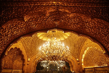 Interior of Darbar Sahib Amritsar
 -
 Main entrance of Darbar Sahib Amritsar


.jpg)
NZMann (talk) 00:27, 1 November 2018 (UTC)
Opinion? NZMann (talk) 23:26, 31 October 2018 (UTC)
- Personally, I like #1 best. It has a clear composition and an interesting subject. It looks like it could use a little bit of clockwise rotation, though. It could also use a tiny little bit of sharpening and/or increased local contrast (
I think that'scalled "clarity" in Lightroom?). Over-all it looks a bit milky, the gold doesn't really pop. Might be due to the weather conditions (sky is a bit pale as well), but could also be due to how it was edited. Maybe lower the shadows/low mid-tones a bit?
- #2 is interesting, but for this kind of composition to work it would need to be perfectly centred: Moving the camera very slightly to the right would (hopefully) have aligned the arches, the chandelier and the building in the background.
- #3 is too busy for my taste. I think I would have preferred a tighter framing without the outdoor fans at the sides and fabric roof on top. That would put a stronger focus on the colorful heads, which harmonize very well with the gold on the walls and the purple of the screens.
- Hope that helps, --El Grafo (talk) 11:04, 12 November 2018 (UTC)
- "I think that's called "clarity" in Lightroom?"
- El Grafo, no, clarity will increase the contrast in all edges, so noise will also increase, for mapped sharpening there is a tool called "sharpening" that allow masking the edge that you want to sharp, holding the alt key you will be able to see exectly where the sharpening is being applied.
- NZMann,
- The first one looks like a good snapshot, but the top of the building is very near to the edge of the frame, and the photo is between a "isometric" view and a frontal view, so not a good angle. Is also too low and a little bit far to be good.
- Is not sharp and a little bit noisy, and hazy. All this, is related to weather conditions, however the lack of sharpness is also because you choose to work with f/2.8, all lens have a hot spot that will delivery the most of the lens, all open the lens will decrease the sharpness and too close also, this is caused by diffraction, and also the deep of field will be more shallow also decreasing the sharpness.
- At f/4 to f/5.6 this photo would be away better. To see the difference in sharpness you can consult the dxomark, click at measurements > sharpness > field map, and compare the f-stops.
- The exposure is in 1/6000 s, so a lower f-stop wouldn't be an issue.
- The second photo
- The fan is a problem, I never been there, but this position with the fan is not ideal, sometimes you can simply go there and remove the object for the photo. If the background building is important, you lowing down could frame it better, if not, is for the best change the position, maybe go under the chandelier and take the photo looking up, this is very interesting subject, could be better explored.
- My suggestion is use a higher ISO, with the optimum f-stop, you take some pictures at the same position, and sum they at Photoshop (or similar) decreasing the amount of noise and increasing the sharpness.
- The third photo
- Patterns are very different of being busy, the problem is the far focus, would be better the focus being trough the whole scene, or closer.
- I get why you focus there, but there is a lot of out focus foreground elements - creating the sensation of a busy photo.
- And I also agree with a tighter crop.
- -- Rodrigo Tetsuo Argenton m 13:31, 7 December 2018 (UTC)
- @Rodrigo.Argenton: I think you misunderstood me there: "Clarity" in Lightroom (and also CaptureOne and ACDSee) changes the micro-contrast in the midtones, resulting in a "clearer" image but also increasing noise (I've actually read up on that by now ;-)). That's pretty much exactly what the "local contrast" tools in Rawtherapee and Darktable do. Or the "details" slider in Lightzone's "relight" tool. This has nothing to do with "local adjustments" that only affect a defined (mapped) section of the image – I guess I just should have written "micro-contrast" to avoid the confusion. Edge sharpening is of course a completely different thing altogether, which is why I wrote "sharpening and/or local contrast". --El Grafo (talk) 14:20, 7 December 2018 (UTC)