This is an archive of past discussions. Do not edit the contents of this page. If you wish to start a new discussion or revive an old one, please do so on the current talk page.
I came across the following picture from another user and thought about nominating it as a quality image, but first want to get some feedback here. Sevku (talk) 17:48, 20 February 2023 (UTC)
I would like an opinion about what should I do to make this stamp (or another in the series) a quality image, and it is also worth checking how well I documented the reason for the work's public domain status: the image on the right is a trial upload to see how well I am doing. I also have a scan of all four stamps together and the presentation pack that I can upload if you wish: I am all ears here. --Minoa (talk) 21:36, 10 April 2023 (UTC)
There's really not much to complain about here, imho! The width of the black border might come up in QI review. It looks very nice, but when embedded in a page as a thumbnail (like here on the right), the broad border means the stamp itself is much smaller than it could be. Maybe try reducing the border width by 1/3 to 1/2 and see if it still looks good?
Your whole documentation (including but not limited to the copyright status) looks great to me, I wish more people would put in half the effort. If this kind of work brings you joy and you want to go all the way (otherwise don't bother): John Norris Wood could use an item on Wikidata, a Creator template drawing the information from that item and a Category for his works. El Grafo (talk) 07:51, 12 April 2023 (UTC)
Presentation pack, front
Hello, here is another test upload, with a 1.5 mm border. I am thinking of using {{Artwork}}, but I cannot configure the "Source/Photographer" field to just read "Source". --Minoa (talk) 22:58, 16 April 2023 (UTC)
Sorry for the delay but I have not yet got the Lego pieces to rescan the stamps without the backing card: they do curl up really slightly (is that the right term?) and I needed to find some kind of weight to hold them down. --Minoa (talk) 04:08, 13 May 2023 (UTC)
General opinions on this picture
European tabby cat looking away
No, I don't imagine having it be promoted. I know it isn't any good; it's my first picture on Commons, a picture of my cat, and I would like to get a few opinions. Gugalcrom123 (talk) 12:55, 14 May 2023 (UTC)
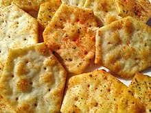
Some food and drink images
I would appreciate any feedback on improving my food and drink photos.
I'm no experienced commonist, but from what I see in the featured pictures, valued images and quality images, most photos are taken at an angle which best represents their subject. Out of these images, I'd suggest you try nominating (as quality image) the one I attached, as the quality seems on par with the lower quality images. You could also try editing them a little, and see if you can make a better version. For an amateur, I'd say these are pretty good (I'm an amateur too). Gugalcrom123 (talk) 08:06, 21 May 2023 (UTC)
Narcissus 'Bridal Crown' near to 1 Whitehall RiversideNephrotoma guestfalica near 1 Whitehall RiversideSign reading "Site entrance Keep Clear!" near Bellhouse, Manchester Metropolitan University.Image of No 1. Whitehall Riverside in Leeds City Centre.View of River Aire from 1 Whitehall Riverside, Leeds on Saturday 6th of May, 2023.A view of Manchester Metropolitan University Business School from Bellhouse.A rubbish box in Leeds, England with litter around it.A Rockspray cotoneaster (Cotoneaster horizontalis) plant next to The Bellhouse Building, part of Manchester Metropolitan University.A Eurytoma schreineri on a Sweet Viburnum (Viburnum odoratissimum) plant.
The rubbish bin and the sweet viburnum are the best of the bunch in my opinion. Some suggestions for improving some of the others: the photo of No 1. Whitehall Riverside has a "building falling backwards" effect because the sides of the building aren't vertical in the picture. If you take the photo from further away or from higher up you might be able to avoid that. Similarly, I think the "Keep Clear" sign and the business school look somewhat distractingly slanted. Just my two cents. —Mx. Granger (talk·contribs) 14:02, 22 May 2023 (UTC)
The images that show a sky have a burned out sky, which is likely to doom any quality or FP nomination. Buidhe (talk) 23:09, 22 May 2023 (UTC)

 chromatic aberration. 多多123 13:11, 21 May 2023 (UTC)
_-_Stamp_(Blue_Tit).png)
_-_Presentation_pack_(front).png)

.jpg)
.jpg)


.jpg)
_002.png)


