Commons:Photography critiques/May 2015
 | This is an archive of past discussions. Do not edit the contents of this page. If you wish to start a new discussion or revive an old one, please do so on the current talk page. |
General feedback reuqested


I would love to hear general feedback and critiques about the two photographs above, so I know where I can improve. Thanks a lot! --Reinhard Müller (talk) 08:43, 18 May 2015 (UTC)
- One thing I would say is that it not always a good idea to centre the horizon in the middle of the photo, it's usually better to choose whether you want the photo to focus more on the foreground (in this case, the lake) or the sky. A 'rule of thirds' is often suggested, where obvious dividing lines like a horizon should be placed at 1/3 or 2/3 of the way down the image. The same applies if you have strong vertical lines or objects, they should be placed at 1/3 or 2/3 of the way across the image. It isn't really a rule though, only a suggestion, but it usually improves composition. Specifically, regarding File:Kopfloch 2.jpg, I would say that the pontoon in the foreground could be more symmetrical. Your view is looking across it slightly to the left. Also, I would perhaps either try to get down lower to look along it, or go for a wider angle lens and look down towards the pontoon to get a feeling that it's leading you to the boat. There's nothing wrong with taking photos from eye level, but as a general rule, photos taken at eye level are not as interesting as photos taken from an uncommon angle IMO. As for File:Sandgrube Mäder 1.jpg, I think it's lacking focus. There isn't an obvious subject to the photo, and it doesn't give me the feeling that you considered why you were taking it and what you wanted to show (other than liking the scene and pressing the shutter). The fact that there's some shaded grass on the bottom right side doesn't help the composition for me, I think you would have been better to walk up to the edge of the lake to avoid the grass, then the reflection in the water would be more prominent in the photo. They're the most obvious things that come to my mind. Hope it helps. Diliff (talk) 08:58, 18 May 2015 (UTC)
- Thank you for your quick, elaborate and helpful feedback! --Reinhard Müller (talk) 12:29, 18 May 2015 (UTC)
- On the boat image, first I am unsure where do you want to guide your view to. There is the jetty, there is the gap in the trees, but the jetty does not lead up to the gap. The pole is also something one has to think about. Now regarding the Sandgrube image, one option is to do away with the foreground and go for image and mirror image with the seam in the middle. Alternatively the grass at the bottom could be used as a frame, but at bottom left it is just too thin a rim. The patch of grass bottom right could be useful, if fully in the sunlight.--KlausFoehl (talk) 11:21, 19 May 2015 (UTC)
- Thanks also to you for your feedback! I did not really intend to get specific instructions how to do a better picture of these specific places, but rather wanted to generally improve on my photography skills. I think your advices can easily be transformed to other occasions and they will help me doing better photographs in future! --Reinhard Müller (talk) 12:14, 20 May 2015 (UTC)
- On the boat image, first I am unsure where do you want to guide your view to. There is the jetty, there is the gap in the trees, but the jetty does not lead up to the gap. The pole is also something one has to think about. Now regarding the Sandgrube image, one option is to do away with the foreground and go for image and mirror image with the seam in the middle. Alternatively the grass at the bottom could be used as a frame, but at bottom left it is just too thin a rim. The patch of grass bottom right could be useful, if fully in the sunlight.--KlausFoehl (talk) 11:21, 19 May 2015 (UTC)
- Thank you for your quick, elaborate and helpful feedback! --Reinhard Müller (talk) 12:29, 18 May 2015 (UTC)
- This section was archived on a request by: Reinhard Müller (talk) 12:14, 20 May 2015 (UTC)
Is there a place for this?
Is there a place for video critiques?Doorknob 747 (talk) 15:27, 2 May 2015 (UTC)
Is this a good phone to take photos and upload it here?
Is the Nokia Lumia Icon a good phone to take photos or videos in maximum resolution, and upload them here? Doorknob 747 (talk) 19:24, 1 May 2015 (UTC)
- It depends on the light conditions. In full day light good photos are possible but not in the inside or with poor light. It also depends on the skills of the photographer, of course :)) Alvesgaspar (talk) 19:30, 1 May 2015 (UTC)
- Thanks. Do you have some advice on how one can improve their photograph skills? Doorknob 747 (talk) 19:38, 1 May 2015 (UTC)
- @Doorknob 747: Read Wikipedia! ;oD There are plenty of articles about photography technics. Regards, Yann (talk) 15:28, 14 May 2015 (UTC)
- Thanks. Do you have some advice on how one can improve their photograph skills? Doorknob 747 (talk) 19:38, 1 May 2015 (UTC)
Perspective correction and image distortion
-
 original photo from camera
 -
 vertical lines made parallel, 'constructed perspective'
 -
 only barrel distortion correction
 -
 anti-perspective correction


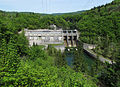
Given that the camera was pointing downwards at time of photos, the power station does show some slanting lines. Applying an image transform that some people call "perspective correction", I find that the image proportions get changed, and that this unnatural distortion outweighs the advantage of having the image geometry conform to 'constructed perspective'. Second opinions? -- KlausFoehl (talk) 14:32, 14 May 2015 (UTC)
- I don't really see a significant difference between them all, to be honest. The angle of view is not that wide and the angle looking down is not extreme so the perspective correction needed is also quite small. The largest difference is that there's more foreground space which I think is compositionally not so good. But the proportions look fairly normal in all images. Diliff (talk) 23:13, 14 May 2015 (UTC)
Framing of photos


I wonder whether I possibly should crop these and similar photos. The visible sky provides some reference, but somehow I feel it is disturbing the image composition.--KlausFoehl (talk) 14:08, 8 May 2015 (UTC)
- In the first one, I think the sky is fine, particularly because it has white clouds that echo the white froth on the water. The one lone conifer stands out a wee too much for my liking, but not disastrously. And I do like that the sky, mountain, and trees add context. The most distracting part in that one is that half of your main topic, the rocks, look almost completely black. Can you bring up the shadows to show some detail in the rocks? Elf (talk) 17:34, 12 June 2015 (UTC)
- In the second, that annoying tree is smack dab in the middle of the photo and of the sky and the sky itself is pointless therefore. You could try cropping out just the sky/tree and see how it feels, but i think that all the remaining mass of vegetation is not attractive; how about cropping all the way down into the rock so that all we're seeing is the gorge? Elf (talk) 17:34, 12 June 2015 (UTC)
- In the third, I think that the background is nice to have, but you could also try cropping all the way into the rock and see which you prefer. Again, bring up the shadows a bit for more details in the rock. And check that this one is straight horizontally; it looks slightly of kilter to me. Elf (talk) 17:34, 12 June 2015 (UTC)