Commons:Photography critiques/June 2011
 | This is an archive of past discussions. Do not edit the contents of this page. If you wish to start a new discussion or revive an old one, please do so on the current talk page. |
May
Harrison Lake

And this? --The High Fin Sperm Whale 00:53, 30 May 2011 (UTC)
- What projection did you use?
- Did you take the original images from a moving boat?
- Quick first opinion: Where the lake opens up towards the back, the sky is structureless (although not 255,255,255). The lake is not level (and it is more than the expected differences of near and far shore). There are at least two stitching errors visible on the shoreline. The chosen output projection distorts the boat on the right. Regarding the composition, in my opinion the lake is too small a strip, and the mountain ridge at the right should not be clipped. -- KlausFoehl (talk) 11:13, 30 May 2011 (UTC)
Cultus Lake Waterpark

Hi, can someone please take a look at this? --The High Fin Sperm Whale 00:53, 30 May 2011 (UTC)
- I actually took four - on two cheapo office monitors, on one calibrated laptop and on one calibrated IPS monitor. Some concerns:
- On cheapo monitors, the sky is uniformly tinted to green/cyan - this is not the case on calibrated screens, but this is what many users will see.
- Full-rez on good monitor gives away what looks like too much highlight extraction, with unnatural magenta and cyan bands around bright and "dark" clouds, a white band around trees, and a glaring white blob (upper edge, right of center). Right, what would you expect on a day like this...
- Greens and yellows look oversaturated (again, for this kind of lighting).
- Human figures on the left unnaturally wide (distorted while stitching?). Slanted verticals (leaning poles aren't a big deal, but leaning guy in blue looks highly unnatural). NVO (talk) 19:41, 1 June 2011 (UTC)
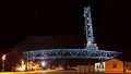
Gantry crane in the city port aka "Stadthafen" in Rostock
Hello! I am on a Hugin stitching project depicting a gantry crane. Shown below is an early alpha version, I hope that I can get some hints for improvements before I begin a new stitch as its duration is about three to five hours on my computer. My most relevant questions are if I should try to straighten the crane or if this distortion akin of a wide angle lens is acceptable from quality point of view (for your information: according to the ruler tool Google Earth, the crane is 63 metres wide and I had a distance of about 50 metres when I took the photos) and if I have to do something about the lensflares of if those are acceptable, too. There is also the question of whether I have to improve the white balance on the lights on the left side, I used a set of JPEG that I got with a RAW development recipe adjusted on an image of the crane cabin. My desired aim is to get an image worth of an award. Regards, Grand-Duc (talk) 05:05, 23 May 2011 (UTC)
-
 24249x14348 Px, full size
 -
 8001x4550 Px, middle size
 -
 4800x2730 Px, small size


- My first thought is why would anyone want to study an entire 63m crane at 350M level of detail. Most of my imaging programs failed to load the biggest image and none of them could zoom to 100%. Looking at your middle sized image, I can see what look like stiching errors on the crane's "ropes". I think if I wanted to study the detailed construction of the crane, I'd want to concentrate on closeups of select interesting portions. Most of the image is black sky or dull site buidlings where nobody needs this detail.
- Looking at the image at screen size, I can clearly see some crude alterations to the orange haze in the sky on the left -- what is going on there? I'd expect to see a gentle graduation of the sky from the orange haze at ground to black at the top. The flare is a problem and probably compounded by the multiple images each having their own flare spots. Is the white balance wrong or is the site lit by sodium lamps, which are orange anyway? The black sky is less interesting than the dark blue sky you get late evening. I also wonder that if the point of the high-resolution image is to show the crane in detail, then why not shoot in daylight? As a picture of a crane, it would be more interesting to see it lifting the container, with an operator in the cab, rather than dormant. And I agree that curvature of the crane body is a problem -- the picture isn't made more artistic by that distortion.
- Sorry to be rather negative, but I think you need to take a different approach. --Colin (talk) 07:42, 23 May 2011 (UTC)
- There is no need at all to feel sorry and thanks for your feedback! This stitching is for me at least an interesting technical gamble, and if I manage to get a high quality work out of it, then the "gamble cake" will be nicely iced (btw. IrfanView displays the full-sized image flawlessly at 100%). But let me answer to your critics:
- You're right, there are stitching errors on the ropes at the level of the orange cabin. I'll try to correct them.
- The crude alterations of the haze are caused by my quick-and-dirty cloning of the background. There are no source images for these portions as it's impossible to see some structures for setting Hugin control points to align plain dark images. Of course, I will make a more decent cloning on a final version, but on this alpha and proof of concept version, I thought it wasn't worth the time.
- I tried a shooting at dusk some days before I recorded the images used for this stitching. I needed roughly half an hour to record all 61 of them, so I guess that at dusk, the lightness would change so much that other problems would arise in the stitch.
- During a daylight shot, I would have to deal with walkers all around.
- This crane is only an industrial landmark, now, it is not used any more. I never saw it in any action for the nearly 7 years that I am living here, in Rostock. The Stadthafen itself was in the days of the GDR a port where AFAIK coal, grain and fertiliser were transshipped, but nowadays, it's a leisure area with several marinas and where the annual sailing festival Hanse Sail is hosted. Residual buildings of shipyards and cranes are either used for other purposes[1], protected as landmarks of the history of the site[2] or simply left in place in a derelict state[3]. The commercial port activity now takes place in the Überseehafen directly at the estuary of the Warnow (in this Google maps view, the gantry crane is located on the angle of the coast line above the letter "L" of the word "Hansaviertel" at the bottom of the image).
- Regards, Grand-Duc (talk) 16:42, 24 May 2011 (UTC)
- There is no need at all to feel sorry and thanks for your feedback! This stitching is for me at least an interesting technical gamble, and if I manage to get a high quality work out of it, then the "gamble cake" will be nicely iced (btw. IrfanView displays the full-sized image flawlessly at 100%). But let me answer to your critics:
![[1]](https://commons.wikimedia.org/wiki/File:Panorama_Neptunwerft_crane_and_hall_2010-10-26.jpg)
![[2]](https://commons.wikimedia.org/wiki/File:Two_port_cranes_of_Stadthafen_Rostock_upstream_2010-12-28.jpg)
![[3]](https://commons.wikimedia.org/wiki/File:Derelict_shipyard_crane_Neptunwerft_Rostock_2011-03-05.jpg)
Willis Building
Here's a vertical panorama (from five originals) of the Willis Building in the City of London.
.jpg)
I've only just started taking pictures like these, so any advice and suggestions are welcome. Thanks. -- Colin (talk) 19:26, 8 May 2011 (UTC)
- As far as quality, this is an excellent photo, except for what looks like glare near the bottom above on of the concrete pot things. However, I'm not sure about composition; the main subject needs a little more room on the left, and other building is too close to the top. Also, the crop is a bit tight on the bottom; almost all the pots have the bottoms cut off. I think a slightly wider shot would do here. Good job. --The High Fin Sperm Whale 18:25, 26 May 2011 (UTC)
- You are right, there is some glare there. I guess that would be fairly easy to fix with some selective contrast enhancement. I am learning I need to leave a good margin round these pictures to allow for the stitching and perspective-correction. Cheers, Colin (talk) 08:32, 27 May 2011 (UTC)
Willis and LLoyd's
Here's a photo showing the Willis Building and the Lloyd's building in the City of London.

I wish I'd managed to get a wee bit more at the bottom of the frame to fully include the pedestrians but I was concentrating on fitting the buildings into the pic. Where does it stand quality-wise? Are there any tweaks I could do to this picture to improve it? How could I improve the pic if I took another? Thanks. -- Colin (talk) 10:30, 6 May 2011 (UTC)
- A decent photo, IMO. Aside from getting a wee more bottom space, I'd try to take this picture at some other time of the day to reduce Sun's glare from the right. Depends on the orientation, of course, I don't know whether or not shooting at some other time would only make the glare worse. In this case, maybe a night shot using a tripod. — Yerpo Eh? 07:30, 23 May 2011 (UTC)
- Or try on a day when it's slightly overcast to diffuse the light, or at sunset. And taking a photo at night with a tripod would be fine, but that would completely change the type of image and would not do as a replacement of alternative. And yes, I'd say just add a bit more room on the bottom, and you've got a fantastic image. And I don't see any glare here (I did with your other image). Just one other thing: what is that 1-pixel wide bar in the top right corner? --The High Fin Sperm Whale 18:29, 26 May 2011 (UTC)
- Yes, if I waited till later on, the sun might have gone down some more making the buildings less dazzling-bright in places. On an overcast day these buildings look quite drab. I think I was fortunate for a completely blue sky and a calm day. I went back again another day to try again and it was so windy I couldn't keep the camera still. And the fluffy clouds in the sky caused exposure problems -- if the building was exposed correctly, the clouds were blown and if the clouds were ok, the building was underexposed. As for fitting it all in, I'm at the limit of my lens wide angle for a single-shot image. Thanks for the advice; I'll have another go sometime. Colin (talk) 08:46, 27 May 2011 (UTC)
- I've looked at my other photos from this session and there are nearby buildings just off-image to the left and right of this picture, which was taken from a narrow street. So if I stood further back, those buildings would crowd the subject and eventually overlap. I guess I need an ultra-wide angle lens to do this in one shot. Colin (talk) 18:15, 27 May 2011 (UTC)
Centennial boardwalk
I've uploaded lots of photos here over the years, and would like to see if any of them might be QI-worthy. I'll start with this one:

It's a boardwalk in the Pelican Island National Wildlife Refuge, with planks for each of the Refuges, in order of founding. Thanks. --Ebyabe (talk) 01:06, 1 May 2011 (UTC)
- The composition is very nice, but you have some blown-out (too white) portions of the bridge on the far end. I find that for most outdoor photos, I prefer to dial -2/3 of exposure compensation on average, if that is available with your camera. -- King of ♥ ♦ ♣ ♠ 22:39, 4 May 2011 (UTC)
- Sunlight and shadows play an important role, however, in digital photography they need to be managed carefully. This type of picture is better taken at early morning or late afternoon, in order to use softer light. You can increase the point of view (higher) in order to increase the area of the boardwalk. --Tomascastelazo (talk) 13:12, 6 May 2011 (UTC)