Commons:Photography critiques/June 2008
 | This is an archive of past discussions. Do not edit the contents of this page. If you wish to start a new discussion or revive an old one, please do so on the current talk page. |
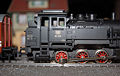
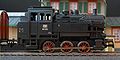
Model train
-
-
 New Version


I was astonish that here aren't any good images that shows this topic so I uploaded this photo I made a cupple of months ago. How can I improve this image laterwise? --Wuzur (talk) 18:56, 4 July 2008 (UTC)
- Nice, I like the house in the background. From the technical side, try increasing your depth of field a little bit, so the engine parts on top (which are a little bit farther) aren't as blurry. As a side effect, the house may be a little less blurry, which I think would look better (my opinion). I recomment using the aperture-priority mode on your camera, and setting the F number a bit higher than usual for close-ups. Also, I would zoom out enough to show the whole engine, plus a tiny bit of space in front of it. You can then crop the top and bottom, and just get a longer image, which is good because the train is long too. --Specious (talk) 22:26, 5 July 2008 (UTC)
I uploaded a new version of this image --Wuzur (talk) 11:21, 6 July 2008 (UTC)
- Very nice! Much better background too! Good luck in the featured contest! --Specious (talk) 19:41, 7 July 2008 (UTC)
- Thank you very much for your help! --Wuzur (talk) 20:05, 7 July 2008 (UTC)
How do I show the egg?


Yes, the butterfly laid an egg on my sock. Is the circle a good way to emphasize it? I tried doing various things to the image of the egg, but they all looked fake. And any advice in general? Can you tell from the white balance that I'm somewhat color-blind?
I learned one thing: next time I see eggs come out of a butterfly's abdomen, don't shoo the butterfly away because it's wasting eggs—keep taking pictures so the eggs pile up and become unmistakable. (And delete pictures that I can retake to get space for this rare opportunity.) JerryFriedman (talk) 03:36, 22 June 2008 (UTC)
Geography & Historical Monuments


I seem to end up taking a lot of images such as these. I'm after advice on how to improve them further, as well as making sure that photos I take in the future are more useful to the project. Any advice is greatly appreciated. Many thanks Gazimoff WriteRead 20:33, 14 June 2008 (UTC)
- First, you would have to pay more attention to composition the next. The tow stone image's subjects is putted on the center and were used to vertical frame, and I'm not sure to what is shot. If all of stones or needful background for explanation were in the frame, came to be more useful. If stones were putted on the bottom or top, get to more fine view, I guess. The left BW image is needs to more wide contrast, for me. When I say about close matters, there is slightly jpg artifacts and CA at all of three. But this is from the effciency of digital-camera. _Fukutaro (talk) 09:26, 15 June 2008 (UTC)
Clouds seen from plane


From a plane I was able to photograph these clouds, thunderstorm clouds, I presume. How can I improve on these photos in case a similar scenery shows up again? -- Klaus with K 20:11, 5 June 2008 (UTC)
- Take a panorama :). Aside from the noise, I don't see how you can improve them. Some of the pictures do look like the window you took them out of is kind of dirty and in 3 and 4 the horizon seems tilted. --Digon3 talk 18:13, 6 June 2008 (UTC)
- Thanks for the panorama suggestion ;) Regarding "dirt", there were specks of frost building up on the window. Camera face on results in reflection of the metallic casing, so these shots aim forward. Regarding noise, I am not a fan of detail-reduction algorithms, and I am still on the lookout for a camera with a less noisy sensor. -- Klaus with K 19:47, 6 June 2008 (UTC)
Toronto 360° Panorama

- Basically my first attempt at a stitched panorama image (and I know it shows). Most of the stitching errors I just couldn't correct and also some blurring are the results of me using a pretty cheap .7 wide angle converter and shooting the (13) individual pictures in portrait format to achieve that very high vertical angle. Still I would appriciate any suggestions for future panorama endeavors. Hurz 10 June 2008
- Well, for a start I'd recommend to use proper stitching software, not the cheap plonk I experienced to come with my digital cameras. Cheap as in underperforming, not price, as there is free software out there like hugin, which is my personal choice. There should be a new official release "soon", in the meantime use the current betas. From looking an the thumbnail, I see that the bay is darker on the left. Looking closer, I do see quite some obvious stitching errors at the horizon line. I did not hunt for lot more nit-picking. And there are a few small grey dots in the image, that is dust in your lense system, something I experience as well.
- For the next time, when you take another pano: try taking the photos with 50% overlap, not less. It will cost you a few more photos, but helps in processing. And (when you can, up CN Tower is is a tad difficult) try to rotate your camera around the no-parallax-point. Good luck. -- Klaus with K (talk) 13:54, 29 July 2008 (UTC)
Toronto Skyline at Night

- Original RAW image was cropped, resampled and denoised with NoiseNinja. Picture is overexposed in the lights obviously but I intended to do so, if maybe not that much (and I wanted the night sky to be visible which I couldn't do with shorter exposures). Unfourtunately there's still a lot of noise due to the tiny sensor of my camera (Panasonic FZ8). Suggestions for improvement are verywelcome. Though night shots are always a problem with that camera ... Hurz 10 June 2008