This is an archive of past discussions. Do not edit the contents of this page. If you wish to start a new discussion or revive an old one, please do so on the current talk page.
Mountain under snow
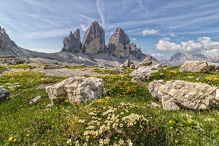
Hi, I submitted these for QI, but they have not been reviewed yet. Is there anything to do to improve them? Thanks, Yann (talk) 16:54, 18 December 2023 (UTC)
Comment Both photos appear to me to be too heavily denoised and then over-sharpened, so that the rocks in particular show strange structures. Unfortunately, I'm seeing more and more photos at QIC that have been overly smoothed out, probably out of sheer fear that they might be rejected due to image noise that can be detected with a magnifying glass. --Smial (talk) 17:07, 18 December 2023 (UTC)
@Smial: There is no modification after taking the pictures. These are taken with a smartphone, so they have technical limitations. Yann (talk) 21:53, 19 December 2023 (UTC)
Well, I have the impression that many ratings are quite arbitrary. Personally, I always try to find a balanced decision and justify it as clearly as possible. In the case of image noise, this means that I accept clearly recognizable noise if the circumstances of the subject or the shooting situation obviously require a high ISO setting, but that exactly the same image noise leads to rejection for "easy-to-take" photos. And I find photos that have been so heavily de-noised that surfaces look like Lego plastic or fine structures look somehow artificial quite terrible. I also find the trend on QIC of completely smoothing out the background of high-ISO photos a terrible thing. --Smial (talk) 12:03, 21 December 2023 (UTC) Translated with DeepL.com (free version)
The shadows in the foreground are distracting. Some combination of getting closer to the sign, choosing a different time of day, tighter crop, and/or changing the angle could address this issue. Buidhe (talk) 19:05, 31 December 2023 (UTC)
In addition to the design flaws already described by Buidhe, the photo shows an inhomogeneous impression of sharpness. Areas with high contrast appear over-sharpened, whereas the algorithm apparently found no edges in the central lettering that it could process. As a result, the letters appear blurrier than the leaves, meadow and everything else around them. --Smial (talk) 11:59, 31 January 2024 (UTC)


 Comment Both photos appear to me to be too heavily denoised and then over-sharpened, so that the rocks in particular show strange structures. Unfortunately, I'm seeing more and more photos at QIC that have been overly smoothed out, probably out of sheer fear that they might be rejected due to image noise that can be detected with a magnifying glass. --Smial (talk) 17:07, 18 December 2023 (UTC)
