Commons:Featured picture candidates/File:US - Mexican border.jpg
Jump to navigation
Jump to search

File:US - Mexican border.jpg, not featured[edit]
Voting period is over. Please don't add any new votes.Voting period ends on 1 Feb 2017 at 23:27:51 (UTC)
Visit the nomination page to add or modify image notes.

- Category: Commons:Featured pictures/Places/Natural
 Info All by -- Tomascastelazo (talk) 23:27, 23 January 2017 (UTC)
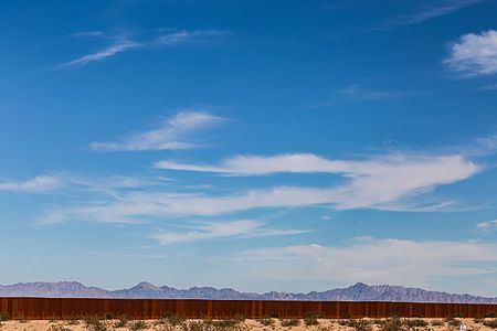
 Support I wonder what happens to fauna migration with this wall... -- Tomascastelazo (talk) 23:27, 23 January 2017 (UTC)
 Question - Why so much sky? Also, seeing a sign that says "se vende" and then is cut off, I want to know what they were selling. Could you possibly add a bit more land on the near side and remove some of the sky? -- Ikan Kekek (talk) 23:48, 23 January 2017 (UTC)
 Comment It is a way to express the folly of borders, the sky is the limit type of thing... The land on the Mexican side was for sale, that could come out... --Tomascastelazo (talk) 23:54, 23 January 2017 (UTC)
- Comment - I understand your poetic point about the sky, though I think the point could still be made with a bit less sky. I'll try to put a suggested crop in the image notes. On cropping out the sign, though, I'd really hate for more land to be cropped out of the picture. -- Ikan Kekek (talk) 01:23, 24 January 2017 (UTC)
- Support I like the artistic approach which makes this a very meaningful picture. --Frank Schulenburg (talk) 03:28, 24 January 2017 (UTC)
- Support per Frank --Martin Falbisoner (talk) 07:43, 24 January 2017 (UTC)
- Comment Tomascastelazo, please add a FP category for this and fix the file categories (Countries?), also one of them doesn't exist yet. – Lucas 15:46, 24 January 2017 (UTC)
- Support This looks like a more contemporary version of the famous Windows XP default wallpaper, the amount of sky is appropriate. Please add a geocode though, it's a long border. --cart-Talk 19:16, 24 January 2017 (UTC)
 Oppose oppose for now, because the wall has a visible halo on its top edge and the Se Vende sign has magenta CAs. You could maybe remove the sign entirely, I find it a bit distracting with its stark white. I'll gladly change my vote later. I would also favor a tighter crop with a bit less sky to have more wall relatively. – Lucas 20:32, 24 January 2017 (UTC)
- Support Per Frank and Ikan. -- Johann Jaritz (talk) 09:03, 25 January 2017 (UTC)
- Comment - But I didn't support. -- Ikan Kekek (talk) 21:27, 25 January 2017 (UTC)
- Oppose I want to see more of the desert. I think you cropped the bottom too severely. Also the exposure seems too dark. -- Thennicke (talk) 09:18, 25 January 2017 (UTC)
- Oppose Your idea to show so much sky works as art, but it's hard to realize that you're showing us the border fence since it takes up so little of the image, and I agree with other criticisms of the technical shortcomings. Daniel Case (talk) 16:28, 25 January 2017 (UTC)
- Oppose Per other opponents. --Karelj (talk) 09:57, 26 January 2017 (UTC)
Confirmed results: