Commons:Featured picture candidates/File:Tulum - God of the Winds Temple 01.JPG
Jump to navigation
Jump to search


File:Tulum - God of the Winds Temple 01.JPG, featured[edit]
Voting period is over. Please don't add any new votes.Voting period ends on 17 May 2016 at 09:53:45 (UTC)
Visit the nomination page to add or modify image notes.

- Category: Commons:Featured pictures/Places/Natural
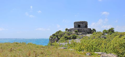
 Info Tulum is the archaeological site of a postclassic Maya city situated on the east coast of the Yucatán Peninsula on the Caribbean Sea in the state of Quintana Roo, Mexico. The structure to the right is the God of Winds Temple as seen from the north. Yes, the midday lighting is a bit harsh - especially when compared to the existing FP. Still, it does help accentuate the stark contrast of the massive stone structure on the one side and the windswept coastal flora on the other. As for the composition, I do like the winding stone wall that helps lead the eye from the blurred foreground to center of the image. All by me, --Martin Falbisoner (talk) 09:53, 8 May 2016 (UTC)
 Support --Martin Falbisoner (talk) 09:53, 8 May 2016 (UTC)
 Comment - But the nearest part of that stone wall is unsharp, and the unsharpness is visible even at thumbnail size. I would suggest cropping the nearest part of the photo, up to the right angle in the wall. I think that would markedly improve the picture. -- Ikan Kekek (talk) 11:04, 8 May 2016 (UTC)
- Comment Unsharpness per se is not a bad thing, Ikan, on the contrary. I do know you're not fond of it though. Too bad Group f/64 doesn't exist any more.
 As for me, I believe the unsharp part of the wall might actually help my composition here but of course I'm open to other opinions. Let's wait for some first... --Martin Falbisoner (talk) 11:23, 8 May 2016 (UTC)
- Comment - I think a natural degree of unsharpness in the background makes sense. I find unsharpness because it's too near to be unnatural, as people with normal eyesight won't find things unsharp due to nearness unless they're a few centimeters from their face. But like you, I will definitely be interested in what others think. -- Ikan Kekek (talk) 11:41, 8 May 2016 (UTC)
Alternative[edit]

- Info OK, Ikan et al., here's an alternative (almost) without any blurred areas --Martin Falbisoner (talk) 11:50, 8 May 2016 (UTC)
- Support --Martin Falbisoner (talk) 11:58, 8 May 2016 (UTC)
- Support - I understand why you like that wall, but after looking back and forth between the different versions, I ultimately think this is the better composition, not only better because there's less blur. -- Ikan Kekek (talk) 11:56, 8 May 2016 (UTC)
- Support -- Thennicke (talk) 12:39, 8 May 2016 (UTC)
- Support 😄 ArionEstar 😜 (talk) 12:59, 8 May 2016 (UTC)
- Support INeverCry 13:55, 8 May 2016 (UTC)
- Support this crop is ok and featurable for me. --Hubertl 20:06, 9 May 2016 (UTC)
- Support And 7 ...--LivioAndronico (talk) 19:59, 10 May 2016 (UTC)
- Support Maybe the midtones could have been dialed up a little less, but that's just quibbling. Daniel Case (talk) 02:48, 12 May 2016 (UTC)
- Support --Johann Jaritz (talk) 03:23, 12 May 2016 (UTC)
 Oppose perhaps I'm missing something important, but for me the composition lacks wow. --Pine✉ 02:16, 15 May 2016 (UTC)
Confirmed results:
This image will be added to the FP gallery: Places/Natural
The chosen alternative is: File:Tulum - God of the Winds Temple 04.JPG