Commons:Featured picture candidates/File:S. Martinho Porto October 2014-4.jpg
Jump to navigation
Jump to search

File:S. Martinho Porto October 2014-4.jpg, not featured[edit]
Voting period is over. Please don't add any new votes.Voting period ends on 28 Oct 2014 at 13:24:45 (UTC)
Visit the nomination page to add or modify image notes.

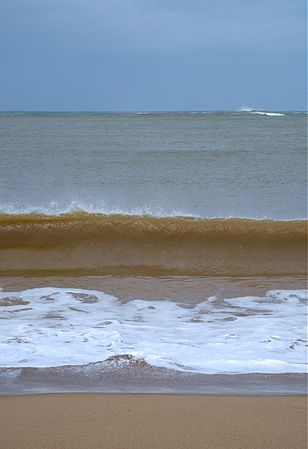
 Info Minmalism: sky, sea, breaking wave, foam and sand. Bay of São Martinho do Porto in a stormy day. All by Alvesgaspar (talk) 13:24, 19 October 2014 (UTC)
 Support -- Alvesgaspar (talk) 13:24, 19 October 2014 (UTC)
- Support The simplicity is greatness, this photograph conveys many things inside me, I was a person raised to 100 meters from the sea, the sea has been my mother, my brother and there all my family memories conglomerate, from my childhood to the present . Everyone will have their own story, you need to look beyond the obvious. --The Photographer (talk) 01:04, 20 October 2014 (UTC)
 Oppose Not working for me I'm afraid. Portrait aspect isn't helping. Not minimal enough perhaps. The focus seems to be on the breaking wave yet the shutter isn't fast enough to capture it crisp. The foam and especially the sand is blurry but not blurry enough to be smooth. The middle of the sea isn't interesting at all. I don't know. Perhaps either very simple calm sea or turbulent sea. -- Colin (talk) 15:40, 19 October 2014 (UTC)
- Oppose Per Colin. Not meant in a mean spirit, but imho "minimalism" is sometimes a bit easy to say when an image has little wow. --DXR (talk) 15:43, 19 October 2014 (UTC)
- Oppose per others. Minimalism is not just showing nearly nothing, it’s doing so in a breathtaking way. --Kreuzschnabel 19:06, 19 October 2014 (UTC)
- Oppose Per Colin. Daniel Case (talk) 21:09, 20 October 2014 (UTC)
 Comment What I feel about the composition: A good idea for a minimalist composition, but the main motive seems to be within the strip of foam and the delicate veil of splashing (the timing was very good), these two elements are horizontal and the photo is vertical, the high angle (for those elements) does not help because it leads my gaze to the horizon leaving these elements in the second plan. In summary a horizontal composition and a very lower angle would be better IMO. -- Lauro Sirgadocontribs 14:07, 21 October 2014 (UTC)
- Support I love this sophisticated picture in its simplicity. It reminds me of Color Field painting. --Michael Gäbler (talk) 16:49, 22 October 2014 (UTC)
Confirmed results: