Commons:Featured picture candidates/File:Planet Mercury diagram.svg
Jump to navigation
Jump to search

File:Planet Mercury diagram.svg, not featured[edit]
Voting period is over. Please don't add any new votes.Voting period ends on 15 Dec 2019 at 09:30:08 (UTC)
Visit the nomination page to add or modify image notes.

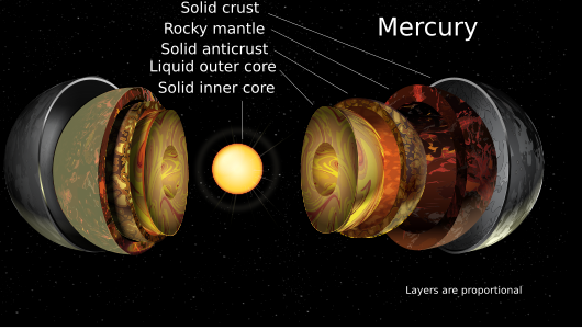
- Category: Commons:Featured pictures/Non-photographic media/Computer-generated
 Info created by A loose necktie - uploaded by A loose necktie - nominated by A loose necktie -- A loose necktie (talk) 09:30, 6 December 2019 (UTC)
 Support -- A loose necktie (talk) 09:30, 6 December 2019 (UTC)
 Comment To me, the size of the texts are strange and not good layout. I would like to easily see what the different layer are, even at smaller image size, instead the less important text "All layers shown are proportional" (should suffice to say "Layers are proportional") is screaming at me. That text should be in the font size of the 'layer text' and the layer info in bigger font size. Also a bit too close crop on the left side. --Cart (talk) 10:29, 6 December 2019 (UTC)
- Comment I'm finding the eggshell layers quite hard to visualise especially in the smaller thumb vs full browser. I think you haven't quite got the lighting to look realistic. The inner layers seem to be lit from below with a darker upper-two-thirds. But the outer layer has a strange dark stripe and is darker towards the top/bottom. The second layer on the right has an odd glare spot on it. The inner layer flat cut surface is oddly dark at the top and bottom, when I'd expect that fairly equally lit. The Solid anticrust looks quite different on the left to the right. The very thin white lines from the text to the subject are a bit randomly placed and vary in how close they go to the text or the subject. It isn't clear to me why the right is more exploded than the left, or why this method of looking at layers is helpful vs a more traditional cut like File:Saturn diagram.svg. This style seems to over-play the idea you can neatly separate the layers. I'm a bit confused why the thumnail shows a san-serif font but when I view the whole thing in Firefox, it is a serif font. Also the thumb's left rocky mantel is shown with a uniform yellow-brown vs a much darker brown in the full size on Firefox. -- Colin (talk) 17:43, 6 December 2019 (UTC)
 Neutral Good job, however, the font size is too big --Wilfredor (talk) 00:43, 8 December 2019 (UTC)
 Oppose per Colin and Cart. Daniel Case (talk) 15:42, 8 December 2019 (UTC)
Confirmed results:
Result: 1 support, 1 oppose, 1 neutral → not featured. /--A.Savin 13:11, 11 December 2019 (UTC)