Commons:Featured picture candidates/File:Paul-Löbe-Haus, Westseite, Frontalansicht, Berlin-Mitte, 151223, ako.jpg
Jump to navigation
Jump to search

File:Paul-Löbe-Haus, Westseite, Frontalansicht, Berlin-Mitte, 151223, ako.jpg, featured[edit]
Voting period is over. Please don't add any new votes.Voting period ends on 9 Feb 2016 at 20:14:15 (UTC)
Visit the nomination page to add or modify image notes.

- Category: Commons:Featured pictures/Places/Architecture
 Info created and uploaded by Code - nominated by Christian Ferrer -- Christian Ferrer (talk) 20:14, 31 January 2016 (UTC)
 Support -- Christian Ferrer (talk) 20:14, 31 January 2016 (UTC)
- Support - Good composition. The sky seems a bit noisy, but not too bad, and I think the varied light conditions must have been challenging, because it was vital to get clear detail of the inside of the Paul-Löbe-Haus without losing the rest of the picture. -- Ikan Kekek (talk) 20:30, 31 January 2016 (UTC)
- Support --Hubertl 20:30, 31 January 2016 (UTC)
- Support --King of ♥ ♦ ♣ ♠ 23:47, 31 January 2016 (UTC)
- Support --Johann Jaritz (talk) 03:22, 1 February 2016 (UTC)
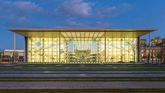
- Support Thank you very much for the nomination, Christian! A special detail of this picture is the fact that the chancellery is reflecting in the facade of the Paul-Löbe-Haus which makes the composition quite interesting and is probably an important element of the architecture, too (government reflecting in parliament). --Code (talk) 06:25, 1 February 2016 (UTC)
- Support This picture is marvelous. I gave it a shot once myself, to no avail. This being said, the photo's a bit too yellowish for me. This is by no means a dealbreaker, the lighting situation is indeed very tricky, and I do love the colorful effect here, but you may have overdone it. --Martin Falbisoner (talk) 06:53, 1 February 2016 (UTC)
- Thank you for your comment, Martin. Indeed it was your picture which inspired me to try it myself. I agree that the WB of your shot is much colder which is usually a good choice for architectural photography. I'm not really sure which one I like better. However, I set the WB manually using the live view of my camera so I believe that it reflects reality quite well. In the end, it may of course be a matter of taste anyways. --Code (talk) 08:58, 1 February 2016 (UTC)
- Support --Alex Florstein (talk) 07:56, 1 February 2016 (UTC)
- Support. Colour saturation, particularly with artificial lighting, is always a matter of taste. It's difficult judge from how you imagine it looks because there are no cues 'in nature' to compare to, whereas we generally know what colour the sky is, or what colour grass is. I do know from experience though that if you try to correct the WB based on the artificial light, you will make everything else outside much too cool. What you could try is to set two white balances, one for the interior and one for the exterior. In Lightroom, you can do this dynamically with the WB and tint adjustment brush, but you could also do it with Photoshop layers. Just a thought anyway. I like it the way it is though. Diliff (talk) 14:13, 1 February 2016 (UTC)
- Support Daniel Case (talk) 02:23, 2 February 2016 (UTC)
- Support Well done -- Thennicke (talk) 13:26, 2 February 2016 (UTC)
- Support -- Pofka (talk) 12:10, 3 February 2016 (UTC)
- Support 😄 ArionEstar 😜 (talk) 20:34, 3 February 2016 (UTC)
Confirmed results:
This image will be added to the FP gallery: Places/Architecture