Commons:Featured picture candidates/File:Palacio Real, Ámsterdam, Países Bajos, 2016-05-30, DD 07-09 HDR.jpg
Jump to navigation
Jump to search

File:Palacio Real, Ámsterdam, Países Bajos, 2016-05-30, DD 07-09 HDR.jpg, featured[edit]
Voting period is over. Please don't add any new votes.Voting period ends on 14 Feb 2017 at 22:45:40 (UTC)
Visit the nomination page to add or modify image notes.

- Category: Commons:Featured pictures/Places/Architecture
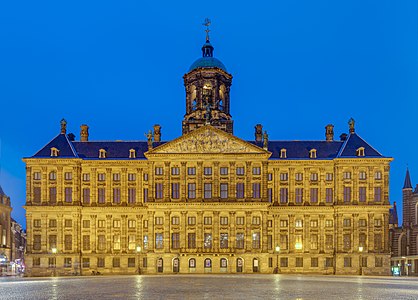
 Info Blue hour view of front of the Royal Palace, Amstedam, Netherlands. The palace was built as a city hall during the Dutch Golden Age and opened in 1655. The building became the royal palace of King Louis Napoleon and later of the Dutch Royal House. Currently it is one of the 3 palaces at the disposal of the monarch. All by me, Poco2 22:45, 5 February 2017 (UTC)
 Support -- Poco2 22:45, 5 February 2017 (UTC)
- Support -- Johann Jaritz (talk) 04:08, 6 February 2017 (UTC)
 Oppose Colors, CA, especially check edges. And its not so sharp i would expect. --Mile (talk) 06:34, 6 February 2017 (UTC)
- Oppose Unnatural colors. -- -donald- (talk) 06:49, 6 February 2017 (UTC)
- Much better now. Support -- -donald- (talk) 20:03, 6 February 2017 (UTC)
 Comment I know that this color is the result of the lights on the façade, but when it occupies such a large portion of the pic, it becomes a bit too much. I did a test and used one of the borders of the posters in the arches (ground floor) for WB and the result was much more harmonious and restful for the eyes. It also brought out the details better. Please try it and see what you think. --cart-Talk 08:54, 6 February 2017 (UTC)
- Agree. It looks like the whole palace is gilt. The streetlights on the far left might need some manual intervention, as your HDR software has made a mess there. It does look a bit like you didn't take enough exposures to handle the highlights. -- Colin (talk) 13:00, 6 February 2017 (UTC)
- Comment -donald-, Colin, Mile, Johann, cart: I've uploaded a new version with new HDR processing, different WB, wider crop in both sides, removed dust spot and additional sharpening Poco2 18:37, 6 February 2017 (UTC)
- Support Looks better now, thanks. --cart-Talk 19:50, 6 February 2017 (UTC)
- Support lNeverCry 21:40, 6 February 2017 (UTC)
- Support --Karelj (talk) 22:04, 6 February 2017 (UTC)
- Oppose --Just no. The sad truth is the lighting of this building is anything but inspired, so probably a daytime picture would work much better. If it has to be a night pic then I chose the orange colored one, as that's how Na lamps, and things lit by them, actually look like in reality. The crop was a definite improvement but in all regards it falls flat compared to the previous one (on which I was more or less neutral). KennyOMG (talk) 22:10, 6 February 2017 (UTC)
- Support -- Colin (talk) 23:00, 6 February 2017 (UTC)
- Support Daniel Case (talk) 03:20, 7 February 2017 (UTC)
Confirmed results:
Result: 8 support, 2 oppose, 0 neutral → featured. /George Chernilevsky talk 05:59, 15 February 2017 (UTC)
This image will be added to the FP gallery: Places/Architecture