Commons:Featured picture candidates/File:Flower of Fuchsia.jpg
Jump to navigation
Jump to search

File:Flower of Fuchsia.jpg, not featured[edit]
Voting period is over. Please don't add any new votes.Voting period ends on 30 Jun 2021 at 14:01:57 (UTC)
Visit the nomination page to add or modify image notes.

- Gallery: Commons:Featured pictures/Plants#Family : Onagraceae
 Info created by Commonists - uploaded by Commonists - nominated by Commonists -- Commonists 14:01, 21 June 2021 (UTC)
 Support -- Commonists 14:01, 21 June 2021 (UTC)
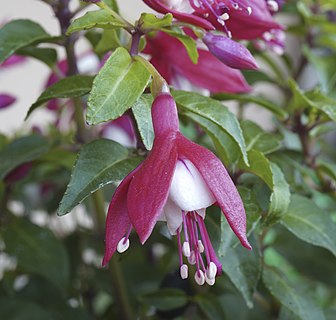
 Oppose A featurable image? The resolution is high indeed, but that's probably the only advantage. The picture is claimed to be a focus stack, but honestly I don't see much difference in focus range in relation to a center-focused single shot. If you zoom in to full size, you see stitching errors at the lower part of the blossom. Furthermore some white parts of the flower are overexposed, there is noise, the background is not appealing. The flower is neither well identified nor well categorized. Compare the already FP image of similar flower. --A.Savin 14:45, 21 June 2021 (UTC)
- I cropped the photo a bit, corrected some mistakes, I don't see any noise,I do not see overexposure and it is definitely not the same as a single shot. Thank you--Commonists 15:11, 21 June 2021 (UTC)
- Service: [1] --A.Savin 17:46, 21 June 2021 (UTC)
- To clarify, "Service" here means that you are invited to examine your photo at full size (100%); that way you can see some of the errors that people are talking about. I've compiled some files for you for clarification. In Lightroom there is a function where any overexposed parts in a photo are shown as red. Take a look at the first photo in the link and you'll see the red that shows up in your photo. As for the stacking errors, they are not the ordinary misaligned parts that show up in stitched photo, instead they are areas that should have been crisp and sharp, but where the program has missed and has used a soft/blurry photo. I have marked some of these areas with blue in the linked file. Hope this makes it easier for you to understand that critique. --Cart (talk) 18:34, 21 June 2021 (UTC)
![[1]](https://upload.wikimedia.org/wikipedia/commons/6/63/Flower_of_Fuchsia.jpg)
- Oppose Kind of busy compositionally. Daniel Case (talk) 15:44, 21 June 2021 (UTC)
- Oppose Along similar lines, the background is too distracting. -- Ikan Kekek (talk) 21:22, 21 June 2021 (UTC)
Confirmed results:
Result: 1 support, 3 oppose, 0 neutral → not featured. /--A.Savin 22:23, 26 June 2021 (UTC)