Commons:Featured picture candidates/File:Extended universe logarithmic illustration (English annotated).png
Jump to navigation
Jump to search

File:Extended universe logarithmic illustration (English annotated).png, not featured[edit]
.png&action=edit§ion=1)
Voting period is over. Please don't add any new votes.Voting period ends on 12 Jan 2022 at 06:49:35 (UTC)
Visit the nomination page to add or modify image notes.
.png)
- Gallery: Commons:Featured pictures/Non-photographic media/Computer-generated#Astronomy
 Info created and uploaded by Pablo Carlos Budassi - nominated by IamMM -- IamMM (talk) 06:49, 3 January 2022 (UTC)
 Support -- IamMM (talk) 06:49, 3 January 2022 (UTC)
 Comment Very interesting and elaborate image, I'd really like to understand it. Pablo Carlos Budassi as your representation of the universe is centered on the Earth (per your description) I would have expected the Earth in the middle with the (minimal or average?) distance of all other planets and celestial bodies to it. Otherweise, I'd have expected that planets that are further from the Earth are depicted further from the Earth than those that are closer. E.g. Neptune is further from the Earth than Saturn is but in the image it's closer to the Earth. Finally I'm not sure about the benefit from having all those annotations in the description page as it's redundant to the information already provided in the image. Poco a poco (talk) 08:45, 3 January 2022 (UTC)
- @Poco a poco: I should mention that there is also another version of this image in the form of a circle and a white background, the elements of which have different dimensions. I put it as an alternative.--IamMM (talk) 15:03, 3 January 2022 (UTC)
.png#c-IamMM-2022-01-03T06:49:00.000Z-File:Extended_universe_logarithmic_illustration_(English_annotated).png,_not_fea)
.png#c-IamMM-2022-01-03T06:49:00.000Z-IamMM-2022-01-03T06:49:00.000Z)
.png#c-Poco_a_poco-2022-01-03T08:45:00.000Z-IamMM-2022-01-03T06:49:00.000Z)
.png#c-IamMM-2022-01-03T15:03:00.000Z-Poco_a_poco-2022-01-03T08:45:00.000Z)
- Thanks for the alt, IamMM, the questions above still remain. It wasn't my intention to discourage other reviewers with my questions, I just wanted to understand what I look at. If somebody else apart from the author can give a hint with regards to my questions above, I'd be very thankful. --Poco a poco (talk) 15:17, 4 January 2022 (UTC)
.png#c-Poco_a_poco-2022-01-04T15:17:00.000Z-IamMM-2022-01-03T15:03:00.000Z)
- Comment Same questions here as Poco. It’s nice but beyond that I cannot see any scientific value here. Neither directions, nor distances, nor size proportions do match, and our own Milky Way is surely not as far away as the Andromeda galaxy, which is certainly a bit further off than the asteroid belt :) & the distant galaxies do not line up into filaments as the picture suggests, and so on. For me, this is just a nice artistic composition of celestial bodies arranged around the sun with no further meaning. --Kreuzschnabel 19:06, 4 January 2022 (UTC)
- @Kreuzschnabel and Poco a poco: Incorporating the entire universe into a digital image is, of course, a matter of controversy and the only one who can give an accurate answer to these issues is the creator. I don't agree that this is just an artistic image, by the way for me this is one of the few times that I have prioritized the scientific value of the image instead of artistic beauty and also different versions of this image have been used to create a better understanding the Universe article in different WP languages. In a visual logarithmic function, creating proportions between the sizes of objects that can pose serious challenges. For example in the solar system, Jupiter is 24,000 times larger than Mercury and it's practically impossible to create a real ratio. This is also the case in geographical maps. IMO considering the position and distance of the Triangulum galaxy with the Milky Way and Andromeda, the creator tried to show the correct distance and ratio of the three main galaxies of the Local Group.
- Sorry for the possible spelling mistakes. --IamMM (talk) 11:06, 5 January 2022 (UTC)
 Oppose The annotations are unhelpful and unnecessary because the heavenly bodies are all named in the image and the annotations are way too close together for people to make a lot of sense out of them at thumbnail size. -- Ikan Kekek (talk) 10:02, 8 January 2022 (UTC)
.png#c-Kreuzschnabel-2022-01-04T19:06:00.000Z-IamMM-2022-01-03T06:49:00.000Z)
.png#c-IamMM-2022-01-05T11:06:00.000Z-Kreuzschnabel-2022-01-04T19:06:00.000Z)
.png#c-Ikan_Kekek-2022-01-08T10:02:00.000Z-IamMM-2022-01-03T06:49:00.000Z)
Alternative Version[edit]
.png&action=edit§ion=2)
.png)
- Support I don't know exactly what I'm seeing either, but I think it's a great photo!--Famberhorst (talk) 17:41, 4 January 2022 (UTC)
- Support Daniel Case (talk) 03:13, 7 January 2022 (UTC)
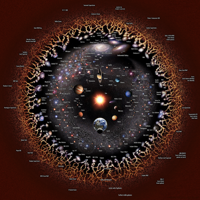
- Support: Impresssive picture with detailed annotations. NOTE:This picture is illustrated in logarithmic scale in order to make it possible to include the whole observable universe, otherwise this image will be full of blank and astronomical objects will be hard to find. --Steven Sun (talk) 11:52, 7 January 2022 (UTC)
- Support If it makes sense according to the logarithmic scale, I support, because it's quite beautiful. -- Ikan Kekek (talk) 09:59, 8 January 2022 (UTC)
- Support --MZaplotnik(talk) 09:29, 9 January 2022 (UTC)
- Comment This one makes more sense to me. The other one seems to suggest that there is "nothing" outside the areas we can actually observe, this one just does not show those areas. But is seems like the description is wrong when it says that it is centered on Earth. As far as I can tell, it is clearly centered on the sun? It would be great if User:Unmismoobjetivo could have a look at that ... --El Grafo (talk) 09:32, 11 January 2022 (UTC)
- Everything discussed above is very useful.
- About the description "centered on Earth": it is true that the schematic illustration is not strictly Earth-centered. It is centered in the Solar System (average position of Earth during the year). The description on the commons page has already been fixed.
- Regarding the unnecessary annotations: as the content is very dense and the annotations very numerous, it is probably right to question the utility on that scale of presentation. I added these annotations to be potentially used in a situation where the image is seen in desktop presentation and in the full width of the window (not for thumbnail as usual in Wikipedia).
- About directions: The directions here were not taken into account (anyway it is difficult to plot directions of a sphere in 2d circle (seaming a cut of a sphere) without overlapping both hemispheres) but a version with the directions with one sense would be interesting.
- About distances: distances were taken into account (with some discrepancies - artistic license in pursuit of visual balance) with a criterion from the center (Sun) to the edges, which was referenced from here: https://www.astro.princeton.edu/universe/
- About sizes: As the description says, the sizes were enlarged and accommodated in each celestial body to appreciate its shape. In any case, I would not say that sizes are meaningless since in my opinion they can serve to give a notion of size comparison at least in objects of the same type (eg gas giants).
- On Andromeda being further away than the Milky Way: It is true, if I remember correctly, at least 10 diameters of the Milky Way further away. In these positions it is only intended to show the situation of the local group of galaxies with only 3 large galaxies including Triangulum.
- I will be attentive to this nomination page in case there are more doubts about the content of this schematic graphic. Sorry, but I don't know if it is appropriate for me to write here or it is better for the author to refrain from commenting. Unmismoobjetivo (talk) 17:13, 11 January 2022 (UTC)
- Something else to keep in mind about the versions: in the original of this nomination labeled "Extended" the edges fade to a reddish noise, this is not "nothing" but it is the cosmic web of galaxies seen from so far away that we can't perceive distinguishable structures (filaments) but a grainy texture (red by the redshift at the time of our observation). This image includes unobservable portions of the universe and the alternate (circular) version is limited to the sphere of the observable universe. Unmismoobjetivo (talk) 04:35, 12 January 2022 (UTC)
.png#c-Famberhorst-2022-01-04T17:41:00.000Z-Alternative_Version)
.png#c-Daniel_Case-2022-01-07T03:13:00.000Z-Famberhorst-2022-01-04T17:41:00.000Z)
.png#c-Steven_Sun-2022-01-07T11:52:00.000Z-Famberhorst-2022-01-04T17:41:00.000Z)
.png#c-Ikan_Kekek-2022-01-08T09:59:00.000Z-Famberhorst-2022-01-04T17:41:00.000Z)
.png#c-MZaplotnik-2022-01-09T09:29:00.000Z-Famberhorst-2022-01-04T17:41:00.000Z)
.png#c-El_Grafo-2022-01-11T09:32:00.000Z-Famberhorst-2022-01-04T17:41:00.000Z)
.png#c-Unmismoobjetivo-2022-01-11T17:13:00.000Z-El_Grafo-2022-01-11T09:32:00.000Z)
.png#c-Unmismoobjetivo-2022-01-12T04:35:00.000Z-El_Grafo-2022-01-11T09:32:00.000Z)
- @Unmismoobjetivo thanks a lot for the reply! First of all, it is absolutely fine for the author to engage in the discussion here. Especially in cases like this, where open questions keep people from committing to a vote, a comment from the author can be really helpful. Clarifying edits to the file description page while the vote is already are also highly encouraged. We've even seen major reworks of nominated files halfway though the vote - that can get a bit messy, but as long as it's handled in a transparent matter, it can be a good thing.
- Your comments above are very enlightening, maybe consider whether some of that could find a place in the file description too?
- Re: the "nothing": that's pretty much what I meant to say ;-) --El Grafo (talk) 09:34, 12 January 2022 (UTC)
.png#c-El_Grafo-2022-01-12T09:34:00.000Z-Unmismoobjetivo-2022-01-12T04:35:00.000Z)
Confirmed results:
.png#c-Yann-2022-01-12T13:47:00.000Z-Alternative_Version)
.png&oldid=621239937)