Commons:Featured picture candidates/File:Exposure triangle - aperture, shutter speed and ISO.svg
Jump to navigation
Jump to search


File:Exposure triangle - aperture, shutter speed and ISO.svg, not featured[edit]
Voting period is over. Please don't add any new votes.Voting period ends on 9 Sep 2017 at 04:39:24 (UTC)
Visit the nomination page to add or modify image notes.

- Category: Commons:Featured pictures/Non-photographic media
 Info All by me -- WClarke 04:39, 31 August 2017 (UTC)
 Support I've seen versions of this diagram, and have found the concept to be helpful, so I decided to make my own public-domain version for Wikipedia. Hopefully it is something photographers here can appreciate. At the very least, if it's not worth featuring, I can get comments from people who know this subject well. Thanks. -- WClarke 04:39, 31 August 2017 (UTC)
 Oppose Visually it is rather plain, and I don't think it is a work of illustrative art on the level of the best FP diagrams. Secondly I have never understood why some books refer to an exposure triangle. I suppose they think "three" and assume a triangle is a suitable visual metaphor. The corners of the triangle have nothing in common (e.g. freezes motion & shallow DoF), nor to they represent limits to any scale (one can go slower than 1s and faster than 1/1000s). Changing one dimension just makes a different shaped triangle, but doesn't tell you how the three attributes interact to form an image -- the area of the triangle for example, isn't relevant. A better visual metaphor is a cube, where the brightness of the resulting image relates to the volume, and the width = shutter duration, height = aperture size, and depth = ISO. An increase in any of these results in greater brightness. If one uses an appropriate scale, doubling the width (shutter duration) can be compensated by halving the height (aperture size) or depth (ISO) and the same volume (brightness) results. However, at the level of physics, only aperture and shutter speed matter to determine how many photons hit the sensor (if we exclude filters, adding flash light and sensor size as variables the photographer can control), since ISO in the digital age is simply post-capture amplification. -- Colin (talk) 07:35, 31 August 2017 (UTC)
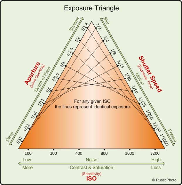
- The ISO thing makes more sense if you think of it as film sensitivity, so I wouldn't complain about that. But what's bothering me about this and all the other attempts I've see so far is that it doesn't actually tell you anything about exposure. What it should probably tell you is that, for example, at ISO 100, f/8 @ 1/250 will give you the same exposure as f/11 @ 1/125. Increase ISO to 200 and you'll get the same exposure as before at f/8 @ 1/125 or f/11 @ 1/250, or … . This attempt does this "for any given ISO", but you don't need a triangle for that. If demonstrating exposure is not the intention of this, it shouldn't be called an "exposure triangle". But then I think something like the first chart on this page would be much better suited to visualize the non-exposure related effects of changing aperture, shutter speed and film/sensor sensitivity. --El Grafo (talk) 09:46, 31 August 2017 (UTC)
- Agree that the diagram on the other page is better to show the effects of changing settings on the image qualities (other than exposure). The cube model does "explain" exposure and how the values each affect the total, but it isn't a particularly complex concept that one needs an analogy -- how much light is gathered by the sensor. The shutter duration and ISO values both double when the exposure doubles (goes up one stop). Only the aperture is strange with all those f/5.6 and f/8 numbers that don't seem to follow a sensible scale nor go the right direction! It makes more sense once you convert to the circular area of the aperture (e.g. f/8 is 122mm² on a 50mm lens, and f/5.6 is 250mm² which is double the area). I don't think the "triangle" model is adding anything useful. -- Colin (talk) 13:48, 31 August 2017 (UTC)
- Oppose Useful, probably a VI, not an FP in my eyes.--Peulle (talk) 12:29, 31 August 2017 (UTC)
- Oppose I like the idea actually, but would be much more intuitive if the triangle were coloured after the amount of exposure (black=dark, white=bright), each coordinate being more or less white. - Benh (talk) 18:55, 31 August 2017 (UTC)
- Oppose per Peulle. Just too busy too effectively convey information ... I've seen this done better elsewhere. Daniel Case (talk) 22:09, 1 September 2017 (UTC)
Confirmed results: