Commons:Featured picture candidates/File:Detail of the San Francisco Federal Building.jpg
Jump to navigation
Jump to search

File:Detail of the San Francisco Federal Building.jpg, not featured[edit]
Voting period is over. Please don't add any new votes.Voting period ends on 11 Dec 2017 at 09:28:18 (UTC)
Visit the nomination page to add or modify image notes.

- Category: Commons:Featured pictures/Places/Architecture
 Info created by dllu - uploaded by dllu - nominated by Dllu -- dllu (t,c) 09:28, 2 December 2017 (UTC)
 Support -- dllu (t,c) 09:28, 2 December 2017 (UTC)
 Comment Both side are leaning out, aren't they? --Basotxerri (talk) 10:13, 2 December 2017 (UTC)
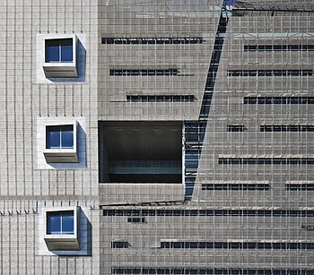
- Info The facade is slightly curved. It bulges out towards you. As such, the vertical lines bend outwards on both sides. This lens has little or no distortion, and perspectve correction was applied to remove any perspective distortion. Perhaps this angle makes it more obvious. dllu (t,c) 10:30, 2 December 2017 (UTC)
- OK, thank you! --Basotxerri (talk) 11:31, 2 December 2017 (UTC)
- Support --Basotxerri (talk) 09:17, 3 December 2017 (UTC)
 Oppose The technical quality is fine, but I'm not seeing anything special here. The light is ordinary, the building features seem completely mundane ... No wow at all.--Peulle (talk) 11:06, 2 December 2017 (UTC)
- Support -- Prismo345 (talk) 22:47, 2 December 2017 (UTC)
- Support I could see this in a modern art museum. -- King of ♥ ♦ ♣ ♠ 01:51, 3 December 2017 (UTC)
- Support per King. Daniel Case (talk) 02:47, 3 December 2017 (UTC)
- Oppose - Yes, we could see it in a museum of contemporary art, but a lot of what's on exhibit in museums of contemporary art that emphasize works starting in the 50s or 60s is there for reasons other than good composition, such as that it's monetarily valuable or the best-known critics like it (which essentially amounts to the same thing, nowadays). I think this is a lot better than a lot of that, but though it does have one or two interesting diagonal lines, it doesn't fully work for me. -- Ikan Kekek (talk) 07:47, 3 December 2017 (UTC)
- Comment - Here's a photo of part of a contemporary building I just saw in QIC that I find more compelling than this: File:Eureka Tower (top), Melbourne 2017-10-30.jpg. Obviously, you may not agree, but the shape does more for me. -- Ikan Kekek (talk) 07:59, 3 December 2017 (UTC)
,_Melbourne_2017-10-30.jpg)
- Support - Pretty confusing when you look at it for longer.--Ermell (talk) 08:31, 3 December 2017 (UTC)
- Comment It gives the idea to be tilted or distotrted (actually you can see in the low right corner that lines are a bit distorted); maybe its not actually tilted but thats the feeling. I also find the compsition quite claustrophobic. I have the feeling you might have found some better composition for this subject:-)Paolobon140 (talk) 10:51, 3 December 2017 (UTC)
- Oppose Composition isnt favourable here. --Mile (talk) 17:20, 3 December 2017 (UTC)
- Oppose I have to say I agree with Ikan that a contemporary art gallery/museum really isn't a good standard to aim for -- plenty crap on display there. There are parts of this that would make an interesting geometric photograph but it isn't working for me as a whole. The right grey part in particular is really not that interesting. -- Colin (talk) 18:46, 3 December 2017 (UTC)
- Oppose Per Peulle Poco2 19:08, 4 December 2017 (UTC)
 I withdraw my nomination, thanks everyone for the comments! dllu (t,c) 21:13, 4 December 2017 (UTC)
Confirmed results:
Result: 6 support, 5 oppose, 0 neutral → not featured. /PumpkinSky talk 03:58, 7 December 2017 (UTC)