Commons:Featured picture candidates/File:Catedrales de Tara, Chile, 2016-02-07, DD 57-60 PAN.JPG
Jump to navigation
Jump to search

File:Catedrales de Tara, Chile, 2016-02-07, DD 57-60 PAN.JPG, featured[edit]
Voting period is over. Please don't add any new votes.Voting period ends on 22 May 2016 at 20:59:03 (UTC)
Visit the nomination page to add or modify image notes.

- Category: Commons:Featured pictures/Places/Natural
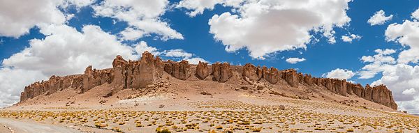
 Info Panoramic view of the Tara Cathedrals, a rock formation at the Tara salt flat in the Atacama Desert, northern Chile. All by me, Poco2 20:59, 13 May 2016 (UTC)
 Support -- Poco2 20:59, 13 May 2016 (UTC)
- Support INeverCry 21:29, 13 May 2016 (UTC)
- Support As always. 😄 ArionEstar 😜 (talk) 21:30, 13 May 2016 (UTC)
- Support - Absolutely! -- Ikan Kekek (talk) 21:39, 13 May 2016 (UTC)
- Support Great shot! --Frank Schulenburg (talk) 00:45, 14 May 2016 (UTC)
- Support --Johann Jaritz (talk) 03:09, 14 May 2016 (UTC)
- Support --Martin Falbisoner (talk) 09:24, 14 May 2016 (UTC)
- Support Kruusamägi (talk) 20:03, 14 May 2016 (UTC)
 Question @Poco a poco: are the colors that way out of the camera or did you do something to increase color saturation? When you viewed the scene with your eyes, did it have colors this vivid? --Pine✉ 02:12, 15 May 2016 (UTC)
- Pine: I shoot RAW, as most people here do. Therefore the answer to "are the colors that way out of the camera [..]?" can only be "no, they are not". I haven't applied though any particular settings for this picture. Still, I have uploaded a version with a slight reduction of contrast and an adjustment of the crop to improve symmetry. The picture does indeed look to me loyal to the captured scene Poco2 07:51, 15 May 2016 (UTC)
- Good point by Pine. I find Pocos colors too often in "500px" or "Flickr" sphere. --Mile (talk) 07:06, 15 May 2016 (UTC)
- Mile: This comment is below the belt. Poco2 07:51, 15 May 2016 (UTC)
- @Poc your colors are often oversaturated. When i see your Feautered pics, i see many of them. Sometimes it worked, for panoramas mainly not. I voted few times negative for oversaturation. You might like saturated colors, i often dont. --Mile (talk) 08:53, 15 May 2016 (UTC)
- Mile: Believe me, I don't really like oversaturated colors, not sure about saturated colors, I want my pictures to look the way I saw them for real. It is for me difficult to accept that all pictures have a systematic problem and many of them get through FP with lots of supports. My other ongoing FPC is a good example, it was taken one day later with the same camera, the same lens and I applied the same settings with the same software. It is clear that the same setting does not work for all pictures same, but I cannot see a systematic problem, sorry. Poco2 15:31, 16 May 2016 (UTC)
- I will Support assuming good faith about the coloring. --Pine✉ 16:56, 15 May 2016 (UTC)
- I will
- weak support --LivioAndronico (talk) 08:53, 15 May 2016 (UTC)
- Support --Llez (talk) 12:51, 16 May 2016 (UTC)
- Support I've been there, figuratively speaking, and I agree that that blue is about as good as you're going to get, given the circumstances. Honestly, I've seen worse. Daniel Case (talk) 19:17, 16 May 2016 (UTC)
- Support --DXR (talk) 05:17, 18 May 2016 (UTC)
Confirmed results:
This image will be added to the FP gallery: Places/Natural