Commons:Featured picture candidates/File:Bergtocht van Alp Farur (1940 meter) via Stelli (2383 meter) naar Gürgaletsch (2560 meter) 002.jpg
Jump to navigation
Jump to search

File:Bergtocht van Alp Farur (1940 meter) via Stelli (2383 meter) naar Gürgaletsch (2560 meter) 002.jpg, featured[edit]
_via_Stelli_(2383_meter)_naar_G%C3%BCrgaletsch_(2560_meter)_002.jpg&action=edit§ion=1)
Voting period is over. Please don't add any new votes.Voting period ends on 20 Dec 2017 at 06:11:58 (UTC)
Visit the nomination page to add or modify image notes.
_via_Stelli_(2383_meter)_naar_G%C3%BCrgaletsch_(2560_meter)_002.jpg)
- Category: Commons:Featured pictures/Places/Natural # Switserland
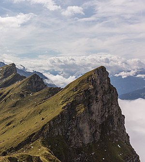
 Info View from the ridge to Gürgaletsch (2560 meters) on the Hüenerchöpf in the east. All by -- Agnes Monkelbaan (talk) 06:11, 11 December 2017 (UTC)
 Support -- Agnes Monkelbaan (talk) 06:11, 11 December 2017 (UTC)
- Support -- Johann Jaritz (talk) 08:50, 11 December 2017 (UTC)
 Oppose I don't think the vertical format suits this. I just want to see more on the left and right. Your "other version" is horizontal but misses out on the interesting ridge. But the sky just looks really strange. The clouds should be brighter. Looking at the EXIF I see you reduced both highlights (-53, perhaps ok) and whites (-50), and did the opposite for the shadows and blacks. Why boost the contrast +26 then? In my experience, dealing with over-bright clouds/snow is best handled by the highlights control alone, and similarly lifting the shadows is best done by the shadows control alone. I find the blacks/whites controls only really give nice results when used to stretch the white/black contrast (i.e. +white and -black, and rarely ever by the amount the Auto setting wants to do). Trying to use the Whites to lower the brightness of clouds just makes them look dull grey. This was taken at midday, so I'd expect the sky to be bright. The white balance is perhaps a little yellow too.
- Support Oh that's so much happier-looking now. And comparing the other framing-options you added, I'm thinking I like this one better now. A small point, would be to do similar for the blacks and allow those dark crevices on the shadow side of the mountain to go black, rather than having so much of a +black adjustment that there's just a lot of dark-grey. -- Colin (talk) 21:08, 11 December 2017 (UTC)
 Comment - I respect Colin's points but would like to support this photo because it's so striking. Agnes, please address his points and maybe edit accordingly, and then I would expect to support. -- Ikan Kekek (talk) 17:47, 11 December 2017 (UTC)
- Comment Thank you for your comment and that of Colin. I have edited this picture, but also the altenatives according to Colin's proposal.--Agnes Monkelbaan (talk) 18:36, 11 December 2017 (UTC)
_via_Stelli_(2383_meter)_naar_G%C3%BCrgaletsch_(2560_meter)_002.jpg#c-Agnes_Monkelbaan-2017-12-11T06:11:00.000Z-File:Bergtocht_van_Alp_Farur_(1940_meter)_via_Stelli_(2383_meter)_naar_Gürgalet)
_via_Stelli_(2383_meter)_naar_G%C3%BCrgaletsch_(2560_meter)_002.jpg#c-Agnes_Monkelbaan-2017-12-11T06:11:00.000Z-Agnes_Monkelbaan-2017-12-11T06:11:00.000Z)
_via_Stelli_(2383_meter)_naar_G%C3%BCrgaletsch_(2560_meter)_002.jpg#c-Johann_Jaritz-2017-12-11T08:50:00.000Z-Agnes_Monkelbaan-2017-12-11T06:11:00.000Z)
_via_Stelli_(2383_meter)_naar_G%C3%BCrgaletsch_(2560_meter)_002.jpg#c-Colin-2017-12-11T12:49:00.000Z-Agnes_Monkelbaan-2017-12-11T06:11:00.000Z)
_via_Stelli_(2383_meter)_naar_G%C3%BCrgaletsch_(2560_meter)_002.jpg#c-Colin-2017-12-11T21:08:00.000Z-Colin-2017-12-11T12:49:00.000Z)
_via_Stelli_(2383_meter)_naar_G%C3%BCrgaletsch_(2560_meter)_002.jpg#c-Ikan_Kekek-2017-12-11T17:47:00.000Z-Agnes_Monkelbaan-2017-12-11T06:11:00.000Z)
_via_Stelli_(2383_meter)_naar_G%C3%BCrgaletsch_(2560_meter)_002.jpg#c-Agnes_Monkelbaan-2017-12-11T18:36:00.000Z-Ikan_Kekek-2017-12-11T17:47:00.000Z)
- Thank you, and Support. -- Ikan Kekek (talk) 19:04, 11 December 2017 (UTC)
- Thank you, and
_via_Stelli_(2383_meter)_naar_G%C3%BCrgaletsch_(2560_meter)_002.jpg#c-Ikan_Kekek-2017-12-11T19:04:00.000Z-Agnes_Monkelbaan-2017-12-11T18:36:00.000Z)
- Support --cart-Talk 22:16, 11 December 2017 (UTC)
- Support Daniel Case (talk) 06:03, 12 December 2017 (UTC)
- Support --Martin Falbisoner (talk) 07:20, 12 December 2017 (UTC)
- Comment - Agnes, this photo isn't actually of a hike you took, but of a specific view during that walk, so I think you should specify in your file description which mountain is in the foreground, and even better would be to describe the names and positions of all mountains in the photo. -- Ikan Kekek (talk) 11:10, 12 December 2017 (UTC)
 Done. Thanks for your reviews.
- Support --Basotxerri (talk) 17:12, 12 December 2017 (UTC)
- Support --Llez (talk) 17:04, 13 December 2017 (UTC)
- Support -- I thought I already supported this. Sorry Agnes, glad I noticed in time. PumpkinSky talk 15:38, 17 December 2017 (UTC)
_via_Stelli_(2383_meter)_naar_G%C3%BCrgaletsch_(2560_meter)_002.jpg#c-W.carter-2017-12-11T22:16:00.000Z-Agnes_Monkelbaan-2017-12-11T06:11:00.000Z)
_via_Stelli_(2383_meter)_naar_G%C3%BCrgaletsch_(2560_meter)_002.jpg#c-Daniel_Case-2017-12-12T06:03:00.000Z-Agnes_Monkelbaan-2017-12-11T06:11:00.000Z)
_via_Stelli_(2383_meter)_naar_G%C3%BCrgaletsch_(2560_meter)_002.jpg#c-Martin_Falbisoner-2017-12-12T07:20:00.000Z-Agnes_Monkelbaan-2017-12-11T06:11:00.000Z)
_via_Stelli_(2383_meter)_naar_G%C3%BCrgaletsch_(2560_meter)_002.jpg#c-Ikan_Kekek-2017-12-12T11:10:00.000Z-Agnes_Monkelbaan-2017-12-11T06:11:00.000Z)
_via_Stelli_(2383_meter)_naar_G%C3%BCrgaletsch_(2560_meter)_002.jpg#c-Basotxerri-2017-12-12T17:12:00.000Z-Agnes_Monkelbaan-2017-12-11T06:11:00.000Z)
_via_Stelli_(2383_meter)_naar_G%C3%BCrgaletsch_(2560_meter)_002.jpg#c-Llez-2017-12-13T17:04:00.000Z-Agnes_Monkelbaan-2017-12-11T06:11:00.000Z)
_via_Stelli_(2383_meter)_naar_G%C3%BCrgaletsch_(2560_meter)_002.jpg#c-PumpkinSky-2017-12-17T15:38:00.000Z-Agnes_Monkelbaan-2017-12-11T06:11:00.000Z)
Confirmed results:
_via_Stelli_(2383_meter)_naar_G%C3%BCrgaletsch_(2560_meter)_002.jpg#c-PumpkinSky-2017-12-18T00:02:00.000Z-File:Bergtocht_van_Alp_Farur_(1940_meter)_via_Stelli_(2383_meter)_naar_Gürgalet)
This image will be added to the FP gallery: Places/Natural # Switserland
_via_Stelli_(2383_meter)_naar_Gürgaletsch_(2560_meter)_002.jpg&oldid=272729769)