Commons:Featured picture candidates/File:Bad Kissingen Foyer Fresko 0417RM0539.jpg
Jump to navigation
Jump to search

File:Bad Kissingen Foyer Fresko 0417RM0539.jpg, featured[edit]
Voting period is over. Please don't add any new votes.Voting period ends on 8 Jan 2018 at 14:27:33 (UTC)
Visit the nomination page to add or modify image notes.

- Category: Commons:Featured pictures/Places/Interiors
 Info all by me, user -- Ermell (talk) 14:27, 30 December 2017 (UTC)
 Support -- Ermell (talk) 14:27, 30 December 2017 (UTC)
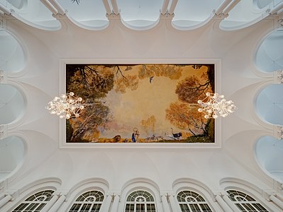
 Comment Very nice but if the fresco is the subject, why not zoom in a bit more? (Also, is that a purple CA line on the right side of the fresco?).--Peulle (talk) 17:07, 30 December 2017 (UTC)
- Comment Where would you want to crop? I lay down on my back to get the arches on the picture. Besides the fresco, I also found the different light colours and strengths interesting.
 DoneI actually didn`t notice the CA. Thanks for the hint.--Ermell (talk) 20:23, 30 December 2017 (UTC)
 Oppose Looking at history, I see the fresco has been selectively brightened. While I had assumed the lamps were lighting the fresco, it is now obvious to me that the brightness is fake -- the fresco obviously can't be brighter than the white walls around it (which the original upload demonstrates). I don't approve of this kind of alteration, which at the very least must be documented per FPC rules, but preferably just not done at all. While it is possible for the ceiling to be dull white, File:Foyer Regentenbau.jpg indicates that there is no shortage of light reaching these walls and ceiling, so I think Benh has a point (even though I think his comment about the histogram is irrelevant -- if the room was actually this dull, then that should be how it is rendered in the JPG and histogram be damned). So I think here we should see a global increase in exposure, while taking care with the lamps -- it is fine for the bulbs to blow because they are point-sources of light -- just try to keep as much detail in the lamps as you can. -- Colin (talk) 14:41, 1 January 2018 (UTC)
- Colin, I never look at a histogram before judging a picture but only to prove my points. Even if the room has dull lighting, your eyes adjust, as so shall a camera when recording a photo. Otherwise, good bye nights shots and starry skies... - Benh (talk) 18:53, 1 January 2018 (UTC)
- Benh, while one's eyes do adjust there is a limit. Today the weather here has been dull with some heavy rain at times. I needed to put on the lights in my living room so I could comfortably read even at midday. I would not need to do that if it was sunny. So my eyes today saw a the dull grey walls of my living room and the book I was reading, even though both of them are close to "white". I don't believe a photo of my living room today should be as bright as a photo of my living room on a sunny day. -- Colin (talk) 19:56, 1 January 2018 (UTC)
- Yes I do agree. But I need to put on sunglasses too when I go skiing. That doesn't mean the whites will be washed out on my pictures. The brain also does some adjustment. And hence the white balance too by the way. - Benh (talk) 21:32, 1 January 2018 (UTC)
- Although the overall scene has now been brightened, it still appears that the artwork is selectively brightened and more luminous than the white ceiling. -- Colin (talk) 08:58, 2 January 2018 (UTC)
- Benh, while one's eyes do adjust there is a limit. Today the weather here has been dull with some heavy rain at times. I needed to put on the lights in my living room so I could comfortably read even at midday. I would not need to do that if it was sunny. So my eyes today saw a the dull grey walls of my living room and the book I was reading, even though both of them are close to "white". I don't believe a photo of my living room today should be as bright as a photo of my living room on a sunny day. -- Colin (talk) 19:56, 1 January 2018 (UTC)
- Colin, I never look at a histogram before judging a picture but only to prove my points. Even if the room has dull lighting, your eyes adjust, as so shall a camera when recording a photo. Otherwise, good bye nights shots and starry skies... - Benh (talk) 18:53, 1 January 2018 (UTC)
- Support -- HalfGig talk 21:28, 30 December 2017 (UTC)
- Support -- Johann Jaritz (talk) 03:19, 31 December 2017 (UTC)
- Support --Agnes Monkelbaan (talk) 07:40, 31 December 2017 (UTC)
- Support --Martin Falbisoner (talk) 08:50, 31 December 2017 (UTC)
- Support --Llez (talk) 15:11, 31 December 2017 (UTC)
- Comment - I like the generous crop, which gives a really good rhythm to the eyes. But Ermell, please add more information about the fresco. I don't think this should be an FP until we know who the painter is and when it was painted. A title, if any, would be nice, too. -- Ikan Kekek (talk) 19:53, 31 December 2017 (UTC)
- Done Sorry I thought the category would be sufficient but now I think it's better.--Ermell (talk) 16:06, 1 January 2018 (UTC)
- Thank you. Support. -- Ikan Kekek (talk) 17:40, 1 January 2018 (UTC)
- Thank you.
- Oppose It's a very nice ceiling, but I personally cannot let the underexposure pass (and this is no artistic choice). Picture with that many whites don't show histograms with a peak in the middle, and the fresco is really dark. - Benh (talk) 11:10, 1 January 2018 (UTC)
- Done I increased the brightness a bit. Does any one else think that the picture was too dark before?--Ermell (talk) 16:08, 1 January 2018 (UTC)
- Thanks but I'm leaving my oppose for now. Still think it's slightly under. - Benh (talk) 21:32, 1 January 2018 (UTC)
- Very weak oppose due to the blown areas on the chandeliers. If different exposures had been combined, this might not have happened. Daniel Case (talk) 03:35, 2 January 2018 (UTC)
- Daniel Case I don't think it is reasonable to expect point-sources of light to not be blown. This is a photo of the ceiling and artwork, not the chandeliers. Actually, the image was fairly well exposed for the chandeliers, but has become worse in the latest version with brightness increased -- quite a bit of detail in the glass has gone. -- Colin (talk) 08:58, 2 January 2018 (UTC)
- @Colin: I perhaps should have added that the chandeliers looking all frosted, as if they had washed and left out to dry during the cold snap we are currently having in the Northeast/Midwest US, seemed to be a result of the selective brightening you uncovered. But the greater point to me—and I think to you as well—is that it was avoidable. Daniel Case (talk) 17:57, 2 January 2018 (UTC)
- Addendum: This has been improved, but I'm still not quite at supporting. Daniel Case (talk) 23:00, 2 January 2018 (UTC)
- @Colin: I perhaps should have added that the chandeliers looking all frosted, as if they had washed and left out to dry during the cold snap we are currently having in the Northeast/Midwest US, seemed to be a result of the selective brightening you uncovered. But the greater point to me—and I think to you as well—is that it was avoidable. Daniel Case (talk) 17:57, 2 January 2018 (UTC)
- Support I see the point that Daniel Case is making, but for me the good qualities of the image outweigh that one minor issue. I especially like the composition. --Pine✉ 05:04, 2 January 2018 (UTC)
- Comment @Colin: @Daniel Case: @Benh: Here is in my opinion the most correct version of this photo. The yellow light is inside and the blue light outside. The fresco should not be brightened up as Colin has already mentioned because the viewer sees it like this in reality. I also reduced the highlights of the light bulbs a bit, although I don't find it too annoying.--Ermell (talk) 09:47, 2 January 2018 (UTC)
- To me, you lost contrast and I think if the painting is there, it's because one should look at it. It's a bit sad if it's dark on the photo, and I didn't think the whole picture would be so hard to expose correctly. Anyways, I guess it's hard to satisfy everyone ;) - Benh (talk) 19:13, 3 January 2018 (UTC)
- Support -- Wolf im Wald 12:15, 4 January 2018 (UTC)
Confirmed results:
This image will be added to the FP gallery: Places/Interiors