Commons:Featured picture candidates/File:Auberge Du Tresor.jpg
Jump to navigation
Jump to search

File:Auberge Du Tresor.jpg, featured[edit]
Voting period is over. Please don't add any new votes.Voting period ends on 19 Jul 2018 at 23:31:57 (UTC)
Visit the nomination page to add or modify image notes.

- Category: Commons:Featured pictures/Places/Architecture
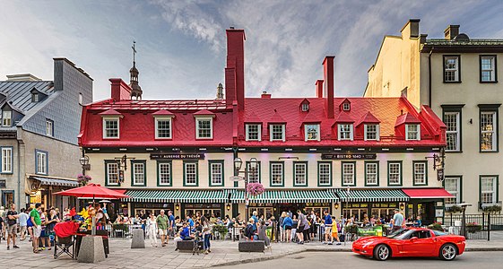
 Info All by -- The Photographer 23:31, 10 July 2018 (UTC)
 Abstain as creator and nominator. -- The Photographer 23:31, 10 July 2018 (UTC)
 Support Good! -- Gerifalte Del Sabana 23:58, 10 July 2018 (UTC)
 Comment I think it's a nice scene, but to me it looks like it's slightly stretched vertically? A simple aspect adjustment in Lightroom would fix it. It's subtle, though, so probably a good idea to wait for someone else to confirm what I think I see. :) — Rhododendrites talk | 00:36, 11 July 2018 (UTC)
 Oppose
 Done Thanks Ermell for add the notes to fix the stitching, clone stamp, noise, lines don´t match and masking remainings issues. Please let me know what do you think. With regard to the comment on the perspective, I personally can not see any error, please feel free to help me. @Rhododendrites: , @Peulle: --The Photographer 01:24, 13 July 2018 (UTC)
- @The Photographer: Great. I've made the aspect/perspective adjustment and uploaded a new version here, then reverted to your most recent. To my eye, the stretched perspective was visible in many of the people, but one ~objective example is the car wheel, one of the few things that should be the same width and height (roughly -- perspective changes it a little), but in the original it is clearly taller than it is wide. With so many people supporting, though, you may want to consider whether you think it's an improvement. :) — Rhododendrites talk | 01:57, 13 July 2018 (UTC)
- Thanks Rhododendrites for your help, I will wait for the opinion of Peulle, Ermell and why not @Colin: , he always criticized me about perspectives fixes in the past that made me hate him, but now I practically have to beg him to criticize me.--The Photographer 02:13, 13 July 2018 (UTC)
- I've tried to compare against other images, and also Google street map. The chimneys are extra all and so unusual to our eyes. I think overall they are not rendered over-tall in this image bearing in mind that it is using a standard perspective that keeps verticals straight and parallel without consideration that things high up are actually further away from us and so would appear smaller to the eye. That distortion increases as one gets close to the subject, and in street scenes it is often very difficult to get comfortably far enough back. So we just have to accept some perspective distortion effect (stretch vs sloping verticals) and judge whether it is too offensive for the eye (compare this which I think is quite silly). I also compared the overall aspect ratio of the building and think Rhododendrites is right that it is a too narrow. I selected the area of window frames and compared with several photos. A global aspect ratio change might be the simplest fix. It is possible the proportions on the far left were OK (or the guy is quite short) whereas I agree the people in the middle are a bit thin looking. It isn't easy to create a stitch by hand with this many people. I do like that one can zoom in and people-watch. -- Colin (talk) 07:15, 13 July 2018 (UTC)
- Dear @Colin: I have applied a manual and complex perspective correction, based mainly on the wheel of the car, the letter "o" of "Trésor", the corrections made by Rhododendrites (thanks) and the comments that you have made (Please see this Gmaps point). Please, tell me what you think Colin, Rhododendrites and Ermell. Thanks again --The Photographer 03:04, 14 July 2018 (UTC)
- Support Looks good to me. :) — Rhododendrites talk | 03:40, 14 July 2018 (UTC)
- Dear @Colin: I have applied a manual and complex perspective correction, based mainly on the wheel of the car, the letter "o" of "Trésor", the corrections made by Rhododendrites (thanks) and the comments that you have made (Please see this Gmaps point). Please, tell me what you think Colin, Rhododendrites and Ermell. Thanks again --The Photographer 03:04, 14 July 2018 (UTC)
- I've tried to compare against other images, and also Google street map. The chimneys are extra all and so unusual to our eyes. I think overall they are not rendered over-tall in this image bearing in mind that it is using a standard perspective that keeps verticals straight and parallel without consideration that things high up are actually further away from us and so would appear smaller to the eye. That distortion increases as one gets close to the subject, and in street scenes it is often very difficult to get comfortably far enough back. So we just have to accept some perspective distortion effect (stretch vs sloping verticals) and judge whether it is too offensive for the eye (compare this which I think is quite silly). I also compared the overall aspect ratio of the building and think Rhododendrites is right that it is a too narrow. I selected the area of window frames and compared with several photos. A global aspect ratio change might be the simplest fix. It is possible the proportions on the far left were OK (or the guy is quite short) whereas I agree the people in the middle are a bit thin looking. It isn't easy to create a stitch by hand with this many people. I do like that one can zoom in and people-watch. -- Colin (talk) 07:15, 13 July 2018 (UTC)
- Thanks Rhododendrites for your help, I will wait for the opinion of Peulle, Ermell and why not @Colin: , he always criticized me about perspectives fixes in the past that made me hate him, but now I practically have to beg him to criticize me.--The Photographer 02:13, 13 July 2018 (UTC)
- @The Photographer: Great. I've made the aspect/perspective adjustment and uploaded a new version here, then reverted to your most recent. To my eye, the stretched perspective was visible in many of the people, but one ~objective example is the car wheel, one of the few things that should be the same width and height (roughly -- perspective changes it a little), but in the original it is clearly taller than it is wide. With so many people supporting, though, you may want to consider whether you think it's an improvement. :) — Rhododendrites talk | 01:57, 13 July 2018 (UTC)
- Support -- George Chernilevsky talk 05:23, 11 July 2018 (UTC)
- Support --Martin Falbisoner (talk) 07:55, 11 July 2018 (UTC)
- Support - To me, and without prejudice to Rhododendrites' remark, this is excellent, both as a scene and a slice of life. -- Ikan Kekek (talk) 09:17, 11 July 2018 (UTC)
- Comment Some fine tuning could be done in the area above the top right chimneys; there's some kind of grey blob there, as well as a small dust/insect spot.--Peulle (talk) 10:20, 11 July 2018 (UTC)
- It's better now that the grey stuff has been mended.--Peulle (talk) 02:27, 13 July 2018 (UTC)
- Support Jee 11:21, 11 July 2018 (UTC)
- Support A really fun people photograph and other things... The car really makes it! Congrats! --Tomascastelazo (talk) 16:03, 11 July 2018 (UTC)
- Support Nice and busy place. --XRay talk 18:25, 11 July 2018 (UTC)
- Support I love the sphere and the people really add something to whole composition. I also like the strong colours --Michielverbeek (talk) 19:46, 11 July 2018 (UTC)
- Support It isn't perfect but I can't stop liking it. You want to walk into this scene and sit down. Daniel Case (talk) 23:14, 11 July 2018 (UTC)
- Support I like the colors and how you framed and processed this scene. It looks very vivid to me. --Frank Schulenburg (talk) 03:25, 12 July 2018 (UTC)
- Support --Tournasol7 (talk) 16:07, 12 July 2018 (UTC)
- Support --Agnes Monkelbaan (talk) 18:01, 12 July 2018 (UTC)
- Support --Pudelek (talk) 07:19, 14 July 2018 (UTC)
- Support --Cart (talk) 13:09, 15 July 2018 (UTC)
- Support -- Colin (talk) 14:27, 15 July 2018 (UTC)
Confirmed results:
Result: 16 support, 0 oppose, 0 neutral → featured. /George Chernilevsky talk 05:16, 16 July 2018 (UTC)
This image will be added to the FP gallery: Places/Architecture