Commons:Quality images candidates/Archives January 08 2014
Jump to navigation
Jump to search

-
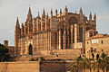
- Nomination Cathedral of Palma de Mallorca --Urmas83 22:47, 5 January 2014 (UTC)
- Promotion ok. --Sputniktilt 23:29, 5 January 2014 (UTC)
-

- Nomination Geranium procurrens. Long Blooming somewhat invasive geranium.--
Famberhorst 16:22, 5 January 2014 (UTC) - Promotion Good quality, very sharp. --Uoaei1 19:23, 5 January 2014 (UTC)
- Nomination Geranium procurrens. Long Blooming somewhat invasive geranium.--
-

- Nomination Dr. Joscha Bach after giving the talk "How to Build a Mind" at the 30th Chaos Communication Congress (30C3) in Hamburg. Rama 11:55, 5 January 2014 (UTC)
- Decline Too noisy IMO --Poco a poco 12:37, 5 January 2014 (UTC)
-

- Nomination Canary Wharf Pier. Mattbuck 11:08, 5 January 2014 (UTC)
- Promotion Good quality. --Taxiarchos228 20:33, 5 January 2014 (UTC)
-

- Nomination Fosse Dionne, spring and lavoir, in Tonnerre, France. --Velvet 10:01, 5 January 2014 (UTC)
- Promotion Interesting and good --Poco a poco 12:21, 5 January 2014 (UTC)
-

- Nomination Old University of Marburg --Hydro 09:09, 5 January 2014 (UTC)
- Decline Lacks sharpness, strong perspective distortion --Poco a poco 12:27, 5 January 2014 (UTC)
-
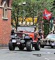
- Nomination Car at the parade "700 Jahre Stadt Dülmen" in Dülmen, North Rhine-Westphalia, Germany --XRay 08:24, 5 January 2014 (UTC)
- Decline Blurry --Poco a poco 12:21, 5 January 2014 (UTC)
-

-

- Nomination Raspberry plant leaves in a garden. --Ethically Yours 07:31, 5 January 2014 (UTC)
- Decline Shallow DOF resulting in little sharp areas --Poco a poco 12:21, 5 January 2014 (UTC)
-

- Nomination Shell of a Zeus Ryssota, Ryssota zeus --Llez 07:24, 5 January 2014 (UTC)
- Promotion Good quality. --Poco a poco 12:37, 5 January 2014 (UTC)
-
- Nomination Morning Glory above the lake on the Famberhorst.--
Famberhorst 06:05, 5 January 2014 (UTC) - Promotion Ok --Poco a poco 12:37, 5 January 2014 (UTC)
- Nomination Morning Glory above the lake on the Famberhorst.--
-

- Nomination Roof mosaic, exhibition building, Mathildenhöhe, Darmstadt --Martin Kraft 01:11, 5 January 2014 (UTC)
- Promotion Nice --Poco a poco 12:37, 5 January 2014 (UTC)
-

- Nomination Wedding Tower (Hochzeitsturm), Mathildenhöhe, Darmstadt, Germany --Martin Kraft 01:11, 5 January 2014 (UTC)
- Promotion Good quality. --Poco a poco 12:29, 5 January 2014 (UTC)
-

- Nomination Sun dail on the Wedding Tower (Hochzeitsturm), Mathildenhöhe, Darmstadt, Germany --Martin Kraft 01:11, 5 January 2014 (UTC)
- Promotion Good quality. --Poco a poco 12:29, 5 January 2014 (UTC)
-

- Nomination Front relief of the Wedding Tower (Hochzeitsturm), Mathildenhöhe, Darmstadt, Germany --Martin Kraft 01:11, 5 January 2014 (UTC)
- Promotion Good quality. --Poco a poco 12:29, 5 January 2014 (UTC)
-

-

- Nomination Aerial photograph of Ruhr University Bochum with Audimax and canteen --Tuxyso 20:42, 4 January 2014 (UTC)
- Promotion
 Support A little bit noisy, but IMO it's QI. --XRay 09:47, 5 January 2014 (UTC)
High ISO was required due to relative poor light. Exposure time of 1/500sec / 1/320 is minium in an oscillating propeller-driven aircraft to get photos without blurr. --Tuxyso 09:50, 5 January 2014 (UTC)
-

- Nomination Larpool Viaduct. Mattbuck 12:56, 1 January 2014 (UTC)
- Promotion
 Comment I like the composition very much, but sharpness could be somewhat better, and perhaps the image has somewhat red tint. -- Smial 09:59, 2 January 2014 (UTC)
 Done Mattbuck 13:00, 5 January 2014 (UTC) Support Still not perfect, but I won't be nitpicking. To make a point: This is QI, not PI as in "perfect images". --Smial 18:31, 5 January 2014 (UTC)
-

- Nomination Zbraslav chateau, former cistercian monastery. U Národní galerie 1, Prague-Zbraslav, the Czech Republic. By User:Zdeněk Fiedler --Ahonc 23:57, 26 December 2013 (UTC)
- Decline Please fix the CA. I also think, that a less compressed JPG could reveal more details. --Cccefalon 05:55, 27 December 2013 (UTC)
Sharpen as well please. Mattbuck 21:28, 30 December 2013 (UTC)
-

- Nomination Dortmund, Phoenix West, eingestürzte Halle und Gasometer --Smial 08:37, 24 December 2013 (UTC)
Not very sharp in full resolution ans the crop appears asaymmetric (top/bottom). I would reduce the size of the image and crop the snow in the lower part to the tree. --NorbertNagel 13:50, 24 December 2013 (UTC) - Decline Norbert, please stop asking people to downsample. Sharpening would help though. Mattbuck 13:49, 30 December 2013 (UTC)
Ok, please sharpen, the image too blurred in full resolution. --NorbertNagel 20:04, 30 December 2013 (UTC)
- Nomination Dortmund, Phoenix West, eingestürzte Halle und Gasometer --Smial 08:37, 24 December 2013 (UTC)
-

- Nomination Matucana polzii, Munich Botanical Garden, Germany --Poco a poco 01:33, 24 December 2013 (UTC)
- Decline I'm not sure about the DOF. Mattbuck 13:49, 30 December 2013 (UTC)
-

- Nomination Cathedral in Kharkiv, Ukraine. By User:Denis Vitchenko --Ahonc 21:54, 23 December 2013 (UTC)
- Decline Needs perspective correction. Please remove CA and add a little bit denoising. --Cccefalon 13:10, 26 December 2013 (UTC)
Tilted. Mattbuck 13:34, 30 December 2013 (UTC)
-

- Nomination Casa refectorio de la iglesia de Antonio y Teodosio. By User:Pedro J Pacheco --Ahonc 21:54, 23 December 2013 (UTC)
Needs perspective correction Poco a poco 13:00, 24 December 2013 (UTC)
New version was uploaded by author.
Left side is still leaning in. Mattbuck 13:34, 30 December 2013 (UTC) - Decline
- Nomination Casa refectorio de la iglesia de Antonio y Teodosio. By User:Pedro J Pacheco --Ahonc 21:54, 23 December 2013 (UTC)


_2.jpg)
_--_2011_--_11.jpg)
,_Hollywood_Boulevard,_John_Lennon_--_2012_--_4990.jpg)


,_Metro_-Hollywood_Western_Station-_--_2012_--_2.jpg)
_1.jpg)
-Temple_Mount-Dome_of_the_Rock_(SE_exposure).jpg)
_-_Monument_of_the_Russian_emperor_Alexander_II_(by_Pudelek).JPG)
Consensual review
[edit]File:Krakow_Wawel_i_Leg_przed_wschodem_Slonca.jpg
[edit]
- Nomination Wawel Hill and Łęg Cogeneration and power plant before sunrise. By User:Jar.ciurus --Ahonc 19:20, 24 December 2013 (UTC)
- Decline
 Oppose Noisy, but very beautiful image ! Can you please add geocoding and remove dust spots ? --Shansov.net 09:03, 25 December 2013 (UTC) --Ahonc - thank you for nomination, Shansov.net - yes, I can remove dust spot, but after Christmas. I've localized one dust spot... can you point the others? --Jar.ciurus 09:56, 25 December 2013 (UTC)
Done These two spots have been removed. Jar.ciurus 17:04, 30 December 2013 (UTC)
Not really noticeable, but I marked them anyway. Other suggestions wouldn't fit into the allowed retouch scope --Shansov.net 14:26, 25 December 2013 (UTC) Oppose The picture is great, wonderful atmosphere and overview but the quality is not at QI level IMHO --Poco a poco 15:57, 25 December 2013 (UTC)
Running total: 0 support (excluding the nominator), 2 oppose → Decline? --Jean11 17:54, 28 December 2013 (UTC)
File:2013.09.27.-3-See Pfingstberg Mannheim-Rheinau-Gemeine Heidelibelle-Paarung.jpg
[edit]
- Nomination Gemeine Heidelibelle - Sympetrum vulgatum, Paarung (couple) --Hockei 21:20, 19 December 2013 (UTC)
- Promotion Oppose Low colour depth - see around thorax of the leftmost one. --Mattbuck 00:50, 24 December 2013 (UTC) Support Minor weakness. Apart from that, it’s an excellent picture IMHO. --Kreuzschnabel 08:25, 24 December 2013 (UTC)
- Support acceptable IMO --Christian Ferrer 23:49, 2 January 2014 (UTC)
- Support QI for me --Archaeodontosaurus 08:26, 7 January 2014 (UTC)
Running total: 3 support (excluding the nominator), 1 oppose → Promote? --Jean11 17:39, 28 December 2013 (UTC)
File:Aline_Fiedler_Landtag_Sachsen_by_Stepro_IMG_1774_LR50.jpg
[edit]
- Nomination Abgeordnete des Sächsischen Landtages Aline Fiedler --Stepro 21:02, 22 December 2013 (UTC)
- Promotion I don't like the left oriented crop. Can you crop wider? From the position of the shoulder from right to left a right oriented crop (or centered) had been much better. --Tuxyso 07:51, 23 December 2013 (UTC) Comment Same here: There are centered pics and others at Category:Aline Fiedler. But in my humble opinion this is right for the use on a standard wiki page, where she is looking at the upper right corner into the text. So the space on the right side is intended. --Stepro 09:29, 23 December 2013 (UTC) OpposeIf it was on purpose I decline this one (I am sure you will change to CR). Of relevance is not an optimized photo for a special use (e.g. in an article) but a good photo in general. From a photographic standpoint (and this is important here) the crop is very unfortunate and no QI for me, sorry. --Tuxyso 09:47, 23 December 2013 (UTC) Support I am not a great fan of this one, but of course Tuxyso's opinion should be discussed, as it is a point of great interest. So, please discuss. (As for me, the crop works with the movement of her hair) --Jebulon 16:11, 23 December 2013 (UTC)
- Support Good one. -- Smial 12:31, 24 December 2013 (UTC)
- You see no problems with the composition? This is no on location festival photography :) IMHO no good idea to optimize a photo for one special infobox on de-WP. For me definitely no QI due to the bad composition (but I've already mentioned it...). --Tuxyso 12:34, 24 December 2013 (UTC)
- Indeed not. Instead I'm bored by most of the other imgages of that project. -- Smial 19:14, 24 December 2013 (UTC)
- You see no problems with the composition? This is no on location festival photography :) IMHO no good idea to optimize a photo for one special infobox on de-WP. For me definitely no QI due to the bad composition (but I've already mentioned it...). --Tuxyso 12:34, 24 December 2013 (UTC)
- Oppose bad crop - no space on the left side and too tight at the bottom --Shansov.net 03:29, 25 December 2013 (UTC)
- Comment I checked it just for fun: Although not intended, the face is placed exactly according to the rule of thirds, just as advised in Commons:Image guidelines. :-) Stepro 19:43, 29 December 2013 (UTC)
- Support QI to me, as mentioned tight to the bottom, but OK. --DKrieger 21:00, 1 January 2014 (UTC)
Running total: 2 support (excluding the nominator), 2 oppose → More votes? --Jean11 17:27, 28 December 2013 (UTC)
File:Serratula seoanei, Zaagblad.JPG
[edit]
- Nomination Serratula seoanei.--
Famberhorst 14:33, 22 December 2013 (UTC) - Promotion Oppose Sorry, but not sharp enough. --Stepro 02:58, 23 December 2013 (UTC)
- Support Looks sharp enough for me. It's a macro and DoF is shallow. --Shansov.net 05:30, 23 December 2013 (UTC)
- Oppose I expect from a presentation of a single flower more DOF. The sharpness here was obviously acquired by harsh post processing. As a result, the background is starting to show artefacts. --Cccefalon 07:56, 26 December 2013 (UTC)
- Support IMHO it is enough for me --The Photographer 17:54, 2 January 2014 (UTC)
- weak Support Looks a bit overprocessed but still OK for QI --Kreuzschnabel 10:56, 4 January 2014 (UTC)
Running total: 1 support (excluding the nominator), 2 oppose → Decline? --Jean11 17:23, 28 December 2013 (UTC)
File:Rievaulx Terrace MMB 11.jpg
[edit]
- Nomination Rievaulx terrace. Mattbuck 11:35, 22 December 2013 (UTC)
- Promotion Oppose Focus is on the trees in the foreground. --Stepro 02:58, 23 December 2013 (UTC)
I accept the trees are in focus, but the background is by no means out of focus. Mattbuck 01:13, 24 December 2013 (UTC) - Support QI IMO --Christian Ferrer 16:08, 24 December 2013 (UTC)
- Comment There is too much red in the sky, indeed it looks pink. Also there is a big dustspot on the left side. --Cccefalon 07:59, 26 December 2013 (UTC)
- Done Mattbuck 00:19, 28 December 2013 (UTC)
- Support I won't dwell about the red breeze, but in my calibrated monitor I noticed the red shine in the sky very often in your photos, Matt. Perhaps an intrinsic error of your monitor? Though not thoroughly resolved, it's better now and I will support the photo. --Cccefalon 14:22, 28 December 2013 (UTC)
- I have my monitors set to autocalibrate, and the colours seem ok on them. Mattbuck 01:52, 30 December 2013 (UTC)
Running total: 2 support (excluding the nominator), 1 oppose → Promote? --Jean11 17:21, 28 December 2013 (UTC)
File:Aysgarth Falls MMB 55.jpg
[edit]
- Nomination Aysgarth Falls. Mattbuck 11:35, 22 December 2013 (UTC)
- Decline
- Oppose I like the motif. However, I expected the river banks to be sharp to get in contrast to the flowing water. As a matter of facts, they are not. --Cccefalon 13:22, 22 December 2013 (UTC)
- I understand what you mean (no tripod that day), but I think it's marginal. I ask for another opinion on this. Mattbuck 01:13, 24 December 2013 (UTC)
- Oppose nothing really sharp (f/29). --Iifar 15:12, 5 January 2014 (UTC)
- Oppose Suffers to much from waht is called "Beugungsunschärfe" (diffraction blur?) in german. Happens at about f/13 and byond.--GMLSX (talk) 23:00, 5 January 2014 (UTC)
Running total: 0 support (excluding the nominator), 1 oppose → Decline? --Jean11 17:19, 28 December 2013 (UTC)
File:Klaus_Lederer_(Martin_Rulsch)_1.jpg
[edit]_1.jpg)
- Nomination Klaus Lederer, Berlin politician (Die Linke) and member of the Abgeordnetenhaus of Berlin (as of 2013). --DerHexer 11:29, 20 December 2013 (UTC)
- Promotion Oppose Too tight crop on top. Also, as an act of courtesy I had retouched the pimple on his forehead. --Cccefalon 10:04, 22 December 2013 (UTC) Support I'm sorry, I find the "decline" reasons a bit harsh, and I ask for a discussion: this picture deserves the label IMO.--Jebulon 17:33, 23 December 2013 (UTC)
- Support QI IMO --Christian Ferrer 16:05, 24 December 2013 (UTC)
- Support QI for me. There could be a bit more space at the top, on the other side that could easily exaggerate his high forehead in an unfortunate way. --Kreuzschnabel 14:32, 25 December 2013 (UTC)
- Support Good quality IMO--Lmbuga 18:48, 30 December 2013 (UTC)
Running total: 3 support (excluding the nominator), 1 oppose → Promote? --Jean11 17:11, 28 December 2013 (UTC)
File:Markt_Unna_2008_IMGP6405_wp.jpg
[edit]
- Nomination Modern pavement and historical buildings before sunrise in Unna, Germany. --Smial 21:55, 19 December 2013 (UTC)
- Promotion Oppose I'm inclined to oppose because of the huge dark area (about 50%) which is a bad counterbalance to the houses bordering the square. I am not sure, but might be the composition can be rescued by cropping right under der chair and brightening the cobblestones. --Cccefalon 11:26, 22 December 2013 (UTC) Comment This view is intended as an alternative to e.g.File:Unna Alter Markt.jpg and File:Unna Markt Fassaden IMGP6369 wp.jpg, where can be seen under different light situations, that these stones are rather dark. Additionally: I don't like HDR very much. -- Smial 15:24, 23 December 2013 (UTC) Support OK for me. Mattbuck 00:50, 24 December 2013 (UTC)
- Support QI IMO --Christian Ferrer 16:03, 24 December 2013 (UTC)
Running total: 2 support (excluding the nominator), 1 oppose → Promote? --Jean11 16:37, 28 December 2013 (UTC)
File:HorvaatiaKRK.jpg
[edit]
- Nomination Tree amongst the ruins--Urmas83 10:11, 19 December 2013 (UTC)
Needs more specific categories Poco a poco 11:00, 19 December 2013 (UTC) Have you got any ideas? --Urmas83 13:43, 19 December 2013 (UTC)
It isn't that hard: what about "Island of Krk" and "Walls in Croatia" Poco a poco 01:21, 21 December 2013 (UTC) Thank you.--Urmas83 07:54, 21 December 2013 (UTC) - Decline I meant both! The more categories, the better. Btw, you should use this tool: Help:Gadget-HotCat if not done yet --Poco a poco 14:20, 21 December 2013 (UTC)
OpposeI disagree. Overprocessed HDR looks completely unnatural. --Smial 17:02, 23 December 2013 (UTC) - Support QI IMO --Christian Ferrer 16:01, 24 December 2013 (UTC)
- Oppose Overprocessed, The halot between the wall and the sky is too visible.--Archaeodontosaurus (talk) 11:54, 27 December 2013 (UTC)
- Oppose Overprocessed--Lmbuga 18:45, 30 December 2013 (UTC)
Running total: 1 support (excluding the nominator), 3 oppose → Decline? --Jean11 16:33, 28 December 2013 (UTC)
File:Jerusalem-2013(2)-Temple Mount-Dome of the Rock (SE exposure).jpg
[edit]-Temple_Mount-Dome_of_the_Rock_(SE_exposure).jpg)
- Nomination The Dome of the Rock, Temple Mount, Old City of Jerusalem. --Godot13 21:12, 21 December 2013 (UTC)
- Promotion Support Good quality. --Alberto-g-rovi 07:00, 22 December 2013 (UTC) Oppose The perspective correction is not properly done. --Cccefalon 09:09, 22 December 2013 (UTC)
- Comment all of the verticals are in alignment. I was not standing square in front of one of the walls...-Godot13 18:15, 23 December 2013 (UTC)
- Oppose too strong distorted. --Ralf Roletschek 12:25, 23 December 2013 (UTC)
- Comment can you please point out the strong distortion.-Godot13 18:15, 23 December 2013 (UTC)
- Comment Did not you know our friend Ralf ? He preaches (against the rules) that every perspective correction is an unacceptable distortion. There is something religious for him...--Jebulon 10:01, 24 December 2013 (UTC)
- Support Good to me.--Jebulon 10:01, 24 December 2013 (UTC)
- Comment For me a very good photo. But it looks for me as if the pillars at the very left are not fully straight. And there a minor CAs (see note). --Tuxyso 10:18, 24 December 2013 (UTC)
- Comment The left is leaning in, it need a correction IMO --Christian Ferrer 15:58, 24 December 2013 (UTC)
- Support Minor distortion maybe but not disturbing. The picture is truthful to me. And the quality is good. --Urmas83 19:56, 26 December 2013 (UTC)
- Comment Godot13, I made two annotations and please take time to review them. The left side is leaning to the right and the right side is leaning to the left. For an architectural structure it is necessary to take care of that. That kind of perspective flaw has nothing to do wether you are standing in front of the walls or not. Verticals are verticals, independent where you are standing. I really wonder, why you deliberately refuse to work on an obvious flaw of that wonderful photo. It even could be sent to FP afterwards. --Cccefalon 05:25, 27 December 2013 (UTC)
- Cccefalon, I'm not deliberately refusing anything. My raw files are on my office computer, it has been the holidays, I hope to get to it within the next day or so. But, I'm am guessing that to correct what you mention may create too much distortion on the dome... But we'll see.--Godot13 17:56, 27 December 2013 (UTC)
- Thank you for clarification. Real life has priority of course. At least give the perspective correction a try and we will see where we end up. --Cccefalon 18:06, 27 December 2013 (UTC)
- Cccefalon-Please take a look now. I have made a slight vertical correction (any more begins to create too much distortion), removed the CA by the columns on the left, slightly reduced the highlights, and a little NR on the sky. Is this better?-Godot13 22:50, 27 December 2013 (UTC)
- Compared to the last version I actually think the dome looks distorted now...-Godot13 22:54, 27 December 2013 (UTC)
- Cccefalon-Please take a look now. I have made a slight vertical correction (any more begins to create too much distortion), removed the CA by the columns on the left, slightly reduced the highlights, and a little NR on the sky. Is this better?-Godot13 22:50, 27 December 2013 (UTC)
- Thank you for clarification. Real life has priority of course. At least give the perspective correction a try and we will see where we end up. --Cccefalon 18:06, 27 December 2013 (UTC)
- Support It's perfect. You should nominate it at FP. --Cccefalon 14:26, 28 December 2013 (UTC)
Running total: 4 support (excluding the nominator), 1 oppose → Promote? --Jean11 16:26, 28 December 2013 (UTC)
File:Shipka pass (Шипка) - Monument of the Russian emperor Alexander II (by Pudelek).JPG
[edit]_-_Monument_of_the_Russian_emperor_Alexander_II_(by_Pudelek).JPG)
- Nomination Shipka pass (Шипка) Bulgaria - Monument of the Russian emperor Alexander II --Pudelek 10:00, 16 December 2013 (UTC)
- Decline Oppose There is something wroing with the perspective. The cross should be rectilinear and also the wind turbine poles should not be inclined. --Cccefalon 14:39, 16 December 2013 (UTC) Support I'm tempted to promote it anyway, seems ok to me. Mattbuck 13:31, 22 December 2013 (UTC)
Comment In general I am inclined to change a comment to an "oppose" if I see that people just upload a lot of new photos instead of replying to the feedbacks. Don't they take the reviewers for serious? --Cccefalon 07:41, 23 December 2013 (UTC)
- no, just I like this picture with this perspective -- Pudelek 18:51, 24 December 2013 (UTC)
- Oppose Per Cccefalon.--Jebulon 20:26, 23 December 2013 (UTC)
- Support There is perspective distortion, on the other hand, this is clearly enough a worm's-eye shot from small distance, so converging lines are to be expected, and straightening to the top would make it look rather unnatural. OK for me. --Kreuzschnabel 14:40, 25 December 2013 (UTC)
- Oppose Per Cccefalon --Lmbuga 18:42, 30 December 2013 (UTC)
Running total: 2 support (excluding the nominator), 3 oppose → Decline? --Jean11 16:20, 28 December 2013 (UTC)
File:Third_station_of_the_cross_Arco_Laghel.jpg
[edit]
- Nomination The third station of the Cross: in Laghel Arco --Moroder 08:35, 15 December 2013 (UTC)
- Promotion Oppose General lack of sharpness. --Mattbuck 12:52, 22 December 2013 (UTC)
I don't buy that, Mattbuck!. Did you look at the script under the relief in the shrine --Moroder 13:34, 22 December 2013 (UTC) - Support acceptable IMO --Christian Ferrer 15:46, 24 December 2013 (UTC)
- Support The main object is sharp. If I had to change something I would crop the sky completely away. That would make the background solid and main object bigger. But of course it's a matter of taste. --Urmas83 20:12, 26 December 2013 (UTC)
- Thanks for the review. I wanted to keep the impression of the environment of the shrine which is amazing --Moroder 00:07, 28 December 2013 (UTC)
Running total: 2 support (excluding the nominator), 1 oppose → Promote? --Jean11 16:12, 28 December 2013 (UTC)
File:Mikulov_Park._Katzrin._Israel._01.jpg
[edit]
- Nomination Mikulov Park. Katzrin. Israel. --Staselnik 23:16, 12 December 2013 (UTC)
- Decline
- Oppose Insufficient quality.Bad light, blurry (why use f/16?) noise. Sorry --Moroder 12:35, 18 December 2013 (UTC)
- Done Photo replaced by a new--Staselnik 22:17, 20 December 2013 (UTC)
- Support -- Better now although the lighting conditions and sharpness are not ideal. -- Alvesgaspar 14:39, 21 December 2013 (UTC)
- Oppose - I concur with Moroder. Not that sharp, bad light. Mattbuck 22:50, 27 December 2013 (UTC)
- Oppose Strong CA, and blacklight. Could be nice see the same image taken with a tripod in afternoon. --The Photographer 12:28, 7 January 2014 (UTC)
Running total: 1 support (excluding the nominator), 2 oppose → Decline? --Jean11 15:50, 28 December 2013 (UTC)
File:Kornkasten_beim_Breitner_Villanders_04.JPG
[edit]
- Nomination Southern view of the barn at the farmhouse "Breitner" Villanders --Moroder 14:35, 7 December 2013 (UTC)
- Promotion
I disagree Did you look at the histogram, well look at the histogram of the blue component of RGB which is the only one clipping and you will see that the area of lost highlights is negligible --Moroder 00:28, 13 December 2013 (UTC) - Maybe that I exaggerate, it is very possible, but if it was one of my photos I would not promote(nominate) it, I apply you the rules that I apply for myself. But it's also true these areas can be considered like negligible, but I will change my vote only if you try to decrease this effect of "burned out ares", maybe with highligh levels or the tool brush --Christian Ferrer 09:08, 13 December 2013 (UTC)
<>*:Just out of curiosity. Here you can see the lost highlights and the clipping blue channel --Moroder 13:39, 13 December 2013 (UTC)
- Thank you for trying to give some explanation, I appreciate, but honestly I do not understand much in graphs, and I trust you when you tell me that curves are OK. But my arguments are based on the fact that I see on photos. At full resolution the part of the house exposed to the sun seem to have burned out, but it's not a big area, indeed. I do not want to frustrate you and the image is beautiful, so I change to
 Neutral. Another opinion would be welcome. --Christian Ferrer 16:41, 13 December 2013 (UTC)
- Yes Christian, this is frustrating me because I work a lot on my images. I thank you anyhow for your reviews and appreciation. I'm glad if you learn something in this process as I did --Moroder 21:44, 13 December 2013 (UTC)
- Support Perhaps somewhat too strong noise reduction esp. in the sky. One very small clipping area on the wall above that sign with "1935", but not disturbing. Very good work on the parts in the shadow, good lighting, composition, and sharpness. All in all QI for me. -- Smial 09:24, 15 December 2013 (UTC)
- Oppose -- Sorry Moroder but, again, the lighting conditions are not good enough. This affects negatively contrast and detail-- Alvesgaspar 14:34, 19 December 2013 (UTC)
- Support Good picture --Shansov.net 03:07, 25 December 2013 (UTC)
Running total: 2 support (excluding the nominator), 1 oppose → Promote? --Smial 08:46, 21 December 2013 (UTC)
File:University Park MMB «96 The Downs.jpg
[edit]
- Nomination The Downs of University Park. Mattbuck 08:05, 6 December 2013 (UTC)
- Promotion Oppose Sorry, it's too dark. The shadows are too dominant. --XRay 07:13, 10 December 2013 (UTC)
- Neutral It's better now.--XRay 07:16, 15 December 2013 (UTC)
- This is an accurate representation of conditions. Mattbuck 21:26, 11 December 2013 (UTC)
- Comment Ok for the conditions, can you can brighten just a bit the shadows? --Christian Ferrer 11:18, 12 December 2013 (UTC)
- Done Mattbuck 10:03, 14 December 2013 (UTC)
- Support ok for me --Christian Ferrer 06:48, 15 December 2013 (UTC)
- Oppose -- Sorry Matbuck but there is a strong blue cast. Alvesgaspar 14:21, 19 December 2013 (UTC)
- Again, that is an accurate representation of conditions. It was a snowy yet sunny day, early morning, on the north side of a wooded hill and thus in shade. Blue sky + white snow + shade = blue tint. Mattbuck 00:49, 20 December 2013 (UTC)
- Support OK for me --Shansov.net 03:03, 25 December 2013 (UTC)
- Comment Aren't the trees lacking in sharpness? Lewis Hulbert 10:02, 6 January 2014 (UTC)
Running total: 2 support (excluding the nominator), 1 oppose → Promote? --Smial (talk) 14:34, 20 December 2013 (UTC)
File:Walt_Disney_Concert_Hall_2013.jpg
[edit]
- Nomination Walt Disney Concert Hall with reflections from the sun in the evening --Tuxyso 20:13, 8 December 2013 (UTC)
- Decline Support --Cccefalon 05:49, 9 December 2013 (UTC)
I have to admit that I overlooked the fact of the blown out highlights. My bad, but should be fixable by shifting the histo however. --Cccefalon 13:46, 9 December 2013 (UTC)~
* Oppose The overexposed part is too strong and appealing (no details of the structure are visible)--Jebulon 10:14, 9 December 2013 (UTC)
IMHO Nothing to fix here. The Concert Hall has a strong reflecting surface. I can shift the histogram, but really bright stays really bright. If there is sun you have not chance to get a photo without such reflections because the surface is directed in different directions and is like aluminium foil --Tuxyso 14:43, 9 December 2013 (UTC)
I could recover some details from the RAW, Jebulon. Better? --Tuxyso 22:04, 9 December 2013 (UTC) - Support OK imo --5.86.57.200 --Wolfgang Moroder (talk)
- Oppose -- regretfully I have to agree with Jebulon. The general lighting conditions are not good either. -- Alvesgaspar 14:30, 19 December 2013 (UTC)
- Oppose As Jebulon, sorry--Lmbuga 18:35, 30 December 2013 (UTC)
Running total: 2 support (excluding the nominator), 3 oppose → Decline? --Cccefalon 05:39, 13 December 2013 (UTC)
File:Aeropuerto_de_Hong_Kong,_2013-08-13,_DD_18.JPG
[edit]
- Nomination B-HNG aircraft of Cathay Pacific in Hong Kong Airport --Poco a poco 09:21, 6 December 2013 (UTC)
- Promotion
- All the straight lines of the aircraft look kind of wobbly. Too much smog/moisture in the air? --El Grafo 10:06, 9 December 2013 (UTC)
- I'd rather say that is kerosene, but anyhow no technical glitch but loyal to what the human eye would say. I'd like to hear more opinions --Poco a poco 10:52, 9 December 2013 (UTC)
- Where do you suppose kerosene to come from at the plane’s nose? It’s just air wake and movement, equivalent to the waves on the waterline of a moving ship. --Kreuzschnabel 07:09, 11 December 2013 (UTC)
- No clue, maybe from the previous airplane? The point is that this picture is loyal to the way it looked and that shouldn't be punished IMHO Poco a poco 11:15, 11 December 2013 (UTC)
- Nice idea to cover the succeeding plane into kerosene shortly before touchdown to make sure their brakes won’t work :-) honestly, no airman would ever do that. Kerosene is dumped in emergencies only, and only over uninhabited areas. --Kreuzschnabel 14:24, 11 December 2013 (UTC)
- Please, let's focus on the relevant discussion topic: the image is loyal to the way the human eye sees it, I don't think that the fact that there is moisture, kerosene, warm air, or whatever in the air should not be an argument to reject the picture Poco a poco 15:51, 14 December 2013 (UTC)
- It's truthful to what the human eye would have seen using binoculars from the place where you took the picture. A Person located near enough to get the same view without optical aids would have probably experienced way less of this distortion, because there would have been less dirty air (I'd go for a combination of smog and heat) between the aircraft and the eye for the light to travel through. You can observe this here: The foremost parts of the aircraft are rather sharp, while the wing tips and especially the elevator have the same distortion effect as our candidate. Sorry, still Oppose for me. --El Grafo 09:55, 16 December 2013 (UTC)
- It's truthful to what the human eye would have seen using binoculars from the place where you took the picture. A Person located near enough to get the same view without optical aids would have probably experienced way less of this distortion, because there would have been less dirty air (I'd go for a combination of smog and heat) between the aircraft and the eye for the light to travel through. You can observe this here: The foremost parts of the aircraft are rather sharp, while the wing tips and especially the elevator have the same distortion effect as our candidate. Sorry, still
- Please, let's focus on the relevant discussion topic: the image is loyal to the way the human eye sees it, I don't think that the fact that there is moisture, kerosene, warm air, or whatever in the air should not be an argument to reject the picture Poco a poco 15:51, 14 December 2013 (UTC)
- Nice idea to cover the succeeding plane into kerosene shortly before touchdown to make sure their brakes won’t work :-) honestly, no airman would ever do that. Kerosene is dumped in emergencies only, and only over uninhabited areas. --Kreuzschnabel 14:24, 11 December 2013 (UTC)
- No clue, maybe from the previous airplane? The point is that this picture is loyal to the way it looked and that shouldn't be punished IMHO Poco a poco 11:15, 11 December 2013 (UTC)
- Where do you suppose kerosene to come from at the plane’s nose? It’s just air wake and movement, equivalent to the waves on the waterline of a moving ship. --Kreuzschnabel 07:09, 11 December 2013 (UTC)
- I'd rather say that is kerosene, but anyhow no technical glitch but loyal to what the human eye would say. I'd like to hear more opinions --Poco a poco 10:52, 9 December 2013 (UTC)
- Support Why not see a wobbled fuselage caused by airstream. IMO its nice and useful --Moroder 13:45, 17 December 2013 (UTC)
- Support Per Moroder --PierreSelim 07:58, 19 December 2013 (UTC)
- Oppose -- I disagree. Under better conditions it would have been possible to take a better quality shot of the same phenomenon. -- Alvesgaspar 14:25, 19 December 2013 (UTC)
- Support As for Moroder -- Smial 16:22, 23 December 2013 (UTC)
- Comment at least 5 dust spots on the image. --Iifar 20:14, 27 December 2013 (UTC)
- Dust spots removed, thanks, Poco a poco 22:52, 30 December 2013 (UTC)
Running total: 3 support (excluding the nominator), 2 oppose → Promote? --Alvesgaspar 14:25, 19 December 2013 (UTC)