Commons:Quality images candidates/Archives February 23 2015
Jump to navigation
Jump to search

-

- Nomination Owain Doull at the 2014 Tour of Britain stage 8a --KTC 02:16, 21 February 2015 (UTC)
- Promotion Good quality. --Johann Jaritz 02:40, 21 February 2015 (UTC)
-

- Nomination View of Cefalù --Jbribeiro1 01:09, 21 February 2015 (UTC)
- Promotion Good quality. --Johann Jaritz 02:33, 21 February 2015 (UTC)
-

- Nomination Kalabakan Utara, Sabah: Police box of the Auxiliary Police (Polis Bantuan) of Felda Plantation Kalabakan Utara 01 --Cccefalon 00:47, 21 February 2015 (UTC)
- Promotion Good quality. --Johann Jaritz 02:35, 21 February 2015 (UTC)
-

-
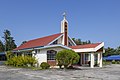
- Nomination Kg. Tamalang, Kudat, Sabah: Basel Christian Church Malaysia (BCCM) Tamalang --Cccefalon 00:47, 21 February 2015 (UTC)
- Promotion Good quality. --Johann Jaritz 02:33, 21 February 2015 (UTC)
-

- Nomination Kota Kinabalu, Sabah: The car yard of the General Post Office Kota Kinabalu --Cccefalon 00:47, 21 February 2015 (UTC)
- Promotion
 Support Good quality. --Johann Jaritz 02:43, 21 February 2015 (UTC)
-

- Nomination Pistacia terebinthus (Terebinth) --Christian Ferrer 23:46, 20 February 2015 (UTC)
- Promotion Good quality. --Johann Jaritz 02:20, 21 February 2015 (UTC)
-

- Nomination Boats in Gamla Oxelösund, the old part of Oxelösund. --ArildV 23:05, 20 February 2015 (UTC)
- Promotion Support Beautiful composition. Good quality. --Johann Jaritz 02:26, 21 February 2015 (UTC)
-

- Nomination The thirteens station of the Way of the Cross in Laghel Arco - Jesus' body is removed from the cross. --Moroder 22:50, 20 February 2015 (UTC)
- Promotion Good quality. --Johann Jaritz 02:23, 21 February 2015 (UTC)
-

-
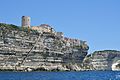
- Nomination Bonifacio with “Stairs of King of Aragon” --Isiwal 22:19, 20 February 2015 (UTC)
- Promotion Support Wow! Good quality. --Johann Jaritz 02:12, 21 February 2015 (UTC)
-

- Nomination Le Grain de Sable - the grain of sand, cliffs of Bonifacio (Corsica) --Isiwal 22:19, 20 February 2015 (UTC)
- Promotion Good quality. --Jacek Halicki 22:43, 20 February 2015 (UTC)
-

- Nomination Rab island, seaside promenade --Isiwal 22:19, 20 February 2015 (UTC)
- Promotion Good quality. --Johann Jaritz 02:15, 21 February 2015 (UTC)
-

-

-
-

-
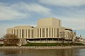
- Nomination Opera Nova, Bydgoszcz, Poland --1bumer 20:12, 20 February 2015 (UTC)
- Promotion Good quality. --Livioandronico2013 20:36, 20 February 2015 (UTC)
-

-
- Nomination Wisłoujście Fortress, Gdańsk, Poland --1bumer 20:12, 20 February 2015 (UTC)
- Promotion Good quality. --Jacek Halicki 22:43, 20 February 2015 (UTC)
-
-

- Nomination Tram in Mulhouse --Billy69150 19:37, 20 February 2015 (UTC)
- Promotion Good composition and good quality -- Spurzem 21:05, 20 February 2015 (UTC)
-

- Nomination Tram in Montpellier --Billy69150 19:37, 20 February 2015 (UTC)
- Promotion Good quality. --Hubertl 23:23, 20 February 2015 (UTC)
-

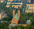
- Nomination Cathedral of the Nativity of the Theotokos, Antoniev Monastery, Veliky Novgorod. By User:Ludvig14 --Brateevsky 18:42, 20 February 2015 (UTC)
- Promotion Good quality --Llez 22:20, 20 February 2015 (UTC)
-

- Nomination Cliffs of Heimaey, Westman Islands, Suðurland, Iceland --Poco a poco 18:40, 20 February 2015 (UTC)
- Promotion Good quality. --Hubertl 18:54, 20 February 2015 (UTC)
-

- Nomination Gniezno Cathedral, Gniezno, Poland --Poco a poco 18:40, 20 February 2015 (UTC)
- Promotion Good quality. --Jacek Halicki 22:43, 20 February 2015 (UTC)
-

- Nomination Baphuon, Angkor Thom, Cambodia --Poco a poco 18:40, 20 February 2015 (UTC)
- Promotion Good quality. --Isiwal 20:13, 20 February 2015 (UTC)
-

- Nomination Colonia del Sacramento, Uruguay --Poco a poco 18:40, 20 February 2015 (UTC)
- Promotion Good quality. --Hubertl 22:29, 20 February 2015 (UTC)
-

- Nomination Hermitage of San Roque, Calatayud, Spain --Poco a poco 18:40, 20 February 2015 (UTC)
- Promotion Support Nice. --Johann Jaritz 02:10, 21 February 2015 (UTC)
-

- Nomination Memorial plaque at the former sacristan house, Saint Martin, Klagenfurt, Carinthia, Austria --Johann Jaritz 18:25, 20 February 2015 (UTC)
- Promotion Good quality. --Hubertl 18:56, 20 February 2015 (UTC)
-

-

- Nomination Subsidiary church Saint Agnes, Moosburg, Carinthia, Austria --Johann Jaritz 18:21, 20 February 2015 (UTC)
- Promotion Good quality. --Hubertl 18:54, 20 February 2015 (UTC)
-

- Nomination Parish church Saint Giles at Tigring, Moosburg, Carinthia, Austria --Johann Jaritz 18:18, 20 February 2015 (UTC)
- Promotion Support --Kreuzschnabel 18:24, 20 February 2015 (UTC)
-
-

- Nomination Sundial at the parish church Saint Giles at Tigring, Moosburg, Carinthia, Austria --Johann Jaritz 18:14, 20 February 2015 (UTC)
- Promotion Good quality. --Isiwal 20:23, 20 February 2015 (UTC)
-

- Nomination Tree on an open field near Bettringen --Kreuzschnabel 15:40, 20 February 2015 (UTC)
- Promotion Support Beautiful motive. Good quality. --Johann Jaritz 02:00, 21 February 2015 (UTC)
-

- Nomination Tree on an open field near Bettringen --Kreuzschnabel 15:40, 20 February 2015 (UTC)
- Promotion Beautiful picture. The Latin name of the tree is missing.--Famberhorst 16:28, 20 February 2015 (UTC)
Would love to provide it but I’ve got no idea yet. --Kreuzschnabel 18:25, 20 February 2015 (UTC) Comment I thought at first a beech (Fagus sylvatica), but the tribe seems too rough. A beech (Fagus sylvatica) has a smooth trunk.--Famberhorst 18:52, 20 February 2015 (UTC)
Probably Carpinus betulus. I’ll try to remember to have a look at the leaves later and add the species here. --Kreuzschnabel 21:21, 20 February 2015 (UTC)
-

- Nomination Eton College Church Yard --Martin Kraft 14:56, 20 February 2015 (UTC)
- Promotion Good quality. --Hubertl 16:54, 20 February 2015 (UTC)
-

- Nomination Eton College Weston's Yard --Martin Kraft 14:56, 20 February 2015 (UTC)
- Promotion Good quality. --Zcebeci 15:36, 20 February 2015 (UTC)
-
- Nomination Group of trees near Bettringen --Kreuzschnabel 14:53, 20 February 2015 (UTC)
- Promotion Good quality. --Zcebeci 15:37, 20 February 2015 (UTC)
-

- Nomination Een lid van een Nederlands arrestatieteam. --Abigor 14:46, 20 February 2015 (UTC)
- Decline
 Oppose Face motion blurred and overexposed --Kreuzschnabel 16:06, 20 February 2015 (UTC)
-
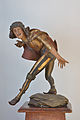
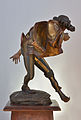
- Nomination Morisco dancer "Hochzeiterer" by sculptor Erasmus Grasser. H 61.5 cm. - 19th century relpica in plaster --Moroder 14:40, 20 February 2015 (UTC)
- Promotion Good quality. --Martin Kraft 14:56, 20 February 2015 (UTC)
-
-

- Nomination Door of the tabernacle in San Filippo Neri baptistery in Busto Arsizio (province of Varese, Lombardy, Italy) --Yiyi 11:06, 20 February 2015 (UTC)
- Promotion Ok. --Martin Kraft 14:56, 20 February 2015 (UTC)
-

- Nomination The tower of villa Ottolini-Tosi in Busto Arsizio (province of Varese, Lombardy, Italy). --Yiyi 10:53, 20 February 2015 (UTC)
- Promotion Ok for QI --Martin Kraft 14:56, 20 February 2015 (UTC)
-
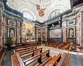
- Nomination Chapel of Saint Casimir in Vilnius Cathedral. (by Diliff) --Pofka 10:30, 20 February 2015 (UTC)
- Promotion Great --Martin Kraft 14:56, 20 February 2015 (UTC)
-

-

- Nomination Karl Marx birthplace in Trier, Germany - Brückenstraße 10 --Berthold Werner 10:27, 20 February 2015 (UTC)
- Promotion Good quality. --Hubertl 16:56, 20 February 2015 (UTC)
-
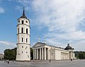
- Nomination Vilnius Cathedral. (by Diliff) --Pofka 10:25, 20 February 2015 (UTC)
- Promotion Good quality. --Martin Kraft 14:56, 20 February 2015 (UTC)
-

-

-

- Nomination Monastery of Jeronimos, main portal. Lisboa, Portugal -- Alvesgaspar 09:43, 20 February 2015 (UTC)
- Promotion Good quality. --Brateevsky 11:23, 20 February 2015 (UTC)
-

- Nomination Former rectory in Bystrzyca Kłodzka 1 --Jacek Halicki 09:39, 20 February 2015 (UTC)
- Promotion Good quality. --Livioandronico2013 20:36, 20 February 2015 (UTC)
-

- Nomination Former rectory in Bystrzyca Kłodzka 2 --Jacek Halicki 09:39, 20 February 2015 (UTC)
- Promotion Good quality. --Livioandronico2013 20:36, 20 February 2015 (UTC)
-
- Nomination Information board on the former rectory in Bystrzyca Kłodzka --Jacek Halicki 09:39, 20 February 2015 (UTC)
- Promotion Good quality. --Martin Kraft 14:56, 20 February 2015 (UTC)
-

- Nomination Saint John of Nepomuk church in Bystrzyca Kłodzka --Jacek Halicki 09:39, 20 February 2015 (UTC)
- Promotion Good quality. --Isiwal 11:27, 20 February 2015 (UTC)
-
- Nomination Saint Florian chapel in Bystrzyca Kłodzka --Jacek Halicki 09:39, 20 February 2015 (UTC)
- Promotion Support Good quality --Halavar 09:51, 20 February 2015 (UTC)
-

-

-

- Nomination Sea front of Heraklio, Crete.--C messier 09:15, 20 February 2015 (UTC)Good quality.--Famberhorst 16:44, 20 February 2015 (UTC)
- Promotion {{{2}}}
-
-
-

-

-

- Nomination' Ruscus aculeatusJohn Redmond'. Few offered very slow growing shrub.
Famberhorst 05:43, 20 February 2015 (UTC) - Promotion Good quality. --Hubertl 06:04, 20 February 2015 (UTC)
- Nomination' Ruscus aculeatusJohn Redmond'. Few offered very slow growing shrub.
-

- Nomination Sculpture “Strandläufer I”, Juist, Lower Saxony, Germany --XRay 05:08, 20 February 2015 (UTC)
- Promotion Support Good quality. --Johann Jaritz 05:32, 20 February 2015 (UTC)
-

- Nomination Dune and promenade, Juist, Lower Saxony, Germany --XRay 05:08, 20 February 2015 (UTC)
- Promotion Support Good quality. --Johann Jaritz 05:30, 20 February 2015 (UTC)
-

-
-

-

- Nomination Exterior figure at Jesuitenkirche, Vienna --Hubertl 03:49, 20 February 2015 (UTC)
- Promotion Good quality. --Johann Jaritz 02:31, 21 February 2015 (UTC)
-

- Nomination Figures at Neue Burg, Hofburg, Vienna --Hubertl 03:49, 20 February 2015 (UTC)
- Promotion Good quality. --Martin Kraft 14:56, 20 February 2015 (UTC)
-

- Nomination Raw milk Reblochon colombière from Stans, Aargau --Hubertl 03:49, 20 February 2015 (UTC)
- Promotion Support Good quality. --Johann Jaritz 05:35, 20 February 2015 (UTC)
-

-

- Nomination Roof tiles - Cathedral of Monreale --Jbribeiro1 01:22, 20 February 2015 (UTC)
- Promotion Good quality. --Hubertl 06:10, 20 February 2015 (UTC)
-

- Nomination View of the Little Ararat. Ararat Province, Armenia. --Halavar 01:18, 20 February 2015 (UTC)
- Promotion Good quality. --Jacek Halicki 22:43, 20 February 2015 (UTC)
-

- Nomination View of the Great Ararat. Ararat Province, Armenia. --Halavar 01:18, 20 February 2015 (UTC)
- Promotion Good quality. --Jacek Halicki 22:43, 20 February 2015 (UTC)
-
-

- Nomination Singapore: Liondance during Chinese New Year 2015 celebrations, performed in front of Marina Mandarin Hotel. --Cccefalon 00:38, 20 February 2015 (UTC)
- Withdrawn Oppose Red channel overexposure, severe loss of detail in red areas --Kreuzschnabel 09:48, 20 February 2015 (UTC)
Handling red colour at a notebook is indeed critical. I withdraw my nomination and rework it back home at the calibrated screen. Thanks for reviewing! --Cccefalon 11:48, 20 February 2015 (UTC)
-

- Nomination Singapore: Liondance during Chinese New Year 2015 celebrations, performed in front of Marina Mandarin Hotel. --Cccefalon 00:38, 20 February 2015 (UTC)
- Withdrawn Support Good quality. --XRay 07:30, 20 February 2015 (UTC) Oppose Red channel partly blown, causing blueish areas --Kreuzschnabel 09:50, 20 February 2015 (UTC)
No need for CR - handling red colour at a notebook is indeed critical and I trust your expertise. I withdraw my nomination and rework it back home at the calibrated screen. Thanks for reviewing! -Cccefalon 11:48, 20 February 2015 (UTC)
-

-

-
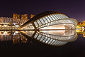
- Nomination The Hemispheric, City of Arts and Sciences, Valencia, Spain --Poco a poco 20:05, 19 February 2015 (UTC)
- Promotion Good quality. --Jacek Halicki 20:54, 19 February 2015 (UTC) Support Good quality --Billy69150 11:07, 20 February 2015 (UTC)
-
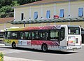
- Nomination Bus in Vienne --Billy69150 07:04, 19 February 2015 (UTC)* Comment the right side is extremely leaning in. --Hubertl 09:19, 19 February 2015 (UTC)
 Done --Billy69150 18:24, 20 February 2015 (UTC)
 - Promotion QI for me now. --Hubertl 18:51, 20 February 2015 (UTC)
- Nomination Bus in Vienne --Billy69150 07:04, 19 February 2015 (UTC)*
-

- Nomination Londres.- Joueur de Cornemuse sur Westminster Bridge --PIERRE ANDRE LECLERCQ 22:37, 17 February 2015 (UTC)
- Withdrawn Oppose Insufficient quality. Main motif (piper) sharp but cropped at the bottom. --XRay 09:10, 20 February 2015 (UTC)
Sorry the piper was based on the unsightly guardrail of the bridge. This explains the crop at the bottom --PIERRE ANDRE LECLERCQ 15:39, 20 February 2015 (UTC)
-

- Nomination Tenniswoman Daniela Hantuchova of Slovakia, during the London Olympic Games in 2012. --TwoWings 20:32, 17 February 2015 (UTC)
- Decline Oppose Severe purple fringing --Kreuzschnabel 09:56, 20 February 2015 (UTC)
-

- Nomination Tennisman Gilles Muller of Luxemburg, during the London Olympic Games in 2012. --TwoWings 20:32, 17 February 2015 (UTC)
- Promotion Support Not too sharp but sufficient quality. --Kreuzschnabel 09:56, 20 February 2015 (UTC)
-

- Nomination Suction dredger (at Silbersee IV), Quarzwerke, Sythen, Haltern am See, North Rhine-Westphalia, Germany --XRay 04:25, 17 February 2015 (UTC) Comment It's a bit dark imo--Moroder 18:47, 19 February 2015 (UTC)
- Promotion Fixed Yes, you're right. The image is now brighter and I optimized WB.--XRay 07:02, 20 February 2015 (UTC)Good quality. --Moroder 14:44, 20 February 2015 (UTC)
- Nomination Suction dredger (at Silbersee IV), Quarzwerke, Sythen, Haltern am See, North Rhine-Westphalia, Germany --XRay 04:25, 17 February 2015 (UTC)
-

-

- Nomination Corvus Corax at Amphi Festival 2014 --Achim Raschka 14:44, 16 February 2015 (UTC)
- Decline The face unfortunately isn't quite sharp. --Mattbuck 23:25, 20 February 2015 (UTC)
-

-

- Nomination Sundial in Florianopolis, Brazil --Ezarate 01:29, 16 February 2015 (UTC) Comment Blue CAs at the left. --C messier 07:55, 19 February 2015 (UTC) Thnaks for review, I cropped the image to avoid the CAs, they are strong} Ezarate 19:07, 19 February 2015 (UTC)
- Decline Too bright and tilted IMO. --Mattbuck 23:25, 20 February 2015 (UTC) I did corrections --Ezarate 02:09, 21 February 2015 (UTC)
- Nomination Sundial in Florianopolis, Brazil --Ezarate 01:29, 16 February 2015 (UTC)
-

-

- Nomination The Reading Room of the Suzzallo Library of the University of Washington --Martin Kraft 16:43, 15 February 2015 (UTC)
* Comment do you have a different, sharp version? This one has no sharp parts at all.--Hubertl 18:30, 15 February 2015 (UTC) - Decline Very good composition, but weak corner sharpness, and no details in bright windows. --Smial 15:01, 19 February 2015 (UTC)
Sorry, I had no tripod with me at that occasion. // Martin Kraft 15:05, 20 February 2015 (UTC)
- Nomination The Reading Room of the Suzzallo Library of the University of Washington --Martin Kraft 16:43, 15 February 2015 (UTC)
-
- Nomination The Suzzallo Library of the University of Washington --Martin Kraft 16:43, 15 February 2015 (UTC)* Comment can you reprocess from RAW? The clouds are completely burned out.--Hubertl 18:30, 15 February 2015 (UTC)
@Hubertl: I just had a look at the RAW: Looks like the coulds are burend out ther as well. But imho the clouds aren't the subject of that shot // Martin Kraft 15:05, 20 February 2015 (UTC) - Decline Burnt out clouds distract. --Mattbuck 23:15, 20 February 2015 (UTC)
- Nomination The Suzzallo Library of the University of Washington --Martin Kraft 16:43, 15 February 2015 (UTC)*
-

- Nomination 2013 Nissan X-Trail photographed at Bradys Lake, Tasmania --EurovisionNim 05:38, 15 February 2015 (UTC) Comment The head lights are a bit bright and I see slight green CA at the frames of the windwos. -- Spurzem 09:54, 15 February 2015 (UTC)
- Decline DOF too low I think. --Mattbuck 23:15, 20 February 2015 (UTC)
- Nomination 2013 Nissan X-Trail photographed at Bradys Lake, Tasmania --EurovisionNim 05:38, 15 February 2015 (UTC)
-

- Nomination: Trialeti Gold Roundel with thanks to the Georgian National Museum for allowing photography. By User:Jonathan Cardy --Chase me ladies, I'm the Cavalry 15:58, 13 February 2015 (UTC)
- Review Compression artefacts. Can probably be resolved by export process and using a higher resolution. --Cccefalon 09:20, 14 February 2015 (UTC)
-

-

- Nomination: Bus articulé à Rennes --Billy69150 10:19, 19 January 2015 (UTC)
Left side leaning in Poco a poco 19:09, 19 January 2015 (UTC) - Review Done --Billy69150 12:25, 24 January 2015 (UTC)
Both sides are leaning in, and the crop at the bottom is too tight. Mattbuck 17:55, 24 January 2015 (UTC) Done properly --Billy69150 20:41, 27 January 2015 (UTC)
Not sure, the right side is still leaning in Poco a poco 19:57, 28 January 2015 (UTC) Done --Billy69150 20:50, 28 January 2015 (UTC)
Right side still leaning in, also there appears to be pincushion distortion. Mattbuck 22:13, 28 January 2015 (UTC) Done --Billy69150 20:34, 2 February 2015 (UTC)
I'm sorry but the same issues are still present. Mattbuck 09:30, 8 February 2015 (UTC) Done New perspective correction --Billy69150 11:25, 8 February 2015 (UTC)
Is the big building in the middle really leaning out? it looks strange to me. I don't know what adjustments you did but I am still not convinced about hte result Poco a poco 12:23, 14 February 2015 (UTC)
- Nomination: Bus articulé à Rennes --Billy69150 10:19, 19 January 2015 (UTC)

.JPG)


.jpg)
.jpg)
.jpg)


_ST_wagon_(2014-12-23)_01.jpg)


.jpg)
Consensual review
[edit]File:Queenstown Road railway station MMB 02.jpg
[edit]
- Nomination Queenstown Road railway station. Mattbuck 07:41, 17 February 2015 (UTC)* Comment Much too dark at the right. No QI for me. -- Spurzem 08:25, 17 February 2015 (UTC)
- Decline
- Oppose Just dark. no QI --Hubertl 08:41, 17 February 2015 (UTC) Done Mattbuck 22:58, 17 February 2015 (UTC)
- Oppose Under the roof at the right side it is too dark for me now as before. -- Spurzem 12:15, 18 February 2015 (UTC)
- Support --Christian Ferrer 08:24, 19 February 2015 (UTC)
Total: 1 support (excluding the nominator), 2 oppose →  Declined --Hubertl 09:05, 20 February 2015 (UTC)
File:London MMB »122 River Thames.jpg
[edit]
- Nomination River Thames. Mattbuck 07:13, 16 February 2015 (UTC)
- Decline
- Oppose Quite soft at full res., probably would have worked much better on a day with less air moisture. --El Grafo 09:09, 17 February 2015 (UTC)
- Comment I'll grant you it would look better on a different day, but I don't think it's decline-worthy soft. --Mattbuck 22:54, 17 February 2015 (UTC)
- Oppose as El Grafo.--Hubertl 10:52, 18 February 2015 (UTC)
- Comment Details are ok but can you increase just a bit the contrast please? --Christian Ferrer 08:21, 19 February 2015 (UTC)
- @Christian Ferrer: - Done Mattbuck 23:01, 19 February 2015 (UTC)
- @Christian Ferrer: -
- Support ok for me, I don't know why the ping don't always work with me. --Christian Ferrer 08:23, 20 February 2015 (UTC)
File:2007-05-13 02b Lok 23042 in Urmitz (kleine Datei).jpg
[edit].jpg)
- Nomination Steam locomotive 23 042 near Urmitz (Germany). For information: South-east sky is not even dark blue. -- Spurzem 10:21, 15 February 2015 (UTC)
- Promotion
- Oppose unsharp, blown sky --Christian Ferrer 15:06, 15 February 2015 (UTC)
- Comment Laughable! -- Spurzem 15:19, 15 February 2015 (UTC)
- Support I disagree, the subject is sharp. --Hubertl 15:21, 15 February 2015 (UTC)
- Support Nice, sharp, image. Looks like a typical German overcast sky to me. Bahnfrend 03:02, 16 February 2015 (UTC)
- Look closely - if all it was was a grey sky, you wouldn't see the detail loss in the foliage that is present. Mattbuck 21:28, 16 February 2015 (UTC)
- Support Good --PIERRE ANDRE LECLERCQ 16:14, 16 February 2015 (UTC)
- Oppose - Noticable CA, overexposure remapped to grey. Mattbuck 21:28, 16 February 2015 (UTC)
- Of course! Nearly the same as Christian Ferrer. I did not await any other vote by Mattbuck. -- Spurzem 10:01, 17 February 2015 (UTC)
- I do agree with Christian fairly frequently - to my mind he's one of the better reviewers here. I don't agree with him all the time, but it happens upon occasion. Mattbuck 22:19, 18 February 2015 (UTC)
- Of course! Nearly the same as Christian Ferrer. I did not await any other vote by Mattbuck. -- Spurzem 10:01, 17 February 2015 (UTC)
- Oppose Image quality is just not good enough even disreagarding the sky. Probably owing to a high ISO setting and sharpening, the image lacks good detail and the colors are nearly posterized. Things become worse further from the front. Alvesgaspar 20:22, 17 February 2015 (UTC)
- Comment. We have a specialist for railway photos in the commons. But did you ever see a picture made by him which would be better than this one? Perhaps you can anser why the sky of a good photo must be dark blue. The answer would be very interesting. And what worse lacks do you see at the front? -- Spurzem 20:45, 17 February 2015 (UTC)
- Apparently you did not understand what I wrote. The sky is not that important for me. But the lack of detail due to noise, which becomes worse from left to right, is. Concerning the train photos by Kabelleger, they are much better than this one. Alvesgaspar 20:56, 17 February 2015 (UTC)
- I have never seen knowingly a photo by Kabelleger. -- Spurzem 21:28, 17 February 2015 (UTC)
- Support I do not think it goes a photo from Kabelleger here. We also have no comparison, would like a photo of Kabelleger looked like.Here we discuss about a phot from Spurzem and this is also in good quality. --Steindy 22:26, 17 February 2015 (UTC)
- Regrettfully Oppose. I loaded the photo into proof view of LR. Big parts of the sky are remapped to RGB 235/235/235, meaning, that there is absolutely no structure in wide parts of the sky. However, even a typical grey sky in Germany has structure. --Cccefalon 01:20, 19 February 2015 (UTC)
- Support --Palauenc05 09:27, 19 February 2015 (UTC)
- @Cccefalon: OK! That's a terrible lack in your eyes! But what about all the promoted images with harsh shadows, also such of rail-ways? Are these shadows better than a grey sky? Look at File:Ravenstor railway station MMB 01 79900.jpg for example. -- Spurzem 09:39, 19 February 2015 (UTC)
- Hast Du irgendwelche persönlichen Probleme mit mir, Spurzem? Wieso sollen meine Augen schrecklich mangelhaft sein? Es gibt keinerlei Grund, mich persönlich anzugreifen, wenn ich eine fachliche Meinung von mir gebe. Ich habe mir eingedenk der verschiedenen Einschüchterungsversuche von verschiedenen Personen in den Vergangenheit lange überlegt, ob ich mich zu diesem Bild äußere und ich war mir bewusst, dass es wieder zu Rachebewertungen oder persönlichen Angriffen kommen könnte. Ich gebe trotzdem die Hoffnung nicht auf, hier wieder vernünftig arbeiten zu können. Was Deinen Vergleich mit Schatten betrifft, bin ich der Meinung, dass das grundsätzlich zwei Paar Schuhe sind. Einen Schatten, der in grossen Bereichen aus #000000 besteht, würde ich genauso abwerten. Das Problem bei Schatten ist allerdings meistens, dass sie nicht aus einem Schwarz bestehen, sonderen verrauscht sind oder Farbrauschen beinhalten. --Cccefalon 11:07, 19 February 2015 (UTC)
- Pssst … „in your eyes“ heißt hier „deiner Ansicht nach“ --Kreuzschnabel 19:21, 19 February 2015 (UTC)
- @Cccefalon: Ich habe keinerlei persönliche Probleme mit Dir und es liegt mir fern, Dich persönlich angreifen oder gar einschüchtern zu wollen. Allerdings habe ich den Eindruck, dass hier mit sehr unterschiedlichem Maß gemessen wird, wohl wissend, dass absolute Objektivität nicht möglich ist. Wahrscheinlich bin ich nicht der einzige, der es nicht versteht, wenn ein nicht störender grauer Himmel zur Ablehnung eines Fotos führt, ein Schatten, der kaum noch etwas erkennen lässt, aber hingenommen wird. Diese Feststellung gilt übrigens nicht nur für die von mir vorgestellten Bilder. -- Spurzem 20:33, 19 February 2015 (UTC)
- Niemand hier ist unfehlbar, auch ich nicht. Ich kann nur sagen, ich versuche, jedes Bild nach bestem Wissen und Gewissen zu beurteilen. Wenn ich eine Chance sehe, dass ein Fehler ausgemerzt werden kann, lehne ich die Nominierung nicht ab. Und wenn ich mir nicht sicher bin, lass ich die Bewertung bleiben und nimm mir ein anderes vor. Was den besagten Himmel betrfft, habe ich mir mehr Mühe als sonst gemacht, um eine nachvollziehbare Entscheidung zu treffen. Frohes Schaffen allerseits. --Cccefalon 00:31, 20 February 2015 (UTC)
- Hast Du irgendwelche persönlichen Probleme mit mir, Spurzem? Wieso sollen meine Augen schrecklich mangelhaft sein? Es gibt keinerlei Grund, mich persönlich anzugreifen, wenn ich eine fachliche Meinung von mir gebe. Ich habe mir eingedenk der verschiedenen Einschüchterungsversuche von verschiedenen Personen in den Vergangenheit lange überlegt, ob ich mich zu diesem Bild äußere und ich war mir bewusst, dass es wieder zu Rachebewertungen oder persönlichen Angriffen kommen könnte. Ich gebe trotzdem die Hoffnung nicht auf, hier wieder vernünftig arbeiten zu können. Was Deinen Vergleich mit Schatten betrifft, bin ich der Meinung, dass das grundsätzlich zwei Paar Schuhe sind. Einen Schatten, der in grossen Bereichen aus #000000 besteht, würde ich genauso abwerten. Das Problem bei Schatten ist allerdings meistens, dass sie nicht aus einem Schwarz bestehen, sonderen verrauscht sind oder Farbrauschen beinhalten. --Cccefalon 11:07, 19 February 2015 (UTC)
Total: 5 support (excluding the nominator), 4 oppose →  Promoted --Hubertl 08:54, 20 February 2015 (UTC)
File:London MMB »114 A1261 Aspen Way.jpg
[edit]
- Nomination A1261 Aspen Way. Mattbuck 21:00, 12 February 2015 (UTC)
- Promotion
- Support Good quality. --Poco a poco 21:25, 12 February 2015 (UTC)
- Oppose Not straight. The building looks as if it would tip forward. --Steindy 00:56, 14 February 2015 (UTC)
- It is straight, it's just not (completely) perspective corrected. I rotate my photos using two should-be vertical points and linear inter/extrapolation. In this case, the vertical seems to go roughly two balcony supports in on the main face of the building. -mattbuck (Talk) 10:15, 14 February 2015 (UTC)
- Oppose perspective incorrected --Livioandronico2013 20:24, 14 February 2015 (UTC)
- I stand by my statement elsewhere that complete perspective correction is not always advisable. Sure if it's a small angle of inclination, but given the inclination here I decided against it (after checking it). Consider that if you stand say 10m from a 30m tall building, you are looking up at such an angle that the upper pixels need to stretch by a factor of 5 or more. That means the photo loses sharpness. It also means you get an incredibly unrealistic looking picture. I decided here that it was preferable to have the perspective as seen than a horribly distorted image. Mattbuck 20:32, 14 February 2015 (UTC)
- Leads to the question whether such pictures can be QI or not. In my opinion such pictures may be nice but in the end they are not meeting the criteria so they can't be QI. As far as I can see, the image guidelines say nothing about exemptions: "Images of architecture should usually be rectilinear." Well, whatever "usually" shall mean. I would like to hear what others think about this. --Code 20:42, 14 February 2015 (UTC)
- Usually means "most of the time, but not always". Most photos should be corrected, because generally photos are taken within a few degrees of horizontal. But there are certain times, for instance File:London MMB »1W9 15 Canada Square.jpg, where the perspective is a deliberate part of the composition and so would not benefit from correction. Mattbuck 22:59, 14 February 2015 (UTC)
- Comment I see! At other points discussed distortions and CAs that are not visible. Here they are part of the composition. It apparently just depends on who took the photo... --Steindy 23:19, 17 February 2015 (UTC)
- I think that since I was persuaded that perspective correction was useful, I've been fairly reasonable in my requests. Mattbuck 22:15, 18 February 2015 (UTC)
- Usually means "most of the time, but not always". Most photos should be corrected, because generally photos are taken within a few degrees of horizontal. But there are certain times, for instance File:London MMB »1W9 15 Canada Square.jpg, where the perspective is a deliberate part of the composition and so would not benefit from correction. Mattbuck 22:59, 14 February 2015 (UTC)
- Leads to the question whether such pictures can be QI or not. In my opinion such pictures may be nice but in the end they are not meeting the criteria so they can't be QI. As far as I can see, the image guidelines say nothing about exemptions: "Images of architecture should usually be rectilinear." Well, whatever "usually" shall mean. I would like to hear what others think about this. --Code 20:42, 14 February 2015 (UTC)
- I stand by my statement elsewhere that complete perspective correction is not always advisable. Sure if it's a small angle of inclination, but given the inclination here I decided against it (after checking it). Consider that if you stand say 10m from a 30m tall building, you are looking up at such an angle that the upper pixels need to stretch by a factor of 5 or more. That means the photo loses sharpness. It also means you get an incredibly unrealistic looking picture. I decided here that it was preferable to have the perspective as seen than a horribly distorted image. Mattbuck 20:32, 14 February 2015 (UTC)
- Support perspectives are acceptable here and even must not be corrected --Christian Ferrer 19:22, 16 February 2015 (UTC)
- Support There is nothing "wrong" with this perspective. It's different, yes, but its also not correctable. The rest of the image appears technically sufficient to me. Ram-Man 03:59, 17 February 2015 (UTC)
- Support Good quality and no problem at all with the perspective. --TwoWings 16:04, 19 February 2015 (UTC)
Total: 4 support (excluding the nominator), 2 oppose → Promoted --Hubertl 08:52, 19 February 2015 (UTC)
File:2014_Nysa,_pałac_biskupi_04.JPG
[edit]
- Nomination Information boards at the Bishops Palace in Nysa --Jacek Halicki 09:37, 12 February 2015 (UTC)
- Promotion
- Support Shame about the shadow, but good quality for me.--Famberhorst 16:32, 12 February 2015 (UTC)
 Question Why is it on Discuss then at all? --Kreuzschnabel 06:13, 13 February 2015 (UTC)
- Comment I did not ask for a discussion. For me a good quality. The shadow was a comment. So the picture can turn green! --Famberhorst 17:37, 13 February 2015 (UTC)
 Info Famberhorst indeed promoted it first. Apparently, Jebulon sent it afterwards with opposition tag to CR per 21:10, 12 February 2015 but introduced a format error, so his comment "Shame about the shadow." was not visible. --Cccefalon 03:12, 14 February 2015 (UTC)
- Support The shadow doesn't seem to be a problem to me. --TwoWings 16:04, 19 February 2015 (UTC)
Total: 2 support (excluding the nominator), 0 oppose → Promoted --Hubertl 12:27, 20 February 2015 (UTC)
File:Hausdülmen,_Große_Teichsmühle,_Brücke_--_2014_--_3050.jpg
[edit]
- Nomination Former bridge at the Große Teichsmühle, Hausdülmen, Dülmen, North Rhine-Westphalia, Germany --XRay 05:51, 8 February 2015 (UTC)
- Decline
- Support Not perfect, but weak QI for me. --Hubertl 10:55, 8 February 2015 (UTC)
- Overexposed sky Oppose. --Mattbuck 00:14, 11 February 2015 (UTC)
- Oppose Overexposed sky.--Jebulon 19:59, 12 February 2015 (UTC)
- Support Why must the sky be dark blue? I see no reason. -- Spurzem 21:37, 12 February 2015 (UTC)
- Dark? Blue? No, just not entirely #ffffff. Because that means there is information loss, and also bleed into adjacent pixels, wiping out detail in the foliage as well. Mattbuck 23:16, 12 February 2015 (UTC)
- Oppose overexposed --Christian Ferrer 06:23, 13 February 2015 (UTC)
- Comment Sorry. I just checked the image. Lightroom said for the RAW file, there is nothing overexposed. Checking the JPG image, I can find values like #fffafe or #fcfafd, not #ffffff. So there is structure in the bright area. IMO that's not overexposed.--XRay 06:41, 13 February 2015 (UTC)
- Support As Spurzem. --Steindy 01:33, 14 February 2015 (UTC)
- Oppose Leafs on the left look overexposed, image may need additional processing. --Shansov.net 02:46, 14 February 2015 (UTC)
Total: 3 support (excluding the nominator), 4 oppose → Declined --Steindy 00:30, 18 February 2015 (UTC)
File:Dülmen,_Kreuzkapelle_--_2014_--_2707.jpg
[edit]
- Nomination Sculpture in front of Holy Cross chapel, Dülmen, North Rhine-Westphalia, Germany --XRay 05:51, 8 February 2015 (UTC)
- Promotion
- Support Good quality. --Johann Jaritz 06:12, 08 February 2015 (UTC)
- Oppose due to overexposed sky. --Mattbuck 00:14, 11 February 2015 (UTC)
- Support --Hubertl 06:46, 11 February 2015 (UTC) There is really a lot of sky... wow!
- Support Absolutely YES! --Livioandronico2013 21:50, 11 February 2015 (UTC)
- Weak Support. Perhaps we could criticize the result of perspective correction if we look to the lantern but in the sky I see no lack. Sky is not always dark blue. -- Spurzem 22:45, 11 February 2015 (UTC)
- Oppose Messy composition, I don't understand this picture.--Jebulon 19:58, 12 February 2015 (UTC)
- Oppose overexposed sky --Christian Ferrer 06:25, 13 February 2015 (UTC)
- Comment Sorry. Same here. RAW file not overexposed (Lightroom), histogram ok, there is nothing overexposed. Checking the JPG image, I can find values like #fefefe or #fdfeff, not #ffffff. It's bright, yes, but not overexposed.--XRay 06:41, 13 February 2015 (UTC)
- Weak Support.--PIERRE ANDRE LECLERCQ 22:54, 13 February 2015 (UTC)
- Support As Spurzem. --Steindy 01:36, 14 February 2015 (UTC)
- Support --Hubertl 21:17, 15 February 2015 (UTC)
- Oppose Sky is fine for me but per Jebulon. --El Grafo 11:22, 17 February 2015 (UTC)
- Oppose per Jebulon. What's the subject ? --TwoWings 16:07, 19 February 2015 (UTC)
File:Weinberge_und_Niederwalddenkmal_Rüdesheim_am_Rhein.jpg
[edit]
- Nomination Vineyards near Rüdesheim am Rhein. --Code 13:55, 7 February 2015 (UTC)
- Promotion
- Oppose The composition could be improved by devoting more of the frame to the subject. The sky conveys little information, yet occupies half the frame. The monument on the horizon is a distracting element, also. Exposure, lighting, DOF, focus, noise and color balance look fine to me. --Wsiegmund 03:54, 8 February 2015 (UTC)
- @Wsiegmund: The photo is supposed to show the location of the monument, so I don't really understand your argument that the monument was a distracting element. Also I don't understand why you decline the nomination while saying the picture could still be improved. However, no need to discuss. Thanks for your opinion. --Code 07:58, 8 February 2015 (UTC)
- I think this image tries to do too much. It depicts the vineyard, monument and sky. If the sky contained diagonal cirrus clouds that complemented the diagonal elements of the vineyard, I could understand its presence. "The monument was constructed to commemorate the foundation of the German Empire after the end of Franco-Prussian War." I have not found a connection, other than proximity, to the vineyard. I don't think it is good depiction of the monument, cf., en:Niederwalddenkmal. If this image "is supposed to show the location of the monument" with respect to the vineyard, it would be helpful to understand why this is educational. Please see COM:SCOPE. I'd be pleased to support this image if it simply showed the vineyard well, without the distractions of the excessive sky and monument. I tried a 3:4 crop of the top and right side so that the monument is more decentered just now. I think it is better since the focus is more on the vineyard. I may have been overhasty in my "oppose". Walter Siegmund (talk) 06:01, 9 February 2015 (UTC)
- Are you seriously telling me that this picture is out of project scope? Well, I didn't put the monument above the vineyards, but there it is. And this is what the picture shows. I am really thankful for your review and your opinion but I am not going to make that crop. If it's not QI that way - so it be. --Code 09:52, 9 February 2015 (UTC)
- You are welcome. Thank you for the opportunity to comment. Best wishes, Wsiegmund 16:47, 11 February 2015 (UTC)
- Support maybe a crop of the sky can help however it is also qi like that IMO --Christian Ferrer 09:03, 8 February 2015 (UTC)
- Support Meets QI criteria. Depicts what the description says. -- Smial 10:43, 10 February 2015 (UTC)
- Oppose Sorry. IMO too much sky and unsharp at the statue and tilted CCW (look at the statue). --XRay 11:38, 12 February 2015 (UTC)
 Weak support --Livioandronico2013 20:30, 14 February 2015 (UTC)
 Weak oppose because I think landscape format would be better --Berthold Werner 15:08, 16 February 2015 (UTC)
- Support It meets the minimum standards for a QI, even if landscape or a crop would be better. I see no tilt issues either. Composition is marginal, but not enough to oppose. Ram-Man 03:43, 17 February 2015 (UTC)
- Oppose For the vineyards sharpness would be fine. However, as a monument is ready, this should be fairly sharp to see. --Steindy 23:39, 17 February 2015 (UTC)
- Support Quality is OK and composition looks fine to me. I actually like this half oblique cut between sky and vineyard. --TwoWings 16:12, 19 February 2015 (UTC)
Total: 5 support (excluding the nominator), 4 oppose → Promoted --Hubertl 11:10, 18 February 2015 (UTC)