Commons:Featured picture candidates/Set/Protein biosynthesis
Jump to navigation
Jump to search
Set: Protein biosynthesis
[edit]Voting period is over. Please don't add any new votes.Voting period ends on 27 Dec 2012 at 23:15:08 (UTC)
Visit the nomination page to add or modify image notes.


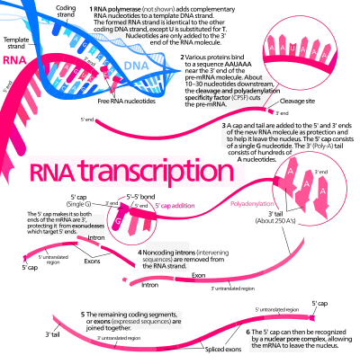
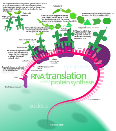
The processes of transcription and translation.
 Info created, uploaded and nominated by Kelvinsong. Editable text versions can be found on the respective file pages.—Kelvinsong (talk) 23:15, 18 December 2012 (UTC)
 Support — Kelvinsong (talk) 23:15, 18 December 2012 (UTC)
 Comment I think, you should write "RNA" in capital letters, since it is an acronym. Moreover, my initial feeling was: "ma transcription... What?!" --Ximeg (talk) 08:20, 19 December 2012 (UTC)
- I see what you mean—I've fixed the titles.—Kelvinsong (talk) 20:19, 19 December 2012 (UTC)
 Oppose Again, it's very nice work and aesthetic and my vote won't change anything, but i'd promote the editable version instead . It's already there after all... Also a bit cluttered (though certainly informative) and agree with the above. - Benh (talk) 09:03, 19 December 2012 (UTC)
- Still, leaving it as text means no multiple weights—as you can see, it strips out all of the light and demi text, and most of the bold text. Also issues with italicized words italicizing up the whole line(See step 1 on the translation one). Browsers also seem to ignore the letter kerning in addition.
- As for it being cluttered, I am always confused by textbooks which label complex diagrams with numbers and put a paragraph key somewhere off to the side—for me anyway, it saves me a great deal of confusion if the pictures are just put with the text instead forcing you to imagine invisible arrows.—Kelvinsong (talk) 20:19, 19 December 2012 (UTC)
- For cluttered, I can understand ur point. That's not my reason for oppose. But what happens below is precisely what I'm pointing at: we need you for any translation. Many diagrams on wikipedia are translated by someone else than author. As for the weight we have regular and bold for many typefaces and even the fancy extralight semibold and others for some. Maybe wikimedia servers now have the Source Sans Pro which has been open sourced by adobe. It's very very nice and has most weights you could dream off ;) Same for Google's Open Sans. I'll give it a try with one of your editable diagram when I have time. - Benh (talk) 23:12, 19 December 2012 (UTC)
- this seems to be a promising alternative (import fonts from google web font, see last answer, much easier than the base 64 embedding I mentioned before), it should work on most computers (but not on Inkscape) ! And if someone really wants to edit the svg itself, we could tell her/him to install the fonts. But I still think the simplest is to use common fonts. - Benh (talk) 23:20, 19 December 2012 (UTC)
- I'll look into creating an alternative with Open Sans(there are many things I like about the font, several I don't), maybe merge the two files by having the editable Open sans text invisible(zero alpha, or white for the simpler pictures) and the original Frutiger underneath—Kelvinsong (talk) 02:30, 20 December 2012 (UTC)
- A problem I've realized—the way I work with fonts is I rename them in fontforge, so each weight is its own font instead of being part of a larger family, because Inkscape will not recognize any weights other than regular and bold. Example—Source Sans Regular (Family—Source Sans) I rename to Source Sans 55 Regular (Family—Source Sans 55), Source Sans Light (Family—Source Sans)→Source Sans 35 (Family—Source Sans 35), etc, so they show up in the font menu like
- Source Sans 15
- Source Sans 25
- Source Sans 35
- Source Sans 45
- Source Sans 55
- Source Sans 65
- Source Sans 75, etc.
- These are bound to be missed by the mediawiki renderer, and anyone else trying to edit them...—Kelvinsong (talk) 21:01, 20 December 2012 (UTC)
- Use the notepad and DjVu Sans fonts. DjVu Sans fonts are recomended by Kaidor. --Kirill Borisenko (talk) 22:12, 20 December 2012 (UTC)
- I'll look into creating an alternative with Open Sans(there are many things I like about the font, several I don't), maybe merge the two files by having the editable Open sans text invisible(zero alpha, or white for the simpler pictures) and the original Frutiger underneath—Kelvinsong (talk) 02:30, 20 December 2012 (UTC)
- this seems to be a promising alternative (import fonts from google web font, see last answer, much easier than the base 64 embedding I mentioned before), it should work on most computers (but not on Inkscape) ! And if someone really wants to edit the svg itself, we could tell her/him to install the fonts. But I still think the simplest is to use common fonts. - Benh (talk) 23:20, 19 December 2012 (UTC)
- For cluttered, I can understand ur point. That's not my reason for oppose. But what happens below is precisely what I'm pointing at: we need you for any translation. Many diagrams on wikipedia are translated by someone else than author. As for the weight we have regular and bold for many typefaces and even the fancy extralight semibold and others for some. Maybe wikimedia servers now have the Source Sans Pro which has been open sourced by adobe. It's very very nice and has most weights you could dream off ;) Same for Google's Open Sans. I'll give it a try with one of your editable diagram when I have time. - Benh (talk) 23:12, 19 December 2012 (UTC)
 Oppose Per the two comments above.+ For english speaking people only, then not encyclopedic enough. Needs an internationalzation of the captions, I can't understand.--Jebulon (talk) 12:11, 19 December 2012 (UTC)
- If you could provide me with the French translations, I would be happy to typeset them into the posters for you. (Per above comment, editability of text is irrelevant for this, translation(linguistic) means just delete the paragraph and write a new one).—Kelvinsong (talk) 20:19, 19 December 2012 (UTC)
 Oppose Per above --Stas1995 (talk) 15:37, 19 December 2012 (UTC)
 Oppose For this kind of illustrations it is customary (compulsory?) to cite your sources. B.p. 17:48, 22 December 2012 (UTC)
![]() I withdraw my nomination—Kelvinsong (talk) 18:08, 22 December 2012 (UTC)
I withdraw my nomination—Kelvinsong (talk) 18:08, 22 December 2012 (UTC)