Commons:Featured picture candidates/File:Wall April 2015-2.jpg
Jump to navigation
Jump to search

Voting period is over. Please don't add any new votes.Voting period ends on 21 Apr 2015 at 15:56:28 (UTC)
Visit the nomination page to add or modify image notes.

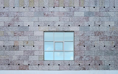
 Info Minimalism: detail of wall and window in the Belém Cultural Centre, Lisboa, Portugal. All by Alvesgaspar (talk) 15:56, 12 April 2015 (UTC)
 Support -- Alvesgaspar (talk) 15:56, 12 April 2015 (UTC)
- Support 😄 ArionEstar 😜 (talk) 19:55, 12 April 2015 (UTC)
 Comment I see a little bit of barrel distortion. --King of ♥ ♦ ♣ ♠ 21:25, 12 April 2015 (UTC)
- Comment I'm not sure about the centered composition.--Jebulon (talk) 22:55, 12 April 2015 (UTC)
- Thank you for the suggestion. Yes, that is a real possibility and it may deserve an alternative version. But what if the !votes split between the two?... What the hell, tht's go for it! Alvesgaspar (talk) 20:32, 13 April 2015 (UTC)
- Support I like these minimalistic compositions a lot! It could benefit from a geocode. -- Slaunger (talk) 19:23, 13 April 2015 (UTC)
- Here it is: the exact object location, so you can go there and do a better job! By the way, I appreciate your deferred (and displaced) comments! -- Alvesgaspar (talk) 20:24, 13 April 2015 (UTC)
 Neutral but prefer this one. --Laitche (talk) 21:50, 13 April 2015 (UTC) --Laitche (talk) 15:39, 15 April 2015 (UTC)
 Oppose Sorry, but I am struggling with the notion of minimalism in FPC. I don't mean this as an attack on anybody, but I personally feel that this is a kind of get-out-of-jail concept that makes an image untouchable to a set of expectations we would otherwise have, such as having a lot of EV, being an appealing and accurate representation of the motive, having nice light etc. When I look at the image, I feel that it is a good supporting photo for an article, giving people a better understanding of the facade details, but this is not something that gives me a wow effect or makes me think that the image is outstanding. Such photos might appeal to many, but I am not sure whether this is just because they are unusual and obviously different from boring standard images many creators now think should be FP. I am not denying that my oppose might be based on personal preference (I usually feel that images of entire works of architecture are superior), but at the end of the day, such preferences make our votes. BTW: The WB also looks too cold to me. --DXR (talk) 10:15, 14 April 2015 (UTC)
- Comment Thank you for bringing this issue to the discussion, DXR. It is a matter of fact that the so-called "artsy images" were never concensually regarded as truly useful for the project (except the reproductions of notable artists) and have usually a hard time in FPC. However we should keep in mind that Commons repository is intended to much more than just illustrating Wikipedia articles. While WP:FPC is focused on the encyclopaedic use and value of the pictures in Wikipedia, that is not the case with Commons, as our FP are used to many purposes outside Wikimedia. I always said, and that is written in my profile of Meet our Photographers (here), that I consider Photography as a means to interpret reality and to transmit such interpretation to others. That is precisely what I'm doing here with the photos of the Centro Cultural de Belém, to which a minimalistic view seems to apply perfectly. Are these images useful, besides being beautiful (for me)? I believe so. Alvesgaspar (talk) 13:35, 14 April 2015 (UTC)
- Thanks Alvesgaspar for your measured response. I think that the point I was trying to make is slightly different, though. I do not want to challenge the value of images like this one, in fact I do think it has EV. I just think that it is quite difficult to assess whether it is outstanding or "the best of commons", because there is little material to measure it against here. In this way, the vote becomes more of a "like vs. don't like" than I personally would like to see in this forum. I agree that WP:FP is more EV-driven, but at the same time COM:FP still is very much biased in the direction of EV on a spectrum between pure documentation and abstract art, at least if we look at what is presented here most of the time. --DXR (talk) 09:21, 15 April 2015 (UTC)
- Neutral --Tremonist (talk) 12:23, 15 April 2015 (UTC)
- Support Photographing a detail of a building, particularly one of architectural merit, is as important as photographing the whole facade or interior. Having looked at other images of this building, I see it lends itself to a minimalist approach. Here we can concentrate on the coloured bricks, the little dark squares and the squares-within-squares window. No other distractions. And symmetry. I can certainly see this photo appearing in a book that discusses the building or its architect, so for me it is plenty enough educational-value (as opposed to encyclopaedic value, where it is unlikely such small details would merit inclusion). -- Colin (talk) 17:25, 19 April 2015 (UTC)

- Info Alternative version special to @Jebulon: (and also for myself) -- Alvesgaspar (talk) 20:32, 13 April 2015 (UTC)
- Support Alvesgaspar (talk) 20:32, 13 April 2015 (UTC)
- Comment It's so funny, I've nerver seen the special alternative for an individual :) --Laitche (talk) 20:47, 13 April 2015 (UTC)
- Support I like this one too. It is an improvement that the lower grey 'bar' is not included in this crop. I think it improves the composition. -- Slaunger (talk) 21:05, 13 April 2015 (UTC)
- Support It's great too. 😄 ArionEstar 😜 (talk) 21:26, 13 April 2015 (UTC)
- Support Yes !--Jebulon (talk) 21:44, 13 April 2015 (UTC)
- Oppose Sorry, but for me the off-center composition distracts from the minimalism. --King of ♥ ♦ ♣ ♠ 23:28, 13 April 2015 (UTC)
- Support for me a perfect composition, everything centered might be wrong.--Hubertl (talk) 05:07, 14 April 2015 (UTC)
- Oppose Per above. I also think that the original composition is better. --DXR (talk) 10:15, 14 April 2015 (UTC)
- Support --Tremonist (talk) 12:21, 15 April 2015 (UTC)
- Oppose it's really a subjective issue, but I fail to get how moving the square to a rule of third point makes it more interesting on such an abstract picture. - Benh (talk) 18:14, 15 April 2015 (UTC)
- Oppose No wow for me --Σπάρτακος (talk) 12:13, 17 April 2015 (UTC)
- Oppose Not inspiring to me, sorry Poco2 08:19, 18 April 2015 (UTC)
- Oppose Sorry, but I don't find this arrangement as satisfying as the first. -- Colin (talk) 17:25, 19 April 2015 (UTC)
Confirmed results: