Commons:Featured picture candidates/File:GM Renaissance Center from below.jpg
Jump to navigation
Jump to search

File:GM Renaissance Center from below.jpg, not featured
[edit]
Voting period is over. Please don't add any new votes.Voting period ends on 9 May 2018 at 05:16:08 (UTC)
Visit the nomination page to add or modify image notes.

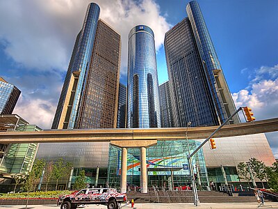
- Category: Commons:Featured pictures/Places/Architecture/Towers
 Info created by Paul Bica - uploaded by Mark Schierbecker - nominated by ParadiseDesertOasis8888 -- ParadiseDesertOasis8888 (talk) 05:16, 30 April 2018 (UTC)
 Support -- ParadiseDesertOasis8888 (talk) 05:16, 30 April 2018 (UTC)
 Oppose - Great building, but I don't like the crops, especially on top. I'd think a more recent picture of this tower might be bigger and higher-resolution, too. -- Ikan Kekek (talk) 06:02, 30 April 2018 (UTC)
- Oppose Yes, the composition has problems. The structure in concrete hides the top of the low building. The top crop of the image is too tight. The perspective is very strong with that car in front that looks giant. Also I find the picture too noisy. Interesting subject but too many issues -- Basile Morin (talk) 09:12, 30 April 2018 (UTC)
- weak oppose There are a couple of things in its favour; very nice light, for instance, and an interesting subject in itself. I agree with the others that the top crop is a bit too tight, but I had to look closely to decide if it was a big problem. There have been FPs succeeding that weren't too far from this level of quality, so on the whole, I see the potential. I'd recommend reshooting, taking into consideration the feedback given above here.--Peulle (talk) 11:44, 30 April 2018 (UTC)
- Oppose A striking composition, but ... while I don't mind the People Mover track in front, nor the traffic light's gantry, I do find the tight crops at top and bottom, the obvious distortion on the front tire of the parked vehicle, the unsharp areas at the top of the left tower, and that anomalous patch of lighter blue between the buildings (did someone miss it while adjusting the rest of the sky?) put this beyond FP consideration. Daniel Case (talk) 23:55, 30 April 2018 (UTC)
- Oppose I like the clear perspective distortion, but it should be more symmetric than this, and the top crop is too tight. --PierreSelim (talk) 08:31, 2 May 2018 (UTC)
Confirmed results: