Commons:Featured picture candidates/File:Cepelinai 1, Vilnius, Lithuania - Diliff.jpg
Jump to navigation
Jump to search

Voting period is over. Please don't add any new votes.Voting period ends on 12 Nov 2015 at 09:05:43 (UTC)
Visit the nomination page to add or modify image notes.

- Category: Commons:Featured_pictures/Food_and_drink
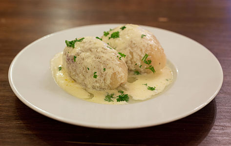
 Info created by Diliff - uploaded by Diliff - nominated by Diliff. My first foray into a new style of photography on FP: food. This is an iconic Lithuanian dish, the Cepelinai, a potato dumpling filled with meat or cheese, and named after the Zeppelin airship that it resembles. I should note that this is not a studio photo, it was simply a photo I took while at a restaurant in Lithuania, so it was hand-held and not arranged specifically for the photo. I'm not saying this as an excuse, but hopefully that can be appreciated when judging. Also, I took a photo of the same dish with the dumpling cut open, but I was unsure about whether this would make a useful set or whether just one should be nominated. Your thoughts on a possible set would be appreciated too. -- Diliff (talk) 09:05, 3 November 2015 (UTC)
 Support -- Diliff (talk) 09:05, 3 November 2015 (UTC)
- I think the other one is more interesting. At first look, I thought these were eggs. Yann (talk) 10:29, 3 November 2015 (UTC)
- Do you think it works as a set (before and after cutting) or do you think only the second one is needed then? I know they look a bit like eggs but that's why I added the explanation of what they are. ;-) Diliff (talk) 10:32, 3 November 2015 (UTC)
- For things with fillings, such as here, I think they would work as a set. -- KTC (talk) 14:20, 3 November 2015 (UTC)
- Do you think it works as a set (before and after cutting) or do you think only the second one is needed then? I know they look a bit like eggs but that's why I added the explanation of what they are. ;-) Diliff (talk) 10:32, 3 November 2015 (UTC)
- Support I support, I'm hungry.
 --Tremonist (talk) 13:41, 3 November 2015 (UTC)
  Question Please, could you add a recipe and the chef?. I could preffer a entire vision range, maybe more DoF. Btw, a dish could be a art work and this picture a derivate work?. Btw, I have been photographing my plate before to eat every day for a year XD. I am not alone! --The Photographer (talk) 19:09, 3 November 2015 (UTC)
 Comment I am waiting for someone to complain the majority of the photo is out of focus and confidently assert that you should have focus-stacked. -- Colin (talk) 21:08, 3 November 2015 (UTC)
- I very much like the focus here; but wonder why the file size is only 866 KB. Not a technical geek; so afraid to ask this stupid question (?) here. :) Jee 02:48, 4 November 2015 (UTC)
- Jee, the file size is small mostly because there isn't a lot of detail in much of the image. The plate and background contains very little detail and the JPEG compression algorithm is able to store it efficiently. Many people make the mistake of confusing file size and resolution. As a general rule, lower compression (larger file size) results in a better quality image, but it isn't always as simple as that. It's usually possible to significantly compress an image without affecting the image quality as long as you know the limits and have a good understanding of what JPEG compression artifacts look like. For those who don't, the rule of thumb to use low compression/large file size is a simple but effective way of keeping maximum image quality but some people go a bit too far IMO and this results in huge file sizes with no visible improvement in image quality. Many of the huge files on Commons (50mb+) could be re-compressed to 10-15mb without any obvious difference in quality. The problem is that for archival purposes, the size is not much of a problem, but for practical purposes (ease of download), smaller is better. Anyway, enough said I think. Diliff (talk) 13:20, 6 November 2015 (UTC)
- Thanks Diliff; now I understood. In my macros, where the background is unfocused, the file size is less than in an image where everything is in focus. File size is reduced a lot while denoising a macro background too. This may be first time I saw an image of you in such a small file size. Jee 13:34, 6 November 2015 (UTC)
- Support Nice presentation and color; at this range I understand about the focus. Daniel Case (talk) 06:57, 4 November 2015 (UTC)
 Oppose Mmm sorry Diliff but in this case per Colin, it's very nice for your own SNS (nice colors and good exposure) but not an FP for me. If you purposely used this shallow DOF, I want to know that purpose and cut off of the shadow in front is also a minus point (did you raise the front side of the plate?), imho. Regards. --Laitche (talk) 04:17, 5 November 2015 (UTC) P.S. I think if this photo were not your work, it would get at least 4 oppose votes before my vote... --Laitche (talk) 04:22, 5 November 2015 (UTC)
- BTW, I think Colin's comment was sarcastic (if I understand properly). Jee 04:39, 5 November 2015 (UTC)
- Thanks Jee but if there wasn't Colin's comment, I think my vote is same except the part "but in this case per Colin" :) --Laitche (talk) 04:57, 5 November 2015 (UTC)
- Yes, I was mocking FPC, which seems to demand focus stacking for all still-life photography. Only on Commons FP would you find anyone suggesting that professional-class food photography (of dishes served on plates) must use focus stacking and have front-to-back sharpness of the whole subject. Having said that, the shallow DoF here is probably more due to the low light conditions forcing the camera settings, rather than artistic choice, though sometimes one feeds the other. -- Colin (talk) 08:08, 5 November 2015 (UTC)
- Yes, I assumed Colin's comment was sarcastic too, because I made it quite clear at the top that this is not a studio food shot. For the same reason, it's not possible to focus stack a moving insect in macro photography, but there is usually still someone in the peanut gallery who insists that focus stacking is necessary for his support vote. ;-) Likewise, I think it's silly to expect someone to set up a tripod and studio lighting in a public restaurant - this is not paid professional food photography. There are two reasons for the shallow DoF: One, I had no choice because it was a dark restaurant, and two, because it's normal for food photography. I'm not saying it should be done simply because others do it, but it is a common aesthetic in food photography. As for the other criticisms, they are fair and legitimate, but I can only mention again that there were practical restrictions to the photography that were dictated by the fact that I was in a public restaurant. ;-) Diliff (talk) 08:27, 5 November 2015 (UTC)
- I can easily understand the difficulty in a restaurant from my experience, last week. :) Jee 09:39, 5 November 2015 (UTC)
- Support --King of ♥ ♦ ♣ ♠ 04:23, 5 November 2015 (UTC)
- Oppose I think the other photo with one dumpling cut open is superior as it properly illustrates the dish. But the presentation is very plain ("boring centred photograph" some would say). I think if we aspire to FP having professional-level food photography (and it should, and doesn't) then the subject needs to be presented as one might see in a recipe book or food magazine -- part of a well-dressed table, carefully lit and composed. Oh, and there's nothing wrong with cropping the plate (someone suggested in another FPC that this was a no no) though it needs to be done deliberately rather than accidentally. This is just QI imo, and I agree with Laitche's comment that if some newbie had nominated this it would have not survived a day (which isn't to say it is terrible, but that everyone is being over-generous in holding back). -- Colin (talk) 08:08, 5 November 2015 (UTC)
- I certainly agree with you that this isn't world class food photography, but compare it to existing food FPs, particularly non-studio style shots, and I think you would find it's comparable, as that's what I did before nominating. There are some FPs with better settings (a set table, more pleasant background etc), but the vast majority have a simple table, or white background. I suppose we have to find a balance between comparing candidates to their FP peers, and aiming for a minimum benchmark standard though. Diliff (talk) 08:33, 5 November 2015 (UTC)
- I agree the current standard of food photography on Commons is poor yet there is no good reason for this. It isn't like there are huge technological challenges or expensive equipment required. I'm not sure the "Picture taken of food I'm about to eat in a restaurant" photo genre, which is apparently extremely popular on social media, is ever likely to generate an FP. Same goes for tourist photos in the middle of the day in summer, or difficult snaps of celebrities at events. It is difficult to do that well, compared to a planned photo, but that isn't really an excuse I feel that should mean we are happy to accept the result as "among our finest images". I would love it if someone raised the game on food photography, as you have done for cathedral interiors, say, and that's why I don't think we should lower the bar merely because everything to date has been disappointing. -- Colin (talk) 10:37, 5 November 2015 (UTC)
- I do totally agree with you, except that I disagree that there's no good reason for it - I think there's an additional barrier to quality food photography: for many dishes, the Photographer has to also be a decent cook, or know someone who's willing to cook some nice looking dishes just for the photo (ok, and to eat it afterwards which I suppose could be an incentive to make friends with budding chefs!). I think the lack of an intersection between the two genres is the main reason why the quality of food photography is not at the standard of cathedrals. With grand buildings, all we have to do as photographers is turn up with the appropriate skills and equipment, we don't have to build it beforehand. :-) Diliff (talk) 18:58, 5 November 2015 (UTC)
- I'm not sure the lack of access to decent food is that big a problem: cooking elaborate dishes to entertain friends is quite popular :-). Not everyone has the talent personally, but then not everyone lives near a great metropolis or in a natural biodiversity hotspot. And it doesn't have to be cooked food: even a simple cold lunch, picnic or salad could be presented well. I reckon we just haven't had anyone turn up here to inspire and/or offer advice, and Wikipedia isn't exactly a recipe website, so the focus there would be on notable dishes. -- Colin (talk) 08:45, 6 November 2015 (UTC)
- I do totally agree with you, except that I disagree that there's no good reason for it - I think there's an additional barrier to quality food photography: for many dishes, the Photographer has to also be a decent cook, or know someone who's willing to cook some nice looking dishes just for the photo (ok, and to eat it afterwards which I suppose could be an incentive to make friends with budding chefs!). I think the lack of an intersection between the two genres is the main reason why the quality of food photography is not at the standard of cathedrals. With grand buildings, all we have to do as photographers is turn up with the appropriate skills and equipment, we don't have to build it beforehand. :-) Diliff (talk) 18:58, 5 November 2015 (UTC)
- I agree the current standard of food photography on Commons is poor yet there is no good reason for this. It isn't like there are huge technological challenges or expensive equipment required. I'm not sure the "Picture taken of food I'm about to eat in a restaurant" photo genre, which is apparently extremely popular on social media, is ever likely to generate an FP. Same goes for tourist photos in the middle of the day in summer, or difficult snaps of celebrities at events. It is difficult to do that well, compared to a planned photo, but that isn't really an excuse I feel that should mean we are happy to accept the result as "among our finest images". I would love it if someone raised the game on food photography, as you have done for cathedral interiors, say, and that's why I don't think we should lower the bar merely because everything to date has been disappointing. -- Colin (talk) 10:37, 5 November 2015 (UTC)
- I certainly agree with you that this isn't world class food photography, but compare it to existing food FPs, particularly non-studio style shots, and I think you would find it's comparable, as that's what I did before nominating. There are some FPs with better settings (a set table, more pleasant background etc), but the vast majority have a simple table, or white background. I suppose we have to find a balance between comparing candidates to their FP peers, and aiming for a minimum benchmark standard though. Diliff (talk) 08:33, 5 November 2015 (UTC)
- Oppose Food photo is what we lack here. They often say dish should be shot from above, I don't agree always, here is ok as is. But background is invasive, color of table is too strong, food could be in focus all - stacking, shadow of dish isn't lucky neither, crop could be same distance dish-edge at least on top and on sides. --Mile (talk) 08:09, 6 November 2015 (UTC)
- There you go Colin, it finally happened. I should focus stack. Diliff (talk) 08:21, 6 November 2015 (UTC)
- :-) -- Colin (talk) 08:45, 6 November 2015 (UTC)
- There you go Colin, it finally happened. I should focus stack. Diliff (talk) 08:21, 6 November 2015 (UTC)
- Support Now I convinced. I love the focus where I start to bite. Jee 13:37, 6 November 2015 (UTC)
 I withdraw my nomination. Close, but no cigar. 2 supports short, and a few too many opposes to pass. Back to the drawing board. I don't usually have the opportunity to shoot asethetically pleasing food but if I do, I'll give it another try. Diliff (talk) 11:27, 11 November 2015 (UTC)