File:Extreme poverty (headcount ratio) vs Life expectancy at birth, OWID.svg
Jump to navigation
Jump to search

Size of this PNG preview of this SVG file: 800 × 565 pixels. Other resolutions: 320 × 226 pixels | 640 × 452 pixels | 1,024 × 723 pixels | 1,280 × 904 pixels | 2,560 × 1,807 pixels.
Original file (SVG file, nominally 850 × 600 pixels, file size: 29 KB)
Captions
Captions
Add a one-line explanation of what this file represents
Summary
[edit]_vs_Life_expectancy_at_birth,_OWID.svg&action=edit§ion=1)
| Description |
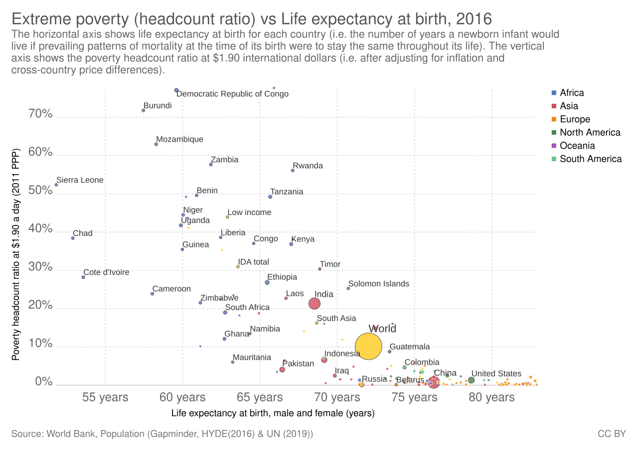
English: :Extreme poverty (headcount ratio) vs Life expectancy at birth
|
| Date | (chart creation) |
| Source | https://ourworldindata.org/grapher/extreme-poverty-headcount-ratio-vs-life-expectancy-at-birth |
| Author | Our World In Data |
| Permission (Reusing this file) |
"License: All of Our World in Data is completely open access and all work is licensed under the Creative Commons BY license. You have the permission to use, distribute, and reproduce in any medium, provided the source and authors are credited." |
Licensing
[edit]_vs_Life_expectancy_at_birth,_OWID.svg&action=edit§ion=2)
This file is licensed under the Creative Commons Attribution 3.0 Unported license.
- You are free:
- to share – to copy, distribute and transmit the work
- to remix – to adapt the work
- Under the following conditions:
- attribution – You must give appropriate credit, provide a link to the license, and indicate if changes were made. You may do so in any reasonable manner, but not in any way that suggests the licensor endorses you or your use.
File history
Click on a date/time to view the file as it appeared at that time.
| Date/Time | Thumbnail | Dimensions | User | Comment | |
|---|---|---|---|---|---|
| current | 23:47, 11 February 2020 | | 850 × 600 (29 KB) | Fæ (talk | contribs) | OWID project #1819 |
You cannot overwrite this file.
File usage on Commons
There are no pages that use this file.
_vs_Life_expectancy_at_birth,_OWID.svg&oldid=877534288)