File:EdwardsFigure.png
Jump to navigation
Jump to search
Size of this preview: 800 × 356 pixels. Other resolutions: 320 × 142 pixels | 640 × 285 pixels | 1,696 × 754 pixels.
Original file (1,696 × 754 pixels, file size: 91 KB, MIME type: image/png)
Captions
Captions
Add a one-line explanation of what this file represents
Summary[edit]
| Description |
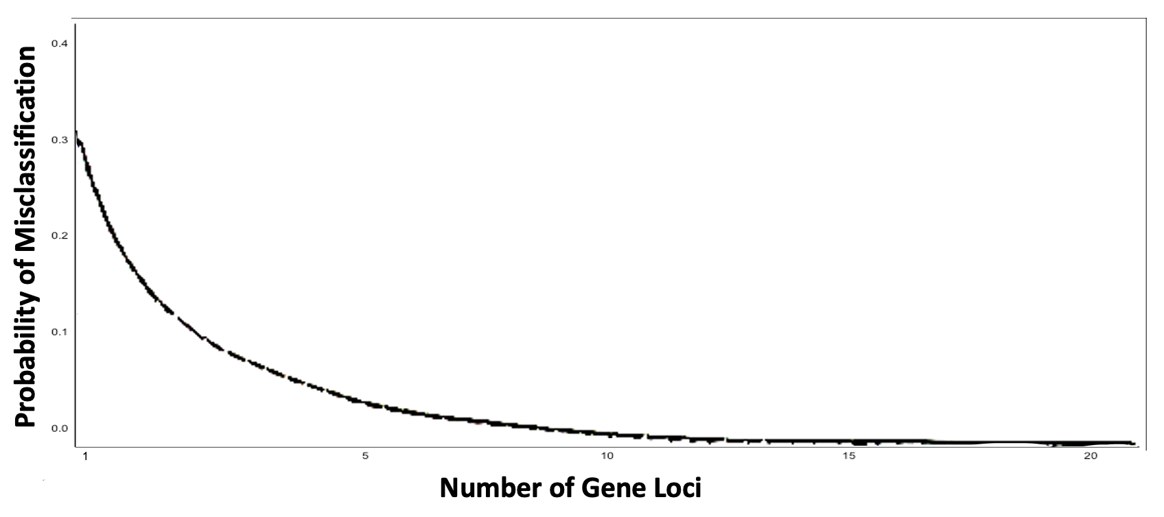
English: Description of the original graph by AWF Edwards: "Graph showing how the probability of misclassification falls off as the number of gene loci increases, for the first example given in the text. The proportion of the variability within groups remains at 84% as in Lewontin’s data, but the probability of misclassification rapidly becomes negligible." The graph displays the same concept as Edward's graph, keeping the axes and the 84% (i.e., 0.3 minor allele frequency) figure the same. |
| Date | |
| Source | Own work |
| Author | Chamaemelum, with inspiration from AWF Edwards' graph. |
Licensing[edit]
| This chart is ineligible for copyright and therefore in the public domain, because it consists entirely of information that is common property and contains no original authorship. For more information, see Commons:Threshold of originality § Charts
|

|
This media file is uncategorized.
Please help improve this media file by adding it to one or more categories, so it may be associated with related media files (how?), and so that it can be more easily found.
Please notify the uploader with {{subst:Please link images|File:EdwardsFigure.png}} ~~~~ |
File history
Click on a date/time to view the file as it appeared at that time.
| Date/Time | Thumbnail | Dimensions | User | Comment | |
|---|---|---|---|---|---|
| current | 09:54, 19 July 2023 | | 1,696 × 754 (91 KB) | Chamaemelum (talk | contribs) | |
| 23:05, 16 June 2023 |  | 1,696 × 754 (97 KB) | Chamaemelum (talk | contribs) | Uploaded while editing "Human Genetic Diversity: Lewontin's Fallacy" on en.wikipedia.org |
You cannot overwrite this file.
File usage on Commons
There are no pages that use this file.