File:20211109 Frequency of extreme weather for different degrees of global warming - bar chart IPCC AR6 WG1 SPM cs.svg

Original file (SVG file, nominally 1,200 × 675 pixels, file size: 12 KB)
Captions
Captions
Summary[edit]
| Description |
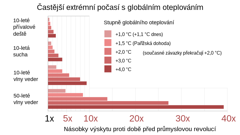
English: Bar chart showing frequency of extreme weather for different degrees of global warming, based on data from IPCC AR6 WG1 SPM (Summary for Policy Makers).
 Warming stripes (five examples compared) Warming stripes bar chart Bar chart (vertical) Pie chart Line charts Scatterplot I've uploaded .xlsx (Microsoft Excel) spreadsheets that automatically generate XML code for charts in SVG format. You simply paste or enter your data into the spreadsheet, and specify image dimensions, number of grid lines, font sizes, etc. The spreadsheet instantly and automatically generates a column of XML code that you simply copy and paste into a text editor and save as an ".svg" file. The spreadsheets produce lean SVG code, avoiding the "extra stuff" that Inkscape inserts. They should save you time in creating SVG charts. Feedback and suggestions on my talk page are welcome. RCraig09 (talk) 23:41, 19 February 2021 (UTC) Click HOW TO for detailed explanation.
Example SVG files: Category:SVG diagrams created with spreadsheet.
Čeština: Sloupcový graf znázorňující četnost extrémního počasí pro různé stupně globálního oteplování na základě údajů z dokumentu IPCC AR6 WG1 SPM (Summary for Policy Makers). |
||
| Date | |||
| Source | Own work | ||
| Author | RCraig09, Czech translation Jirka Dl | ||
| Other versions | English version, Czech version |


Related files[edit]
The following files are based on Fig. SPM.6 of the Sixth Assessment Report of the Intergovernmental Panel on Climate Change / Summary for Policymakers:
-
 20210809 Projected extremes for different degrees of global warming - IPCC AR6 WG1 SPM.svg
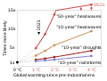
9 August 2021: Line chart of 10- and 50-year datasets (includes frequency, omits intensity) -
 20211107 Projected extremes for different degrees of global warming - 3x10yr area chart - IPCC AR6 WG1 SPM.svg
7 Nov 2021: "L" charts includes both frequency and intensity of the 10-year datasets (omits 50-year dataset) -
 20211109 Frequency of extreme weather for different degrees of global warming - bar chart IPCC AR6 WG1 SPM.svg
9 Nov 2021: Bar chart of 10- and 50-year datasets (includes frequency, omits intensity)


Licensing[edit]
- You are free:
- to share – to copy, distribute and transmit the work
- to remix – to adapt the work
- Under the following conditions:
- attribution – You must give appropriate credit, provide a link to the license, and indicate if changes were made. You may do so in any reasonable manner, but not in any way that suggests the licensor endorses you or your use.
- share alike – If you remix, transform, or build upon the material, you must distribute your contributions under the same or compatible license as the original.
File history
Click on a date/time to view the file as it appeared at that time.
| Date/Time | Thumbnail | Dimensions | User | Comment | |
|---|---|---|---|---|---|
| current | 07:37, 30 December 2021 | | 1,200 × 675 (12 KB) | Jirka Dl (talk | contribs) | font changes |
| 07:25, 30 December 2021 |  | 1,200 × 675 (12 KB) | Jirka Dl (talk | contribs) | Uploaded own work with UploadWizard |
You cannot overwrite this file.
File usage on Commons
The following page uses this file: