Voting period is over. Please don't add any new votes.Voting period ends on 25 Jul 2011 at 20:49:04 (UTC)
Visit the nomination page to add or modify image notes.
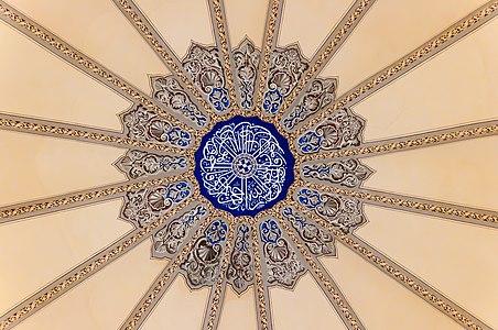
Featured picture candidates/File:Kuppel Kleine Hagia Sophia.jpgCommons:Featured picture candidates/File:Kuppel Kleine Hagia Sophia.jpg
This image of the dome is shot by me yesterday (19 July 2011). Natural day-lighting was coming from the circular windows of the dome (the lights inside the Mosque were turned off). It is clear that in this nomination the white balance is wrong and the image has a general pink color which is not natural. Greetings from Istanbul. Ggia (talk) 11:58, 20 July 2011 (UTC)[reply]
Oppose lacking metadata, improper notation of digital editing (please consider using {{Retouched image}}), symmetry could be improved, the subject has almost no structure and its colours look rather flat, sharpness could be more crisp. regards, PETER WEISTALK08:31, 17 July 2011 (UTC)[reply]
Oppose in the middle there s a cord which is hanging a lamp from the dome that you removed.. look here. and seems the colors flat - over-processed.. Ggia (talk) 09:24, 17 July 2011 (UTC)[reply]
Info I did take a note that the cable was removed (see upload history)! The colours in my image are as close as you can get to how they really look, that other image you linked to has awful colours that aren't even close to how it really looks there! (Compare it to all the other pictures on Commons.) As for the "crispness", please note that the painting itself is rather soft in many areas as they tried to make it look three-dimensional through artificial shadows. -- H00521:28, 17 July 2011 (UTC)[reply]
Comment the colors of the other image are close to the lighting conditions the time the image has taken.. there is no comparison between the two image.. And it is not mentioned that the other image has to get the FP status instead of this one. Ggia (talk) 23:33, 17 July 2011 (UTC)[reply]
Neutral The removal of the cable was not that easy and was quite successful. But it looks tilted (although it is a ceiling). It should have been rotated so that symmetry is perfect. Also, EXIF can be restored from the original. W.S.17:16, 18 July 2011 (UTC)[reply]
Comment Thanks to all for their comments. Unfortunately it was impossible to take the photo in full symmetry because you'd have to go directly under the top point of the dome, and then the lamp hanging down would cover the center od the painting. I will nonetheless try to improve the symmetry by manipulations. As for the white balance: This is made from a raw file without changing the white balance. @Ggia: Other images found on the internet have various colours, but check out e.g. a Google search [1] - I believe that most images are closer to the colours of my image than to your photo from Tuesday, but you find both. It may be a matter of the actual light falling in through the windows. It was a cloudy day when I was there IIRC. -- H00522:08, 22 July 2011 (UTC)[reply]


 Info created by H005 - uploaded by H005 - nominated by H005 -- H005 20:49, 16 July 2011 (UTC)
 Support -- H005 20:49, 16 July 2011 (UTC)
_dome_Istanbul_Turkey.jpg)
 Oppose lacking metadata, improper notation of digital editing (please consider using {{Retouched image}}), symmetry could be improved, the subject has almost no structure and its colours look rather flat, sharpness could be more crisp. regards, PETER WEIS TALK 08:31, 17 July 2011 (UTC)
 Comment the colors of the other image are close to the lighting conditions the time the image has taken.. there is no comparison between the two image.. And it is not mentioned that the other image has to get the FP status instead of this one. Ggia (talk) 23:33, 17 July 2011 (UTC)
 Neutral The removal of the cable was not that easy and was quite successful. But it looks tilted (although it is a ceiling). It should have been rotated so that symmetry is perfect. Also, EXIF can be restored from the original. W.S. 17:16, 18 July 2011 (UTC)