Commons:Featured picture candidates/File:Korenveld met kraaien - s0149V1962 - Van Gogh Museum.jpg
Jump to navigation
Jump to search


File:Korenveld met kraaien - s0149V1962 - Van Gogh Museum.jpg, featured[edit]
Voting period is over. Please don't add any new votes.Voting period ends on 2 Feb 2024 at 14:17:05 (UTC)
Visit the nomination page to add or modify image notes.

- Gallery: Commons:Featured pictures/Non-photographic media/Exteriors#Landscapes
 Info created by Vincent van Gogh - uploaded by Wojtu - nominated by Moheen -- ~Moheen (keep talking) 14:17, 24 January 2024 (UTC)
 Support -- ~Moheen (keep talking) 14:17, 24 January 2024 (UTC)
- Support --Yann (talk) 15:06, 24 January 2024 (UTC)
- Support ★ 18:47, 24 January 2024 (UTC)
- Support --Thi (talk) 22:04, 24 January 2024 (UTC)
- Support Cmao20 (talk) 01:03, 25 January 2024 (UTC)
- Support -- Radomianin (talk) 09:49, 25 January 2024 (UTC)
 Oversaturated Support --Aristeas (talk) 11:09, 25 January 2024 (UTC)
- Support--Agnes Monkelbaan (talk) 12:49, 25 January 2024 (UTC)
- Support Van Gogh's brush strokes cannot be expressed in 2D, but this is still worthy of FP. --Laitche (talk) 12:53, 25 January 2024 (UTC)
 Oppose Garish colors. Oversaturated, yes. Not Van Gogh's usual palette, sorry. Compare with the version in Van Gogh Museum, and newspapers like Le Temps, The Conversation, Times of Malta, Le Figaro, France Info, Telerama, Vogue, Le Point, La Voix du Nord... -- Basile Morin (talk) 03:08, 26 January 2024 (UTC)
 Comment I wonder which parts are oversaturated compare with this one or this one??? --Laitche (talk) 04:10, 27 January 2024 (UTC)
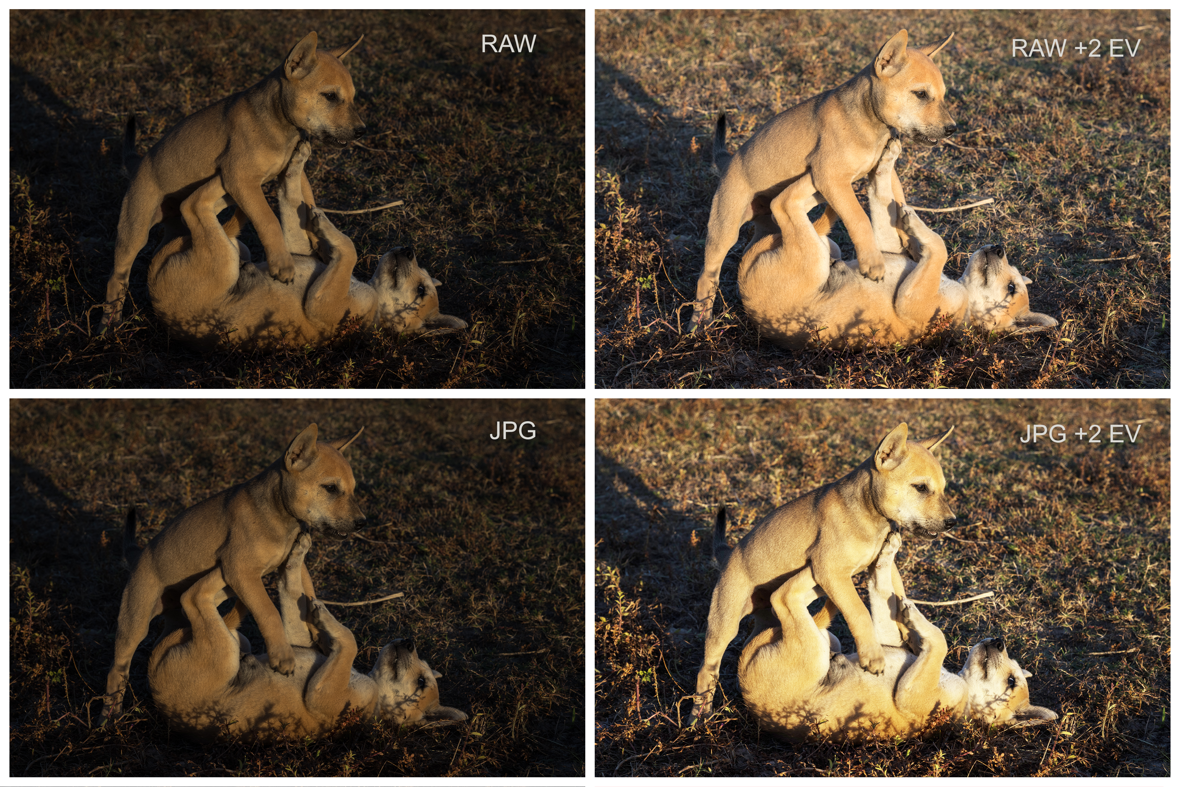
- Clearly different colors when the 2 images are superimposed for comparison. The original blue is not an electric blue but a much warmer tint, kind of Persian blue / Persian indigo. It has an impact on the mood. Quality of the file is good, but I think the colors have been modified too much from the original version.
- Moreover, when increasing the exposure on Photoshop, the colors remain accurate. I don't know which process has been made here, but temperature and saturation seem wrong.
- The original version (archived) from the Van Gogh Museum is here. Although dark, it is very likely that the light calibration is relevant, and the difference is huge. I don't find good to overwrite the original picture by an arbitrary version, so different. At the very least it should have been done under a different file name.
- The original picture is not a RAW but a JPG. It means that if you alter the luminosity, you are modifying fixed colors (not flexible). The more important the change is, the more damaged are the nuances of the palette. Non-artistic files, like graphics or tables, can be improved that way, but hardly art pieces, where subtle colors are essential and skillfully designed by sensible artists -- Basile Morin (talk) 05:37, 27 January 2024 (UTC)
- Yes, it's definitely different, but isn't it more like brightened than oversaturation, in my eyes :-) --Laitche (talk) 07:47, 27 January 2024 (UTC)
- Brightening, lightening, or whatever tool was applied here, has resulted in oversaturated colors because the JPG colors were pushed excessively. To verify, you can try this simple test on your computer: take a RAW photograph, then convert it in JPG. Afterwards, increase the light of both images, the RAW and the JPG separately, then you'll notice a significant difference in the saturation of the colors. The RAW will seem plausible, while the JPG will appear unnatural -- Basile Morin (talk) 08:42, 27 January 2024 (UTC)
- Okay, I got it! :) --Laitche (talk) 09:00, 27 January 2024 (UTC)
-
- Thank you, Basile Morin, for the explanations and the instructive example! This shows the much higher potential of raw files. And there are even more benefits of shooting raw over shooting JPEG. Hence the common advise “Shoot raw” … --Aristeas (talk) 11:07, 28 January 2024 (UTC)
- Another painting also made by Van Gogh, was uploaded the same day from the same official website. The exposure is okay, suggesting that there might be a valid reason to present this version of the painting, rather than a bright one. Very possibly the original artwork is composed of dark colors on the canvas. -- Basile Morin (talk) 01:56, 29 January 2024 (UTC)
- Comment Added retouched template -- Basile Morin (talk) 01:43, 29 January 2024 (UTC)
- Support --MZaplotnik(talk) 20:36, 30 January 2024 (UTC)
Confirmed results:
Result: 10 support, 1 oppose, 0 neutral → featured. /-- Radomianin (talk) 21:12, 2 February 2024 (UTC)
This image will be added to the FP gallery: Non-photographic media/Exteriors#Landscapes