Voting period is over. Please don't add any new votes.Voting period ends on 3 Dec 2010 at 22:30:55 (UTC)
Visit the nomination page to add or modify image notes.
Featured picture candidates/File:Figure in Manga style.pngCommons:Featured picture candidates/File:Figure in Manga style.png
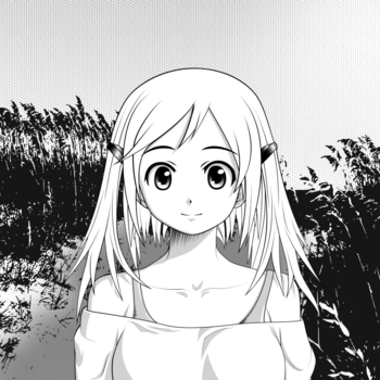
In manga you are usualy limmited to 3 colors (black, light gray, white) and patterns. Thats exactly what this image should illustrate, as it is totally common and currently no other freely available image shows this limitation. --Niabot (talk) 00:47, 25 November 2010 (UTC)[reply]
Comment "Please don't forget that the image you are judging is somebody's work. Avoid using phrases like "it looks terrible" and "I hate it". If you must oppose, please do so with consideration." It may be more considerate to say, "The quality falls short my standard for a featured picture", for example. Walter Siegmund(talk)00:56, 25 November 2010 (UTC)[reply]
An SVG version is available (svg), but it has 12 MB and Commons isn't able to display it. The small preview works (with errors) but otherwise it isn't shown at all. So i decided to nominate the PNG export while the SVG is available for the ones that want to use this image for other cases. Would not want to nominate and incorrectly renderered SVG again, thinking on the last image with missing eyes in thumbnails. ;-) --Niabot (talk) 11:18, 25 November 2010 (UTC)[reply]
Support I didn't know anything about "mangas", except a previous controversial nomination of a "hentaï" (?). But from this picture, I followed and followed the links, and discovered a very interesting part (to me) of the modern japanese civilization. That's why I think "Commons" is great. As a french "classical" photographer, especially loving "classical" subjects, and maybe shooting in his own foot, I'm happy to say that there is not only the Louvre Museum in the world of art !! At the end, concerning this picture, I think it is a very good "basic" illustration of this kind of art, and can be therefore featurable, in my humble opinion. --Jebulon (talk) 10:25, 25 November 2010 (UTC)[reply]
Oppose -- Maybe this is a very characteristic example of the so-called manga art, I don't know. But I don't like it aesthetically and think that a much better use of the few available colors could have been made in the central figure, which is flat and boring. We do know, from the long western tradition (Europe and America) of BW cartoons and comics that much better solutions are possible. As for the more general scope of manga and anime, I think that the present FPs of the same creator are of much higher quality (here and here) -- Alvesgaspar (talk) 11:13, 25 November 2010 (UTC)[reply]
Question I do not know much about manga, but there is something about the eyes which appears different, slightly different as compared to other cartoons I have seen. In the nominated photo, there is a distance between the eye brows and the upper part of the eye. Is it not more typical that the eyebrow is an "integrated" part of the eye, see, e.g., File:Anime eye.svg? I guess the character looks a bit more naive or young this way. Is it intentional? Or maybe I am just mixing up the eyelid and the eyebrow? --Slaunger (talk) 22:49, 25 November 2010 (UTC)[reply]
Depending on style there are three basic ways to draw the lower eyelashes. The simplest is to ignore them completely, but it fores you to draw the upper eyelashes in a wide circle type. Prominent examples for this style are Azumanga Daioh ([1]) or Koe de Oshigoto ([2]) or Oreimo ([3]), which both uses them to show more or less naivety. You will also find many works which just draw them if the the lower eyelashes and pupil collide, which is common for styles with very large eyes/pupils ([4], [5]). And right, you also have styles that draw them thick and every time. ([6], [7]). To make it short: The artist is absolutely free to decide if or not. --Niabot (talk) 23:36, 25 November 2010 (UTC)[reply]
Thanks for the informative and enlightening response. I did have the feeling I was walking on thin ice regarding this. I kinda agree with the concerns raised by other regarding the composition. That it is rather uninteresting, also compared to your other manga creations. Any comments on the composition relative to illustrating what B/W manga is about? Could the same points be illustrated with a more striking composition? --Slaunger (talk) 09:27, 26 November 2010 (UTC)[reply]
I choose that composition mainly for one reason: To show the proportion between body (shoulders) vs head-size and the mouth vs nose vs eyes ratio, which can't be easily seen if you don't choose a more or less frontal view. Even the indication of the nose basically only works if looked at frontally. For the proportions i used the golden ratio (which perfectly fits to the face), as shown in the image beside. --Niabot (talk) 11:45, 26 November 2010 (UTC)[reply]
Neutral tending towards support. Thank you for taking your time to make these detailed explanations. There is much more to the composition than I had first noticed. I find it very interesting. I really do not understand how other reviewers can argue that such kinds of images are not really in scope for Commons. It is informative and educational, not only with illustrating the basic techniques and proportions, as well as how one renders to B/W. Moreover, such images are seldomly licensed in a way, which is compatible with Commons. I do understand the concerns about the composition, that it seems rather plain. I guess it is because everything in the image is so standardized. You sort of need to bend or break a rule to make an image really interesting. It is this aspect of the image which leads to my neutral vote. --Slaunger (talk) 21:26, 28 November 2010 (UTC)[reply]
Oppose Sort of per Alvesgaspar - the composition is central and flat, and the face is minimalist. A portrait photograph with similar composition would struggle to get votes. --99of9 (talk) 00:20, 26 November 2010 (UTC)[reply]
Oppose Good! But, the caracter says nothing with his face and his body, Why? The manga style allows a expressive drawing! The absence of colors is regrettable for a FP.--Citron (talk) 17:12, 26 November 2010 (UTC)[reply]
Oppose I think the whole subject/style is out of scope for Commons, but merely comparing it to already Featured works such as this and this demonstrates that this doesn't meet the standard. Steven Walling21:54, 26 November 2010 (UTC)[reply]
Comment: This is really what Featured Picture voting is about? To summarize the above opposes: I don't understand it but I don't like it. Me, neither. No Japanese art should be on our server. Oh, and black and white pictures should be in color! Wow. Just wow. 75.41.110.20018:20, 27 November 2010 (UTC)[reply]
You are right, I'm from germany. But has that anything to do with drawing in a prototype Japanese style of manga? Can the river dance only be executed by Irish men? Does that mean Shibari must be performed by a person of Japanese decent? Pointillists must be from France? Surrealists must be from Spain? --Niabot (talk) 01:39, 28 November 2010 (UTC)[reply]
I don't really know what you are trying to tell me, since i have problems with the translation of the linked page (can't speak or read french). Can you explain it in more detail? --Niabot (talk) 20:04, 28 November 2010 (UTC)[reply]
Niabot: I'm not suggesting it's less than great for us to have contributions from a German imitating a Japanese visual style. I'm just pointing out that it's completely hyperbolic to attack the oppose voters as if we were rejecting all Japanese art on Commons. Steven Walling22:04, 28 November 2010 (UTC)[reply]
Support The others that other people linked are good (and almost pornographic heehee) but this one is very well-done as well and very crisp, I don't particularly miss the color and I like the whole proportions thing. --IdLoveOne (talk) 14:35, 29 November 2010 (UTC)[reply]


 Info created, uploaded, nominated by Niabot -- Niabot (talk) 22:30, 24 November 2010 (UTC)
 Support -- Niabot (talk) 22:30, 24 November 2010 (UTC)
 Oppose I see no point in featuring non-notable poor quality cartoons. Sorry. --The High Fin Sperm Whale 22:52, 24 November 2010 (UTC)
 Comment "Please don't forget that the image you are judging is somebody's work. Avoid using phrases like "it looks terrible" and "I hate it". If you must oppose, please do so with consideration." It may be more considerate to say, "The quality falls short my standard for a featured picture", for example. Walter Siegmund (talk) 00:56, 25 November 2010 (UTC)
 Question I do not know much about manga, but there is something about the eyes which appears different, slightly different as compared to other cartoons I have seen. In the nominated photo, there is a distance between the eye brows and the upper part of the eye. Is it not more typical that the eyebrow is an "integrated" part of the eye, see, e.g., File:Anime eye.svg? I guess the character looks a bit more naive or young this way. Is it intentional? Or maybe I am just mixing up the eyelid and the eyebrow? --Slaunger (talk) 22:49, 25 November 2010 (UTC)

 Neutral tending towards support. Thank you for taking your time to make these detailed explanations. There is much more to the composition than I had first noticed. I find it very interesting. I really do not understand how other reviewers can argue that such kinds of images are not really in scope for Commons. It is informative and educational, not only with illustrating the basic techniques and proportions, as well as how one renders to B/W. Moreover, such images are seldomly licensed in a way, which is compatible with Commons. I do understand the concerns about the composition, that it seems rather plain. I guess it is because everything in the image is so standardized. You sort of need to bend or break a rule to make an image really interesting. It is this aspect of the image which leads to my neutral vote. --Slaunger (talk) 21:26, 28 November 2010 (UTC)
.png)