File talk:Phineas Gage Cased Daguerreotype WilgusPhoto2008-12-19 EnhancedRetouched Color.jpg
Notes
[edit]
Email discussion
[edit]
The following was copied from an email from nagualdesign to EEng, 16 December 2017:
Here's my professional photo forensic analysis, for what it's worth. It's a bit technical in places, and it's difficult to explain in writing exactly what I did with the images, since pictures are worth a thousand words, so feel free to ask for clarification.
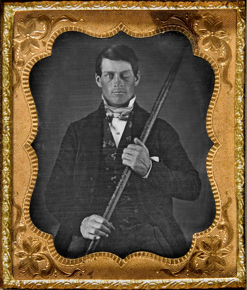
Evidently, the hi-res image of his upper body was/is part of the exact same photograph of the daguerreotype, since it was precisely the same orientation as the Wilgus photograph on the Commons, and it's identical in every detail (just larger). I expect that the one on the Commons has been downscaled at some point, and the hi-res one has obviously been cropped, but they almost certainly share the same provenance. A different photograph of the same artefact would exhibit subtle differences in orientation, particularly considering that the photo was very slightly rotated (before I was finished I rotated the whole thing 0.1° clockwise). The possibility of two photographers orienting their camera to within 0.05° (which is the level of accuracy I employed) is vanishingly small. The only real difference between the two was the tone; the hi-res image is slightly darker, but in such a precise way that I can tell it had been darkened (or the low-res one lightened) in a single adjustment, since the curves adjustment I used to correct it was simplicity itself (every point on the curve was raised by 10):

Normally, when an image requires lightening the curve (in this case, a straight line) is quite complex, since the different tones require different amounts of adjustment, but when I 'turned everything up by 10' the hi-res image was indistinguishable from the low-res image.
The software used to enlarge the low-res image, waifu2x, produces incredible results using a deep convolutional neural network. If you compare the new image (the one I made) to the old one on Commons you can see what a great job it did of upscaling. Look at his hands, for example, or the texture of the brass. Since the human eye is adept at analysing facial details it was better to use the hi-res source for that part of the image, scaled down. Without getting into the technical details I was able to convert the hi-res image into a 'smart object', meaning I was able to make repeated small adjustments to scale and position in a lossless manner, so that I could align the images with sub-pixel precision. Suffice to say it was incredibly accurate. The only visible difference when switching between the two was that one had higher acutance (the difference in resolution was apparent).
To integrate the two so that there was no sudden transition I created a mask that preserved his head and shoulders in the hi-res image while blending the background. Since the original daguerreotype was sharply focused on his face and less so on the background the transition mimicked the depth of field of the original photo. I'm not really sure how to explain it any better than that, since it's taken me many years to get to this level and I've gone way beyond putting things into words in my own mind. My thought process is entirely visual with things like that. Suffice to say that I'm constantly switching back and forth to see the effect of every single stroke of the mouse, eyes wide open, critically assessing whether what I've just done works. It can be quite painstaking but the results are worth the effort.
The only real changes that warrant any sort of explanation (on the image file page) are the restoration. Upscaling the image and using a hi-res source for his face don't really represent material changes. Spot removal, removing some discolouration and the repair to the lower left are actually much more significant alteration, even though they're quite subtle, and would normally be sufficiently explained in one word: restored. All in all I'd personally describe the finished image as being the original photograph enlarged and restored, or to be slightly more explanatory of its provenance, original photograph (Wilgus), enlarged (Waifu2x) and restored (Haythornthwaite). If anyone needs to know more than that they can of course ask. I don't normally post a long explanation of the specifics on Commons.
I hope all this meets with your approval. If you'd like a second opinion there's another user on Wikipedia and the Commons, Quibik, who's an expert on this sort of thing. Feel free to forward any of these emails to him, and/or be sure to express that I won't be offended if he disagrees. If he did I'd probably learn something invaluable in the process.
Regards,
Joe Haythornthwaite
Continued discussion
[edit]
The following discussion was copied from W:User talk:EEng#Phineas Gage images:
Did you upload the hi-res image of Gage's face as a derivative? If not I'll upload it as File:Phineas Gage Cased Daguerreotype WilgusPhoto2008-12-19 CroppedHeadOnly EnhancedRetouched Color.jpg if that's okay with you. nagualdesign 21:37, 20 December 2017 (UTC)
I was going to update File:JacksonJBS A descriptive catalogue of the Warren Anatomical Museum 1870 frontispiece 623x1024.jpg using a hi-res version of the original, which I'd intended to clean up, but looking at the image at 100% I noticed that what looks like the hole in the top of his skull is actually a bit of damage to the original photograph. Obviously I can't just repair the damage as it would repair the skull, so I gave up. The reason I mention it is because, given the circumstances, you might agree that the image is somewhat misleading. It's unfortunate that the original photo happens to be damaged at that particular spot, but there you have it. If you can find an alternative photograph I'll be happy to clean it up. Regards, nagualdesign 00:41, 21 December 2017 (UTC)
...Actually, comparing that damaged hi-res image with File:Simulated Connectivity Damage of Phineas Gage SkullDisplayWarren.jpg I see that the damage is almost exactly the same shape as the hole. Something to do with the way the exposed parts of the photo (that is, the dark parts, since photography employs negatives) become more susceptible to damage, perhaps? The good news is that it isn't entirely misleading. I may be able to selectively repair it using the modern photo as a guide. I'll have a go at it in the next few days. nagualdesign 01:15, 21 December 2017 (UTC)
- Hi, nagualdesign, and thanks for your great work on this. I've requested a rename of File:Phineas_Gage_daguerreotype,_photographed_(Wilgus),_enlarged_(Waifu2x),_restored_(Haythornthwaite).jpg to harmonize the filename with the other Gage image files. I thought I'd wait until that rename goes through before creating the derivative crop, to avoid confusion, because the derivative has to point back to the original, and if the original is renamed, then the pointer has to change ...
- Now, on your second point, the holes you see (two jagged openings – a large one closer to the reader, and a much smaller on nearer the top of the skull) are the holes that really are there. However, when you zoom in on the image you linked (above) as "his-res", I agree those areas look very artificial. That image is from JBS Jackson's A Descriptive Catalogue of the Warren Anatomical Museum (1870), and I suspect it was retouched for publication to enhance the contrast. But here's the thing. The primary interest of this image is simply its quaintness, the heavy drapery, the dramatic side-by-side of skull and iron on Harlow's front hall table (or whatever it is); there are way better images of the skull itself available (File:Simulated_Connectivity_Damage_of_Phineas_Gage_SkullDisplayWarren.jpg), and somewhat better images of the iron (the big portrait you already enhanced, plus File:Phineas_Gage_GageMillerPhoto2010-02-17_Unretouched_Color_Cropped.jpg) – on both of these last two, you can actually make out some of the inscription. So there's little point in enhancing this particular image.
- Also, if by "modern image" you mean File:JacksonJBS A descriptive catalogue of the Warren Anatomical Museum 1870 frontispiece 623x1024.jpg -- that's the same image from the same source, just with brightness and contrast adjusted.
- In general I don't like the idea of retouching historic images, except for removing scratches and so on in the background (not on the subject). I think your grand work on the portrait was an exception because (if I'm understanding you correctly) you made no changes to the head/face (obviously the area where authenticity matters most) other than swapping in the hi-res there. I would have preferred that the hands had also remained unaltered, but it's not a big deal. Come to think of it, though, I'd like to add to the following, if it's true, to the description page for File:Phineas_Gage_daguerreotype,_photographed_(Wilgus),_enlarged_(Waifu2x),_restored_(Haythornthwaite).jpg: "Digitally enhanced and manually retouched, but no enhancement or retouching of the face/head." Is that a true statement?
- Personally, what I'd love is for you to take crack at is making a better replacement of File:Phineas_Gage_GageMillerPhoto2010-02-17_TampingIron_EnhancedCropped.jpg. You can see a discussion of how it came to be at W:Graphics_Lab/Photography_workshop/Archive/Nov_2013#Extract_legible_inscription_from_portrait_of_Phineas_Gage. Doing whatever it was he did, V4711 got a pretty good result, but maybe with newer software or whatever you can better bring the inscription out. However, the result should be strictly algorithmic, no manual retouching. Do you think that would interest you?
- EEng 02:48, 21 December 2017 (UTC)
,_enlarged_(Waifu2x),_restored_(Haythornthwaite).jpg&action=edit&redlink=1)
- Okay, taking your points in order... There's no rush to upload the enhanced head shot, and I'm happy to wait until the large portrait is renamed.
- As for the JacksonJBS photo, my intention was only to do some spot removal, undoing any damage (which can be clearly seen in the original), and re-doing the conversion to grayscale in a way that's mindful of the discolouration. What I mean by that is, there are weird blobs on the upper edge of the teeth, the cheek bone and other areas that shouldn't be there, and on the black and white image they look like additional skull damage, which they are not. And since the original photo has an area that's greenish, directly converting the image to greyscale without correcting this has produced unintended effects. I wouldn't do anything that detracted from its quaintness, the heavy drapery, the dramatic side-by-side of skull and iron on Harlow's front hall table, I'd only restore the image somewhat closer to its original condition, and regain a higher resolution. At the moment, if anyone wants to take a closer look at the black and white version being used in the article it leaves a lot to be desired when you compare it to the original.
- By "using the modern photo as a guide" I meant using this image purely as a reference so that I don't remove any spots that are genuine damage to the skull rather than damage to the photo.
- Regarding the photo I uploaded - I would have preferred that the hands had also remained unaltered, but it's not a big deal. - I made no alteration to the hands. Along with most of the rest of the photo they were enlarged purely computationally, using Waifu2x. I only pointed them out to you to show what a beautiful job the algorithm does of interpolating. Sorry if I wasn't clear about that.
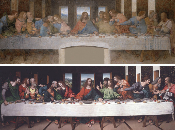
- The statement, "Digitally enhanced and manually retouched, but no enhancement or retouching of the face/head." isn't quite true, no, since the head required the most work to integrate it with the rest of the image. That isn't to say it's been altered more though. I realize this may sound like a contradiction but it takes a lot more work and effort to ensure that an image, or part of an image, isn't materially altered. It wasn't 'enhanced' in any way, aside from some minor spot removal, which is really equivalent to removing specks of dust. You can easily compare the before (at 200% zoom) and after (at 100%), switching between the two, to see that nothing important has been altered whatsoever. I didn't do a Last Supper if that's what you're worried about. I'd stick with the phrase, "Digitally enlarged and manually restored."
- I can certainly have a crack at extracting the tamping iron from the Miller photo. You might have to give me a couple of days to get on with that, as I have other work on at the moment. And don't worry, I won't scratch my name into the metal or anything.
 nagualdesign 14:29, 21 December 2017 (UTC)
- My point about the drapery and so on is not that I'm worried they'll be compromised, rather that those elements are the only reason that image (array of four images, actually) is interesting. It's not really interesting as a record of what Gage's skull looks like, because we have other photos to do that job. Thus I think it's a bad idea to try to restore it, remove apparent damage, etc., because I don't think that gives us anything we don't get better from something else, and it risks falsifying the image unintentionally. How can you know what the "original condition" was? (As always -- and I may forget to say this at appropriate points -- cleaning up the background to remove scratches, dust, etc., is never objectionable. My concern is always with changes to the subject's face, hands, clothing, what he's holding, etc.) Sooner or later I can have a professional image taken of not just the image as seen in a pristine copy of Jackson's catalog, but (depending on my powers of persuasion) of the original photographic print held in the Woburn Public Library. That's not doing to happen anytime soon because it's just one more thing to do, but when it does it will make all this work and discussion moot. So I really urge you to not do this.
- Now let's go back to the main portrait. First, my understanding is that what we see, in your restoration, of the head and face is primarily the "hi res" version of the head and face digitally inserted over the resolution-enhanced version of the rest of the portrait. But then you did some spot removal, right? EEng 15:20, 21 December 2017 (UTC)
- That's correct, yes. I also desaturated the entire middle portion of the image (the daguerreotype itself), including the face, to remove some minor discolouration. As you can see here the source image has some very slight yellowing in places, plus a few magenta artefacts, which I desaturated. nagualdesign 15:28, 21 December 2017 (UTC)
- Gosh, I'm sorry to say this, but I'm uncomfortable with those last steps. How do you know what's a spot? How do you know what's discoloration? For his face (and, less importantly, his hands) this is the only indication we have of what he looked like in life, including his scars and other disfigurement, and I'm very, very wary of making any assumptions about what's real and what's not. EEng 15:36, 21 December 2017 (UTC)
- The resolution of the photograph is greater than the resolution of the daguerreotype, so it's fairly easy to see the difference between something in the original image and something on the image, and I only remove things that I'm pretty certain about, and have no effect on what he looks like. Daguerreotypes are monochromatic, so any amount of colour shouldn't really be there. That isn't to say that a small amount of split toning isn't acceptable (the white areas may be slightly yellower than the darker areas), but in areas where the colour has no relation to the tone we can be certain that that's discolouration.

- If you look at the animation to the right you will see 4 frames. The first frame is the source image. The second frame highlights the type of spots that I removed, most of which are bits of inconsequential lint. I did remove a large scratch on the left of the image, which I knew was a scratch as it overlaps background and foreground, and I removed because it detracted from the subject. The only spot that affected his appearance in any way was the small whiteish line on his hair. In my opinion that's a small scratch or bit of something stuck to the photo. At worst it was a bit of something stuck to Gage's hair, which I've removed in error, but it hardly changes his appearance. The third frame shows the colour information, greatly enhanced for clarity. In actual fact the image is almost purely grayscale, but as you can see from the enhanced colour image there are areas of yellowing. The bluing is an artefact of the photograph, and simply indicates areas where there is less yellowing. They shouldn't be blue though. Nor should there be any greenish spots. In the fourth frame I've highlighted a few reddish spots that are probably the result of people touching the daguerreotype, and the grease that was left has coloured over time. Again, daguerreotypes are supposed to be black and white.
- I hope that allays your fears. To be honest I think you're being a bit overly cautious. I actually share your belief that historic photographs ought to be treated with kid gloves, and I've made every effort to avoid making the mistakes you're fearful I may have made. As I said before, you can simply compare the before and after images to see with your own eyes exactly what I've done, and what I haven't done. The image I uploaded gives a better indication of what he looked like in life than the image currently used in the article, which is actually rather purple following your own edit, don't you think? nagualdesign 16:37, 21 December 2017 (UTC)
- I'm satisfied that the changes were appropriate, and that this discussion allows anyone who cares to understand them. Great work, thanks again! EEng (talk) 03:24, 22 December 2017 (UTC)